Combining background masks with section dividers in Divi adds another layer of creativity to an already powerful arsenal of background design options. If you haven’t had much experience with Divi’s background options, you’re definitely missing out. One convenient, yet powerful, option gives you the ability to add a background mask to your background gradient (or image) in just a few clicks. In addition to background options, section dividers also give users the ability to enhance their background designs.
In this tutorial, we are going to show you how to combine background masks with section dividers in Divi. We’ll give you step-by-step instructions on how to complete a background design for a Divi section using this technique. Plus, we’ll even cover how to create some alternative designs with just a few simple tweaks.
Enjoy!
Sneak Peek
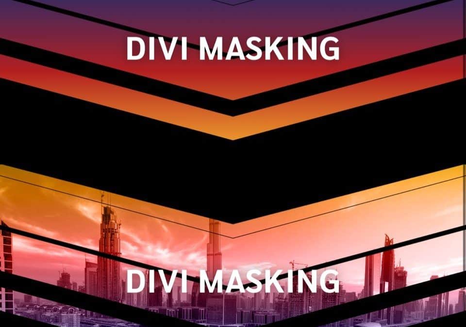
Here is a quick look at the designs from this tutorial.
The Concept
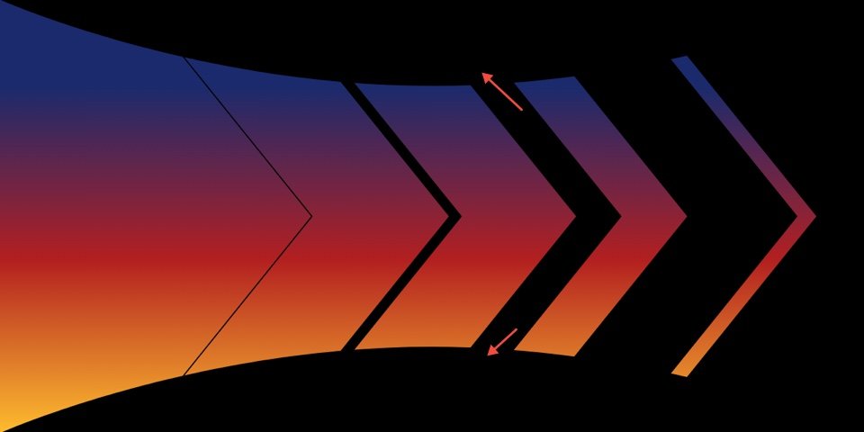
The basic concept for this tutorial is to combine a background mask and section dividers to create even more unique mask shapes.
First, we add a background mask.
Then we add section dividers to complement the mask shape in a creative way.
Download the Layout for FREE
To lay your hands on the designs from this tutorial, you will first need to download it using the button below. To gain
access to the download you will need to subscribe to our Divi Daily email list by using the form below. As a new
subscriber, you will receive even more Divi goodness and a free Divi Layout pack every Monday! If you’re already on the
list, simply enter your email address below and click download. You will not be “resubscribed” or receive extra emails.
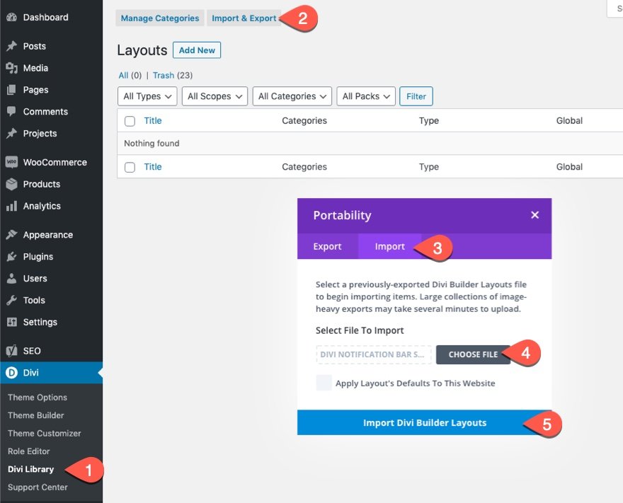
To import the section layout to your Divi Library, do the following:
- Navigate to the Divi Library.
- Click the Import button at the top of the page.
- In the portability popup, select the import tab
- Choose the download file from your computer (make sure to unzip the file first and use the JSON file).
- Then click the import button.
Once done, the section layout will be available in the Divi Builder.
Let’s get to the tutorial, shall we?
What You Need to Get Started
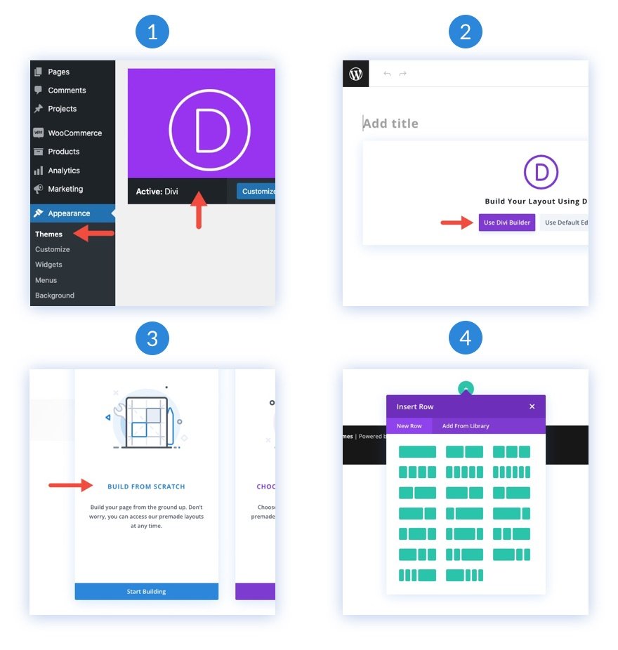
To get started, you will need to do the following:
- If you haven’t yet, install and activate the Divi Theme.
- Create a new page in WordPress and use the Divi Builder to edit the page on the front end (visual builder).
- Choose the option “Build From Scratch”.
- Now have a blank canvas to start designing in Divi!
How to Combine Background Masks and Dividers in Divi
1. Add Section Size and Spacing
To start things off, we are going to add size and spacing to the existing section in the builder. We are going to hold off adding a row or any content so we can concentrate on the background design of the section
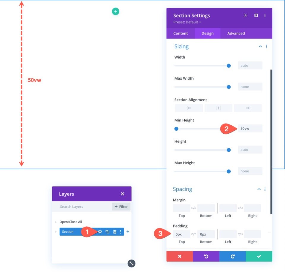
Open the settings for the Section. Under the Design tab, update the size and spacing as follows:
- Min Height: 50vw
- Padding: 0px top, 0px bottom
Using the VW length unit for height might seem strange. However, since we are going to be using the VW length unit to size our background elements, this will make sure the design scales fluidly on different browser widths.
2. Create the Background Gradient
Once the section has some height, we are ready to add the background gradient to the section. This will give us some background color so that we can showcase the background mask and divider combo later on.
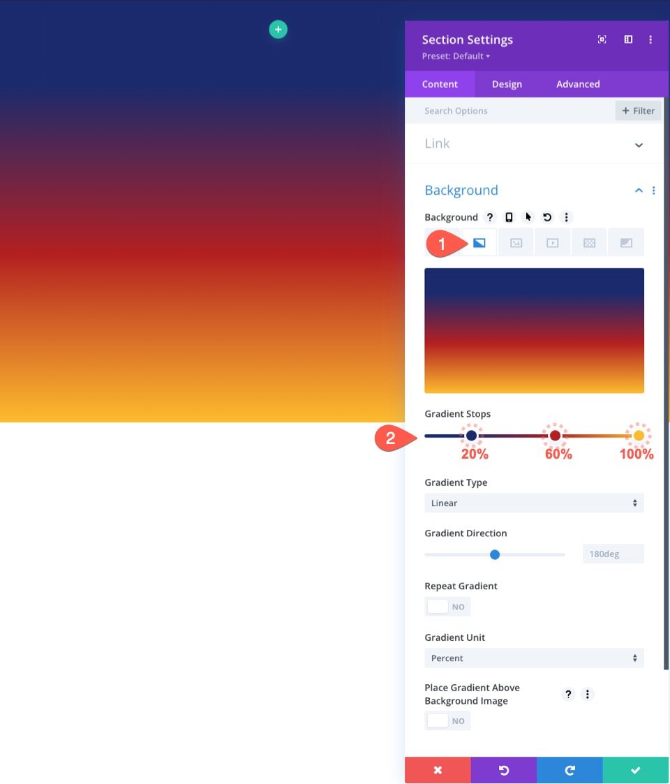
Under the Content tab, click the background gradient tab under the background options. Then add a gradient as follows:
- Color Stop 1: #1a2a6c (at 20%)
- Color Stop 2: #b21f1f (at 60%)
- Color Stop 2: #fdbb2d (at 100%)
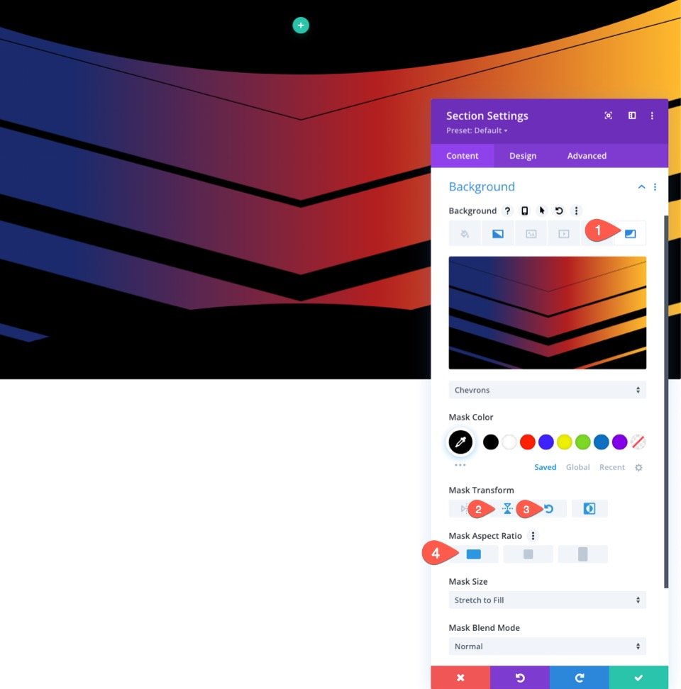
3. Create the Background Mask
Now that we have a color gradient, we are ready to create a background mask.
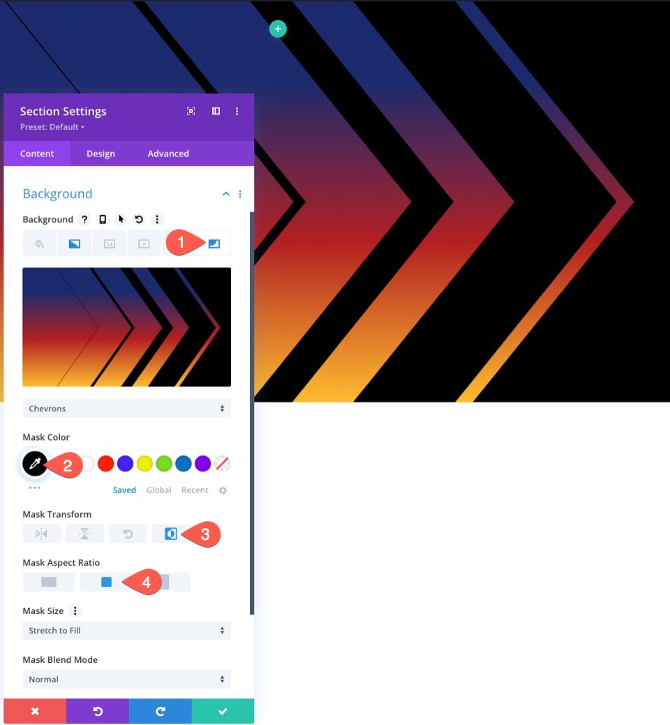
Under the Background Mask tab, update the following:
- Mask: Chevrons
- Mask Color: #000
- Mask Transform: Inverted
- Mask Aspect Ratio: See Screenshot
4. Add the Section Background Dividers
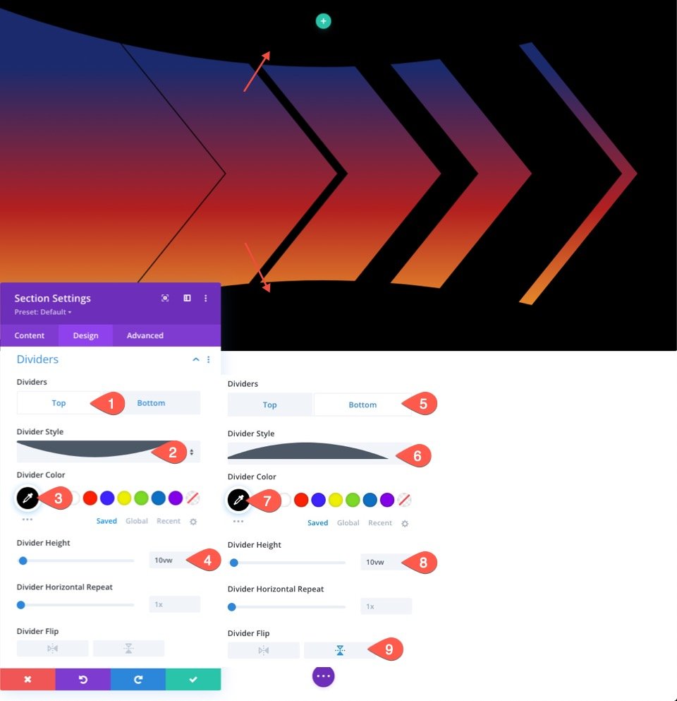
Once our mask is in place, we can modify the masking shape further by using section dividers. In this example, we are going to add a half-circle section divider to the top and bottom. This will squeeze the background mask to look more like a fancy arrow design.
To do this, click the Design tab and add the following Dividers:
First, add a top divider under the Top tab.
- Divider Style: See Screenshot
- Divider Color: #000
- Divider Height: 10vw
Next, add a bottom divider under the Bottom tab.
- Divider Style: See Screenshot
- Divider Color: #000
- Divider Height: 10vw
- Divider Flip: Vertical Flip
The Result
Here is the result so far.
Tweaking the Background Options and Dividers for More Designs
Now that you have the basic idea in place, we can easily play around with the background options section dividers to create more designs.
Alternate Design #1
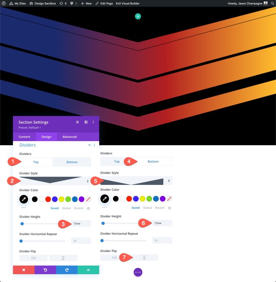
For our first alternative design, we are going to rotate the existing background mask and replace the half-circle section dividers with triangles.
To do this, open the existing section settings, click the background Mask tab, and update the following:
- Mask Transform: Vertical Flip, Rotate
- Mask Aspect Ratio: See Screenshot
Next, update the Section Dividers as follows:
Top Divider
- Divider Style: See Screenshot
- Divider Height: 13vw
Bottom Divider
- Divider Style: See Screenshot
- Divider Height: 13vw
- Divider Flip: disable
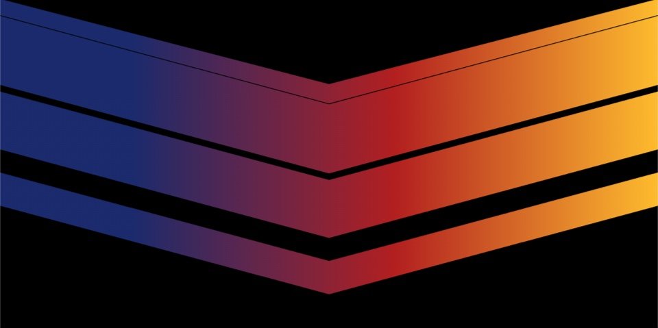
The Result
Here is the result.
Alternate Design #2
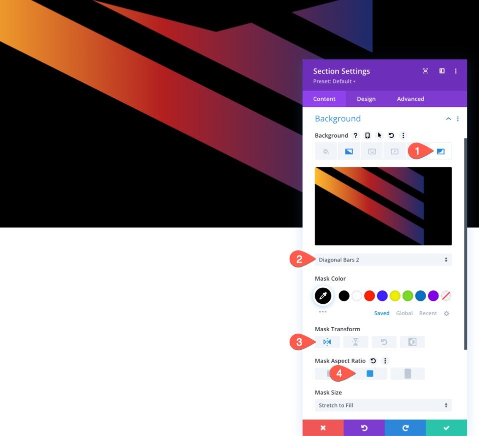
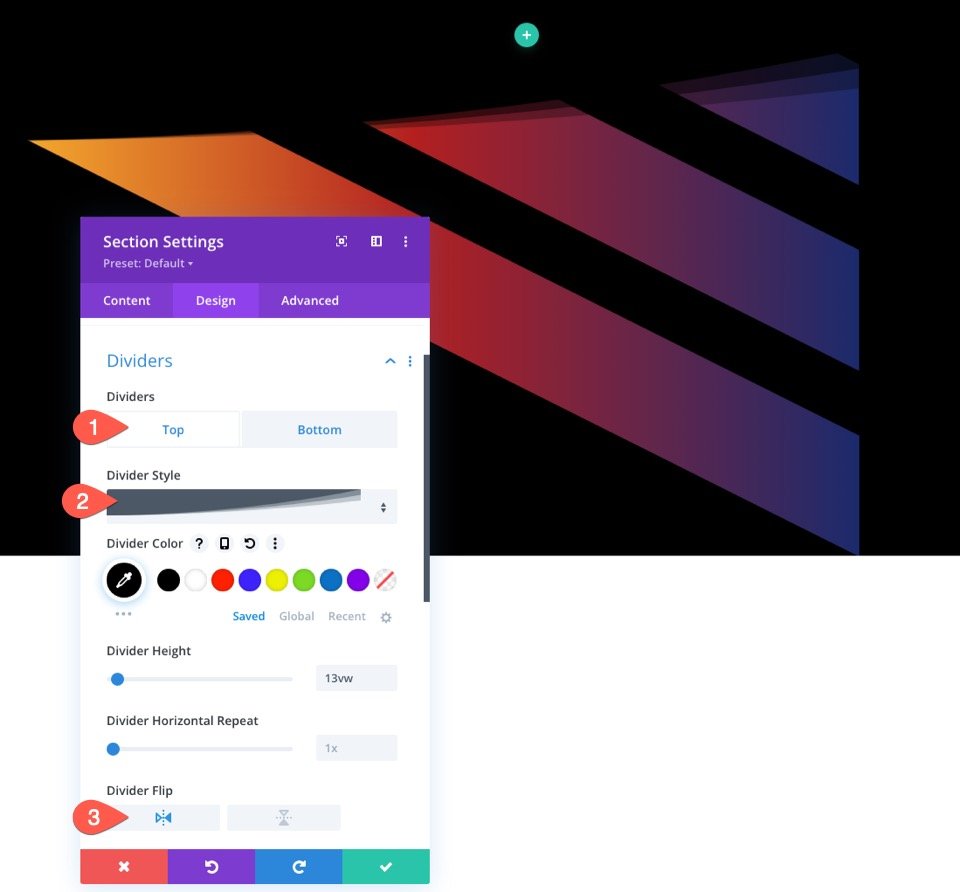
For our second and final alternative design, we are going to replace the Chevrons Mask with the Diagonal Bars 2 Mask and also give it a new top section divider to add a subtle swooshing effect to the design.
To do this, open the existing section settings, click the background Mask tab, and update the following:
- Mask: Diagonal Bars 2
- Mask Transform: Horizontal Flip
- Mask Aspect Ratio: See Screenshot
Next, update the Section Dividers as follows:
Top Divider
- Divider Style: See Screenshot
- Divider Flip: Horiizontal Flip
Bottom Divider
The Result
Here is the result.
Final Results
To give you a better idea of what these backgrounds will look like with some content, I added a single-column row with a large heading positioned in the center of the section. I also added an additional design for each that includes an image with a blend mode.
Check them out!
To explore the settings used for the content and the images, feel free to download the free layout for this tutorial (see above) which includes each of the designs.
Final Thoughts
Combining masks and section dividers for background designs opens up more possibilities for creating unique shapes for those built-in masks. Feel free to explore different combinations on your own. Hopefully, this will come in handy for your own website or your next project.
I look forward to hearing from you in the comments.
Cheers!

