Divi Pixel is a third-party plugin for Divi with a set of tools that adds hundreds of options, 20 modules, theme customizations, and a new post type. Divi Pixel makes it easy to customize your website and add lots of new features just by enabling them. In this article, we’ll look a Divi Pixel and see what it can do to help you decide if it’s the right plugin for your Divi website.
Divi Pixel Settings Menu
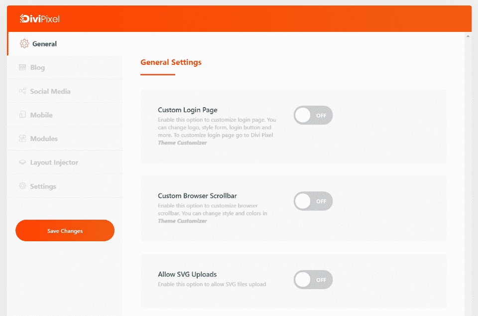
The settings screen includes over 200 settings that can be enabled or disabled. Many of them can be customized using new controls that are added to the theme customizer. Many of the settings open new options when you enable them. Here’s a look at each of the categories and a few of the settings in each one.
General Settings
General settings include general settings, header and navigation, and footer options. The General tab includes a custom login page, browser scrollbar, AVG uploads, back to top button, hide or rename the projects custom post type, hide the admin bar, a custom map marker, preloader, and rename the testimonials custom post type.
Custom Login Page
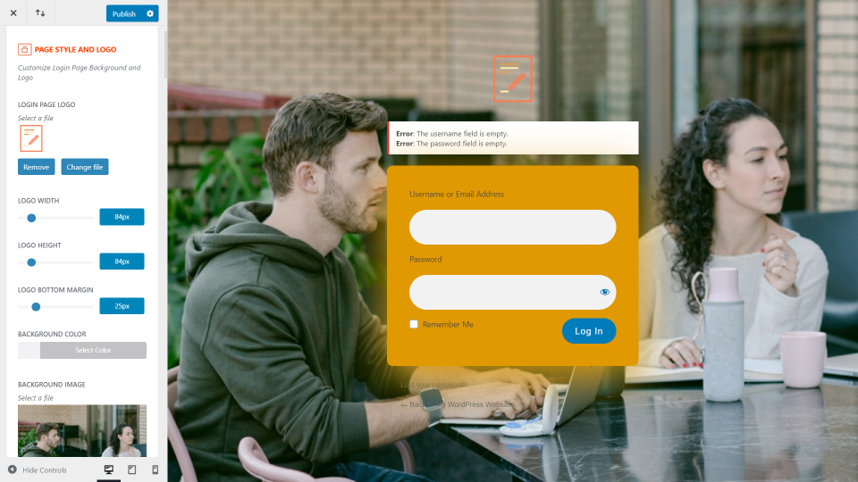
This example shows the login screen. Customizing it opens to the front-end where you can make your adjustments live.
Scrollbar and Back to Top
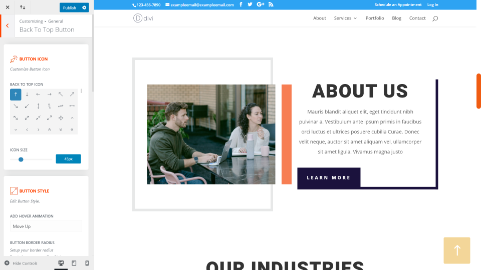
This example shows the custom scroll bar and back to top button and settings. Both include lots of options to get any design you want.
Preloaders
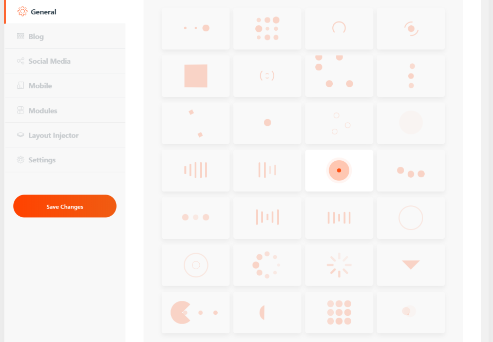
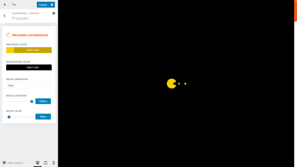
Here’s a look at the preloaders. There are 28 preloaders to choose from. You can also upload a custom preloader and choose to only display it on the home page.
You can customize them with the theme customizer. Adjust the preloader color, background color, animation, duration, and delay.
Header Settings
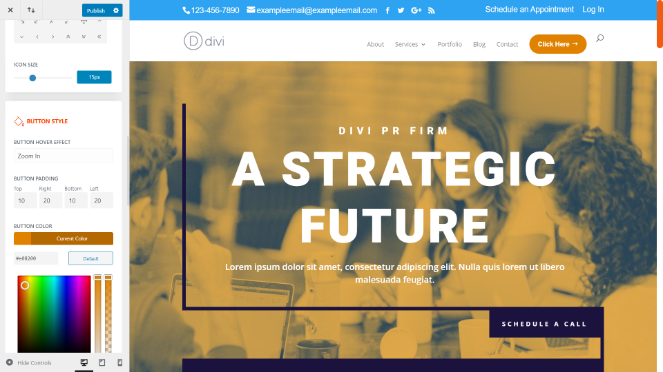
Header lets you customize the styles, hide the shadow, stop shrinking on scroll, change the logo on scroll, and zoon the logo on hover. Styles include a fully customizable CTA button. Add text, an icon, change the colors, etc. In this example above, I’ve added the button and changed the color. I’ve also increased the size of the secondary menu font.
Blog
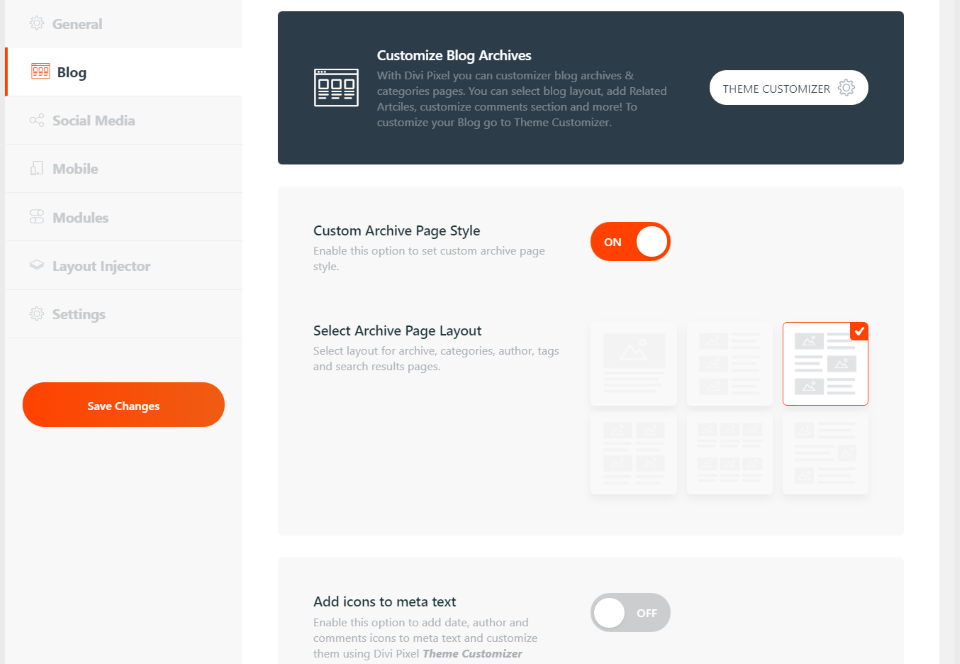
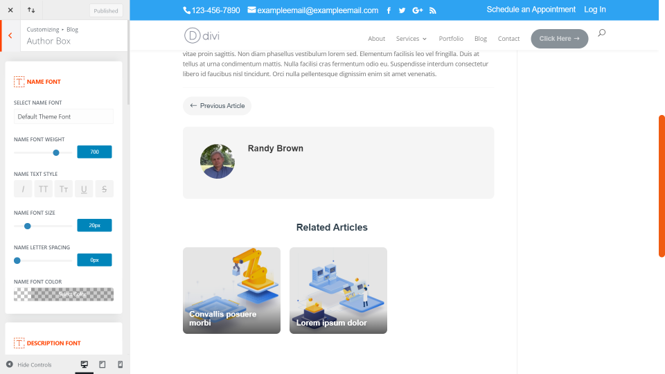
Blog settings allow you to customize the page, choose a custom archive page style, add icons to the meta, hide the excerpt text, remove the sidebar or border, add a read more button, author box, blog navigation, related articles, and customize the comments section.
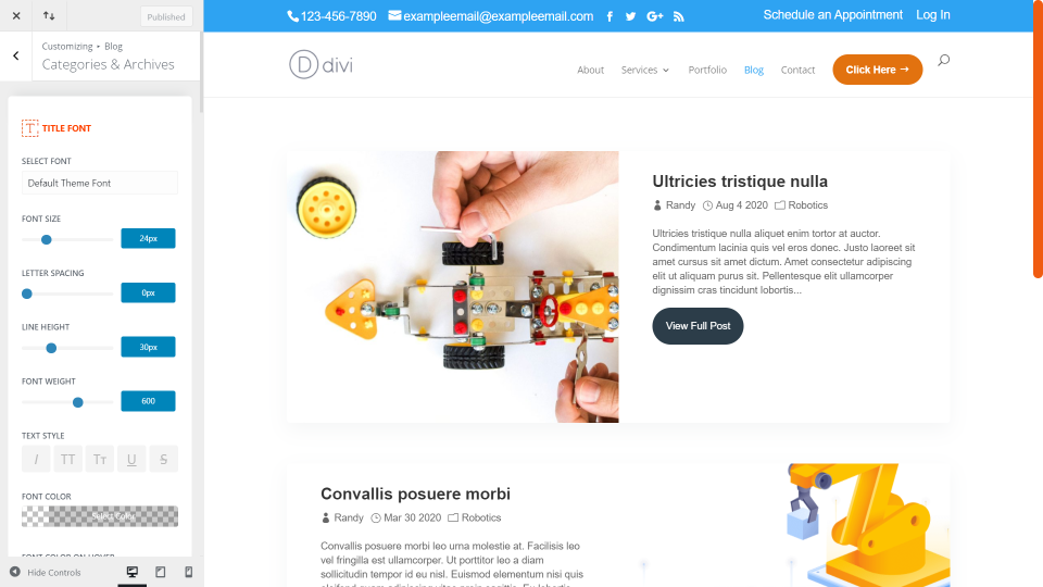
You have full customization control over every element. This is the archive page. I’ve selected an alternating layout and removed the sidebar. All of the rest are the default settings, but I have access to style the text, icons, buttons, etc.
This is a post with navigation, author box, and related articles added. Each of these elements can be edited individually.
Social Media
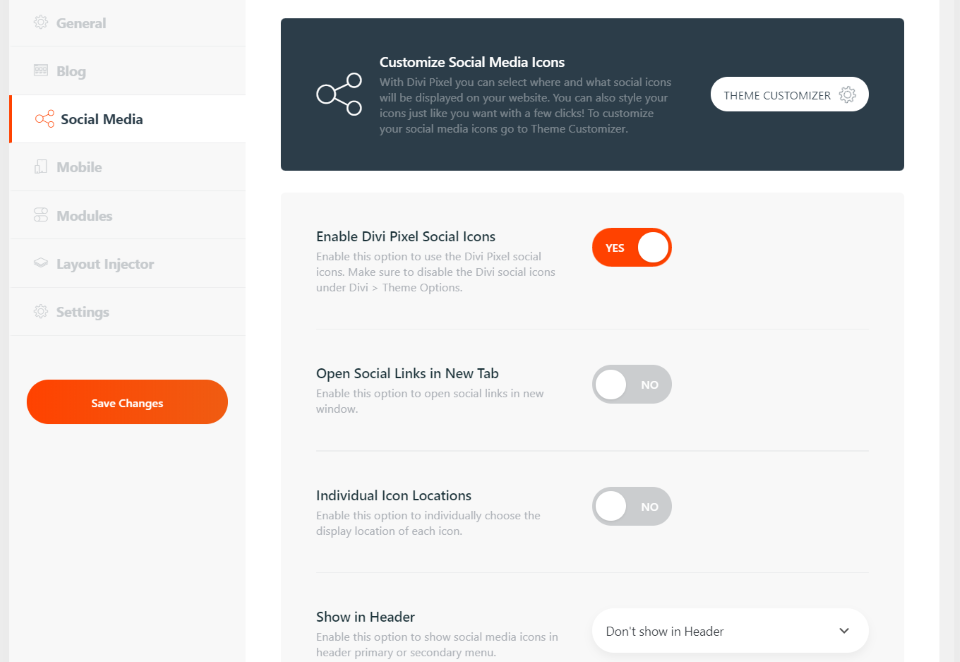
Social Media adds lots of networks and new icons. You can determine where they display, how they open, etc. and style them with the theme customizer.
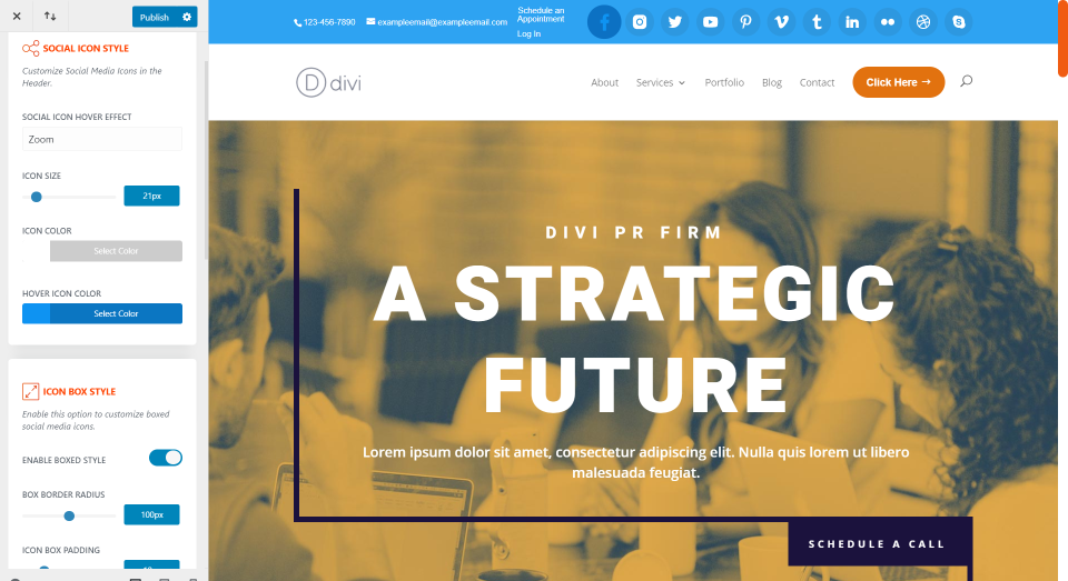
I’ve added the social icons to the top bar and customized the colors. I’m hovering over the first icon. You can adjust the icon and background separately and control the border shape.
Mobile
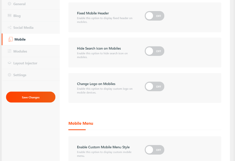
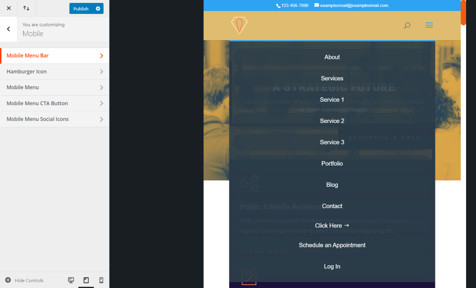
Mobile adds custom breakpoints, a fixed header, hide search icon, change the logo, custom mobile styles, hamburger icon animation, and collapse the submenu items.
I’ve changed the background color, given it a new icon, and made the dropdown menu not full-screen.
Modules
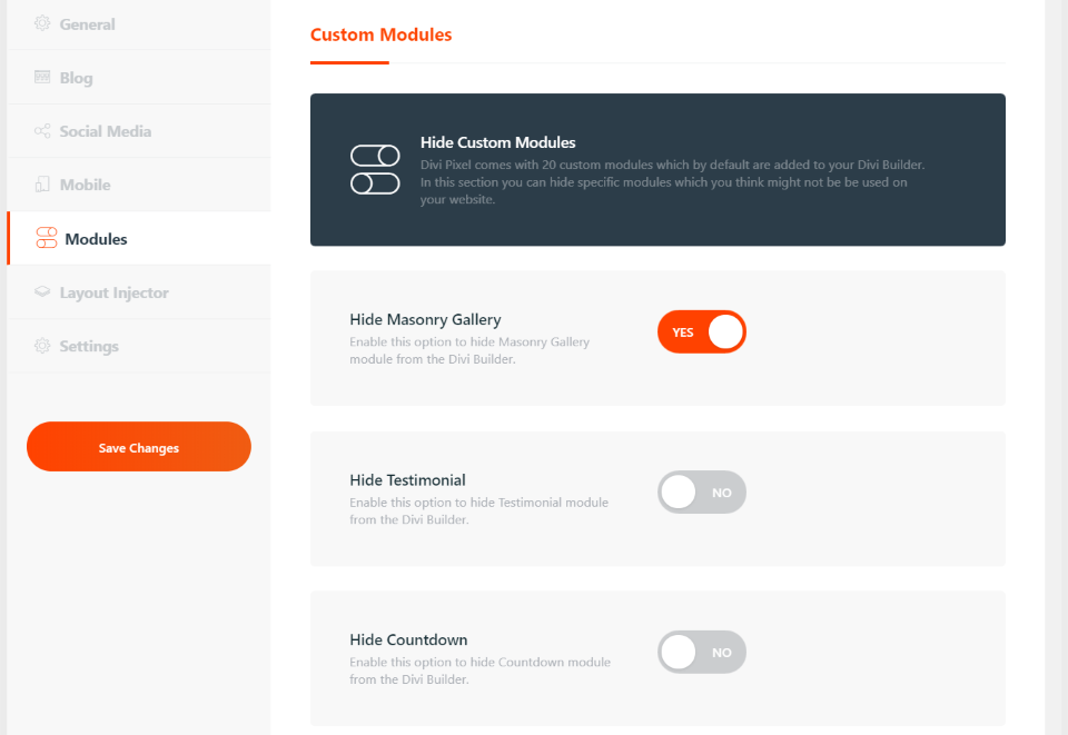
Divi Pixel adds 20 new modules. This allows you to hide specific custom modules if you don’t want to use them. This helps clean up your Divi Builder module list. This list also shows modules that are coming soon.
Layout Injector
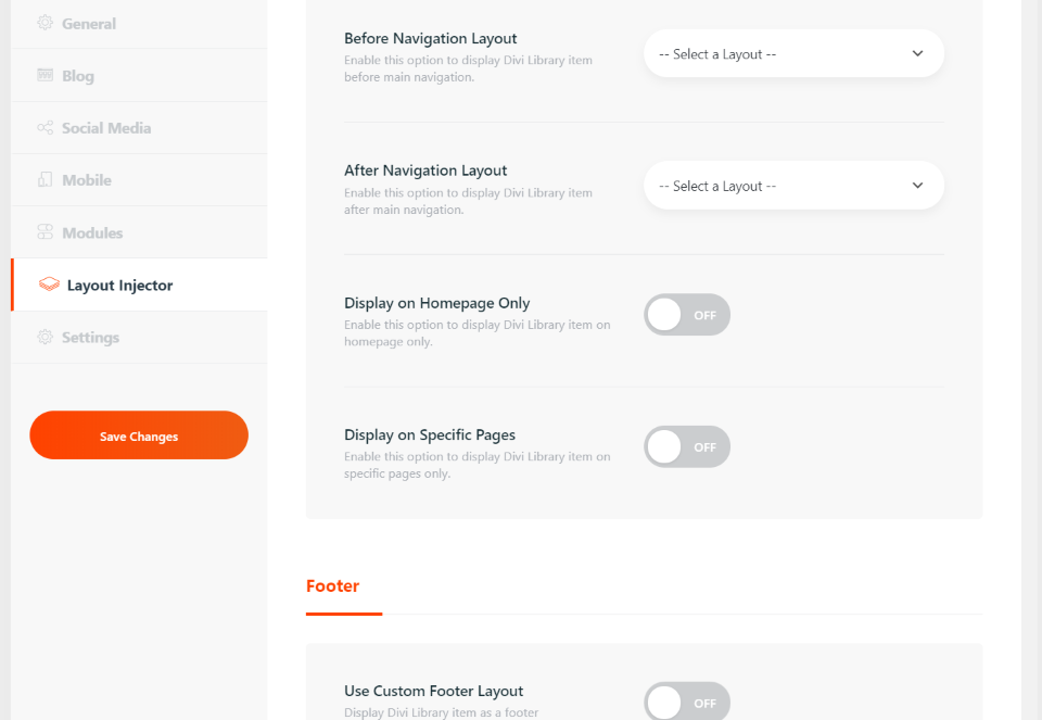
The layout injector lets you choose Divi layouts and add them to specific locations on your website and create a custom 404 page. Add them to navigation, the footer, and the blog. You can choose for them to display on the entire website, home page only, or only on specific pages. Simply choose a layout from the dropdown list for the location you want the layout to display.
Settings
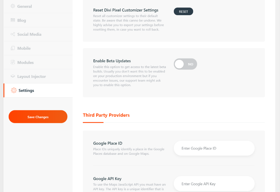
Settings let you reset all of the Divi Pixel settings or just the customizer settings. Other settings allow you to add your ID and API keys for third-party providers and import or export your Divi Pixel settings.
Divi Pixel Modules
20 new modules are added to the Divi Builder. They include modules for images, sliders, counters, text, accordions, testimonials, price lists, breadcrumbs, buttons, star ratings, and lots more. Here’s a look at a few of the modules.
Before and After Slider
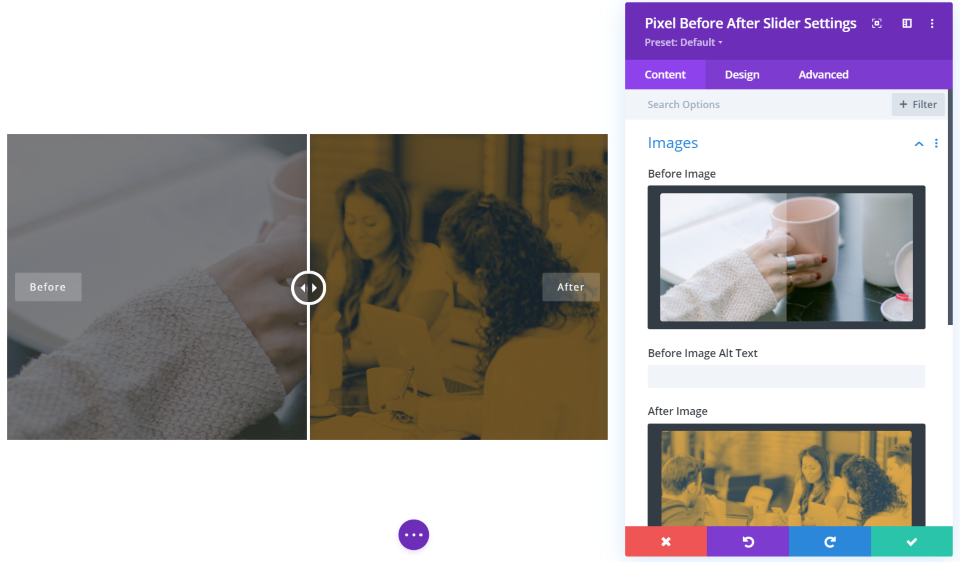
The Before and After Slider lets you display two images and slide between which is showing on the screen. You have control over the direction of the slider and you can customize the overlay, labels, icon color, handle color, etc.
Breadcrumbs
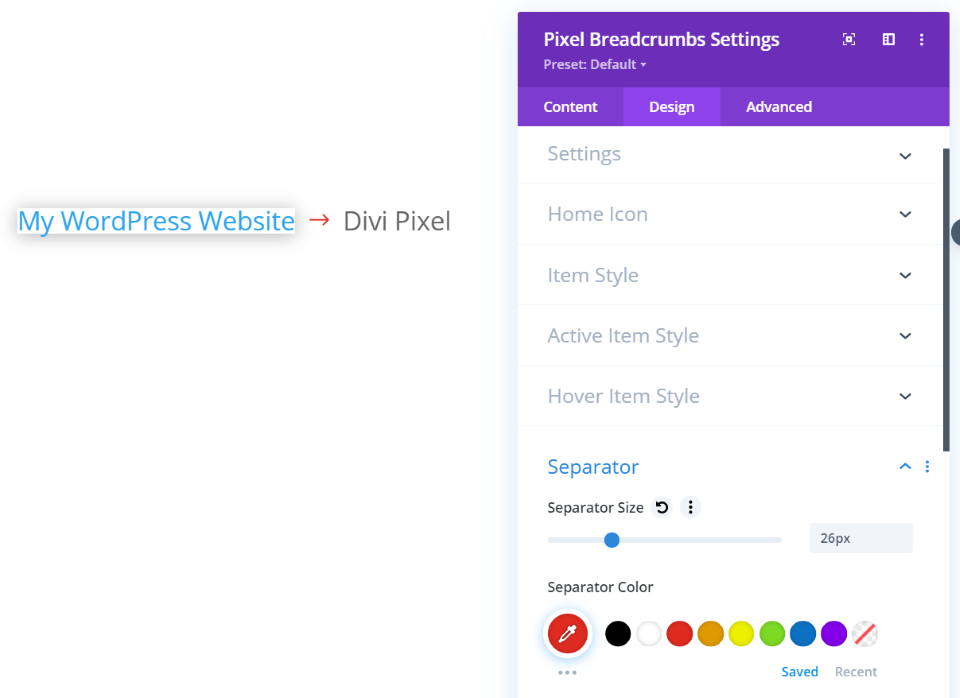
The breadcrumbs module gives you control over the home page, separator, active item, and items individually or all together. I’ve increased the size of the text and separator, changed the color of the separator, and added a box shadow to the home page.
Button Grid
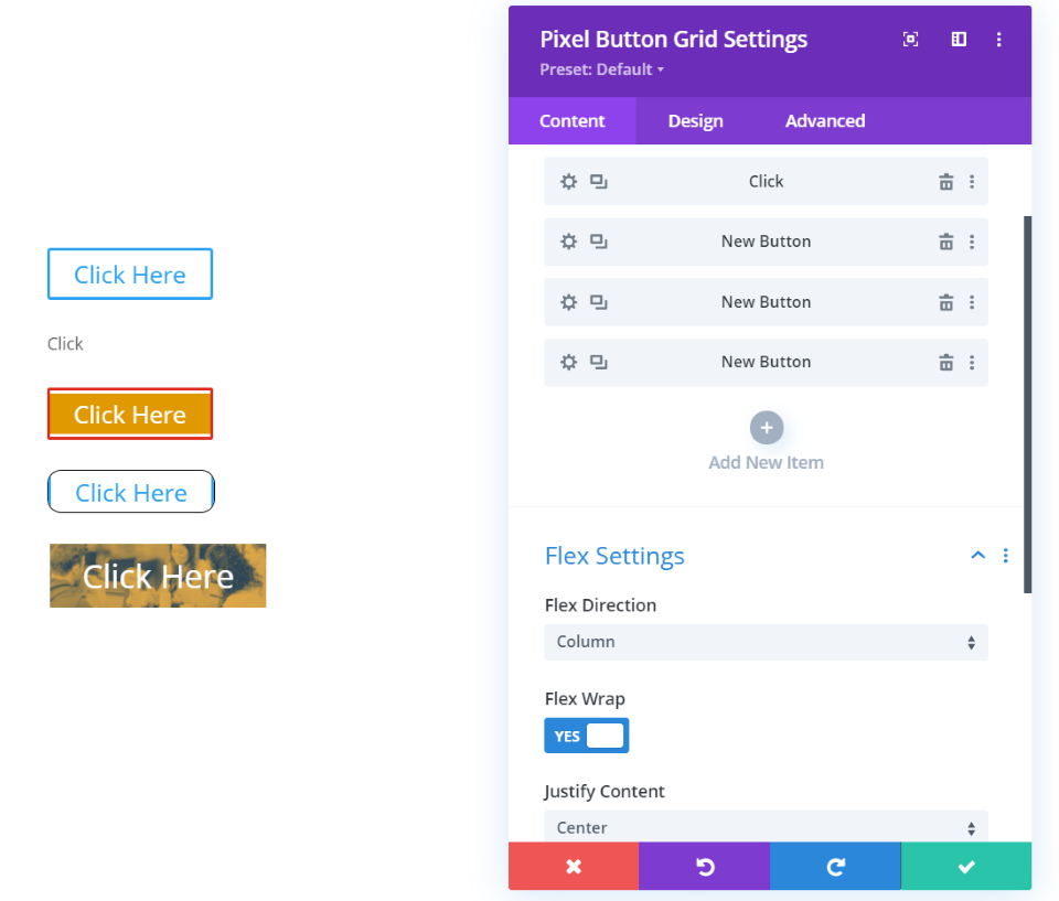
The button grid module lets you add as many buttons as you want and style them independently. You can display them as a column or as a row.
Blog Slider
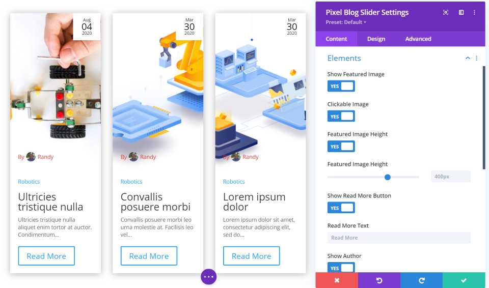
The blog slider module gives you lots of control over how the blog posts are displayed. I’ve added a box shadow, which adds the shadow to the individual cards. I’ve also set the featured image height, made the image clickable, added a read more button, and adjusted the font color for the author. The date displays in the upper right corner. You can adjust the position, add a border, make it a circle, and lots more. You can also add custom navigation icons.
Countdown
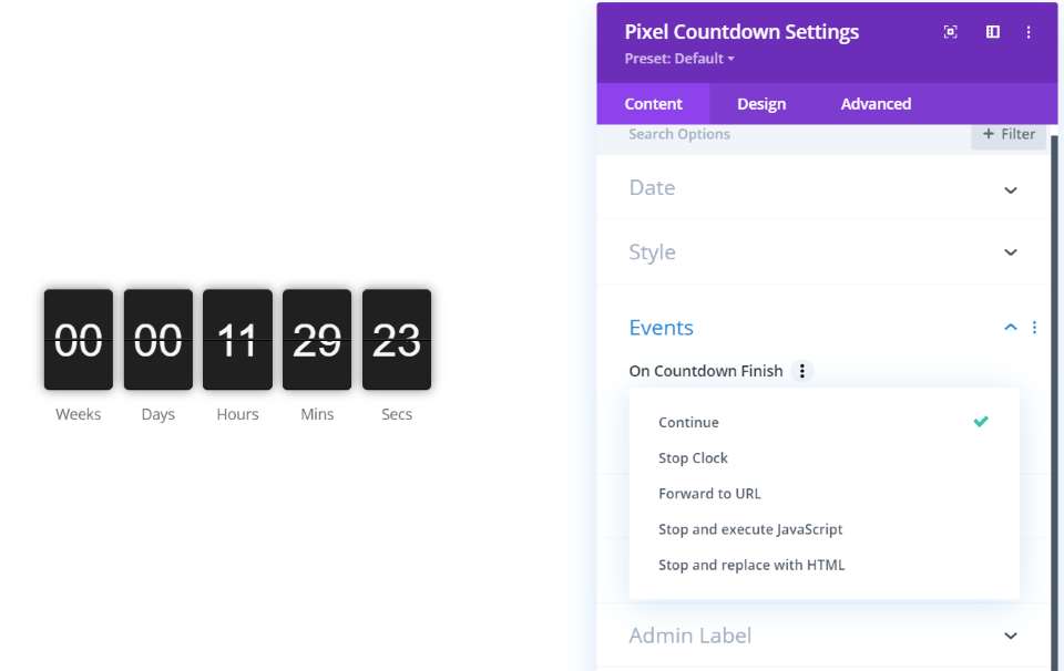
The countdown module gives you three styles for displaying the countdown: flip clock, block clock, and custom. For custom, you can create your own format, similar to customizing your permalinks. You can also choose what it does when the countdown is finished. Have it to stop, forward to a URL, execute JS, or replace it with HTML. This example shows the flip clock.
Fancy Text
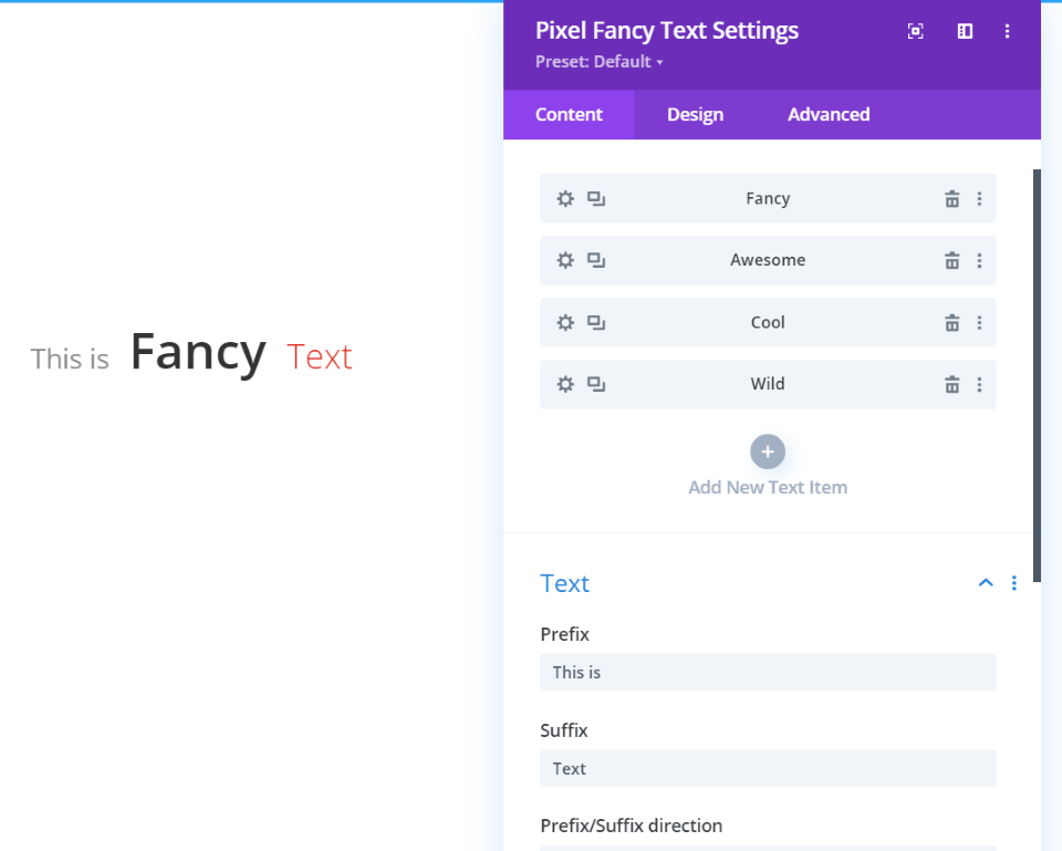
Fancy Text lets you add a prefix and suffix, and then the fancy text is placed with submodules. Each can be styled independently. The fancy text is animated, changing from one submodule to another. I’ve adjusted the fonts for each of the types of text in this example.
Image Accordion
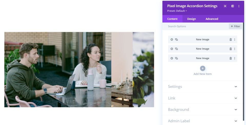
The image accordion module places images as submodules. The images are placed next to each other in a box. The more images you add the less of each image is visible. When you hover over an image, all of the other images are pushed away so you can see that image.
Star Rating
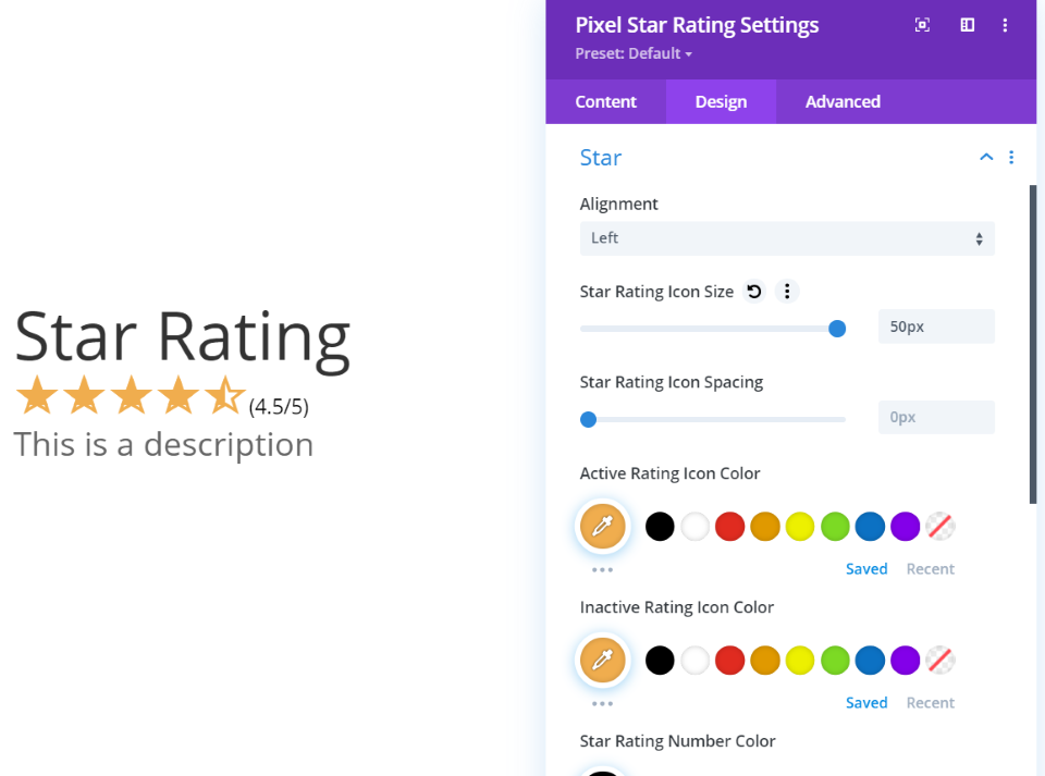
Star Rating provides you with fields to add a title, the number of stars to display, and a description. You have full control over the styling for each. I’ve added 4.5 stars, a title, and a description, and adjusted the size of each.
Testimonials
Divi Pixel adds a testimonials custom post type. This includes categories, the post type editor, etc.
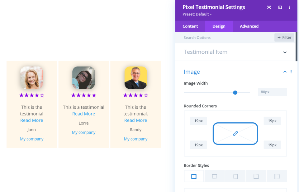
The Testimonials module will display the testimonials that you’ve created or just the categories you’ve selected. They display as cards. Display them in a slider or as tilted cards with animation. Adjust the colors, fonts, image size, border, position, and lots more. I’ve adjusted the background, image shape, added a box shadow to the images, changed the color of the star rating, changed the size of the description text, and reduced the space between the cards. You can also add navigation and a popup.
Tilt Image
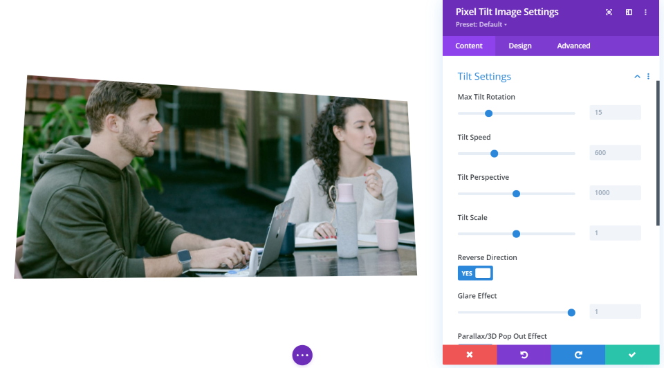
Tilt Image will tilt an image based on the mouse’s hover location. It lets you add an image and adjust the tilt settings. The tilt includes a 3D effect, glare, an overlay to show icons, images, and an overlay color, and lots of adjustments. The overlay image or icon can be placed in the center, top, or bottom with a left, center, or right alignment.
Typing Effect
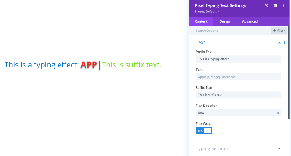
Typing Effect types your text onto the screen. Place the text with a prefix and suffix if you want. You can adjust all of the text together or independently. Typing settings include loop, cursor, speed, back speed, and back delay. I’ve changed the colors and increased the size for all three, and added a shadow to the typing text.
Price
Divi Pixel is available from the publisher’s website. It has 3 plans available:
- Single site – €49 per year
- 3 sites – €99 per year
- Unlimited sites – €149 per year
Each plan includes 1 year of support and updates.
Ending Thoughts
That’s our look at Divi Pixel. It seems like several large plugins combined. You can do a lot with just this one plugin. It’s simple to use and the amount of features don’t feel overwhelming. The customizer controls don’t include up and down arrows, a field to enter the number, or a button to reset to default. I’d like to see these added, but that’s the only thing that felt missing.
It’s an easy way to make your site pretty and add lots of little things that are useful and improves UX. I especially like the blog post options, preloader, testimonials, custom scrollbar, breadcrumbs, and star ratings. There are so many features that it’s hard to choose. If you’re interested in adding tons of useful features to Divi with a single plugin, Divi Pixel is a great choice.
We want to hear from you. Have you tried Divi Pixel? Let us know what you think about it in the comments.
Featured Image via mrwebhoney / shutterstock.com

