[ad_1]
Adding a disclaimer is a great way to provide important information to your audience. It’s a good first step in protecting yourself and your website against legal liability. Disclaimers include affiliate notifications, showing that the opinions of writers may not be those of the parent company, etc. We usually see them in the footer. Fortunately, disclaimers are easy to add to Divi. In this article, well see 3 ways to add a disclaimer to the Divi footer.
Preview
Desktop Static Disclaimer
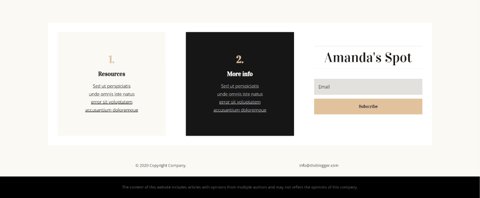
Here’s the static disclaimer on a desktop.
Mobile Static Disclaimer
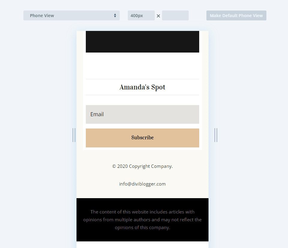
Here’s the static disclaimer on a phone.
Desktop Sticky Disclaimer
Here’s the sticky disclaimer on a desktop.
Mobile Sticky Disclaimer
Here’s the sticky disclaimer on a phone.
Desktop Animated Disclaimer
Here’s the animated disclaimer on a desktop.
Mobile Animated Disclaimer
Here’s the animated disclaimer on a phone. It disables the animation and shows the text as normal.
Upload a Divi Footer Template
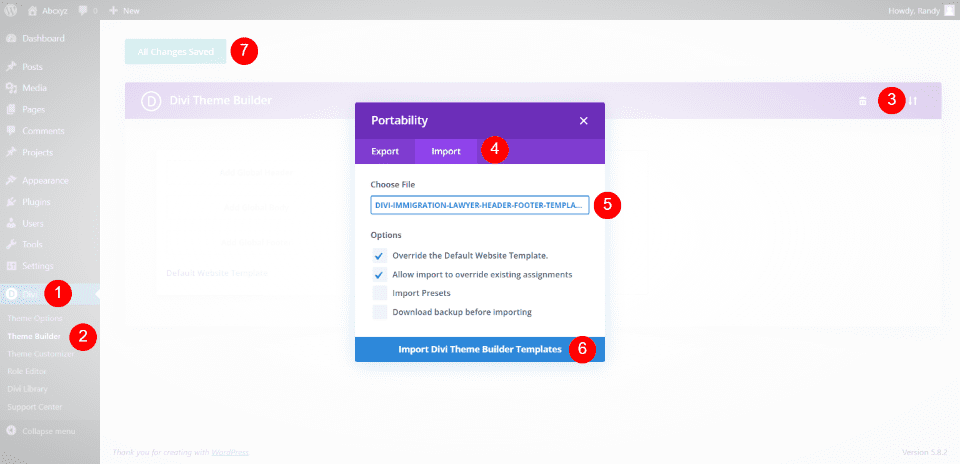
We’ll use three different free footer templates from the Elegant Themes blog. You can find them by search for “free footer” in the blog. To use them, unzip the download file. In WordPress, go to Divi > Theme Builder and select Portability. Click on Import in the modal that opens. Navigate to your file and select it. Click Import Divi Theme Builder Templates. Wait for the upload to complete and save your settings.
Add a Static Disclaimer to the Divi Footer
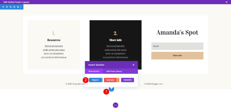
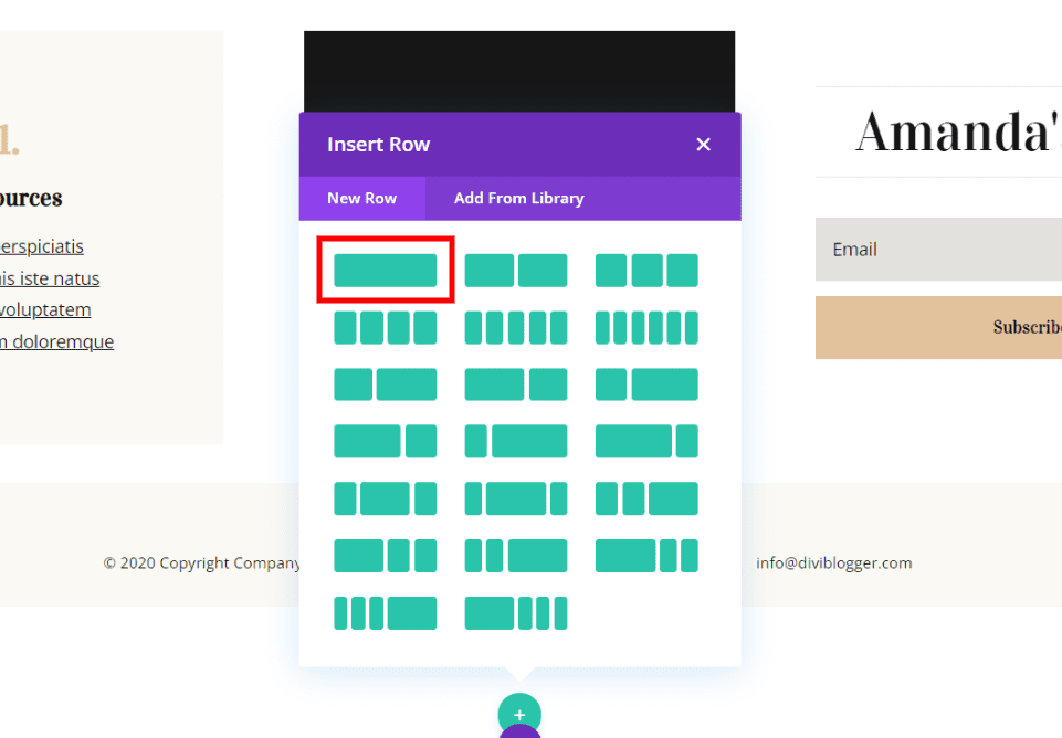
For this example, we will build a static disclaimer in a new section at the bottom of the footer. This example uses the footer template from the Header & Footer for Divi’s Blogger Layout Pack. Hover over the last row and click the blue icon and click on Regular to add a new section.
Select the full-width row.
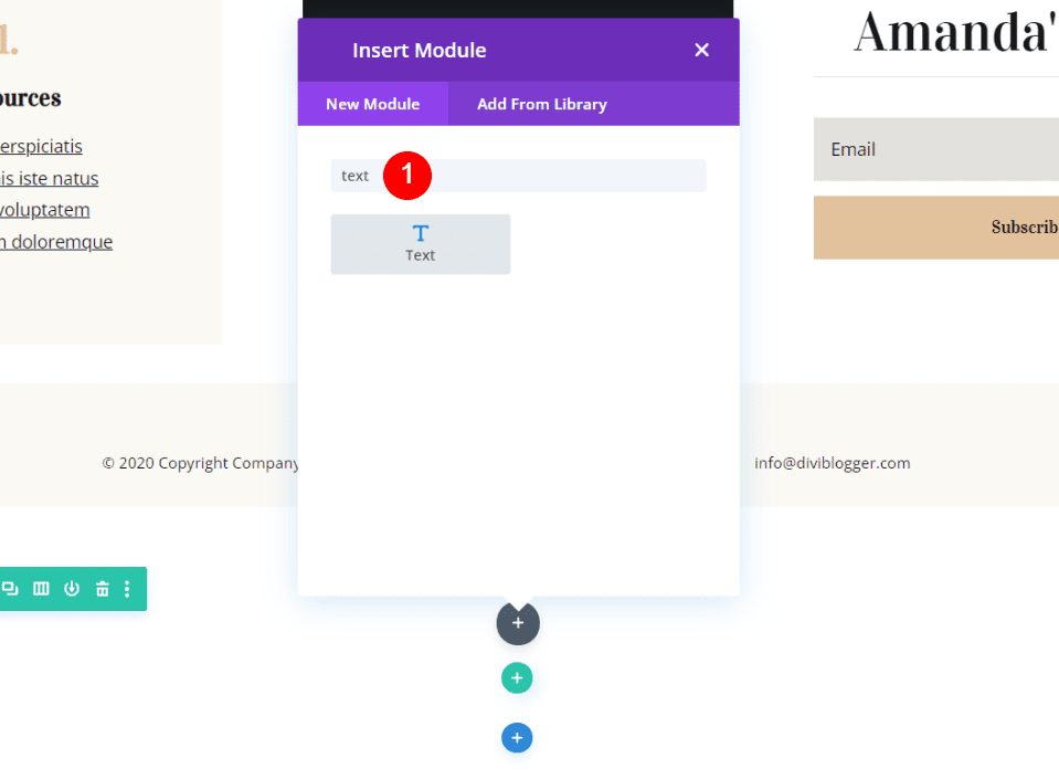
Add a Text module and then close its settings. We’ll come back to this after we make some adjustments to the section and the row.
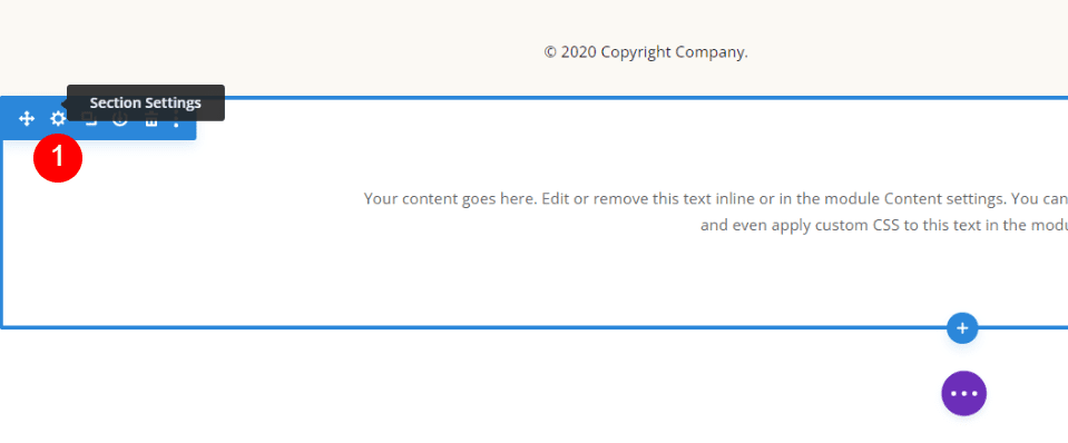
Open the Section’s settings by clicking its gear icon.
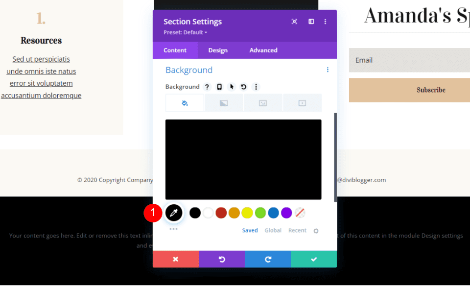
Scroll down to Background and set it to Black.
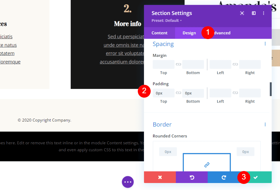
Open the Design tab and scroll down to Spacing. Add 0px padding for the top and bottom. Close the module’s settings.
- Padding: Top 0px, Bottom 0px
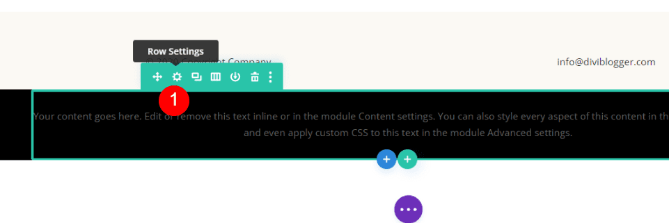
Open the Row settings by clicking its gear icon.
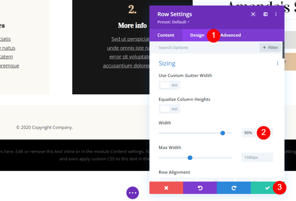
Open the Design tab and scroll to Sizing. Set the Width to 90%. Close the module’s settings.
Open the Text module’s settings by clicking its gear icon.
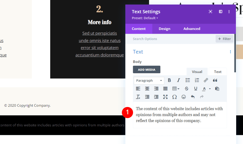
Add your disclaimer to the body. I’m adding a disclaimer about the content being created by multiple authors and their opinions might not reflect those of the website.
- Body: The content of this website includes articles with opinions from multiple authors and may not reflect the opinions of this company.
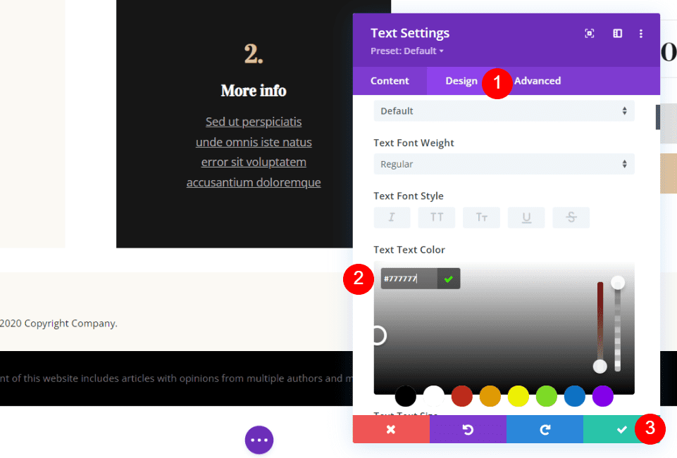
Select the Design tab and scroll to the Body Text. Set the text color to #777777 and close the module’s settings.
Save your work.
Add a Sticky Disclaimer to a Divi Footer
Sticky elements remain in place as you scroll. You have control over how and where they work. We’ll create a sticky disclaimer that appears at the top of the footer and remains in place until it reaches its final location at the bottom of the page.
We’ll create a disclaimer that the writing is the author’s opinion and should not be used in place of professional help. I’m using the footer from the Header & Footer for Divi’s Immigration Lawyer Layout Pack for this example.
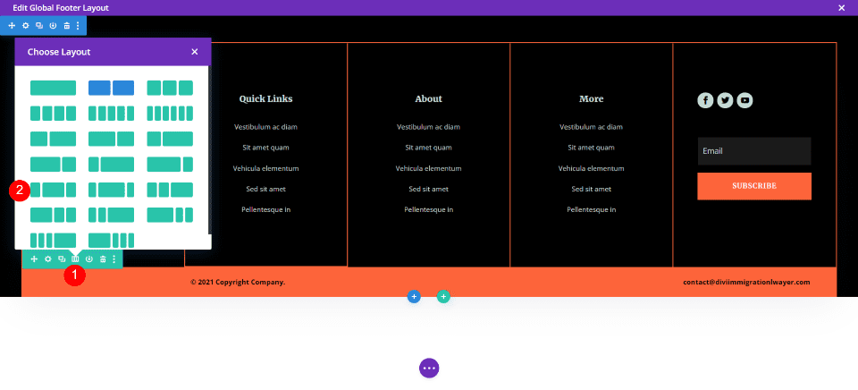
Hover over the bottom row and select the layout options. This row currently has two columns. Choose the option with ¼, ½, ¼ columns. This gives us a large section for the disclaimer.
Drag and drop the Text module in the center to the location on the right.
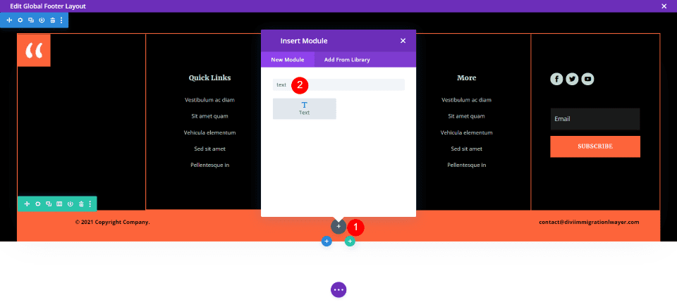
In the center column, click on the dark gray plus icon and search for Text. Add the Text module to the column.
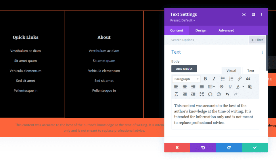
The Text module will open. Add your disclaimer to the Body. The disclaimer is up to you. I’m adding this one:
- Body: This content was accurate to the best of the author’s knowledge at the time of writing. It is intended for information only and is not meant to replace professional advice.
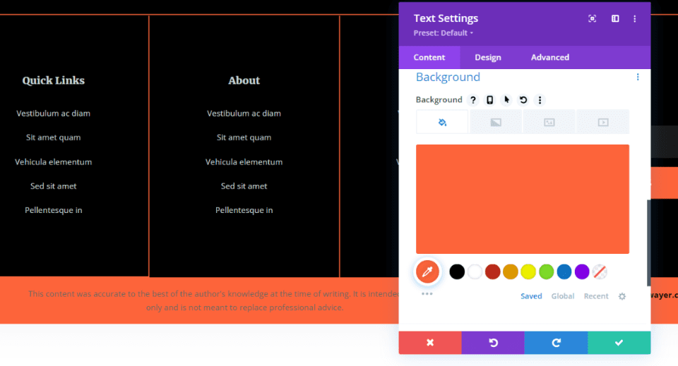
Scroll down to Background and add #fd643a. the row already has this background, but we want to include it in the module so it will display when the module is visible outside this row.
Design Tab
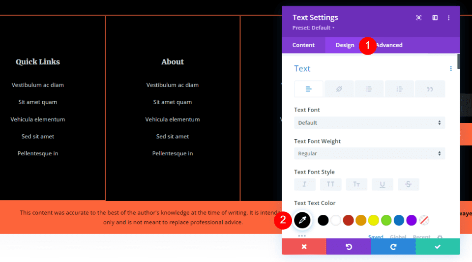
Select the Design tab and choose black for the Text Color. We’ll use the default font and weight for this one.
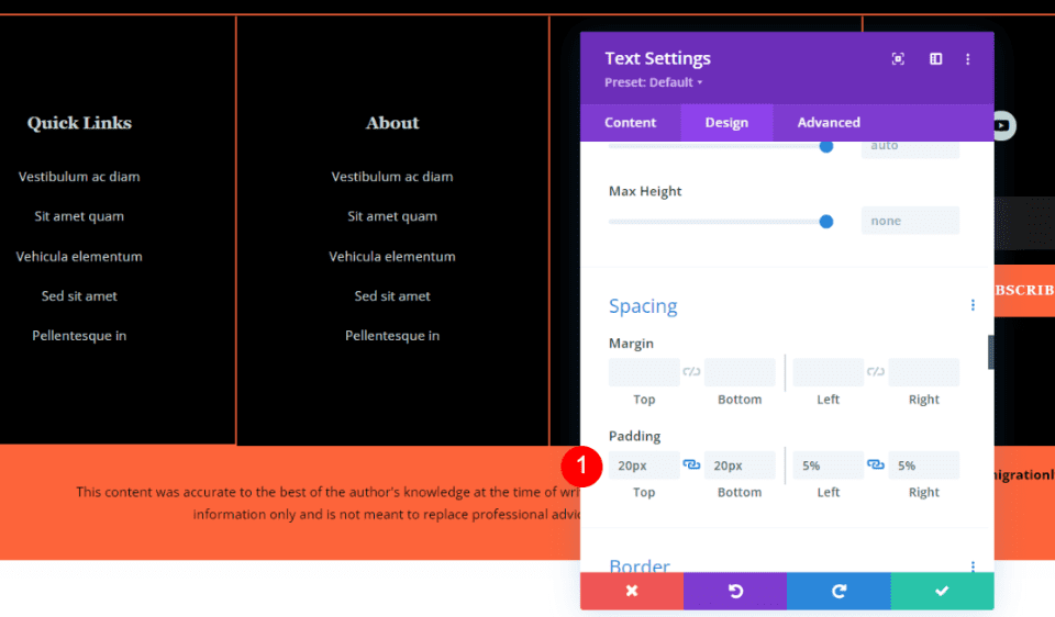
Scroll to Spacing and add 20px padding for the top and bottom, and 5% for the left and right.
- Padding: Top 20px, Bottom 20px, Left 5%, Right 5%
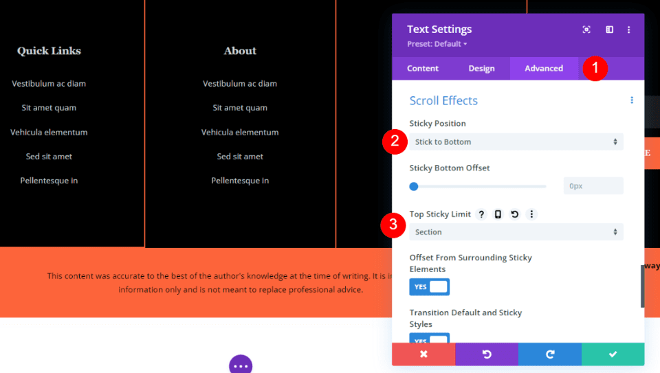
Select the Advanced tab and scroll down to Scroll Effects. Choose Stick to Bottom for the Sticky Position. Open the Top Sticky Limit dropdown box and select Section. Click the green check to close this module.
- Sticky Position: Stick to Bottom
- Top Sticky Limit: Section
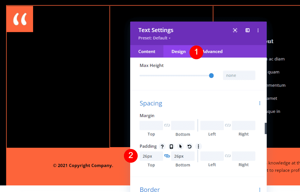
Open the settings for the Text module on the left, select the Design tab, and add 26px of padding to the Top and Bottom and save the module’s settings.
- Padding: Top 26px, bottom 26px
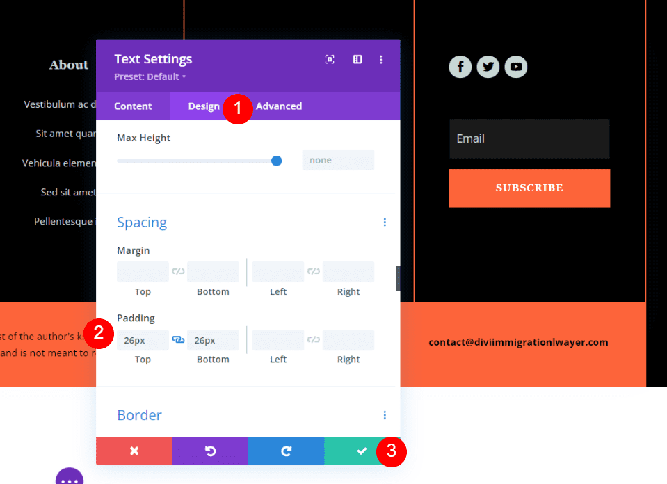
Finally, the settings for the Text module on the right, select the Design tab, and add 26px of padding to the Top and Bottom and save the module’s settings and save your work.
- Padding: Top 26px, bottom 26px
Add an Animated Disclaimer to the Divi Footer
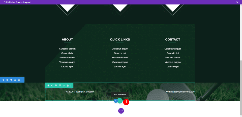
For this example, I’m using the footer template from the Header & Footer for Divi’s Golf Lessons Layout Pack. We’ll add a new row with a text notification and animate the text. Hover over the last Row and click the green plus icon to add a new row.
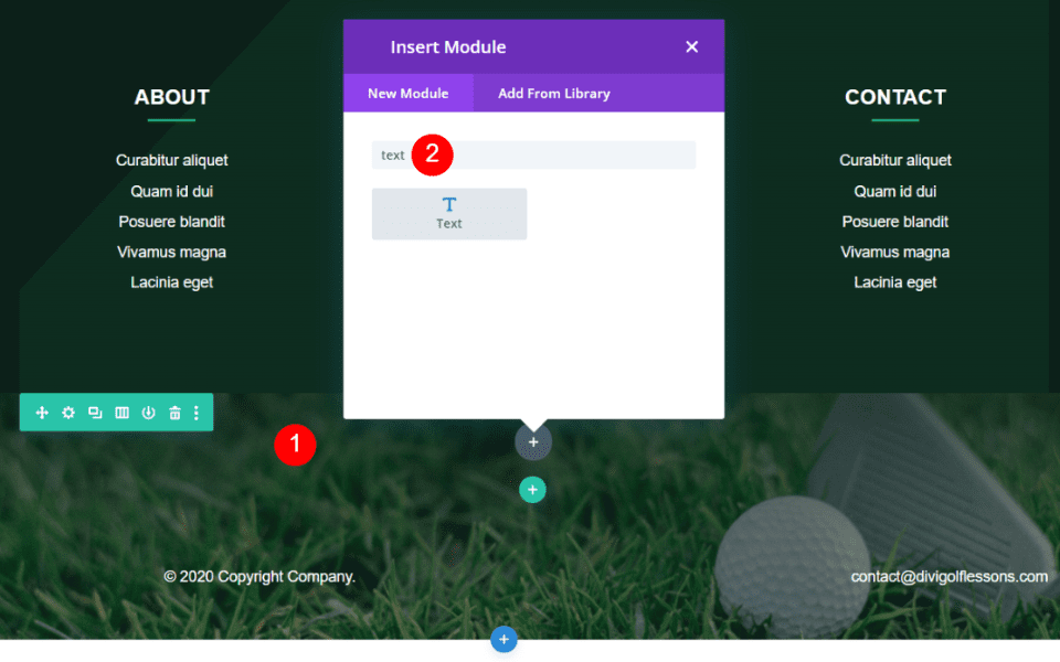
Drag the Row above the bottom row and add a Text module.
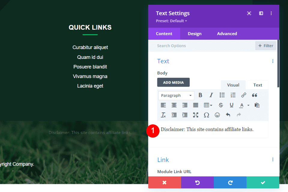
Add your disclaimer text to the Body. I’m using a disclaimer that informs the visitors that the site includes affiliate links.
Note, any site that uses affiliate links also needs to include the proper notifications within the pages and posts that use them. Search for affiliate notification laws in your country. For the US, that’s the FTC affiliate disclosure.
- Body: Disclaimer: This site contains affiliate links.
Design Tab
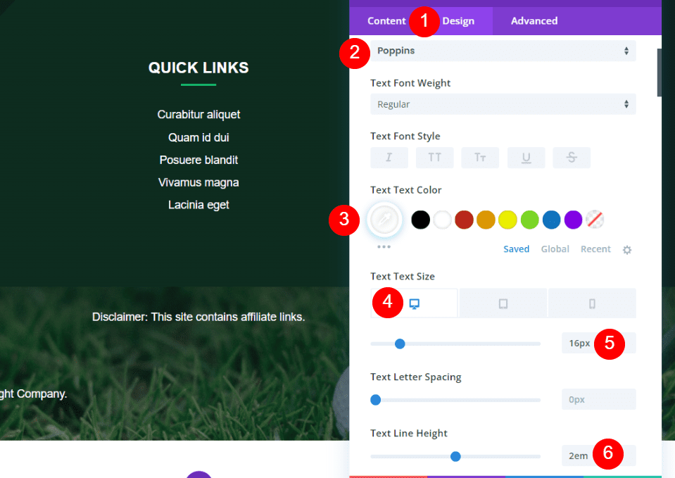
Open the Design tab and change the font to Poppins, set the color to white, and set the desktop size to 16px. Set the Line Height to 2em.
- Text: Poppins
- Color: #ffffff
- Text Text Size (desktop): 16px
- Line Height: 2em
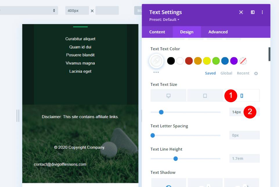
Select the Phone tab in the text size and set it to 14px.
- Text Text Size (phone): 14px
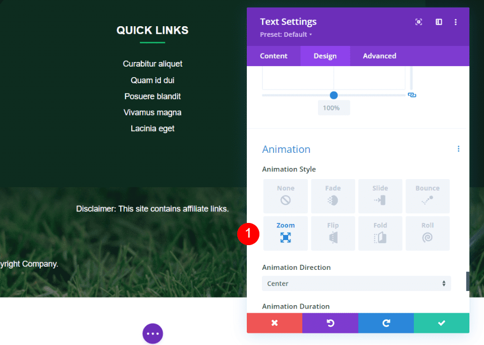
Scroll down to Animation and select your preferred Animation Style. I’m selecting Zoom. The animation will not display on the phone version.
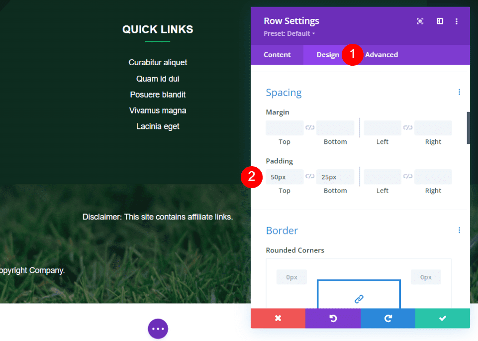
Open the row settings for this module. Go to the Design tab and add 50px padding to the Top and 25px to the Bottom.
- Padding: 50px Top, 25px Bottom
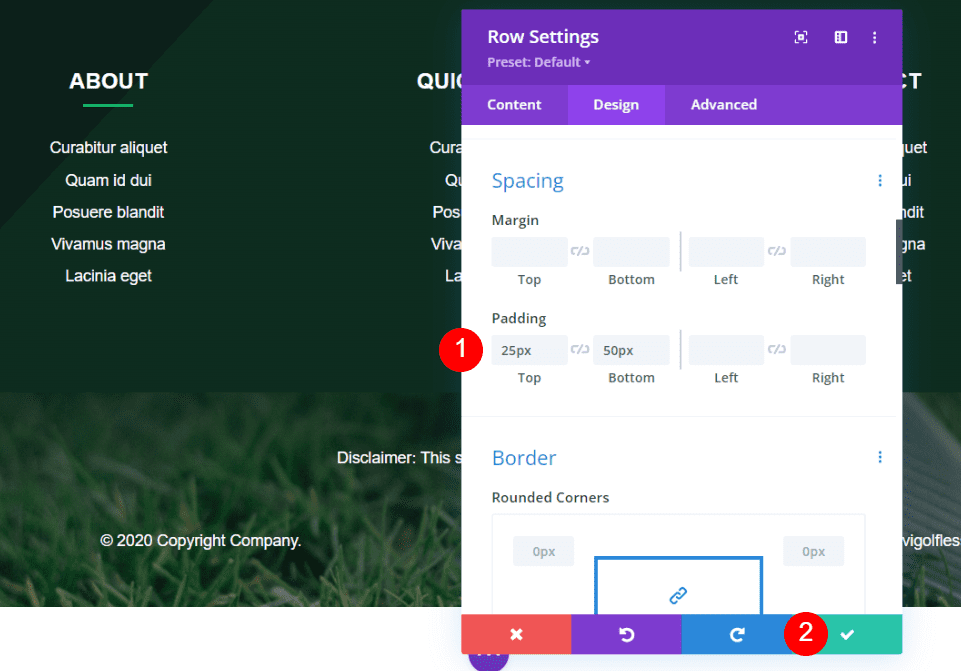
Open the settings for the bottom Row, select the Design tab, go to Spacing. Disconnect the Top and Bottom Padding and change the Top to 25px.
Close your module and save your settings.
Results
Desktop Static Disclaimer
Here’s the static disclaimer on a desktop.
Mobile Static Disclaimer
Here’s the static disclaimer on a phone.
Desktop Sticky Disclaimer
Here’s the sticky disclaimer on a desktop.
Mobile Sticky Disclaimer
Here’s the sticky disclaimer on a phone.
Desktop Animated Disclaimer
Here’s the animated disclaimer on a desktop.
Mobile Animated Disclaimer
Here’s the animated disclaimer on a phone. It disables the animation and shows the text as normal.
Ending Thoughts
That’s our look at how to add a disclaimer to the Divi footer. Disclaimers are important for informing your audience about using your advice, affiliate links, etc. The footer is an excellent location for this. This article covers several options for adding the disclaimer and displaying it in ways that stand out or blend in. Not every website will need a disclaimer, but for those that do, this article will get you started.
We want to hear from you. Have you used either of these methods to add a disclaimer to your Divi footer? Let us know in the comments.
[ad_2]
Source link

