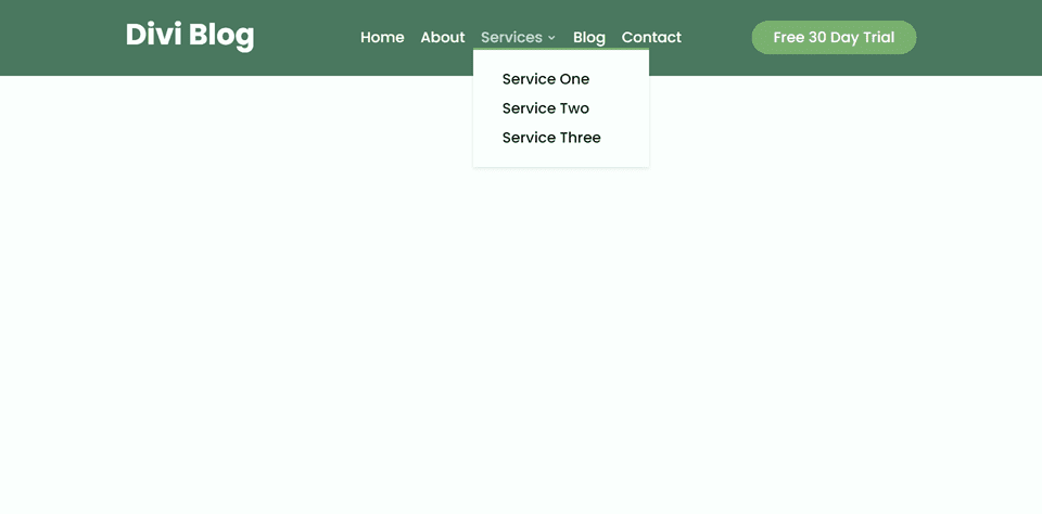
An often overlooked but essential part of any website is the navigation menu. Navigation is a key element in terms of creating a pleasing user experience. If done correctly, a menu can greatly improve the user experience and make it easy for your visitors to navigate through the website.
Divi comes with 2 different types of navigation modules; Fullwidth Menu and Regular Menu. In this article, we will discuss and demonstrate some of the differences between Divi’s fullwidth menu module and the regular menu module. If you’ve ever wondered which module to use for your website, hopefully this article will help you understand the key differences and use cases for these modules. We will also give you step-by-step instructions to customize the design of a fullwidth menu and a regular menu module.
Let’s get started!
Sneak Peek
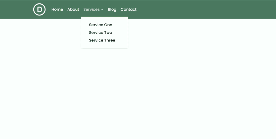
Desktop: Fullwidth Menu Module
Desktop: Regular Menu Module
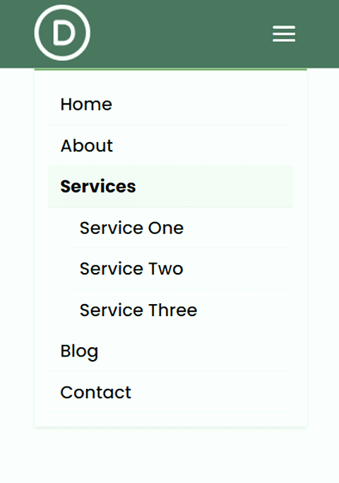
Mobile: Fullwidth Menu Module
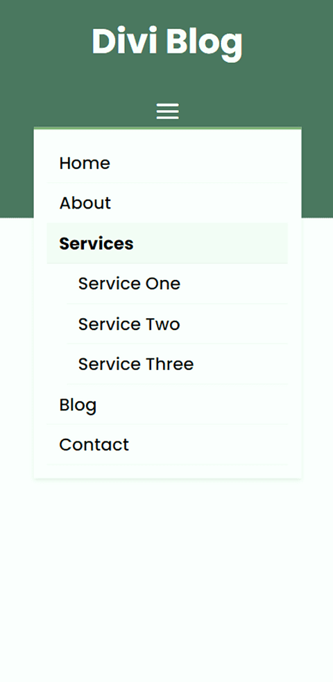
Mobile: Regular Menu Module
Key Differences Between Divi’s Fullwidth Menu Module and Regular Menu Module
Here is an overview of the key differences between a fullwidth menu module and a regular menu module.
Regular vs Fullwidth Section Container
The fullwidth menu module requires a fullwidth section in Divi. Because the section is fullwidth, any module you add will take up the entire width of the page. Unlike the regular menu section, you cannot have multiple modules side-by-side. The fullwidth menu module is great if you want the menu to span the width of the page and don’t need any additional modules alongside it.
The regular menu module requires a regular section in Divi. Regular sections have many different row layouts, and you can use any layout with the regular menu module. This allows you to include additional content alongside the menu using the other rows to create a more complex menu bar. Thanks to Divi’s many row options, you can easily create unique layouts for your menu bar using the regular menu module.
Built-In Width Settings vs Editing the Row Container
The other key difference between the regular and fullwidth menus is that they have different ways to edit the width and spacing of the module.
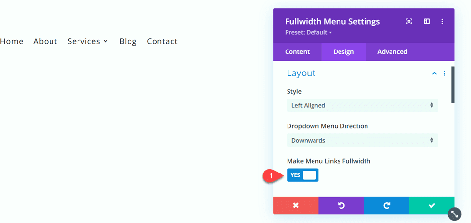
The fullwidth menu module comes with some built-in settings to edit the width. You can make the menu text fullwidth with the “make menu links fullwidth” option. This extends the fullwidth menu module beyond the default content width.
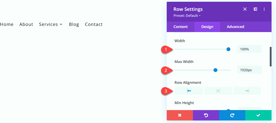
To achieve a similar look with a regular menu module, you would need to edit the containing row’s settings instead. For example, edit the width, max width, and alignment of the row containing the regular menu to extend the regular menu module beyond the default content width.
Using Divi’s Fullwidth Menu Module vs Regular Menu Module
What You Need to Get Started
If you would like to follow along with this tutorial, install and activate the Divi Theme and make sure you have the latest version of Divi on your website.
Now, you are ready to start!
Designing a Fullwidth Menu Module
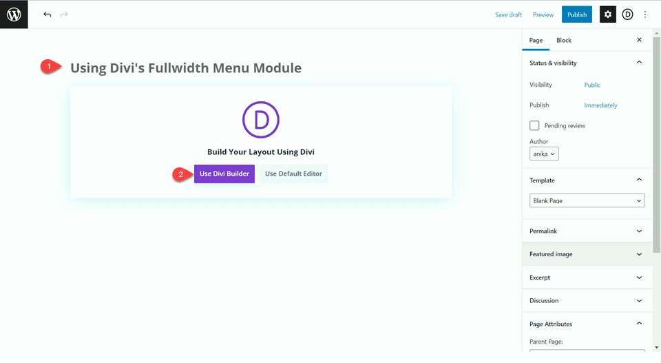
Add a new page to your website and give it a title, then select the option to Use Divi Builder.
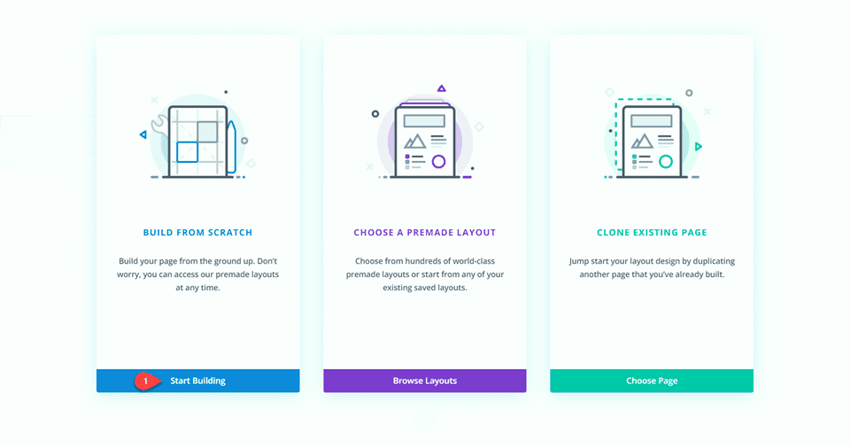
For this tutorial we will build the design from scratch, so select the option to Start Building.
When you first create a blank page, it comes preloaded with a regular section. First add a fullwidth section below the regular section.
Then, delete the regular section from the page.
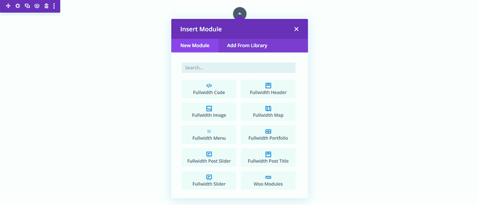
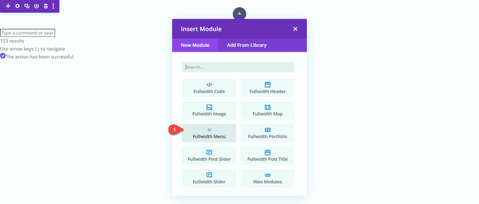
Add a Fullwidth Menu module to the fullwidth row.
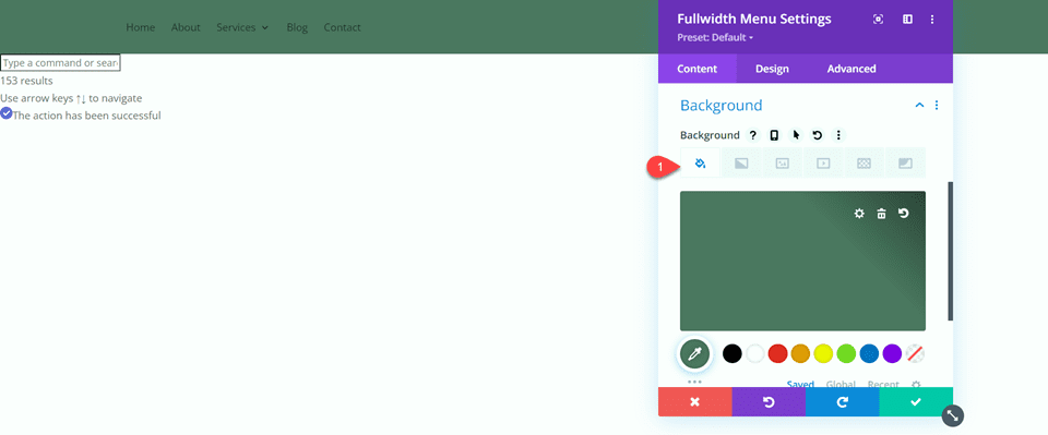
Add a background color to the fullwidth menu.
- Background: #4e7560
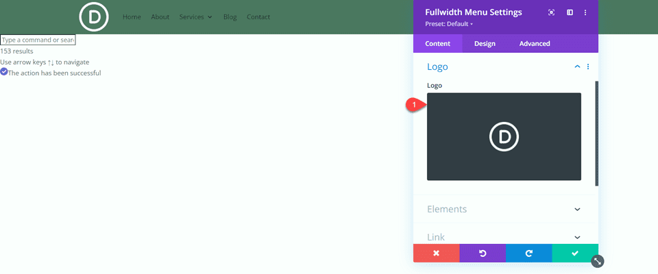
Add a logo to the fullwidth menu.
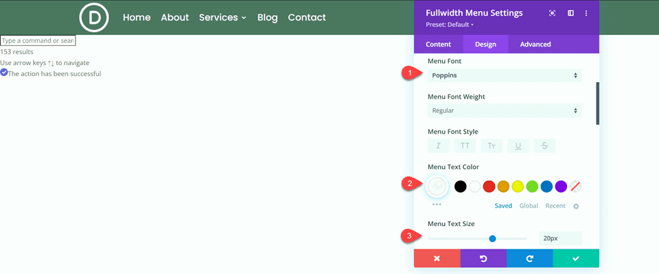
Next, navigate to the Menu Text options under the Design tab.
- Menu Font: Poppins
- Menu Text Color: #FFFFFF
- Menu Text Size: 20px
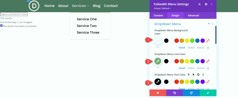
Next, navigate to the Dropdown Menu settings.
- Dropdown Menu Background Color: #FFFFFF
- Dropdown Menu Line Color: #7EAD70
- Dropdown Menu Text Color: #000000
Set the Mobile Menu background and text color.
- Mobile Menu Background Color: #FFFFFF
- Mobile Menu Text Color: #000000
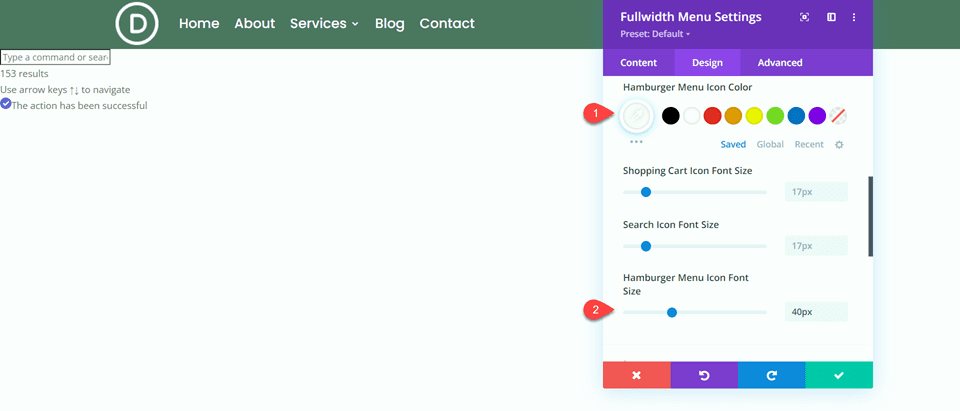
Next, change the Hamburger Menu settings.
- Hamburger Menu Icon Color: #FFFFFF
- Hamburger Menu Icon Font Size: 40px
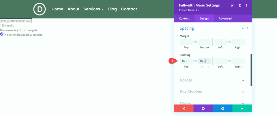
Finally, add some top and bottom padding.
- Padding-Top: 10px
- Padding-Bottom: 10px
Now your fullwidth menu module is complete!
Designing a Regular Menu Module
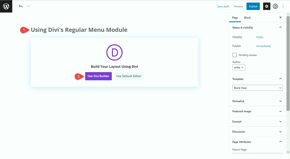
Add a new page to your website and give it a title, then select the option to Use Divi Builder.
Select Start Building to build from scratch.
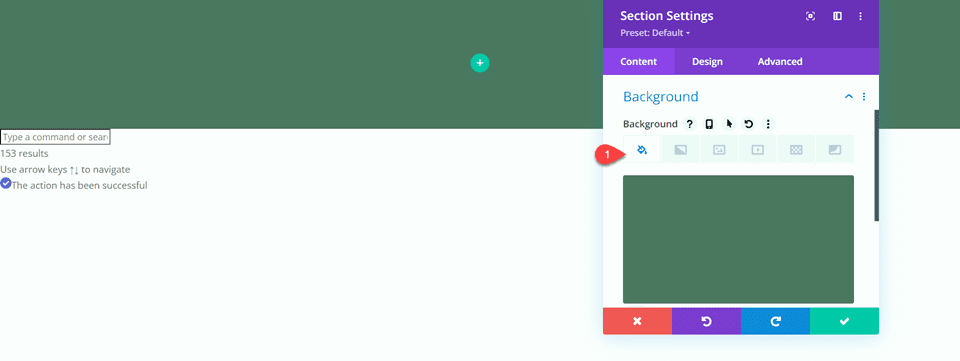
The page comes preloaded with an empty regular section. To this section, add a background color.
- Background: #4e7560
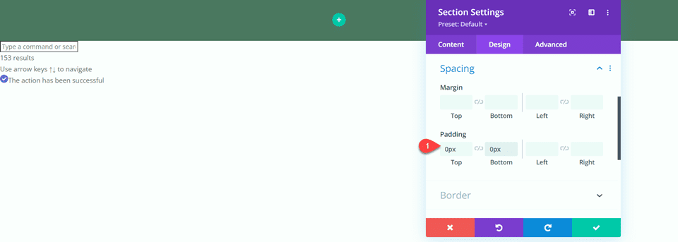
Next, remove the top and bottom padding.
- Padding-Top: 0px
- Padding-Bottom: 0px
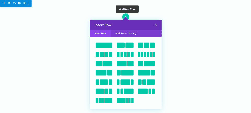
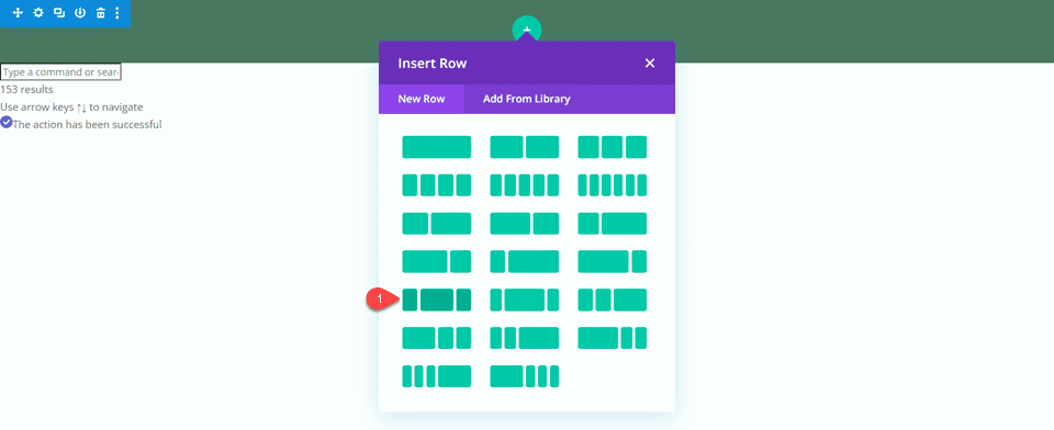
Add a new row with the layout shown below.
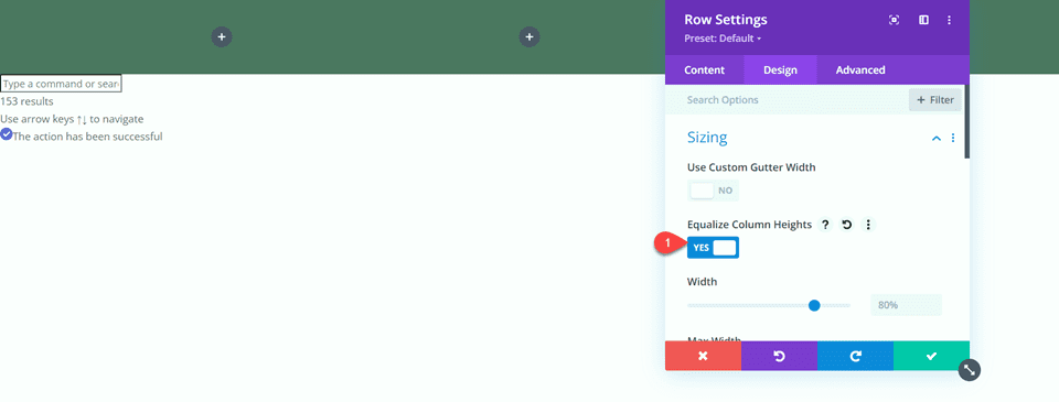
In the row settings, equalize the column heights.
- Equalize Column Heights: Yes
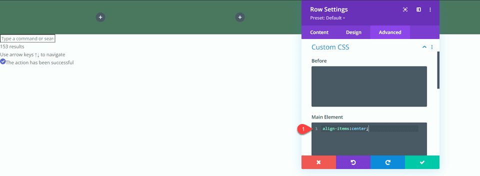
In the Main Element CSS settings under the Advanced tab, add the following custom CSS.
align-items:center;
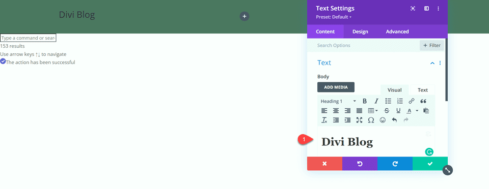
Add a text module to the leftmost column. We will use this to display the website name instead of uploading a logo. This is a unique advantage of the regular menu module because you can use it alongside other modules to add extra elements to the menu bar.
- H1 Text: “Divi Blog”
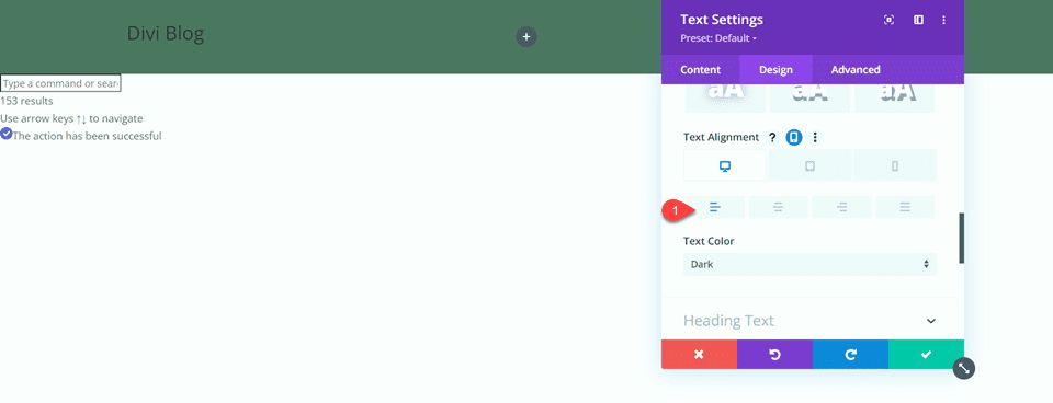
Set the Text Alignment to left on desktop.
- Text Alignment-Desktop: Left
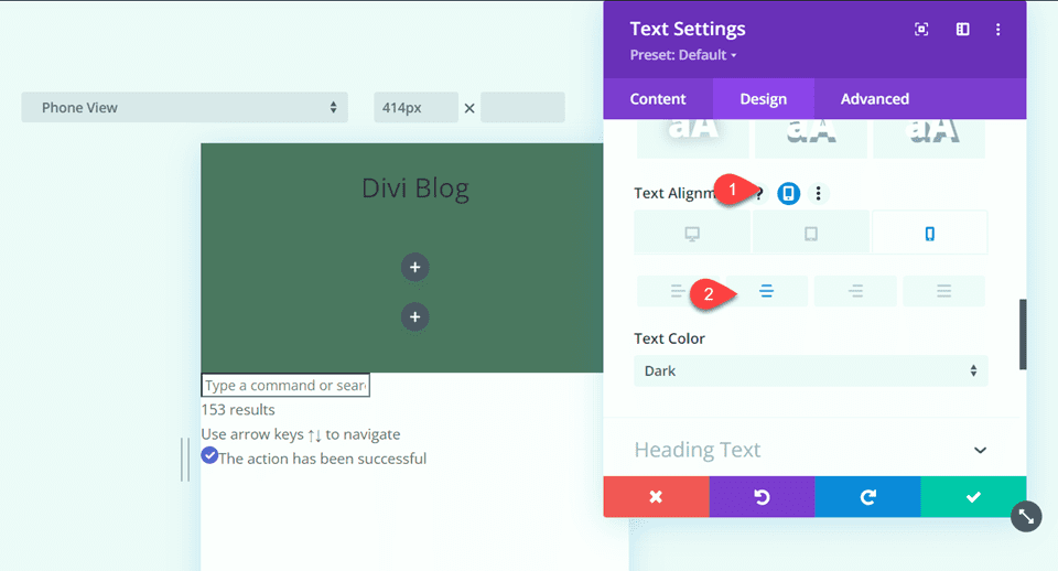
Set the Text Alignment to center on tablet and mobile.
- Text Alignment-Tablet: Center
- Text Alignment-Mobile: Center
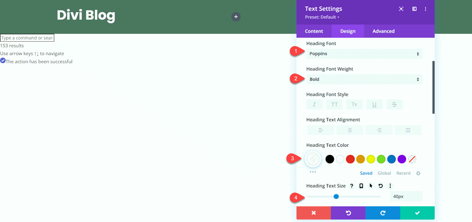
Next, navigate to the heading text settings.
- Heading Font: Poppins
- Heading Font Weight: Bold
- Heading Text Color: #FFFFFF
- Heading Text Size: 40px
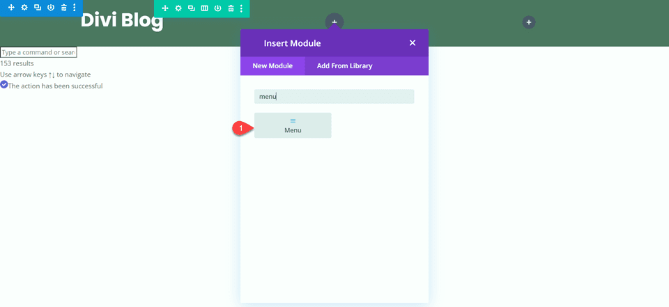
Now that the “Divi Blog” title is done, let’s add the regular menu module to the center column.
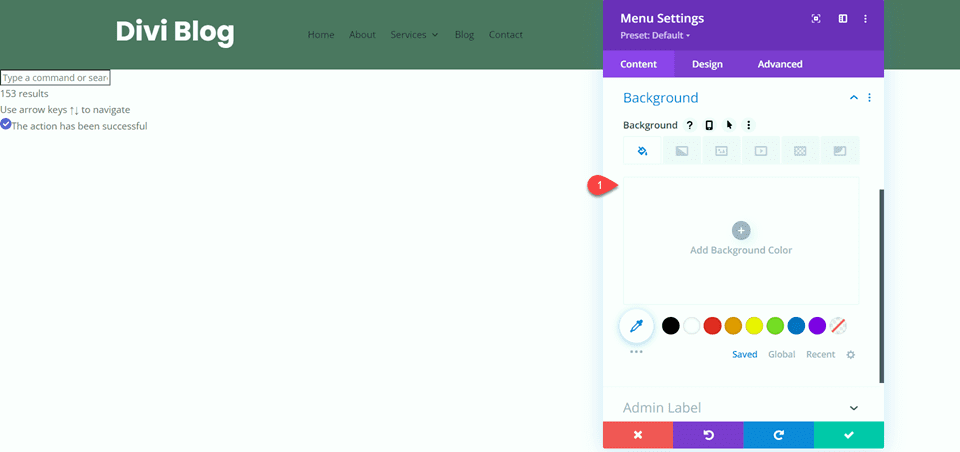
Remove the background color.
- Background: None
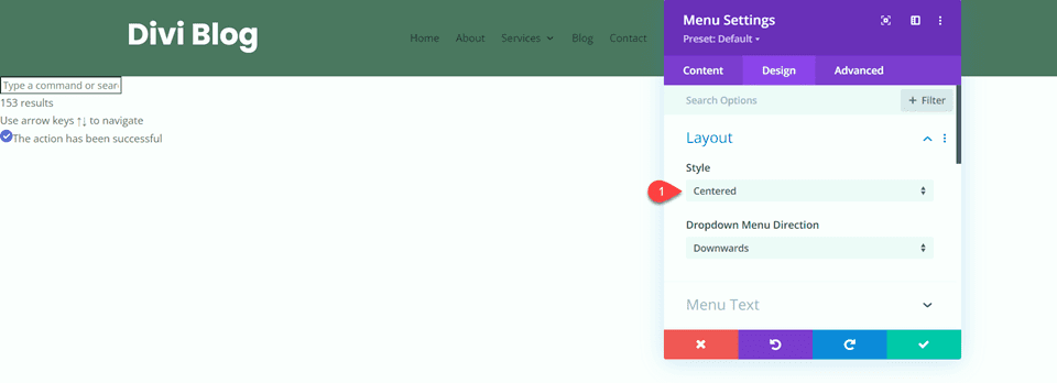
Next, navigate to the design tab. Under Layout, change the style to Centered.
- Style: Centered
Now we can modify the menu text styles.
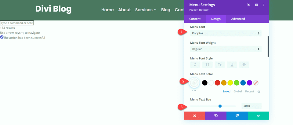
- Menu Font: Poppins
- Menu Text Color: #FFFFFF
- Menu Text Size: 20px
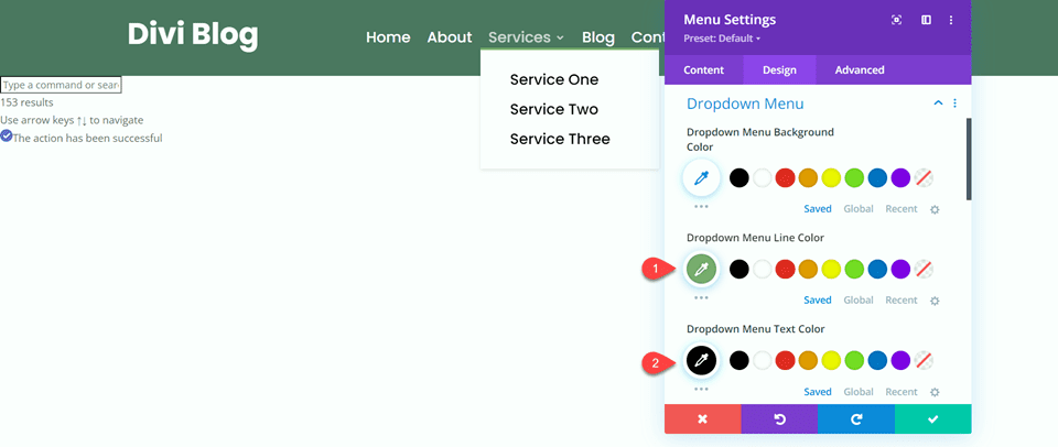
Modify the dropdown menu styles as well.
- Dropdown Menu Line Color: #7EAD70
- Dropdown Menu Text Color: #000000
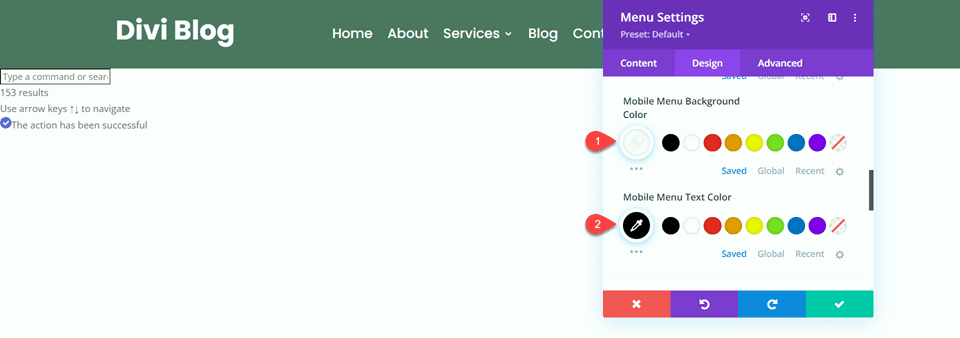
Next, change the mobile menu settings.
- Mobile Menu Background Color: #FFFFFF
- Mobile Menu Text Color: #000000
Finally, modify the hamburger menu settings.
- Hamburger Menu Icon Color: #FFFFFF
- Hamburger Menu Icon Font Size: 40px
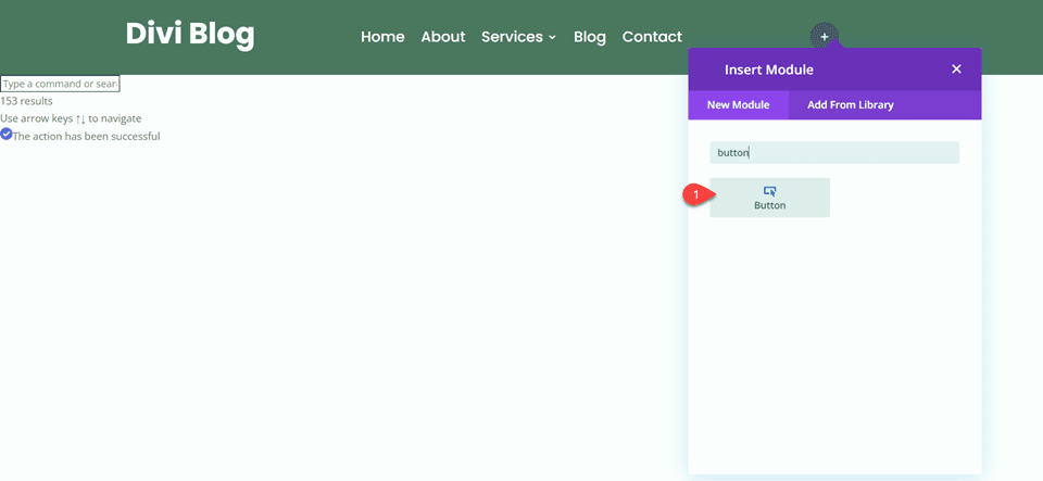
This completes the styling of the regular menu module. To finish up the menu design, let’s add a call-to-action button to the right column. First, add the button module.
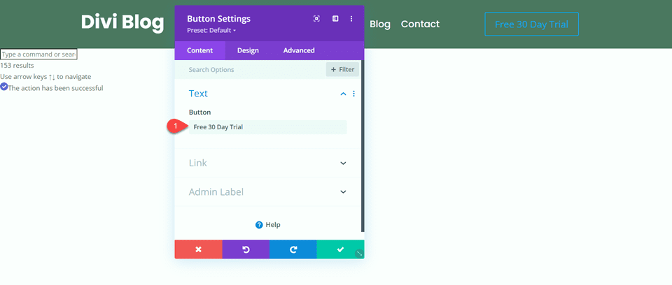
Change the button text.
- Button: “Free 30 Day Trial”
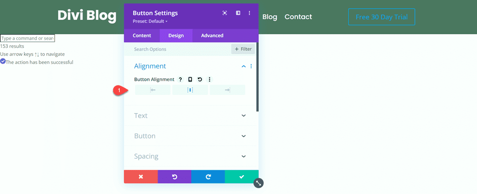
Set the button alignment to center.
- Button Alignment: Center
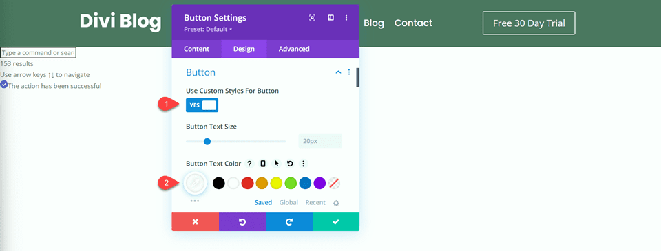
Set “Use Custom Styles for Button” to Yes and modify the text color.
- Use Custom Styles for Button: Yes
- Button Text Color: #FFFFFF
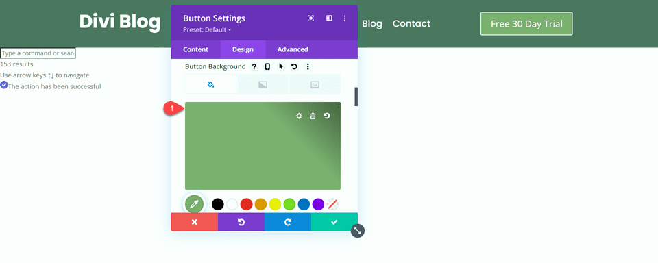
Set the button background.
- Button Background: #7EAD70
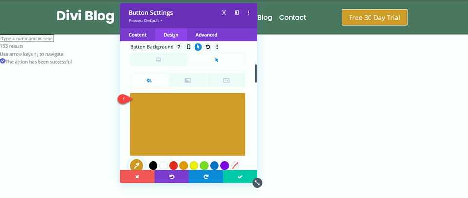
Set the button background on hover to orange.
- Button Background on Hover: #D19929
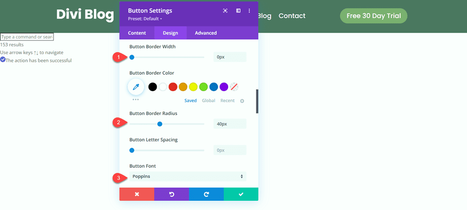
Next, set the button border width, radius, and font.
- Button Border Width: 0px
- Button Border Radius: 40px
- Button Font: Poppins
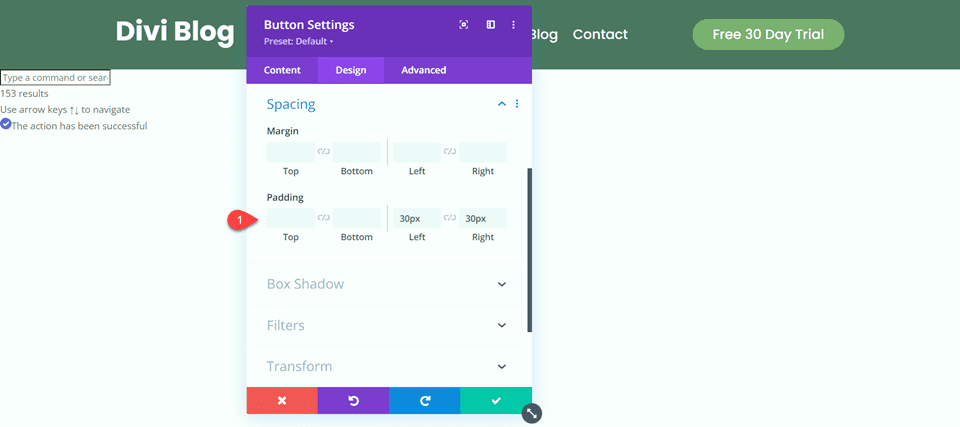
Finally, set the left and right padding.
- Padding-Left: 30px
- Padding-Right:30px
Final Result
Now let’s take a look at the final result for our menu modules.
Desktop: Fullwidth Menu Module
Desktop: Regular Menu Module
Mobile: Fullwidth Menu Module
Mobile: Regular Menu Module
Final Thoughts
Hopefully this article has helped you understand some of the key differences between Divi’s fullwidth menu module and regular menu module. Both are incredibly easy to customize to create great-looking menus for your website. The fullwidth menu module takes up the width of the page and comes with built-in options to modify and tweak the width. On the other hand, the regular menu module can be used alongside other modules and is contained within a row, where the width and other sizing options can be tweaked. Do you use a fullwidth menu module or a regular menu module on your website? We would love to hear from you in the comments!

