It’s that time again for our monthly Divi Showcase, where we take a look at ten amazing Divi websites made by our community members. Each month we showcase the best Divi websites that were submitted from our community and today we want to share with you the top ten websites for the month of April. Throughout the post, I’ll point out some of my favorite design features that draw me to each of the websites.
I hope you like them!
Divi Design Showcase: New Submissions from April 2021
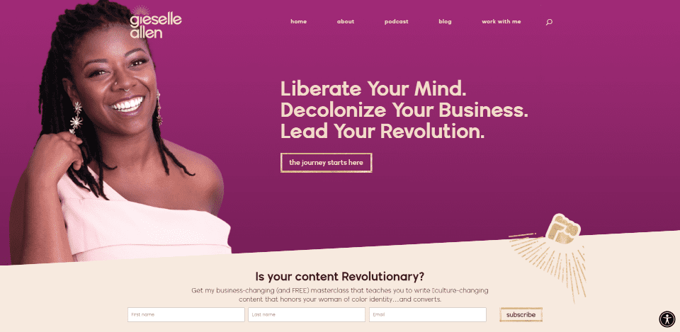
1. Gieselle Allen
This site was submitted by Leslie Tagorda. This site makes great use of color. The backgrounds between various shades of purple and tan. Each of the sections includes angled separators. The fonts work well with the backgrounds. It also includes graphics placed around the other elements, such as the images and CTAs. The images include styled borders and unique shapes that stand out from the backgrounds. Many of the backgrounds in the images match other graphical elements. I also like the background patterns.
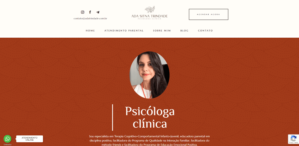
2. Ada Trindade
This site was submitted by Duo Digital. This site makes great use of fonts and background colors. The hero section and several backgrounds display a patterned background that stands out just enough to noticed and give it some visual texture. Many of the text elements include borders that work together to build shapes and CTAs. Some build visual elements just to draw attention, which works well for the testimonial. I also like that it has one graphical element to take up visual space.
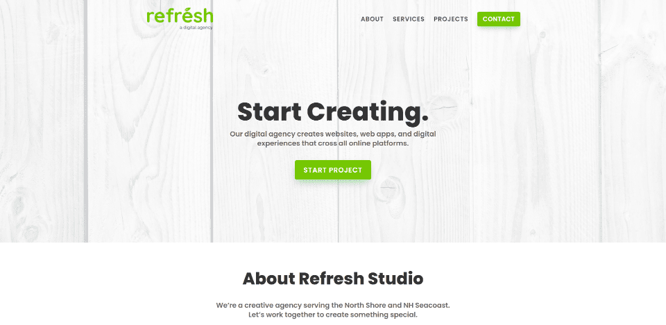
3. Refresh Studio
This site was submitted by Bradley Maravalli. This site makes interesting use of white space. It alternates between white and off-white backgrounds with elements that include white backgrounds with shadows that just stand apart from the background. The hero section displays a white image in parallax. The text is black, but it’s not too dark. It’s just light enough that it has the right contrast with the backgrounds to be easy to read. The logo, email links, and buttons are green, which stands out and looks elegant against the white.
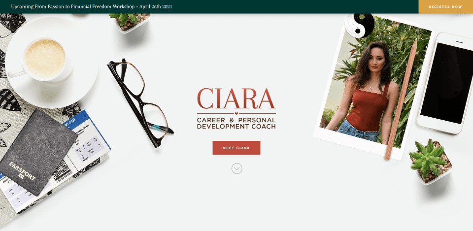
4. Ciara
This site was submitted by Ryan Olton. This one also makes excellent use of color and whitespace. The hero section shows an image of items that leave the center of the screen empty. The title and CTA sit perfectly in this location. Several sections include similar background images on one side or the other. All text has whitespace around it so that it stands out from anything else. Titles use a dark orange/red that works perfectly against the white backgrounds. I also like the banner at the top. It’s dark green with an orange button. The banner is replaced with the menu when you scroll.
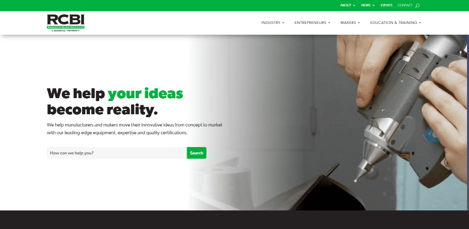
5. RCBI
This site was submitted by Jimmy Lemon. This one makes excellent use of brown backgrounds, green highlights, and images to create an industrial design. The hero section displays a background image that blends into a white background on the left with a CTA in the foreground. Categories are shown with large images in two columns over a brown background that stands out. The blog section also uses this background. Events are shown with large cards and deep box shadows that stand out.
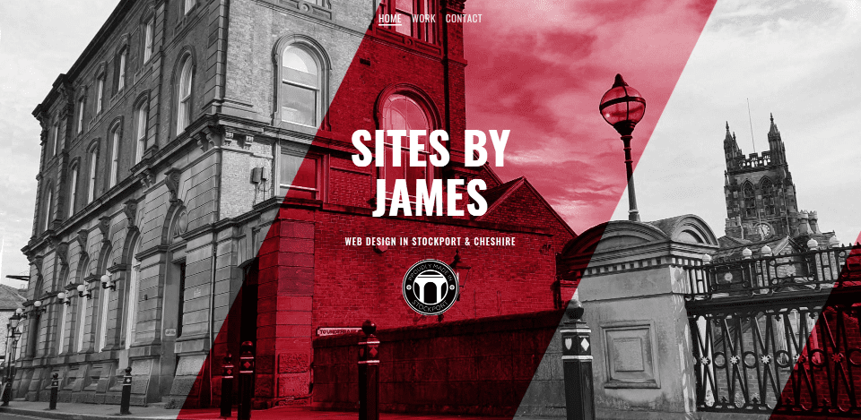
6. Sites by James
This site was submitted by James Pettecrew. This site makes excellent use of red highlights and a blend of light and dark backgrounds. The hero section especially stands out. It displays a monochrome image with a red diagonal section in the center for the title. Many of the sections use this red for titles, buttons, borders, etc., but it’s used sparingly so it always stands out. This site also has an interesting CTA. It uses a background image in parallax that’s a Google search for the website on desktop and mobile. Many will appreciate the logo in the footer that’s created with a Star Wars design.
7. The Valued Leader
This site was submitted by Shayne Wyler. This one makes great use of color and images. The backgrounds alternate between off-white and dark gray. A couple of the backgrounds, starting with the Hero section, display full-width images. Highlights, including buttons, icons, and tabs, are in blue. The blue is used sparingly enough that it always stands out. Several elements overlap sections. My favorite is the embedded videos with tabs for navigation. They display a video on one side and a CTA on the other.
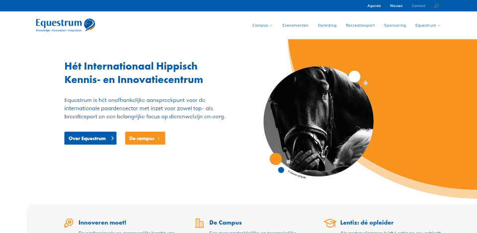
8. Equestrum
This site was submitted by Michenou Crama. This one makes excellent use of orange and blue highlights and white space. The orange and blue elements include buttons, background patterns, icons, text, and a background overlay. The hero section displays a large orange circle with a circled image that overlaps it. Smaller circles in both orange and blue overlap that. Several background elements are fixed while others are floating. All the CTAs, blog posts, and informational blurbs are colorful and stand out. Even the back-to-top button is styled to match the site.
9. Elite Turning & Machining
This site was submitted by Justin Arcara. This one makes excellent use of bright red and images to create an industrial design that looks elegant. Many of the images overlap sections and other images. One of the images is a slider. Red highlights include the CTA in the menu, buttons, titles, numbers, borders, icons, and one image overlay for contact information. Many of the sections include background patterns in gray that sit behind the images or blurbs. I like the section of blurbs that uses gray icons and red buttons. The blurbs include a red border for the bottom of the card.
Visit Elite Turning & Machining
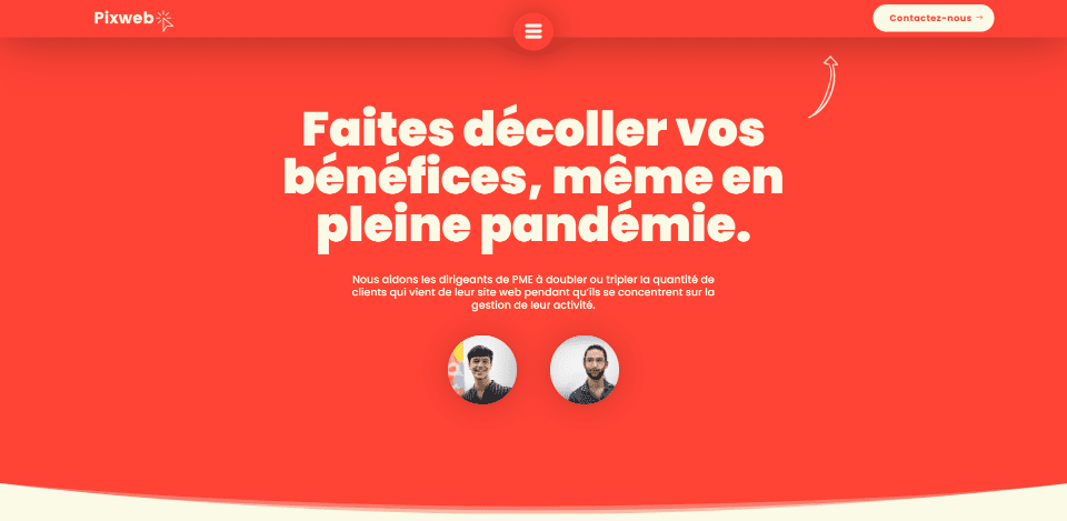
10. Pixweb
This site was submitted by Yanis. This site makes great use of color. An interesting bright red/orange is used for backgrounds. These alternate with tan backgrounds. Text in the red sections is in tan, which matches the tan backgrounds. Many of the red elements include box shadows that stand out. The header is in red and includes tan text, a box shadow, and an overlapping hamburger menu in the center. The hamburger icon opens a full-screen menu with a red background and tan graphical elements. My favorite is the CTA at the bottom. it overlaps a tan section and a red footer. It stands out from the red footer with a box shadow.
Wrapping Up
That’s our 10 best community Divi website submissions for the month of April. These sites look amazing and as always we want to thank everyone for your submissions!
If you’d like your own design considered please feel free to email our editor at nathan at elegant themes dot com. Be sure to make the subject of the email “DIVI SITE SUBMISSION”.
We’d also like to hear from you in the comments! Tell us what you like about these websites and if there is anything they’ve done you want us to teach on the blog.
Featured Image via GoodStudio / shutterstock.com

