Creating a zoom-out header scroll effect can be an impressive design element to engage users with your content. The effect is similar to what you see on Apple’s macOS Catalina page. In this tutorial, we are going to show you how to create a zoom-out header transition on scroll with Divi. The trick is to add scaling and vertical motion scroll effects to an entire row to create the zoom out effect. The result is a beautiful transition that leaves users pleasantly surprised.
Let’s get started.
Sneak Peek
Download the Layout for FREE
To lay your hands on the designs from this tutorial, you will first need to download it using the button below. To gain access to the download you will need to subscribe to our newsletter by using the form below. As a new subscriber, you will receive even more Divi goodness and a free Divi Layout pack every Monday! If you’re already on the list, simply enter your email address below and click download. You will not be “resubscribed” or receive extra emails.
To import the layout to your page, simply extract the zip file and drag the JSON file into the Divi Builder.
Let’s get to the tutorial, shall we?
What You Need to Get Started
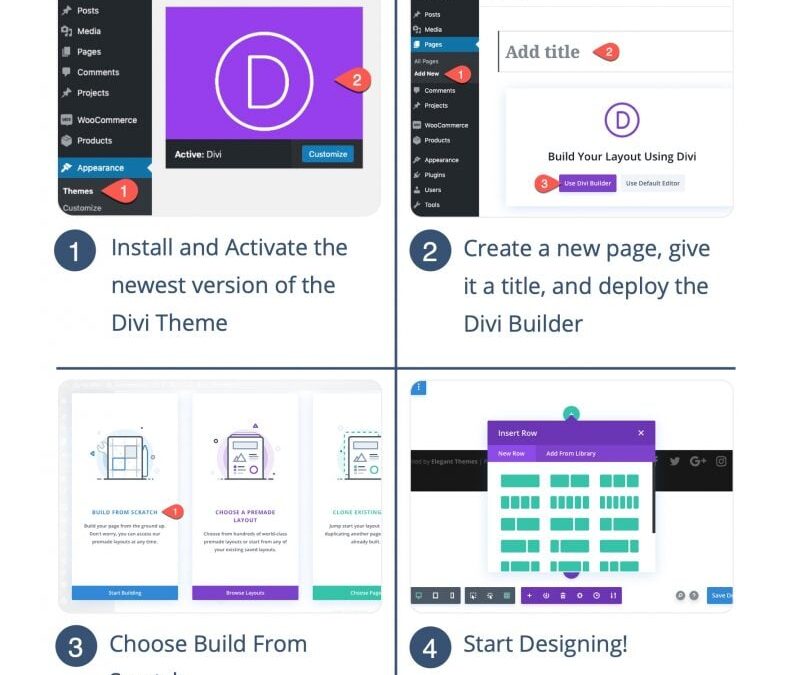
To get started, you will need to do the following:
- If you haven’t yet, install and activate the Divi Theme.
- Create a new page in WordPress and use the Divi Builder to edit the page on the front end (visual builder).
- Choose the option “Build From Scratch”.
After that, you will have a blank canvas to start designing in Divi.
How to Create a Zoom Out Header Effect in Divi
Section Height
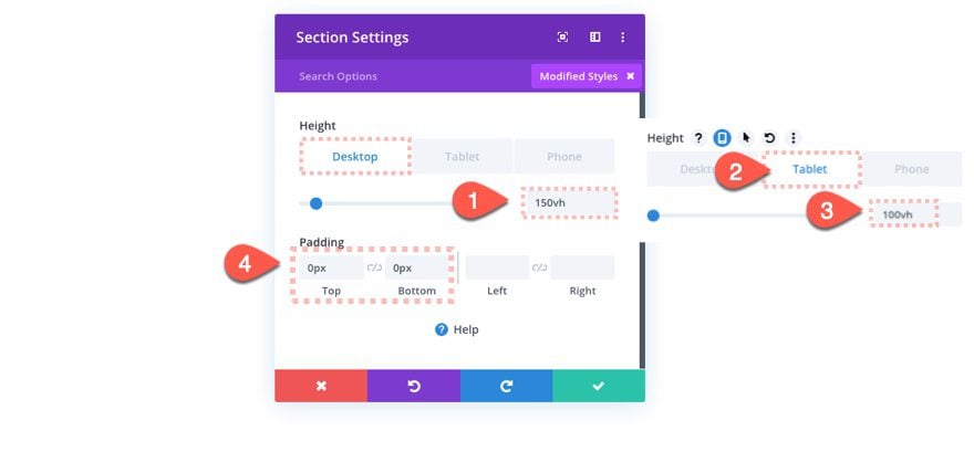
For this design, we need to give our section a height that extends beyond the height of the viewport to give some room for the scroll effect to work.
Before doing anything else, open the section settings and update the following:
- Height: 150vh (desktop), 100vh (tablet), 100vh (phone)
- Padding: 0px top, 0px, bottom
The Row
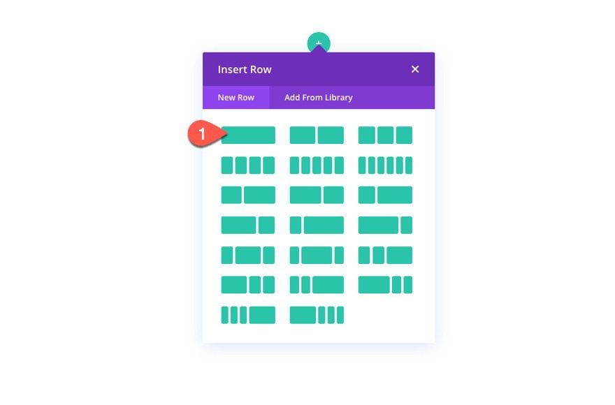
After the section height is complete, add a one-column row to the section.
Row Background Image
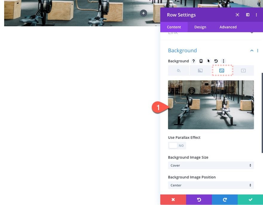
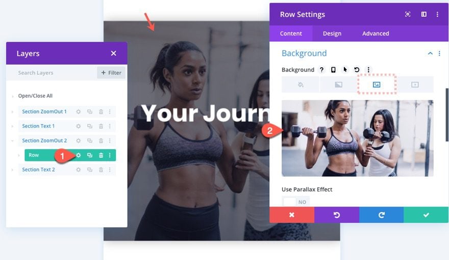
Before adding a module, open the row settings and add a background image. Make sure the image is at least 1920px wide (large enough to span the full screen of a large monitor).
Row Size and Spacing
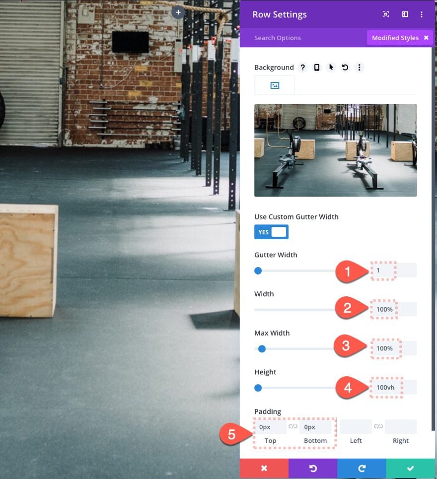
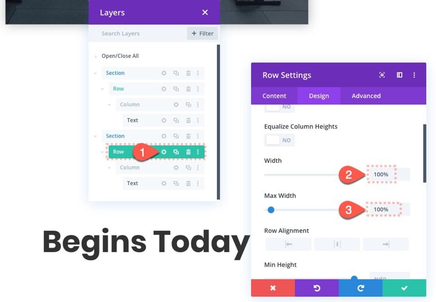
Once the background is in place, we need to make sure our row spans the full width and height of the page. To do this, update the following design settings for the row:
- Gutter Width: 1
- Width: 100%
- Max Width: 100%
- Height: 100vh
- Padding: 0px top, 0px bottom
Row Box Shadow
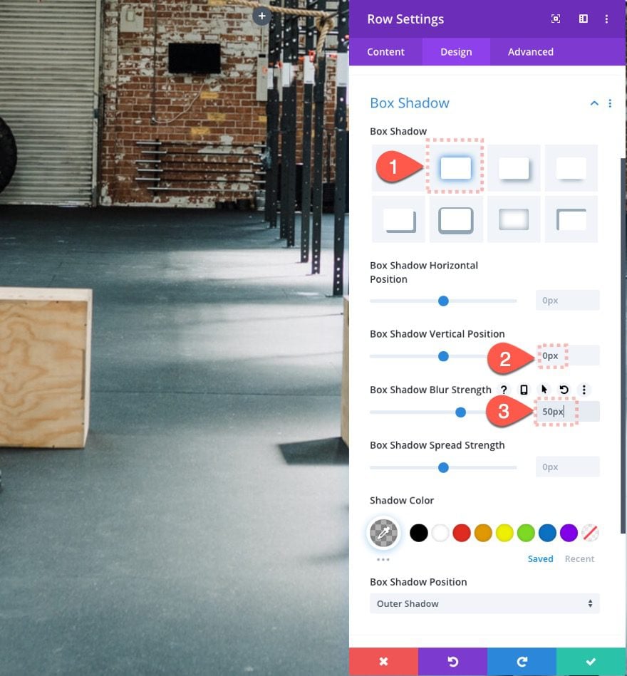
Then give the row a box-shadow. We won’t see it until we add the scroll effect that scales the row down to create the zoom out effect.
- Box Shadow: See Screenshot
- Box Shadow Vertical Position: 0px
- Box Shadow Blur Strength: 50px
Add a Text Module for the Heading Text
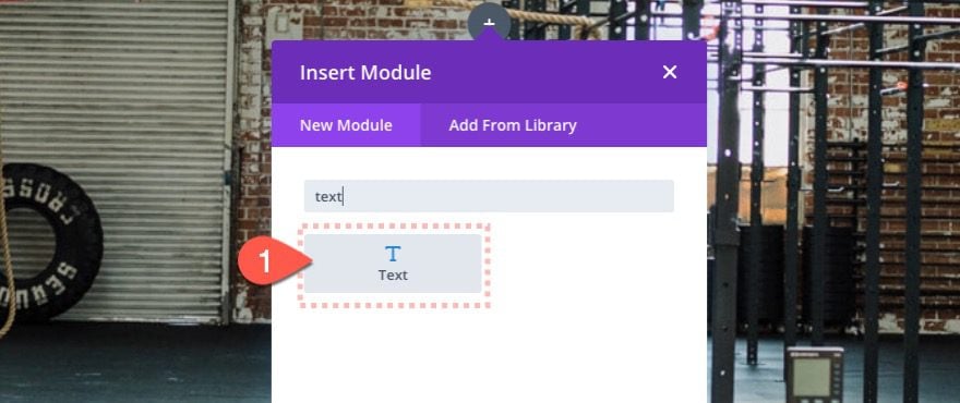
Next, add a new text module inside the row.
Text Content
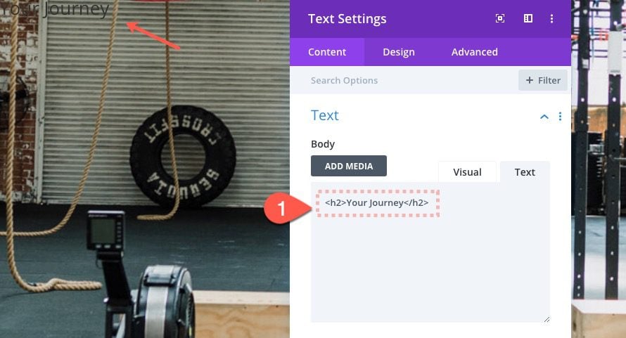
Update the body content with the following H2 heading:
<h2>Your Journey</h2>
Text Design Settings
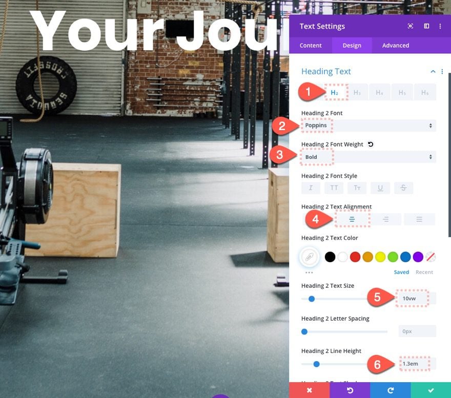
Then update the design settings for the text as follows:
- Heading 2 Font: Poppins:
- Heading 2 Font Weight: Bold
- Heading 2 Text Alignment: Center
- Heading 2 Text Size: 10vw
- Heading 2 Line Height: 1.3em
Column Height and Background Overlay
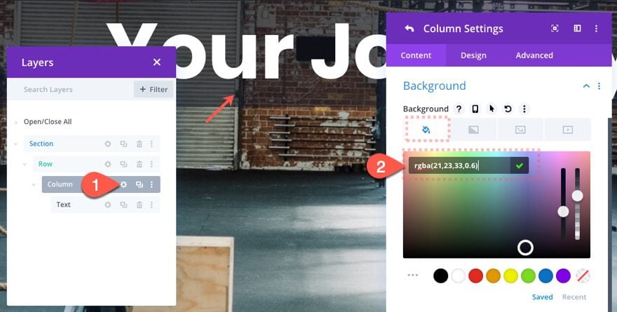
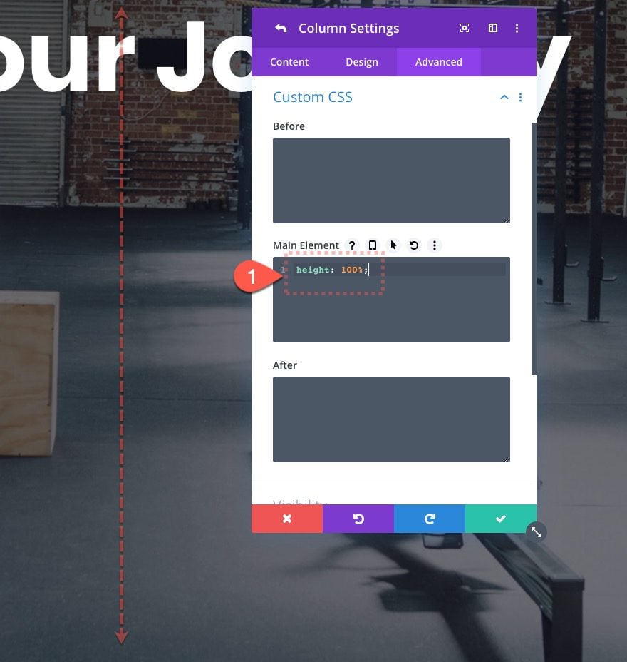
Once the text module is in place, we need to customize our column settings so that it becomes a nice overlay for our row background. To do this we will need to update the background color with a semi-transparent color and give the column a 100% height.
Open the settings for column 1 and update the following:
Under the advanced tab, add the following custom CSS in the Main Element:
height: 100%
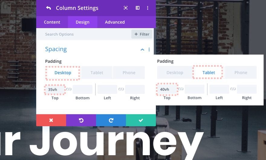
Next, add some padding to the column…
- Padding (desktop): 35vh top
- Padding (tablet): 40vh top
Column Scroll Effect
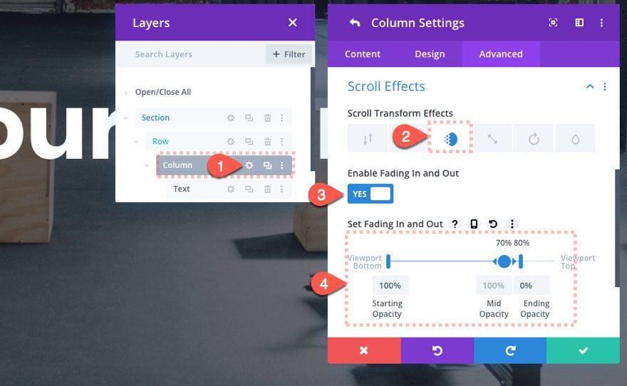
Next, add a scroll effect to the column that will fade out the column (with the background color and text) on scroll. To do this, update the following:
Under the Fading In and Out tab…
- Enable Fading In and Out: YES
- Starting Opacity: 100% (at 0% viewport)
- Mid Opacity: 100% (at 70% viewport)
- Ending Opacity: 0% (at 80% viewport)
Add Scroll Effects to the Row
Now we can start adding the scroll effects to the row.
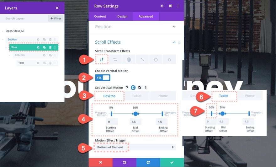
Vertical Motion
Open the row settings and update the following:
Vertical Motion Scroll Effect (Desktop)
- Enable Vertical Motion: YES
- Starting Offset: 0 (at 5% viewport)
- Mid Offset: 4.5(at 50% viewport)
- Ending Offset: 4.5 (at 100% viewport)
Vertical Motion Scroll Effect (Tablet)
- Starting Offset: 0 (at 30% viewport)
Make sure to update the motion trigger effect to the bottom of the element. This is key for making the scroll effect work. To do this, update the following:
- Motion Effect Trigger: Bottom of Element
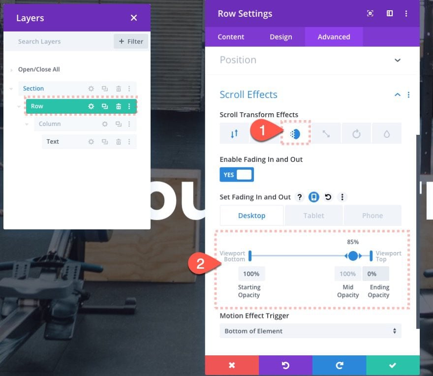
Fading In and Out
To make the header fade out just before leaving the top of the viewport on scroll, open the row settings and update the following:
Fading In and Out Scroll Effect
- Enable Fading In and Out: YES
- Starting Opacity: 100% (at 0% viewport)
- Mid Opacity: 100% (at 85% viewport)
- Ending Opacity: 0% (at 100% viewport)
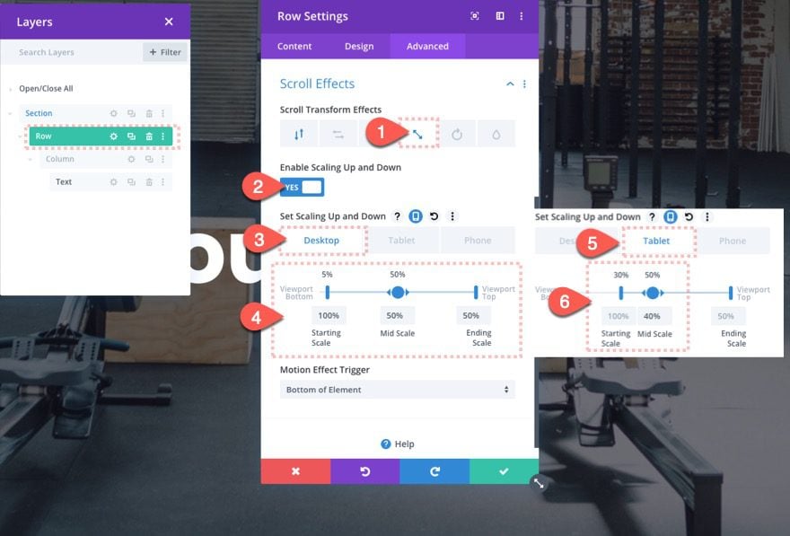
Scaling Up and Down
To make the header “zoom out” we need to scale it down to 50% on scroll. To do that, update the following:
Desktop
- Enable Scaling Up and Down: YES
- Starting Scale: 100% (at 5% viewport)
- Mid Scale: 50% (at 50% viewport)
- Ending Scale: 50% (at 100% viewport)
Tablet
On tablet, adjust the following:
- Starting Scale: 100% (at 30% viewport)
- Mid Scale: 40% (at 50% viewport)
That takes care of our zoom out heading section!
Creating the Second Section of Text
Now we can create a new section for the second block of static content that will appear under the main heading as the user scrolls down the page.
Add New Section
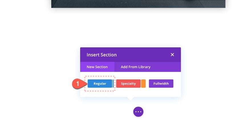
To do this, first, create a new regular section below the previous section.
Add One-Column Row
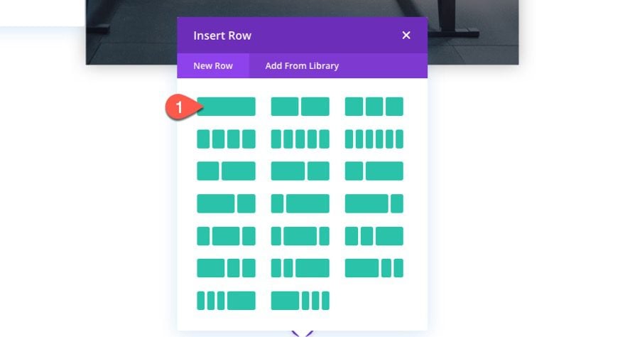
Then add a one-column row to the section.
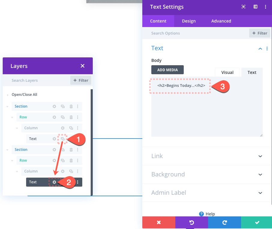
Duplicate Text Module
Duplicate the text module with the heading of the first section above and paste it into the new section column. Then update the text module content with the following text:
<h2>Begins Today...</h2>
Update Text Settings
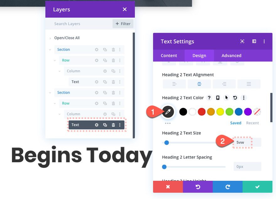
Then make a few design adjustments to the text as follows:
- Heading 2 Text Color: #333333
- Heading 2 Text Size: 5vw
Update Row Settings
Once the text is finished, open the row settings and update the width as follows:
- Width: 100%
- Max Width: 100%
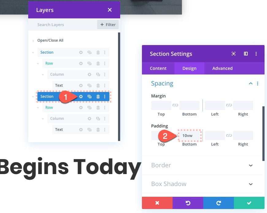
Section Settings
Then open the section settings and add some padding to even out the spacing a bit.
That’s it. Now we can check out the result so far on the live page.
Creating Additional Heading Sections
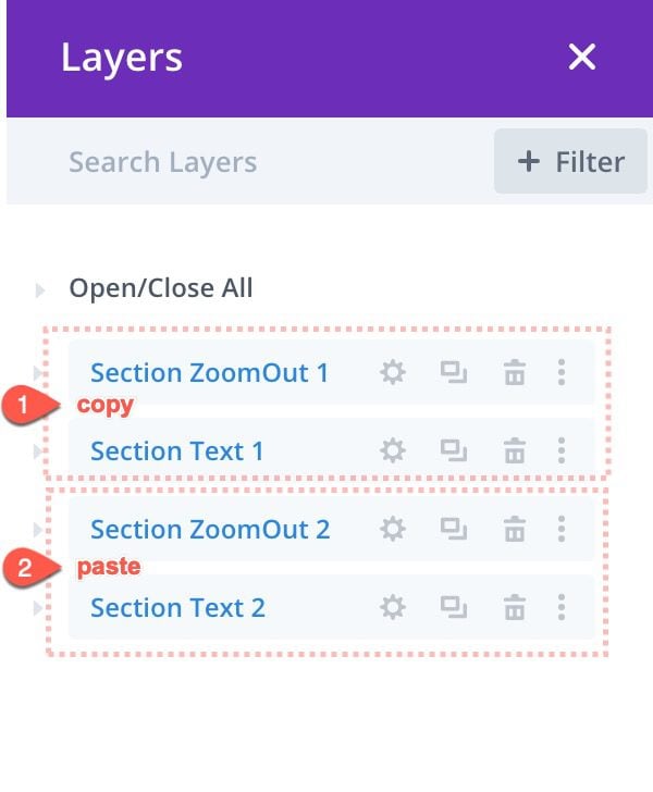
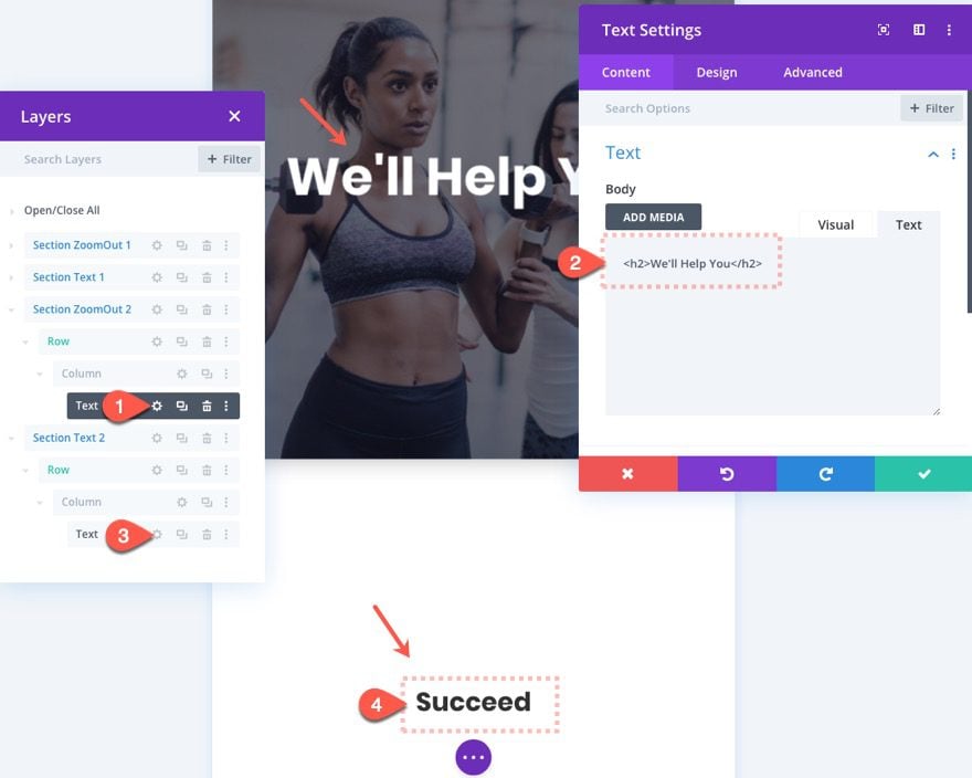
To create additional heading sections, duplicate the first two sections and move them below. This can easily be done using the layers feature or wireframe view.
Then update the row background image.
Change the heading text inside the two text modules.
And that’s it. Now you can start to see a complete layout starting to form with the zoom out heading effect.
Final Result
Final Thoughts
The zoom-out header scroll effect is pretty simple (and quick) to create. But the design can be a bit tricky to get right on all browser sizes. The download provided should help you explore a working model that you can tweak for your website. Hopefully, you find it helpful and inspirational.
I look forward to hearing from you in the comments.
Cheers!
https://www.elegantthemes.com/blog/divi-resources/how-to-create-a-zoom-out-header-transition-on-scroll-in-divi

