Every website that regularly communicates with customers can benefit from a FAQ section. When creating your website with Divi, there are many ways to approach designing your FAQ section. Now, in this post, we’ll be creating a fun FAQ section that focuses on combining the column and module container to create a beautiful design. You’ll be able to download the JSON file for free as well!
Let’s get to it.
Preview
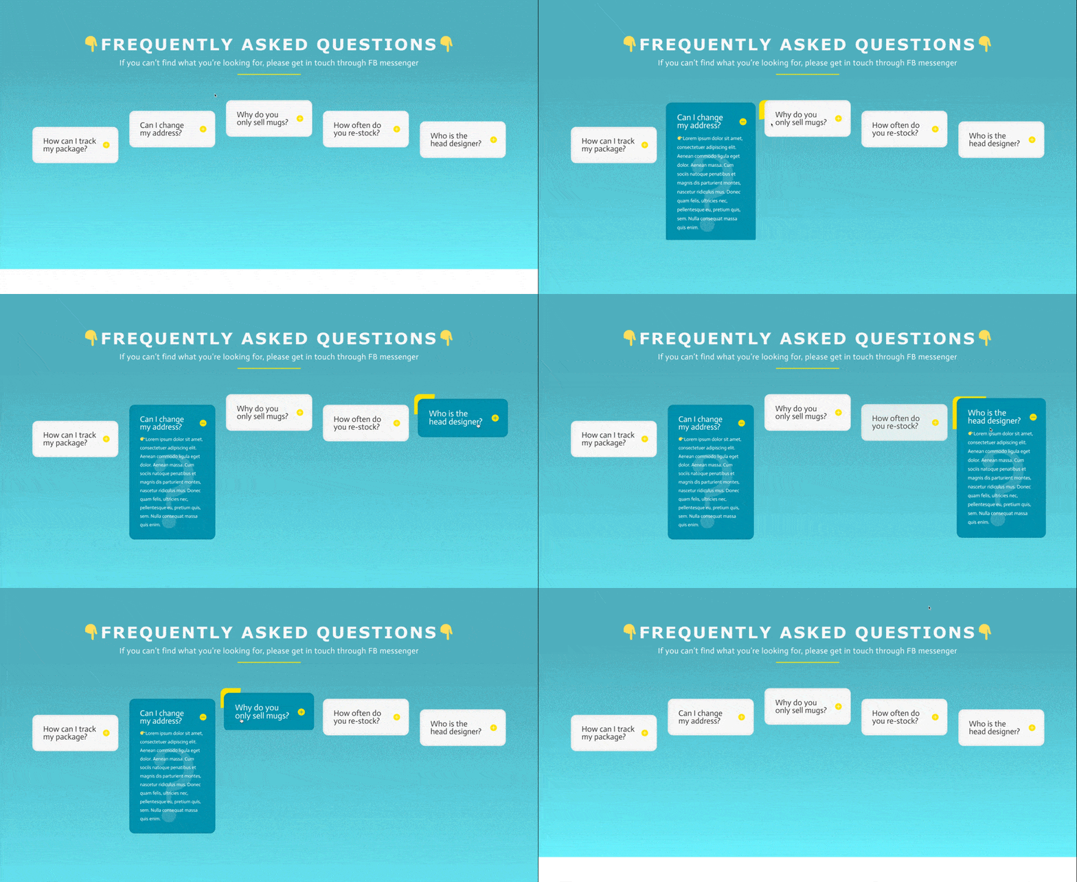
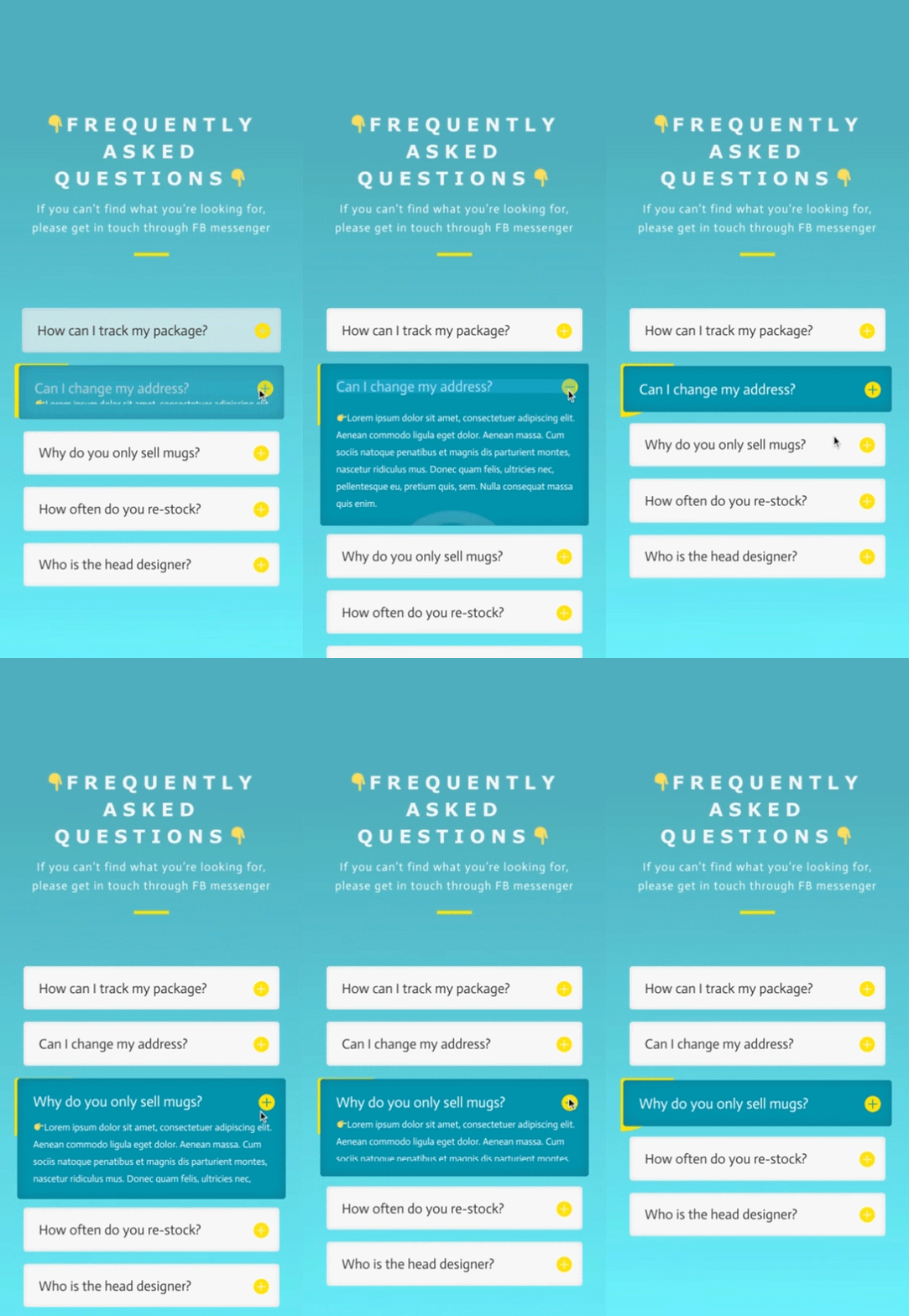
Before we dive into the tutorial, let’s take a quick look at the outcome across different screen sizes.
Desktop
Mobile
Download The Column FAQ Design for FREE
To lay your hands on the free column FAQ design, you will first need to download it using the button below. To gain access to the download you will need to subscribe to our newsletter by using the form below. As a new subscriber, you will receive even more Divi goodness and a free Divi Layout pack every Monday! If you’re already on the list, simply enter your email address below and click download. You will not be “resubscribed” or receive extra emails.
Subscribe To Our Youtube Channel
Let’s Start Recreating
Add New Section
Background
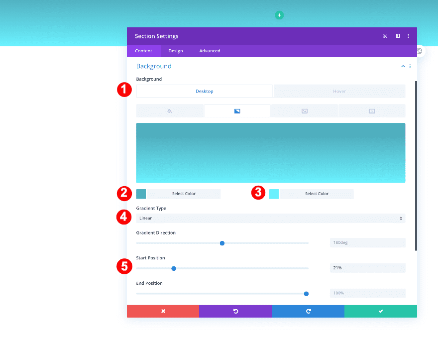
Start by adding a new regular section to the page you’re working on. Before adding a row, adjust the section background.
- Background: Gradient
- Color One: Dark Aqua #50aebf
- Color Two: Light Aqua #6bf2ff
- Direction: 180deg
- Start Position: 21%
Spacing
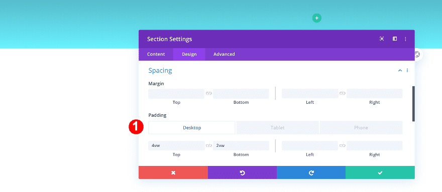
Modify the section’s padding values too.
- Top Padding:
- Desktop: 4vw
- Tablet: 15vw
- Phone: 24vw
- Bottom Padding: 2vw
Add New Row
Column Structure
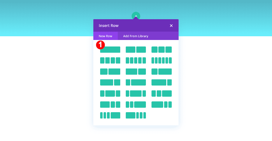
Continue by adding a new row to the section using the following column structure:
Column Settings
Spacing
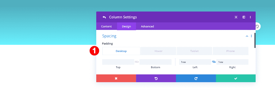
Open the column 1 settings and add some left and right padding.
- Left and Right Padding:
- Desktop: 1vw
- Tablet + Phone: 3vw
Add Text Module
Add Content
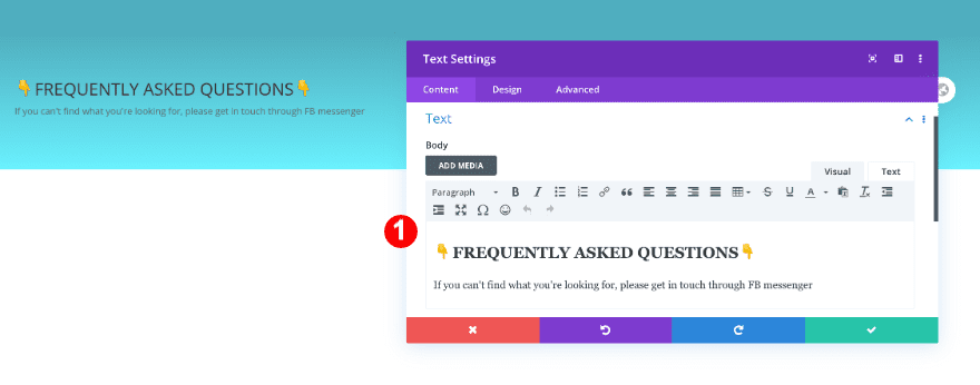
Time to start adding modules! Add a new text module with some H2 and paragraph content of your choice.
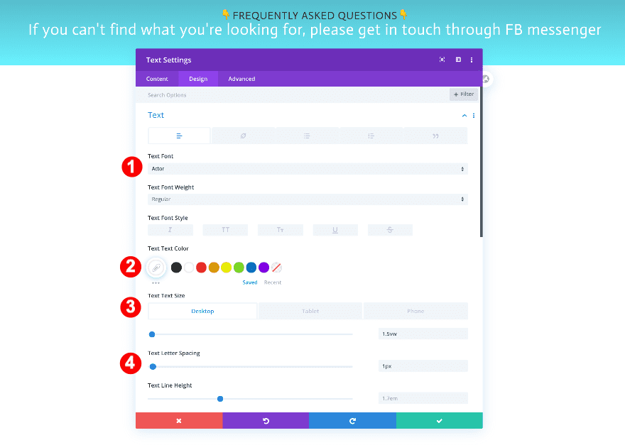
Text
Move on to the design tab and style the paragraph text.
- Text Font: Actor
- Text Color: Off White ##f6f6f6
- Text Size:
- Desktop + Tablet: 1.5vw
- Phone: 3.8vw
- Text Letter Spacing: 1px
- Text Alignment: Center
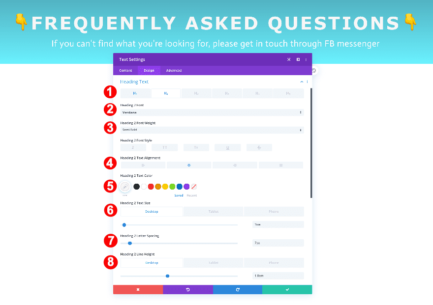
Heading Text
Then, style the heading text.
- Heading Text Level: H2
- H2 Font: Verdana
- H2 Font Weight: Semi-Bold
- H2 Font Color: Off White: #f6f6f6
- H2 Font Size:
- Desktop: 3vw
- Tablet: 5vw
- Phone: 6vw
- H2 Letter Spacing: 7px
- H2 Line Height:
- Desktop: 1.8em
- Tablet: 1.6em
- Phone:1.5 em
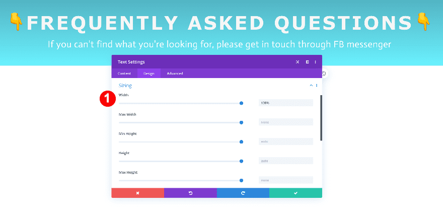
Sizing
Furthermore, adjust the sizing.
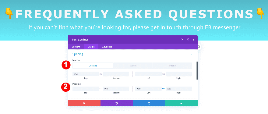
Spacing
Finally, adjust the spacing.
- Top Margin:
- Bottom Margin:
- Bottom Padding: 0vw
- Left + Right Padding: 7vw
Add Divider Module
Line
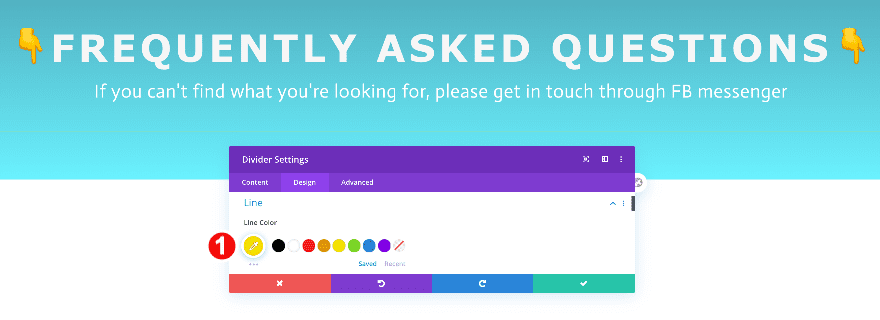
Below the text, add a divider module and make it yellow.
- Line Color: Yellow #ffe100
Sizing
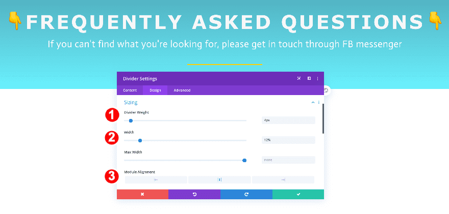
Then, adjust the weight and width.
- Divider Weight: 4px
- Width: 12%
- Module Alignment: Center
Spacing
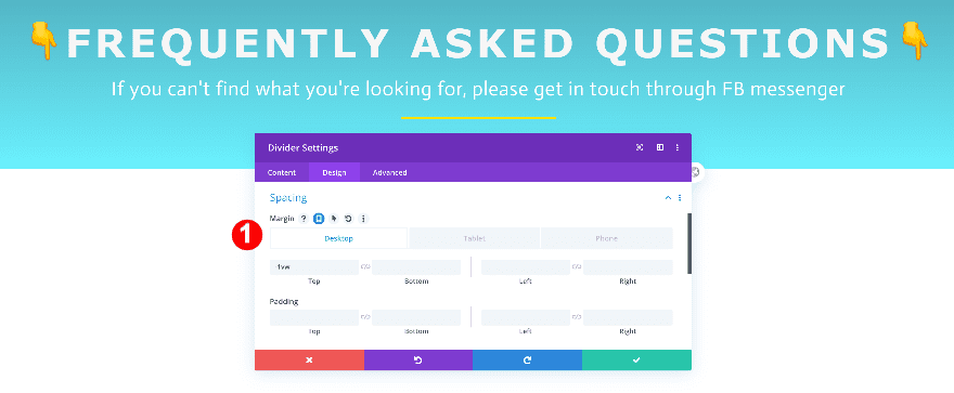
Finally, adjust the spacing.
- Top Margin:
- Desktop + Tablet: -1vw
- Phone: 10vw
Add New Row
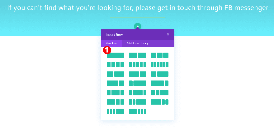
Column Structure
Continue by adding a new using the following column structure:
Sizing
Before anything else, adjust the sizing.
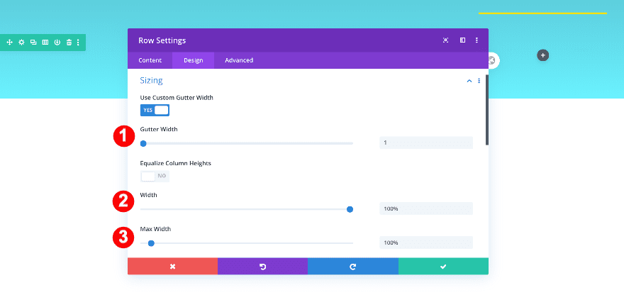
- Gutter Width: 1
- Width: 100%
- Max Width: 100%
Spacing
Then adjust the spacing.
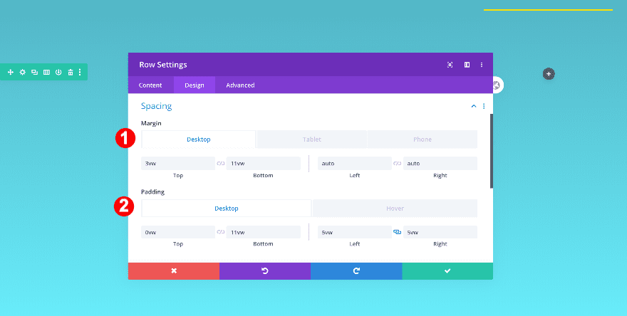
- Top Margin: 3vw
- Bottom Margin: 11vw
- Left and Right Margin: auto
- Top Padding: 0vw
- Bottom Padding: 11vw
- Left and Right Padding: 5vw
Column 1 Settings
Background on Hover
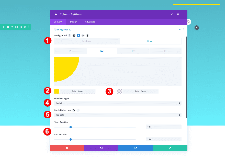
Before adding the other columns, style the column 1 background as follows:
- Hover Background: Gradient
- Color One: Yellow #ffe100
- Color Two: Transparent
- Gradient Type: Radial
- Radial Direction: Top Left
- Start and End Position: 19%
Spacing
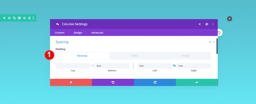
Add some spacing values to the column next.
- Bottom Padding:
- Desktop + Tablet: 0vw
- Phone: 4vw
- Left and Right Padding:
- Desktop: 1vw
- Tablet + Phone: 3vw
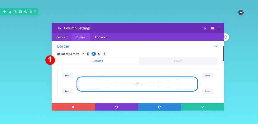
Border
Add some rounded corners to the column as well.
- Rounded Corners: 1vw all four corners
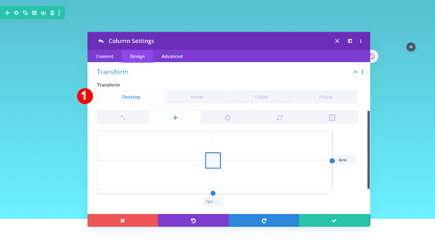
Transform
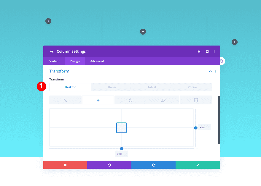
Finally, apply a custom transform translate value to the column.
- Transform Translate: 4vw y-axis (Desktop), 0vw (Hover, Tablet & Phone)
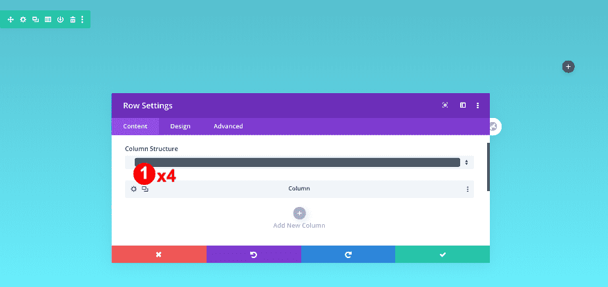
Duplicate Column 1 Four Times
Now, duplicate the first column four times.
Column 2 Settings
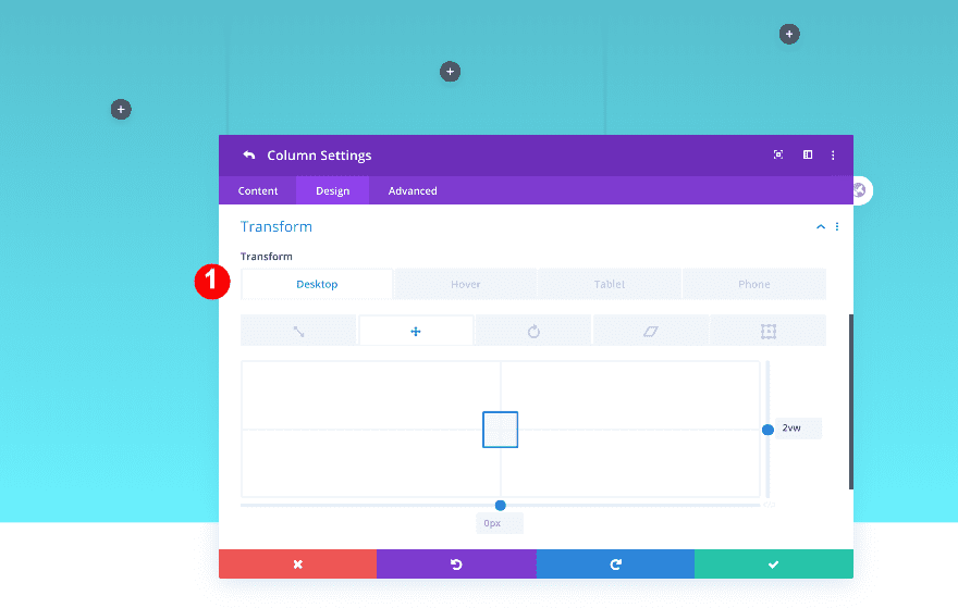
Transform
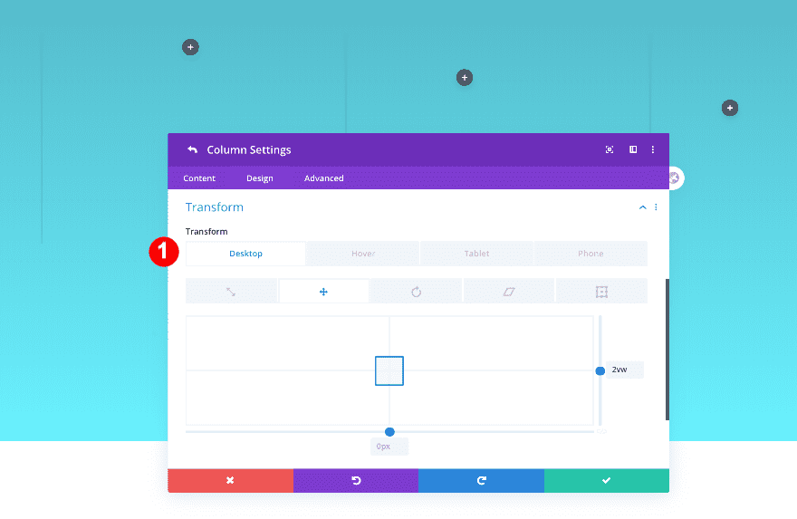
Then, adjust the transformation values. First, column 2.
- Transform Translate: 2vw y-axis (Desktop), 0vw (Hover, Tablet & Phone)
Column 3 Settings
Transform
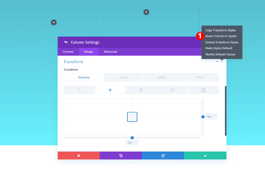
Then, reset the transformation value in column 3.
- Transform Translate: Reset
Column 4 Settings
Transform
Also, adjust the transform value in column 4.
- Transform Translate: 2vw y-axis (Desktop), 0vw (Hover, Tablet & Phone)
Column 5 Settings
Transform
Finally, review the transform values in column 5.
- Transform Translate: 4vw y-axis (Desktop), 0vw (Hover, Tablet & Phone)
Add Toggle Module to Column 1
Add Content
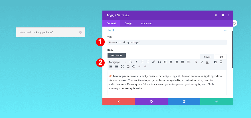
Time to start adding modules! Add a toggle module to the first column with some content of your choice.
State
Then, select ‘Close’ as the module’s state.
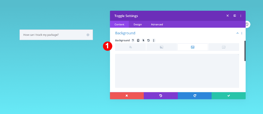
Background
And add a transparent image of a question mark as the background.
- Background: Image
- Background Image Blend: Soft Light
Icon
In the design tab, style the icon.
- Icon Color: Yellow #ffe100
- Icon Size:
- Desktop: 34px
- Tablet + Phone: 20px
Toggle
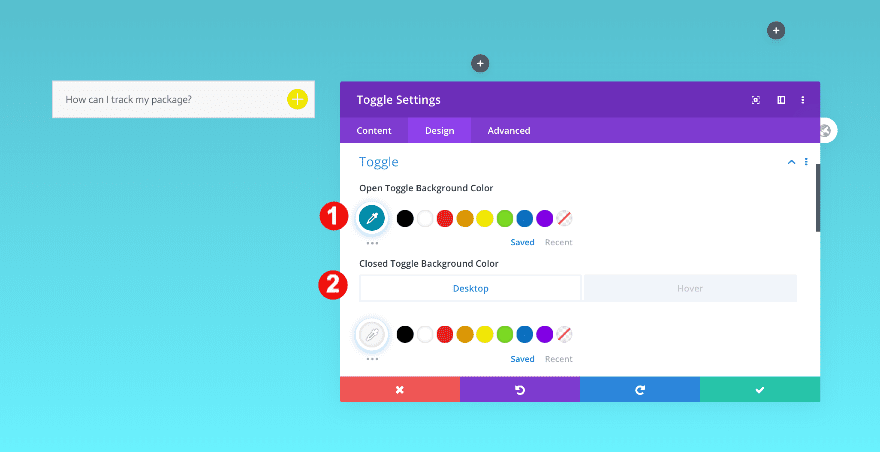
Then, style the toggle backgrounds for static and hover.
- Open Toggle Background Color: Teal #0092af
- Closed Toggle Background Color: Off White: #f7f7f7
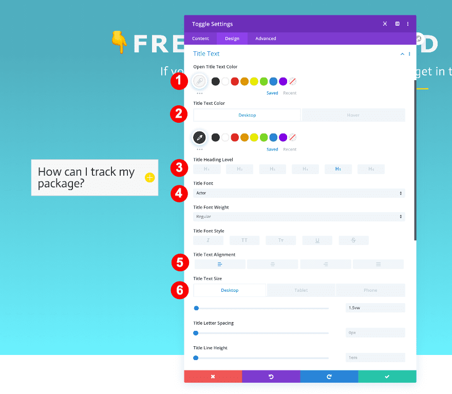
Title Text
Continue by styling the title text.
- Open Title Text Color: Off White: #f7f7f7
- Title Text Color: Very Dark Grey #3a3a3a
- Hover: Off White: #f7f7f7
- Title Heading Level: H5
- H5 Font: Actor
- H5 Alignment: Left
- H5 Text Size:
- Desktop: 1.5 vw
- Tablet: 3 vw
- Phone: 4.5 vw
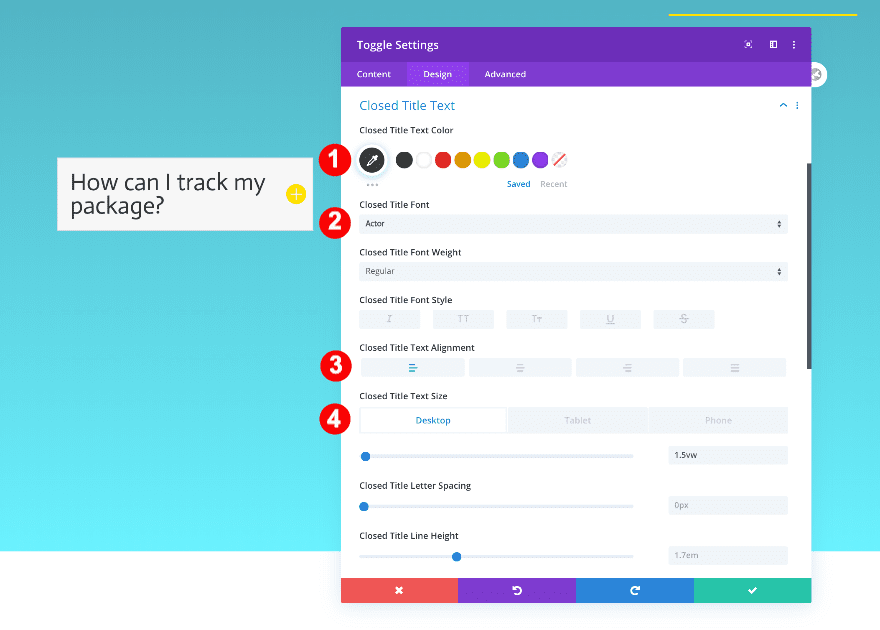
Closed Title Text
Style the closed text as well.
- Closed Title Text Color: Very Dark Grey #3a3a3a
- Closed Title Font: Actor
- Alignment: Left
- Closed Text Size:
- Desktop: 1.5vw
- Tablet: 3vw
- Phone: 4.5vw
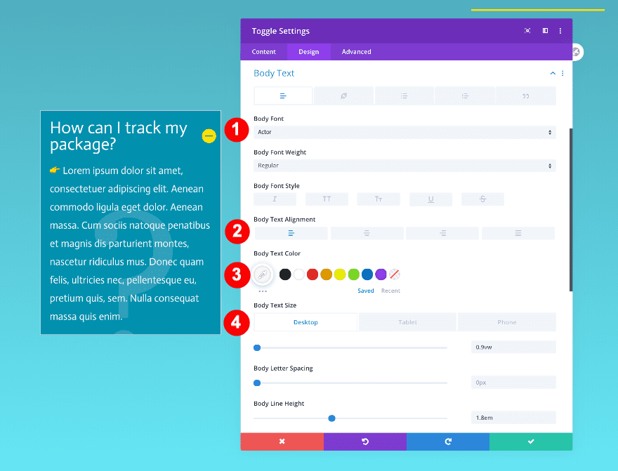
Body Text
Don’t forget the body text.
- Body Font: Actor
- Body Text Alignment: Left
- Body Text Color: Off White: #f7f7f7
- Body Text Size:
- Desktop: 0.9vw
- Tablet: 2vw
- Phone: 3vw
- Body Line Height: 1.8em
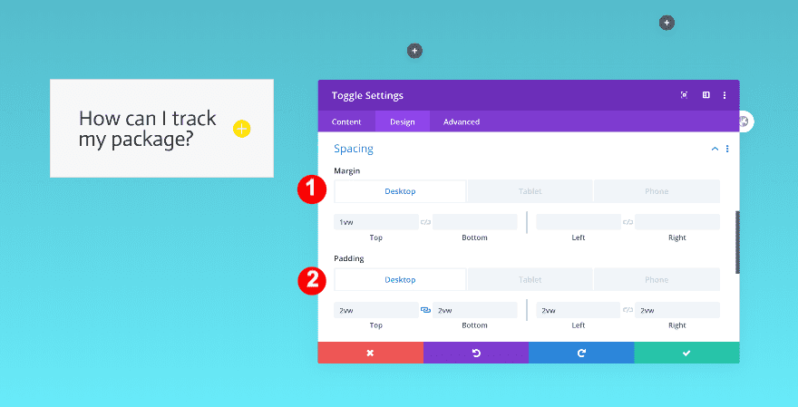
Spacing
After the text styling, add some spacing values.
- Top Margin:
- Top + Bottom Padding:
- Desktop: 2vw
- Tablet: 3vw
- Phone: 5vw
- Left Padding:
- Desktop: 2vw
- Tablet: 4vw
- Phone: 5vw
- Right Padding:
- Desktop: 2vw
- Tablet: 3vw
- Phone: 4vw
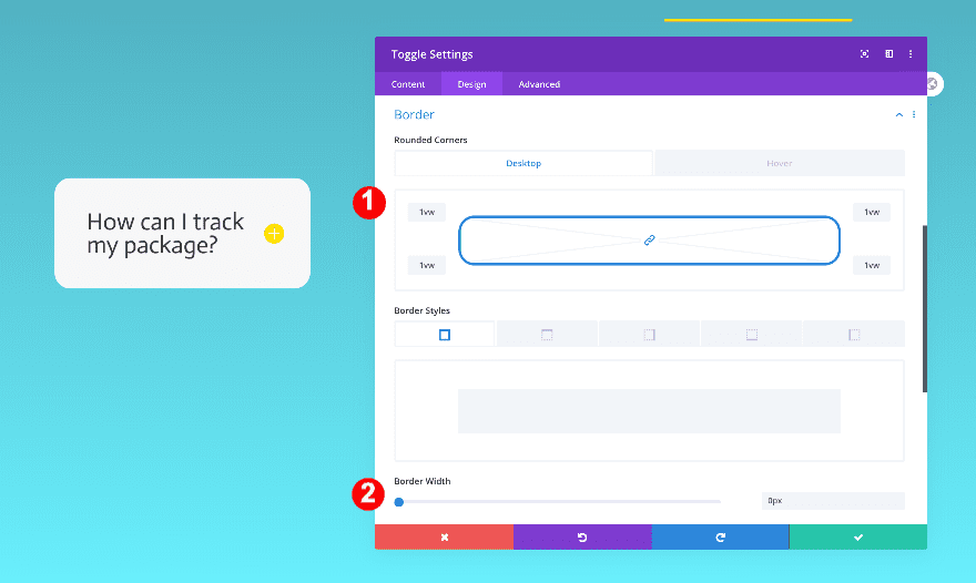
Border
Add some rounded corners and remove the default 1px border.
- Rounded Corners: 1vw all four corners
- Border: 0px
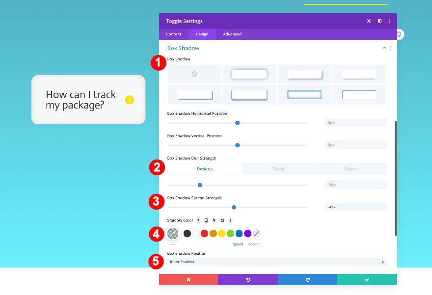
Box Shadow
Finally, add an inner box shadow.
- Box Shadow: 6th Option
- Box Shadow Blur Strength:
- Desktop + Tablet: 18px
- Phone: 9px
- Box Shadow Spread Strength: -4px
- Shadow Color: rgba(0,0,0,0.21)
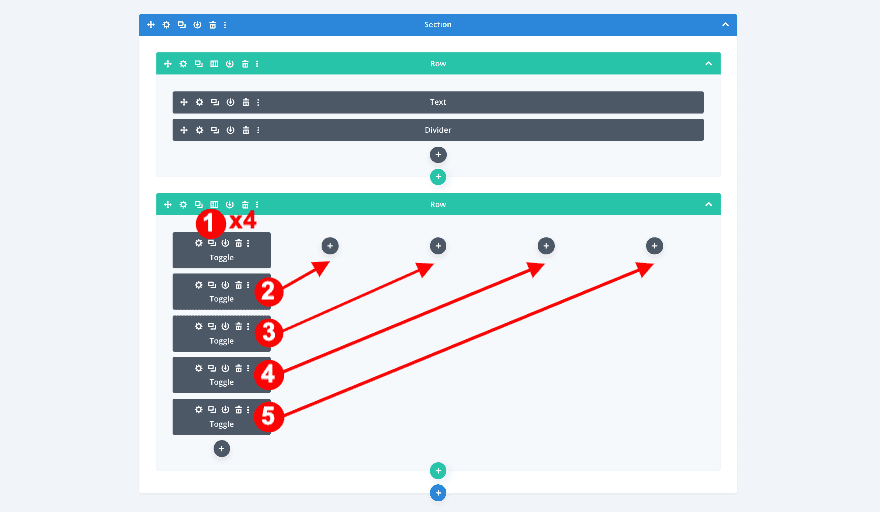
Duplicate Toggle Module 4 Times
Duplicate the styled toggle module four times and drag the new ones to the empty columns.
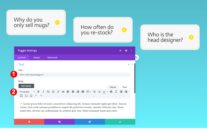
Edit Content
Edit the questions and answers in the duplicated toggle modules and you’re done!
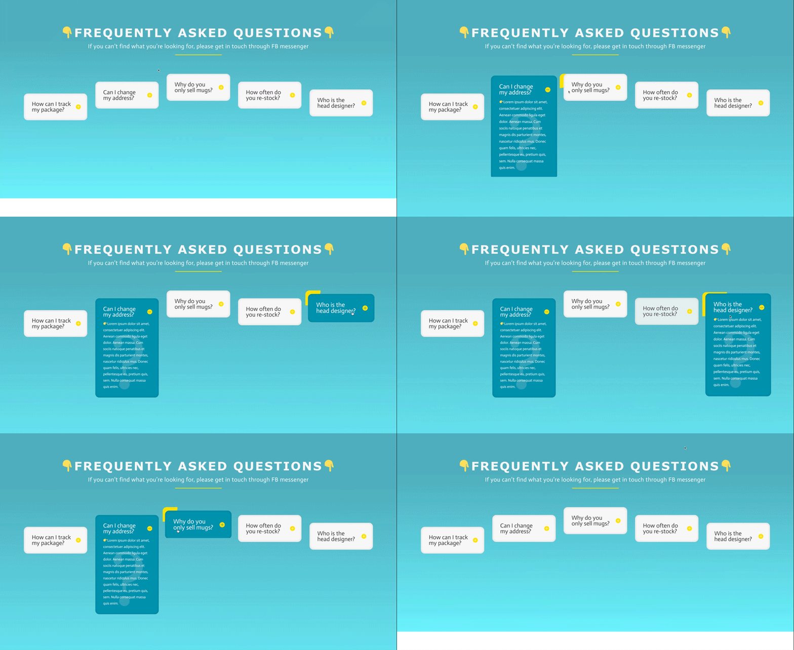
Preview
Now that we’ve gone through all the steps, let’s take a final look at the outcome across different screen sizes.
Desktop
Mobile
Conclusion
In this post, we’ve shown you how to create a unique column FAQ design. We added some hover options to give the design an interesting yellow corner effect. We hope this design will inspire you to create interesting FAQ designs as part of your Divi projects. If you have any questions or suggestions, feel free to leave a comment in the comment section below!
https://www.elegantthemes.com/blog/divi-resources/creating-unique-column-faq-designs-with-divi

