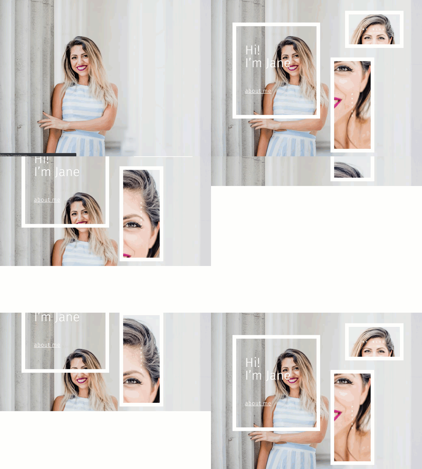
Whether we are preparing a meal or designing a website, the ingredients alone will not guarantee a tasty dish or a beautiful site. It is how well we combine those elements together that makes all the difference. In this tutorial, I’m going to show you how to combine animation and image parallax in a way that you may have never considered before. If you don’t already know, animation is a built in Divi feature that can be added to any Divi element on page load. Parallax is also a Divi option that allows you to add unique movement to your background images on scroll.
Today, we are going to use Divi’s built-in design settings to combine animations and parallax in all sorts of creative ways. The combination works together quite magically to create a beautiful layout of animated parallax images that look awesome as you scroll down the page.
Let’s get started!
Sneak Peek
Download the Layout for FREE
To lay your hands on the designs from this tutorial, you will first need to download it using the button below. To gain access to the download you will need to subscribe to our newsletter by using the form below. As a new subscriber, you will receive even more Divi goodness and a free Divi Layout pack every Monday! If you’re already on the list, simply enter your email address below and click download. You will not be “resubscribed” or receive extra emails.
To import the layout to your page, simply extract the zip file and drag the json file into the Divi Builder.
Let’s get to the tutorial shall we?
What You Need to Get Started
To get started, you will need to have the following:
- The Divi Theme installed and active
- A new page created to build from scratch on the front end (visual builder)
- Images to be used for mock content. You can find the images used for this tutorial in the Life Coach Divi Layout Pack.
After that, you will have a blank canvas to start designing in Divi.
The Basic Idea
The basic idea behind this design concept centers on the use of CSS parallax on background images. Because of the way CSS parallax works, the parallax image will remain fixed and automatically fill the browser window no matter the size of the element using it. The fixed nature of the image allows you to use the same parallax image on multiple elements in Divi and then move those elements around using animation. When the animation settles, the parallax background images used will match up and work as expected when scrolling down the page.
Part 1: Creating the Divi Animation and Parallax Design (Version 1)
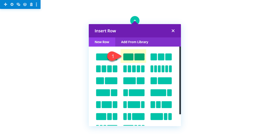
Create a new section with a two-column (1/2 1/2) row.
Before we add our modules, let’s make a few adjustments to the section and row.
Update Section and Row Settings
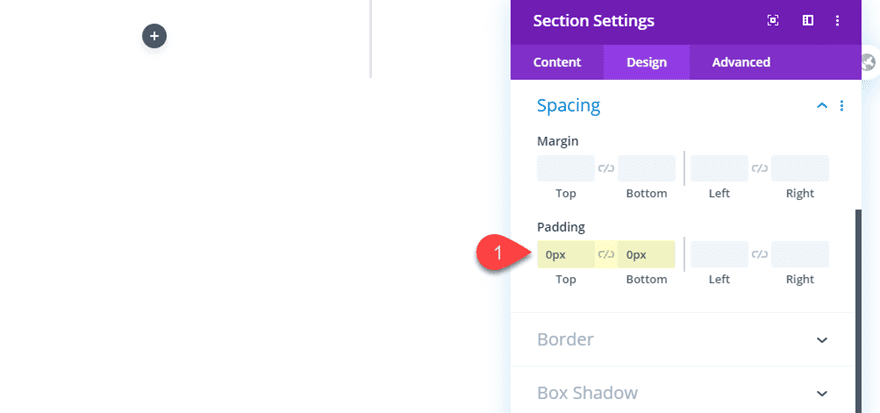
First, open the section settings and take out the default padding as follows:
Padding: 0px top, 0px bottom
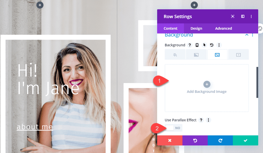
Then open the row settings and give the row a parallax background image.
Background Image: [upload image]
Use Parallax Effect: YES
Parallax Method: CSS
Here the parallax method must be set to CSS for the design to work.
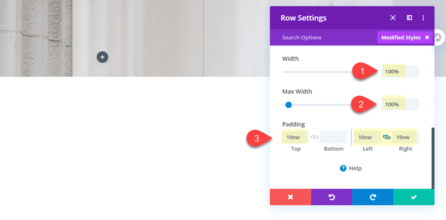
Width: 100%
Max Width: 100%
Padding: 10vw top, 10vw left, 10vw right
Add the Text Module with Matching Parallax Background
Now we are ready to start adding our text modules to the design. The first text module is the key to this design. By applying the exact same background image and css parallax to the text module, we can get creative with the animation for a completely unique effect.
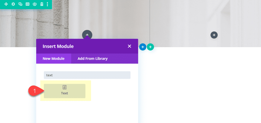
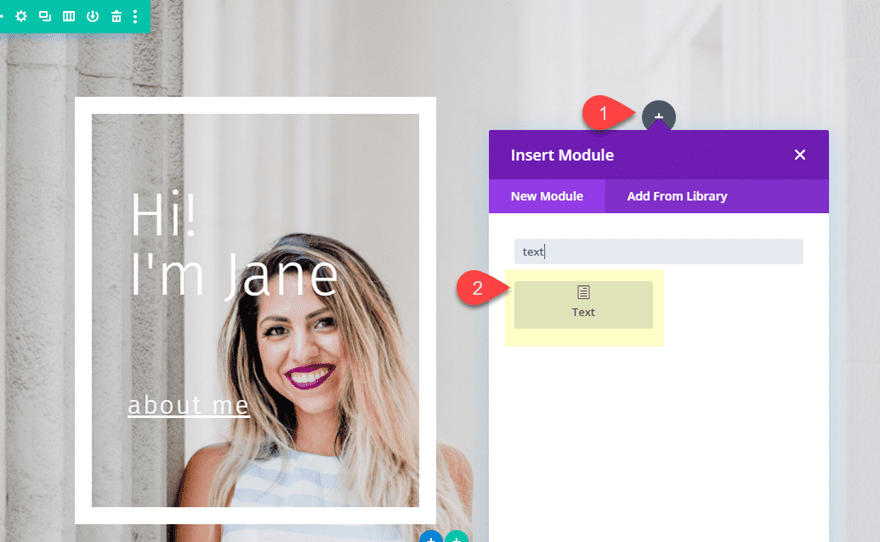
Go ahead and add a new text module to column 1.
Then update the text module settings as follows:
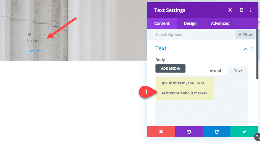
Body Content:
<p>Hi!<br>I'm Jane...</p>

<a href="#">about me</a>
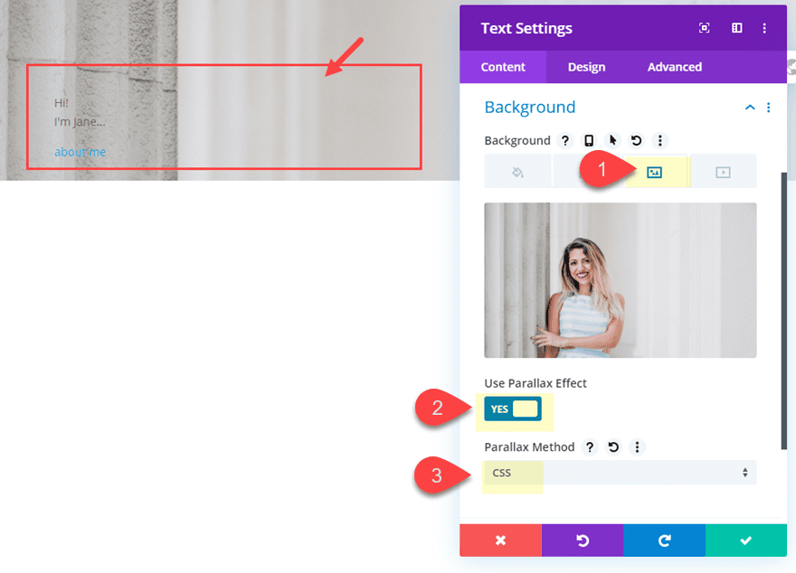
Then give the text module the same css parallax background image you added to the row.
Background Image: [upload image]
Use Parallax Effect: YES
Parallax Method: CSS
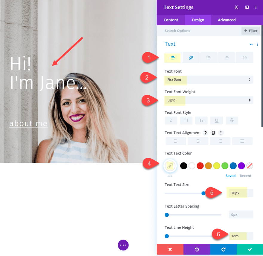
Text Font: Fira Sans
Text Font Weight: Light
Text Text Color: #ffffff
Text Text Size: 70px
Text Line Height: 1em
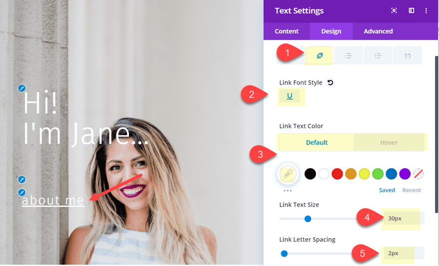
Link Font Style: Underline (U)
Link Text Color: #ffffff (default), #881e67 (hover)
Link Text Size: 30px
Link Letter Spacing: 2px
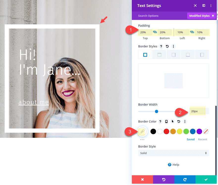
Padding: 20% top, 20% bottom, 10% left, 10% right
Border Width: 20px
Border Color: #ffffff
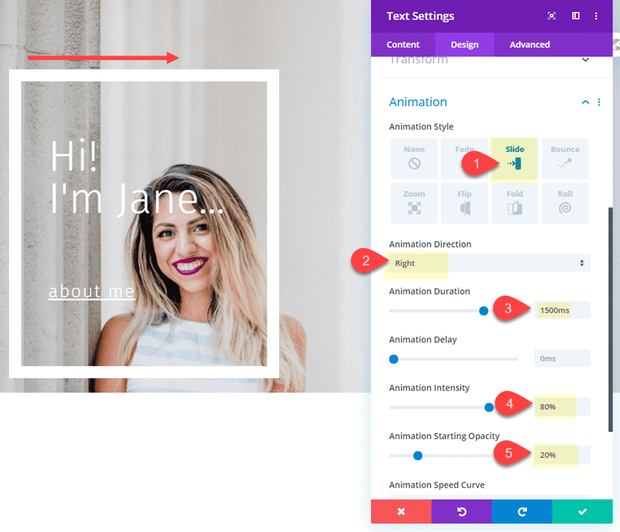
Then adding the following animation to the text module:
Animation Style: Slide
Animation Direction: Right
Animation Duration: 1500ms
Animation Intensity: 80%
Animation Starting Opacity: 20%
Let’s check out the effect so far…
Notice how the background image of the animated text module comes to rest on the matching location of the row background. This is because they both share the same background image with the css parallax effect.
Adding the Second Text Module with a True Parallax Background Image
At this point we are ready to add our next text module. This next one will have a different background image using the true parallax effect. We will also give it some animation as well.
Add a new text module to column 2.
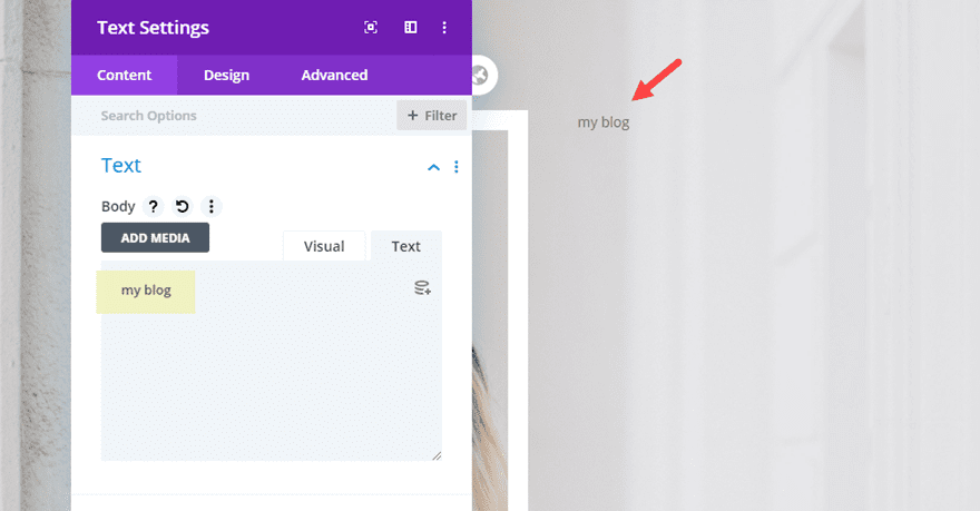
Then update the body content with the word “my blog”.
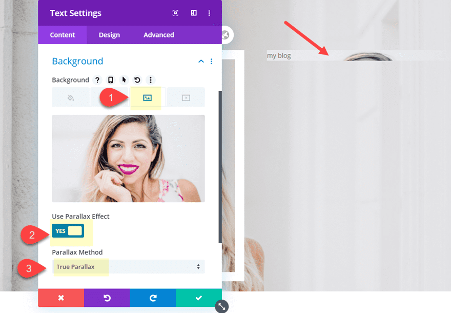
Then add a background image with the true parallax method.
Background Image: [upload image]
Use Parallax Effect: YES
Parallax Method: True Parallax
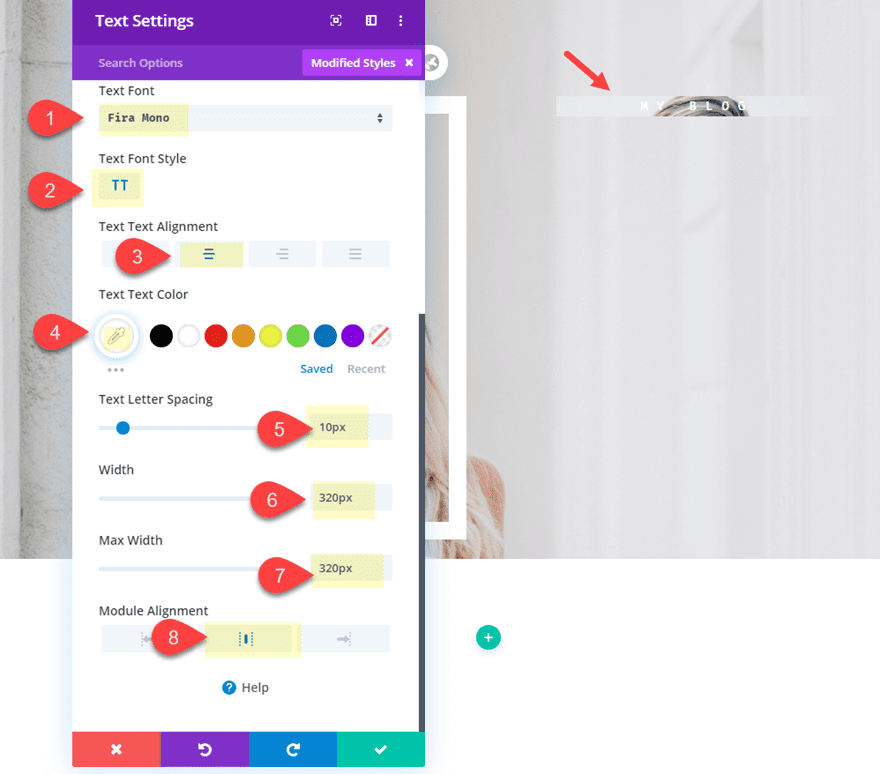
Text Font: Fira Mono
Text Font Style: TT
Text Text Alignment: center
Text Text Color: #ffffff
Text Letter Spacing: 10px
Width: 320px
Max Width: 320px
Module Alignment: Center
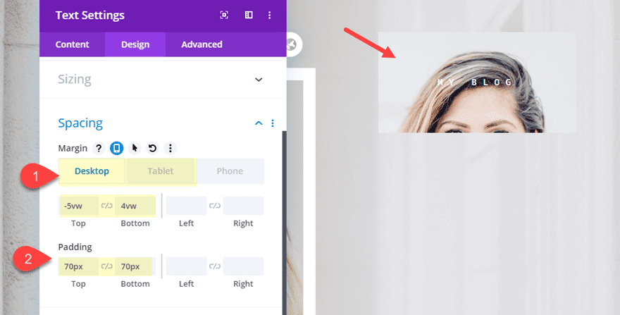
Margin: (desktop): -5vw top, 4vw bottom
Margin (tablet and phone): 3vw top
Padding: 70px top, 70px bottom
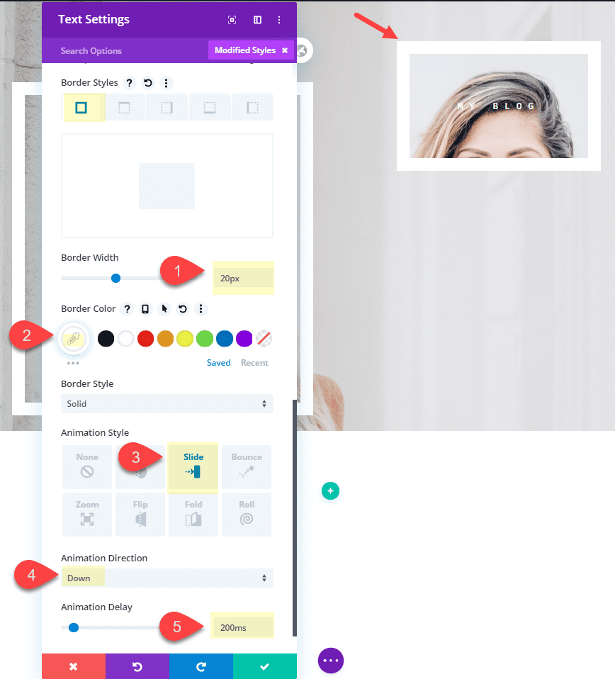
Border Width: 20px
Border Color: #ffffff
Animation Style: Slide
Animation direction: down
Animation Delay: 200ms
Creating the Third Text Module with a new Parallax Background Image
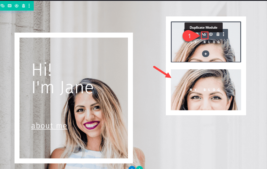
To create the third text module, duplicate the text module you just created in column 2.
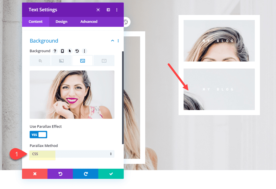
Then we are going to keep the background image the same but we are going to update the parallax effect with the CSS parallax method.
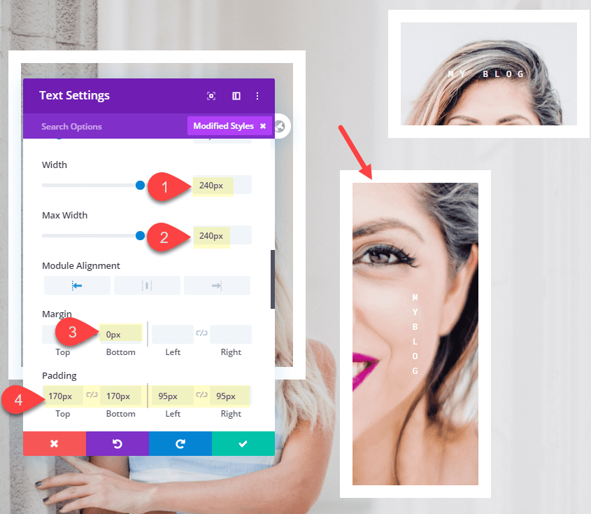
Width: 240px
Max Width: 240px
Module Alignment: left
Margin: 0px bottom
Padding: 170px top, 170px bottom, 95px left, 95px right
The custom width and the right and left padding are used to create the vertical text display which goes well with the longer module design.
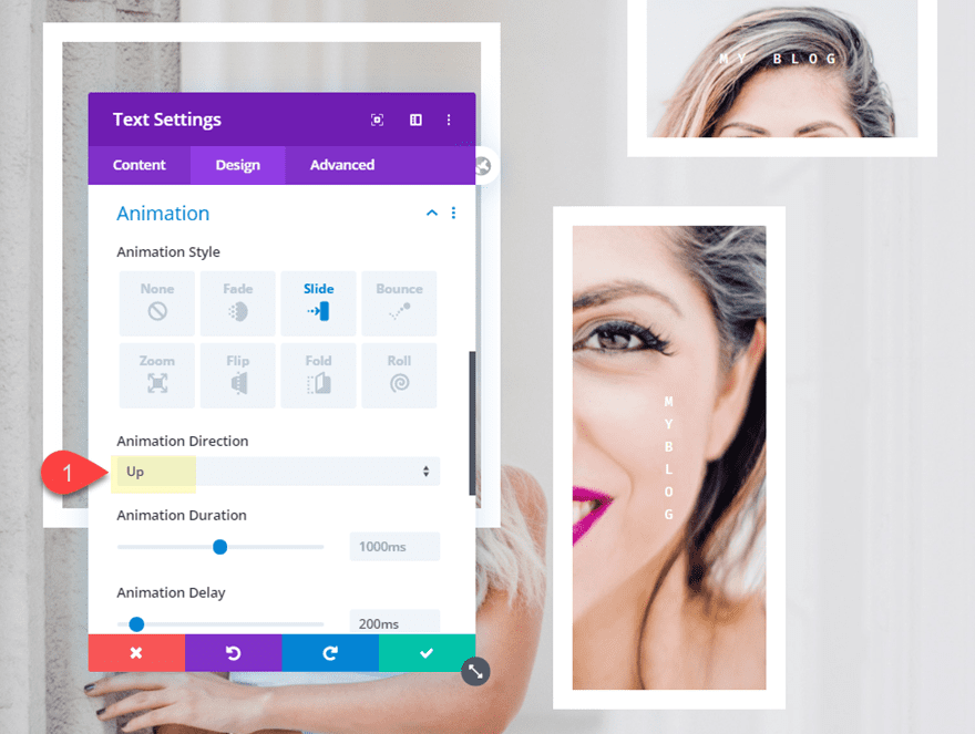
Then update the animation direction to up instead of down.
Animation Direction: UP
Final Result
Now let’s check out the final result.
Part 2: Creating the Animation and Parallax Design (version 2)
This next design is going to add a unique animation by loading the parallax background image for the row after the initial animation of the modules. To do this we will need to use a separate row strictly for the CSS parallax background image that will move behind the content. And since we will have our section background exposed initially, we can add a custom background color for our content before the row animation.
Here’s how to do it.
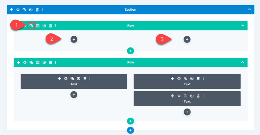
First, deploy the wireframe view mode. Then duplicate the row containing your text modules. Now you will have two identical rows. Next, delete the text modules inside the top row. All we really wanted to do was get a head start on the design of our top row.
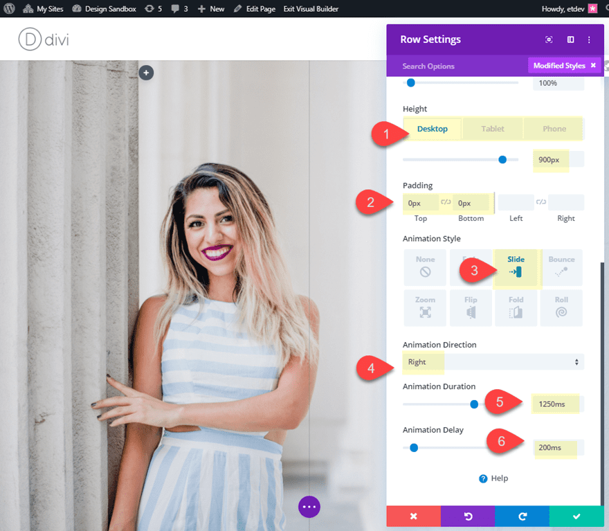
Next, update the settings for the top row as follows:
Height: 900px (desktop), 2000px (tablet and phone)
Padding: 0px top, 0px bottom
Animation Style: Slide
Animation Direction: Right
Animation Duration: 1250ms
Animation Delay: 1800ms
We are giving the row a set height because the empty row will not have any height by default. So you need to make sure the height of the row is enough to cover the content of your second row with the content. We also gave the row an animation with a delay so that it will slide behind the content after the text modules appear.
Overlapping the Two Rows
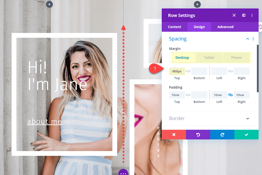
Now all we have to do is bring the bottom row upward using negative margin so that it overlaps the top row with our background animation.
Open the settings for the bottom row and update the margin as follows:
Margin: -900px top (desktop), -2000px (tablet and phone)
Then take out the background image with the css parallax method for the row since we will use the top row background image instead.
Here is the design so far. Notice the delayed background animation in the first row and how the parallax background for the text module in column 1 matches it perfectly.
Adding a Section Background Color
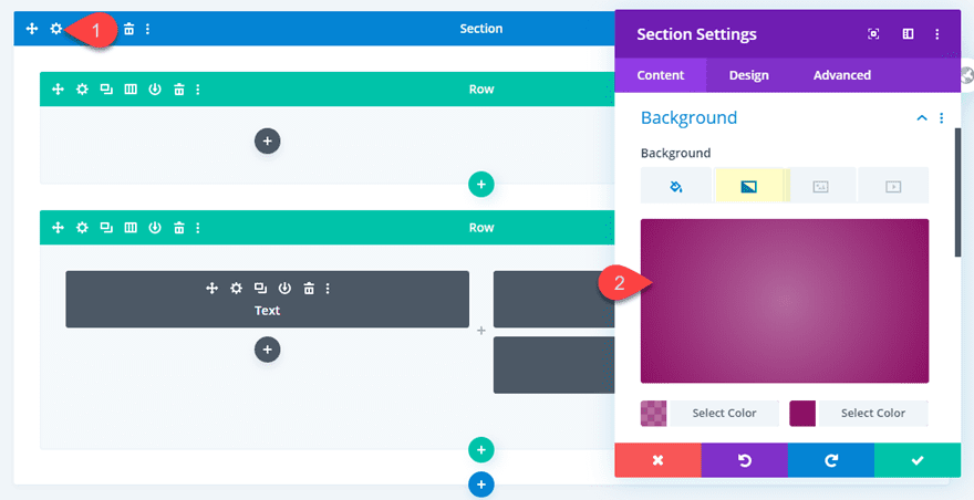
To give the text modules an initial background color before the row animation, you can give a background color to the section.
Open the section settings and add the following:
Background Gradient Left Color: rgba(136,30,103,0.61)
Background Gradient Right color: #881e67
Gradient Type: Radial
Final Result
Now let’s check out the final result.
Optional Blend Mode and Animation combo
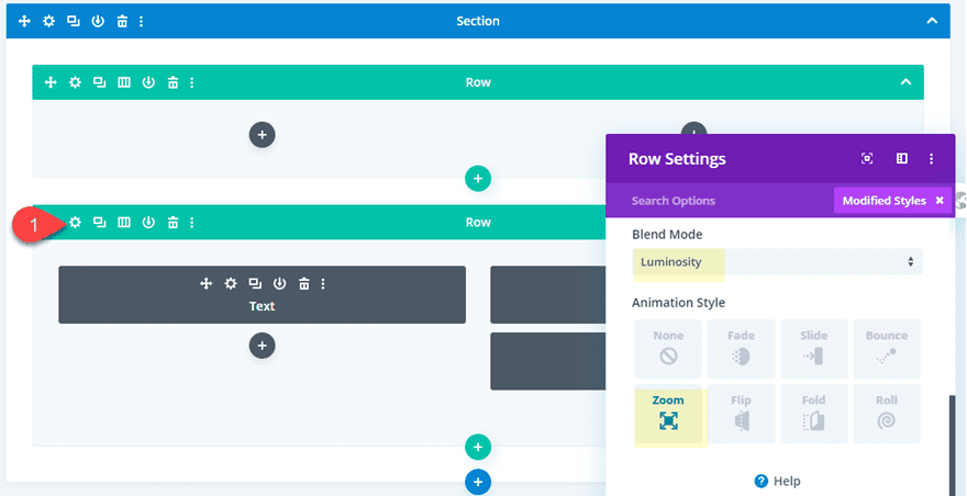
You can also get even more creative by adding a blend mode to the second row and adding a zoom animation that will work in tandem with the module animations.
Blend Mode: Luminosity
Animation Style: Zoom
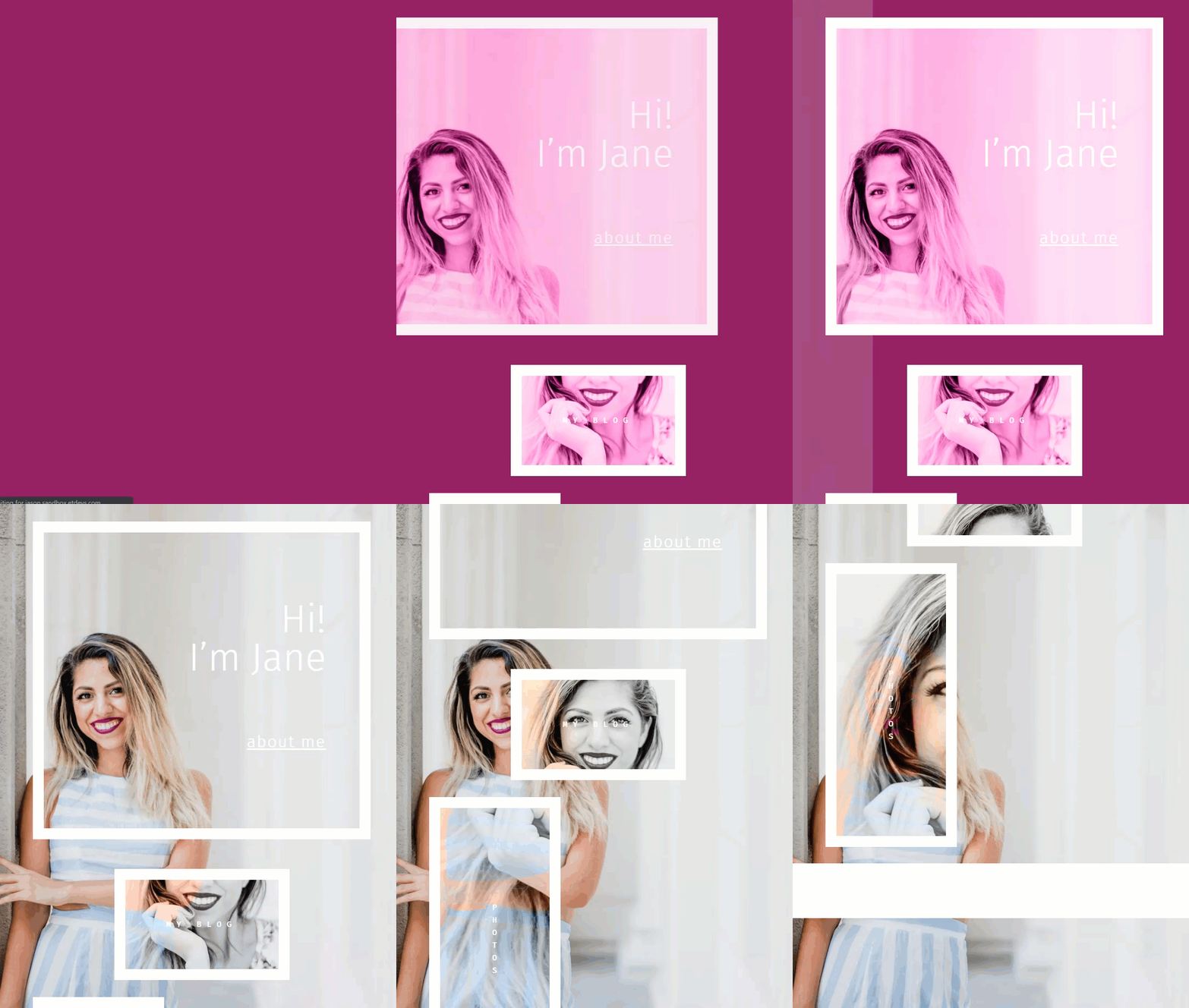
Here is the final result.
And here is how it looks on mobile.
Final Thoughts
I hope you have learned a few things along the way as we explored some unique ways to combine animation and parallax images. The results are definitely unique and I’m sure you can easily tweak this setup to build countless other combinations that will look stunning on your next project.
I look forward to hearing from you in the comments.
Cheers!
https://www.elegantthemes.com/blog/divi-resources/how-to-combine-animations-and-parallax-in-divi-for-unique-designs


