Divi and its built-in transform options have proven to be an extremely useful design tool, allowing you to scale, rotate, skew, or position any element on a page with ease. And, you can even choose to transform elements in the hover state for amazing hover effects. But today, I’m going to introduce a method for deploying these transform properties on click. This method does require a little custom jQuery (don’t worry, it’s nothing too scary). However, the cool thing about this technique is that you can actually use Divi’s built in design settings to style the transform properties and then activate (or toggle) those transform properties with a click of the mouse. This will open up a ton of unique possibilities to reveal hidden content by moving elements on click instead of hover. And it also helps reduce the need to know a lot of CSS as well.
Let’s get started.
Sneak Peek
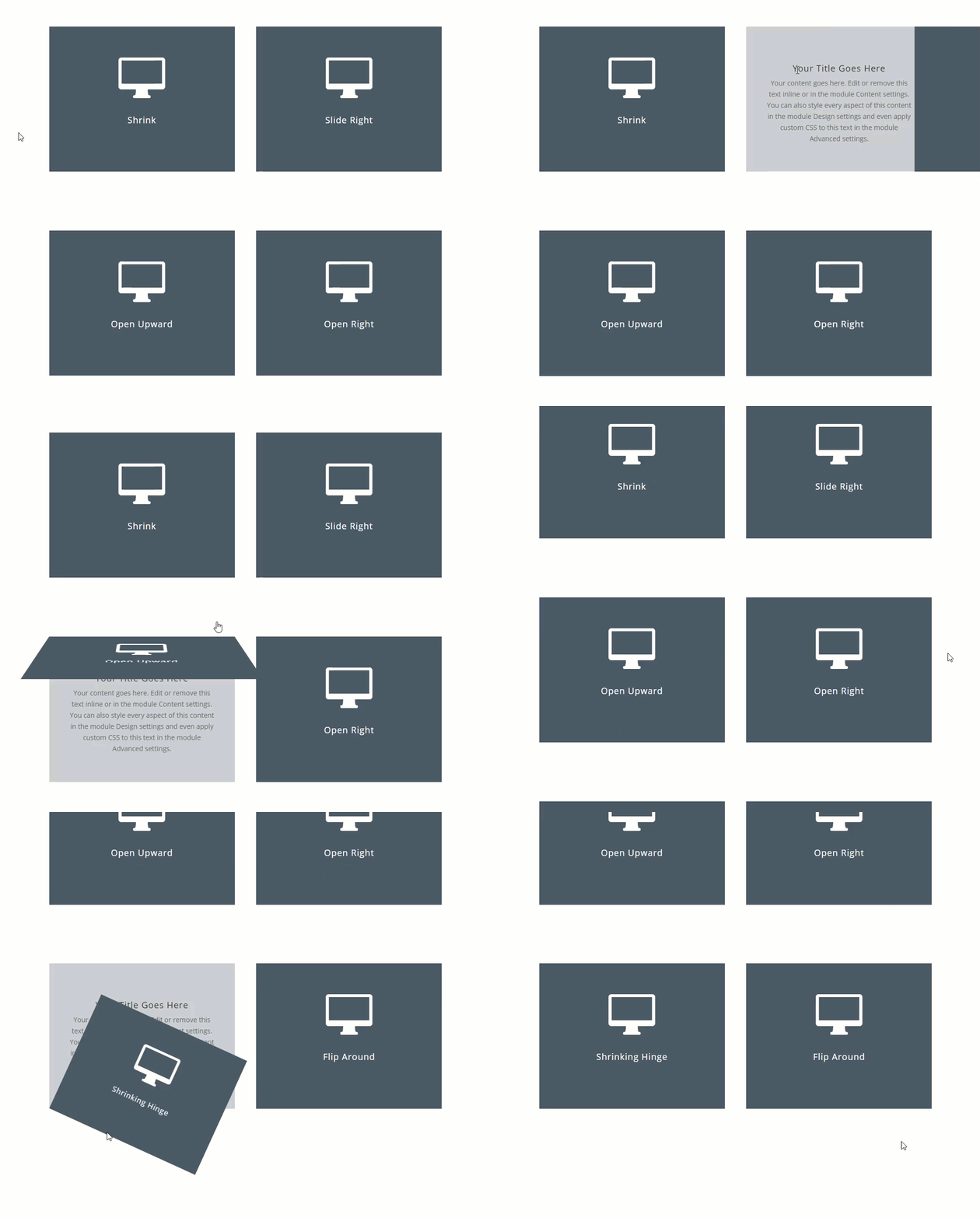
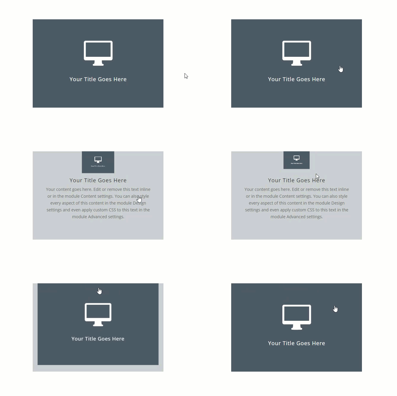
Here is a sneak peek of the “on click” functionality we will build in this tutorial.
Download the Transform on Click Examples Layout for FREE
To lay your hands on the designs from this tutorial, you will first need to download it using the button below. To gain access to the download you will need to subscribe to our newsletter by using the form below. As a new subscriber, you will receive even more Divi goodness and a free Divi Layout pack every Monday! If you’re already on the list, simply enter your email address below and click download. You will not be “resubscribed” or receive extra emails.
To import the layout to your page, simply extract the zip file and drag the json file into the Divi Builder.
NOTE: Once the layout has been loaded to the page, you can find the CSS and jQuery code from the tutorial has been added inside a code module at the bottom of the page.
Now let’s get to the tutorial shall we?
Subscribe To Our Youtube Channel
What You Need to Get Started
For this tutorial, all you really need is Divi. To get started, go to your WordPress dashboard. Create a new page, give your page a title, and deploy the Divi builder on the front end. Select the option to “Build from Scratch”. Now you are ready to go!
The Basic Idea Explained
Before we get too far into the details of this tutorial, I thought I’d explain the basic idea behind toggling transform options on click in Divi.
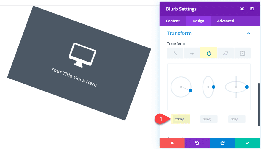
Every time you customize an element (section, row, or module) in Divi, you are adding custom CSS to that element behind the scenes. For example, using Divi’s built-in settings, you can add a transform rotate property to a blurb module so that it rotates the module along the Z axis 20 degrees.
But behind the scenes, you are creating custom CSS that is added to that text module that will look something like this:
.et_pb_text_0 {
transform: rotateZ(20deg);
}
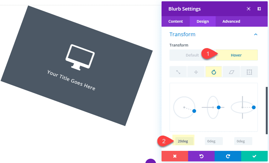
Simple enough. And let’s say you wanted to add that same transform option on hover. All you would need to do is apply the transform property for the hover state in the Divi Builder settings.
And the code will look something like this behind the scenes:
.et_pb_text_0:hover {
transform: rotateZ(20deg);
}
However, if you wanted to deploy the transform property on click, things will need to work a little differently. You will need to introduce a little jQuery to trigger a click event on the element (or text module).
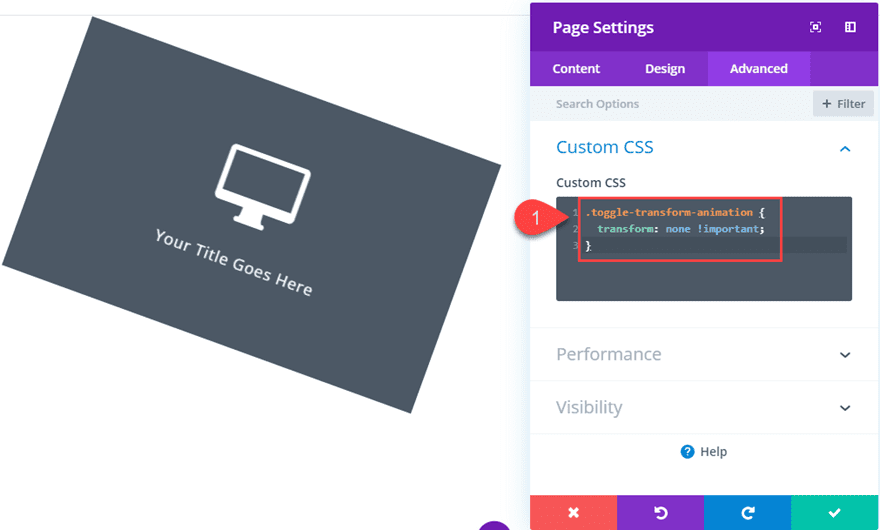
With our current example, our main goal is essentially to activate and deactivate the transform property “transform: rotateZ(20deg)” on click. A simple way to go about this is to create a custom CSS class with the property “transform: none !important” to our page settings (or external style sheet). It would look something like this.
.toggle-transform-animation {
transform: none !important;
}
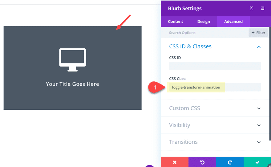
With that CSS in place. We can add the CSS Class “toggle-transform-animation” to the blurb module element that has our transform property.
This will disable (override) the transform property and keep it from activating initially even though it has transform property styling added to it already.
Now all we need to do is toggle (add and remove) that Custom CSS Class when clicking the element. That way whenever we click on the element, the class will be removed and the transform properties (the ones you added with Divi) will deploy.
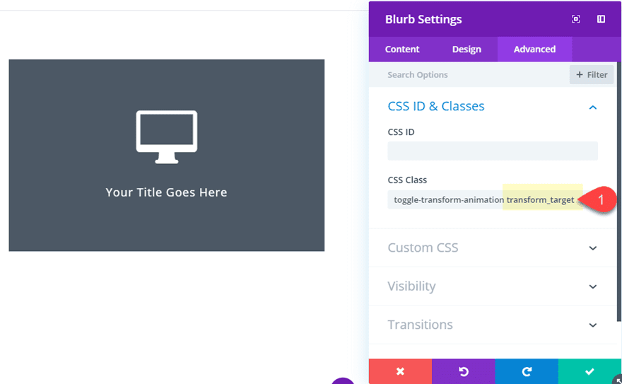
Here is a simple example of how to do this. First, add another CSS Class to the blurb module named “transform_target”.
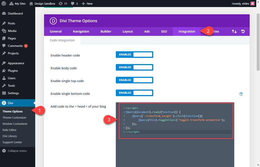
Then navigate to Divi > Theme Options > Integration and add the following jQuery script to the head of your blog:
<script>
jQuery(document).ready(function() {
	jQuery('.transform_target').click(function(){
		jQuery(this).toggleClass('toggle-transform-animation');
	});
});
</script>
That’s it! Now whenever you click on the blurb module, the transform property you added to the blurb in Divi will toggle on and off.
Now let’s build a few more real life examples from scratch so you can see how this might come in handy for your own projects.
How to Toggle Transform Properties on Click to Reveal Content in Divi
For this example, we are going to stick with a simple blurb example used above. Then we are going to add an additional blurb behind it so that whenever the top blurb is clicked, it will move out of the way to reveal the additional content of the blurb sitting behind it.
Creating the front and Back Blurb Modules
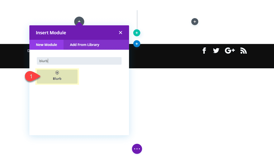
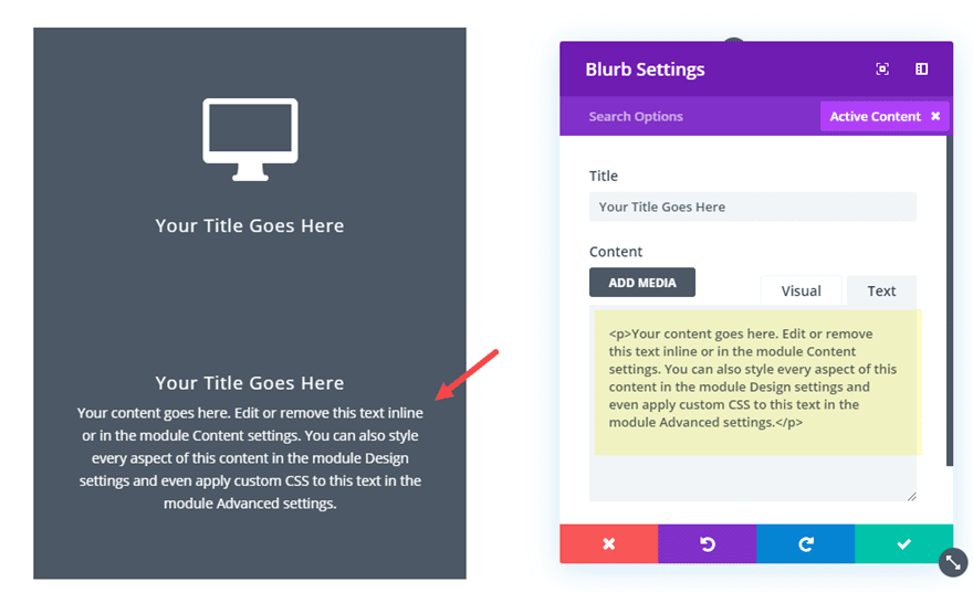
Then add a blurb module to column 1.
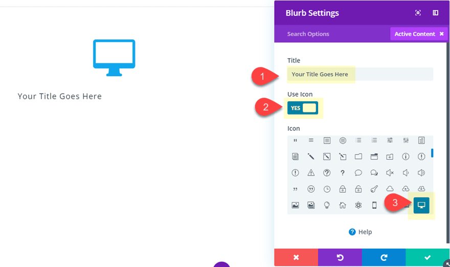
Update the content of the blurb to include only a Title (take out the default body content) and then add a Blurb icon.
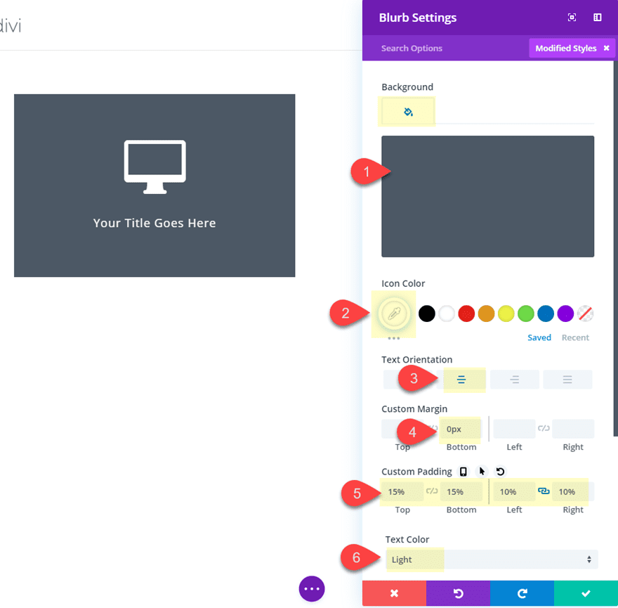
Then update the design settings as follows:
Background Color: #4c5866
Icon Color: #ffffff
Text Orientation: center
Text Color: light
Custom Margin: 0px bottom
Custom Padding: 15% top, 15% bottom, 10% left, 10% right
We will come back to this module later, but for now we need to create our second blurb module that will serve as our “back” module with addition content.
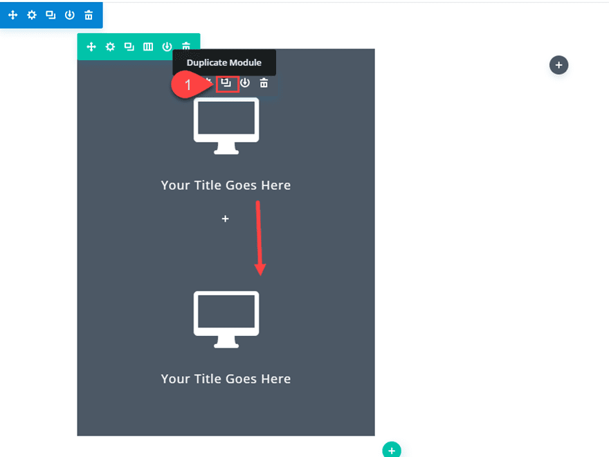
To do this, duplicate the blurb module you just created.
Then take out the blurb Icon (and default image) and add some body content back to the module.
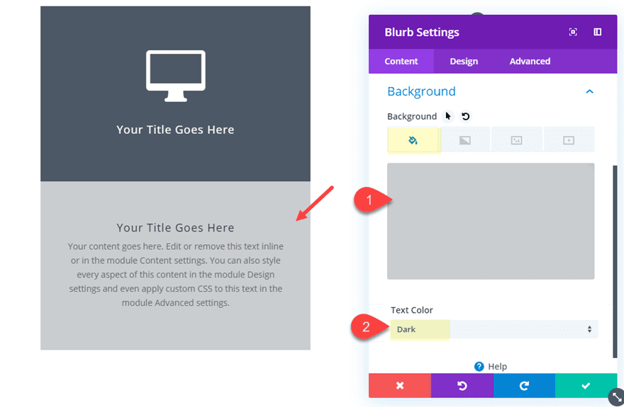
Then update the design settings as follows:
Background Color: rgba(76,88,102,0.3)
Text Color: Dark
Custom Padding: 20% top
Positioning the Front Blurb Module
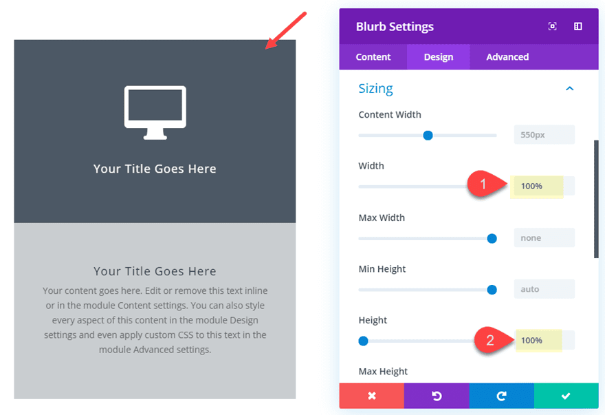
Now that both of our blurbs are styled, we need to go back to our front (top) blurb module and position it above the back (bottom) blurb module. To do this we are going to give it an absolute position with a 100% height and a 100% width.
First, open the top/front blurb module settings and update the following:
height: 100%;
width: 100%;
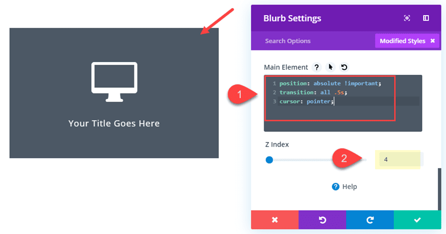
Then add the following custom CSS to the Main Element:
position: absolute !important;
transition: all .5s;
Then update the z index as follows:
Z index: 4
The absolute position combined with the 100% height and width and the z index will make sure the blurb module stays above the blurb module sitting behind it. The transition property is actually for the transition duration of the transform options we will be deploying on click in our next step. And the “cursor:pointer” is to change the cursor so that the element looks clickable to the user.
Adding the Transform Options and Custom Classes to the Front Blurb
Now it is time to add our transform properties to the front blurb. Then we will add the custom CSS Classes necessary for our jQuery to toggle those properties on click.
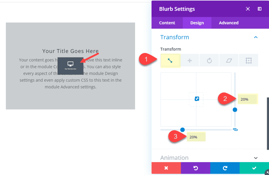
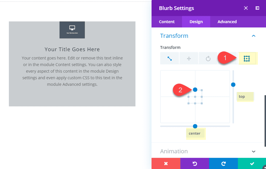
Under the design settings of the front blurb, add the following transform properties:
Transform Scale x and y: 20%
Transform Origin: top center
Remember, the transform design you see at this point will be what is triggered on click. We are simply taking advantage of the Divi builder to get the design we want. In this case, the front blurb will shrink and become centered at the top of the blurb like a clickable icon.
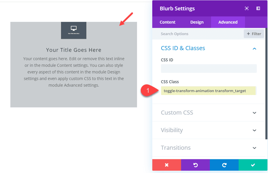
Once you are done, add the two CSS Classes needed to target the front blurb with jQuery as follows:
CSS Class: toggle-transform-animation transform_target
(make sure to separate each class name with a space)
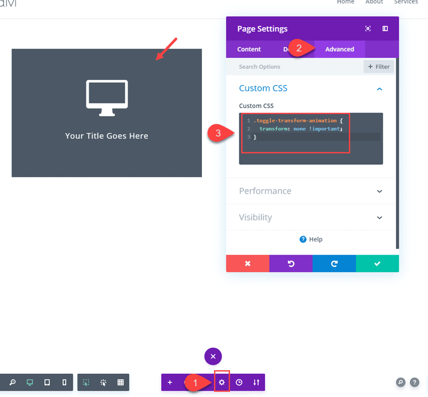
Next, add the following custom CSS snippet that will be used to toggle the transform properties on and off with jQuery.
.toggle-transform-animation {
  transform: none !important;
}
You will notice the front blurb transform properties that added earlier have become disabled because we this class has been applied to it.
Now navigate to Divi > Theme Options > Integration and add the following jQuery script to the head of the blog:
<script>
jQuery(document).ready(function() {
	jQuery('.transform_target').click(function(){
		jQuery(this).toggleClass('toggle-transform-animation');
	});
});
</script>
Let’s check out the final result.
More Examples
Now that we have a working example of how to reveal content on click, we can experiment with countless other transform properties. Here are a few…
TIP: When testing out new transform properties, you will want to temporarily remove the class that initially disables the transform effect from showing. To do this, you can simply take away a letter from the class “toggle-transform-animation” or take it out altogether. Then you can set the transform options you want with the Divi builder to see how it will look before adding the class back.
Slide Open on Click
For this design, simply duplicate the two blurb modules in the left column and add them to the right column. Then update the transform options as follows:
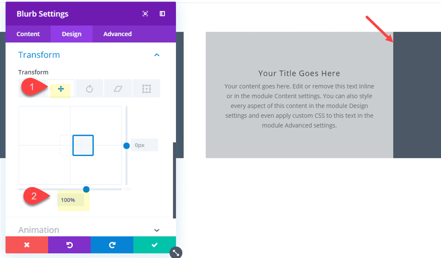
Transform Translate X axis: 100%
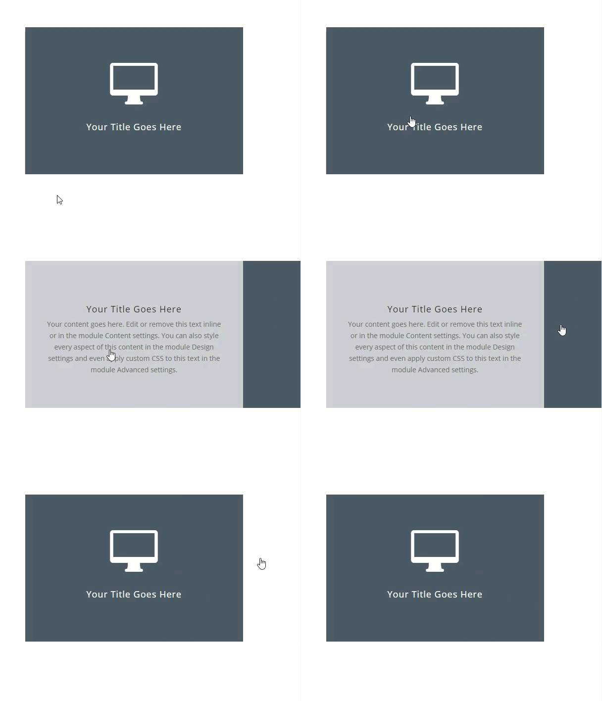
This will slide the front blurb over to the right in order to reveal the back blurb content on click.
Here is the result.
TIP: Since this effect causes the module to extend beyond the row and section, you will need to change the Horizontal Overflow setting of your section to hidden.
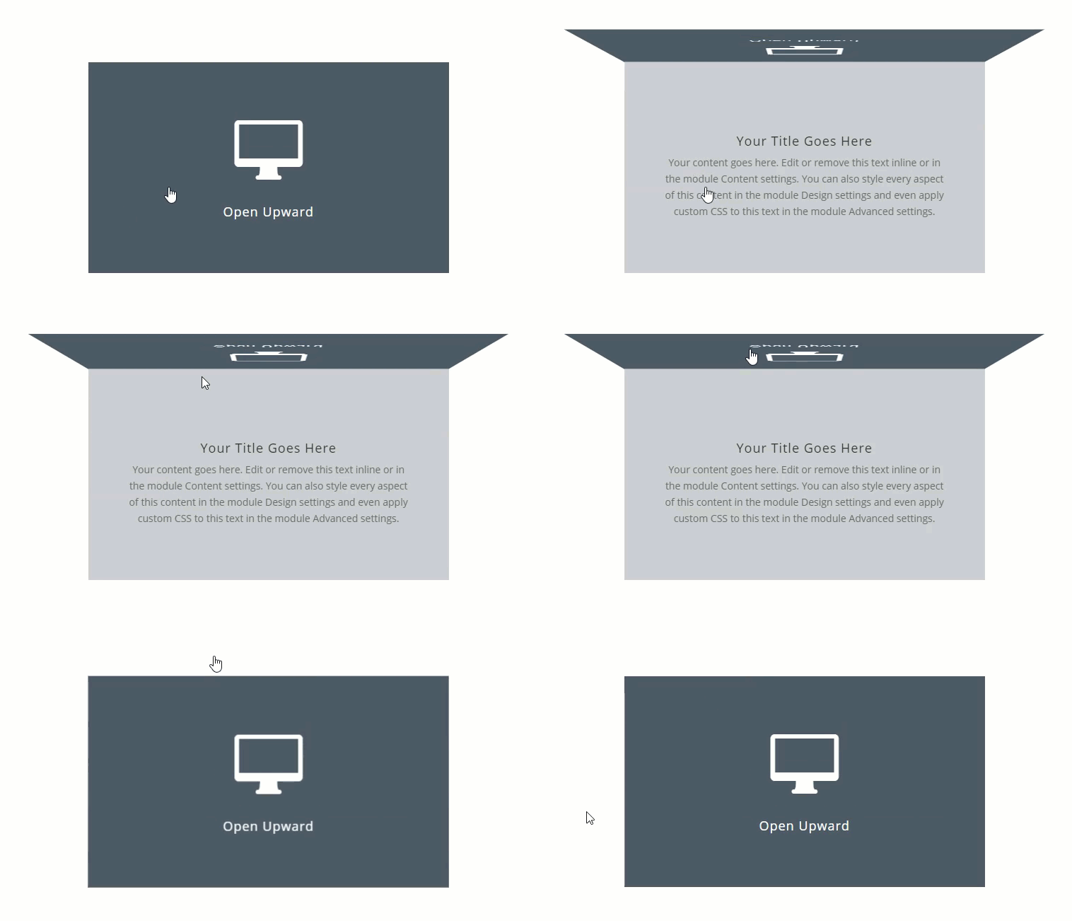
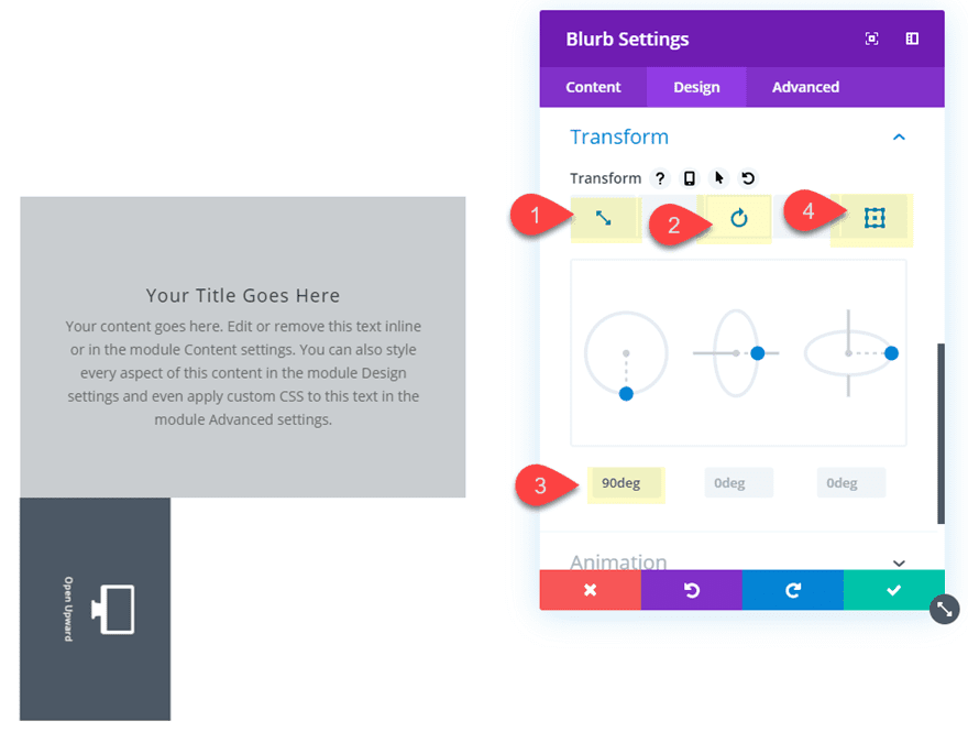
Open Upward on Click
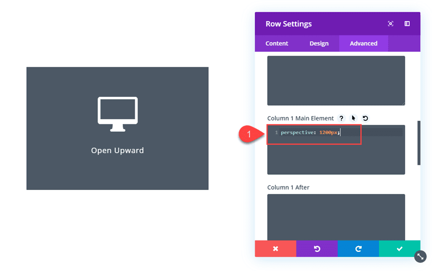
For this design, go ahead and create a new two-column row and then copy the two blurbs and paste them into column 1. Then open the row settings and add the following snippet of custom CSS to the Column 1 Main Element:
Column 1 Main Element:
perspective: 1200px;
This is necessary to get the 3D effect when rotating the blurb module in our design.
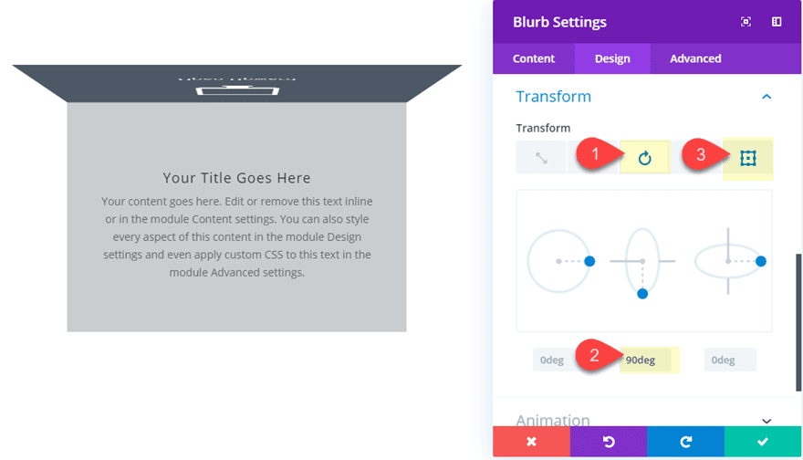
Then open the Front (top) blurb settings and update the transform options as follows:
Transform Rotate Y: 90deg
Transform Origin: top center
Here is the result.
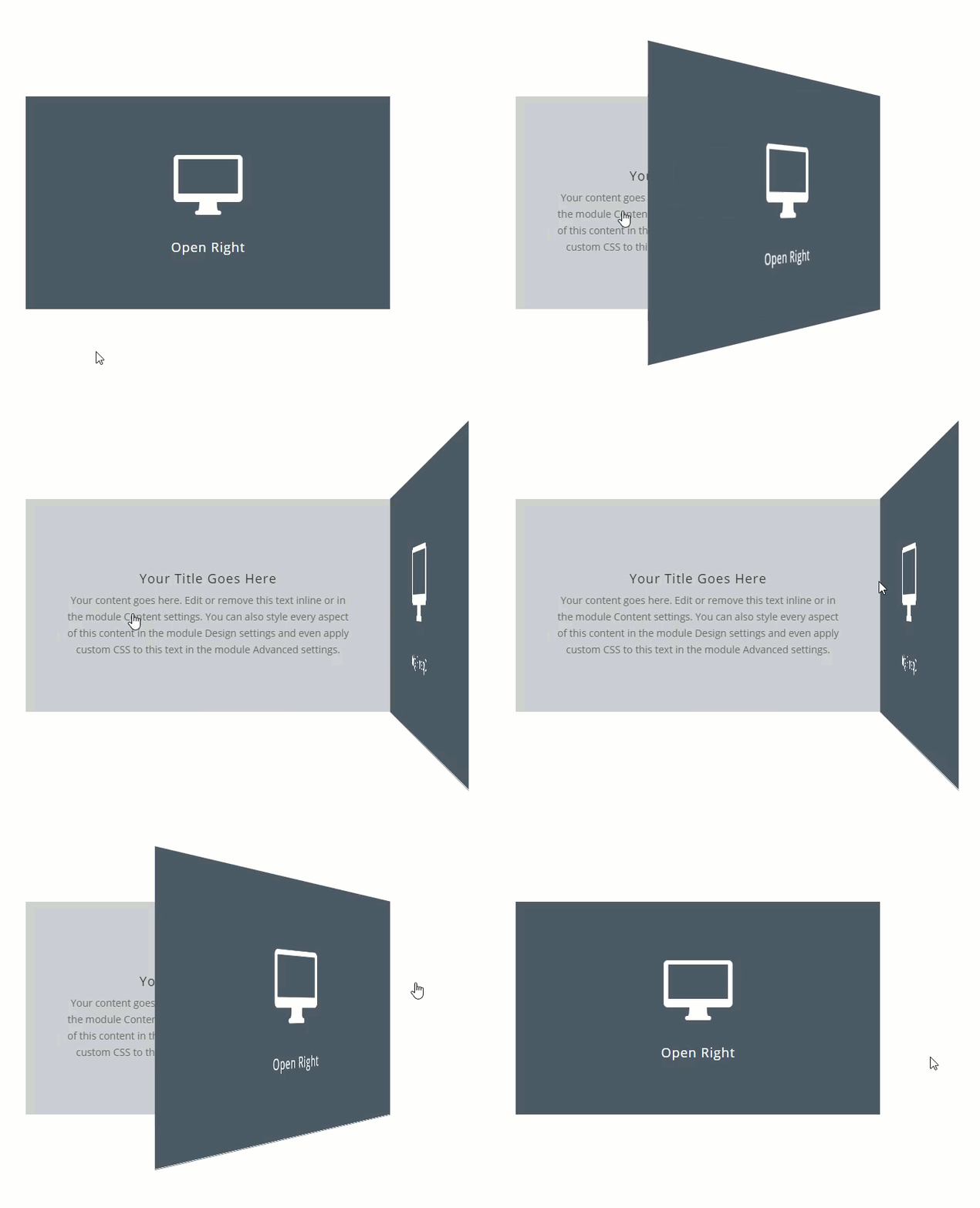
Open to the Right on Click
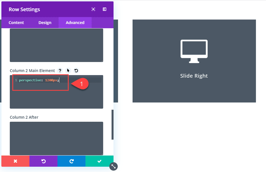
This next design is similar to the previous transform effect. Go ahead and duplicate the two blurbs in column 1 and paste them in column 2. We want the same 3D effect for this one so open the row settings and add the following custom CSS snippet to the column 1 main element:
Column 2 Main Element:
perspective: 1200px;
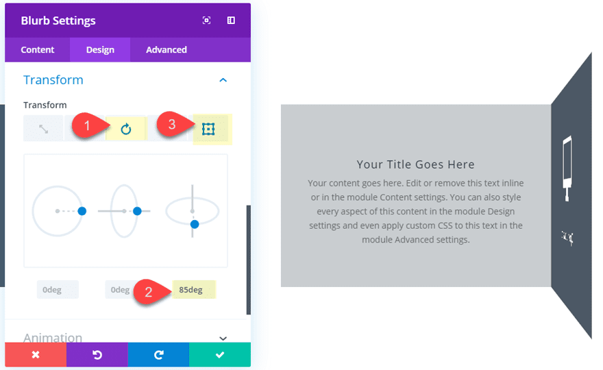
Then update the transform options:
Transform Rotate X: 85deg
Transform Origin: top left
Here is the result.
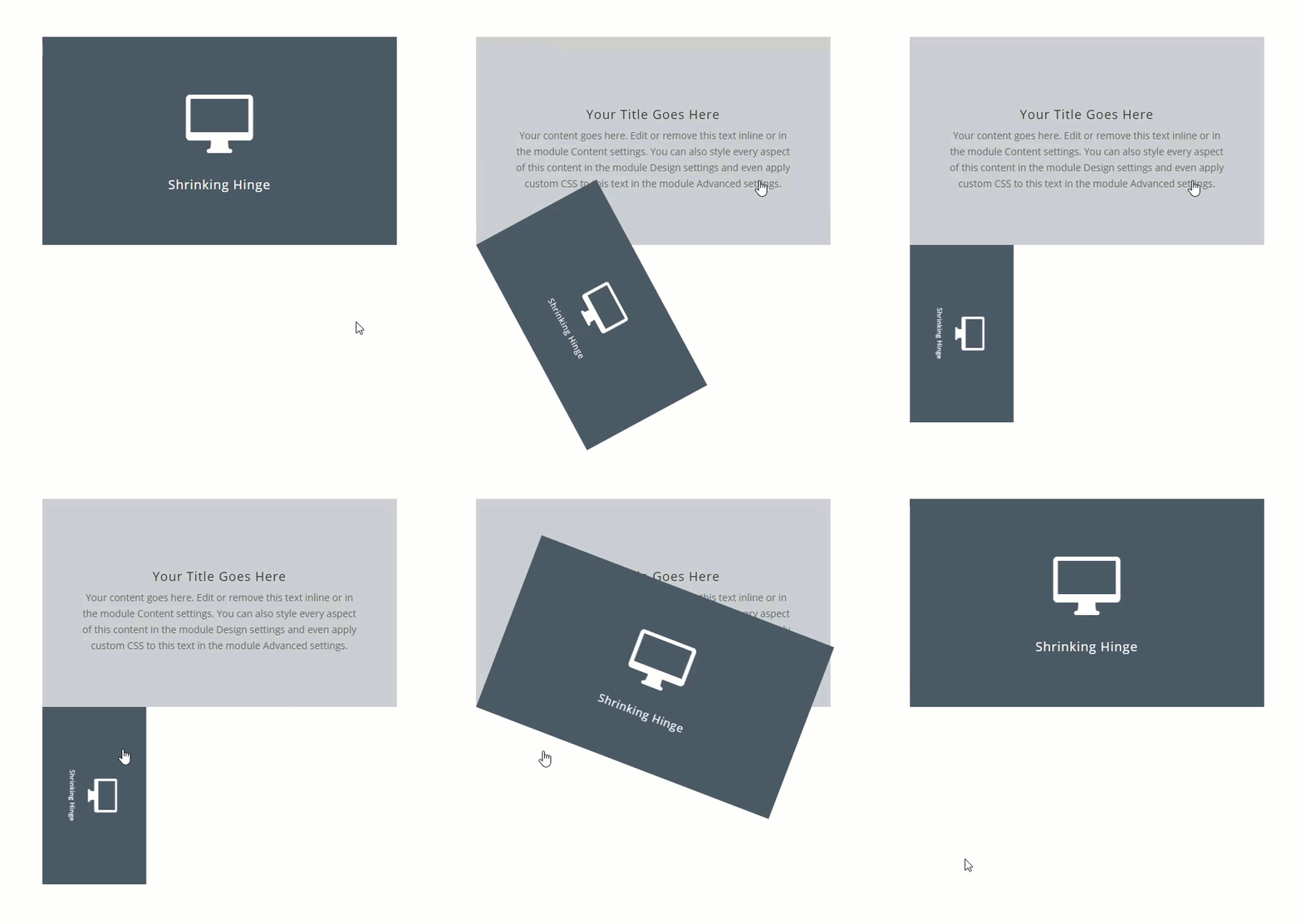
Shrinking Hinge Effect on Click
For this design, copy and paste the blurbs into a new column and update the following transform options:
Transform Scale: 50%
Transform Rotate Z: 90deg
Transform Origin: bottom left
Here is the result.
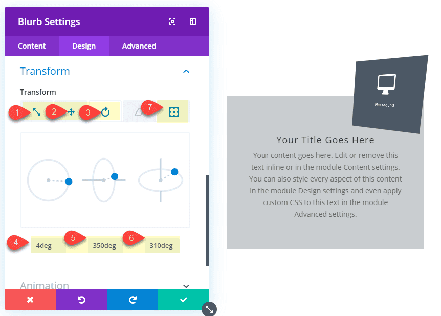
Flip Around on Click
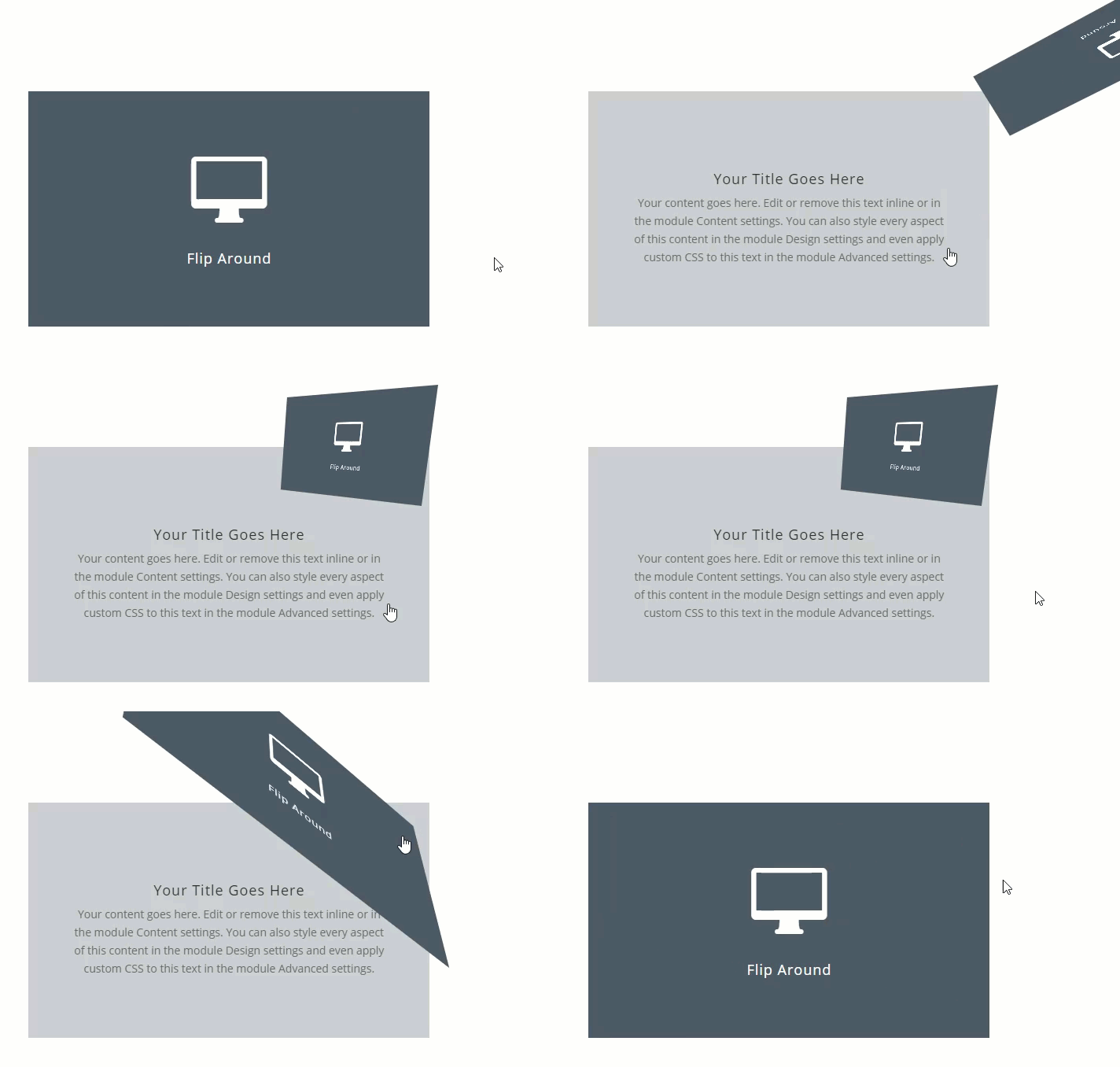
This final design example combines multiple transform options to flip the front blurb around, shrink it, and display it at the top right of the content blurb.
To create this effect, copy and paste the blurbs into a new column and update the following:
Transform Scale: 50%
Transform Translate Y: -100%
Transform Rotate Z: 4deg
Transform Rotate Y: 350deg
Transform Rotate X: 310deg
Transform Origin: right center
Make sure to give the column the custom CSS snippet “perspective: 1200px” for this design as well.
Here is the result.
Final Results
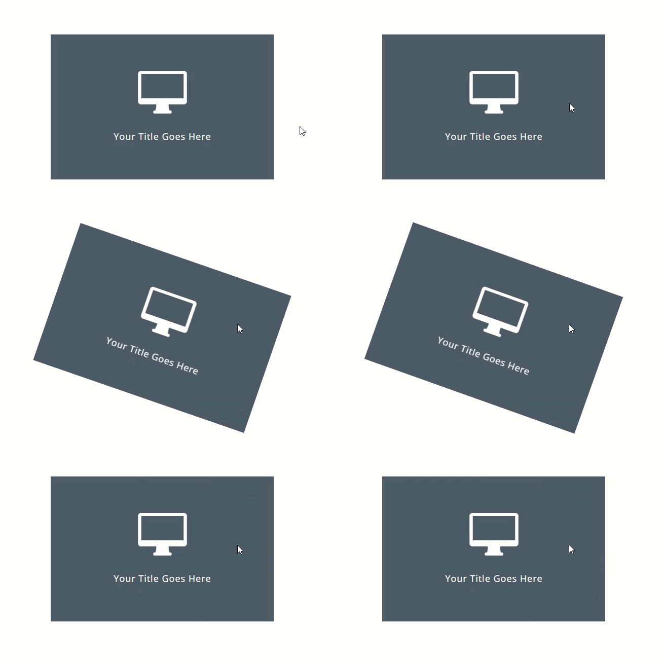
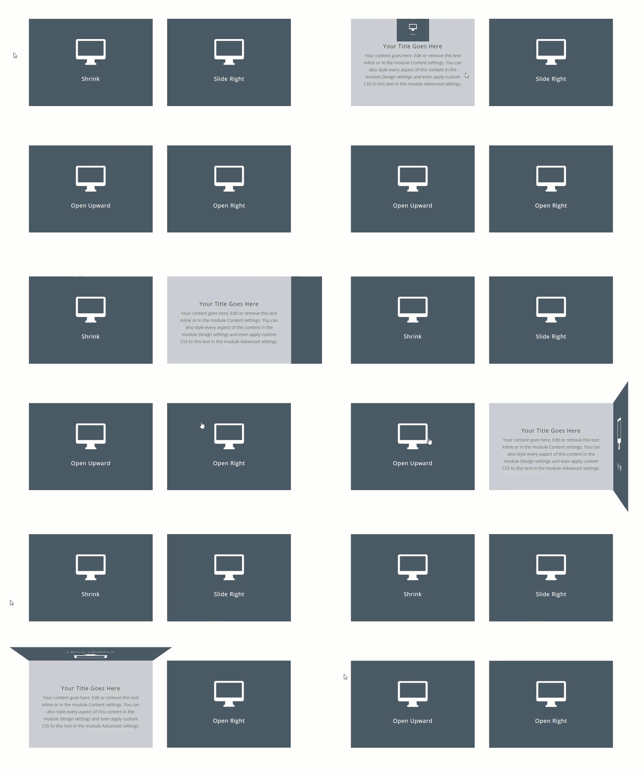
Here are the final results of all six transform effects on click.
Optional jQuery for Clicking Multiple Elements on a Page
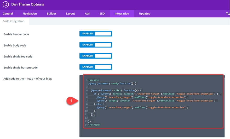
Right now the click functionality will toggle the transform effect when clicking the Blurb with the custom CSS Class “transform_target”. However, if you feel that you want a more advanced functionality, this jQuery may help. Once this jQuery is added, the transform properties will toggle open and closed when clicking either the front blurb or the back blurb. It will also close any open elements when clicking another element our outside the elements.
To get this functionality, simply replace the custom jQuery under your theme options with the following:
<script>
jQuery(document).ready(function() {

  jQuery(document).click( function(e) {
    if ( jQuery(e.target).closest('.transform_target').hasClass('toggle-transform-animation') ) {
      jQuery(".transform_target").addClass('toggle-transform-animation');
      jQuery(e.target).closest('.transform_target').removeClass('toggle-transform-animation');
    } else {
      jQuery(".transform_target").addClass('toggle-transform-animation');
    }
  });

});
</script>
Here is the final result of this functionality.
Cross Browser Support
The design and click functionality represented in this tutorial is supported by all major browsers (including IE) so there shouldn’t be a need to add any fallbacks to the code. However, there may be some inconsistencies when combining hover effects with these transform animations.
Final Thoughts
For most of us Divi users, adding transform effects on click may seem a bit too far out of our comfort zone. But once you understand how Divi stores the CSS generated when building on the visual builder, you can easily enable and disable that CSS by adding and removing a custom CSS class with jQuery. Like an on/off switch you can toggle any transform options you add with Divi’s built in options with a simple click. Of course, there are probably more advanced jQuery solutions and setups out there, but I hope this tutorial at least get’s your foot in the door for exploring some really cool click interactions.
I look forward to hearing from you in the comments below.
Cheers!
https://www.elegantthemes.com/blog/divi-resources/how-to-toggle-divi-transform-properties-on-click-with-jquery


