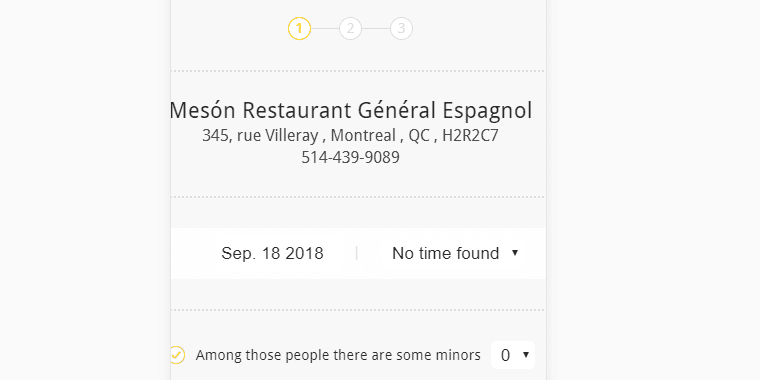
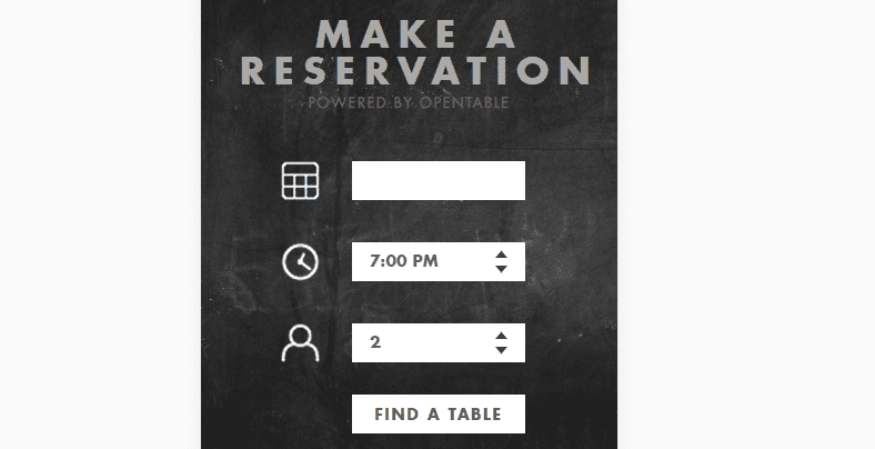
Contact forms are a key component of many websites. Although they’re usually simple in functionality, you still need to ensure they’re easy to use if you want to collect leads and stay in touch with your users. This isn’t usually a problem with desktop traffic, but using forms can get tricky if you’re on a mobile device.
In this article, we’re going to talk a bit about the importance of designing mobile friendly forms. Then we’ll walk you through five tips to ensure your forms work beautifully on mobile devices.
Let’s get to work!
Why It’s Important for Your Forms to Be Mobile Friendly
Forms come in all shapes and sizes. Most commonly, you’re going to be dealing with contact forms:
Signup forms (or opt-ins) are also remarkably popular since they enable you to collect emails and targeting them during campaigns:
However, forms can be used for all kinds of other purposes. For example, you might want to collect information using an online poll or quiz, in which case you’ll need forms for users to enter the responses.
To put it another way, forms are very versatile and almost every site uses forms in one way or another. Therefore, ensuring your forms are easy to use is critical (unless you want to provide a frustrating experience for your visitors).
Using forms from a desktop computer or a laptop is usually very simple. You have a mouse and a full keyboard, so selecting the field you want to use and entering data shouldn’t be a problem. However, browsing the web from your smartphone or another small-form-factor device provides complications.
When you’re working with your fingers on small screen, interacting with forms can sometimes be a pain due to poor design decisions. This is something you need to avoid in your own designs. After all, if mobile users can’t interact with your forms, you may lose out on conversions, leads, or just annoy visitors altogether.
It’s also essential to understand that mobile traffic is now just as – if not more – important than desktop sources. In fact, mobile traffic has already surpassed the latter within the past few years. This means designing a mobile friendly website should be your primary goal when launching a new project.
5 Tips to Design Mobile Friendly Forms
Fortunately, designing mobile friendly forms isn’t as hard as you might imagine. In most cases, all it takes is keeping some fundamentals in mind and testing your forms thoroughly before they go live. Let’s talk about how to do it!
1. Remove Any Unnecessary Sections
The more fields your forms include, the more difficult they’ll be to use on mobile. That’s because, as well-designed as they might be, using forms on mobile is simply more complicated. By reducing the number of fields or sections your forms include, you can maximize your chances of visitors filling them out.
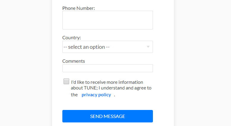
Here’s a quick example of a contact form with a few additional fields it could do without:
In most cases, all you need for an excellent contact form is a name, an email, and the body of the message you want to receive. Everything else depends on what kind of website you’re running and if you’re trying to collect leads.
Ultimately, the fewer fields your form includes, the easier it’ll be for mobile visitors to use them. After all, selecting a field using a touch screen can be difficult, even if it’s well-designed, so you want to minimize the number of ‘jumps’ users have to make.
Your goal at this stage is to take a look at your site’s existing forms. Go over each of their sections and consider if you really need any additional fields beyond those we mentioned earlier. If there’s a superfluous field, simply cut it.
2. Use Drop-Down Lists When Possible
Most of us are comfortable typing on mobile devices and using touchscreens. However, texting a friend and filling out a contact form are two very different experiences. With the latter, chances are you may get frustrated if you have to type a lot of information.
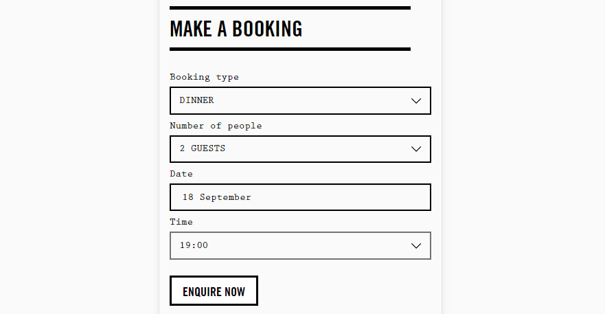
One of the ways you can make your mobile visitor’s life easier is to simplify the choices they need to make regarding your site’s elements. To give you an idea of what we’re talking about, let’s build upon our earlier restaurant reservation example:
To make a reservation, you’d probably need to leave a name, email, phone, and indicate a time, as well as how many people will be attending. There are two ways you could create a form field to validate a reservation time:
- Set up a field that only accepts numerical inputs.
- Design a drop-down list including all available times for a reservation.
As you might imagine, the latter is more user-friendly for mobile users. With this approach, they won’t need to type in numbers and they can just pick what works best for them out of the options you include.
The idea for you to take a look at your forms and see if they include any fields you could replace with drop-down menus. This won’t always be the case since you can’t use drop-down menus to collect names or emails, but there are other options where they might work.
Regardless of what their use case is, you want to make sure your drop-down menus include options that are easy to select from mobile devices. In other words, make the menu large enough that someone won’t have to peck around to pick the right option.
3. Make Sure Your Submission Buttons Are Easy to Touch
This tip is pretty straightforward, but still worth mentioning. Every form you design will need to include a way for users to confirm they want to submit the data they’ve entered. In most cases, this means creating a submission button:
When you’re using a regular computer, clicking on a submission button is about the most natural thing in the world. However, we’ve run across a few forms on mobile where pressing a button is much harder than it should be.
If your visitors can’t submit the information they entered into your forms, all your efforts will be for nothing. Plus, nothing looks as unprofessional as a Submit button that doesn’t work as intended.
To design better submission buttons for mobile, here are three quick tips you need to keep in mind:
- Make sure they’re big enough to press with ease when using a mobile device.
- Don’t place your buttons too close to other elements, so users won’t hit the wrong one.
- Highlight your buttons in some way, such as using contrasting colors or creative typography.
Aside from all this, you’ll also want to test your buttons thoroughly before your website goes live. We’ll go more in depth about how to do so in a minute. For now, let’s talk about performance.
4. Ensure Your Forms Load Quickly
We talk a lot about website performance in several of our articles, and it’s not because we have a need for speed. The fact is, most people don’t like slow websites, which makes absolute sense.
With internet speeds getting quicker, waiting overly long for a website to load can be a chore. Plus, mobile internet speeds tend to vary a lot more than regular home connections. This means your website will need to be highly-optimized for mobile devices if you want to keep those users happy, since not all of them will have suitable (i.e. fast) internet access.
This particular tip can apply to your whole website in general, but it’s also important for the mobile pages displaying your forms. If those parts of your site take too long to load, you’ll lose out on leads and opportunities to establish contact with your visitors. As a rule of thumb, a website shouldn’t take over two seconds to load. Once you go past that line, bounce rates tend to rise dramatically, which is terrible news for you.
Given the nature of browsing on mobile, getting this time down as far as possible is a boon. With this in mind, there are a lot of ways you can boost your site’s overall performance. For example, you might upgrade to a better hosting plan, use a responsive theme optimized for speed, and compress your images. Of course, these will help all users, but will be of particular benefit to those using smaller devices.
5. Test Your Forms Before You Publish Them
Considering forms are such a key element to most websites, it stands to reason you should test yours thoroughly before publishing them. With WordPress, this process is simple enough. You can go ahead and design specific pages to display your forms, and not publish them until you’ve fully tested them.
Of course, the plugin or theme you want to use is up to you (as long as it can help develop mobile sites). However, as far as the testing phase goes, we recommend you keep things simple and use something such as the Chrome Dev Tools to get the job done.
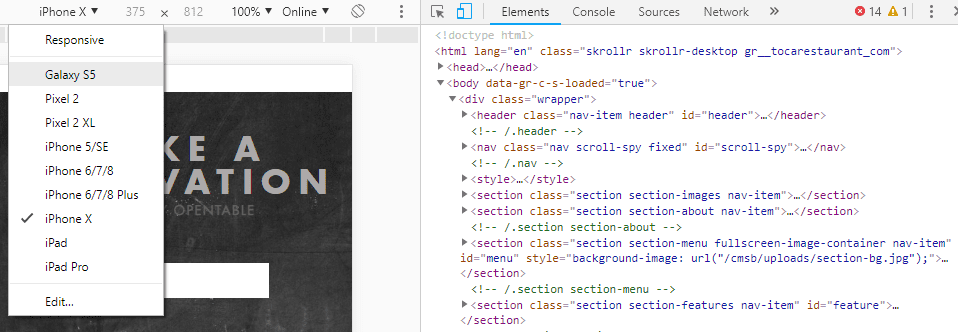
Let’s go over a quick example. If you’re using Chrome, go ahead and preview the page that includes the form you want to test. Next, right-click anywhere on that page and choose the Inspect option. Chrome will show you a set of tools you can use to review and edit the page’s source code to right and to the left, you can see a preview of how it’d look from a mobile device:
At the top of the screen, there’s a menu you can use to switch between different resolutions. Chrome includes settings for several popular mobile devices, but you can also input a custom resolution.
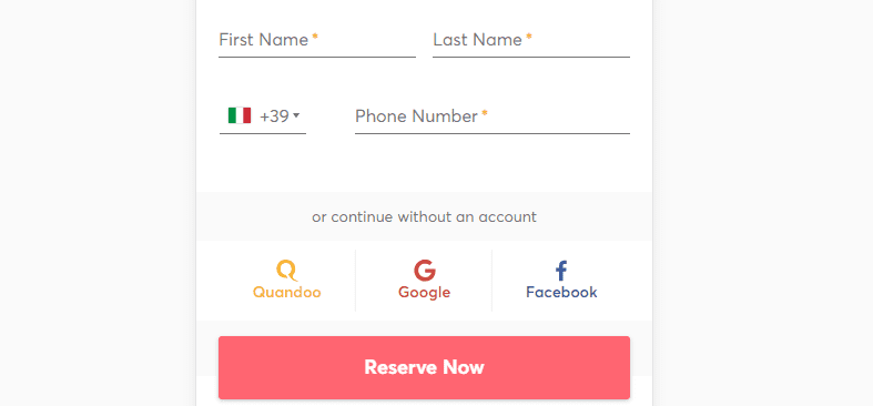
At this point, you should check out how your contact form looks and behaves across multiple devices. Take the example below – the form works perfectly, but you can see it doesn’t scale as well as it should. Pay close attention to the text and icons in particular, which are too close to the border of the screen:
One way to prevent this issue is to keep your forms simple, as we outlined during the first tip. In the example below, the form uses multiple drop-down lists and only requires three fields. That makes it easy to use and, more importantly, the form is so simple that it should scale perfectly across every device:
If you run into issues with any of your forms, you should obviously fix them right away. Otherwise, you risk alienating your mobile audience, which is what we’re trying to avoid in the first place!
Conclusion
Ensuring your website is mobile-friendly is paramount for keeping hold of traffic, and not frustrating your visitors. Specifically, your forms need to be easy to use on mobile devices if you don’t want to miss out on receiving messages or collecting valuable leads.
When it comes to designing mobile-friendly forms, here are five quick tips to make your life easier:
- Remove any unnecessary sections.
- Use drop-down lists when possible.
- Make sure your submission buttons are easy to press.
- Ensure your forms load fast.
- Test your forms before you publish them.
Do you have any questions about how to create mobile-friendly forms using Divi? Ask away in the comments section below!
Article thumbnail image by Irina Adamovich / shutterstock.com.


