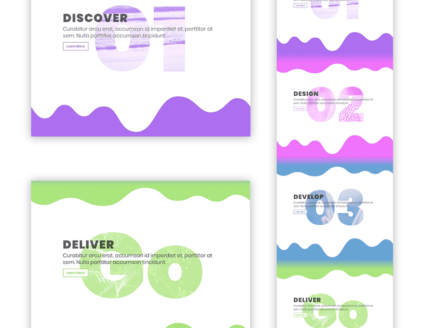
Filling text with images is a great way to add a modern design to your website. With Divi’s blend modes, you can show background images through any text you want. And, using custom margins within the Divi Builder, you can position the image-filled text to serve as a background for your content.
In this tutorial, I’m going to show you how to use the screen blend mode to add colorful image-filled text backgrounds using Divi. I’ll also show you how to add dividers that match the design of your background text and sections that transition smoothly between dividers.
Let’s get started.
Sneak Peek
Here is a sneak peek of what we will be created today.
Getting Prepared
To help you complete this tutorial, you will need the following:
- Divi Theme (installed, active and updated)
- 4 Images to use for each text background. For best results, I suggest using darker images with a lot of texture and at least 1920×1080 in size.
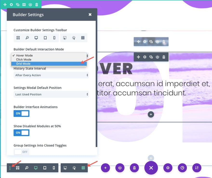
- Visual Builder Grid Interaction Mode – Since we are going to be overlapping modules and creating a more complex layout, I suggest using the grid interaction mode so that you can avoid confusion when trying to hover over elements that are overlapping within the visual builder.
How to Fill Text with Images for Creative Backgrounds using Divi
Subscribe To Our Youtube Channel
Create First Section
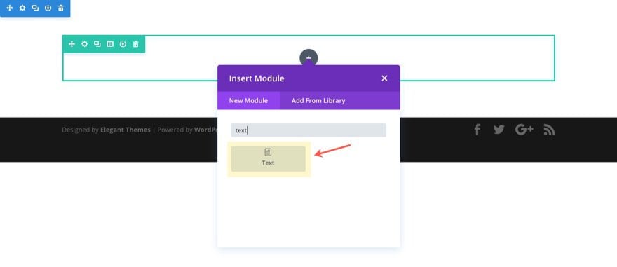
Create a new page and deploy the visual builder. Then add a regular section with a one-column row (or just use the one already there by default), and add a text module to the row column.
Update the Text Module Settings
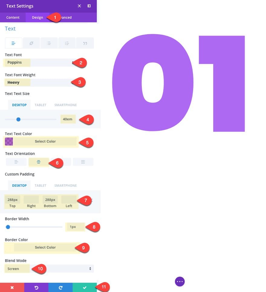
Open the text module settings and update the following:
Content…
Content: 01 (this will be the number used for our background)
Background Color: #ffffff
Design…
Text Font: Poppins
Text Font Weight: Heavy
Text Text Size: 40em (desktop), 25em (tablet), 15em (smartphone)
Text Text Color: rgba(131,0,233,0.65)
Text Orientation: Center
Custom Padding: 288px top, 288px bottom
Border Width: 1px
Border Color: #ffffff
Blend Mode: Screen
Note: The white background and the screen blend mode is what creates the effect of seeing the row background (not created yet) through the text module.
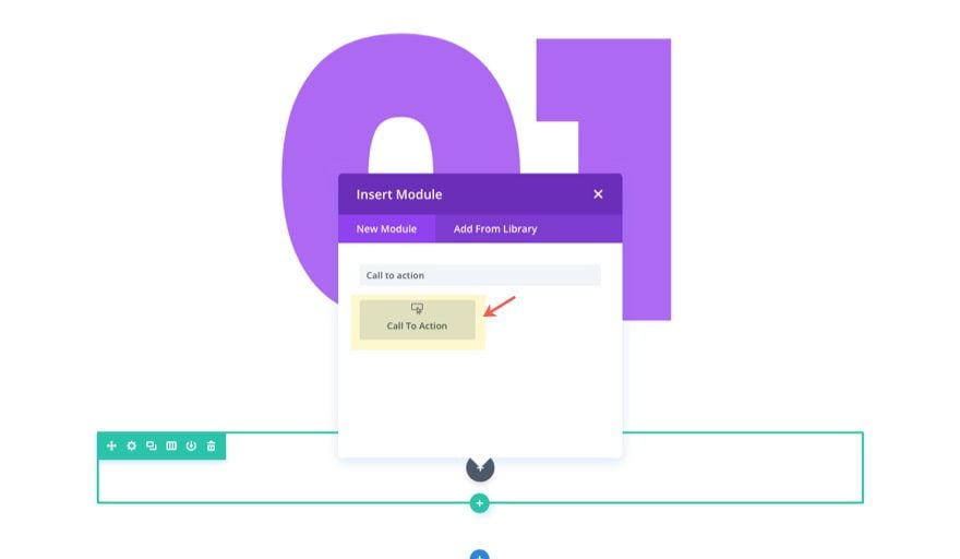
Next add a new one-column row under the current row and then add a call to action module to it.
Update the Call to Action Module Settings
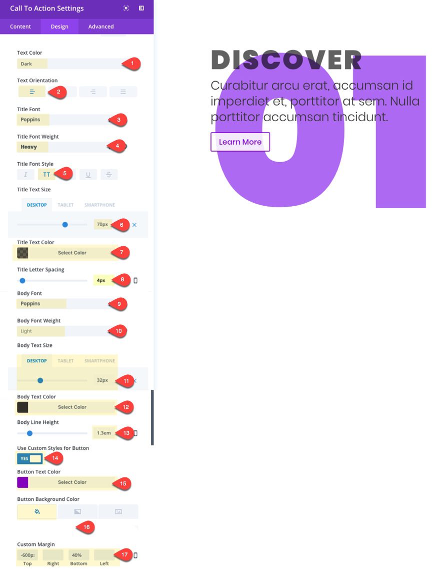
Update the Call to Action module with the following:
Content…
Title: Discover
Button Text: Learn More
Button URL: #
Background Color: rgba(255,255,255,0) (this is transparent)
Design…
Text Color: Dark
Text Orientation: Left
Title Font: Poppins
Title Font Weight: Heavy
Title Font Style: TT
Title Text Size: 70px (desktop), 50px (tablet), 40px (smartphone)
Title Text Color: rgba(0,0,0,0.62)
Title Letter Spacing: 4px
Body Font: Poppins
Body Font Weight: Light
Body Text Size: 32px (desktop), 24px (tablet)
Body Text Color: #333333
Body Line Height: 1.3em
Use Custom Styles for Button: YES
Button Text color: #8300e9
Button Background Color: rgba(255,255,255,0.85)
Custom Margin: -600px top, 40% bottom
Note: I set the top margin with a pixel value because I wanted limited the movement of the module when adjusting browser widths. I set the bottom margin to 40% in order to keep the bottom section from overlapping the row that holds this module. Setting it to a percentage helps adjust the bottom margin on mobile devices.
Update Row Settings
Now that we have our content in place, let’s edit our first row settings as follows.
Content…
Column 1 Background Image: Insert Image
Here is the image I’m using…
Design…
Make this Row Fullwidth: YES
Custom Gutter Width: 1
Custom Padding: 10% Top, 7% Bottom
Border width: 1px
Border Color: #ffffff
In the second row, update the settings as follows:
Custom padding: 0px Top, 0px Bottom
At this point we are done with our first successful background text.
We are limited to a white background surrounding the text because of the way the screen blend mode works. But we can add some color by adding some dividers to our section.
Add Dividers to your Section
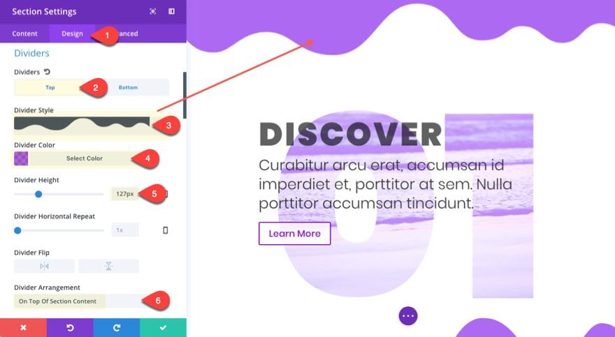
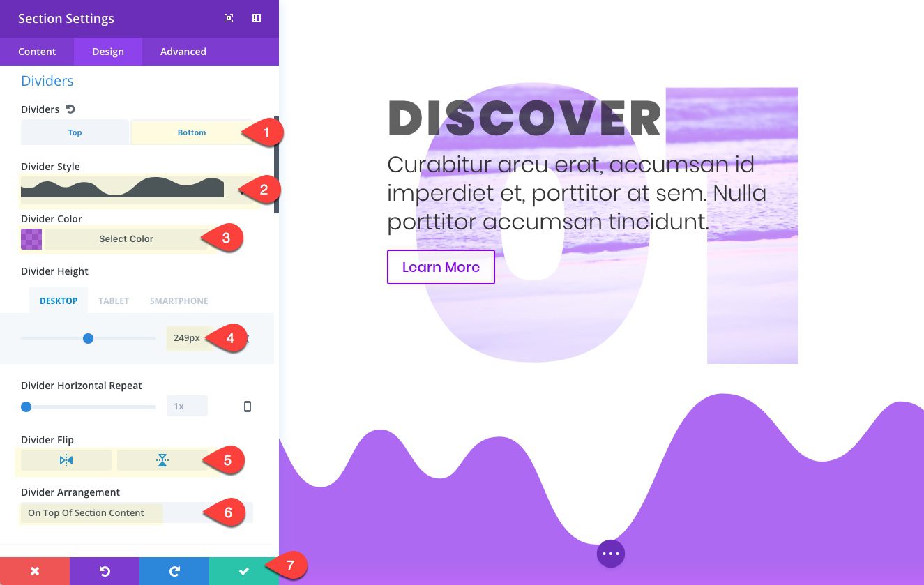
To add a divider, go to the section settings under the design tab and update the following.
Top Divider…
Divider Style: see screenshot
Divider Color: rgba(131,0,233,0.65)
Divider Height: 127px
Divider Arrangement: On Top of Section Content
Bottom Divider…
Divider Style: see screenshot
Divider Color: rgba(131,0,233,0.65)
Divider Height: 249px (desktop), 127px (tablet)
Divider flip: vertical and horizontal
Divider Arrangement: On Top of Section Content
Adding the Transition Section
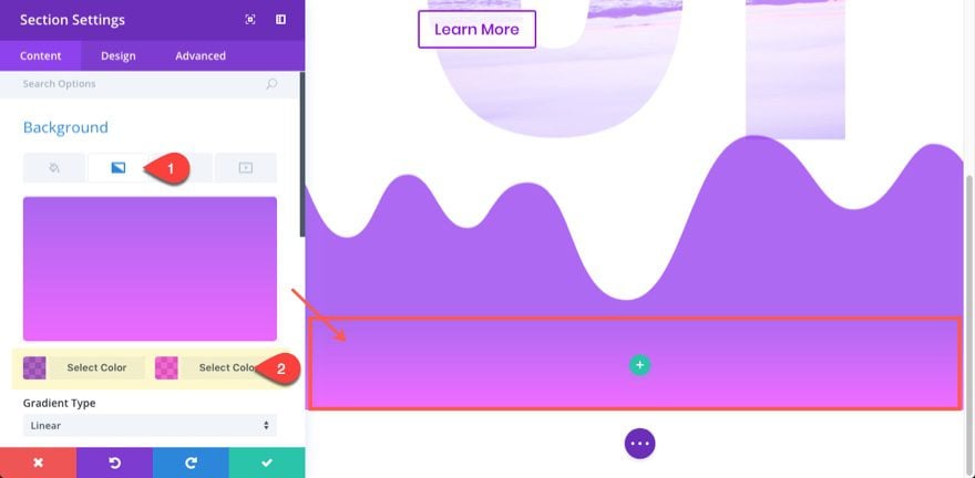
Before we start our next section, we must first create a regular section to serve as a smooth transition of color between the bottom and top dividers. To create the transition, we must use the color of the bottom divider above and top divider below (sorry, that may be a tad bit confusing). With those two colors, we will create a background gradient to transition from the divider above with the divider below.
Go ahead and add a new regular section, but delete the row column because we won’t be using any rows for this section. Then under the content tab, add a background gradient with the first color being the same color we used for the section above: rgba(131,0,233,0.65).
For the second color, use the following: rgba(233,0,255,0.65)
This will be the color of our next section dividers.
At this point, all of the brunt work has been done. All there is left to do to complete the next 3 sections is duplicate the section we already have and update some content and colors.
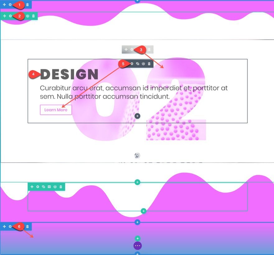
Create the Second Section
For the second section, copy our first section we created and paste it below the transition section.
Complete the following:
- Update the section Top and Bottom Divider Colors to rgba(233,0,255,0.65).
- Change the top row 1 column background image.
- Update the text module with the number 02, and then change the text text color to rgba(233,0,255,0.65).
- Change the blurb module title to read “Design”.
- Update the blurb module button text color to #e900ff.
- Add another transition section below with these two colors for the gradient background:
rgba(233,0,255,0.65) , rgba(12,113,195,0.65)
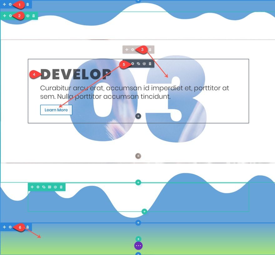
Creating the Third Section
For the third section, copy one of the sections we already created and paste it below the second transition section.
Complete the following:
- Update the section Top and Bottom Divider Colors to rgba(12,113,195,0.65).
- Change the top row 1 column background image.
- Update the text module with the number 03, and then change the text text color to rgba(12,113,195,0.65).
- Change the blurb module title to read “Develop”.
- Update the blurb module button text color to #0c71c3.
- Add another transition section below with these two colors for the gradient background:
rgba(12,113,195,0.65) , rgba(124,218,36,0.65)
Creating the Fourth Section
For the fourth section, copy one of the sections we already created and paste it below the third transition section.
Complete the following:
- Update the section Top and Bottom Divider Colors to rgba(124,218,36,0.65).
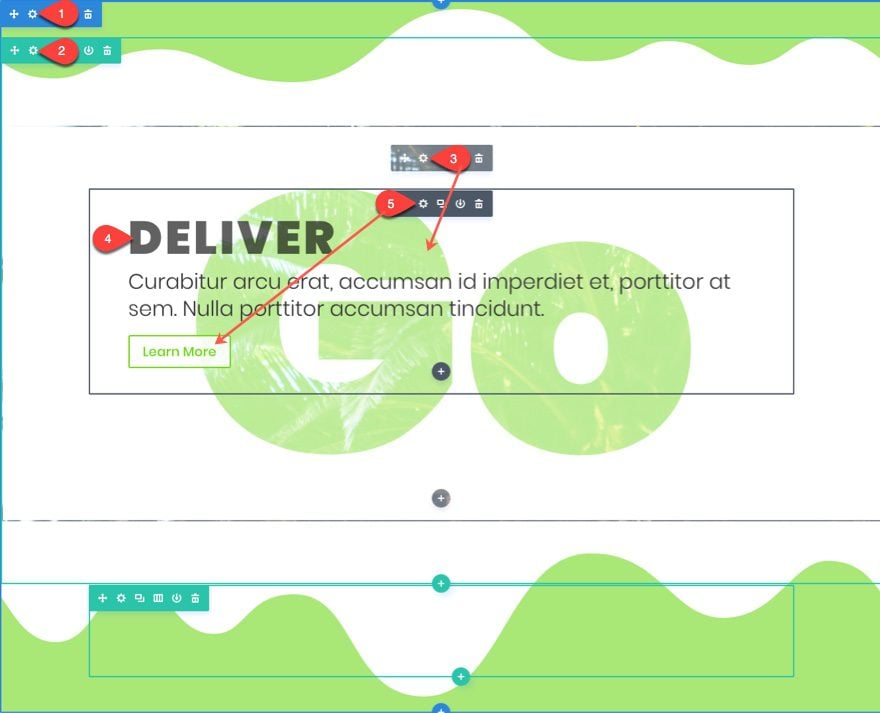
- Update the text module with the text “Go”, and then change the text text color to rgba(124,218,36,0.65).
- Change the top row 1 column background image.
- Change the blurb module title to read “Deliver”.
- Update the blurb module button text color to #68d800.
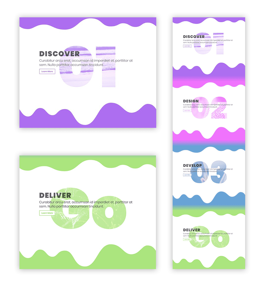
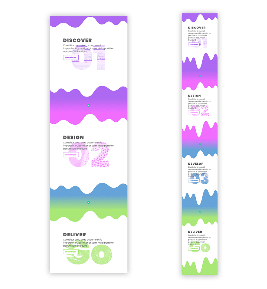
Here is the final result:
It’s Responsive
The design process used in this tutorial includes setting custom spacing elements (margin and spacing) and text sizes for each mobile device. This way any advanced customizations set on desktop will also render nicely on mobile.
Here is what our design looks like on tablet and smartphone.
Create a Dark Version
The Screen Blend Mode works by blending the text module elements with the row background image and then displaying a lighter mixture of the two elements. Similarly, the Multiply Blend Mode mixes the two but, instead of showing a lighter version, it shows a darker version of the mixed elements. This is obvious if you toggle between Multiply and Screen when editing your settings.
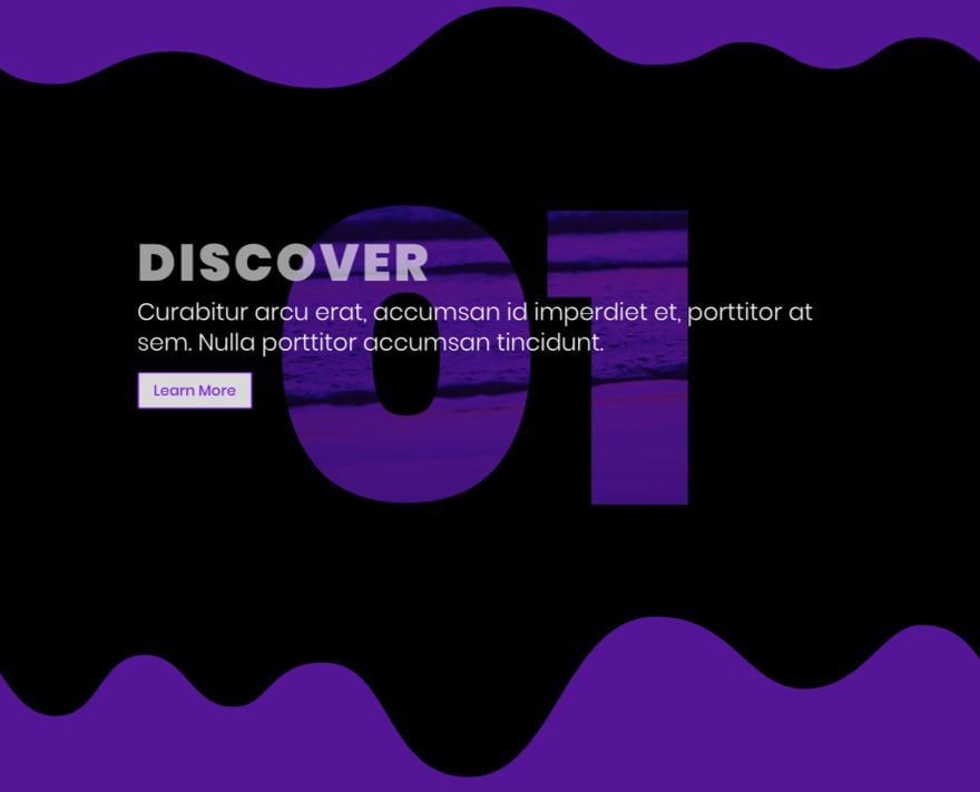
You can use the multiply blend mode in place of your screen blend mode to create a dark version of this design. To do that all, you will need to do is set the section background color and the text module background color to black (and also the border colors if you have borders). Change the text module blend mode to Multiply. Then change your Call to Action Title text and body text to a lighter/white color.
That’s it. Here is an example of what a dark version will look like.
Limitations and Fallbacks to this Design
Because of the way the screen and multiple blend modes work, this effect works best with white and black backgrounds. Any other colors will most likely show the background image through the whole module, not just the text. However, you design ninjas out there may know some tricks that I don’t, so don’t hesitate to share those with us in the comments.
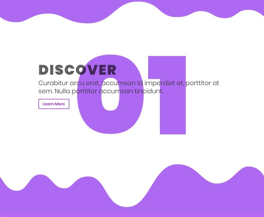
Also, the screen mix-blend-mode used to create our image-filled text backgrounds does not play well on IE, Edge, and Opera mini. This is not a big deal because, even though the background will not show through the text and the text color will still be displayed. This is a great fallback so you should keep this in mind whenever you are setting the text color for your background text.
Here is an example of what the design looks like on IE.
Final Thoughts
With Divi, you can fill any text you want with any image you want, all from the comfort of the Visual Builder. The example design used in this tutorial is really meant to be inspiration for so much more. So, test it out for yourself and build something amazing.
This tutorial was inspired by the post series on How to Recreate the Color Filters Effects & Blend Mode Examples.
I look forward to hearing from you in the comments.
Cheers!

