[ad_1]
As web designers, we strive for perfection in our day to day processes. Although we are human, many of our daily tasks are to handle designing and developing projects down to the nearest pixel. Along the way we sometimes overlook the details we’d rather not to maintain our professional edge.
Below are a list of 10 mistakes you’re probably making as a web designer. Use these mistakes as a means to correct bad habits or overcome the hurdles we are all guilty of.
1. Using Flash
Flash is amazing but it just isn’t what it used to be. While Flash offers some amazing animated experiences, it also comes with some baggage. Long load times, no mobile support or having to learn another complete language is what has caused it’s recent demise. Currently, only a handful of mobile devices support flash with additional support from plugins.
Future support for Flash looks a bit bleak as new libraries come forth. JavaScript based libraries like jQuery or AngularJS are changing the way we use the internet and at insane speeds to boot.
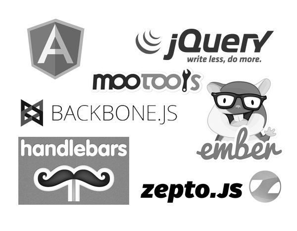
Various JavaScript libraries available to introduce all types of functionality into your web designs and apps.
2. Massive Images
A common trend these days is to use larger images throughout a website. While this adds to the experience and gives users plenty to look at, it also adds a few complications to the mix.
A big result of using larger images is the increased page load time. Various tools assist with image optimization like GruntJS-ImageMin(For all you Grunts), ImageOptim (via command line or GUI), and apps like CodeKit and PrePros which do image optimization automatically inside the application. These tools help our workflows but won’t solve those dreaded load time issues completely.
Lately, a lot of designers have been adopting the SVG trend and using code to draw or animate graphics in the browser. The result equates to accelerated page load and still plenty of eye catching elements to look at.
Another reason images complicate things is their non responsive quality. An image has a set width and height and that won’t ever change. A browser can skew and scale an image but the file size lies unaffected.
This problem is currently being addressed by the W3C to include the new <picture> element into our current HTML5 markup. Adding this element allows for different image sizes to be called inside the element depending on screen width. The end result is the best experience for any user on any device.
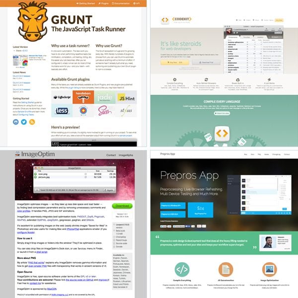
Screenshots of helpful task runners and image optimizers for web designers and developers.
3. Fixed heights and widths
Fixed sizes restrain adaptation for all users. While there are workarounds, these principles should be avoided to allow for a truly responsive web design pattern. Setting a fixed height in your CSS for example limits what is viewable to the user unless that height is later adjusted with a media query. Having this extra code leads to performance issues and bloat that is otherwise not needed. There are exceptions to this rule but as a basis setting fixed sizes should always be avoided if possible.
4. Assuming your design fits all screen sizes
Designers that work inside of Photoshop, Sketch or any other graphic editor, design for specific breakpoints in their responsive workflow. While these screen widths cover a lot of devices, it doesn’t always cover them all. With so many devices on the market it’s really hard to design for everything.
Forward thinking and proper planning can offer the best result with your design at certain widths. Make sure to always keep this in the back of your mind and definitely test on the devices you have access to. While most of the design can be done in a graphic editor, much of it will be designed inside the browser once this stage is reached.

5. Overuse of animations or effects
Many websites are breathtaking to experience. Some offer unique experiences while others offer amazing content. The key and real secret to web design is to combine both of these principles. Many websites want to impress the user so much that they forget about why the user came to the website in the first place, the content.
Popular animations or hacks get in the way of the experience like elements fading in, up, down, around, etc.. or scroll hacking for example. Using these treatments can definitely add to the experience but you should be vigilant when implementing them into your projects.
6. Poor link treatment
Be sure to appreciate what a link is and what it does. A hyperlink allows the web to exist if you think about it holistically. To go from page to page easily a link is required. Users need quick access to links to get the information they came for. Make sure your links look like links and not those default blue underlined kind as well!
7. Not using the DRY approach with your CSS
Use the DRY approach to benefit yourself and your users. DRY stands for Don’t Repeat Yourself. This method helps keep your code clean and concise while only using the necessary code to style up your website.
Traditional CSS requires a lot of repetition when styling specific elements inside other elements. Your selectors commonly grow in size and end up taking more time to write. Use classes throughout your design rather than styling each element you have in your HTML independently.
CSS pre-processing languages like Less and Sass are the latest and greatest of CSS technology. These languages speed up the design and development process by offering features such as nesting, variables, mixins, functions and more. The code produced is then compiled into the regular CSS code we all know and love. Less and Sass allow web designers and developers to write fewer lines of code without repetition.

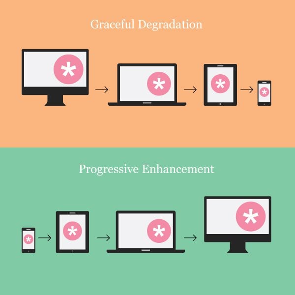
8. Graceful Degradation & Progressive Enhancement
Graceful degradation is the practice of building your web functionality that provides a certain level of user experience in more modern browsers but degrades gracefully to a lower level of user experience in older browsers.
A common example of this is support for Internet Explorer 7 and 8. Many users simply don’t update their browsers and as a result some level of support is required to succumb to this factor.
Developing a modern website seems like a walk in the park at times until you realize later you have to support some older browsers that have their own specific dependencies.
Progressive Enhancement is similar to graceful degradation but it does things in reverse. Start with a basic level of user experience that every browser supports. Then you also build in more functionality automatically available to browsers that can use it.
Both of these approaches are hard and are what sets some good websites apart from bad websites. There are many different browsers available to support different scenarios. A lot of times web designers and their client must decide what will and what won’t be supported for their users. At best, you should try to use both approaches in your projects to provide the best experience to the most active users you can.
9. Non-user friendly navigation
Navigation is a key component to the functionality of a website. Designers must find a way to make the experience almost natural for the user to navigate across a website by providing a common user experience. Most users gain knowledge of the experience instantly if it is well designed and thought out.
If the user experience is poor, the user will become frustrated and likely not visit the site again looking elsewhere for a better solution. Always keep usability in mind. Your design could look amazing but if it’s not functional and easy to use or learn then the design is rendered useless.
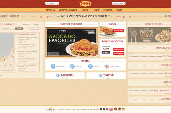
Denny’s recent design displays a lot of content but relies on both horizontal and vertical scrolling which makes for harder navigation.
10. Focusing more on design rather than content
A common principle form follows function was made popular in the 20th century during the industrial design phase of modern architecture. This principle stands high alongside any form of design in recent history.
The same rules apply for everything from architecture to graphic and web design. A form of an object should be first based on its intended function or purpose.
Websites are like buckets of information collected across the internet. Users use each and every website they visit to digest the data of their choosing. If the user can’t get the information they need due to a bad user experience then they move on to another source. People want information fast which is a big reason why the internet is so huge and so powerful.
Form over function plays a massive role in the success of many properly designed websites. These websites are both aesthetically pleasing and naturally functional.
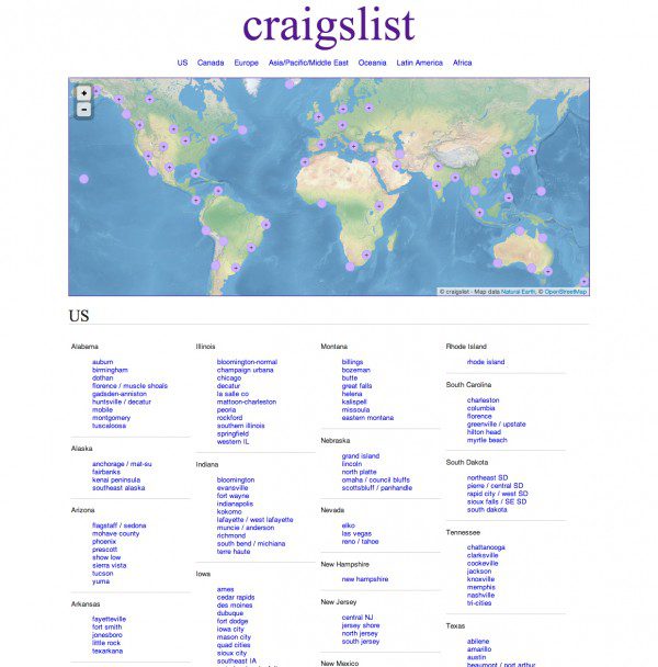
Craigslist focuses on content first as opposed to design. Users would likely react negatively to a complete redesign of the user experience.
We’ve only covered a handful of mistakes web designers commonly make. There are many more mistakes we all have experienced. Share the mistakes you have made below and fill us in on what you did to correct them.
Article thumbnail image by Ingka D. Jiw / shutterstock.com
[ad_2]
Source link