[ad_1]
Your blog page content can be organized in a lot ways. Since it is a blog page, most of the content will consist of a feed of recent blog posts. Knowing how to organize this content can be a great way to break up the monotony and open the door for more unique blog page designs.
In this tutorial, we will share with you 5 helpful tips for organizing blog page content in Divi that will help you learn the following:
- How to Create a Two Column Layout
- How to Use Sticky Posts
- How to use post offsets
- How to use multiple blog modules to create a custom layout for blog posts
- How to display recent posts by category
Sneak Peek
Here is a look at some ways we will organize blog page content in Divi.
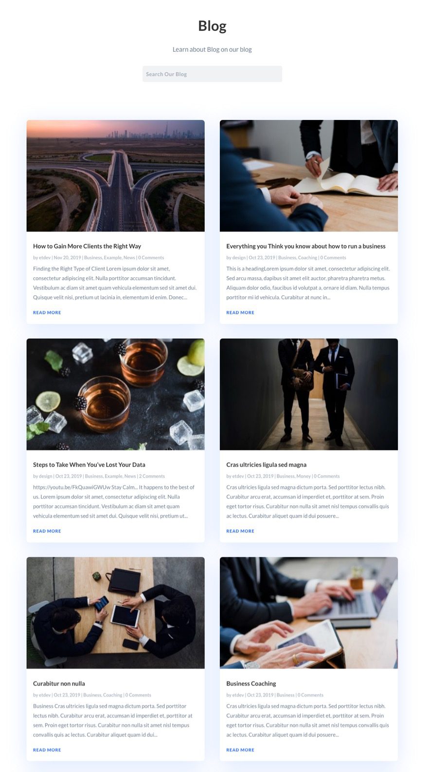
Using A Two Column Layout
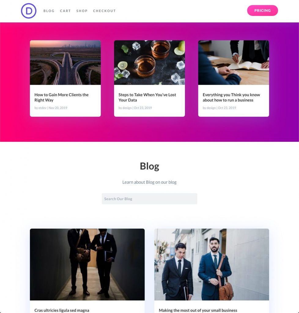
A Featured Post Section Above the Main Blog Feed
A Fullwidth Post Slider Above the Main Blog Feed
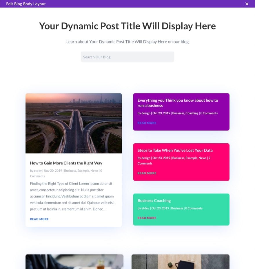
Using Multiple Blog Modules for a Unique Layout and Design
Featuring Recent Posts by Category
What You Need to Get Started
If you haven’t yet, install and activate the Divi Theme.
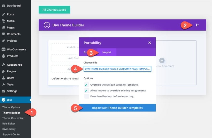
For this tutorial, I will be using the Second Theme Builder Pack Category Page Template. If you want to use it to follow along, download the pack and import the divi-theme-builder-pack-2-category-page-template.json file to the theme builder using the portability options.
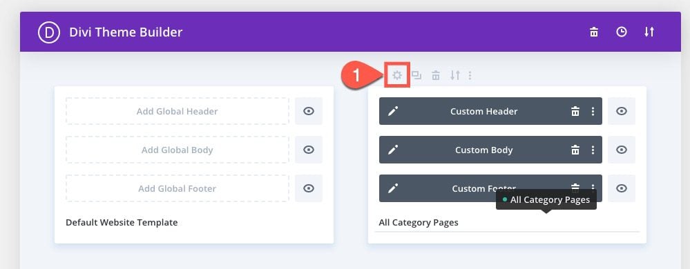
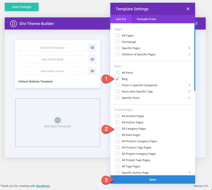
By default, the imported template will be assigned to “All Category Pages”. Open the template settings and assign it to the Blog.
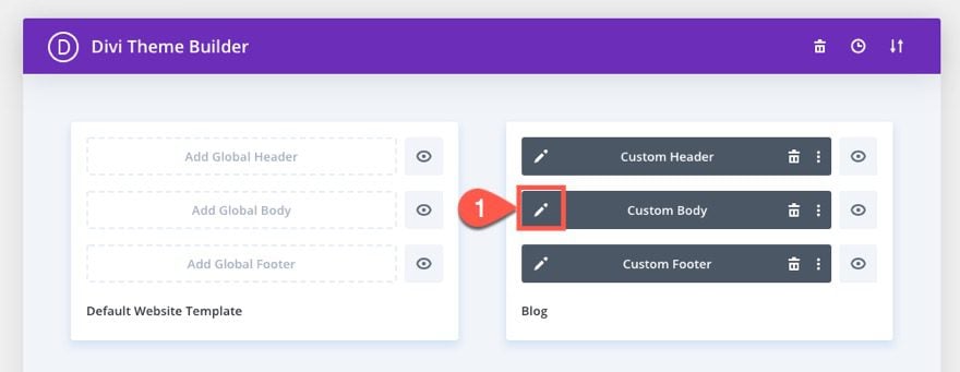
Now you are ready to start the process of organizing blog page content within the template. To get started, click the edit icon on the body area of the template.
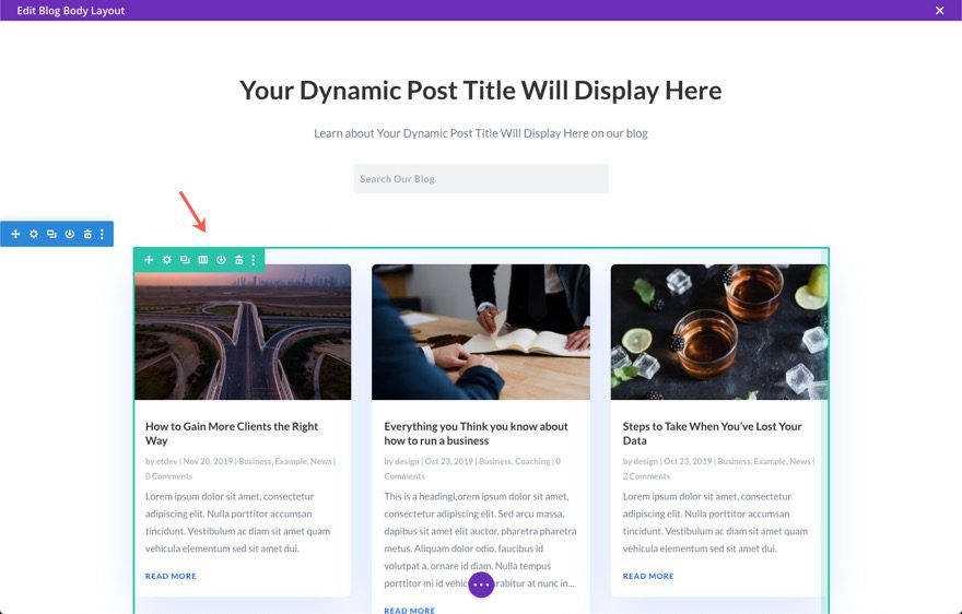
Now you can use the layout editor to modify the layout.
5 Tips for Organizing Blog Page Template in Divi
In this template, we have a blog module that is in a one column row that is displaying the posts (in three columns on desktop) for the current page. This is a standard setup for blog and archive page templates. However, we don’t have to keep this standard layout for displaying posts. Here are a few helpful tips for organizing blog page content in Divi.
#1 Create a Two Column Layout
The blog module (if set to grid layout) will display the posts in a three-column structure if the module is added to a one-column row (just like in our template).
If you want to change the layout to display posts in a two column layout, here’s something you can do.
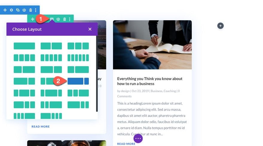
First, change the column layout of the row to a two-thirds one-third layout. This will display the blog posts in two columns in the left column of the row.
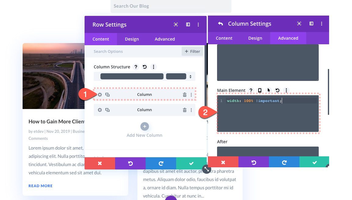
Next, open the settings for column 1 (the one containing the blog module) and add the following custom CSS to the Main Element:
width: 100% !important;
This will cause the column to span the full width of the row.
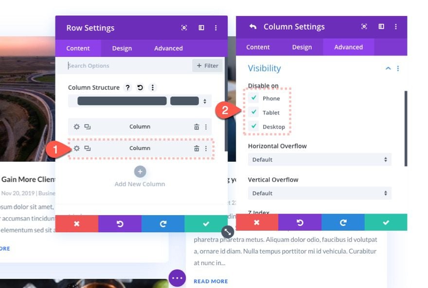
Now all we need to do is hide the column on the right. Open the settings for column 2 (the empty one) and disable the visibility of the column on all devices.
Now you can organize blog page content with two columns on desktop instead of three if you want.
#2 Use Sticky Posts
If you are familiar with WordPress, you may already know about this one. Each post created in Divi (or WordPress) can be made sticky. When you make a post sticky, the post will automatically display at the very front of the blog feed on the blog page, even before the most recently published post. This is a great way to feature posts that you know your audience will want (or need) to see.
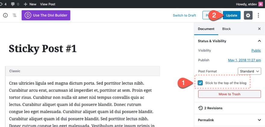
To make a post sticky, simply edit a post in Divi and check the “Stick to the top of the blog” option in the right sidebar.
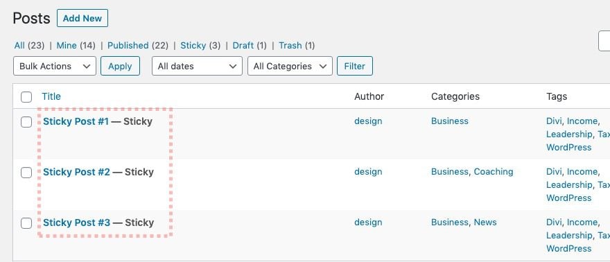
Each post that you make stick will be labeled as “Sticky” when viewing all posts on the backend.
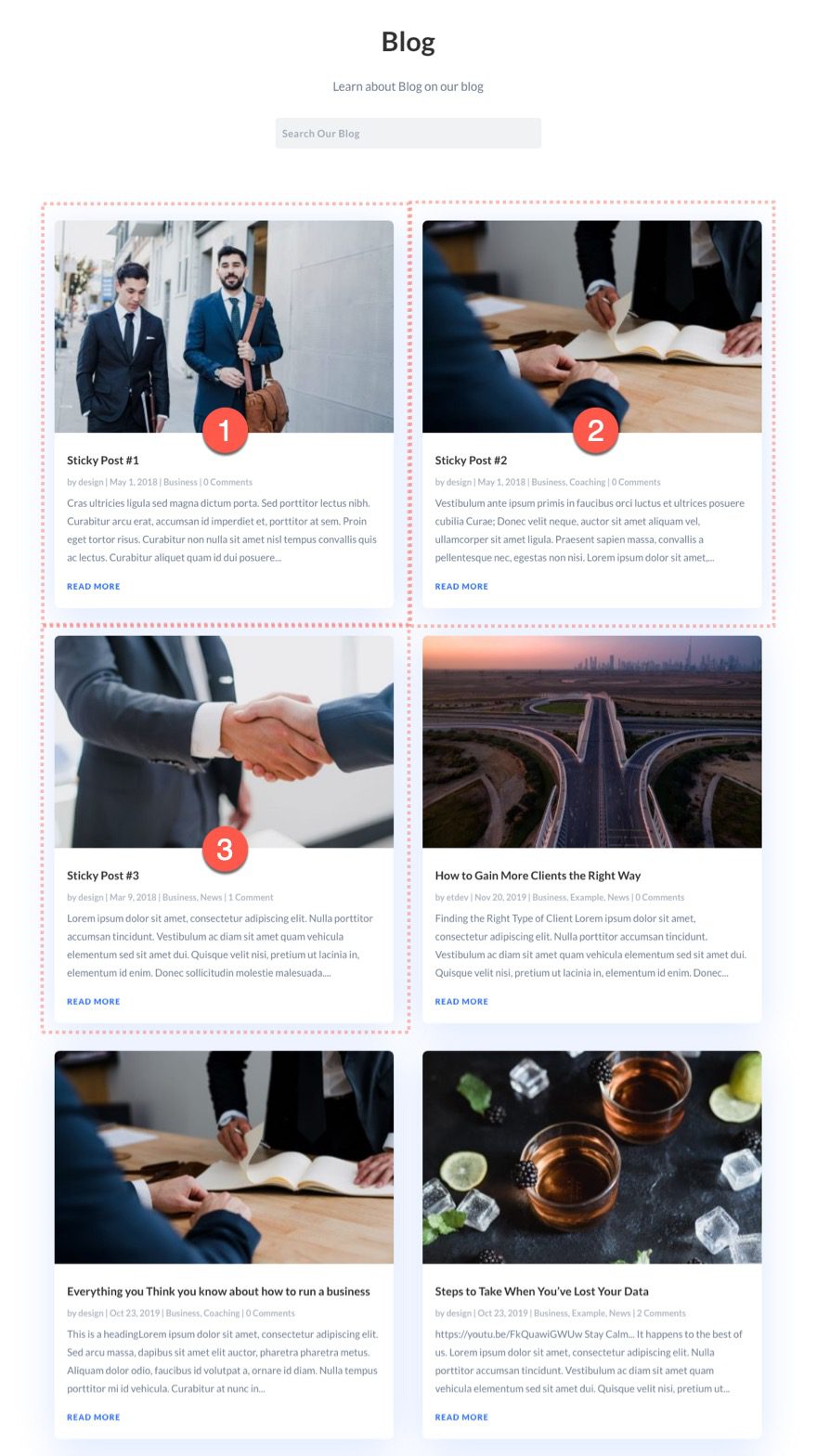
Now when you visit the blog page, you can see the sticky posts have jumped to the front of the blog post feed.
Note: Sticky posts may not work as expected when using post offsets in the Blog Module. For example, if you set the blog module to display 3 posts with a post offset of 3, your sticky posts will still be displayed before (and in addition to) the 3 posts.
Before you go on to the next tip, I suggest that you get rid of the sticky posts.
#3 Use Post Offsets to Organize Blog Page Content into Separate Sections
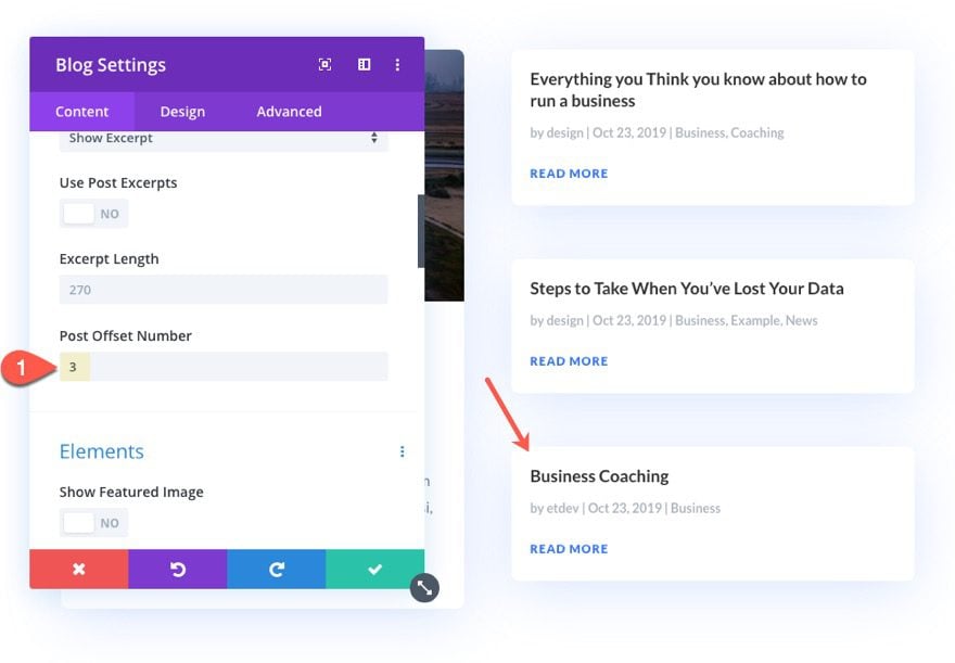
Each blog module has an option to enter a Post Offest Number. This tells the blog module to skip over a certain number of recent blog posts before displaying the blog feed. This option comes in handy whenever you want to mix up the layout of your blog page a bit by using multiple blog modules to display your posts. This gives you more flexibility with the design of the layout because you can design each blog module differently.
Featuring Most Recent Posts with a Separate Blog Module using Post Offset
One way you can organize blog page content on your template layout is to add a featured blog post section at the top of the page. This is a way you can highlight the top three newest posts in a unique way. Here’s now to do it.
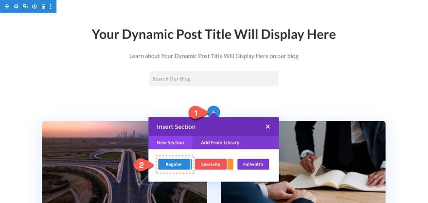
Add a new regular section to the layout.
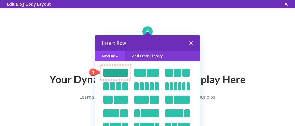
Then add a one-column row.
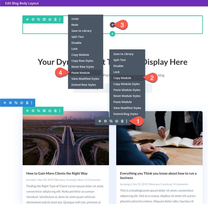
Copy the blog module that came with the template and paste it into the new row.
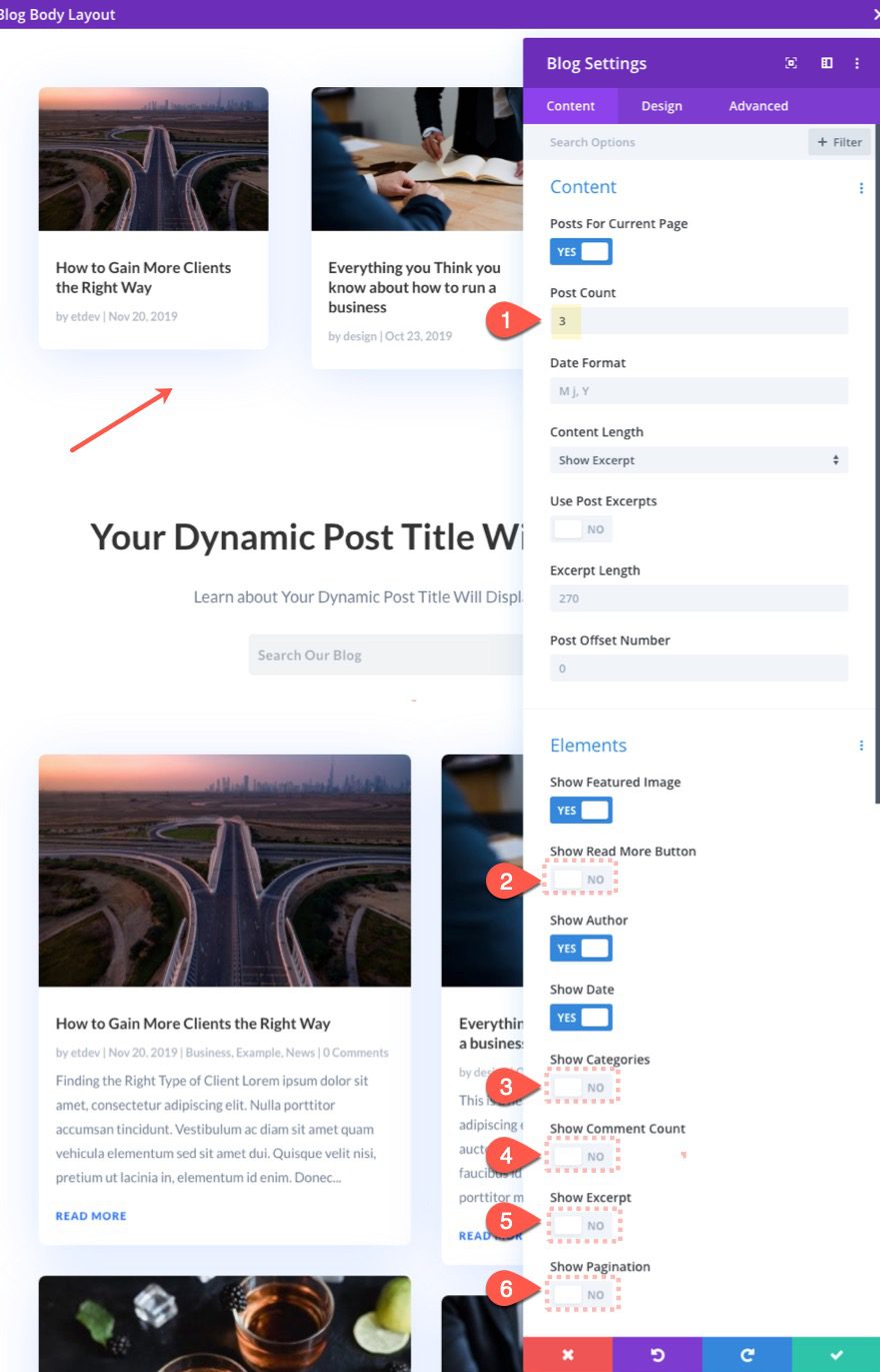
Update the blog settings as follows:
- Post Count: 3
- Show Read More Button: NO
- Show Categories: NO
- Show Comment Count: NO
- Show Excerpt: NO
- Show Pagination: NO
We will have the three most recent posts being displayed in the top section of the page.
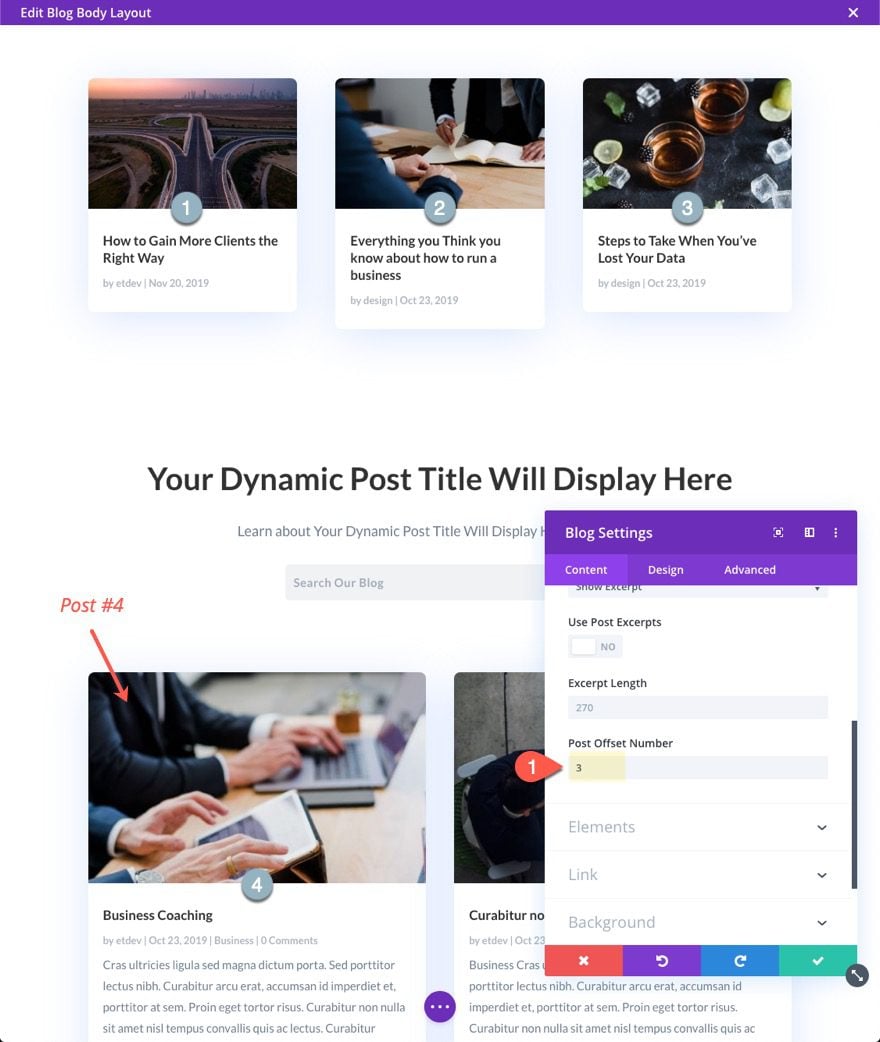
Now we need to add a post offset number to the orginal blog module so that it will skip the first three posts that are already being displayed above.
Open the blog settings for the original blog module and update the following:
Now the blog feed will start with post #4.
To make the featured section at the top of the page stand out, you can add a background gradient.
Here is an example of what that would look like.
Adding a Fullwidth Post Slider Above the Main Blog Feed
Much like the featured section above, we can also organize blog post content by adding a fullwidth post slider at the top of the blog page. This is a popular design for blog pages and you can use it in combination with a blog module that has a post offset.
Here’s how to do it.
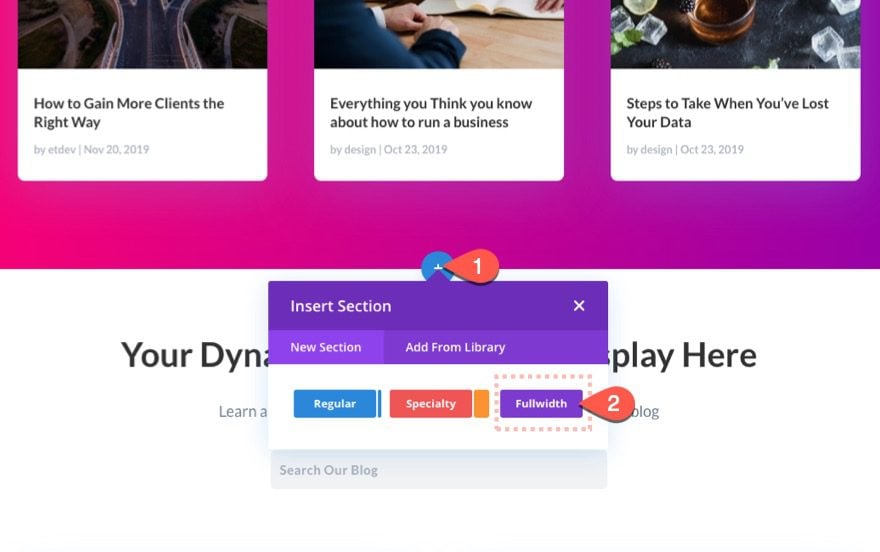
First, add a fullwidth section to the layout.
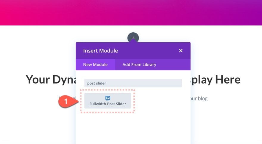
Then add a fullwidth post slider module to the section.
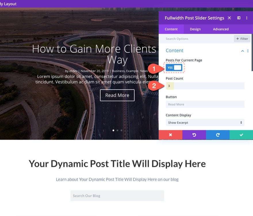
Then update the following settings:
- Posts for Current Page: YES
- Post Count: 3
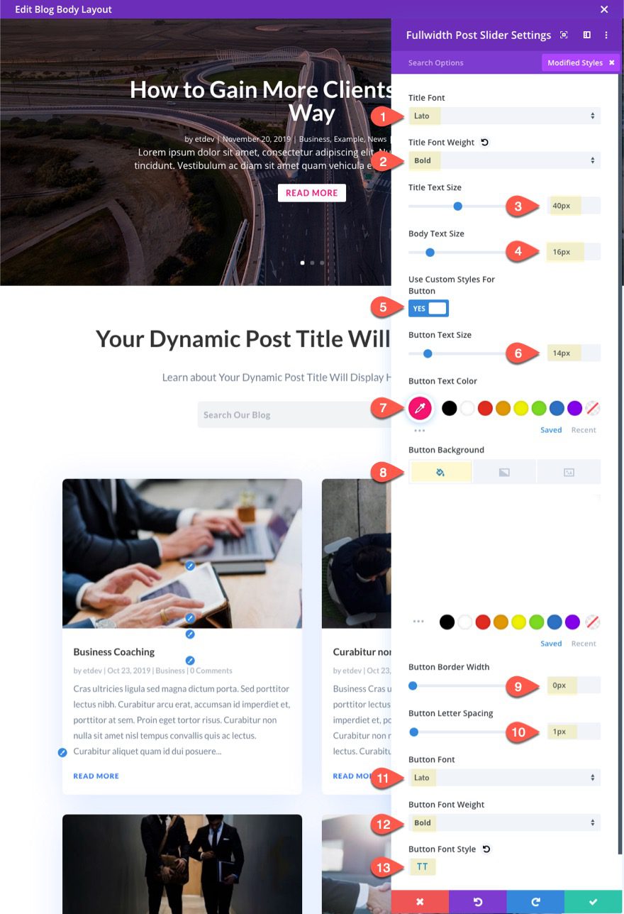
Then update the design of the post slider to match the layout as follows:
- Title Font: Lato
- Title Font Weight: Bold
- Title Text Size: 40px
- Body Text Size: 16px
- Button Text Size: 14px
- Button Text Color: #ff0071
- Button Background Color: #ffffff
- Button Border Width: 0px
- Button Font: Lato
- Button Font Weight: Bold
- Button Font Style: TT
Make sure the blog module display the main feed has an post offset number still set to 3 to accommodate for the post slider’s 3 posts.
Then check out the result.
Looking good so far.
Now let’s take the idea of using a separate blog module a step further with this next tip.
#4 Adding Multiple Blog Modules Each with a Single Post
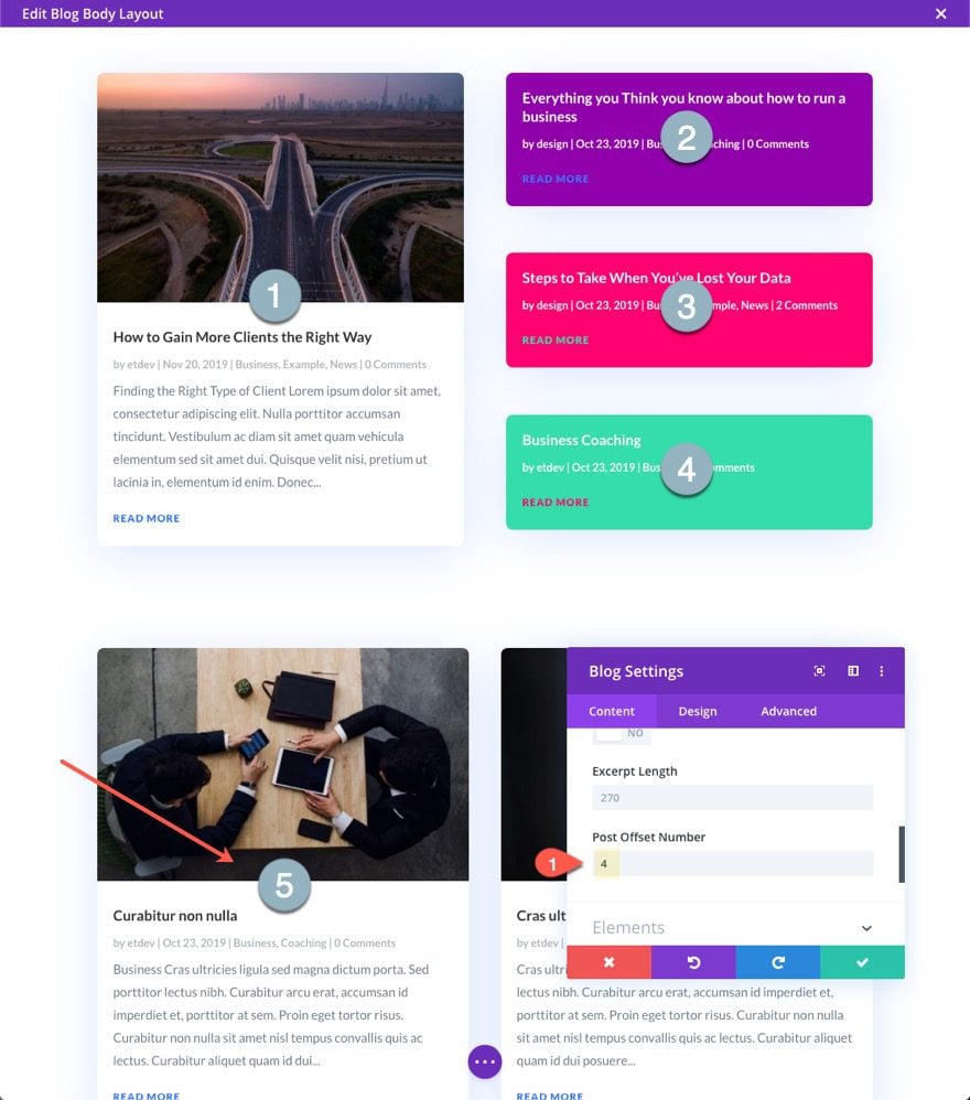
We don’t have to stop at just adding one extra blog module to a template layout. In fact, we can use as many blog modules as we need. We can even choose to display only one post per blog module in order to give a unique design to a single blog post card. Then, using post offsets, we can create a completely unique layout of dynamically display blog posts.
Here’s how to do it.
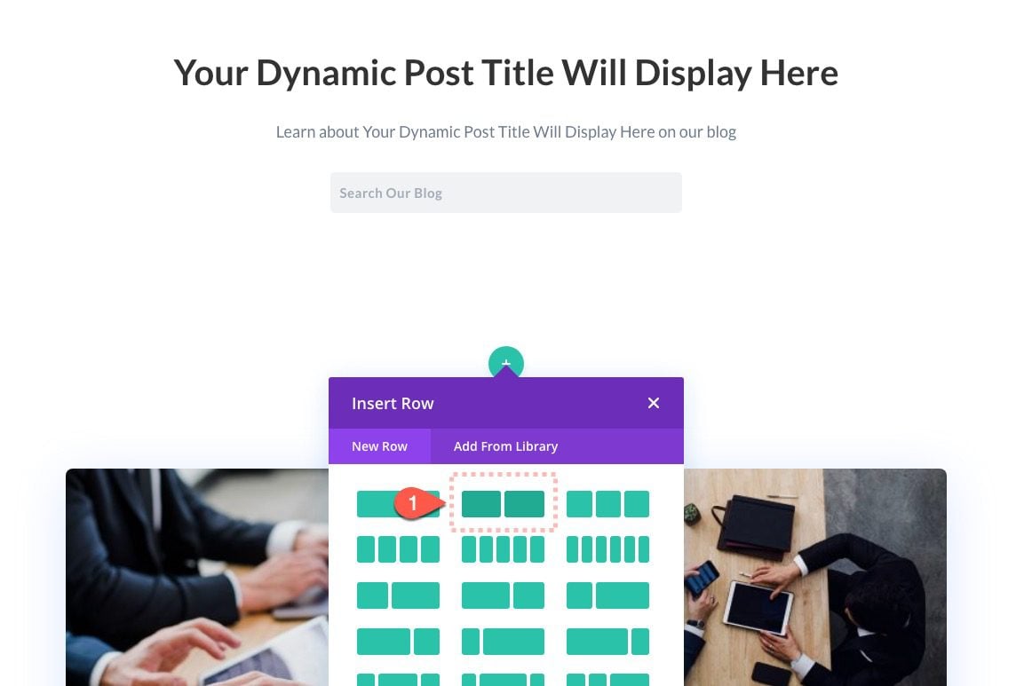
First, add a new one-half one-half column row above the row containing the main blog module.
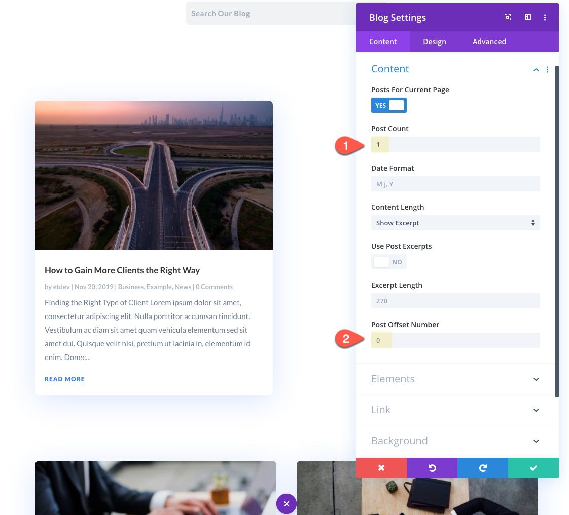
Copy the original blog module below and paste it into the left column of the new row. Then update the following:
- Post Count: 1
- Post Offset Number: 0
- Show Pagination: NO
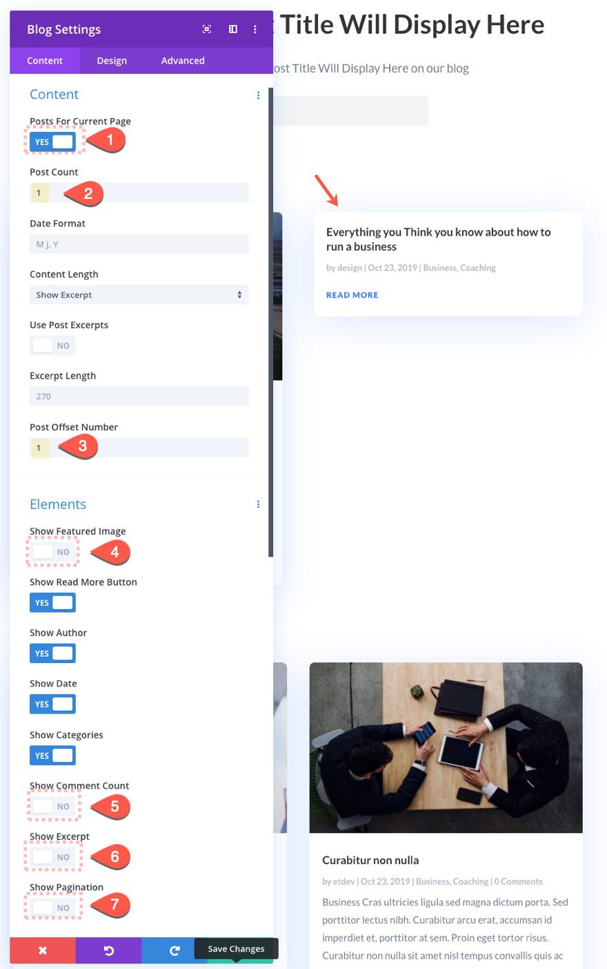
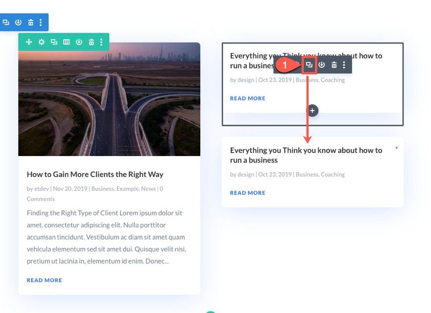
Next, copy the blog module you just created and paste a duplicate into the right column.
Then update the following:
- Post Offset Number: 1
- Show Featured Image: NO
- Show Comment Count: NO
- Show Excerpt: NO
Make sure to set the post offset number to 1 in order to skip the first one in the left column.
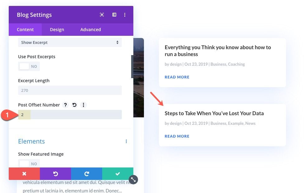
Now continue this process by creating another blog module and increasing the post offset number by 1 each time.
Duplicate the blog module in the right column.
Then change the post offset number to 2.
Duplicate the blog module one more time and change the post offset number to 3.
Now you can have freedom to customize the design of each of the blog modules individually. For example you could add a different background color to each.
Here is the result.
If you are going to keep the main blog feed below, make sure to update the post offset number to 4 in order to accommodate for the 4 posts in the row above.
You can also see this same technique being used on some of our Theme Builder Category Page Templates. Check out our tutorial on how to create a category page template using the same concept.
#5 Display Recent Posts by Category on Blog Page
In addition to the main blog feed on the blog page template, you can also display your recent posts by category. This is a great way to organize blog page content by breaking up the layout a bit and highlighting different categories at the same time.
Here’s how to do it.
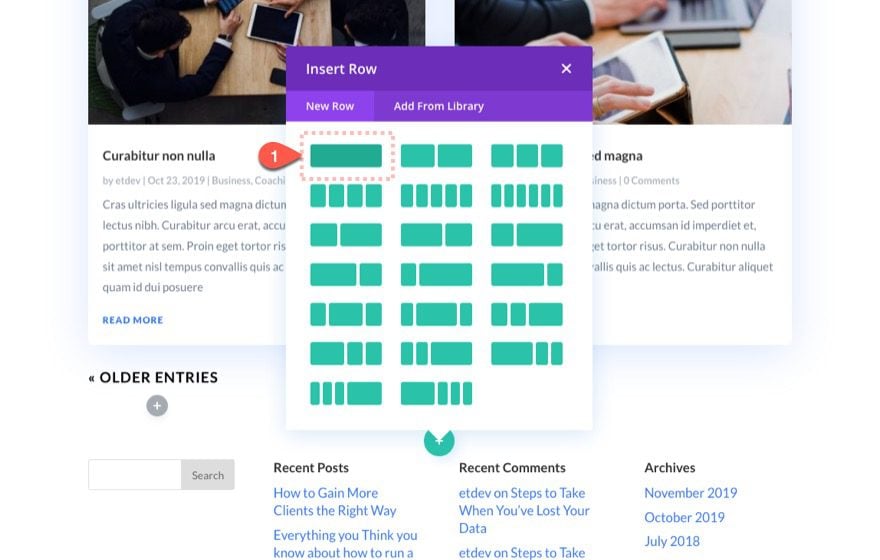
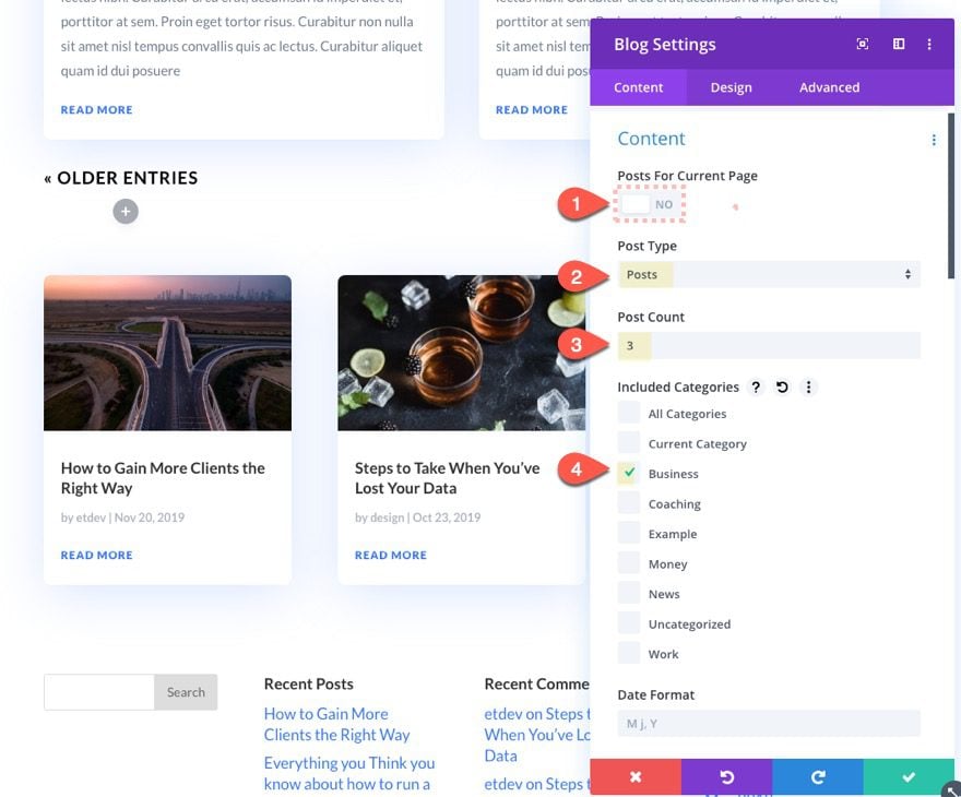
First, add a new one-column row under the row containing the main blog module.
Then update the blog settings as follows:
- Posts for Current Page: NO
- Post Type: Posts
- Post Count: 3
- Included Categories: Business (or one of your own)
This will display the three most recent posts from the Business category.
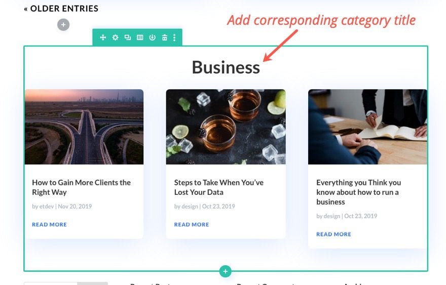
Then add a text module above the blog module with a corresponding category title.
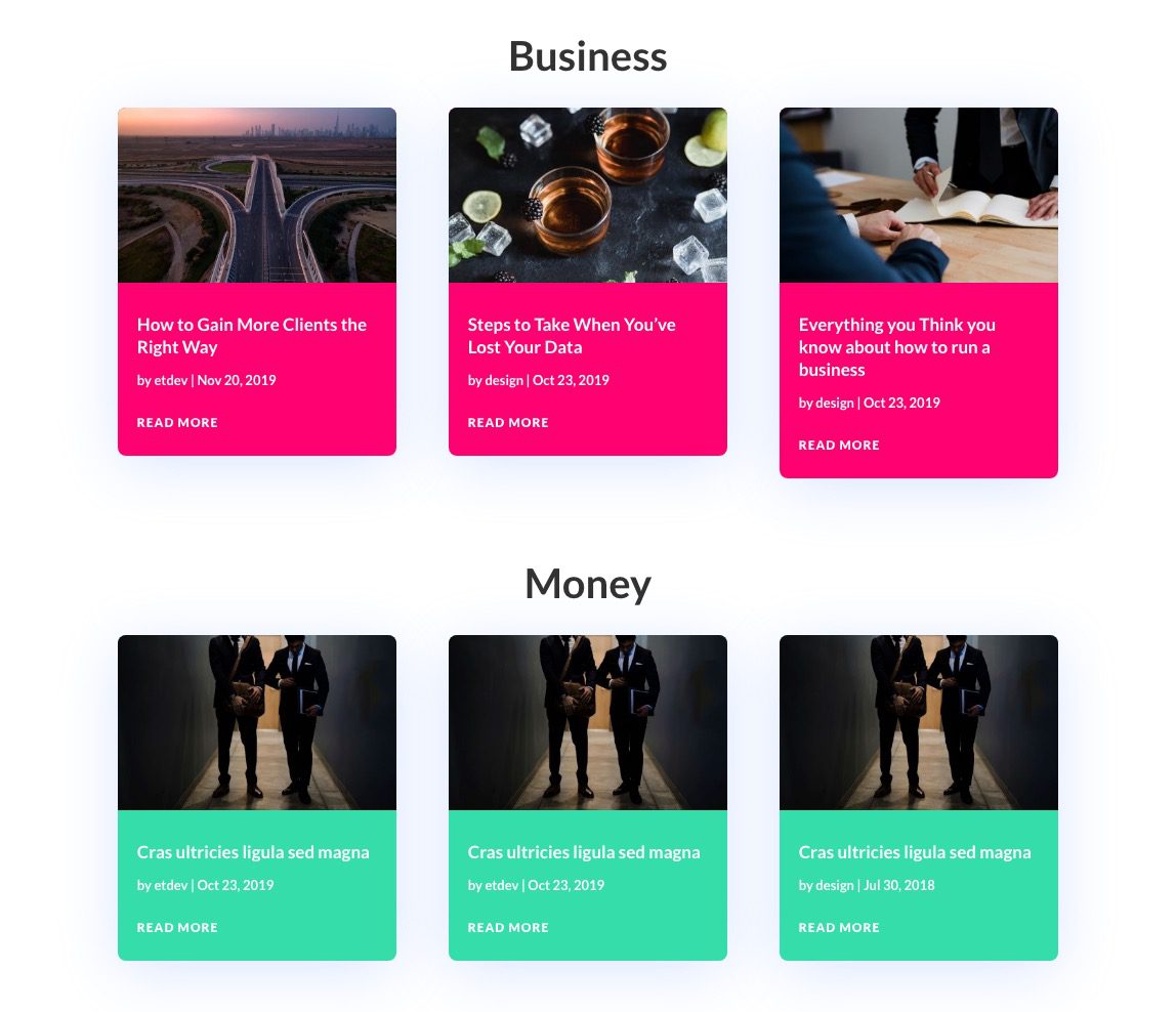
And just like that you have a featured category section on your blog page – a great way to organize blog page content!
You can even add multiple featured category sections, each with a unique design.
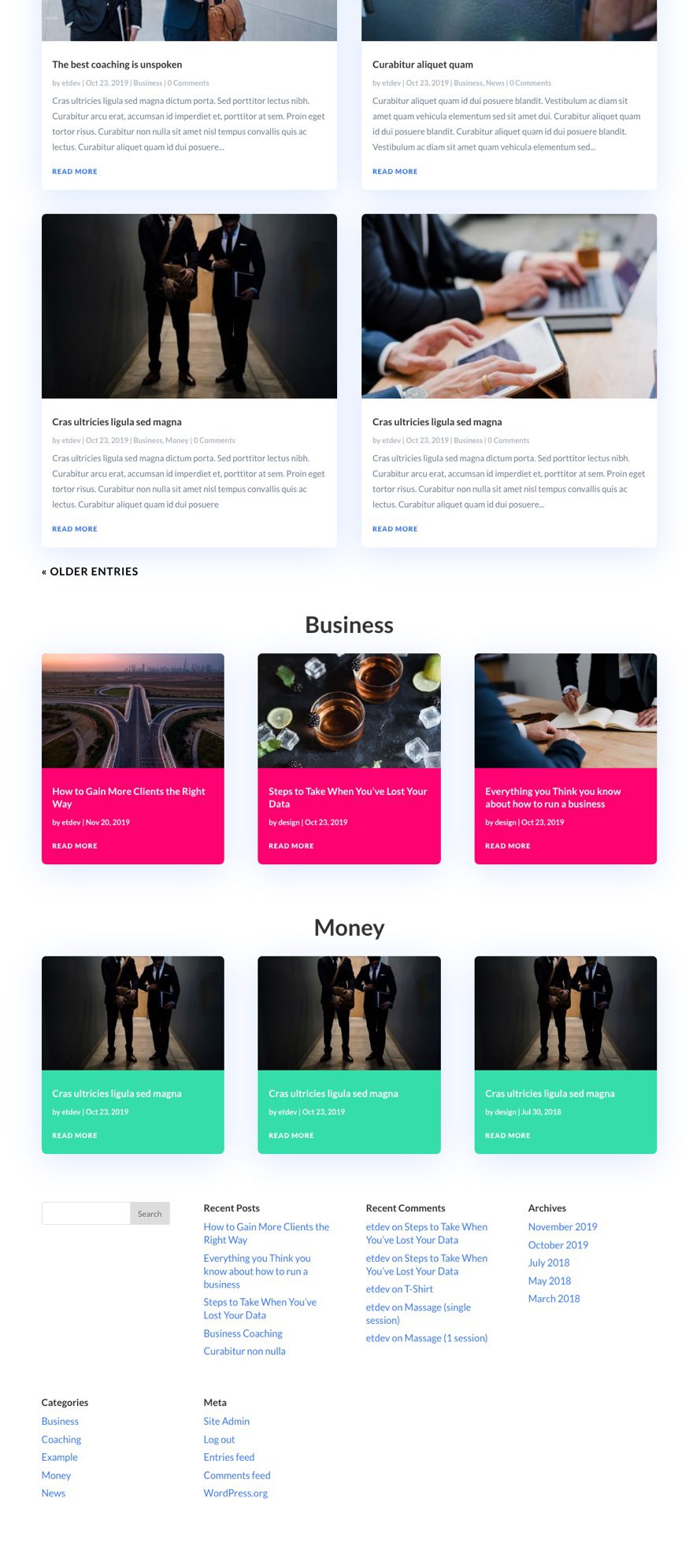
These featured category sections fit well at the bottom of the blog page template.
Final Thoughts
These tips should help you organize blog page content in all kinds of unique ways. And, these same tips would work for a lot of other types of templates (like category/archive page templates) that use the blog module to display content. Feel free to explore these tips and use them in your next project.
I look forward to hearing from you in the comments.
Cheers!
[ad_2]
Source link

