[ad_1]
Data is a key tool in the field of marketing. By using charts, graphs, tables, and other visual communication tools, you can better understand where to focus your attention and how to effectively engage consumers.
This post will provide an entry-level guide to data visualization for marketers. We’ll explain the technique, show you how to implement it, and make some suggestions for carrying visual data into your marketing content.
Let’s get to it!
An Introduction to Data Visualization
In short, data visualization is the process of translating data into a chart, graph, or other visual component. This makes it easier to read and analyze the data. Patterns and outliers are more obvious when you can see them clearly, rather than having to search for them in a spreadsheet or database.
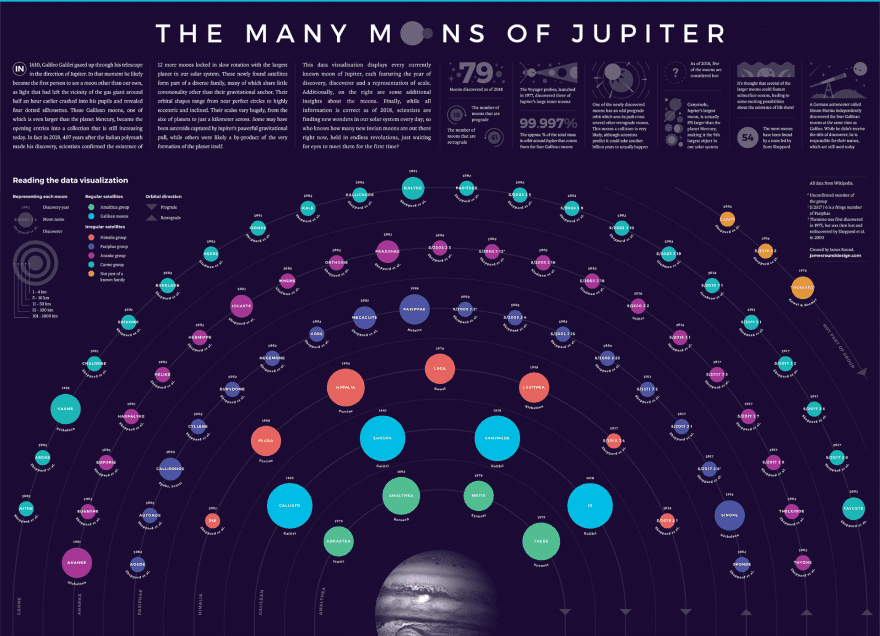
Generally speaking, it’s easier for us to comprehend shapes and colors than it is to assess a list of numbers. We can read and understand information faster when it’s shared using features such as piecharts, bar graphs, distributions maps, Venn diagrams, timelines, and more:
Data visualization is useful for a few different marketing-related tasks. For starters, you and your marketing team can use it for your own purposes when looking at data from Google Analytics, social media insights, or specific campaigns.
You can also use it as a marketing tool when crafting content for campaigns. Sharing data with consumers can help demonstrate common problems faced by your target audience and how your brand provides convenient solutions to them.
How to Render Data Visually for Marketing Purposes (In 3 Steps)
Regardless of how you plan to use data visualization in your marketing strategy, the process of creating visual representations of your data is more or less the same. The steps below will help you create effective displays for your key information.
Step 1: Determine the Best Method for Visualizing Your Data
When it comes to data visualization, you have a wide variety of options. There are so many different types of charts, graphs, diagrams, and other methods of visualizing data that determining which one to use isn’t always the most straightforward decision.
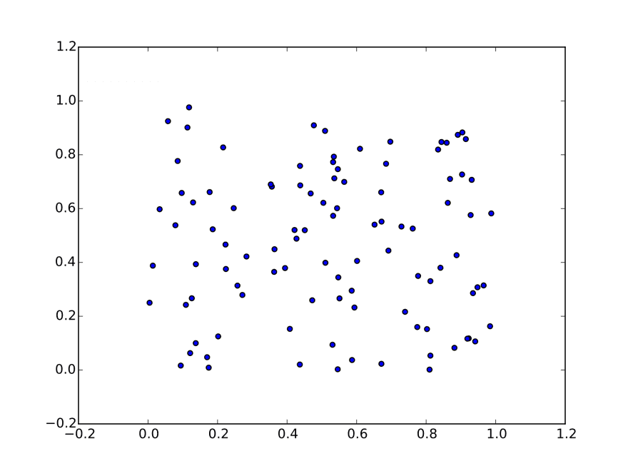
There are a few points you may want to consider. Firstly, determine how many data points you plan to include. If you have a large number of points spread out across a certain range, a dot graph or scatter plot may be more effective than cluttering a piechart or table:
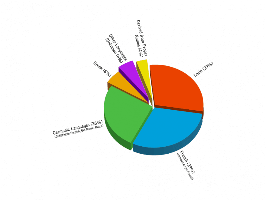
It’s also helpful to keep in mind whether you need to compare any of your data points to one another. Where you need to make a point regarding the differences between two or more pieces of data, visual tools such as piecharts and Venn diagrams tend to be most effective:
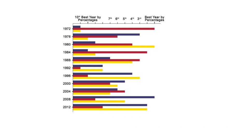
Visualizing data efficiently is also helpful and can help save space on your website, social media posts, or marketing emails. Line graphs, bar graphs, and tables can all show multiple types of data in a single visual element, while other options can only show one at a time:
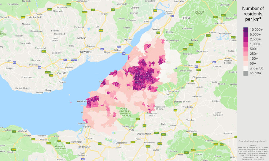
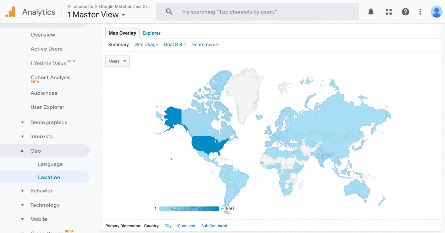
If time or location are significant to your data, you can take advantage of specific data visualization methods suitable for these types of information. Timelines and distribution maps will convey this data most effectively:
You can also look into more specialized options such as word clouds, heat maps, and flow charts. It may be helpful to try out a few different types of data visualization to determine which is the best for the data you need to display.
Step 2: Create Your Chart, Graph, or Other Visual Feature
When it comes to actually creating a visual representation of your data, you have yet another big choice to make. There are a wide variety of tools you can use to get the job done. Which is best for you depends on how you intend to use data visualization.
Simple Charts and Graphs
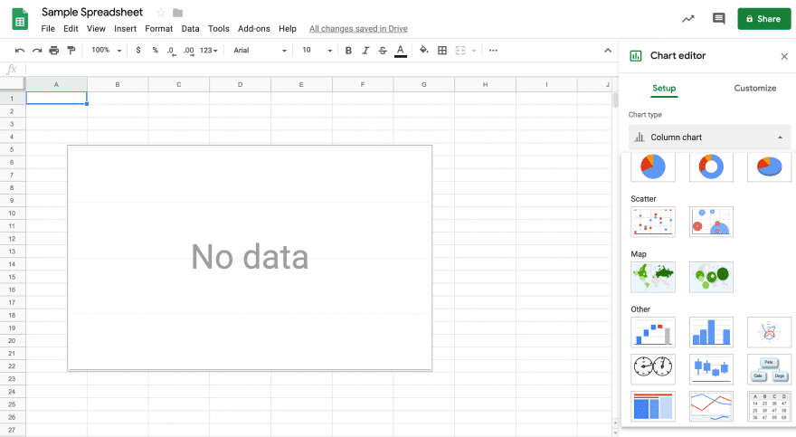
The simplest and most common solution for creating charts and graphs is likely spreadsheet platforms such as Microsoft Excel or Google Sheets. Both offer several visualization options, including bar and line graphs, piecharts, and scatter plots. Google Sheets also includes maps and timelines:
If you already have your data stored in a spreadsheet on one of these platforms, this is a fast and easy way to create a data visualization. The platform will generate your chart or graph automatically without requiring you to input the data yourself.
Graphic Design for Data Visualization
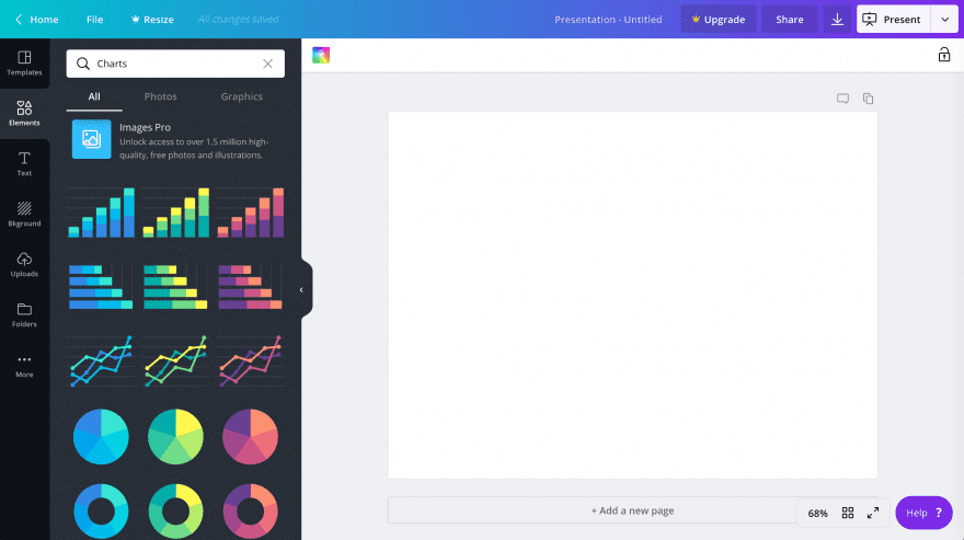
On the other hand, if you would prefer to take a more design-oriented approach to your charts, a graphic design solution such as Canva may work better for you. Canva includes a handful of pre-built charts and graphs you can customize:
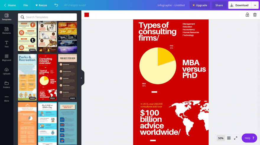
It also includes templates for email newsletters, social media posts, and infographics. The latter is particularly useful if you want to showcase several different charts, graphs, or other visual elements alongside one another:
Canva enables you to input your data by hand, or copy and paste it from a spreadsheet to create your chart or graph. The main advantage of this over a spreadsheet is that you can style your visual elements to fit the needs of your website, social media post, or email marketing campaign.
Data Visualization Platforms
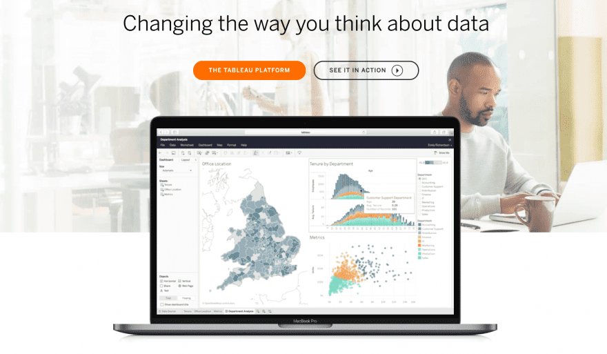
Finally, for sharing and analyzing data with your team, you might consider a data visualization platform such as Tableau:
This solution creates a wide range of visuals. It will even compile them into a handy interactive dashboard for easy navigation. You can share charts and graphs with your team members, and quickly search for the information you need to make data-driven decisions regarding your next marketing campaign.
The downside is that this platform is mainly geared towards internal use. Sharing data with consumers with take some additional work on your part to create graphics you can easily post online. Even so, for data analysis purposes, this tool is much more convenient than switching between spreadsheet tabs.
Step 3: Assess Patterns and Trends and Plan Campaigns
Once your data is visualized, you can start assessing it to shape a more effective marketing strategy. You’ll particularly want to keep an eye out for patterns and trends, as these likely indicate areas where you can market your brand’s products or services successfully:
For example, say you generate a distribution map detailing where most of your consumers are located. If you notice a large number of them in one or two specific areas, you may want to make changes to better appeal to these demographics.
You might change your social media or email distribution schedule to coincide with optimal times for posting or delivering marketing emails. Additionally, you could run special promotions in these areas. Offering free shipping or coordinating seasonal discounts can be highly effective.
This is just one example of how you can put data to work for you. By visualizing this information in graphs and charts, you should be able to more easily find similar opportunities.
Sharing Data to Generate Interest in Your Brand
Earlier in this post, we mentioned that you can use data visualization in your marketing content as well. Since 90 percent of the information our brains take in is visual, features such as charts, graphs, maps, and other methods for displaying data can make for highly effective promotional content.
There are a few areas where sharing visualized data can be particularly effective. Firstly, Instagram and Facebook lend themselves well to visual campaigns. Instagram in particular is centered around images. Consider creating a chart or graph using Canva and sharing it with a short description.
You can also use data visualization in your email marketing campaigns. Since people read differently on a screen than they do on paper, breaking up any text in your marketing emails with images or other visuals can help keep consumers more engaged.
Finally, don’t forget about your blog. Infographics are very useful blog post features and can present large amounts of data in interesting, readable ways. You can also make them sharable so readers from your blog can promote them on social media.
Conclusion
A data-based marketing strategy can help increase brand awareness and sales for your business. Information gathered from sources such as Google Analytics or social media insights gives your marketing team direction and can lead to more effective campaigns. Visualizing your data first will enable you to quickly assess it and plan accordingly.
In this post, we’ve noted three steps for rendering your data visually for marketing purposes:
- Determine the best method for visualizing your data.
- Create your chart, graph, or other visual feature.
- Assess patterns and trends and plan campaigns.
Do you have any questions about data visualization? Let us know in the comments section below!
Article Thumbnail Image wan wei / shutterstock.com
A Guide to Data Visualization for Marketers
[ad_2]
Source link

