[ad_1]
Lots of websites display source code within their articles. Displaying source code isn’t always easy. Most sites use plugins that require tags, shortcodes, embedded links, or similar solutions. The solutions can sometimes feel clumsy and even cause formatting problems. Another option is a plugin for Divi called Code Snippet Module.
Code Snippet Module is a third-party plugin that adds a new module to the Divi Builder to display code. This is different from the Divi Builder Code module. The standard Code module runs the code that you place within it. The Code Snippet module displays the code with syntax highlighting. Code Snippet Module works with Divi, Extra, and the Divi Builder plugin.
In this article we’ll see how the module works, how it can be styled to fit with your website’s design. Code for this plugin highlight was taken from W3Schools.com and is only meant to demonstrate how code is displayed within the code snippet module. Images for example layouts were taken from Unsplash.com.
Installation and Settings
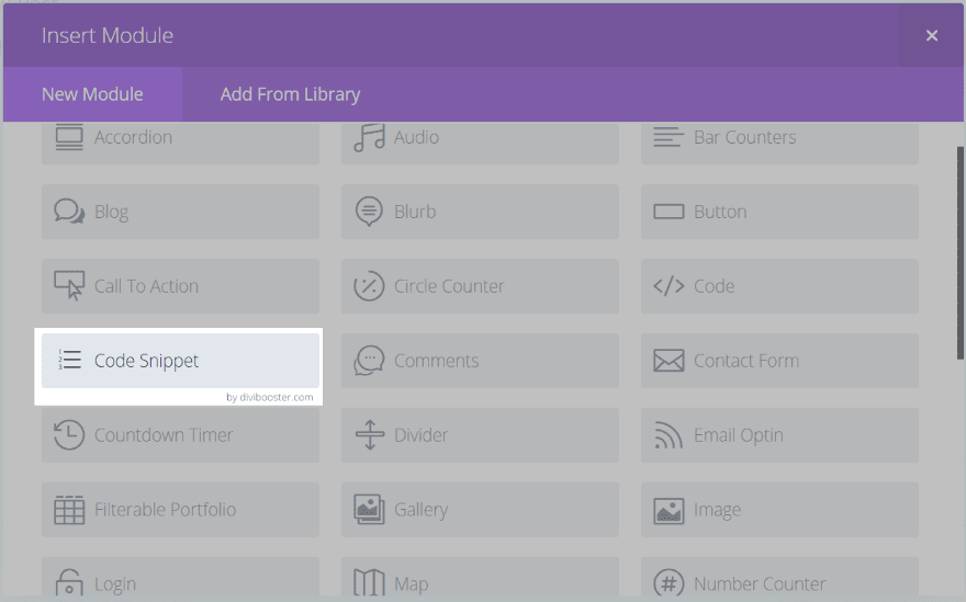
Upload and activate the plugin as normal. No account info is required. The Code Snippet Module will be added to the Divi Builder.
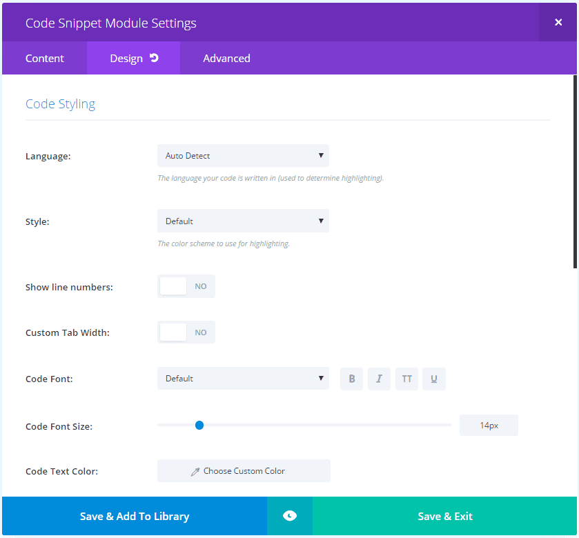
The module includes the code box in the Content tab. The Design tab has lots of settings for code styling. Settings include language (for highlighting), style (the color scheme), show numbers, custom tab width, and lots of font styles. It also includes the standard heading and border styling.
It will attempt to auto-detect the language by default. If it has trouble with the auto-detect some of the code may not be formatted correctly. If this happens you can choose the language manually. I had no issues with the auto-detect formatting the language correctly.
It has over 70 styles. They mostly change the colors of the fonts and the backgrounds. Some have background patterns but most are solid colors. The fonts match a code-type, so variables will be one color, statements will be another, comments use a different color, etc.
Using the Code Snippet Module
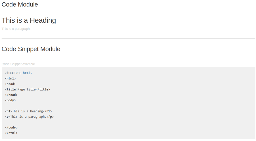
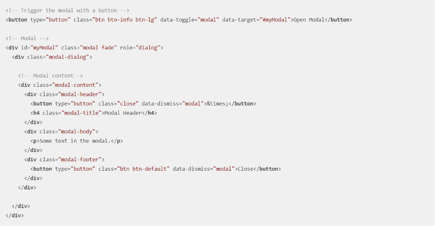
The image above shows the standard Divi Code module on top and the Code Snippet module on bottom. This shows how the two modules react with code. Both modules have the same HTML code placed within them. The Divi Code module runs the code. The Code Snippet module displays the code.
This is the default settings. Let’s take a look at several languages using different styles. I’ve included the default settings for each one to help you compare.
HTML
This is the same code as in the previous example. It’s using the default style, but I’ve added line numbers and changed the font to Georgia. I increased the font size to 18 point. Tags are in bold.
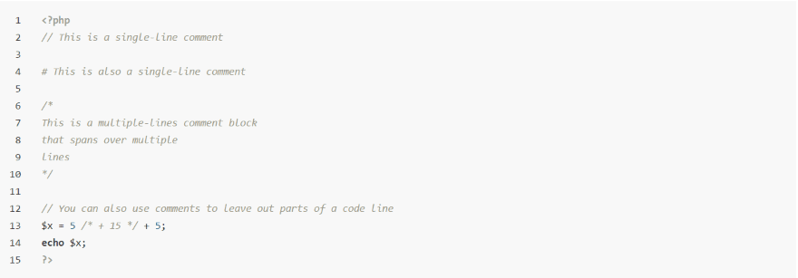
Here’s a look at comments in the default settings. The comments are light gray so they look different than the markup.
This one uses the style called Darkula. The tags are in orange.
CSS
The CSS selectors and properties are in bold. Numerical values are in red. Braces and textual values use the default code font. This uses auto-detect and the default style.
This is the Agate style. Selectors are in orange and properties are in yellow. Braces and textual values on in the default white font while numerical values are in red.
CSS comments are light gray in the default settings.
This example uses Codepen Embed.
This one is Estuary Dark. I’ve included line numbers.
Here’s Estuary Light. I’ve included the line numbers in this one as well.
JavaScript
Here’s a JavaScript snippet using the default settings. Statements are in green and gray while the HTML element and values are red.
This is JavaScript using the style called Android Studio. Statements are in a grayish blue while the HTML element and values are green.
Here’s the same snippet using Arduino Light. I’ve added a blue background to the row to make the code snippet module stand out. Statements are in red and grayish blue while the HTML element and values are green.
This one includes comments. The comments are multi-colored.
This is the same code using Dune Dark.
This is Dune Light.
This one uses Far. I’ve added line numbers.
SQL
The SQL statements are in bold while the tables use the default font. Values are in red.
This uses the style called Brown Paper. The statements are in blue, tables are black, and values are purple. This is one of the few styles that use a pattern in the background.
Here’s the default settings with comments. The comments are lighter than the rest of the code.
Here’s a look at Foundation. I’ve included line numbers.
PHP
The PHP language tags are in blue. Keywords use the default font, functions are in bold, and variables are in red.
This examples uses Cave Dark. The PHP language tags are in red. Keywords are gray, functions are in purple, and variables are in blue/green.
This one is Cave Light. It has a slight purple background and the colors for the code are a variation of Cave Dark.
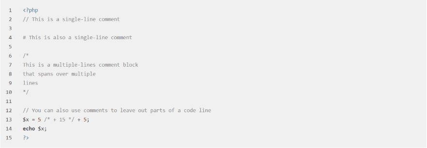
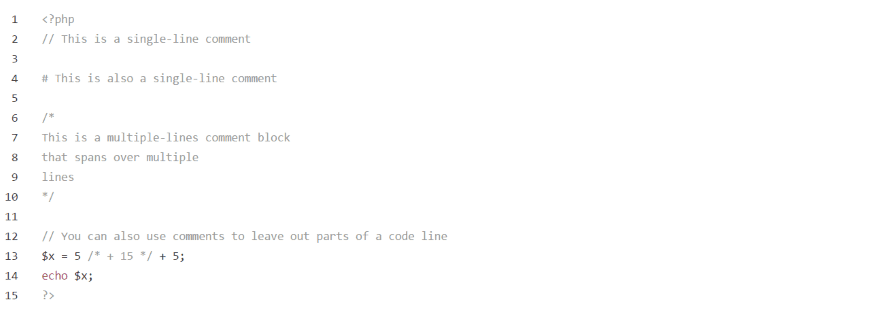
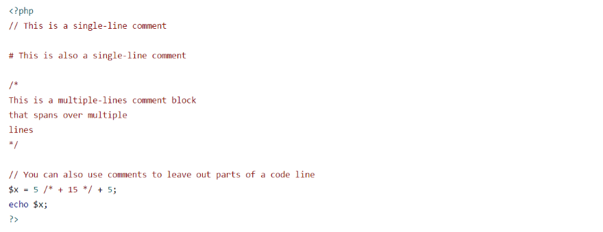
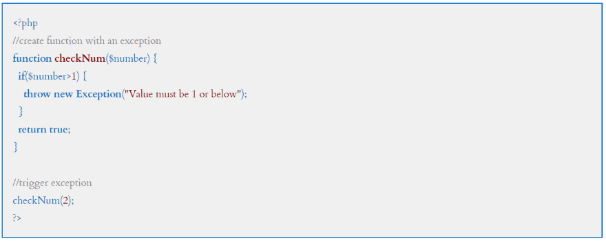
This one has comments using the default settings.
This style is Github. The comments are in italics.
This is Github Gist.
This one is Google Code.
This one is Visual Studio. This will look familiar to VS users. I’ve added a background to help it stand out. Using a border is another option.
Bootstrap
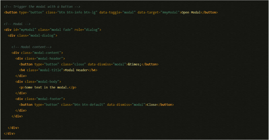
Here’s a Bootstrap example using the default styles. Bootstrap isn’t specifically stated as a language (since it’s an HTML, CSS, and JavaScript framework) but I wanted to show that it does format correctly.
This is Pojoaque.
jQuery
Here’s a look at jQuery.
This uses XT256. I’ve given it a border to help it stand out.
XML
Here’s an example of XML using the default settings.
This is Zenburn. I’ve chosen XML from the dropdown and as you can see the auto-detect in the previous image has formatted the code correctly.
This one is School Book. I’ve added line numbers. The code lines up with the page lines at this font size. Increasing the size aligns them differently.
Making Adjustments
This is a PHP snippet. Let’s make some manual changes to the design.
I changed the code font type, size, color, and line height. I also added a border.
Tab Width
In this example (which uses Sulphur Pool Light) I added tabs before pasting in the code. Fortunately you can adjust the tab width so the code displays correctly.
I’ve adjusted the tab width to 1, which decreases the amount the tab is indented. This is Sulphur Pool Dark.
Custom Styling
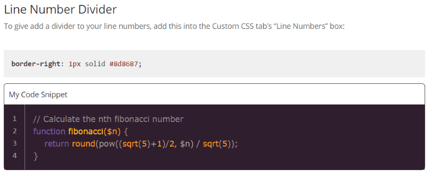
The code snippet display area can even be styled with CSS. The documentation includes some styling examples. This is one of the examples provided.
Layout Examples
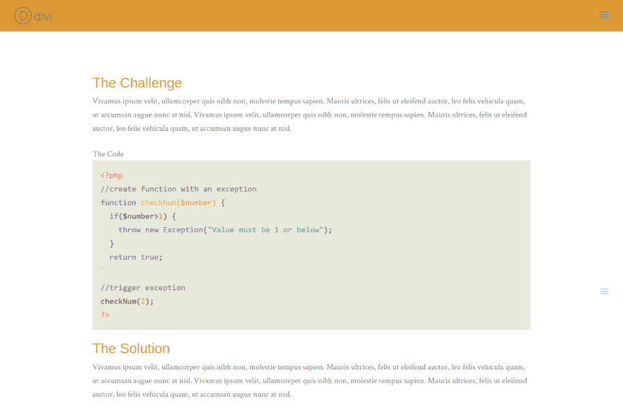
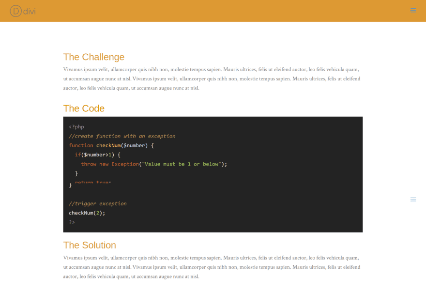
Of course the advantage of the module is that it uses the Divi Builder and fits in with your Divi layouts. There are enough styles that you can fit it into the design of your site with ease. This one uses Paraiso Light. It fits in well with the styling of my sample page.
This one is Railcasts. I’ve customized the header font style, size, and color to match the headers of the page.
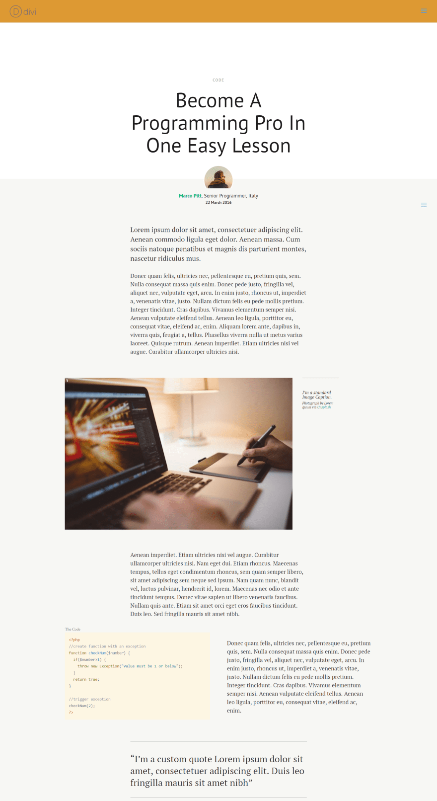
This one uses the blog post layout from Divi 100. The code style is Solarized Light.
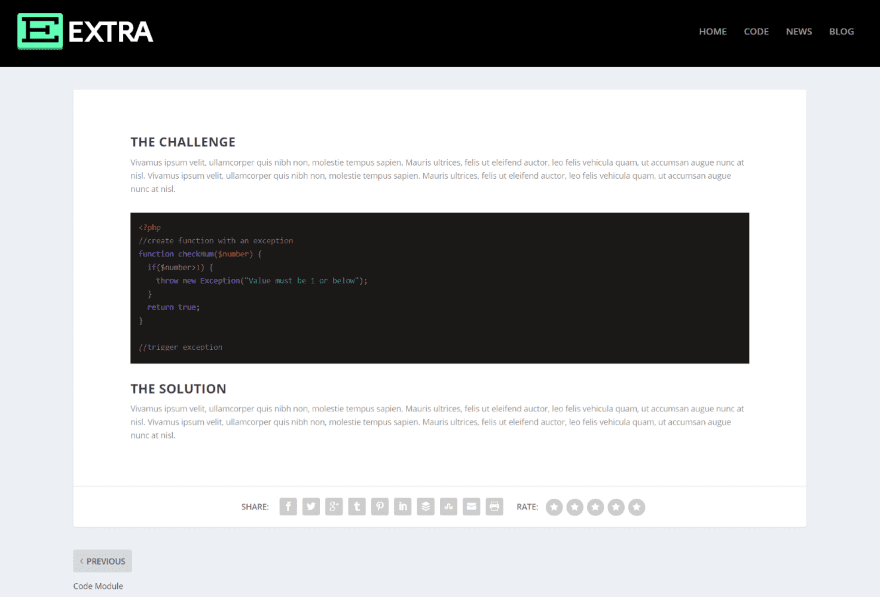
It also works great with Extra. This example uses Plateau Dark.
License and Documentation
It has unlimited installs. It even comes with a 60 day money back guarantee. Documentation is provided on the developer’s website. It includes instructions and CSS styling examples.
Final Thoughts
Code Snippet Module is a great way to display code within your Divi layouts. It’s easy to change the look and feel and the code is clean and can be copied for pasting. I’ve only shown a small handful of the many languages it’s compatible with and I had no issues with formatting. All of the styles work with all of the languages and they can be styled further using CSS. If you provide code for your readers, Divi Snippet Module might be the plugin you need.
We want to hear from you! Have you used Code Snippet Module? Let us know what you think in the comments below.
Featured Image via hanss / shutterstock.com
[ad_2]
Source link


