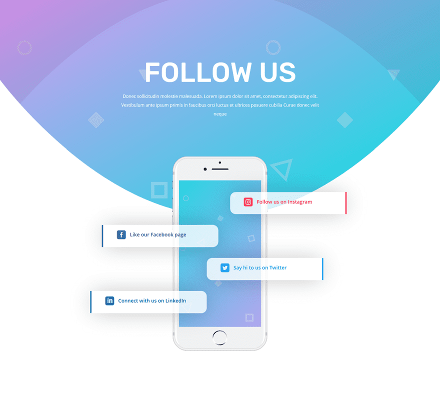
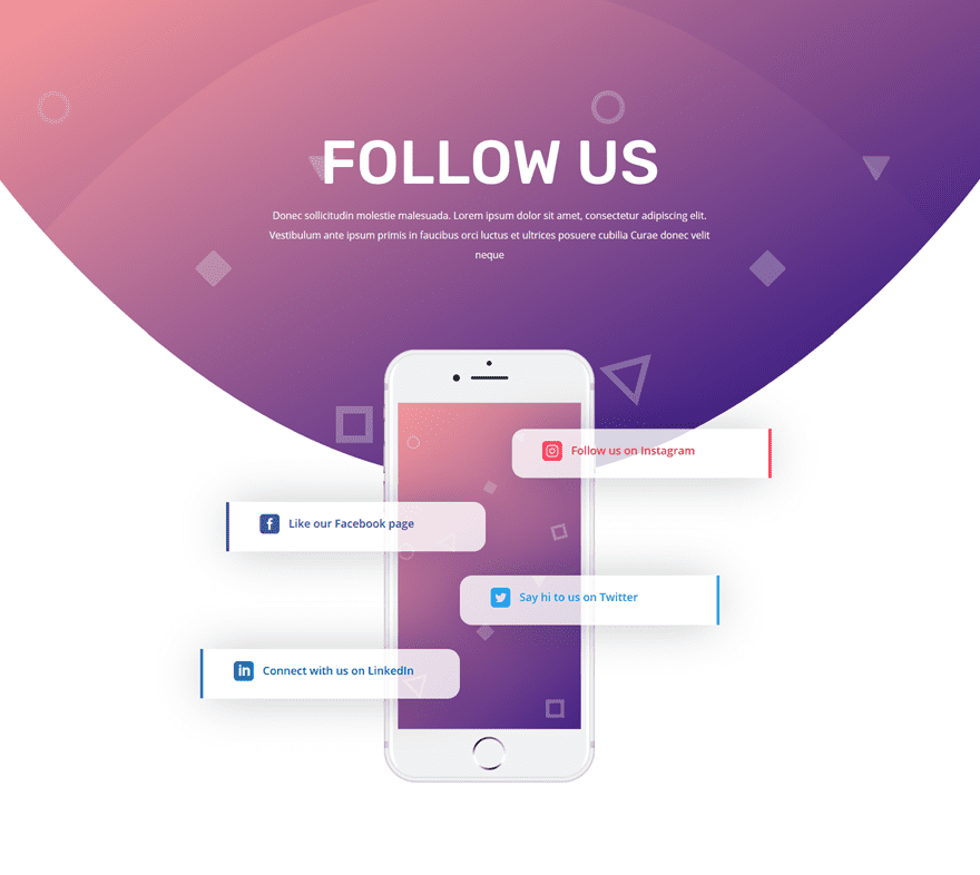
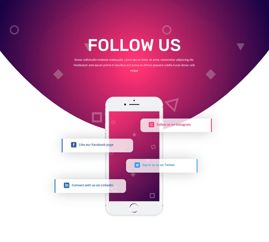
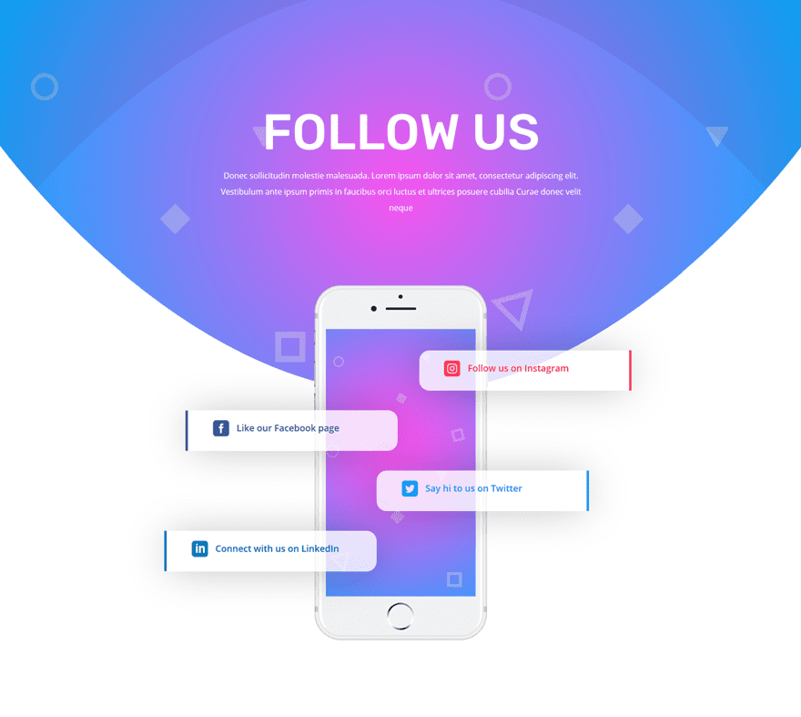
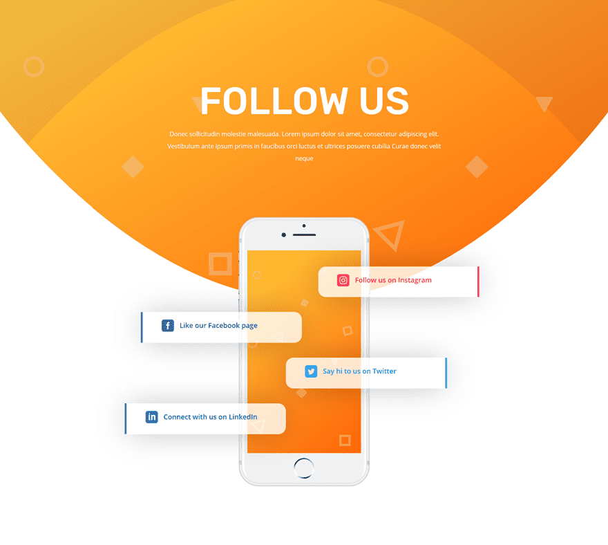
Websites and social media often go hand in hand. Social networks are used to drive traffic to websites but the opposite is true as well, especially if you want to increase engagement on your social networks. That’s why most websites include links to their social networks on various pages. You can go with the classic way and add icons, or you can try a more unique approach.
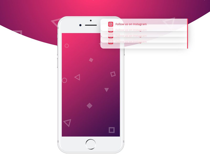
We’ve created a stunning and creative social follow design that you can download and can use on any website you build using Divi. On top of that, we’ve also provided you with 5 different color palettes that look great for this design.
Let’s get to it!
Preview
Let’s start off by taking a look at the different variations of this design and the view on different screen sizes.
Download The Social Follow Design for FREE
To lay your hands on the social follow design with 5 different color palettes, you will first need to download them using the button below. To gain access to the download you will need to subscribe to our newsletter by using the form below. As a new subscriber, you will receive even more Divi goodness and a free Divi Layout pack every Monday! If you’re already on the list, simply enter your email address below and click download. You will not be “resubscribed” or receive extra emails.
Color Palettes
We’re going to guide you step by step through the process. But before we do that, go ahead and choose a color palette of choice and keep the color codes close by. We’ll refer to the color number throughout the tutorial.
Palette #1
- Color #1: #D09CF1
- Color #2: #00e2df
Palette #2
- Color #1: #ffa0a0
- Color #2: #10007f
Palette #3
- Color #1: #ff3273
- Color #2: #050042
Palette #4
- Color #1: #f954ee
- Color #2: #00aeff
Palette #5
- Color #1: #ffca3a
- Color #2: #ff6005
Recreate Social Follow Design from Scratch
Add Section #1
Gradient Background
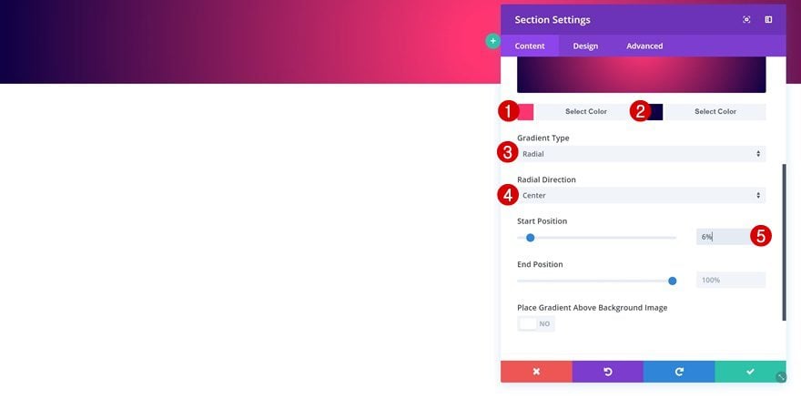
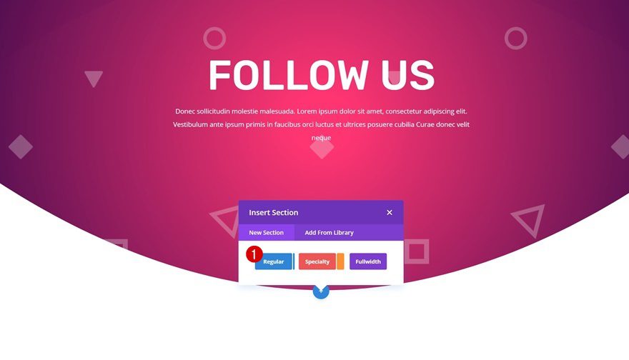
Start by adding a regular section to a new or existing page. Open the section settings and apply a gradient background:
- Color 1: Color #1 (Find in Color Palette)
- Color 2: Color #2 (Find in Color Palette)
- Gradient Type: Radial
- Radial Direction: Center
- Start Position: 6%
Background Image
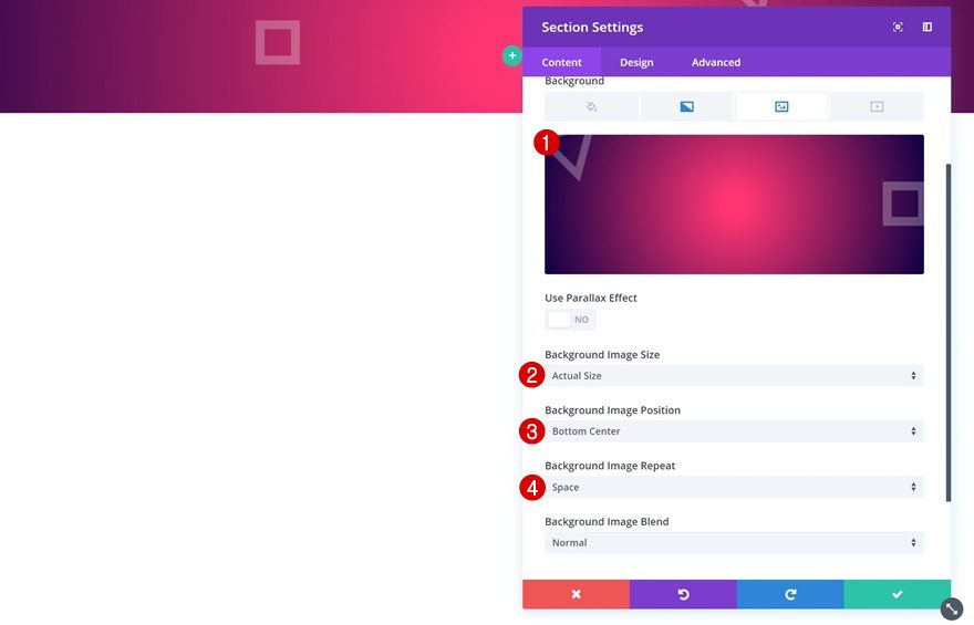
Then, upload the background pattern which you can find by going to the downloaded folder > Background Pattern. Combine the background pattern with the following background settings:
- Background Image Size: Actual Size
- Background Image Position: Bottom Center
- Background Image Repeat: Space
Top Divider
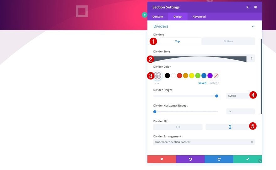
Open the divider settings next and add a top divider.
- Divider Style: Find in List
- Divider Color: rgba(72,0,79,0.08)
- Divider Height: 500px
- Divider Flip: Vertical
Bottom Divider
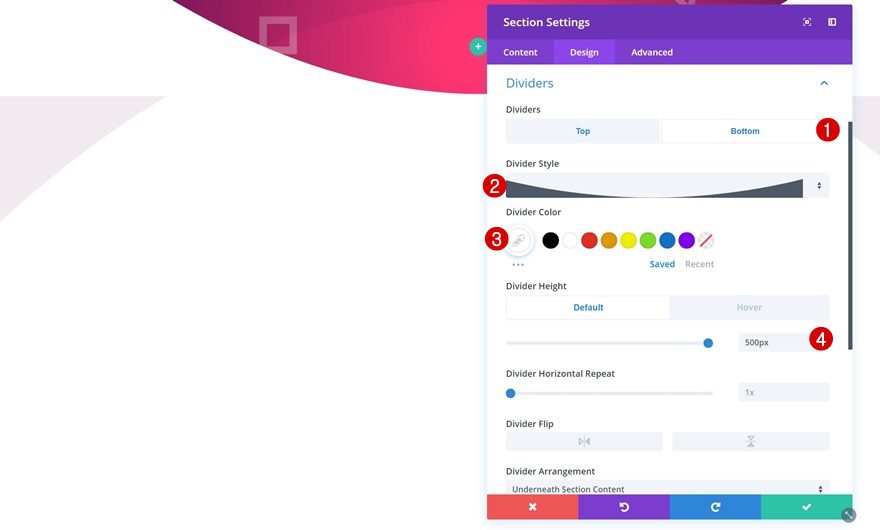
Add a bottom divider as well.
- Divider Style: Find in List
- Divider Color: #FFFFFF
- Divider Height: 500px
Spacing
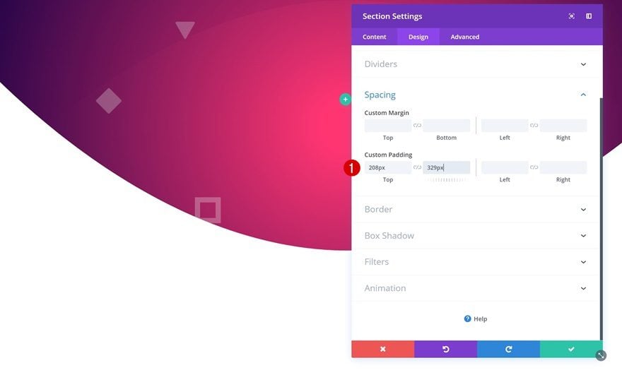
Then, go to the spacing settings and add some custom padding.
- Top Padding: 220px
- Bottom Padding: 329px
Animation
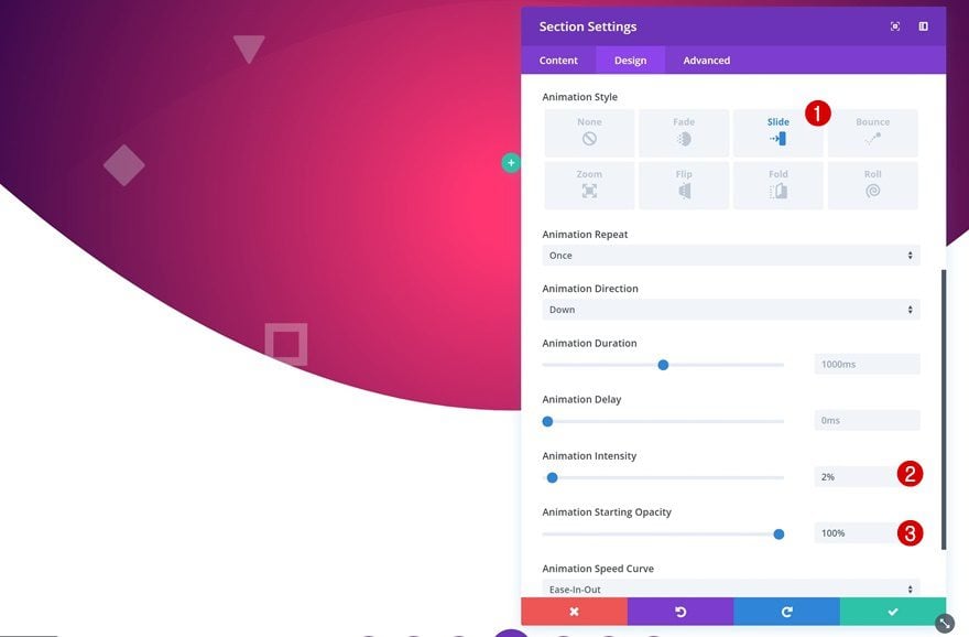
Lastly, add a subtle animation to the section.
- Animation Style: Slide
- Animation Direction: Down
- Animation Intensity: 2%
- Animation Starting Opacity: 100%
Add Row
Column Structure
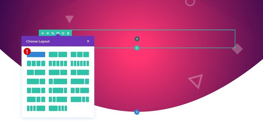
We can now add a new row using the following column structure:
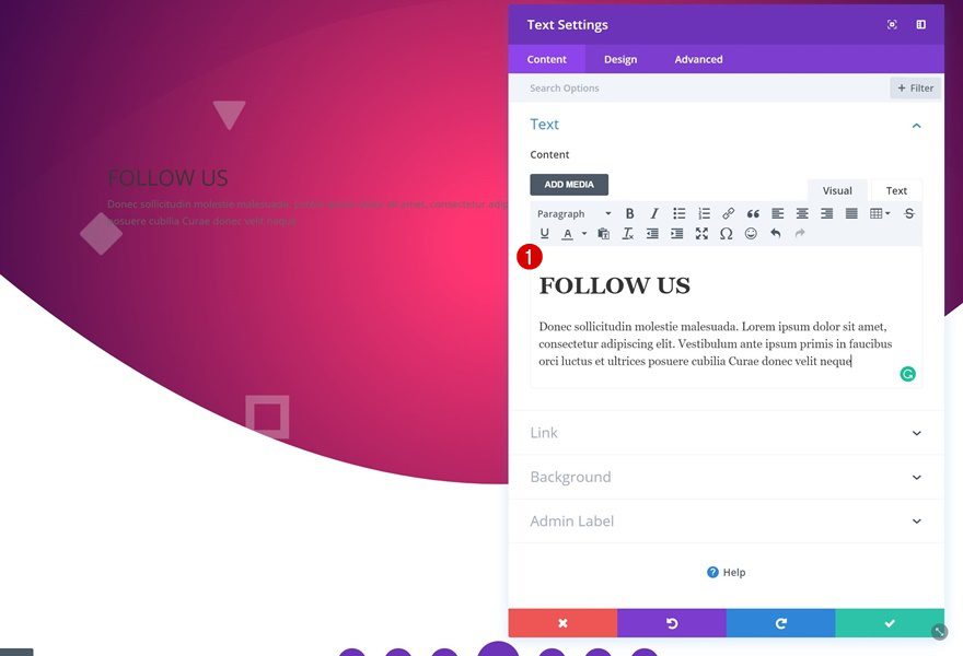
Add Text Module
Add Content
The only module we’ll need in this row is a Text Module. Add a heading and a paragraph to the content box.
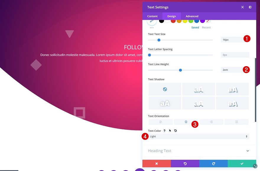
Text Settings
Then, go to the text settings and make some modifications.
- Text Size: 16px
- Text Line Height: 2em
- Text Orientation: Center
- Text Color: Light
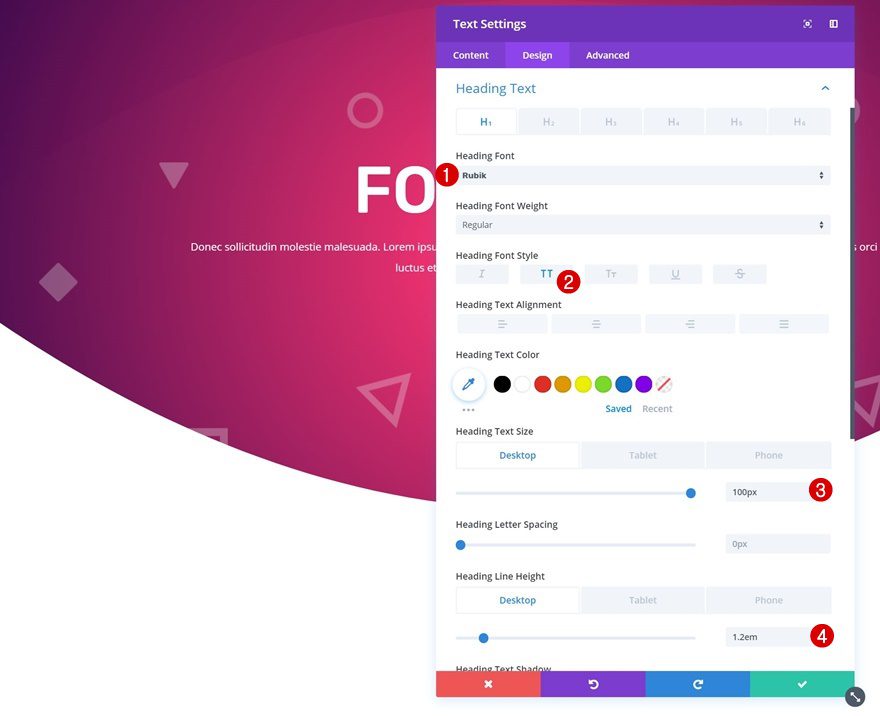
H1/H2 Text Settings
Change the settings of the heading you’ve chosen as well.
- Heading Font: Rubik
- Heading Font Style: Uppercase
- Heading Text Size: 100px (Desktop), 42px (Tablet), 32px (Phone)
- Heading Line Height: 1.2em
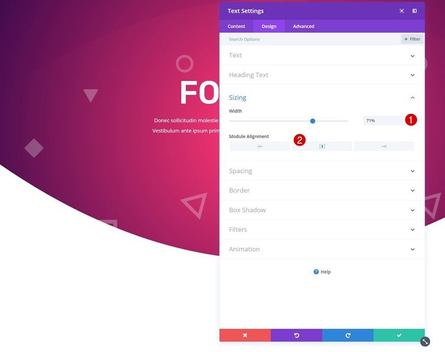
Sizing
Decrease the width of the module next.
- Width: 71%
- Module Alignment: Center
Add Section #2
Right below the previous section, go ahead and add a new regular section. No need to make any changes to the section settings.
Add Row
Column Structure
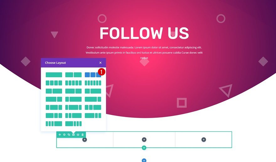
Add a row using the following column structure:
Sizing
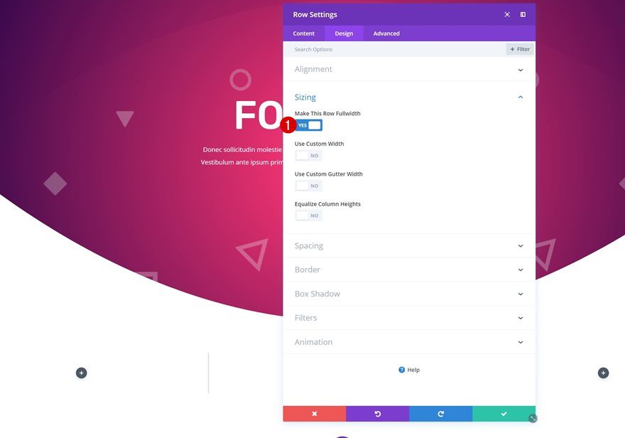
Then, make the row fullwidth in the sizing settings.
- Make This Row Fullwidth: Yes
Add Image Module to Column 2
Upload Mockup
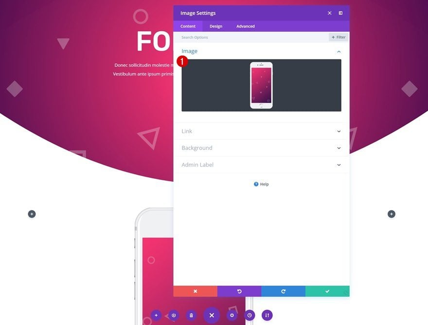
Time to start adding modules! Start off by adding an Image Module to the second column. Upload the mockup that matches the color palette you’ve chosen. You can find all varieties of mockups by going to the downloaded folder > Mockups.
Sizing
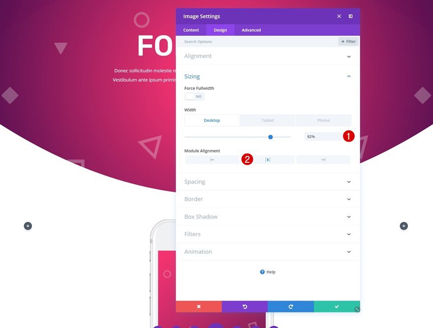
Change the sizing of the Image Module too.
- Width: 82% (Desktop), 100% (Tablet & Phone)
- Module Alignment: Center
Spacing
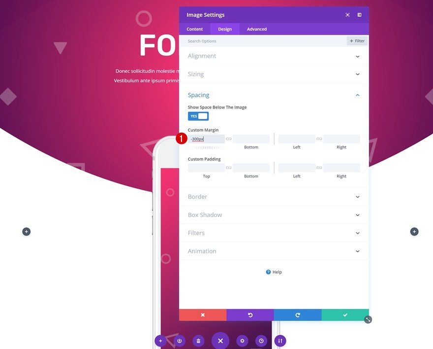
To overlap the Image Module and the previous section, add some negative margin to the Image Module.
Add Blurb Module to Column 3
Add Content
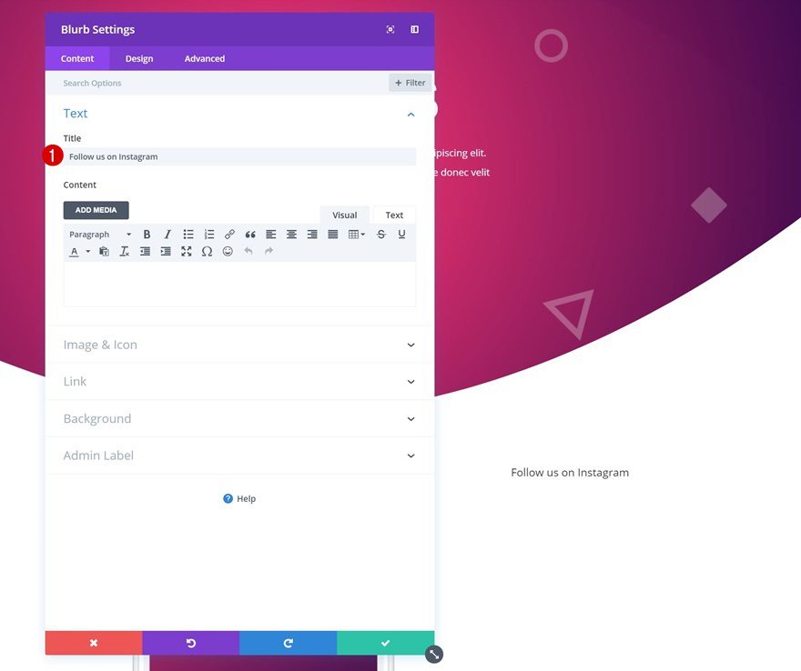
We can now add all the social networks! To create them, we’re using Blurb Modules. Go ahead and add the first Blurb Module to the third column and change the content.
Add Link
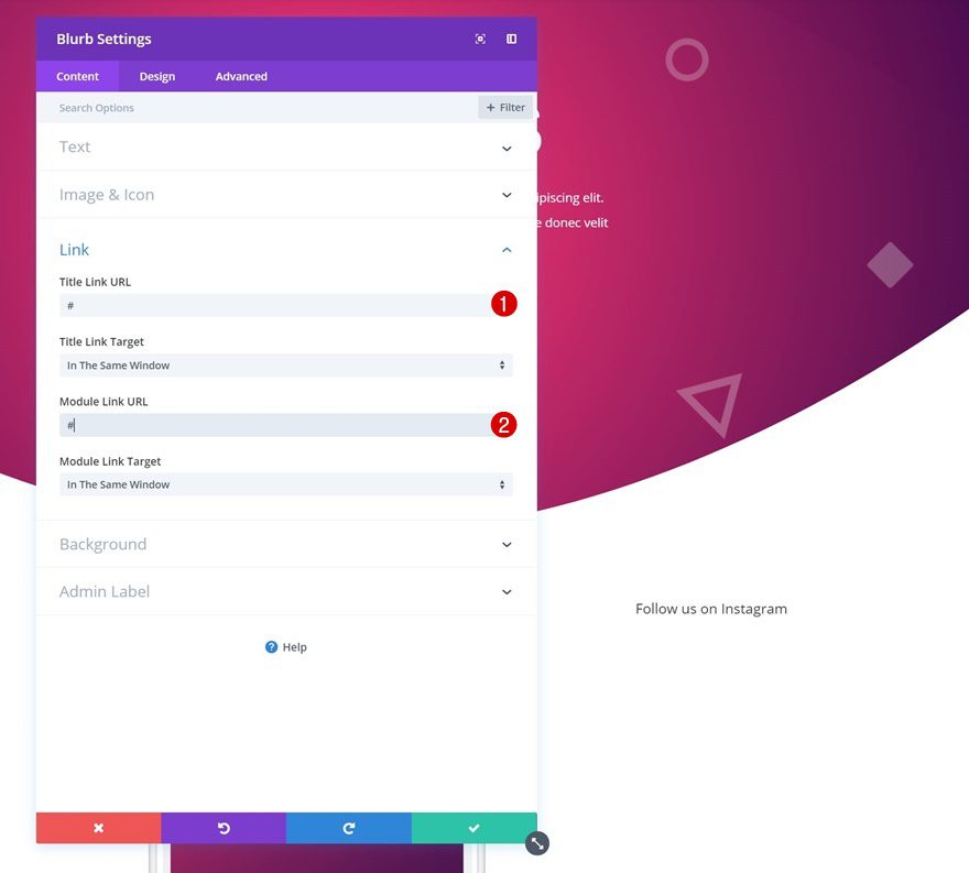
Add a link to the social page next.
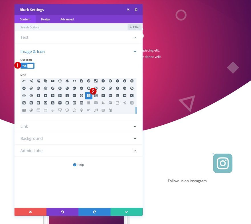
Choose Icon
Choose your icon as well.
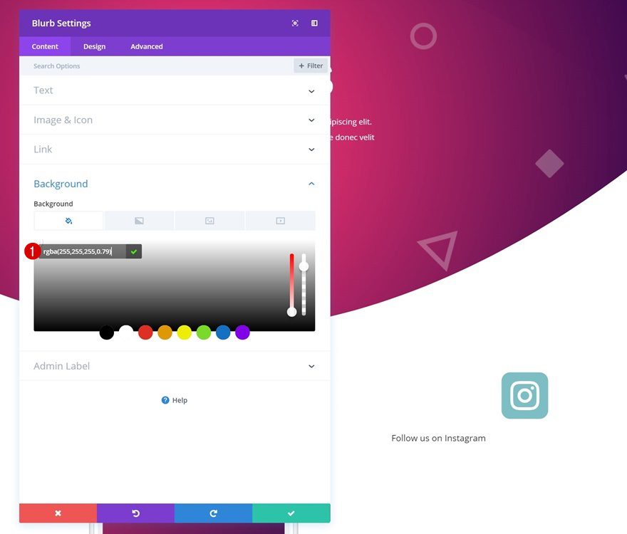
Background Color
Continue by going to the background settings and using a slightly transparent background color.
- Background Color: rgba(255,255,255,0.79)
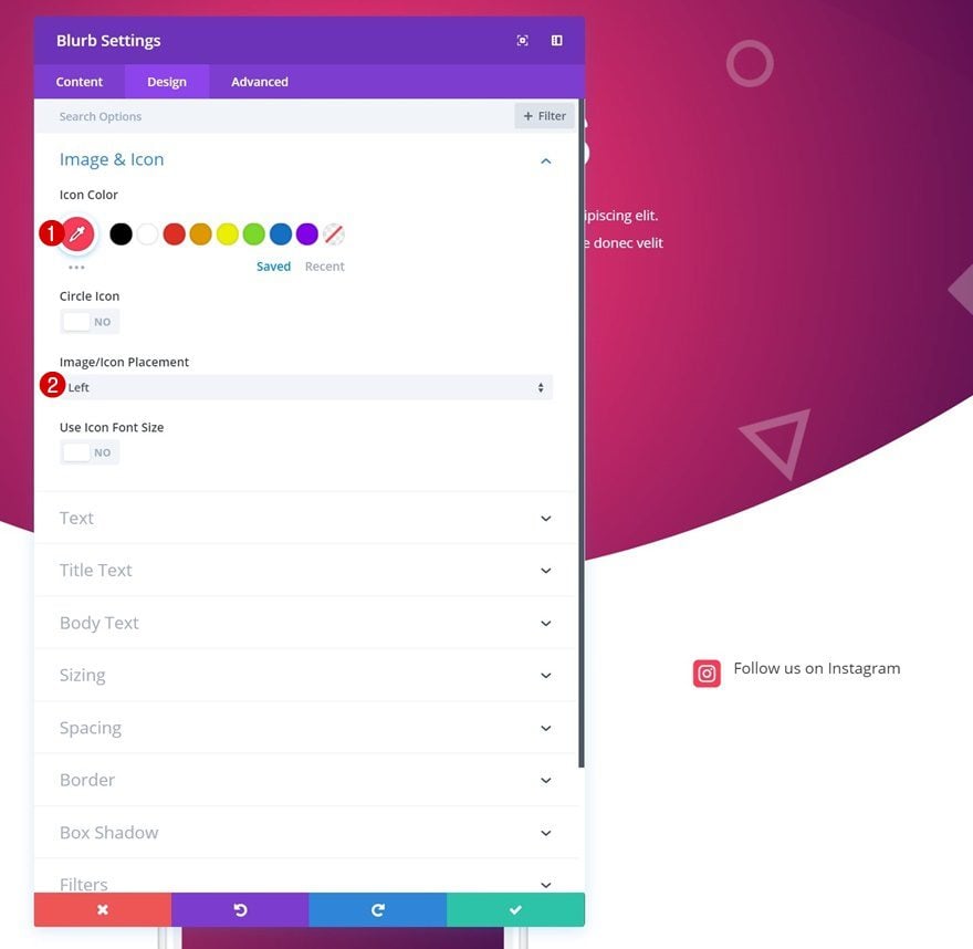
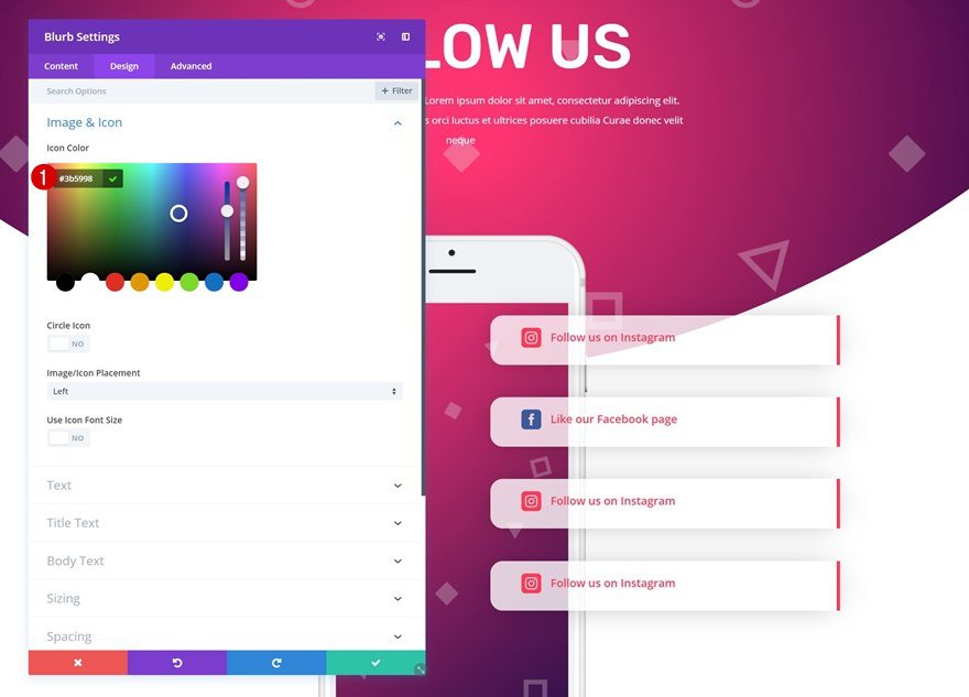
Icon Settings
Then, change the icon settings. Here, we’re using one of Instagram’s official colors.
- Icon Color: #fb3958
- Icon Placement: Left
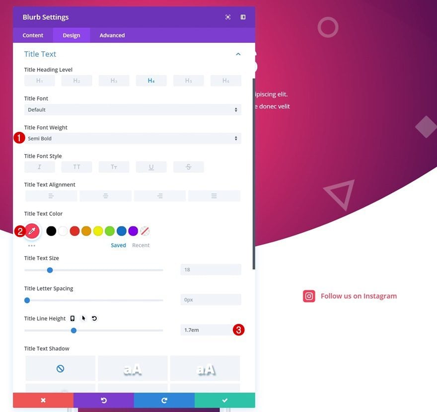
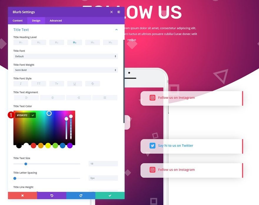
Title Text Settings
Make some changes to the title text settings next.
- Title Font Weight: Semi Bold
- Title Text Color: #fb3958
- Title Line Height: 1.7em
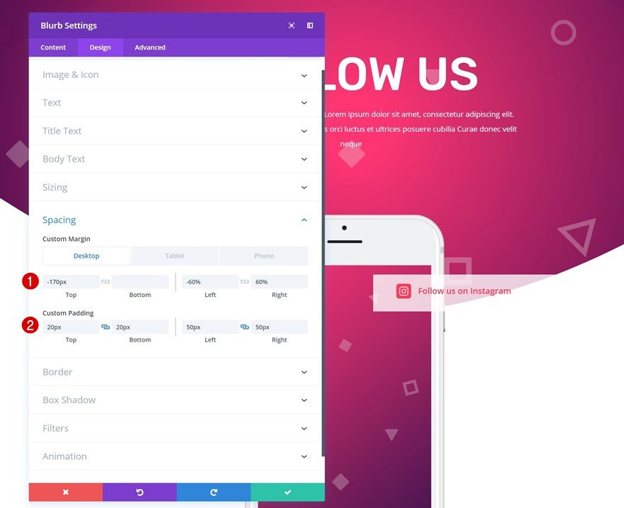
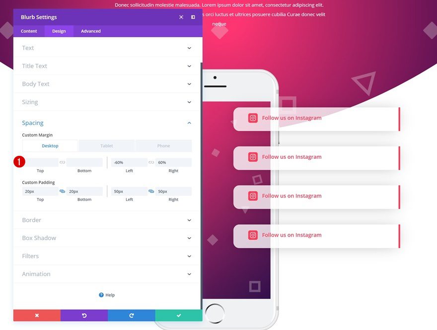
Spacing
To create an overlap with the mockup, we’re going to add some spacing values.
- Top Marign: -170px (Desktop), -800 (Tablet), -700 (Phone)
- Left Margin: -60% (Desktop), 0% (Tablet & Phone)
- Right Margin: 60% (Desktop), 0% (Tablet & Phone)
- Top Padding: 20px
- Bottom Padding: 20px
- Left Padding: 50px
- Right Padding: 50px
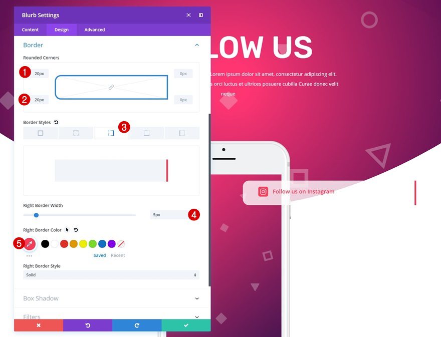
Border
We’ll play around with the border settings as well.
- Top Left Border: 20px
- Bottom Left Border: 20px
- Right Border Width: 5px
- Right Border Color: #fb3958
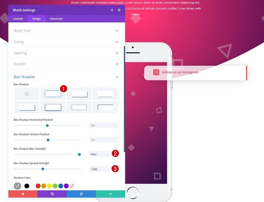
Box Shadow
Adding a box shadow will give the design element some depth.
- Box Shadow Blur Strength: 80px
- Box Shadow Spread Strength: -11px
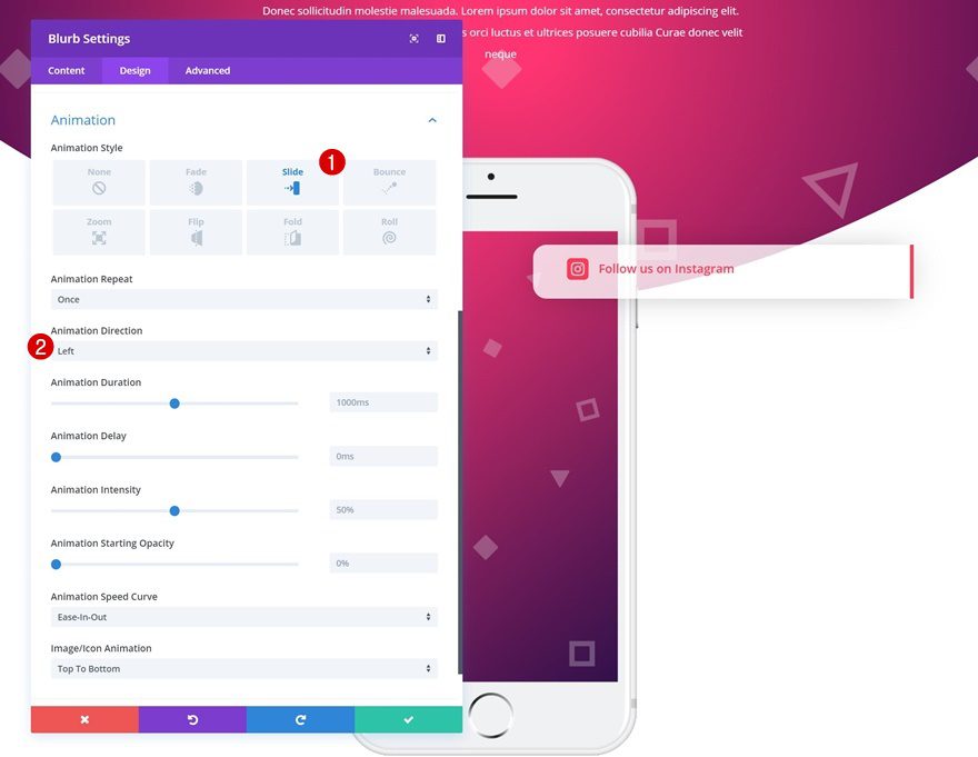
Animation
Lastly, we’re using a slide-in animation style to imitate the mobile notification effect people are familiar with.
- Animation Style: Slide
- Animation Direction: Left
Clone Blurb Module Three Times
To save time, we’re going to clone the Blurb Module three times. Then, we’ll modify each one of the duplicates to create our desired outcome.
Remove Negative Top Margin of Duplicates
To maintain a good overview, we’ll start by removing the negative custom margin of each one of the duplicates.
Unique Blurb Module Settings
Blurb Module #2
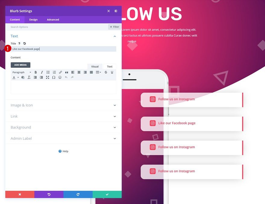
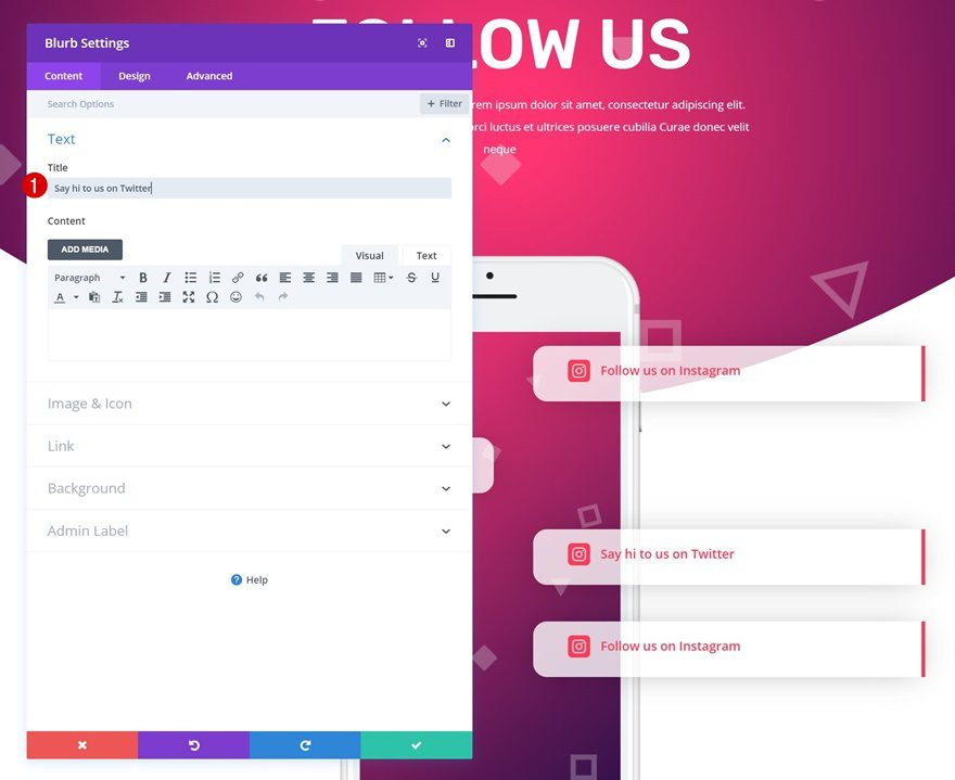
Change Copy
Open the second Blurb Module in the third column and change the content.
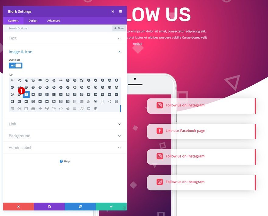
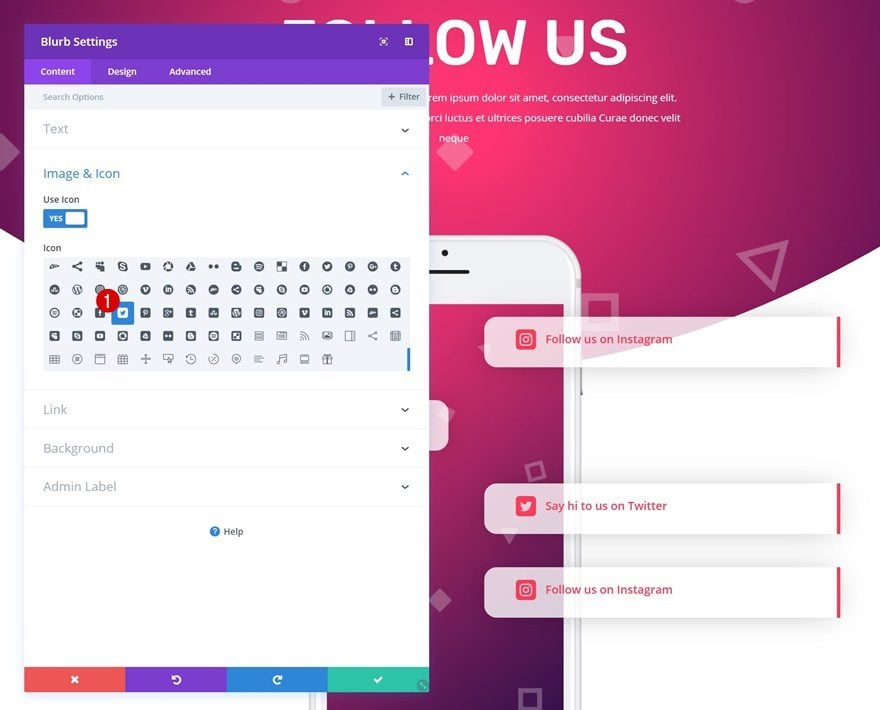
Choose Icon
Select another icon as well.
Icon Settings
Change the icon color to match the social network it is representing.
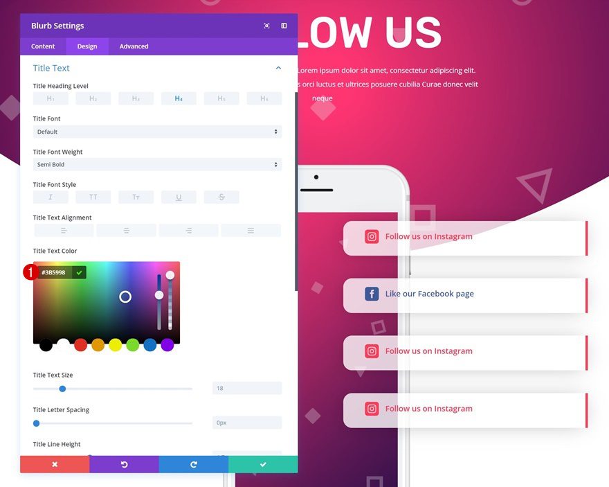
Title Text Settings
Use that same color for the title text color as well.
- Title Text Color: #3b5998
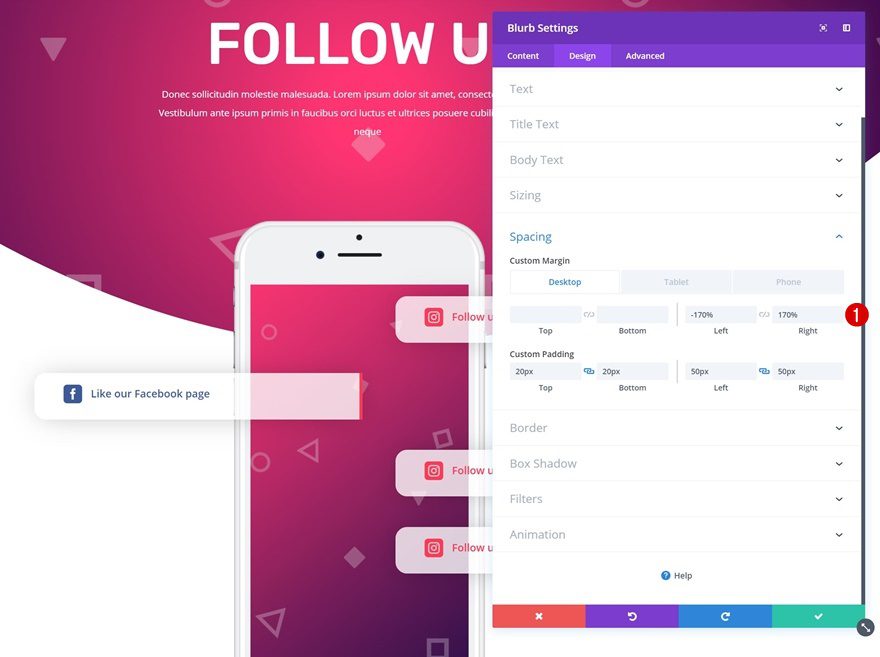
Spacing
To create another overlap on the other side of the phone, change the spacing values.
- Left Margin: -170% (Desktop), 0% (Tablet & Phone)
- Right Margin: 170% (Desktop), 0% (Tablet & Phone)
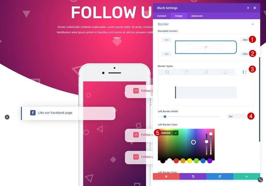
Border
Modify the border settings next.
- Top Right Corner: 20px
- Bottom Right Corner: 20px
- Left Border Width: 5px
- Left Border Color: #3b5998
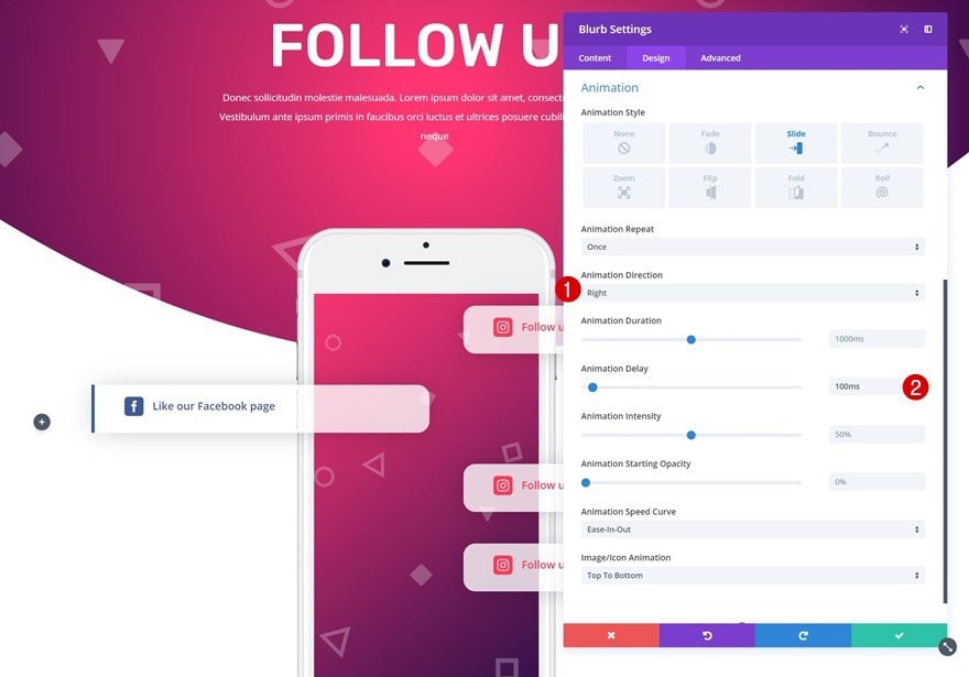
Animation
Make this Blurb Module slide-in from the other side with a small delay as well.
- Animation Direction: Right
- Animation Delay: 100ms
Blurb Module #3
Change Copy
The third Blurb Module needs some different copy as well.
Choose Icon
Choose another icon next.
Icon Settings
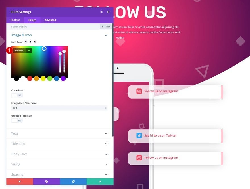
Change the icon color into one that matches the social network it is representing.
Title Text Settings
Use the same color for the title text color.
- Title Text Color: #1da1f2
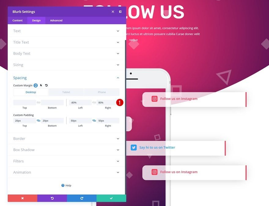
Spacing
Change the spacing settings as well.
- Left Margin: -80% (Desktop), 0% (Tablet & Phone)
- Right Margin: 80% (Desktop), 0% (Tablet & Phone)
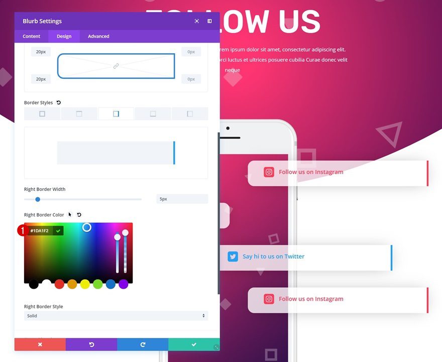
Border
Change the border color in the border settings too.
- Right Border Color: #1da1f2
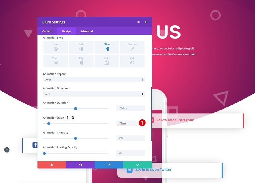
Animation
Lastly, add a small delay to the animation that is already there.
Blurb Module #4
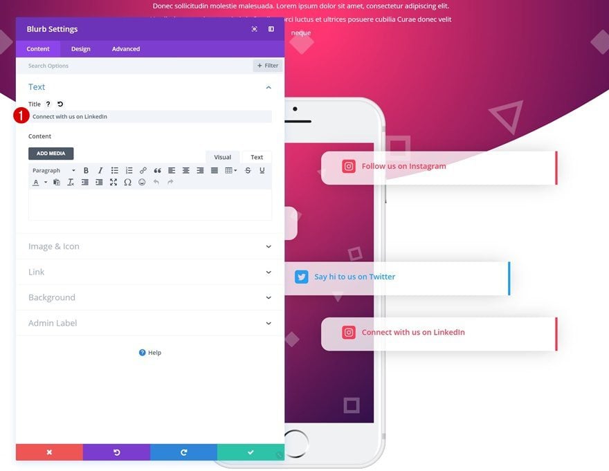
Change Copy
For the last Blurb Module, we’re starting off by changing the content.
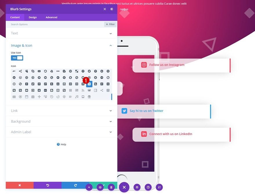
Choose Icon
Select another social icon in the Image & Icon settings next.
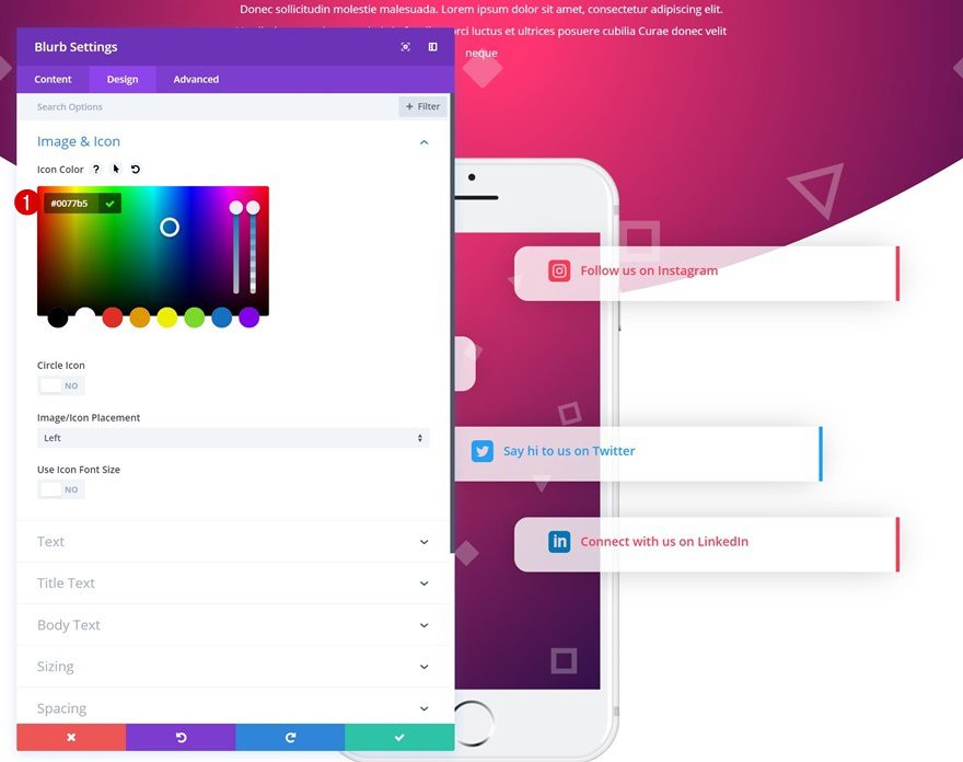
Icon Settings
Make the icon color match the social network that is displayed.
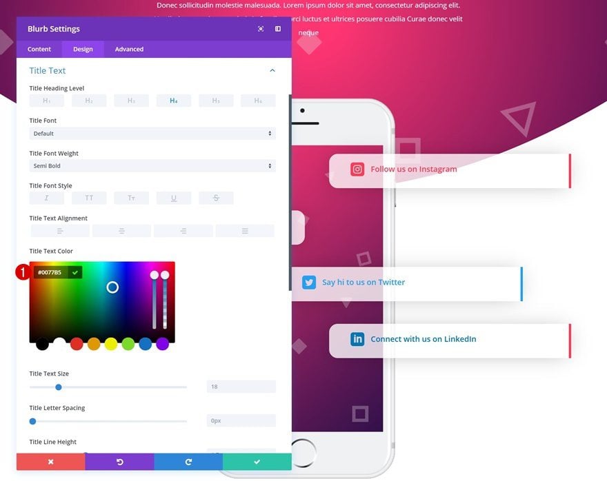
Title Text Settings
Use the same color for the title text.
- Title Text Color: #0077B5
Spacing
Push the Blurb Module to the left side using different spacing settings as well.
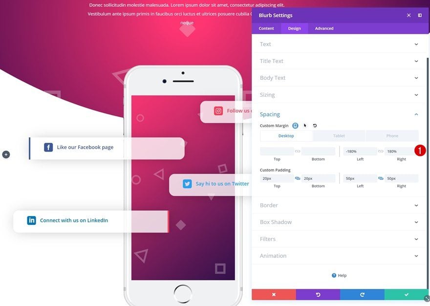
- Left Margin: -180% (Desktop), 0% (Tablet & Phone)
- Right Margin: 180% (Desktop), 0% (Tablet & Phone)
Border
Then, modify the border settings.
- Top Right Corner: 20px
- Bottom Right Corner: 20px
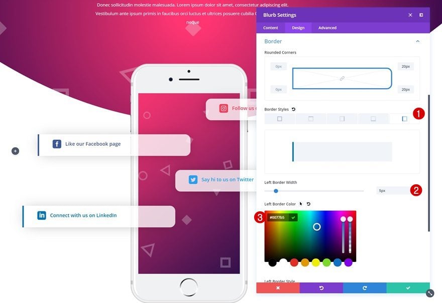
- Left Border Width: 5px
- Left Border Color: #0077B5
Animation
Last but not least, add a different animation direction and some animation delay to this Blurb Module.
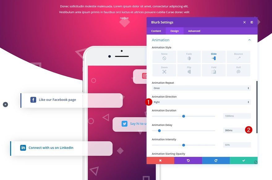
- Animation Direction: Right
- Animation Delay: 300ms
Preview
Now that we’ve gone through all the steps, let’s take a final look at the outcome.
Final Thoughts
In this post, we’ve shared a unique social follow design which you can download for free. We’ve also provided you with 5 different colors palettes that you can apply to it. Feel free to use the JSON files on any Divi website you create to increase social engagement through your website. If you have any questions or suggestions, make sure you leave a comment in the comment section below!


