Did you know that over 50 percent of internet traffic comes from mobile devices? That means that the mobile version of your website is extremely important, and may even be the primary way someone will visit your page. Making sure that your website is responsive and mobile-friendly is an essential step in designing a website. In this tutorial, we will show you how to add a responsive logo to your fullwidth menu module using Divi’s built-in responsive options. This will allow you to add a larger or more complex logo that will appear on bigger screens and a smaller or simpler logo that will appear on smaller screens.
Let’s dive in!
Sneak Peek
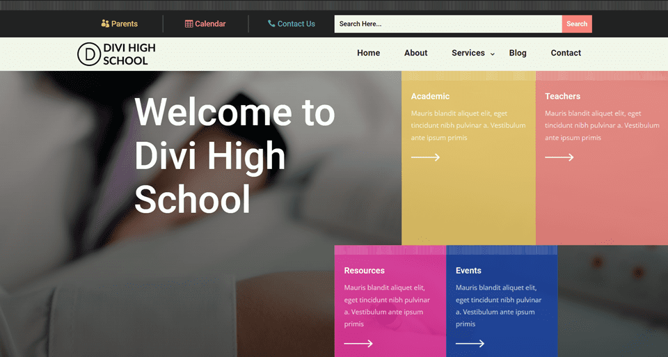
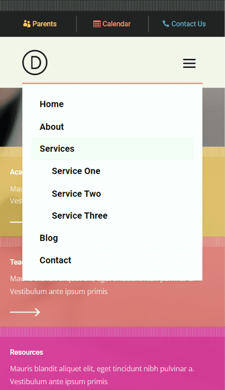
Here is a preview of what we will design. The desktop version of the website will have an expended logo with additional text, and the mobile version of the logo will only have the basic logo mark.
Why You Need a Responsive Logo
Before we begin the tutorial, let’s go over why you might need a responsive logo on your website.
First, what is a responsive logo? A responsive logo is a variation of your logo that may be smaller, simpler, abbreviated, or rearranged to be more visible and legible at smaller sizes. If your logo has too many detailed elements, they may not show up well at a smaller size. Small font sizes and extra typography in a responsive logo can also be hard to read on a small screen. By implementing a responsive logo on your website tailored to the user’s screen size, you can make sure that your brand identity is clearly represented, no matter what. For some great examples of responsive logos, take a look at this website!
What You Need to Get Started
First, install and activate the Divi Theme and make sure you have the latest version of Divi on your website. Next, make sure you have at least two versions of your logo – one for the desktop view of your site, and one for the mobile view. Finally, download the Header and Footer Template for Divi’s High School Layout Pack.
Now, you are ready to start!
How to Add a Responsive Logo to Your Fullwidth Menu Module in Divi
Import the Header and Footer Layout
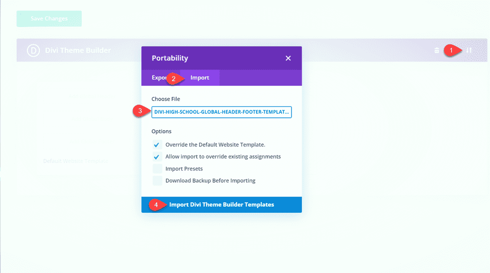
Navigate to the Theme Builder from the Divi menu in the sidebar. Import the High School Header and Footer layout by selecting the portability icon. Select the Import tab and choose the layout file. Then select Import Divi Theme Builder Templates.
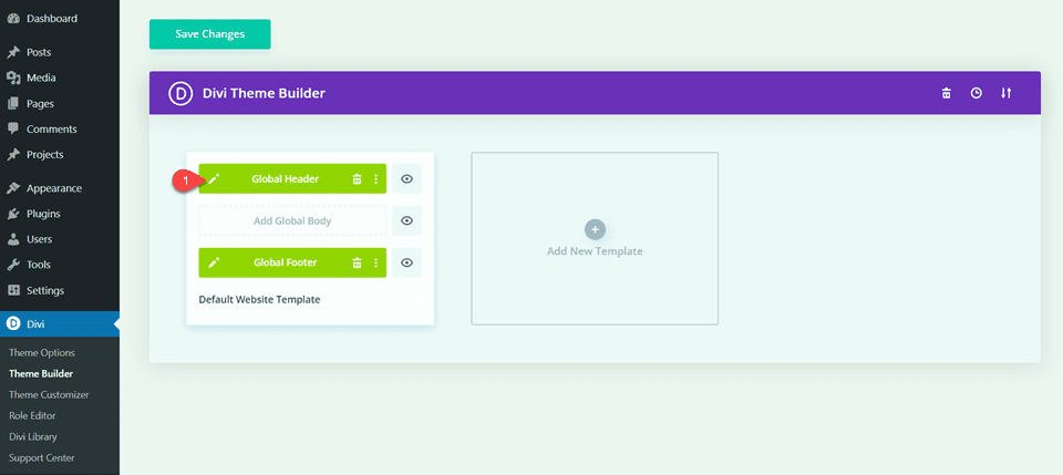
We will edit the header and add our responsive logo in the theme builder. Click on the pencil icon to edit the header.
Create the Fullwidth Menu Module
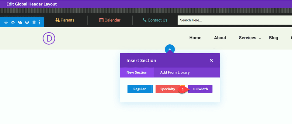
Add a Fullwidth Section
Since the original menu is built with a standard menu module, we will need to modify the layout to add a fullwidth menu module. First, add a fullwidth section to the global header below the existing menu.
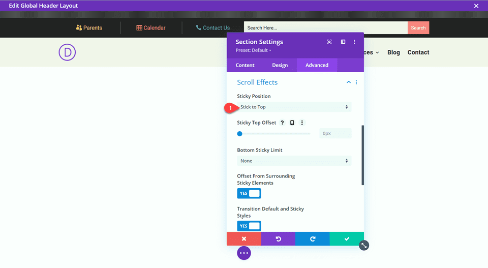
In the fullwidth section settings, navigate to Advanced, then Scroll Effects.
- Sticky Position: Stick to Top
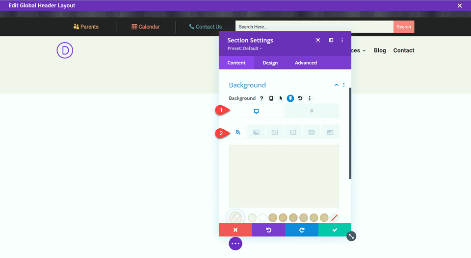
Next, add the background color.
- Background Color: #f5f0eb
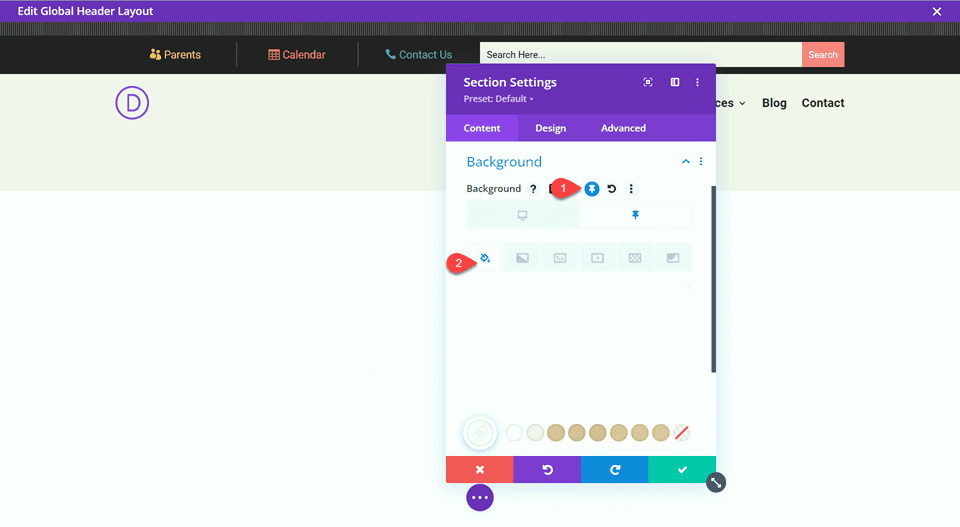
Add a different color for the sticky background.
- Sticky Background Color: #ffffff
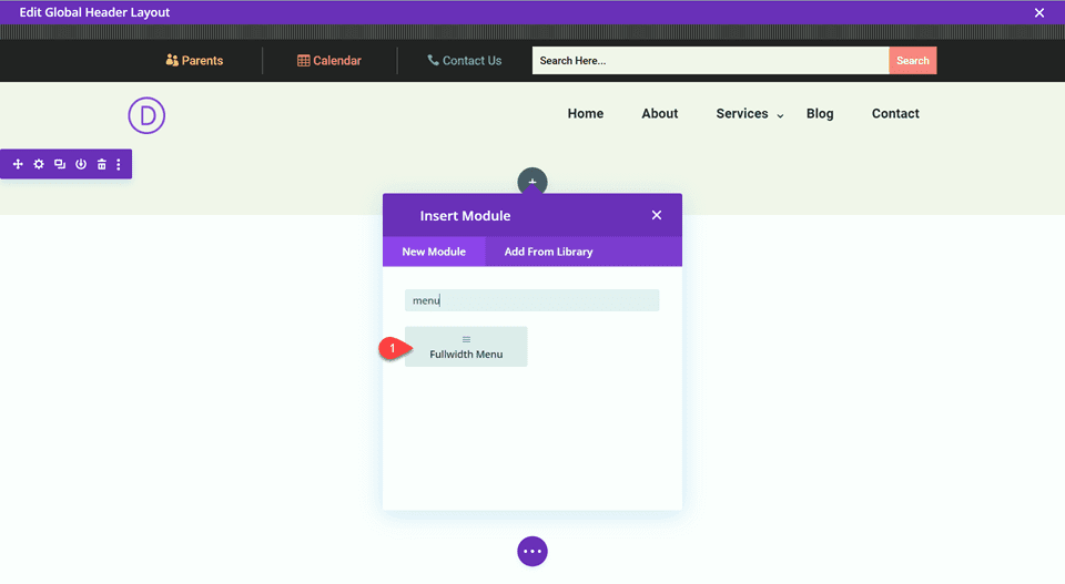
Add a Fullwidth Menu Module
Now let’s add the fullwidth menu module.
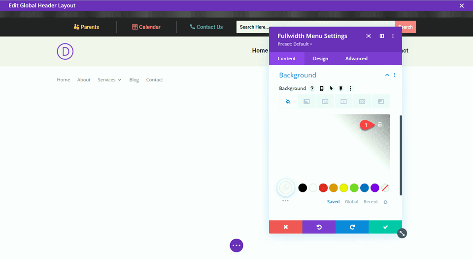
Open the module settings and remove the background.
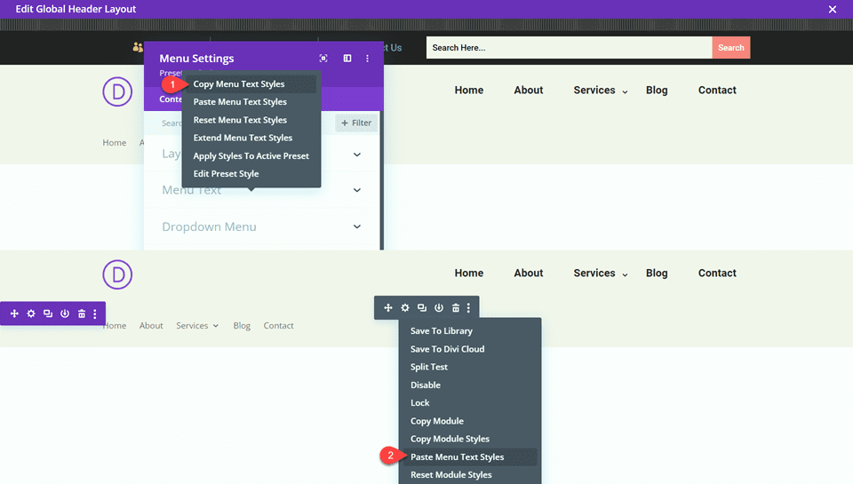
To easily replicate the look of the original menu, we can use the copy styles function to copy over some of the customized settings. Open the settings for the original menu, then right click on Menu Text Styles and select Copy Menu Text Styles.
Once copied, click the three dots for the fullwidth menu module, then select Paste Menu Text Styles.
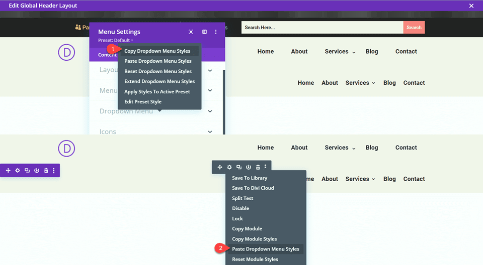
Now we will repeat the same steps with the dropdown menu settings. Open the settings for the original menu, then right-click on Dropdown Menu Styles and select Copy Dropdown Menu Styles. Click the three dots for the fullwidth menu module, then select Paste Dropdown Menu Styles.
Repeat once more for the icon styles. Open the settings for the original menu, then right click on Icon Styles and select Copy Icon Styles. Click the three dots for the fullwidth menu module, then select Paste Icon Styles.
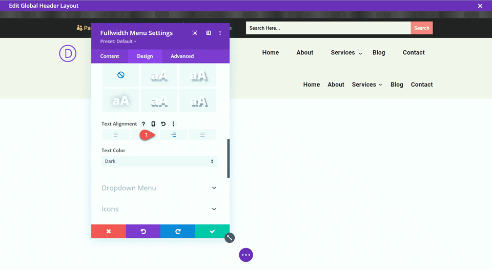
Set the text alignment to left.
- Text Alignment: Left
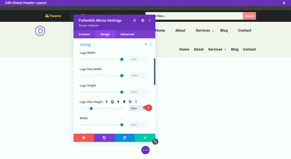
Set the logo max height under Design, then Spacing.
- Logo Max Height: 50px
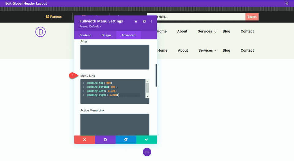
Add the following CSS to the Menu Link section under Custom CSS.
padding-top: 0px;
padding-bottom: 5px;
padding-left: 0.3em;
padding-right: 1.3em;
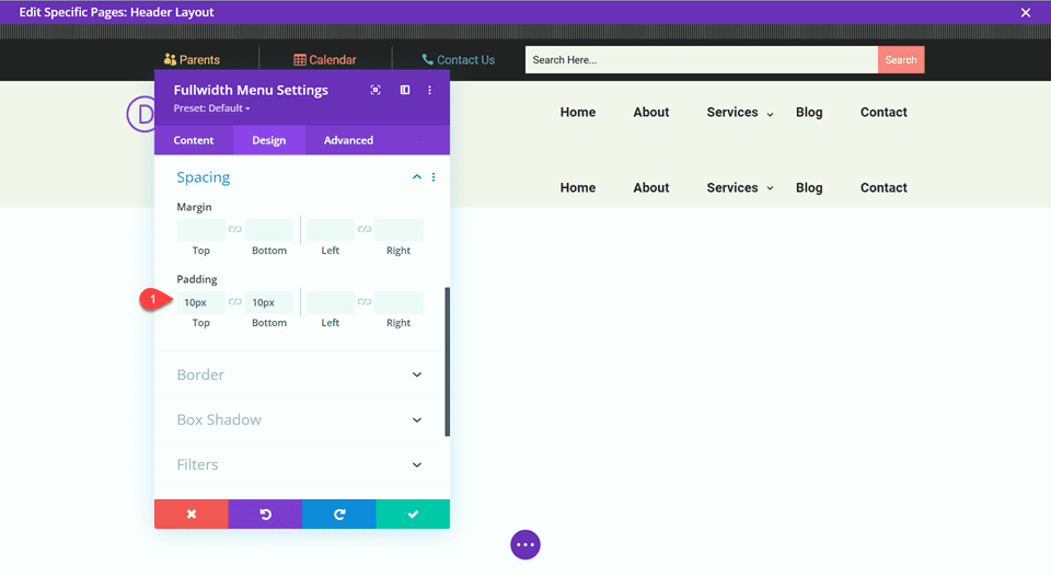
Finally, set the top and bottom padding.
- Padding-Top: 10px
- Padding-Bottom:10px
Now delete the original menu section.
Add a Responsive Logo
Now we will add the responsive logo. Thankfully Divi makes this easy with the built-in responsive options.
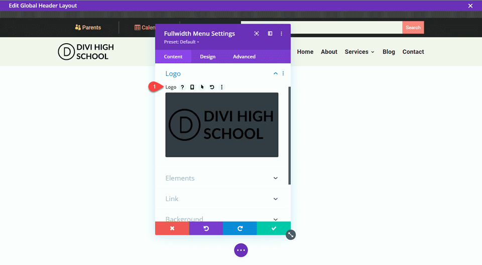
Under General, open the logo settings and upload the desktop version of your logo.
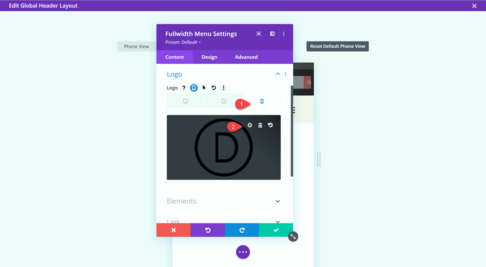
Select the phone icon to use the responsive options, then replace the mobile logo with your responsive logo.
Create a New Page with a Premade Layout
To see the fullwidth menu with the responsive logo in action, let’s create a new page with a premade layout from the Divi library. For this design, we will use the High School Home Page from the High School Layout Pack to match the header and footer.
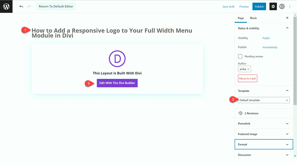
Add a new page to your website and give it a title, then select the option to Use Divi Builder. Since we imported the header and footer layout as the global header and footer, use the default layout for this page.
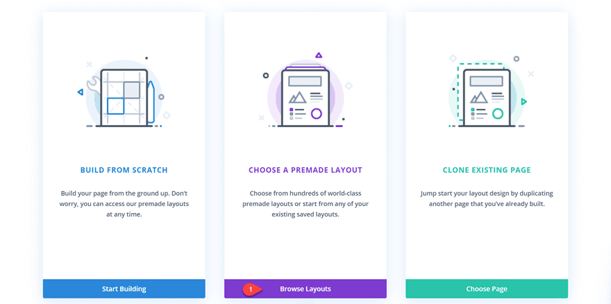
We will use a premade layout from the Divi library for this example, so select Browse Layouts.
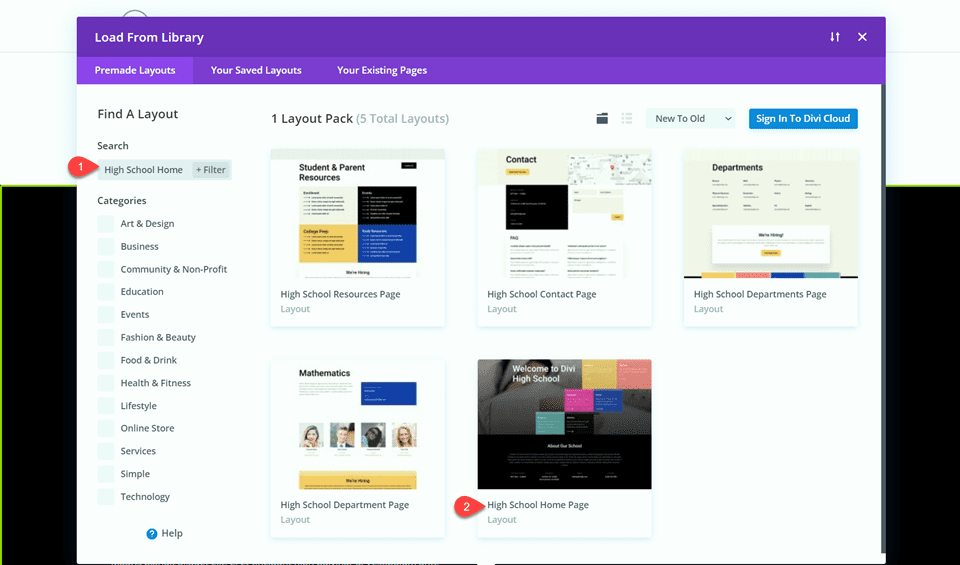
Search for and select the High School Home Page layout.
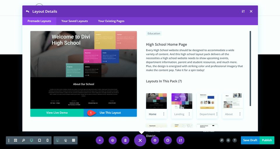
Select Use This Layout to add the layout to your page.
Final Result
Now let’s take a look at our final design.
Final Thoughts
Having a mobile-friendly and responsive website is more important than ever. And thanks to Divi’s built-in responsive options, building one is easier than ever! With a responsive logo, your brand identity will always be clear, no matter what size the screen. If you are interested in learning more about Divi’s responsive options, check out this tutorial about responsive testimonial content. How have you implemented responsive designs into your website? We’d love to hear your thoughts in the comments!

