When building your about page, you might consider adding your company’s different team members in a showcase. When starting that design process, you’ll notice that three things can’t be missing off the bat: an image, a name and a position. But if you want to highlight your team members even more, you can consider adding their social network links to the design as well. Of course, you could go about it the old-fashioned way and add a Social Media Follow Module below the person’s name and position. However, you can also choose to add a tiny bit of interaction by triggering the social icons as soon as someone hovers one of the person images. In today’s tutorial, we’ll show you exactly how to do that using Divi. You’ll be able to download the JSON file for free as well!
Let’s get to it.
Preview
Before we dive into the tutorial, let’s take a quick look at the outcome across different screen sizes.
Desktop
Mobile
Download The Layout for FREE
To lay your hands on the free layout, you will first need to download them using the button below. To gain access to the download you will need to subscribe to our Divi Daily email list by using the form below. As a new subscriber, you will receive even more Divi goodness and a free Divi Layout pack every Monday! If you’re already on the list, simply enter your email address below and click download. You will not be “resubscribed” or receive extra emails.
Let’s Start Recreating!
Add Section #1
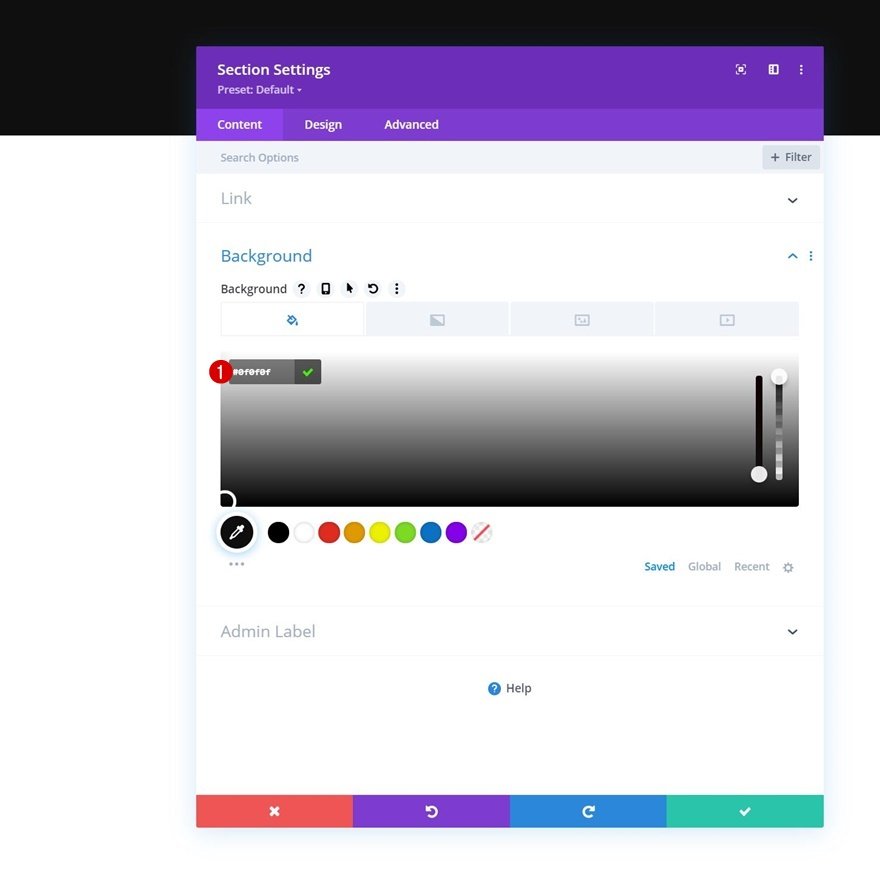
Background Color
Start by adding a new section to the page you’re working on. Open the section settings and change the background color.
- Background Color: #0f0f0f
Spacing
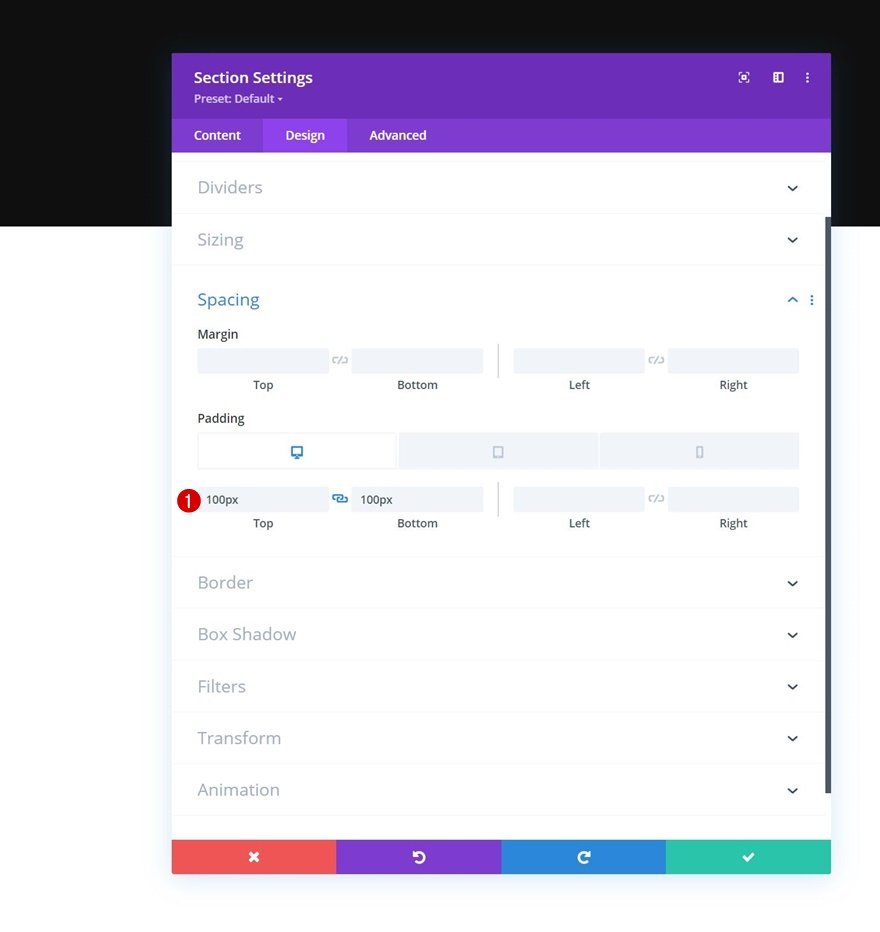
Move on to the section’s design tab and change the spacing settings next.
- Top Padding
- Desktop & Tablet: 100px
- Phone: 50px
- Bottom Padding:
- Desktop & Tablet: 100px
- Phone: 50px
Add New Row
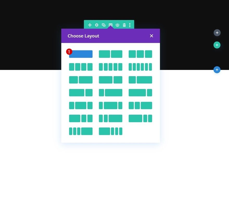
Column Structure
Continue by adding a new row using the following column structure:
Add Text Module #1 to Column
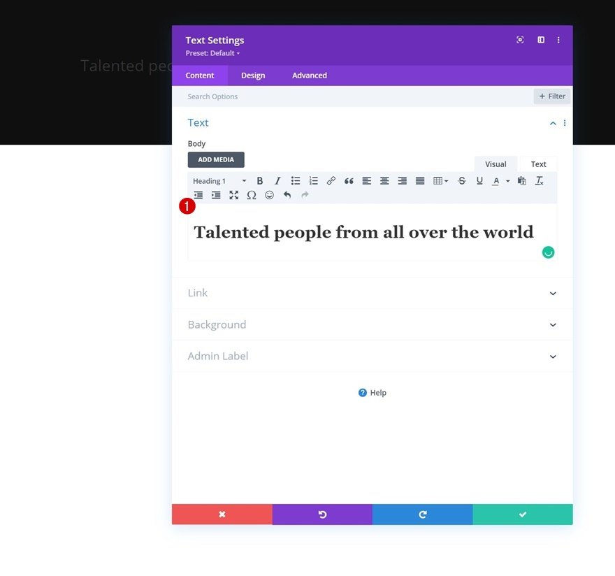
Add H1 Content
Add a first Text Module to the row’s column with some H1 content of your choice.
H1 Text Settings
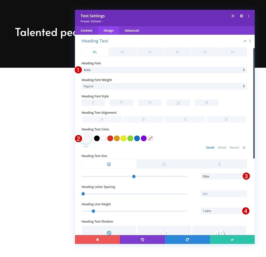
Move on to the module’s design tab and change the H1 text settings accordingly:
- Heading Font: Alata
- Heading Text Color: #ffffff
- Heading Text Size:
- Desktop: 50px
- Tablet: 45px
- Phone: 35px
- Heading Line Height: 1.2em
Add Divider Module to Column
Visibility
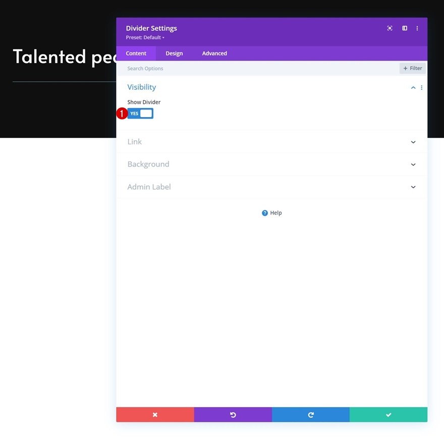
Next, we’ll add a Divider Module. Make sure the “Show Divider” option is enabled.
Line
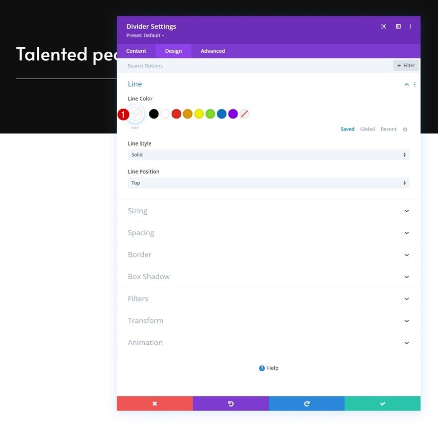
Move on to the module’s design tab and change the line color.
Sizing
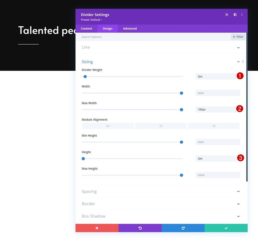
Change the sizing settings too.
- Divider Weight: 2px
- Max Width: 100px
- Height: 2px
Add Text Module #2 to Column
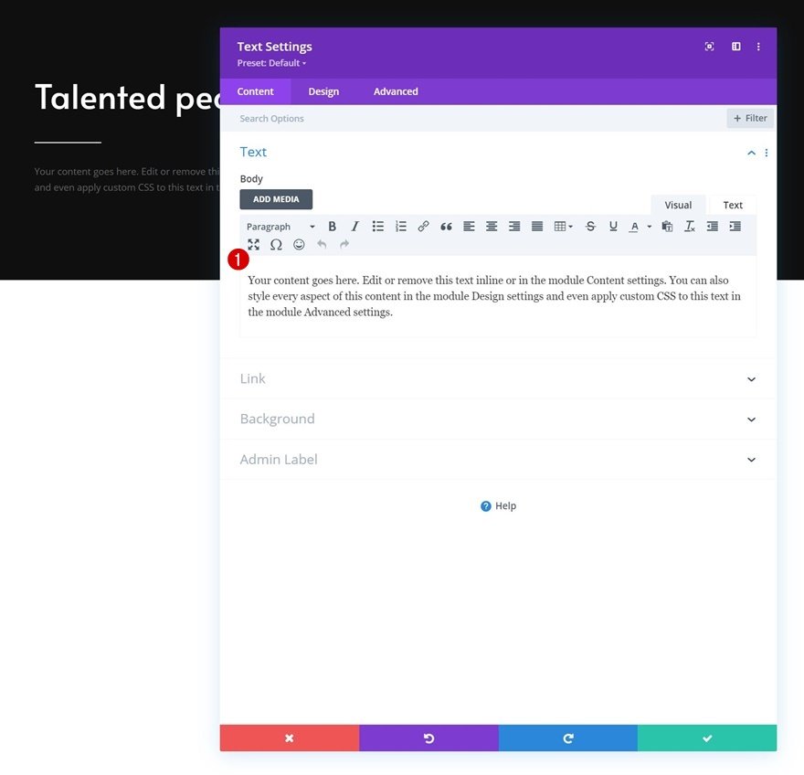
Add Description Content
The next and last module we need in this row is another Text Module with some description content of your choice.
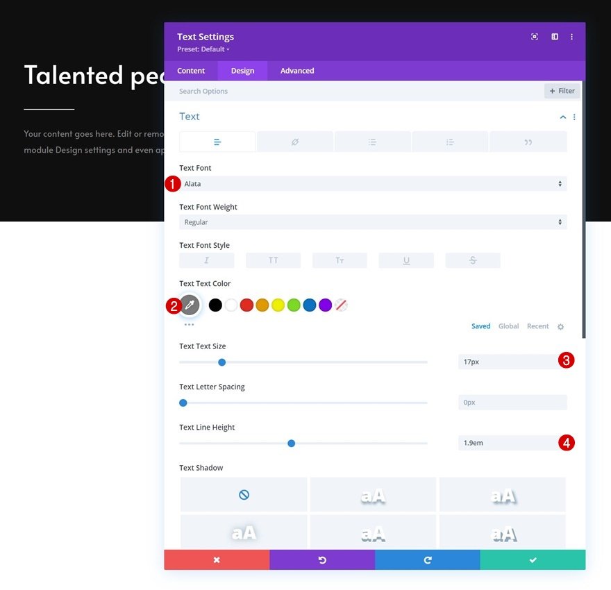
Text Settings
Move on to the module’s design tab and change the text settings as follows:
- Text Font: Alata
- Text Color: #7c7c7c
- Text Size: 17px
- Text Line Height: 1.9em
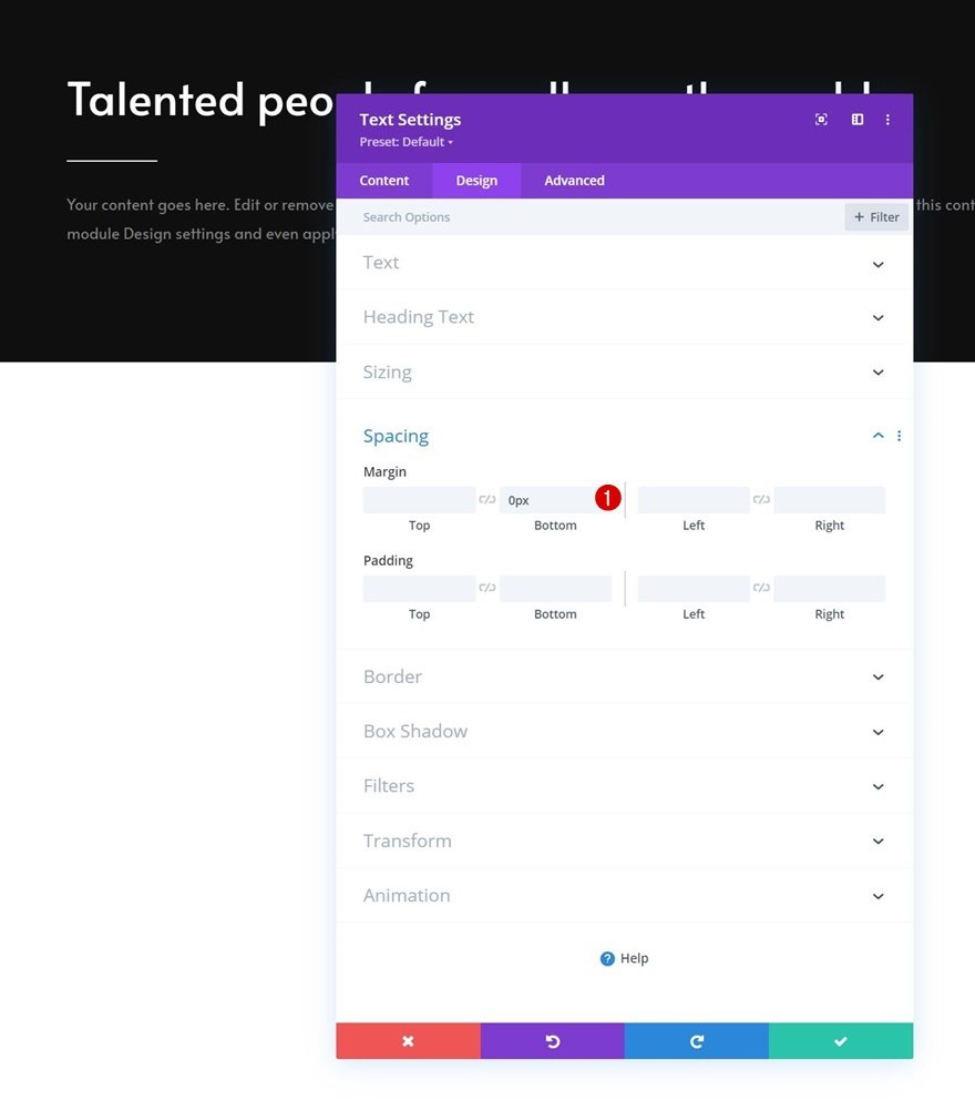
Spacing
Remove the default bottom margin too.
Add Section #2
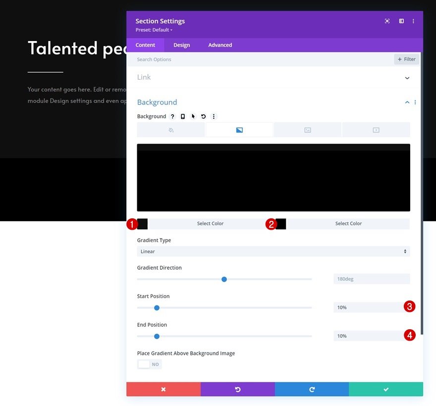
Gradient Background
Add another section right below the previous one and use a gradient background for it.
- Color 1: #0f0f0f
- Color 2: #000000
- Start Position: 10%
- End Position: 10%
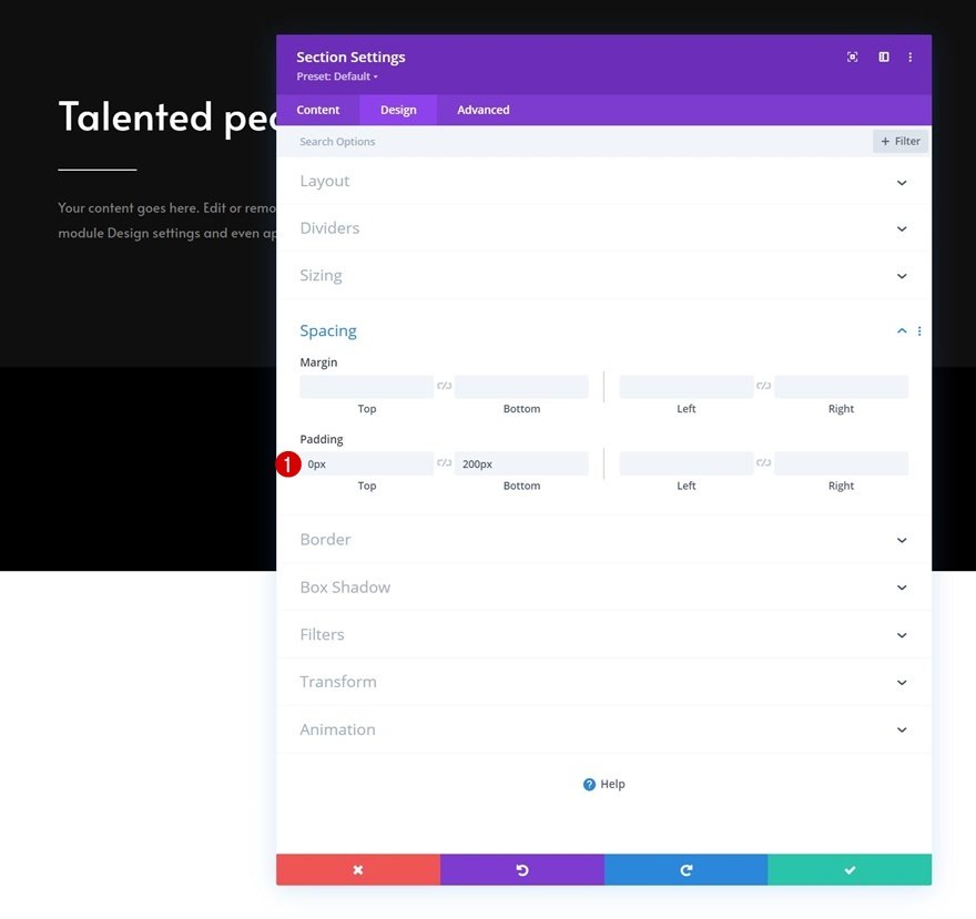
Spacing
Modify the spacing settings next.
- Top Padding: 0px
- Bottom Padding: 200px
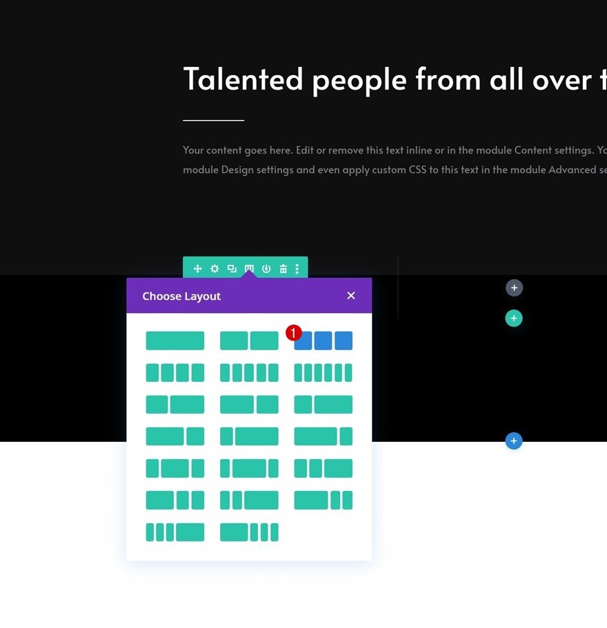
Add New Row
Column Structure
Continue by adding a new row to the section using the following column structure:
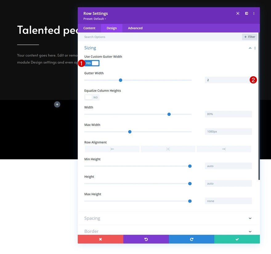
Sizing
Open the row settings and change the sizing settings as follows:
- Use Custom Gutter Width: Yes
- Gutter Width: 2px
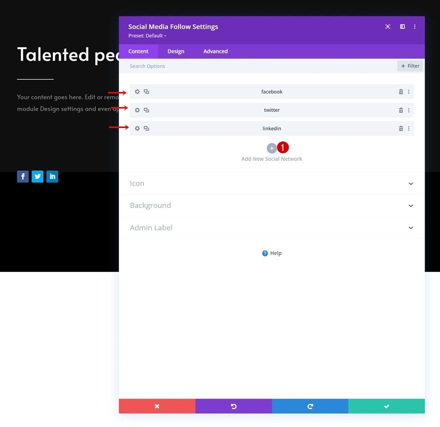
Add Social Media Follow Module to Column 1
Add Social Networks of Choice
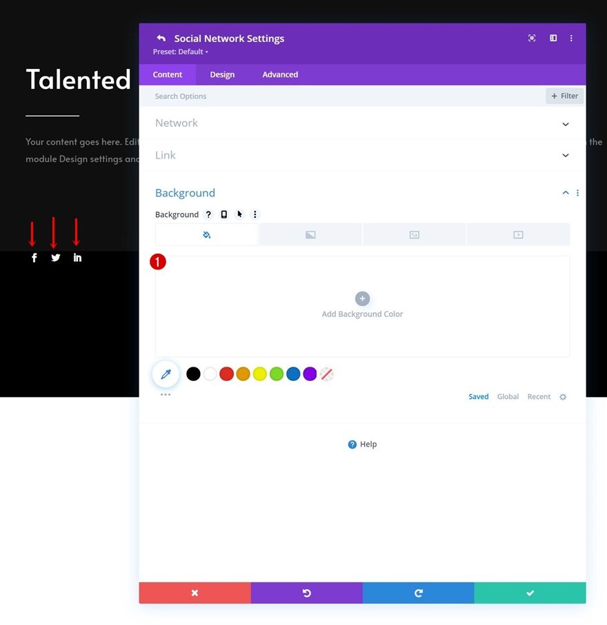
The first module we need in our row is a Social Media Follow Module in column 1. Add the social networks of your choice.
Remove Each Social Network Background Color Individually
Then, open each social network individually and remove the background color.
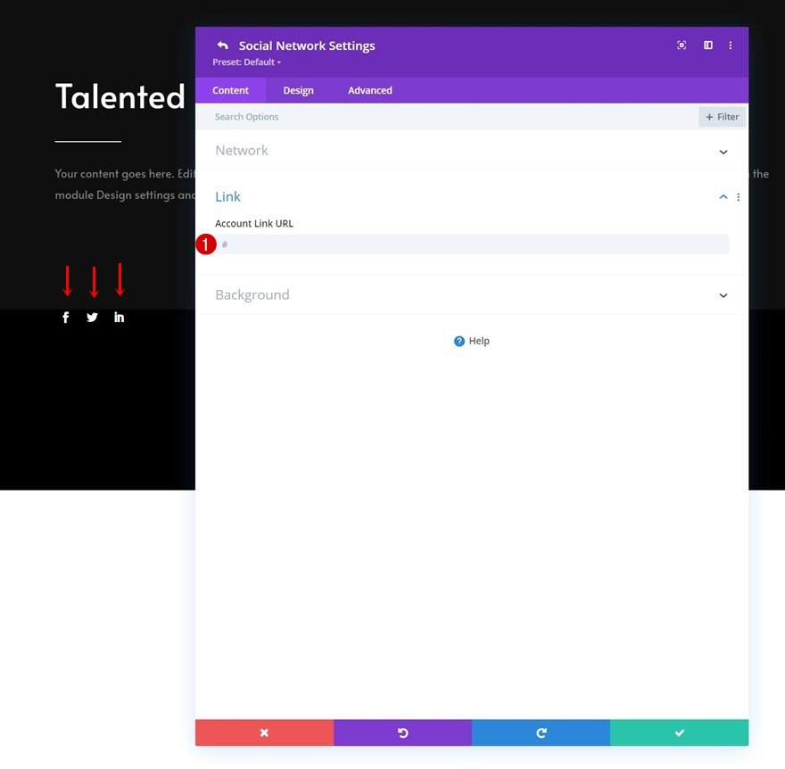
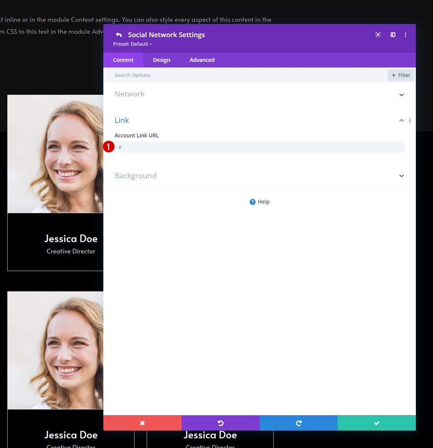
Add Link to Each Social Network Individually
Add a corresponding link to each social network too.
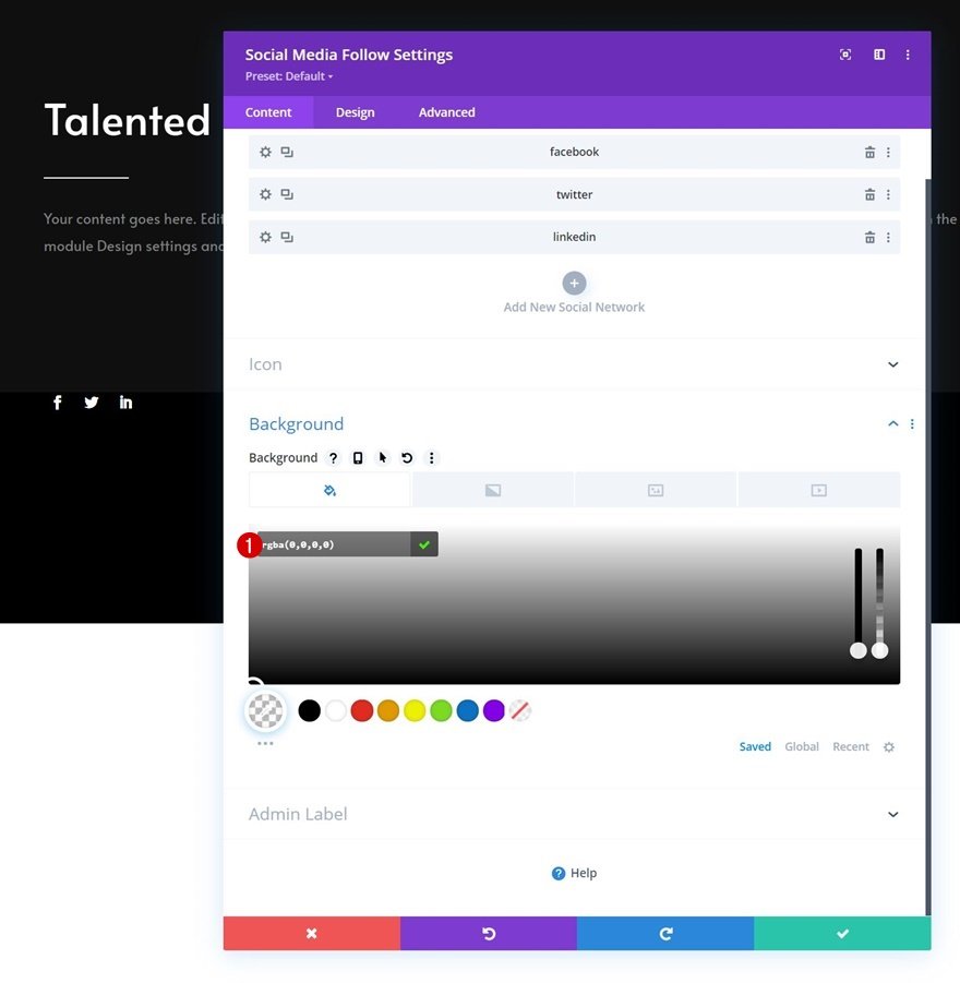
Default Background Color
Then, go back to the general module settings and apply the following background color:
- Background Color: rgba(0,0,0,0)
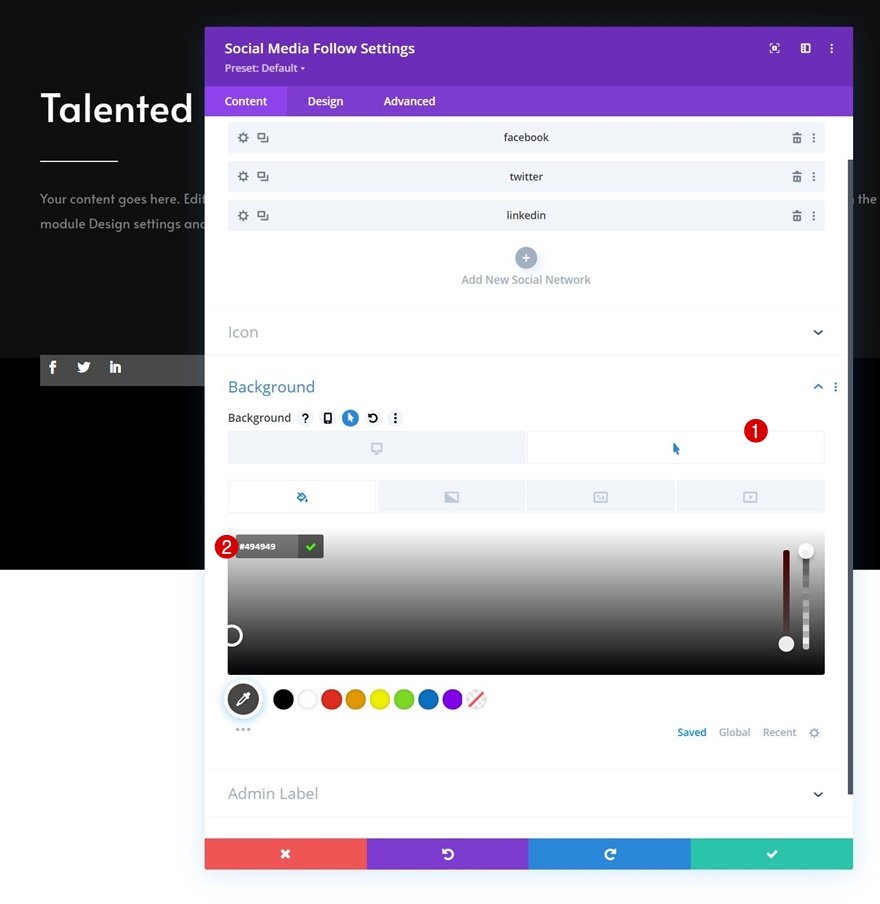
Hover Background Color
Change the background color on hover.
- Hover Background Color: #494949
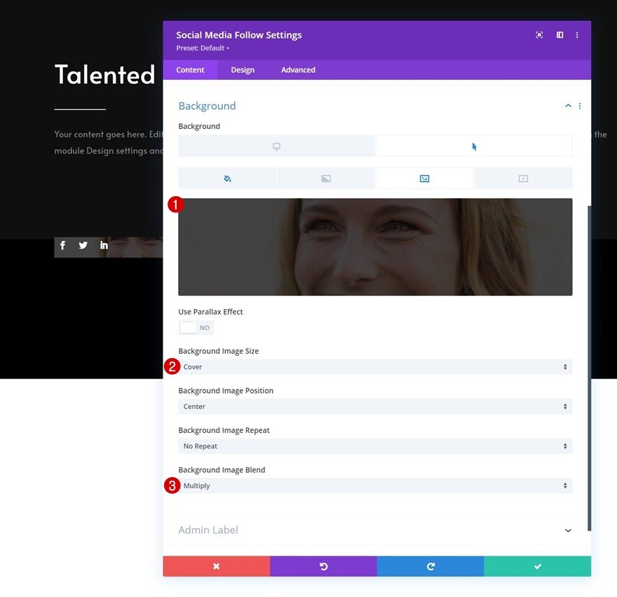
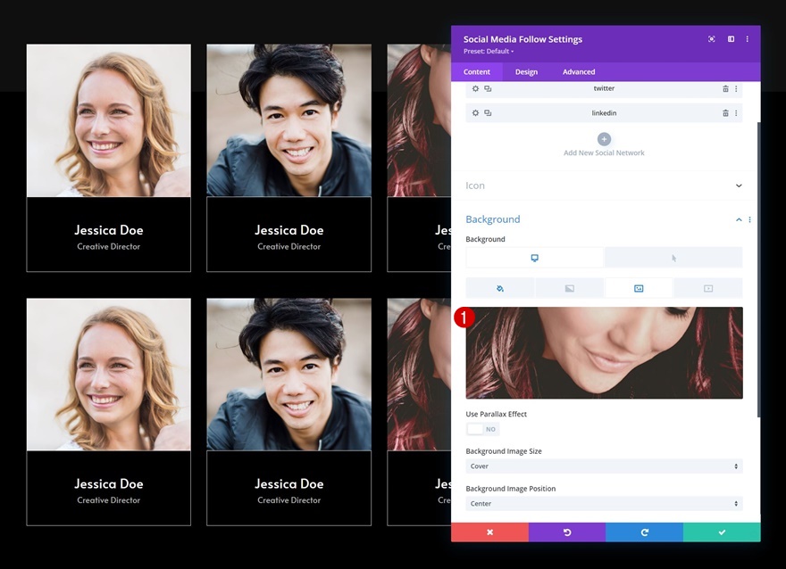
Background Image
Then, upload a background image.
- Background Image Size: Cover
- Background Image Blend: Multiply
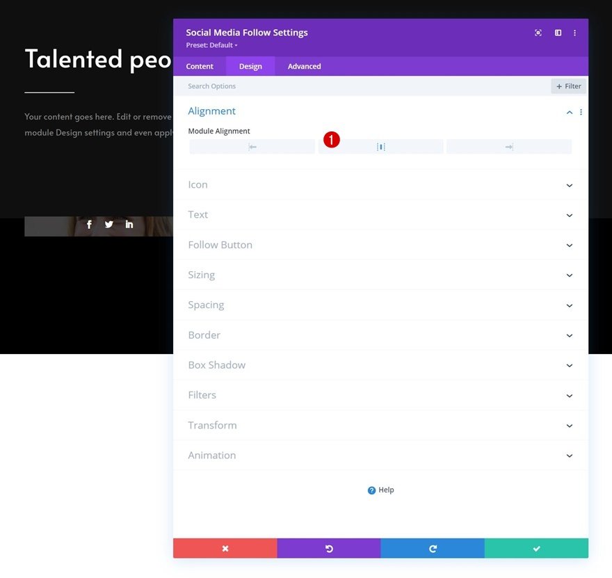
Alignment
Move on to the module’s design tab and change the alignment.
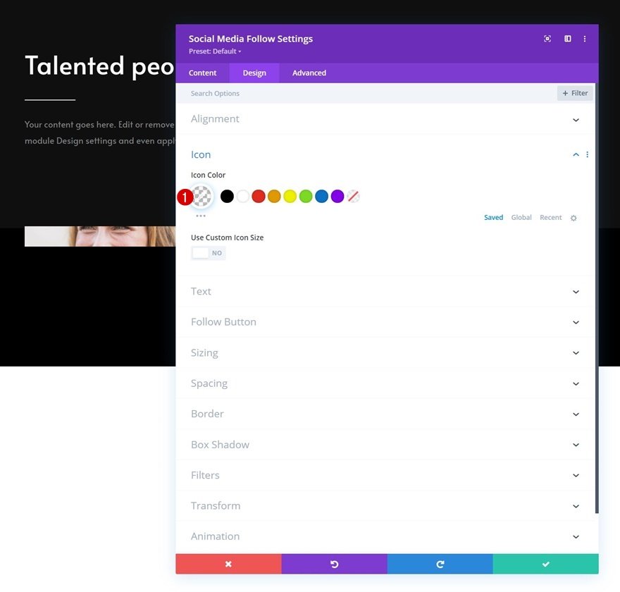
Icon
Modify the icon color too.
- Icon Color: rgba(0,0,0,0)
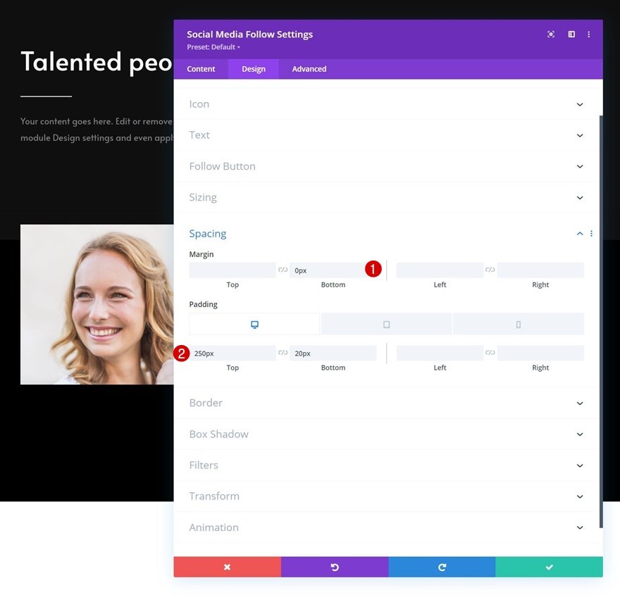
Spacing
Then, go to the spacing settings and apply the following values:
- Bottom Margin: 0px
- Top Padding:
- Desktop: 250px
- Tablet: 450px
- Phone: 200px
- Bottom Padding: 20px
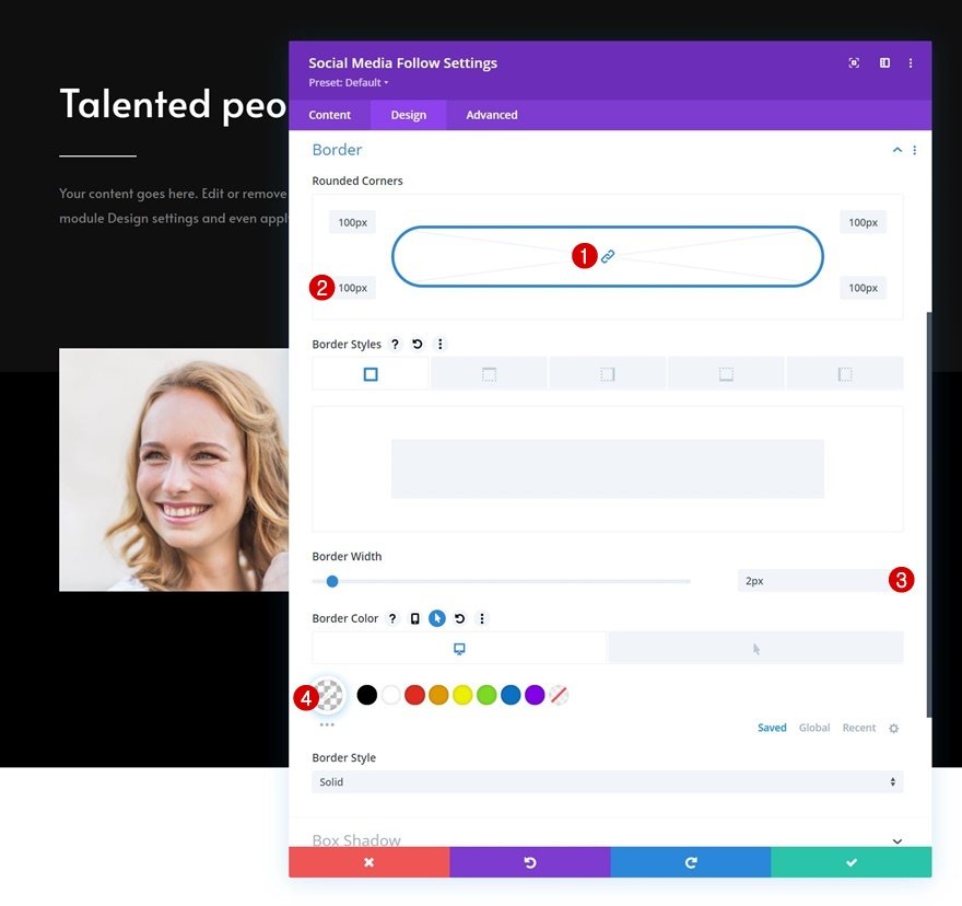
Border
We’re changing the border settings as well.
- All Corners: 100px
- Border Width: 2px
- Border Color: rgba(255,255,255,0)
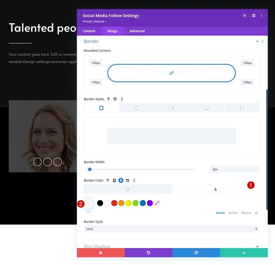
Hover Border
Use another border color on hover.
- Hover Border Color: #ffffff
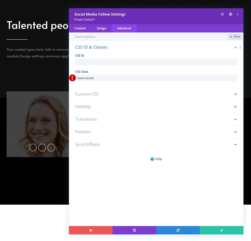
CSS Class
Then, go to the advanced tab and apply a custom CSS class.
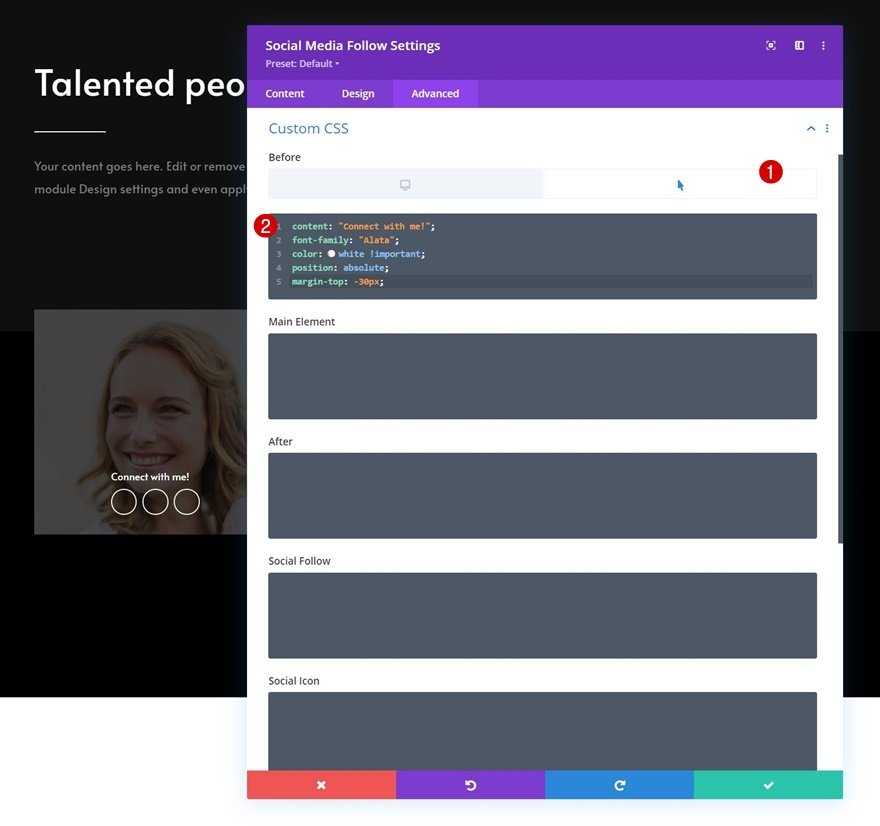
Hover Before Element
And complete the module settings by enabling the hover setting on the before element and copy-pasting the following lines of CSS code:
content: "Connect with me!";
font-family: "Alata";
color: white !important;
position: absolute;
margin-top: -30px;
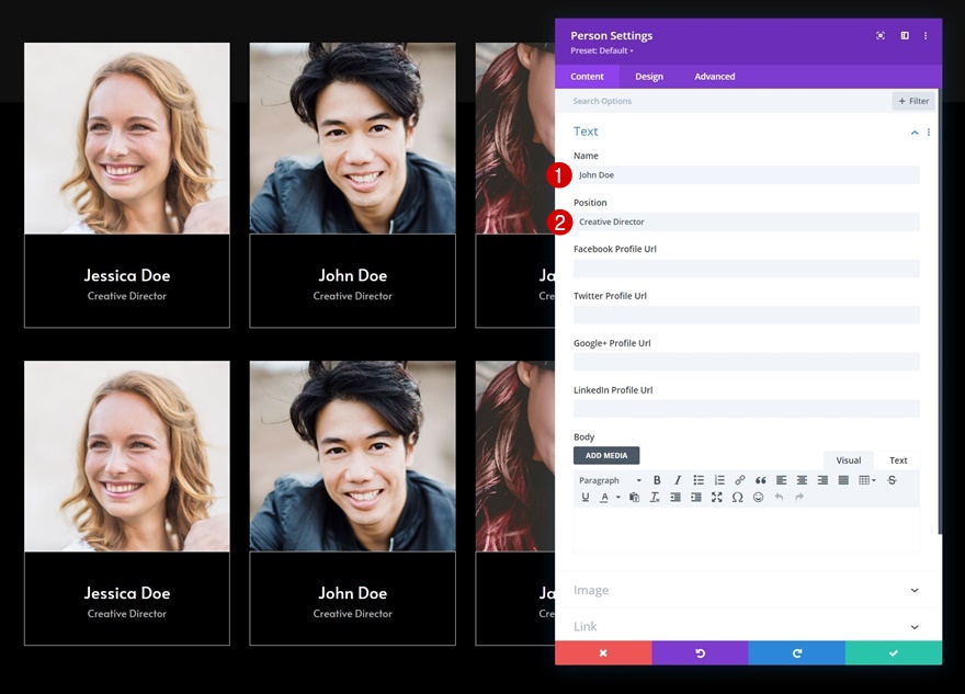
Add Person Module to Column 1
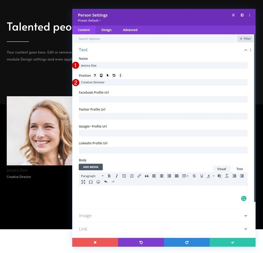
Add Content
The next and last module we need in column 1 is a Person Module. Add some content of your choice.
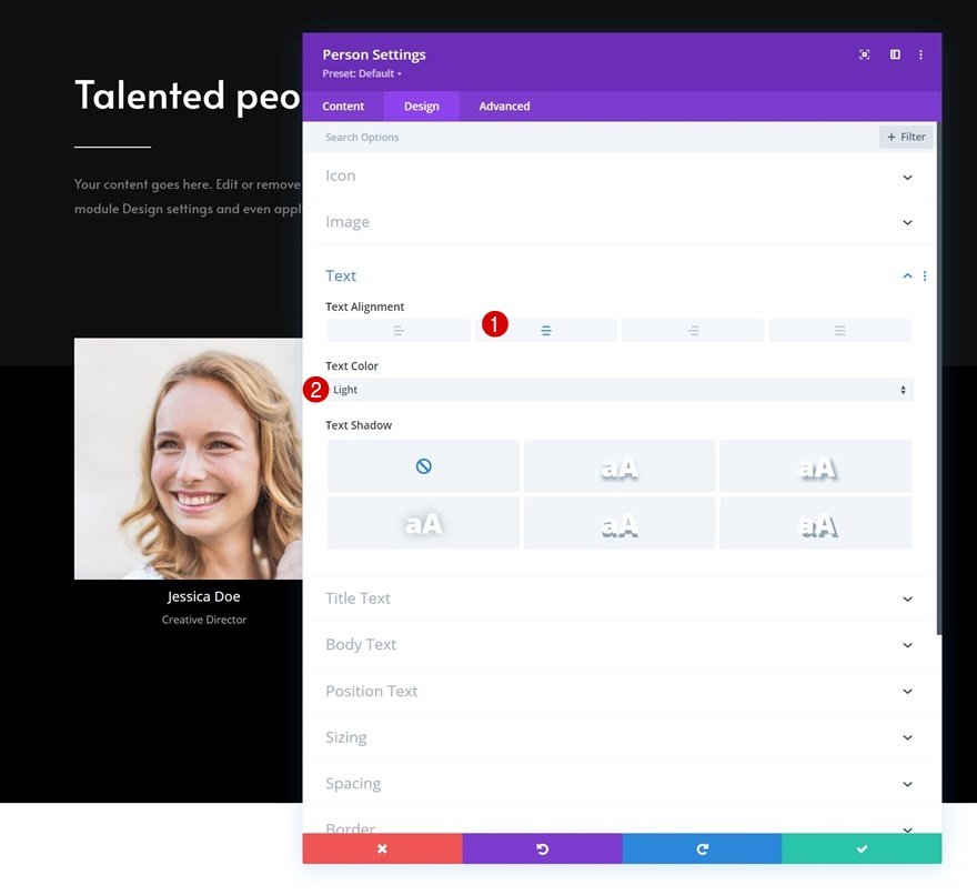
Text Settings
Move on to the module’s design tab and change the text settings as follows:
- Text Alignment: Center
- Text Color: Light
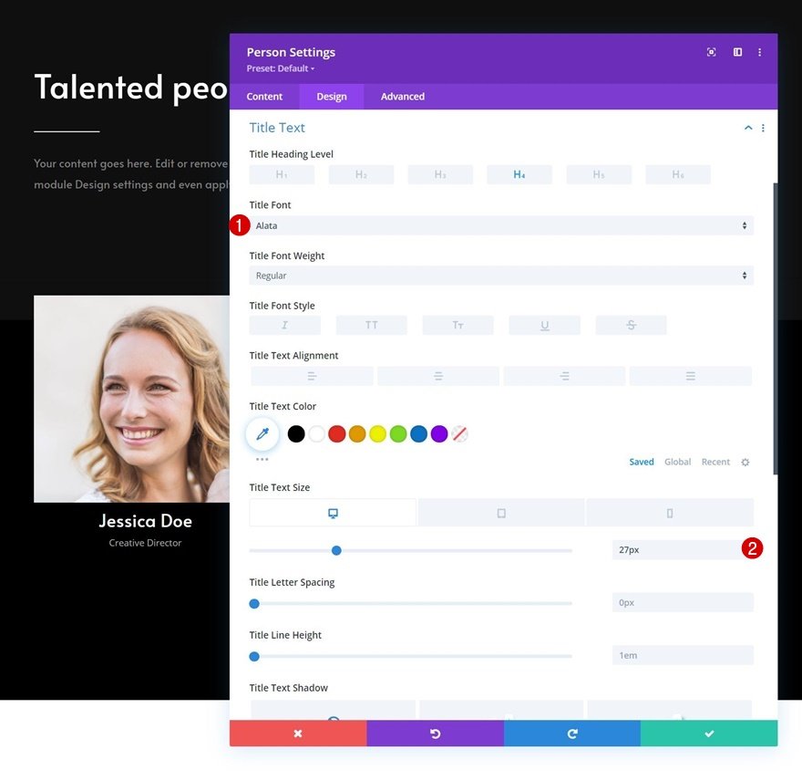
Title Text Settings
Style the title text next.
- Title Font: Alata
- Title Text Size:
- Desktop: 27px
- Tablet: 25px
- Phone: 22px
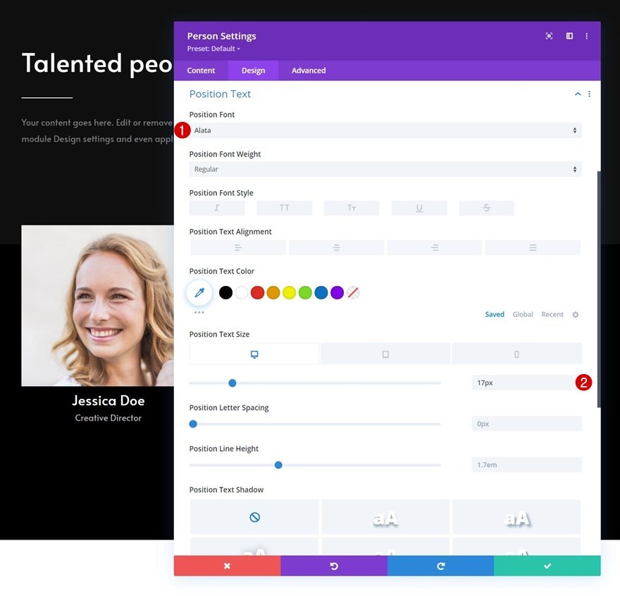
Position Text Settings
Then, modify the position text settings.
- Position Font: Alata
- Position Text Size:
- Desktop: 17px
- Tablet & Phone: 15px
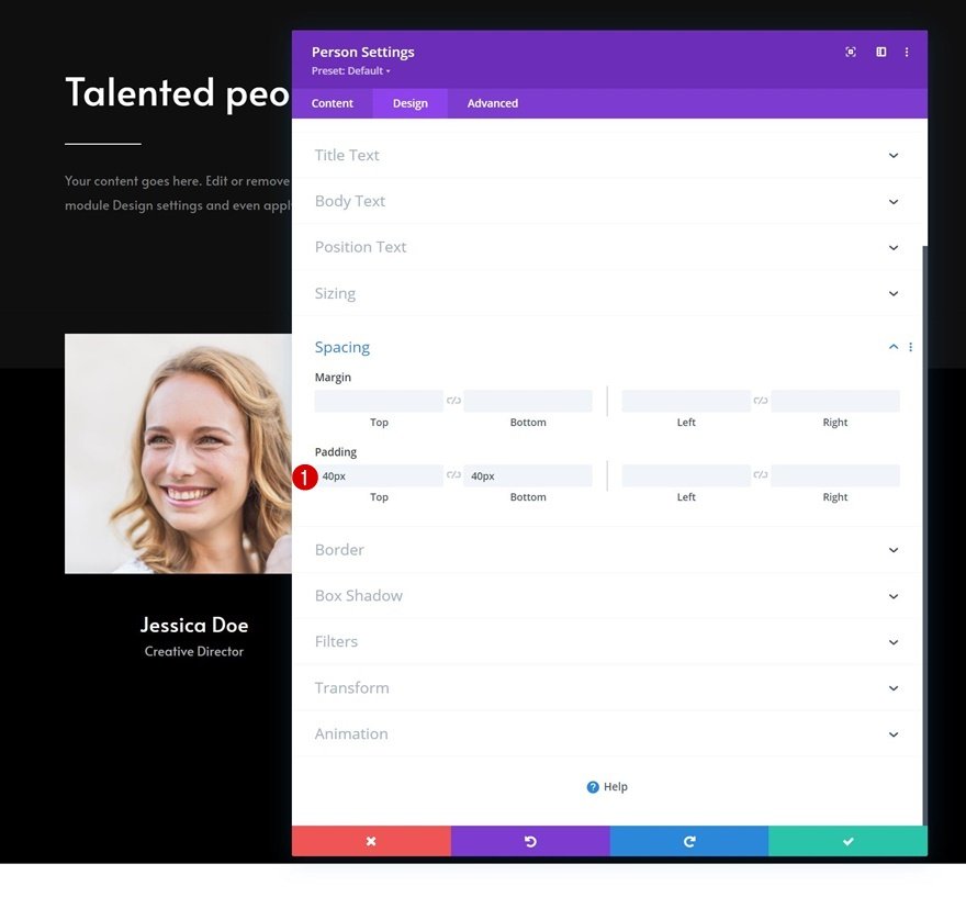
Spacing
Apply some custom top and bottom padding to the spacing settings.
- Top Padding: 40px
- Bottom Padding: 40px
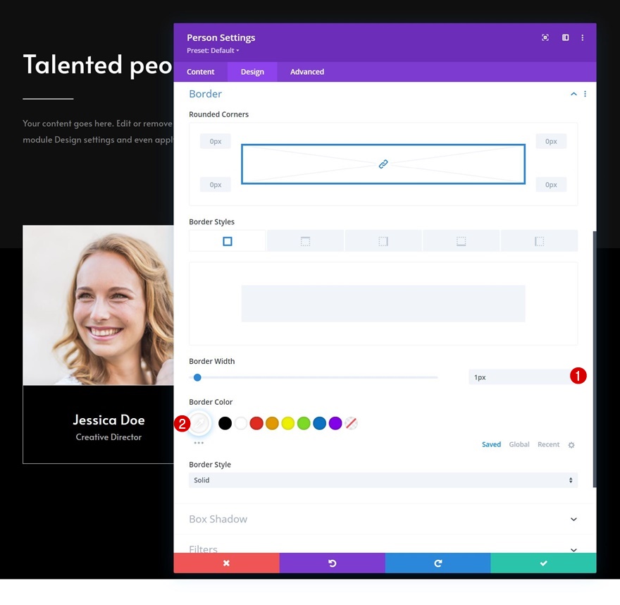
Border
And complete the module settings by applying the following border settings:
- Border Width: 1px
- Border Color: #ffffff
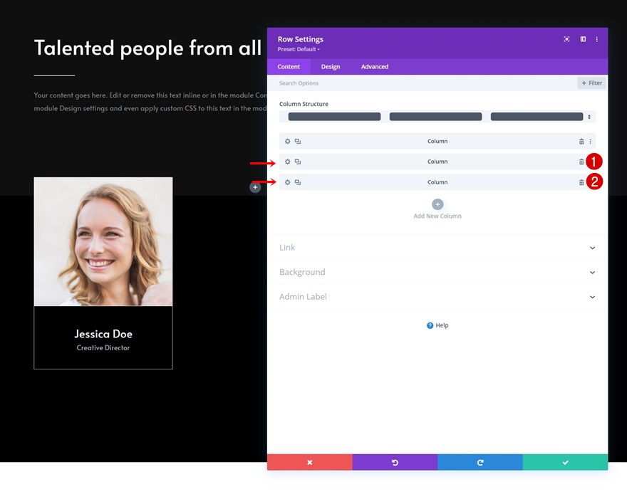
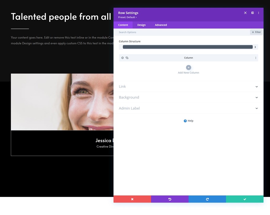
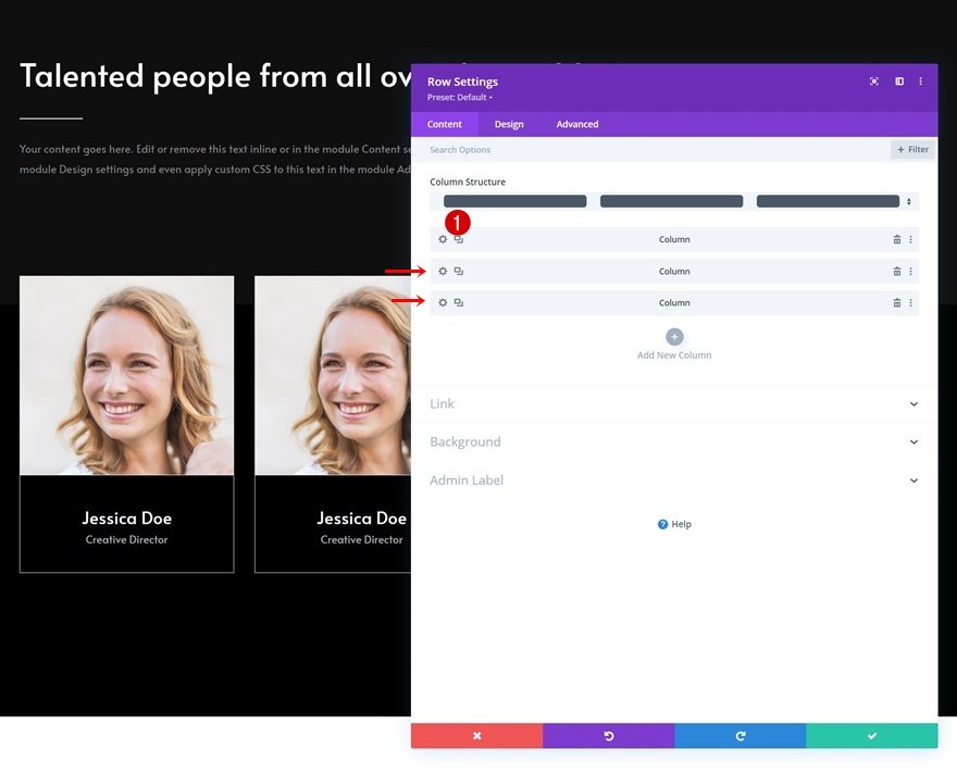
Remove Remaining Columns of Row
Once you’ve completed the modules in column 1, you can remove the two remaining columns of the row.
Clone Column Twice
Reuse column 1 by cloning it twice.
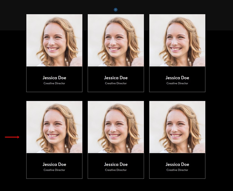
Clone Entire Row
Then, clone the entire row as many times as you need.
Change All Duplicate Content
Social Media Follow Links
Of course, you’ll need to modify all duplicate content, starting with the social network links in each duplicate Social Media Follow Module.
Social Media Follow Background Images
Then, change the background image in each Social Media Follow Module.
Person Module Content
And complete the changes by modifying the content in each Person Module.
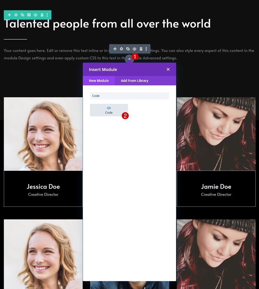
Add Code Module Below Last Text Module in Row #1 of Section #1
Now, to make sure each social network changes styles as soon as the entire module is hovered, we’ll need a few lines of CSS code. We’ll place this code inside a new Code Module which we’ll add to the first section, right below the description Text Module.
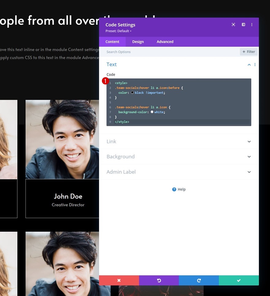
Add CSS Code
Copy-paste the following lines of CSS code and you’re done:
<style>
.team-socials:hover li a.icon:before {
  color: black !important;
}

.team-socials:hover li a.icon {
  background-color: white;
}
</style>
Preview
Now that we’ve gone through all the steps, let’s take a final look at the outcome across different screen sizes.
Desktop
Mobile
Final Thoughts
In this post, we’ve shown you how to get creative with your team member showcase. More specifically, we’ve shown you how to trigger social icons when you hover one of the team member’s images. This results in a subtle but fun interaction that you can use for any kind of website you build. You were able to download the JSON file for free as well! If you have any questions, feel free to leave a comment in the comment section below.
If you’re eager to learn more about Divi and get more Divi freebies, make sure you subscribe to our email newsletter and YouTube channel so you’ll always be one of the first people to know and get benefits from this free content.

