[ad_1]
The Ken Burns Effect has been around for a while. The effect was made famous by the American Documentarian, Ken Burns, as he used a combination of panning and zooming techniques to bring images to life in his movies. In web design, the Ken Burns Effect has proven to be a popular design technique to bring background images to life.
The Ken Burns Effect can also be used as a hover effect for images. Surely you have seen this used before. In an effort to bring images to life, web designers add hover effects to images that cause them to zoom, move, and rotate.
With the release Transform effects to the Divi Builder, it has never been easier to bring ken burns hover effects to your images. These transform options allow you to scale (zoom), move (or pan), and rotate an image however you want. And since you can apply these transformations to the hover state of image, the design possibilities are pretty much endless.
In this tutorial, I’ll be showing you how easy it is to create completely unique ken burns hover effects to images and rows using the Divi Builder.
Let’s get started.
Sneak Peek
Here is a sneak peek of the ken burns hover effect that can easily be accomplished with Divi’s transform options.
The Basic Concept Explained
The basic concept for creating the Ken Burns hover effect involves using Divi’s new transform options to scale, position, and rotate the image when hovering over that image. You can increase the scale transform property by a certain percentage to make the image grow larger on hover. You can use the translate transform property to move the image along the x and y axis. And you can rotate the image using the rotate transform property by setting a specific degree value (in this case the degree value for rotation on the x axis). Lastly, you can control the transition duration (speed) and speed curve to control the speed a flow of the ken burns hover effect. The three transform properties and transition properties work together to create a ken burns hover effect that bring your photos to life.
You can easily fine tune the transform properties and transition properties using the built-in settings Divi provides. However, the key to making this effect work involves a simple line of css (overflow:hidden) that need to be applied to the column containing your image. Since you are going to be scaling, moving, and rotating the image, you want the overflow of the image to be hidden outside of the column containing it.
Once you have the basic idea down and the functionality in place, it is remarkable how easy it is to position the image exactly how you want it using Divi’s transform options.
Download The Ken Burns Hover Effect Examples for FREE
To lay your hands on the free Ken Burns Hover Effect Examples, you will first need to download it using the button below. To gain access to the download you will need to subscribe to our Divi Daily email list by using the form below. As a new subscriber, you will receive even more Divi goodness and a free Divi Layout pack every Monday! If you’re already on the list, simply enter your email address below and click download. You will not be “resubscribed” or receive extra emails.
Once you have downloaded the zip file, unzip the folder. Next, import the .json layout using the Divi Builder Portability feature. Or you can simply drag the file into the Divi Builder using Divi’s Drag and Drop functionality. That’s it!
You have successfully subscribed. Please check your email address to confirm your subscription and get access to free weekly Divi layout packs!
Getting Started with a New Page
The first thing you need to do is create a new page. Then give you page a title and deploy the Divi Builder on the front end. Then choose the option to “Build from Scratch”.
Adding the Ken Burns Effect to an Image in a One Column Row
For this first basic example, I’m going to show you how to add the ken burns hover effect to a single image in a one column row. I’ll be using the scale, translate, and rotate transform options to accomplish this effect.
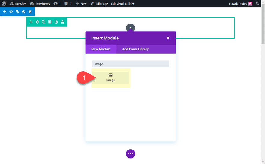
First, create a new a new section with a one-column row. Then add an image module to the row.
Hiding Overflow of Column
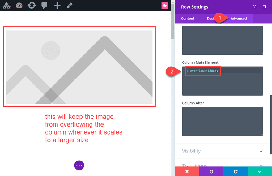
Before we start updating the Image settings, open the row settings and click the Advanced Tab. Then add the following custom CSS to the Column Main Element:
overflow: hidden;
This will keep the image from extending (or overflowing) beyond the column container whenever the image scales to a larger size on hover. If you don’t add this, the image will break out of the container and hide other elements of the page. Technically, you could add this css to the row main element instead of the column, but you would need to get rid of any custom row padding as well.
Save the row settings.
Adding your Image
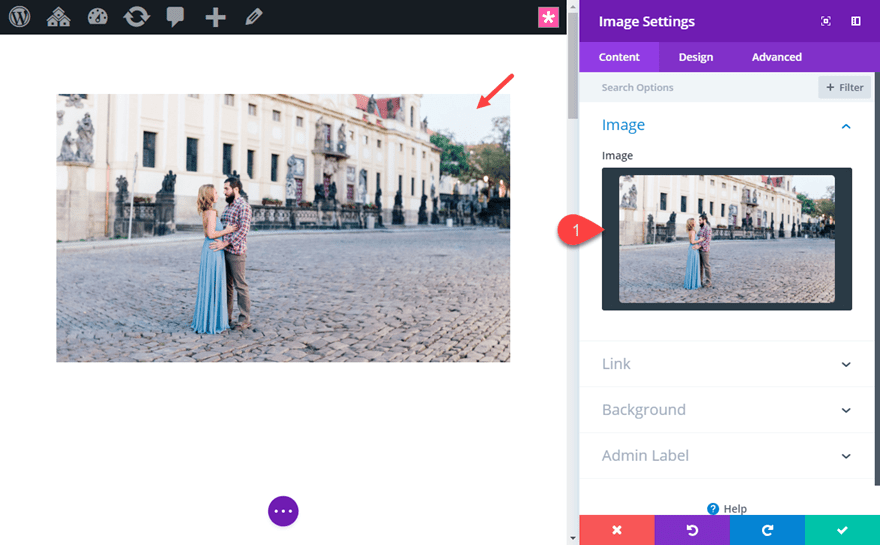
Now we can add out image to the image module. Open the image module settings and add an image.
Make sure the image is considerably larger than the column. This is important to keep the image from looking blurry when you scale the image to a larger size on hover. If you are using the default settings of a one-column row, the max width of the column will be 1080px. So, I’m using an image that is about 1500px in width and 900px in height.
Important: As a rule of thumb, the larger the image, the more room you will have to scale, move and rotate the image without losing image quality.
Adding Transform Hover Effects
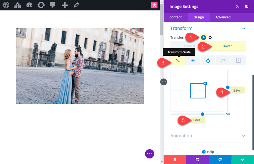
Now that we have our image in place, it’s time to use those transform options to create the Ken Burns hover effect. Hop over to the design tab toggle open the Transform options. Activate the hover effects and select the hover tab. Now any transform effect customizations will apply only to the hover state of the image module. Then under the Transform Scale tab, update the following:
Transform Scale x-axis (hover): 136%
Transform Scale y-axis (hover): 136%
Then click the Transform Translate tab and update the following:
Transform Translate x-axis (hover): 3%
Transform Translate y-axis (hover): 9%
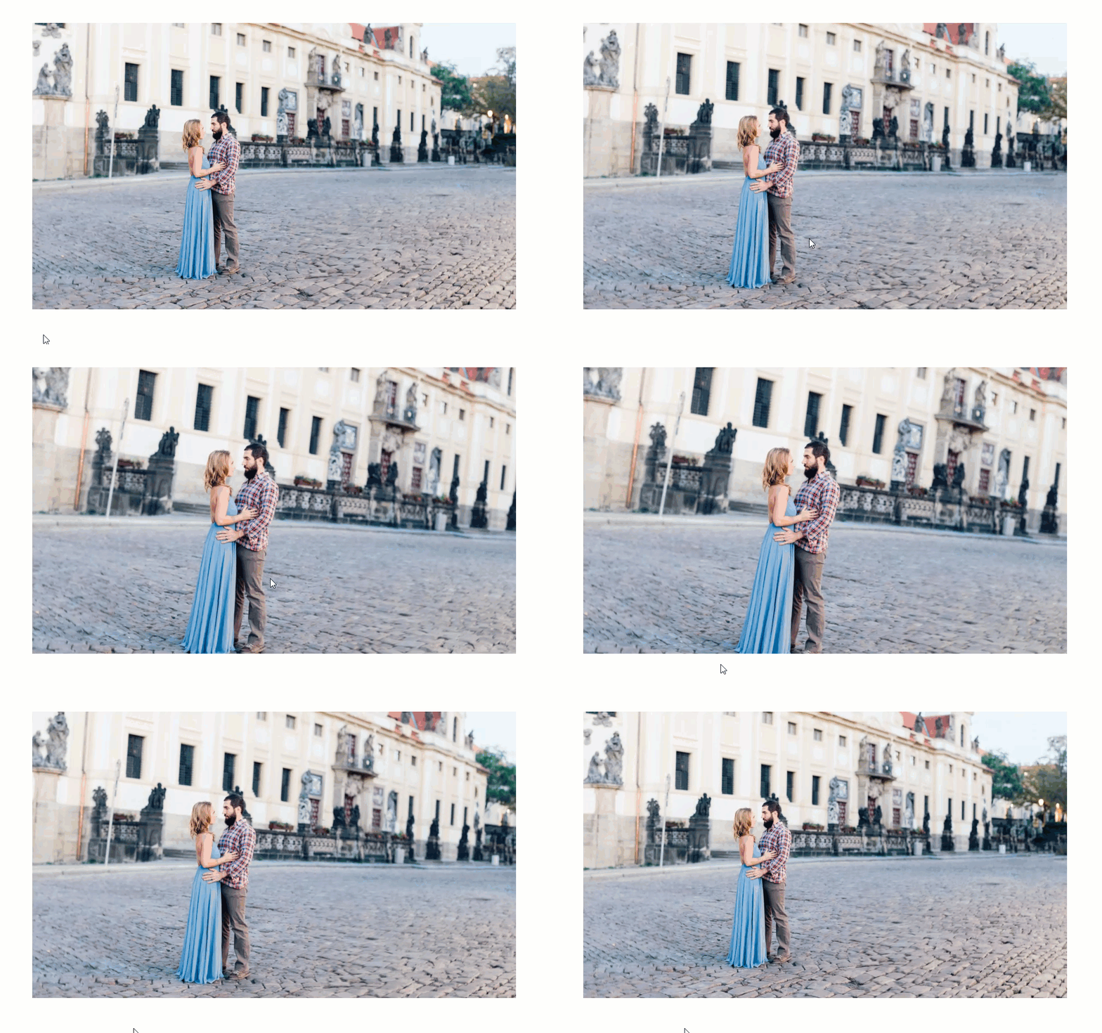
This moves the image to the left by 3% and downward by 9%. For this specific image, I was going for and effect that would zoom in and bring the couple to the center of the column viewport.
By default the translate length values will be in pixels (not percentage). You can use pixels for moving the image around but I find that using percentages makes the positioning more responsive.
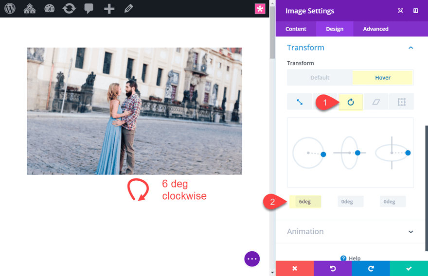
Next click the Transform Rotate tab and update the following:
Transform Rotate x-axis (hover): 6deg
Update Transition Options
Finally, we need to update the transition duration (how long it takes the transform hover effect to complete) and the speed curve (the timing function that allows the transition to change speed over its duration). For this example, I want the transition to take longer for a more dramatic (and classic) Ken Burns effect on hover. To do this, go to the advanced tab and update the transition options as follows:
Transition Duration: 2000ms (or 2 seconds)
Transition Speed Curve: Linear (this makes sure the speed of the transition doesn’t change in duration)
Final Result
Now Let’s check out the final result. Don’t be misled by the choppiness of the gif below. The transition is really smooth on a live site.
Adding the Ken Burns Hover Effect to multiple images in a Three Column Row
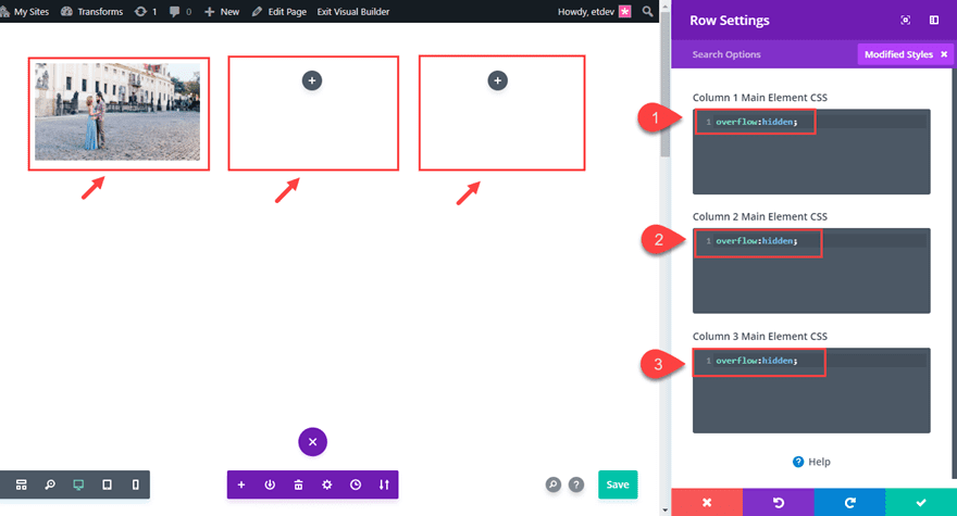
If you are wanting to add the ken burns hover effect to images in multiple columns, the same process applies. The main thing you need to do is make sure and add the “overflow:hidden” css snippet to each of the columns that contain your image.
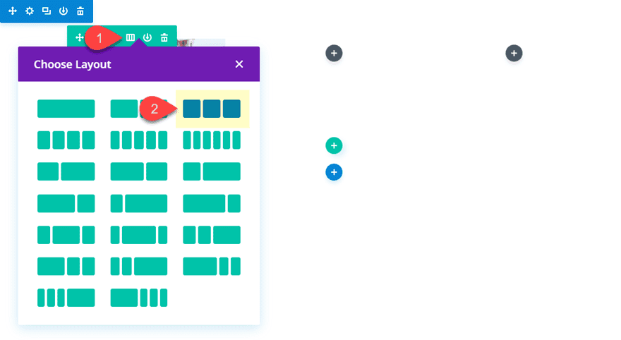
Using our previous example above, change the column structure of the row to a three-column layout.
Next, update the row settings with the custom CSS snippets that will hide the overflow of each column.
Column 1 Main Element CSS:
overflow:hidden;
Column 2 Main Element CSS:
overflow:hidden;
Column 3 Main Element CSS:
overflow:hidden;
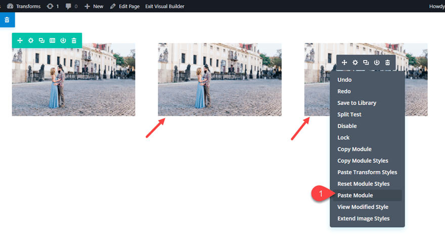
Next copy the image module and paste it into column 2 and column 3.
That’s it. Here is the final result.
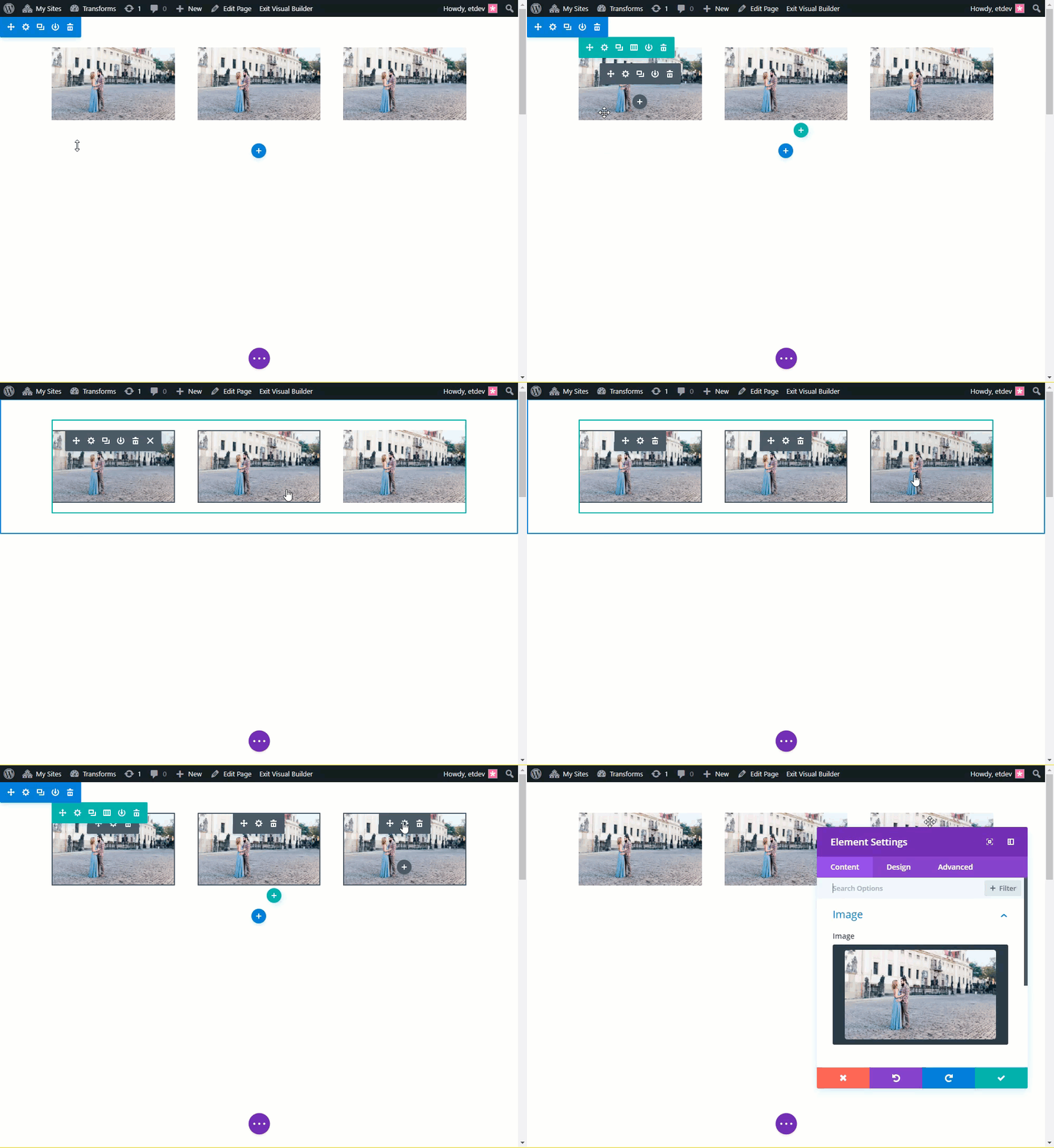
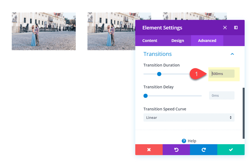
Since this design is more typical of a gallery grid layout, you will probably want to speed up the transition duration a bit to sharpen up the hover animation. You can do this easily using Divi’s multiselect feature. Hold ctrl or cmd and select all of the image modules. Then click on the settings gear icon on one of the images to open the Element Settings modal.
Now any updates you make in the element settings will be applied to all images at once. Update the transition options in the element settings as follows:
Transition Duration: 500ms
Here is the new transition duration in effect.
Adding the Ken Burns Hover Effect to a Any Module with a Background Image
The Ken Burns hover effect can also be used for modules other than the Image Module. This works well if you want to transform text or icons along with the background image of a module.
Here is how to add the Ken Burns effect to a Text Module.
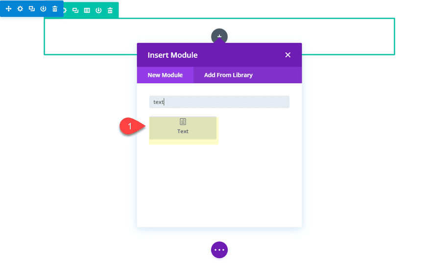
First create a new regular section with a one-column row. Then add a text module to the row.
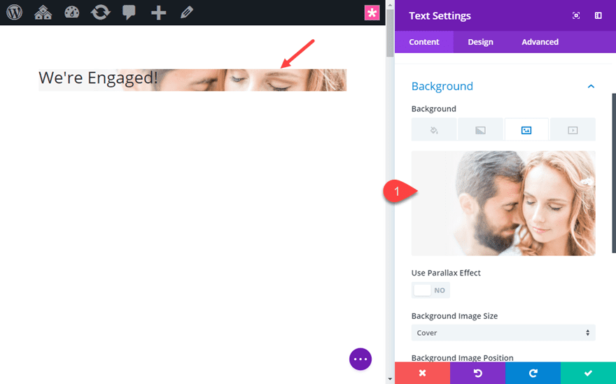
Update the text module with the following content:
<h1>We're Engaged!</h1>
Then add a background image to the module. Remember to add an image large enough to leave room for scaling and moving the image on hover.
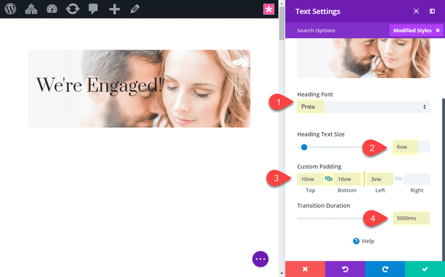
And then update the heading design options as follows:
Heading Font: Prata
Heading Text Size: 6vw
Custom Padding: 10vw top, 10vw bottom, 3vw left
Transition Duration: 5000ms
Now add the following Transform Settings to the text module.
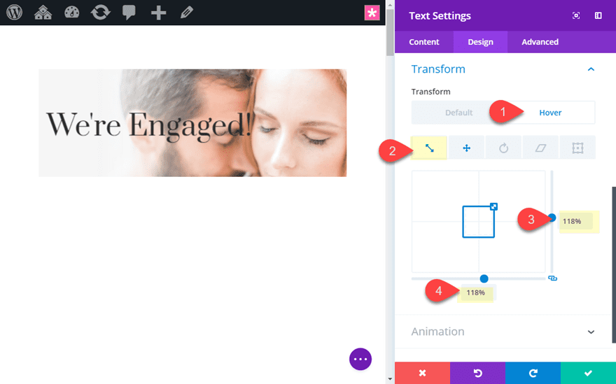
Transform Scale x-axis (hover): 118%
Transform Scale y-axis (hover): 118%
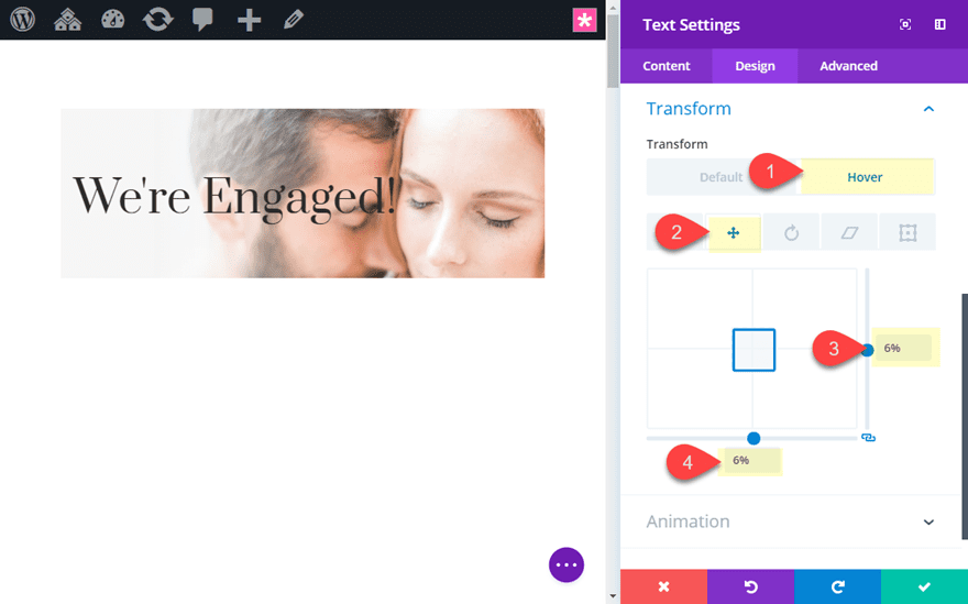
Transform Translate x-axis (hover): 6%
Transform Translate y-axis (hover): 6%
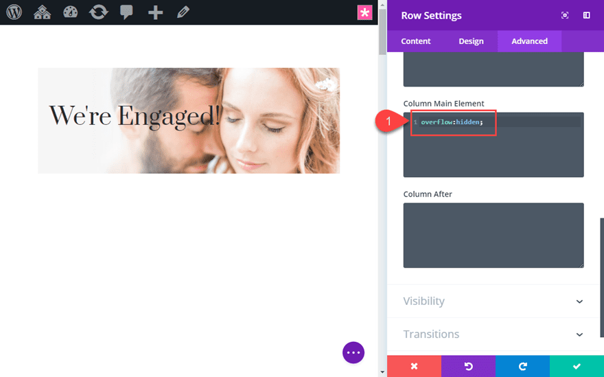
Now, update the Row Settings with the following custom CSS for the Column.
Column Main Element CSS:
overflow:hidden;
Now check out the result.
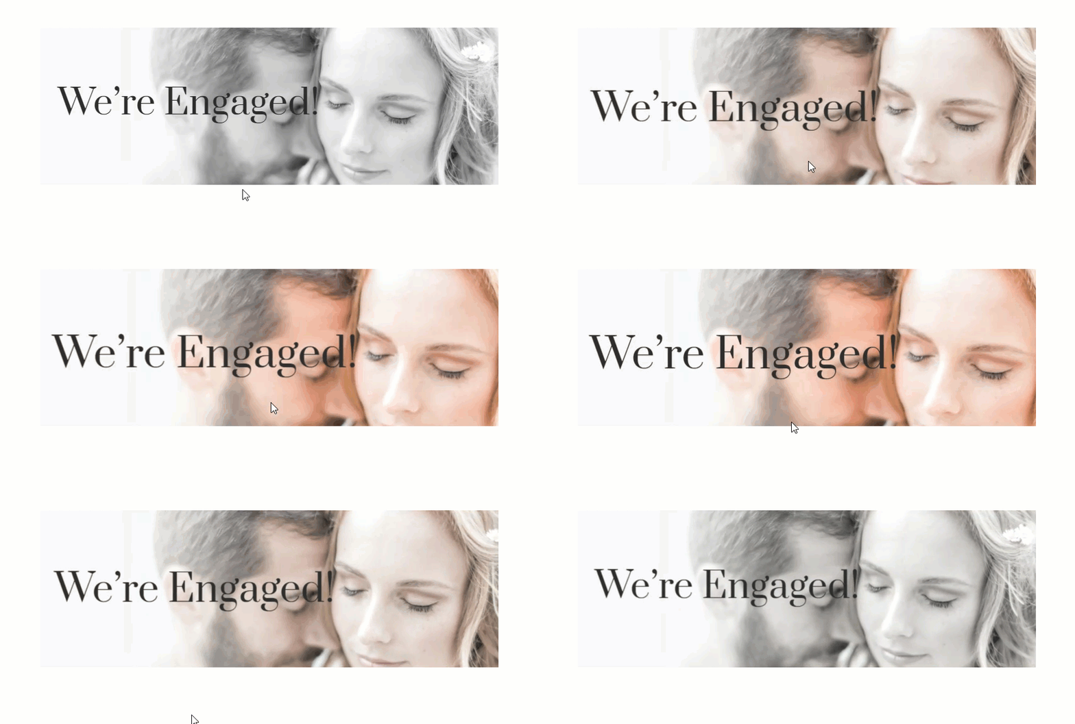
Notice how the text and the background image will transform together on hover.
Combining the Ken Burns Hover Effect with Additional Hover Effects
You can also combine the Ken Burns Hover Effect that is applied to a module with additional effects for even more creativity.
Combining Ken Burns Hover Effect with Filter Effects
In case you forgot about them, filter effects are a great way to add creative styling to your modules, especially on hover. And you can combine these filter effects with transform effect for some pretty unique hover transitions.
To show you, let’s use the example above that added the ken burns effect to a text module. Since the text module already has the transform hover effect in place, let’s add an additional filter effect to change the image from black and white to color.
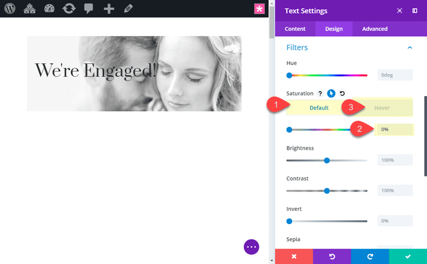
Open the text module settings and update the following filter option:
Saturation (default): 0%
Saturation (hover): 100%
This transition will set the text module to 0% saturation by default which will strip out the color making it black and white. Setting in back to 100% on hover will add the original color of the image back.
Here is the final effect of the filter effect combined with the ken burns hover effect.
Combining Ken Burns Hover Effect with Row Transform Effects
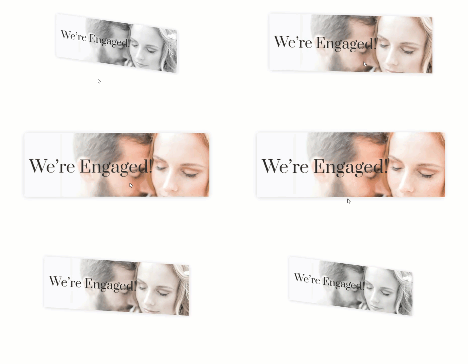
For this example, I’m going to show you how to combine the ken burns hover effect with an additional transform effect added to the row. The idea is to use transform effects to scale and rotate the row at its default state and then restore the original design on hover.
NOTE: This technique will really only work well for a one-column row with a single module. This is because the visitor will need to hover over the module and the row simultaneously. Therefore the module needs to take up the full height and width of the row. Additional modules or spacing will break the hover state and cause problems.
To do this, we are going to stay with our current text module design which already combines the ken burns hover effect with an additional filter effect. So this is actually a triple hover effect!
Open the settings of the row that contains the text module. Then update the following:
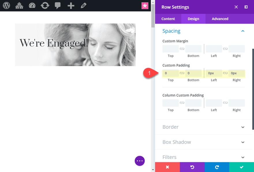
Custom Padding: 0px top, 0px bottom, 0px left, 0px right
This is to make sure there is no additional spacing between the text module and the row.
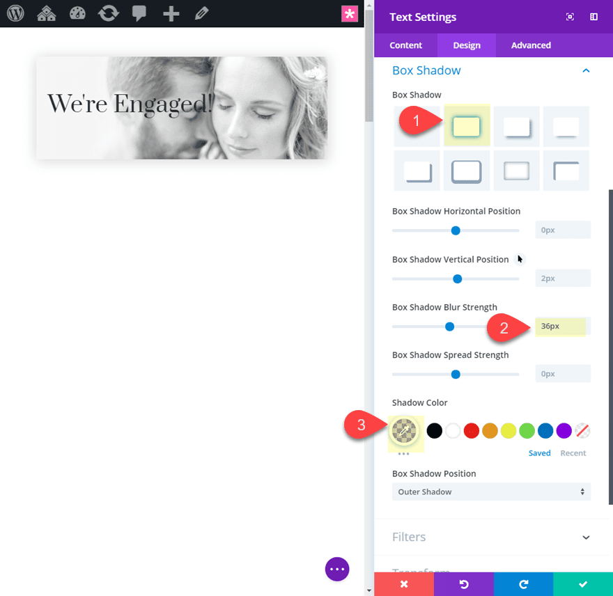
Next we are going to add a box shadow to the row as follows:
Box Shadow: see screenshot
Box Shadow Blur Strength: 36px
Shadow Color: rgba(0,0,0,0.17)
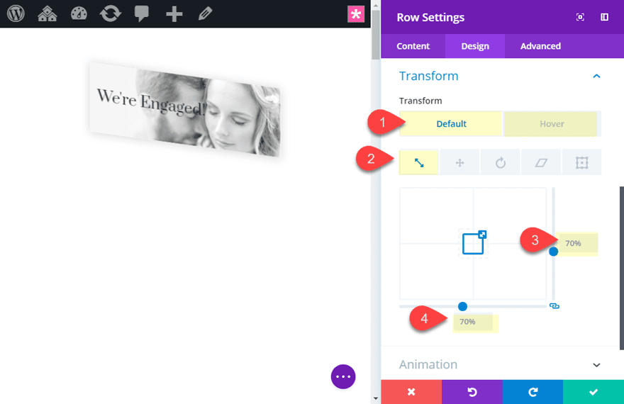
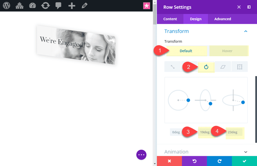
Now add the following Transform effects:
Transform Scale x-axis (default): 70%
Transform Scale x-axis (hover): 100%
Transform Scale y-axis (default): 70%
Transform Scale y-axis (hover): 100%
Transform Rotate y-axis (default): 19deg
Transform Rotate y-axis (hover): 0deg
Transform Rotate z-axis (default): 23deg
Transform Rotate z-axis (hover): 0deg
Now let’s check out the final result.
Adding the Ken Burns Hover Effect to an Entire Row of Content
Just in case you were wondering, the Ken Burns hover effect can also be used to bring an entire row of content to life on hover. This won’t be very practical for rows with a lot of content because it will be way to confusing or distracting for visitors. But for things like headers, this can be a useful design technique. The trick is to add the custom CSS snippet “overflow:hidden” to the section. Then you can add the transform effects to the row.
Final Thoughts
Although the Ken Burns Effect has been around for a while, you might still find it useful for creating some pretty unique hover effects for your images and modules in Divi. The trick is knowing how to use the Divi Transform options which are surprisingly intuitive. This examples given in this tutorial were meant to introduce the concept and hopefully provide a little inspiration for your own usage. When you think about all the ways you combine transform options with all the other styling options available in Divi, tons of ideas start to pop up.
I look forward to hearing from you in the comments.
Cheers!
[ad_2]
Source link

