Chances are high that you’ve landed on a 404 page and immediately left the website because it was less than helpful. A 404 page is what WordPress displays when someone enters or clicks on a URL that doesn’t exist on your website. This page is a generic error that just informs the visitor the page wasn’t found. In this article, we’ll explore how to create a custom 404 page for WordPress. Along the way, we’ll see both good and bad designs.
Why Create a Custom 404 Page for WordPress?
It’s tempting to skip designing the 404 page because you hope no one will see it. However, it needs to be helpful to your visitors. It can be just as important as any other page. A general message is a bad user experience. It doesn’t look good and it gives them no reason to stay on your website.
First, let’s look at the generic page we’re trying to avoid.
Generic 404 Page
The standard 404 page that WordPress displays is just an error message. It’s placed within the body content area and shows your header, footer, and sidebars if you have them.
Unfortunately, it isn’t helpful. It’s kind of like asking a store worker if something you’re looking for is on the aisle you’re in and they just say no. You want them to point you to the correct aisle. You want more information.
A 404 page should give you more information. It should be helpful. It should provide tools, links, advice, or some form of help. You don’t want to be left alone in the aisle not knowing where to go next.
Custom 404 Page Examples
There are thousands of amazing 404 pages across the web. Some are funny, some are serious. Some are more helpful than others. A few are plain, while others are gorgeous. Here’s a look at a few 404 pages to get an idea of how they’re designed. Some are simple and boring while others are helpful and look great.
1. Google
Google’s (not WordPress) 404 page is simple. It’s a small area of content in the center of the screen. The message just tells you there’s an error and provides a graphic of a robot in pieces. It doesn’t provide other information, but it’s Google, so all you have to do is type something else in the search bar.
2. WordPress.org
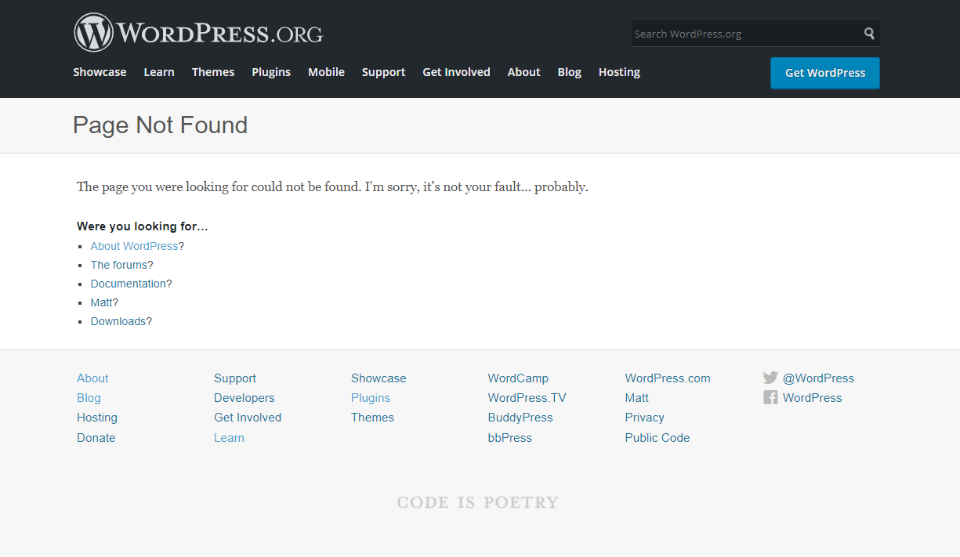
WordPress.org’s 404 page displays their standard header and footer. The body includes a title to show the page wasn’t found, a short explanation with a touch of humor, and then a list of links to help guide you. The links focus on being helpful.
3. WordPress.com
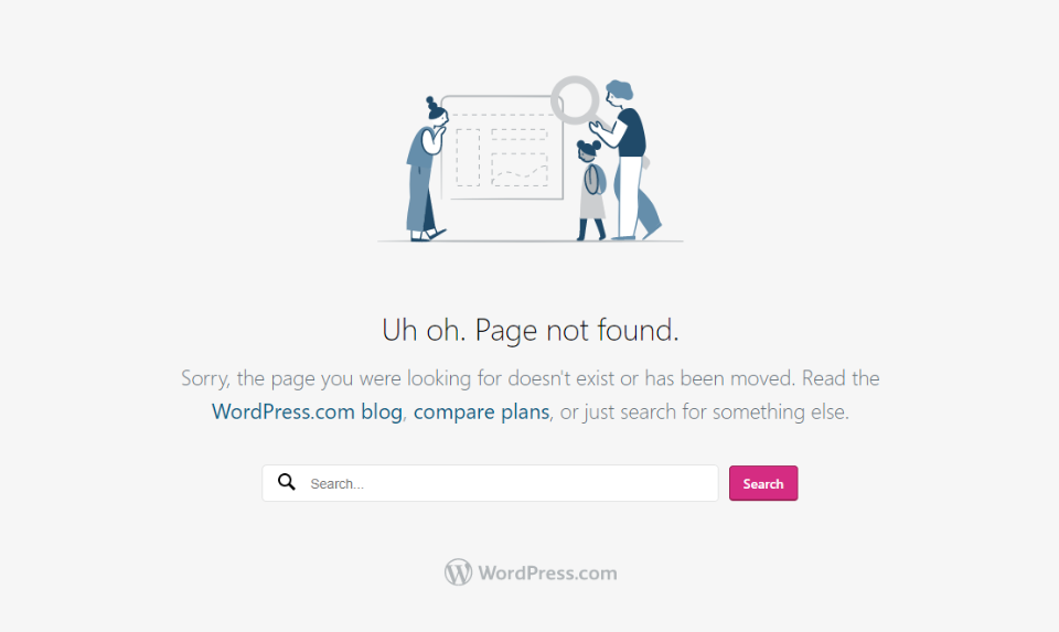
WordPress.com’s 404 page removes the header and footer. It shows a graphic, a title, a description with clickable links, a search box, and the WordPress.com logo. The links are helpful.
4. Elegant Themes
Elegant Themes’ 404 page (because I know you’re going to look anyway) shows the ET header, a large title with a small explanation, and a button as a CTA. You have access to almost everything from here.
5. Twenty Twenty-One
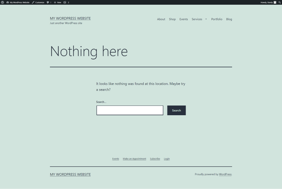
WordPress’s Twenty Twenty-One theme has a 404 page that uses your primary and footer menus. It has a large title. The body has a short description and a search box. Lines are used for styling. The background matches the site.
6. Twenty Twenty
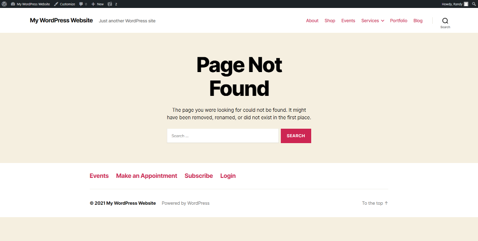
WordPress’s Twenty Twenty theme displays the header and footer. The body shows a large title in the center, an explanation, and a search box. All use the theme’s colors.
7. Slack
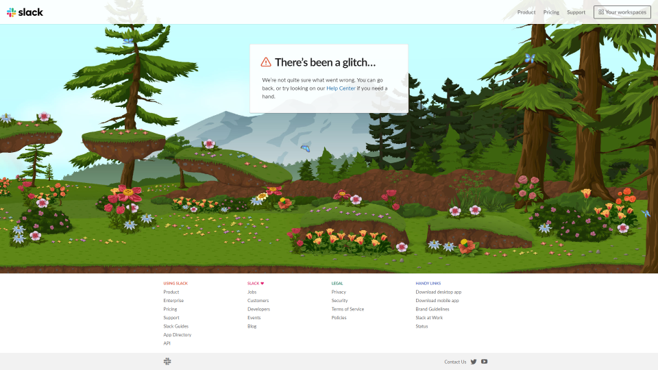
Slack’s (non WordPress) 404 page shows a box in the center with information about the error with a link to the help center. All the menus are here, too. The interesting part is the background. It’s a cartoon background that scrolls right or left to follow your mouse. Animated animals move across the screen.
8. Amazon
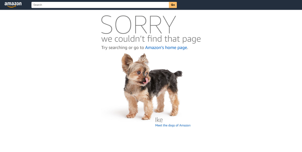
Amazon’s (also not WordPress) 404 page includes the Amazon logo with a search box, a large message, a smaller message with a link to the home page, and a photo of an animal with a link to learn more. It includes lots of different photos that can be displayed. They’re chosen at random.
404 Page Content
So, what does a 404 page need? We see a few common elements in the examples above.
First, it needs to be helpful. It shouldn’t just tell the visitor there is an error. It should tell what the error means. Imagine an error light coming on in your car. Your first question would be “what does that mean?” Not providing useful information about the error is frustrating.
Visitors need to know if they did something wrong or if the content doesn’t exist. If they don’t know, they’ll keep looking for the content until they furiously leave the website, vowing to never return. This is best done with a simple message and possibly an image that catches the eye. Something that stands out from your normal content that would appeal to your audience.
Next, it needs to provide some direction of what to do next. This could be a list of articles, a search box, a list of categories, most popular posts, most recent posts, a way to contact you, etc.
It’s that simple. 404 pages don’t need a lot of content. Just enough to be helpful.
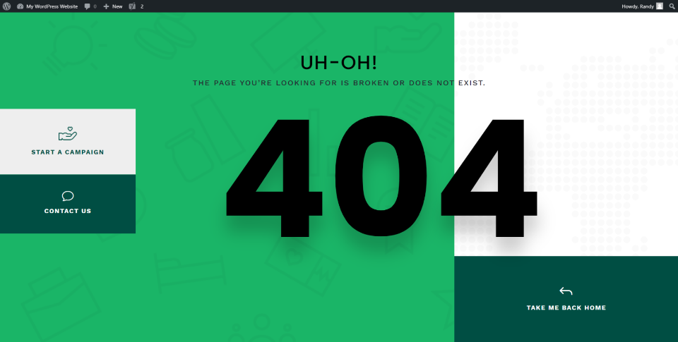
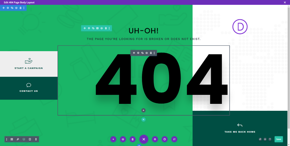
The example above includes:
- Background colors and patterns that would match the website/
- A title with a short message about the error.
- Large text showing that it’s a 404 page.
- A few buttons providing the visitor with some directions.
It’s simple but stylish and helpful. That’s all you need.
Let’s look at how to create a custom 404 page for WordPress using the content ideas we just discussed.
How to Create a Custom 404 Page in WordPress with the Divi Theme Builder
The Divi Theme Builder makes it easy to create and assign a 404 page. Elegant Themes has several premade 404 pages that you can download for free. You can customize them any way you want. They’re a great way to get a head start on a 404 page design. If you prefer, you can build one from scratch.
The example above is from the Fourth Theme Builder layout pack. There are lots of 404 pages available in the ET blog. To find them, search for “theme builder layout pack” or check them out here:
Importing a Custom 404 Page into the Divi Theme Builder
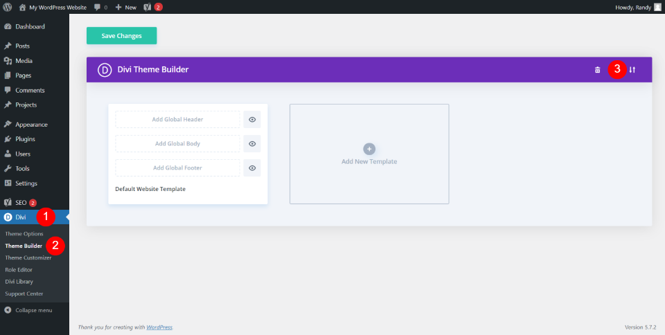
You’ll find the Divi Theme Builder in the WordPress dashboard by going to Divi > Theme Builder. This opens the page where you can create or import templates and assign them. In the upper right corner, you’ll see the import icon. Click this icon to import your 404 page template.
Note – for tutorials on using the Divi Theme Builder, search for “theme builder” here in the Elegant Themes blog.
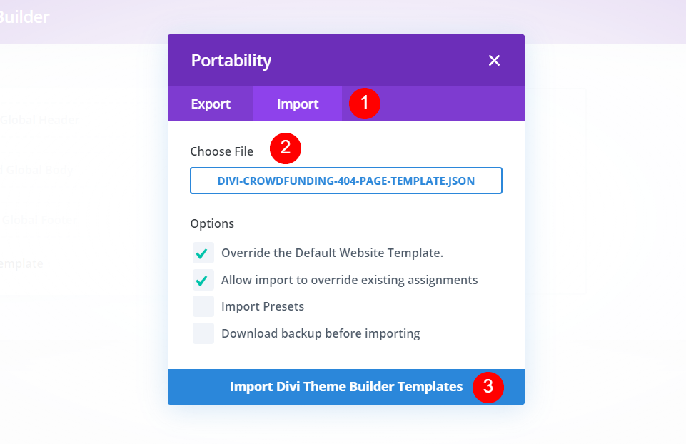
A modal opens where you can import your template. Select Import and navigate to your file under Choose File. The options to override the defaults and assignments are selected by default. I recommend leaving them selected. Click to import the template at the bottom of the modal. I’m importing the 404 page for the Crowdfunding Layout Pack.
By importing a 404 page, it’s assigned automatically. Next, click on the edit icon to open the builder.
Now, make your edits within each module by adding your links, images, colors, text, etc. Save the layout and click the x in the upper right corner to close the builder.
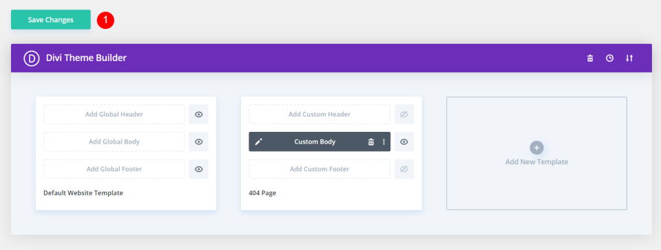
Finally, save the changes to apply the template. You now have a custom 404 page.
Creating a Custom 404 Page with the Divi Theme Builder
In the Theme Builder, select to add a new template.
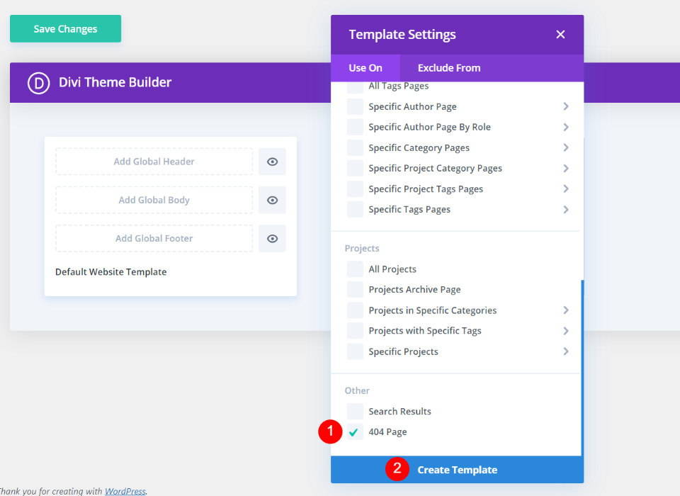
This opens the template settings. Scroll to the bottom and select 404 Page under Other. Next, click Create Template. The template settings will close.
Now, you can create the 404 page. Most don’t use a header or footer. Select Add Custom Body.
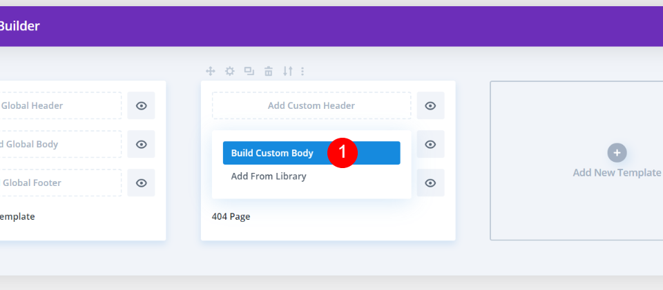
This shows two selections allowing you to build a custom body or add from the library. Select Build Custom Body.
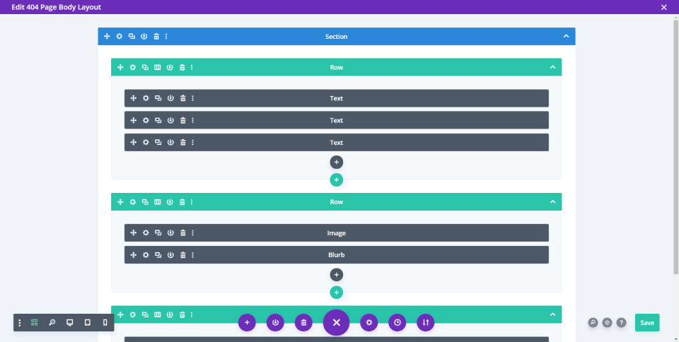
Build the 404 page with the Divi Builder as normal. Save and exit.
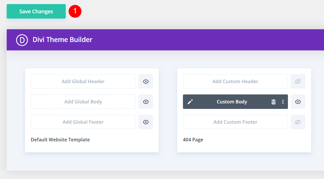
Finally, save your changes. You’re done.
Ending Thoughts on Creating a Custom 404 Page for WordPress
That’s our look at how to create a custom 404 page for WordPress. 404 pages need to be helpful. Unfortunately, the generic WordPress 404 page isn’t helpful, and it provides a poor user experience. Fortunately, you can create your own 404 page using the Divi Theme Builder.
Using the information we’ve provided here, you’re well on your way to create a beautiful 404 page that provides users with a great experience and looks amazing while doing it.
We want to hear from you. Have you created a custom 404 page for your WordPress website? Let us know about our experience in the comments.
Featured Image via Letters-Shmetters / shutterstock.com


