Creating a popup login form in Divi can be an effective way to boost the design and user experience of logging in and out of your site. The idea is to create a login form that shows in a popup box whenever the user clicks a login button on the header of the page. This is more convenient than redirecting the user to a custom Login page. Plus, it allows web developers to create a custom design of the login form (at least on the initial front end) which can be a refreshing alternative to the traditional WordPress login experience.
In this tutorial, we are going to create a popup login form with custom login and logout buttons in Divi. Using the Divi Login Module and a couple of button modules, we will create a seamless popup login experience on the front end by allowing users to log in and log out without being redirected to a different page.
Granted, this solution is limited to the front-end login form design, which means that any errors that occur (or if the user needs to reset a password) will redirect to the traditional WordPress login form/page design found at “wp-login.php”. However, for those looking for a custom login design on the front-end without having to use a plugin, then this may be the solution for you.
Let’s get started!
Sneak Peek
Here is a quick look at the design we’ll build in this tutorial.
Notice how the login button and logout buttons change respectively. And, once the user logs in, they remain on the current page. Plus the popup login form shows different “warning” content whenever the user attempts to log out.
Download the Template for FREE
To lay your hands on the designs from this tutorial, you will first need to download the file using the button below. To gain access to the download you will need to subscribe to our Divi Daily email list by using the form below. As a new subscriber, you will receive even more Divi goodness and a free Divi Layout pack every Monday! If you’re already on the list, simply enter your email address below and click download. You will not be “resubscribed” or receive extra emails.
How to Upload The FREE Template
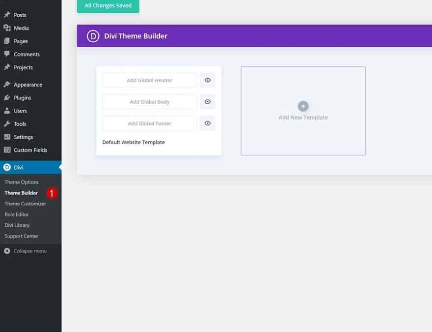
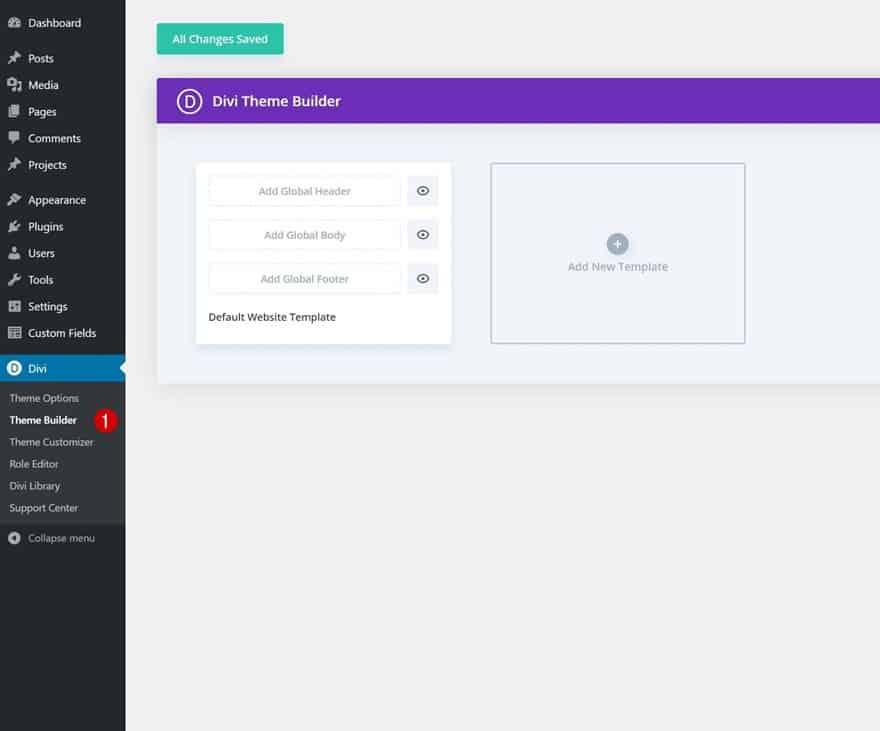
To upload the template, navigate to the Divi Theme Builder in the backend of your WordPress website.
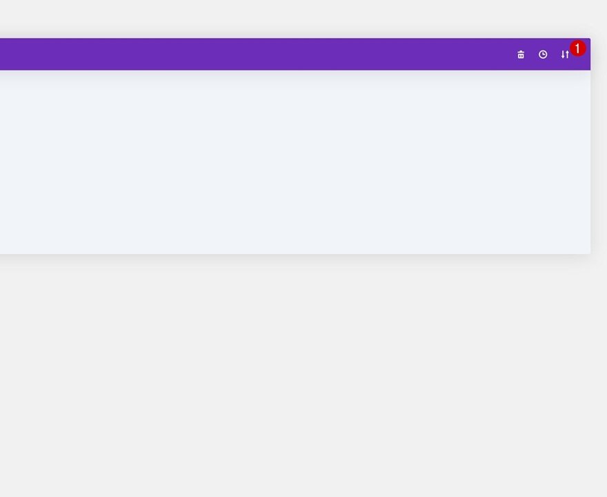
Then, in the top right corner, you’ll see an icon with two arrows. Click on the icon.
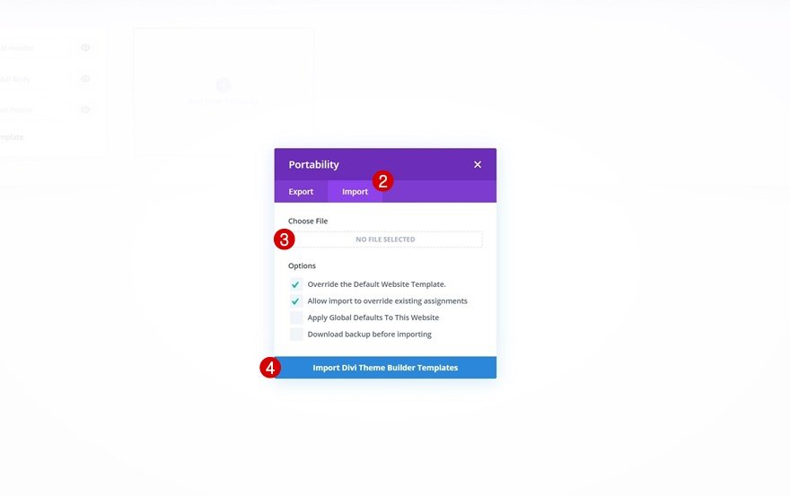
Navigate to the import tab, upload the JSON file which you were able to download in this post and click on ‘Import Divi Theme Builder Templates’.
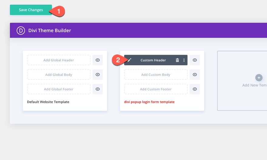
Once you’ve uploaded the file, you’ll notice a new global header and footer in your default website template. Save the Divi Theme Builder changes as soon as you want the template to be activated.
To modify the header template’s elements, start by opening the template.
Let’s get to the tutorial, shall we?
What You Need to Get Started
Although you can add this popup login form and custom login/logout buttons to any custom header, we are going to use a premade header to speed up the process and get a jump start on the design.
If you haven’t yet, install and activate the Divi Theme.
Import Crowdfunding Header Template to Theme Builder
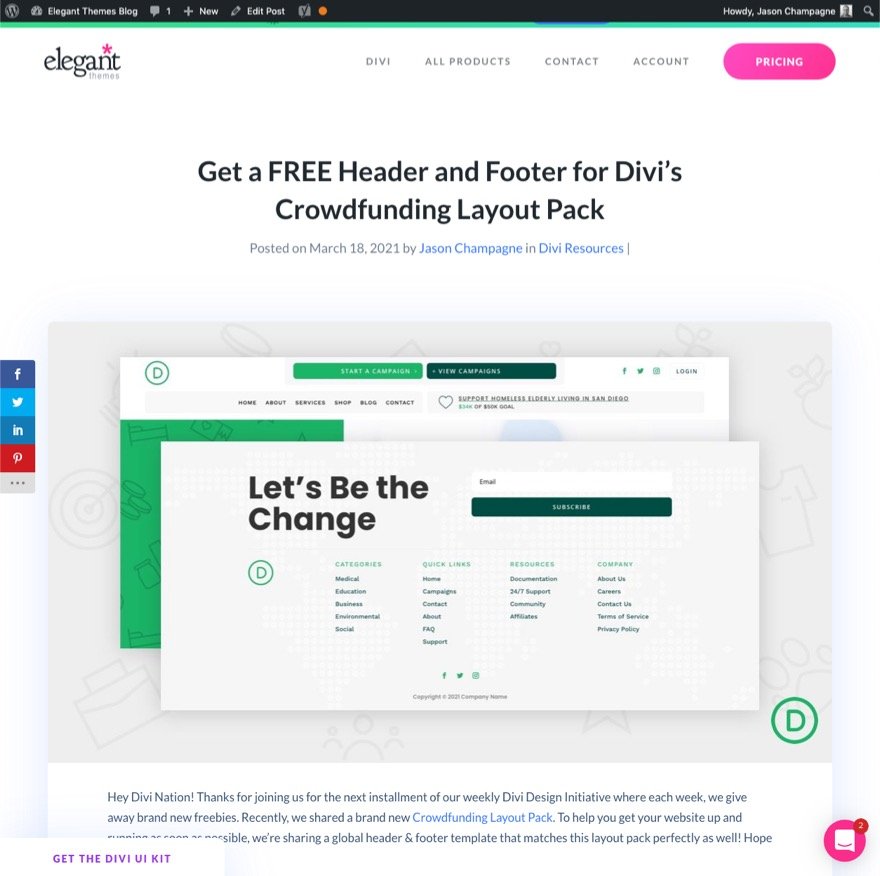
To get started, download the free header and footer for Divi’s Crowdfunding Layout Pack. To do this, go to the blog post.
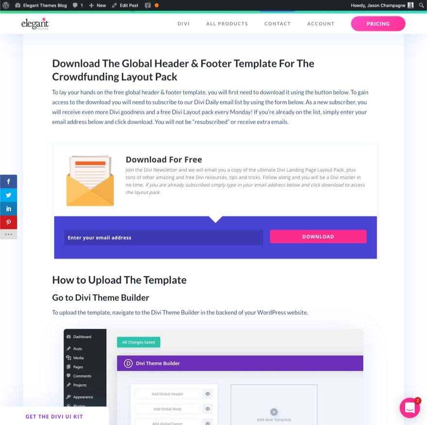
Then enter your email to download the zip file.
After that, unzip the file so that it is ready for import.
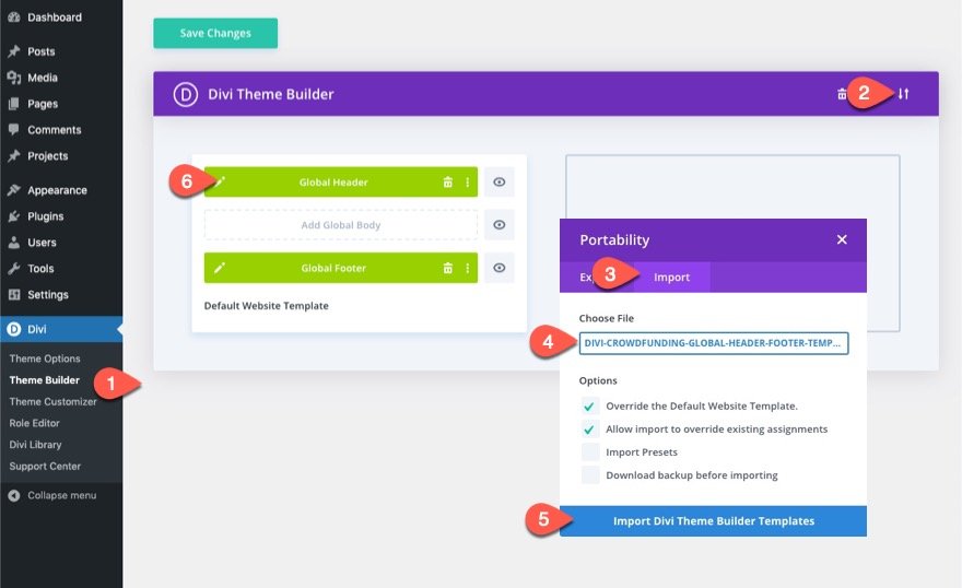
To import the file to the theme builder, follow these steps:
- Navigate to Divi > Theme Builder.
- Click the Portability Icon.
- In the Portability popup, select the import tab.
- Choose the unzipped file previously downloaded to be imported.
- Click the Import button.
- Click the edit icon to edit the imported header.
Creating the Popup Login Form with Custom Login/Logout Buttons in Divi
Part 1: Creating the Login and Logout Buttons
Once in the Global Header Layout editor, open the layers view so that you can see all of the elements easily.
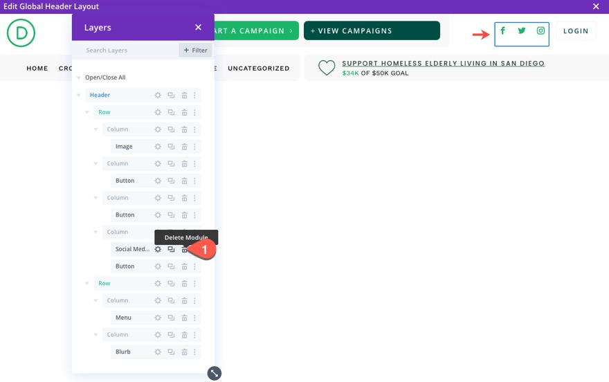
In the top row of the header section, delete the social media follow module next to the Login button in column 3.
Creating the Login Button
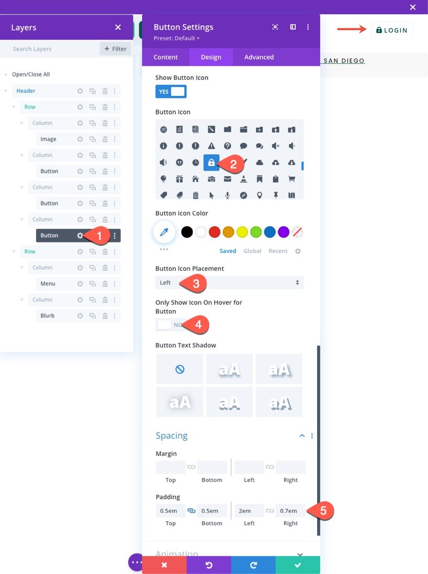
To create our login button, open the settings for the button module in column3 of the top row.
Update the following under the design tab:
- Button Icon: lock icon (see screenshot)
- Button Icon Placement: Left
- Only Show Icon On Hover for Button: NO
- Padding: 0.5em top, 0.5em bottom, 2em left, 0.7em right
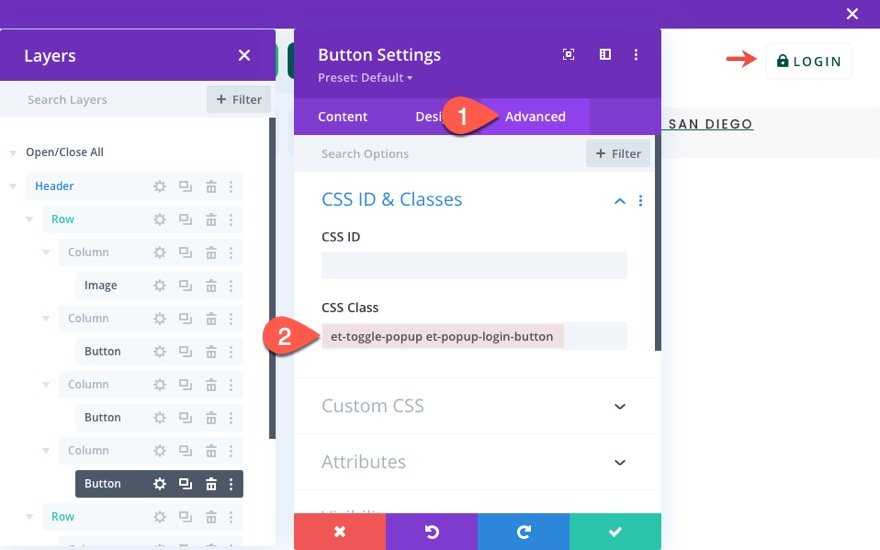
Under the Advanced tab, give the button two custom CSS Classes as follows:
- CSS Class: et-toggle-popup et-popup-login-button
Creating the Logout Button
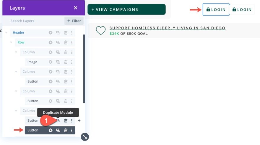
To create our logout button, duplicate the existing Login button in column 3.
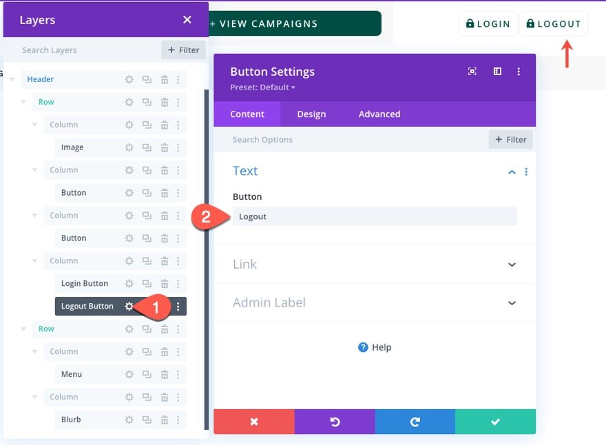
To help distinguish the two buttons, you can update the label of each respectively. Then, open the settings for the duplicate button module in column3.
Change the button text to read “Logout”.
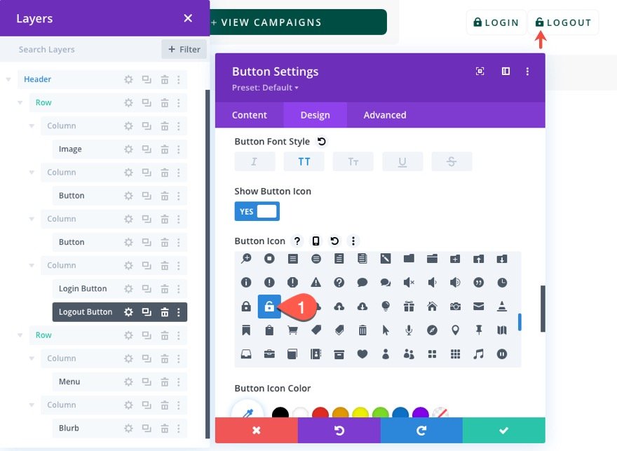
Update the following under the design tab:
- Button Icon: unlock icon (see screenshot)
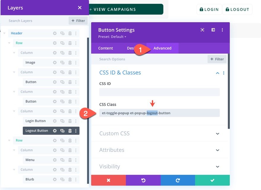
Under the Advanced tab, update the button CSS Classes as follows:
- CSS Class: et-toggle-popup et-popup-logout-button
The first class will remain the same but the second class will be different.
Part 2: Creating the Popup Section
Once the buttons are finished, we are ready to create the popup section that will serve as our popup containing the login form(s).
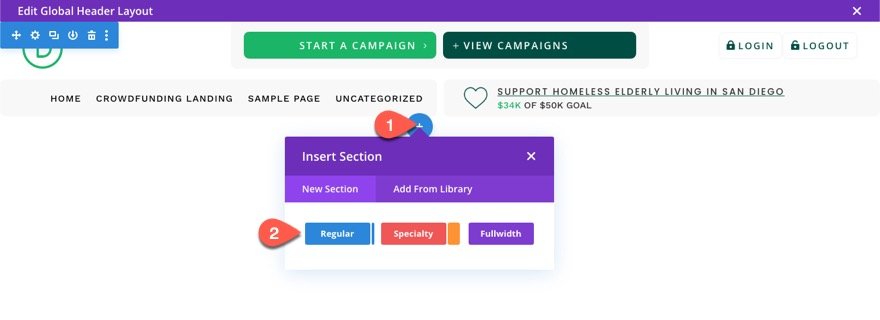
Under the header section, add a new regular section.
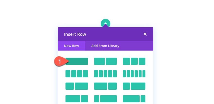
Then insert a one-column row inside the section.
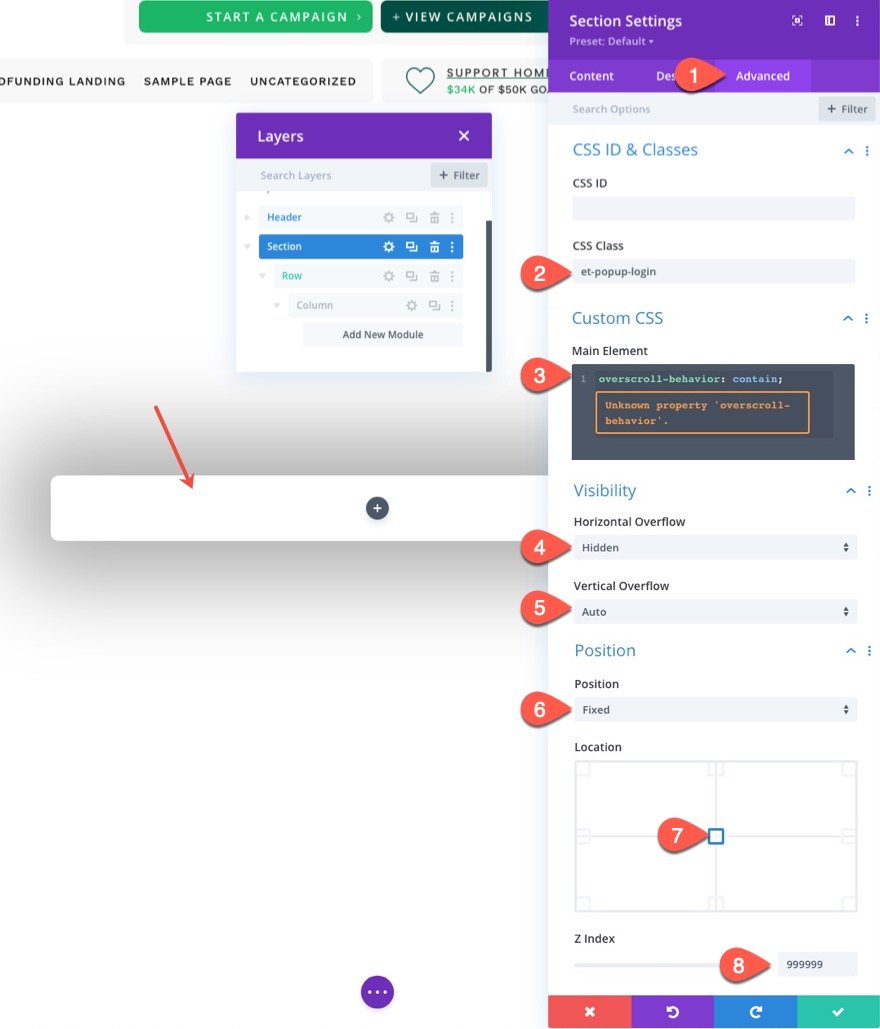
Section Settings
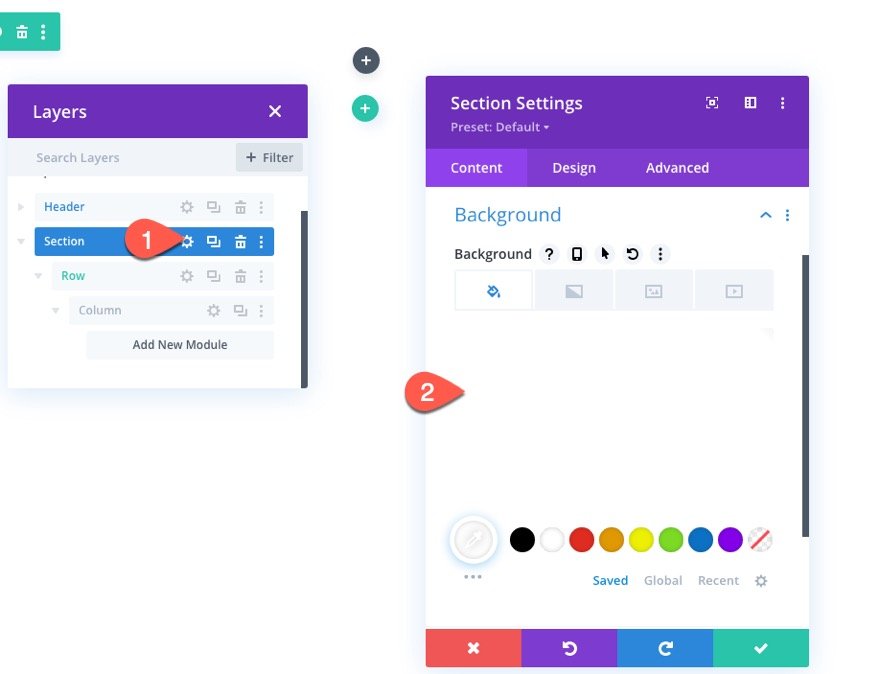
Before updating the row, open the section settings.
Under the content tab, give the section a white background color:
- Background Color: #ffffff
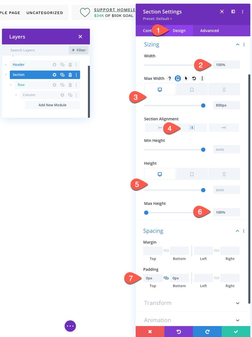
Under the design tab, update the following:
- Width: 100%
- Max Width: 800px (desktop), 80% (tablet), 100% (phone)
- Section Alignment: Center
- Height: auto (desktop and tablet), 100% (phone)
- Max Height: 100%
- Padding: 0px top, 0px bottom
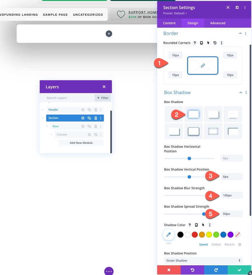
- Rounded Corners: 10px
- Box Shadow: see screenshot
- Box Shadow Vertical Position: 0px
- Box Shadow Blur Strength: 100px
- Box Shadow Spread Strength: 50px
Under the Advanced tab, update the following:
Add a custom CSS Class.
- CSS Class: et-popup-login
Add a snippet of custom CSS to the Main Element:
overscroll-behavior: contain;
Update the Visibility and Position options.
- Horizontal Overflow: hidden
- Vertical Overflow: auto
- Position: Fixed
- Location: Center Center
- Z Index: 999999
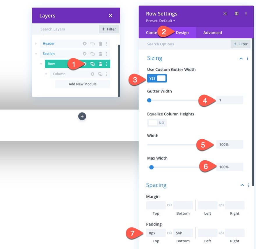
Row Settings
Once the section settings are in place, open the settings for the row and update the following design settings:
- Use Custom Gutter Width: YES
- Gutter Width: 1
- Width: 100%
- Max Width: 100%
- Padding: 0px top, 5vh bottom
Part 3: Creating the Close Popup Icon
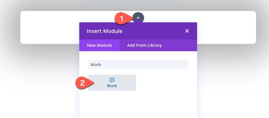
To create the Close Popup Icon that will close/hide the popup on click, we are going to use a blurb module.
Add a new blurb module to the row.
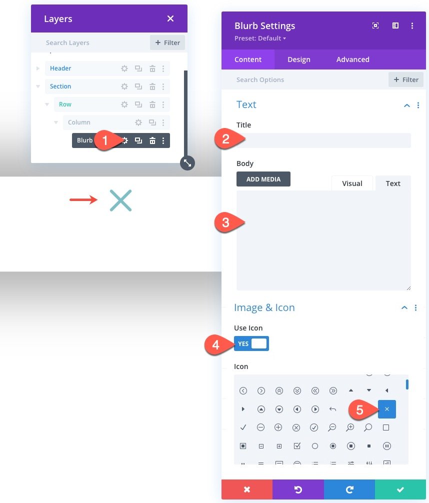
Open the setting for the blurb module, and delete the Title and Body text.
Then add the icon as follows:
- Use Icon: YES
- Icon: “x” icon (see screenshot)
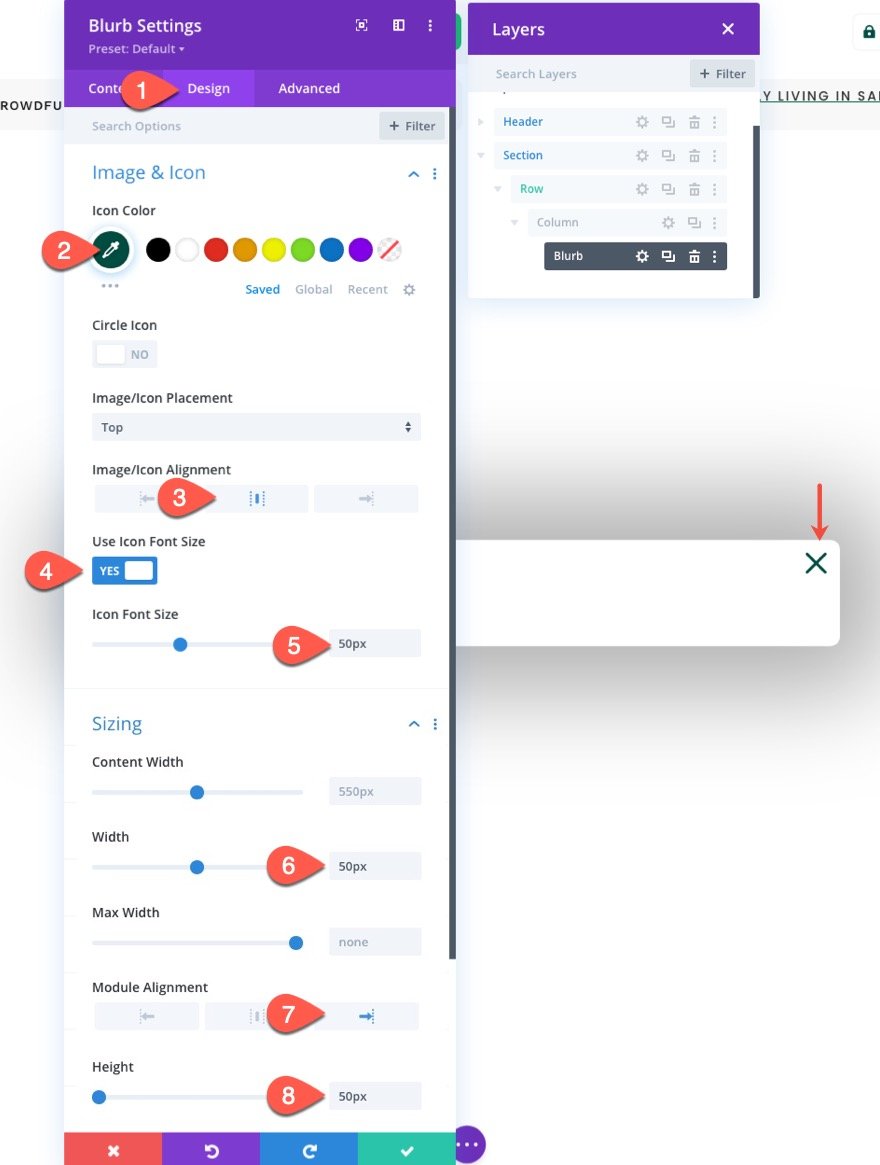
Under the design tab, update the following:
- Icon Color: #004e43
- Image/Icon Alignment: Centered
- Use Icon Font Size: YES
- Icon Font Size: 50px
- Width: 50px
- Module Alignment: Right
- Height: 50px
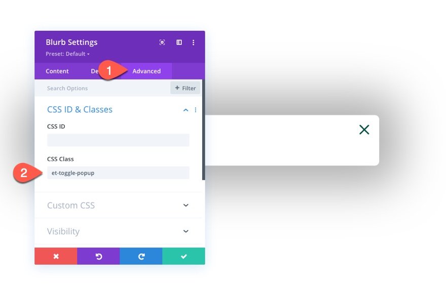
Under the Advanced tab, add a CSS class to the blurb as follows:
- CSS Class: et-toggle-popup
Part 4: Creating the “Logged Out” and “Logged In” Login Forms
In order to have different content and design for the login form when logging in and logging out, we are going to create two different login form modules. The first will be the login form that will show whenever the user is “logged out”. The second will be the login form that will show whenever the user is “logged in”.
Creating the “Logged Out” Form
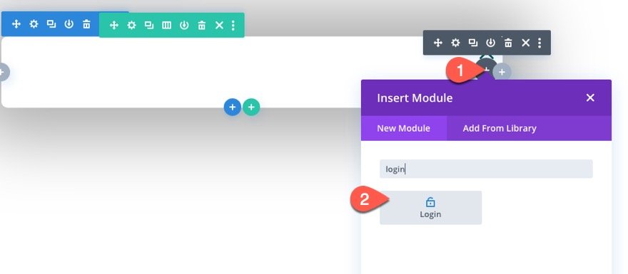
To create the “Logged Out” Login Form, add a new login form module under the blurb module icon inside the row.
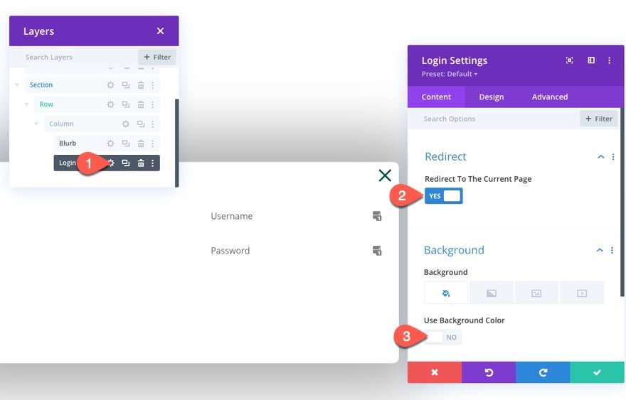
Open the login module settings and update the following:
Content tab
- Redirect To The Current Page: YES
- Use Background Color: NO
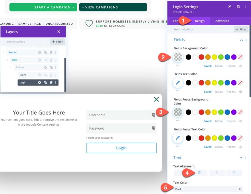
Design Tab
- Fields Background Color: rgba(0,78,67,0.05)
- Fields Focus Background Color: rgba(0,78,67,0.15)
- Text Alignment: Center
- Text Color: Dark
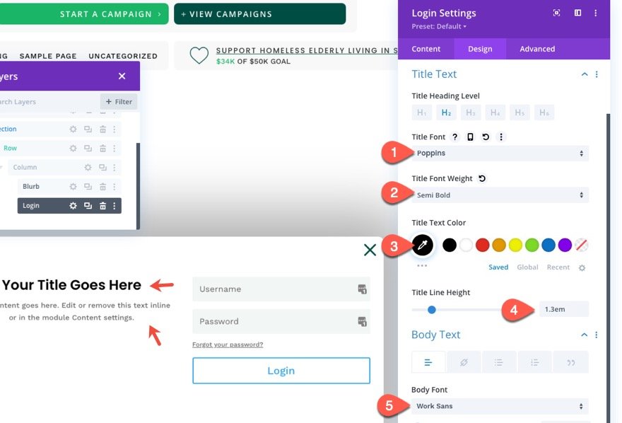
- Title Font: Poppins
- Title Font Weight: Semi Bold
- Title Text Color: #000000
- Title Line Height: 1.3em
- Body Font: Work Sans
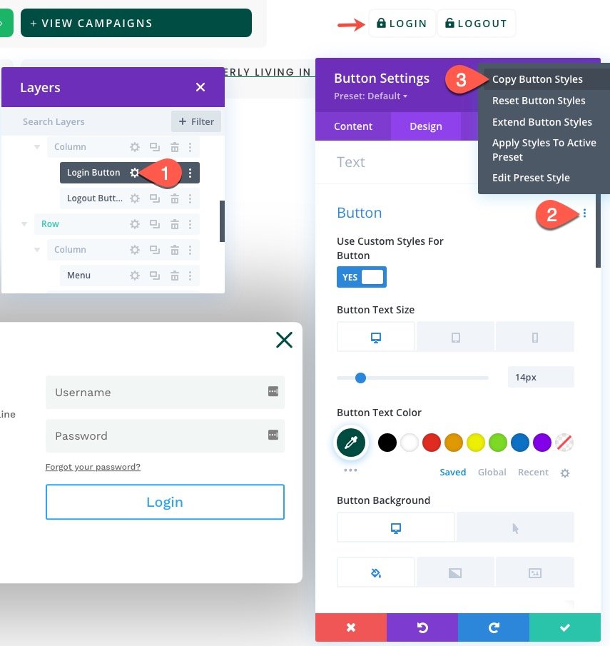
To update the button styles, copy the button styles of the Login Button we created in the third column of the row in the Header section.
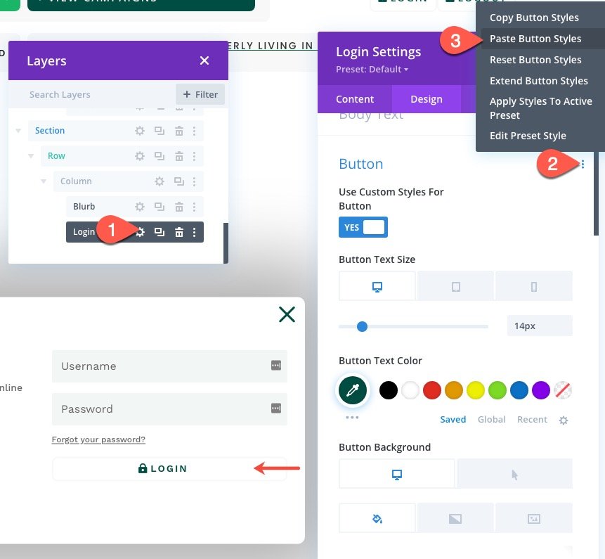
Then paste the button styles to the button option group in the Login Settings under the design tab.
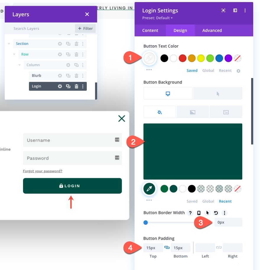
Then update the button styles for the login form as follows:
- Button Text Color: #ffffff
- Button Background Color: #004e43
- Button Background Color (hover): #00683c
- Button Border Width: 0px
- Button Padding: 15px top, 15px bottom
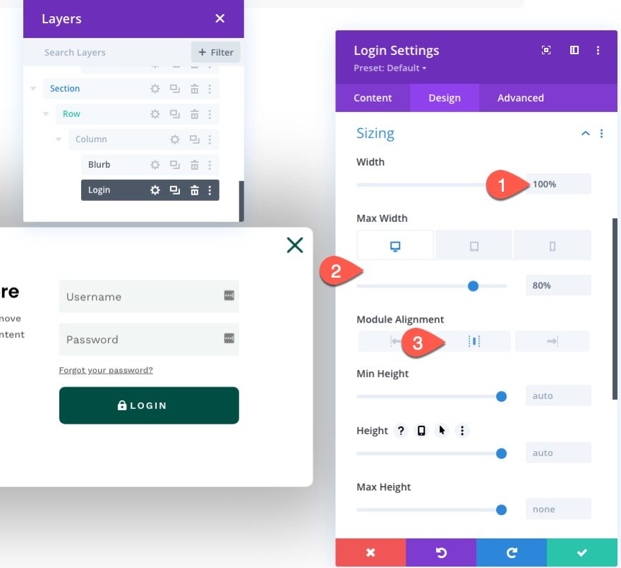
Then update the sizing options as follows:
- Width: 100%
- Max Width: 80% (desktop), 90% (tablet), 95% (phone)
- Module Alignment: Center
Advanced Tab
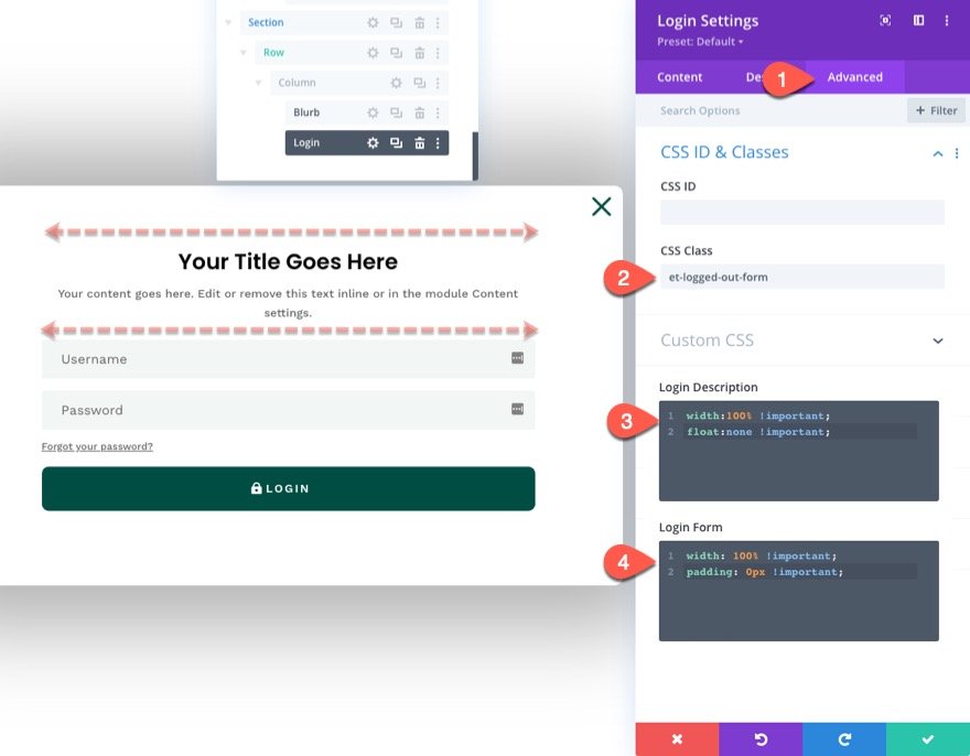
Under the Advanced Tab, update the CSS Class and Custom CSS as follows:
- CSS Class: et-logged-out-form
Custom CSS for Login Description:
width: 100% !important;
float: none !important;
Custom CSS for Login Form:
width: 100% !important;
padding: 0px !important;
This will make sure the login form module spans the full width of the row/column even on desktop.
Creating the “Logged In” Form
Now that the “Logged Out” version of the form is complete, we need to create the “Logged In” version which will have different content and styling to maximize the user experience.
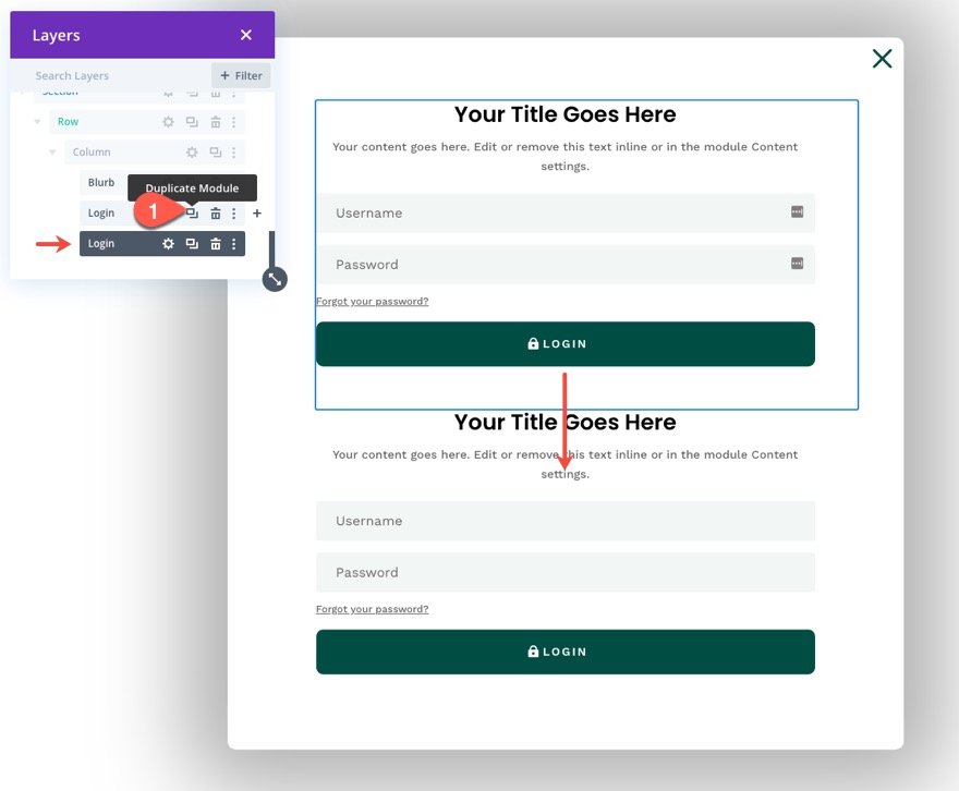
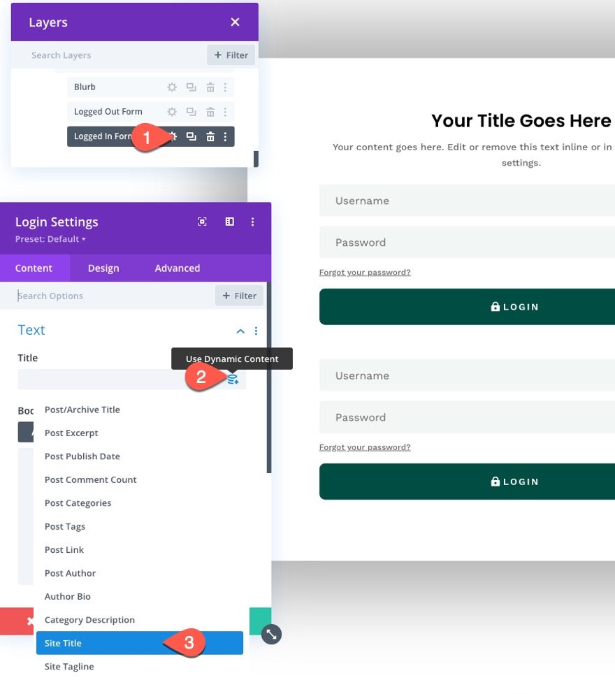
To create the “Logged Out” login form, duplicate the existing login form.
Then update the label for each of the login forms respectively.
Open the settings for the duplicate (the “Logged In” form) and add the Site Title as dynamic content to the Title of the login form module.
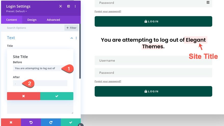
Next open the settings for the site title dynamic content and update the before and after content as follows:
- Before: “You are attempting to log out of “
- After: “. “
This will create a nice dynamic notification for users attempting to log out of the site.
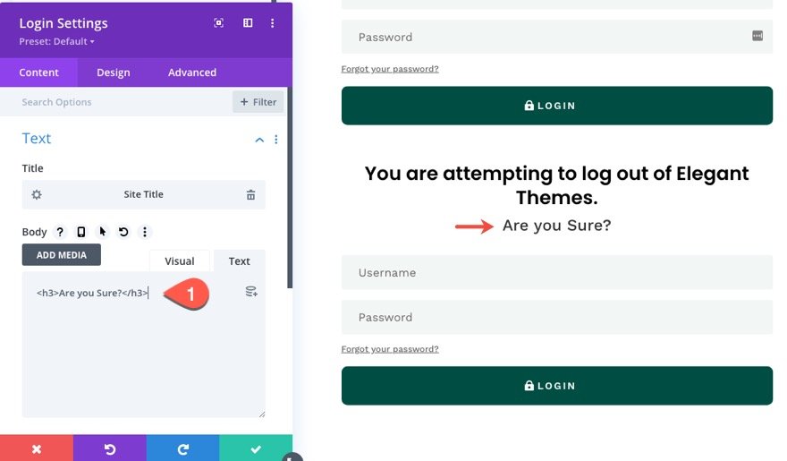
Then add the following H3 heading to the body:
<h3>Are you sure?</h3>
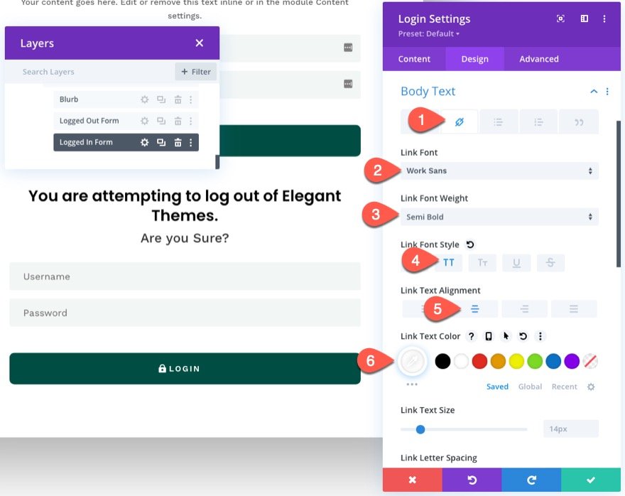
If you have ever seen the login form module content when logged in, you know that there is a custom message that includes a custom “logout” link. To style this link to look like a button, we need to customize the body link font/text settings as follows:
- Select the link tab under body text options.
- Link Font: Work Sans
- Link Font Weight: Semi Bold
- Link Font Style: TT
- Link Text Alignment: center
- Link Text Color: #ffffff
NOTE: You won’t be able to preview these results until you view the form on a live page.
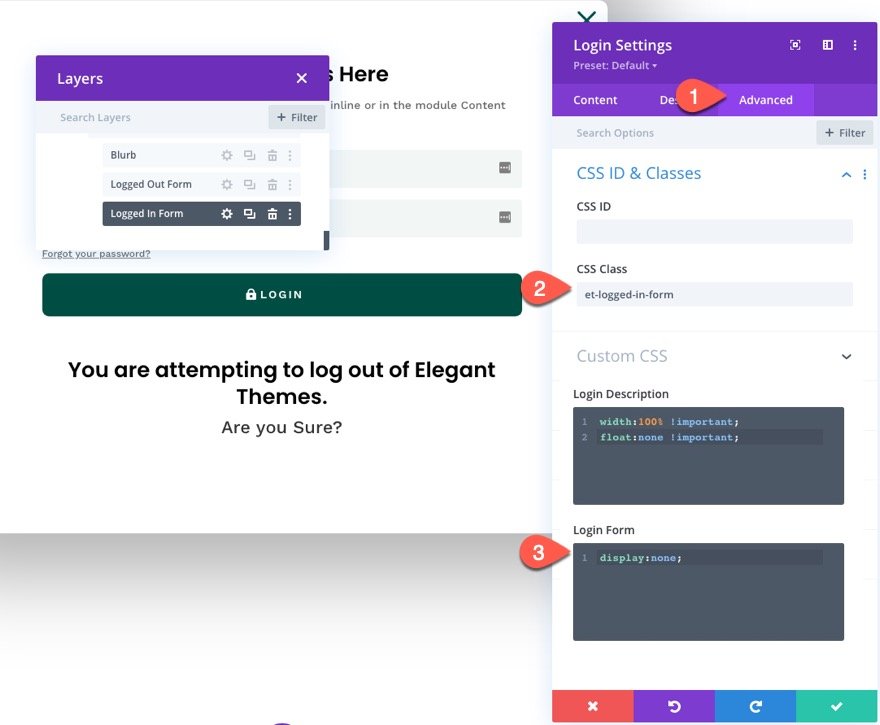
Under the Advanced tab, update the CSS Class and Custom CSS as follows:
- CSS Class: et-logged-in-form
Custom CSS for Login Form:
display:none;
Part 5: Adding the Custom Code
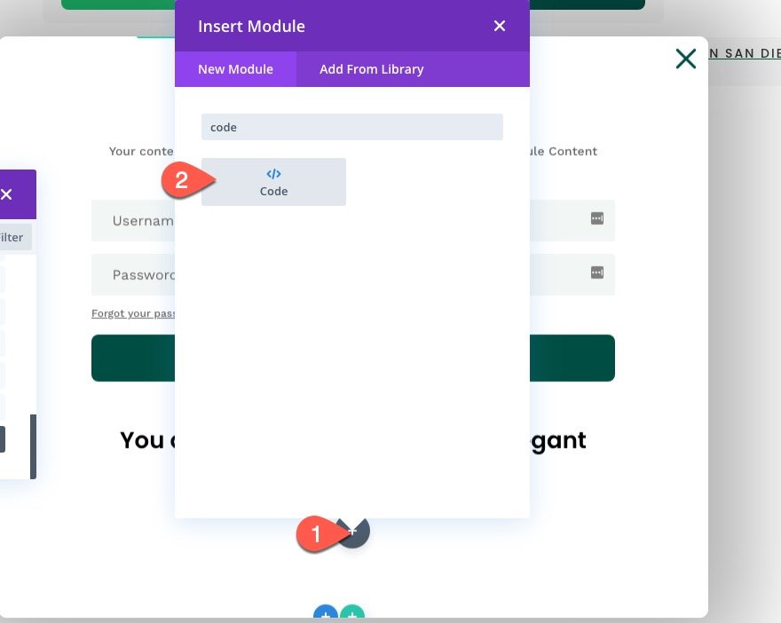
To add the custom CSS and JQuery needed for the functionality of the popup login form, create a new code module under the last login form module.
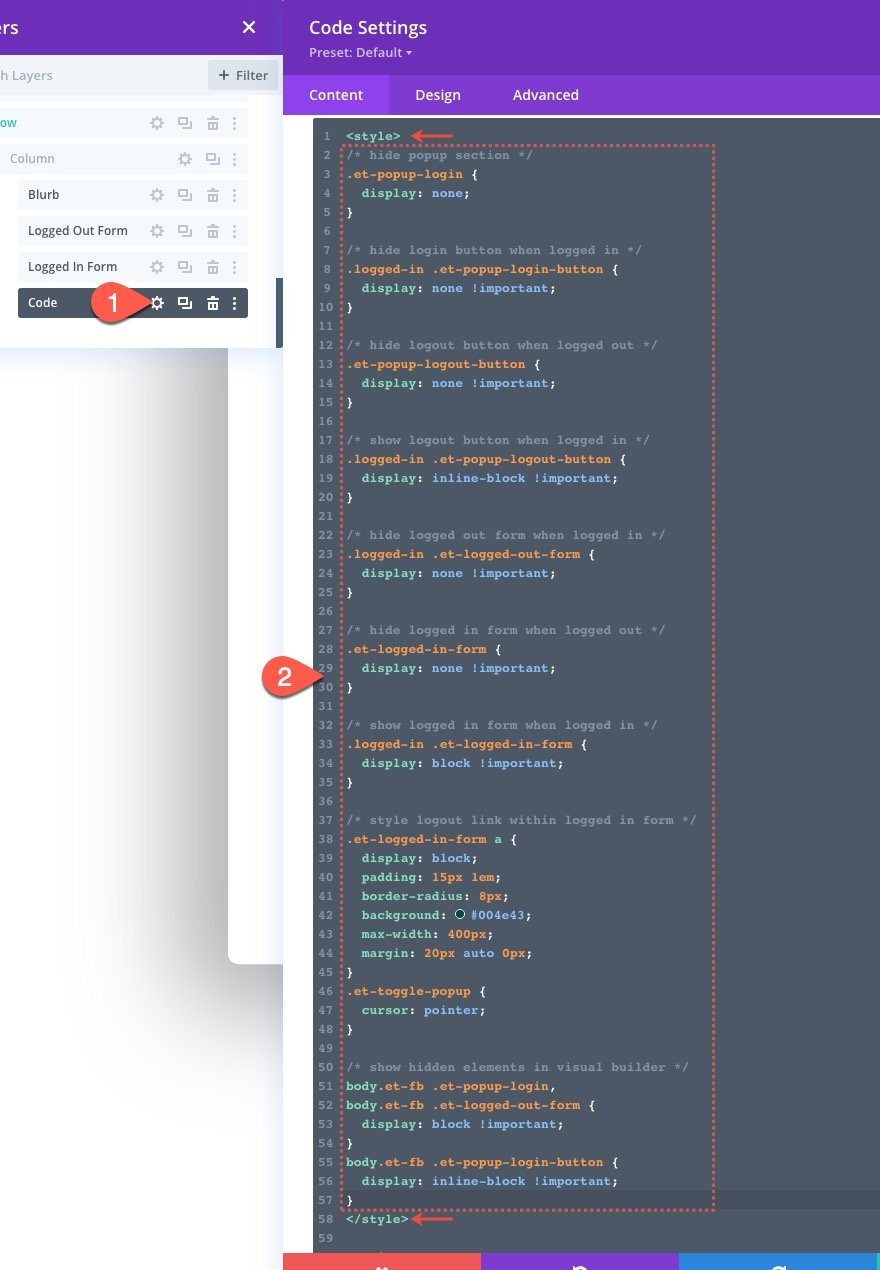
The CSS
Open the code module settings and paste the following CSS to the code box, making sure to wrap the CSS in the necessary style tags.
/* hide popup section */
.et-popup-login {
  display: none;
}

/* hide login button when logged in */
.logged-in .et-popup-login-button {
  display: none !important;
}

/* hide logout button when logged out */
.et-popup-logout-button {
  display: none !important;
}

/* show logout button when logged in */
.logged-in .et-popup-logout-button {
  display: inline-block !important;
}

/* hide logged out form when logged in */
.logged-in .et-logged-out-form {
  display: none !important;
}

/* hide logged in form when logged out */
.et-logged-in-form {
  display: none !important;
}

/* show logged in form when logged in */
.logged-in .et-logged-in-form {
  display: block !important;
}

/* style logout link within logged in form */
.et-logged-in-form a {
  display: block;
  padding: 15px 1em;
  border-radius: 8px;
  background: #004e43;
  max-width: 400px;
  margin: 20px auto 0px;
}
.et-toggle-popup {
  cursor: pointer;
}

/* show hidden elements in visual builder */
body.et-fb .et-popup-login,
body.et-fb .et-logged-out-form {
  display: block !important;
}
body.et-fb .et-popup-login-button {
  display: inline-block !important;
}
Notice that the CSS uses the “logged-in” class that is built-in to WordPress in order to hide/show the corresponding login/logout buttons and “logged in”/”logged out” login forms whenever the user is logged in or logged out.
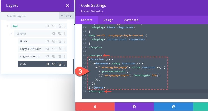
The JQuery
Under the ending style tag, paste the following JQuery making sure to wrap the code in the necessary script tags.
(function ($) {
  $(document).ready(function () {
    $(".et-toggle-popup").click(function (e) {
      e.preventDefault();
      $(".et-popup-login").fadeToggle(500);
    });
  });
})(jQuery);
This snippet simply toggles the popup section whenever the user clicks any of the three elements with the class “et-toggle-popup” (the login and logout buttons plus the “x” blurb icon).
That’s it!
Don’t forget to save the changes you made on the template in the Theme Builder. Once saved, you can view the results on a live page.
Final Result
Here are the final results on desktop, tablet, and phone.
Notice how the login button and logout button change. And, once the user logs in, the user remains on the current page. Plus, the popup login form shows different “warning” content whenever the user attempts to log out.
Final Thoughts
Hopefully, building this popup login form and the custom login/logout buttons will give you some insight on how to use Divi’s login form in creative ways. Feel free to adjust the design and content of each login form (or buttons) to create a unique login experience on your own website.
I look forward to hearing from you in the comments.
Cheers!

