Many websites get tons of visitors from mobile devices. This leads to the question of whether or not your designs are sufficiently optimized for smaller screen sizes. With Divi, a design that is built for a desktop experience ends up being instantly responsive as well. But just because something is responsive doesn’t mean it’s optimized as well.
If mobile is your main source of visitors, it can really help to start designing and building from a mobile perspective instead of a desktop one. In this post, we’ll show you exactly how to do that. After going through some tips and tricks that you should keep in mind, we’ll also recreate an example from scratch that takes these tips into account.
Let’s get to it!
Preview
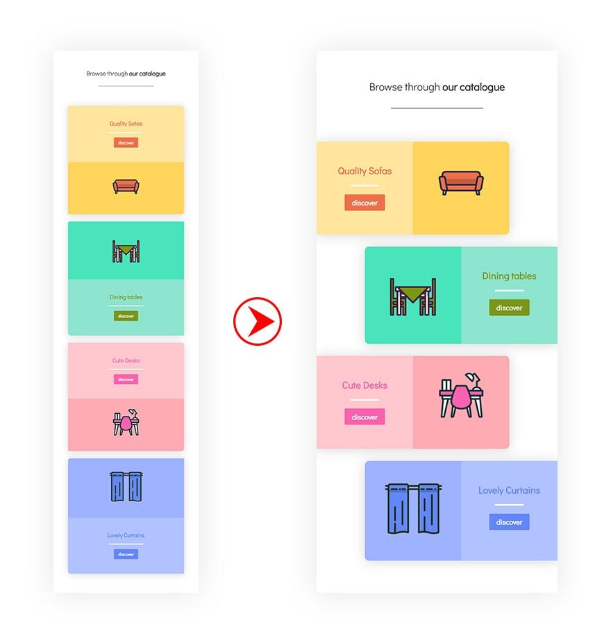
As mentioned before, we’ll start off by going over some tips and tricks. Afterwards, we’ll recreate an example from scratch that makes use of these tips. Let’s take a look at the outcome.
Mobile
Desktop
Approach
Subscribe To Our Youtube Channel
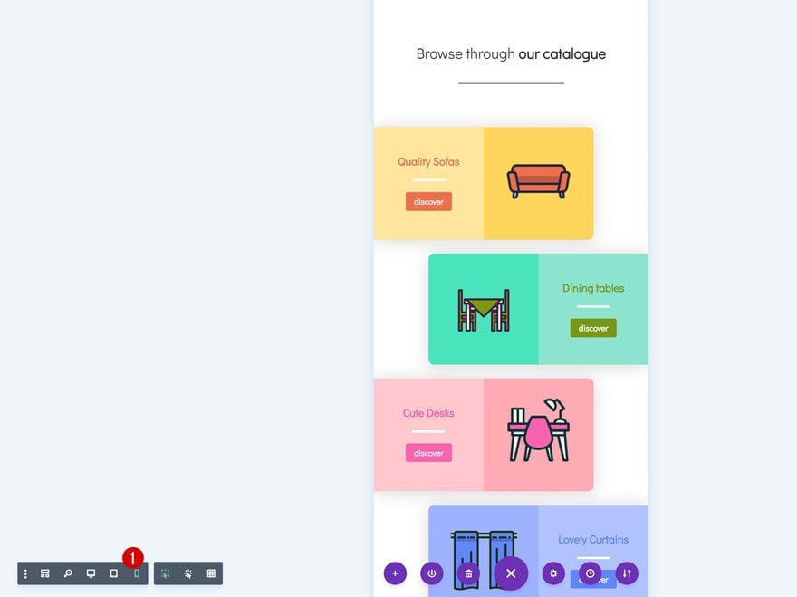
1. Switch Over to Mobile View Right After Adding a New Page
The first thing you need to do, after adding a new page, is immediately switching over to mobile view. This will allow you to create a design that is mobile-oriented and accurate.
2. Enable Responsive Options for Each Design Element & Modify the Mobile Values First
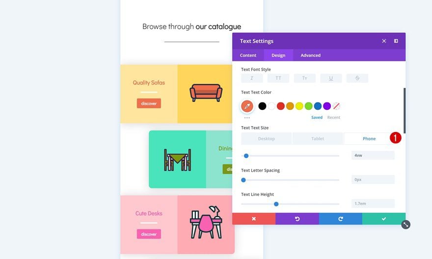
Once you start designing whatever design you’re going for, you’ll want to enable the responsive options for design elements. This includes but is not limited to text size, padding and margin. The first values you’ll add will be the mobile values (instead of the desktop ones) to make sure the design is optimized for mobile first.
3. Remove Default Space Between Columns & Add Padding Manually if Needed
To create more horizontal space, it’s also recommended to remove all of the default custom padding between columns. If needed, you can always add the padding manually to each column or design element and choose for yourself how much distance you want there to be.
4. Place 2 or 3 Columns Next to Each Other to Create a Horizontal Design
The responsive structure in Divi is vertically-oriented. This means that modules and columns appear below each other. This, however, requires more vertically scrolling. Depending on the design your working on, creating a more horizontal flow can really make the difference.
5. Modify Desktop & Tablet Views Along the Way or Afterwards
Even though you’re designing for a mobile-first purpose, it’s important to keep the other views in order as well. Responsive options that are included within each design element will help you accomplish that. You can choose to modify these values afterwards or throughout the designing process.
Let’s Start Recreating the Example!
Add New Section
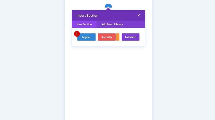
Open a new page, switch over to mobile view and add a new section to get started.
Add Row #1
Column Structure
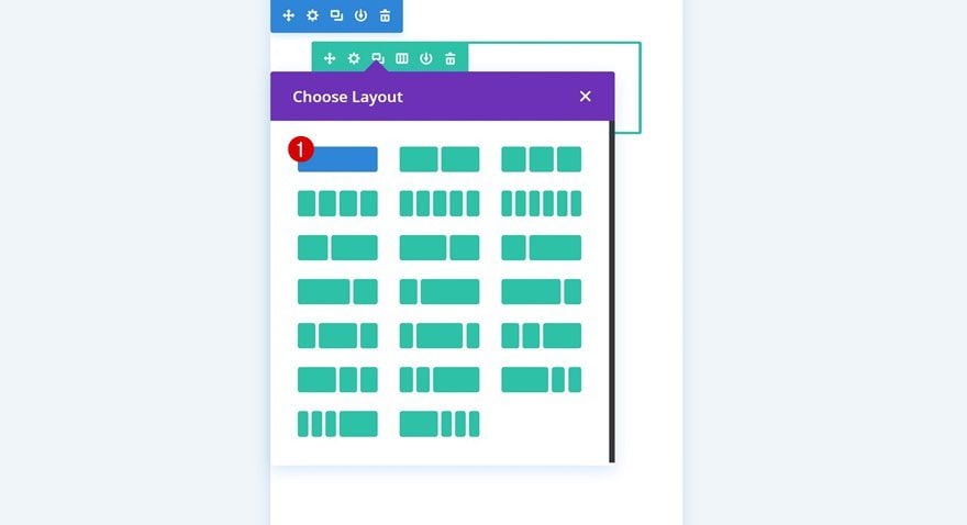
Continue by adding a new row to your section using the following column structure:
Add Text Module to Row
Add H2 Content
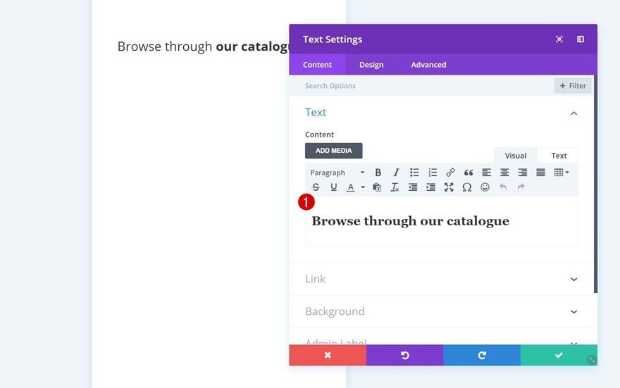
Add a Text Module to the column of your row and enter some H2 title content.
H2 Text Settings
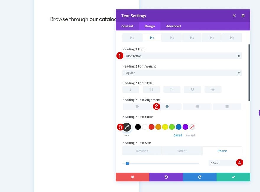
Then, go to the heading text settings and change the appearance of the title.
- Heading 2 Font: Didact Gothic
- Heading 2 Text Alignment: Center
- Heading 2 Text Color: #333333
- Heading 2 Text Size: 5.5vw (Phone), 5vw (Tablet), 2vw (Desktop)
Add Divider Module to Row
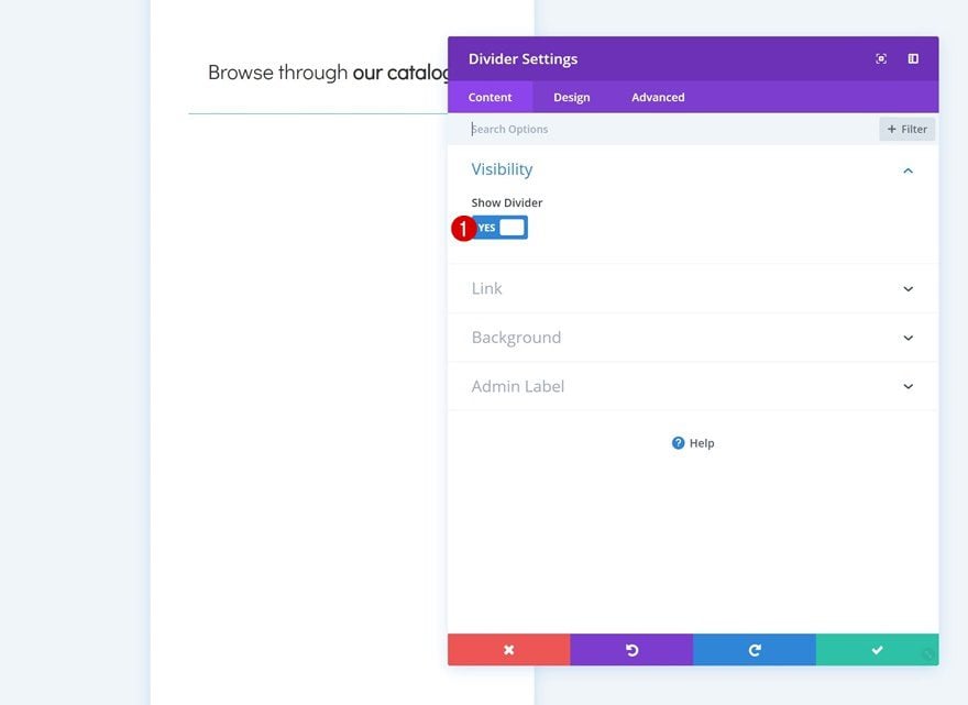
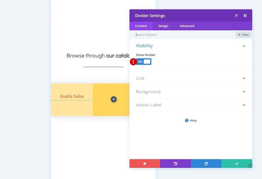
Visibility
Right below the Text Module you’ve added, go ahead and add a Divider Module. Make sure the ‘Show Divider’ option is enabled.
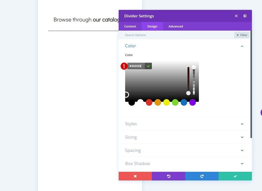
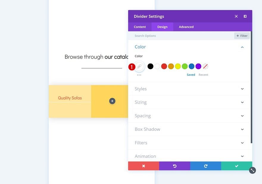
Color
Then, go to the design tab and change the color of the divider.
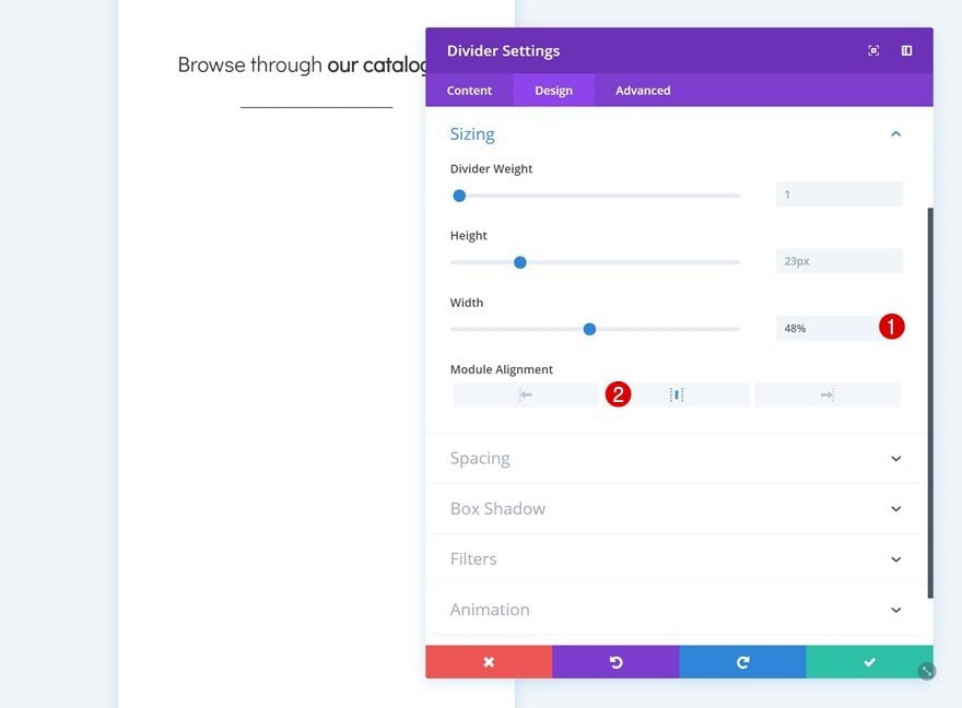
Sizing
Modify the sizing settings as well.
- Width: 48%
- Module Alignment: Center
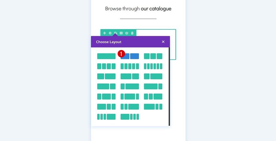
Add Row #2
Column Structure
Continue by adding another row to the section using the following column structure:
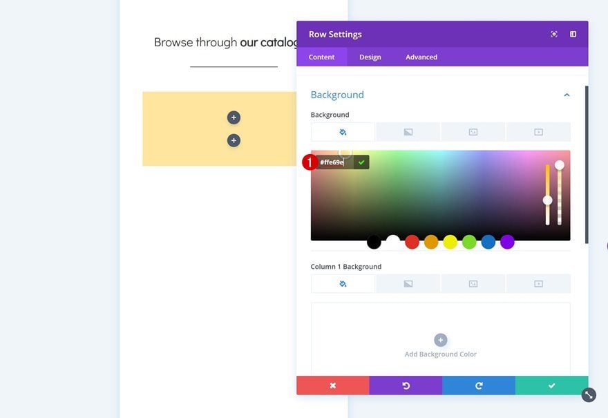
Background Color
Without adding any modules yet, open the row settings and add a background color to the row.
- Background Color: #ffe69e
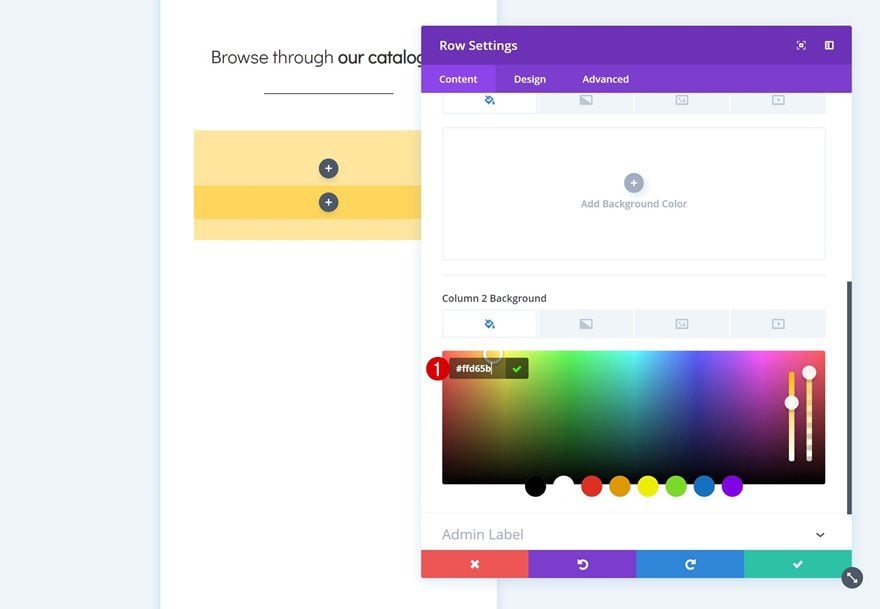
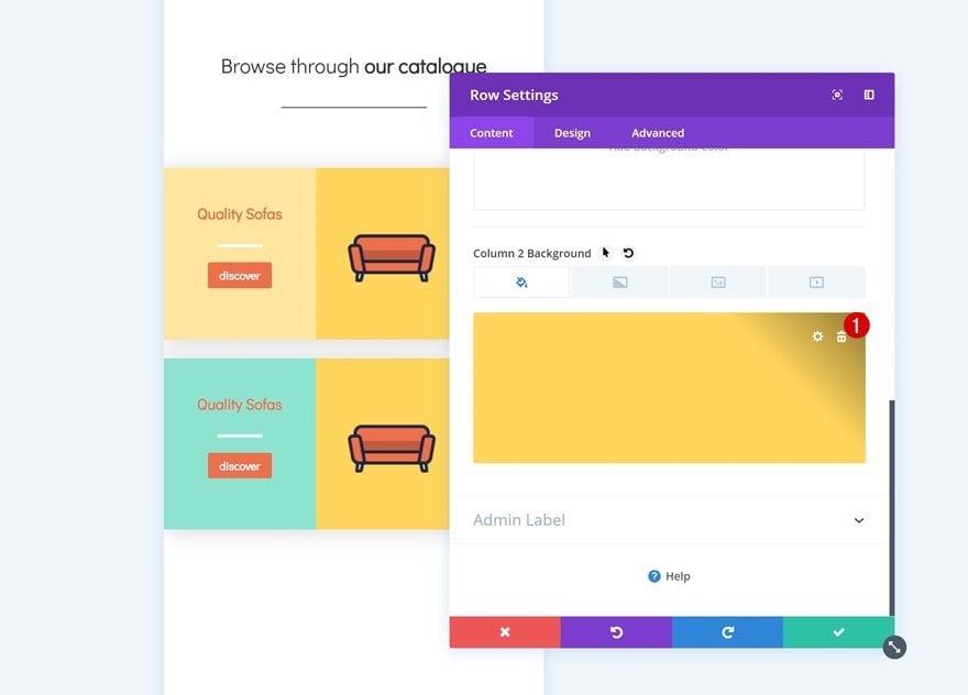
Column 2 Background Color
Add a background color to the second column of the row as well.
- Column 2 Background Color: #ffd65b
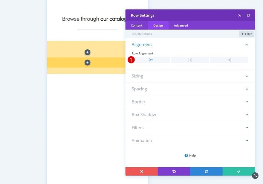
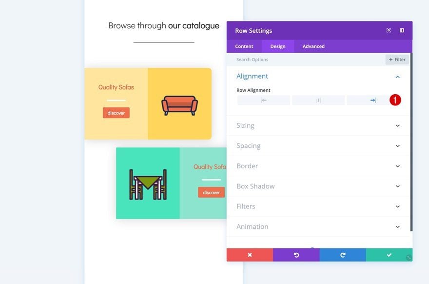
Alignment
Then, change the row alignment.
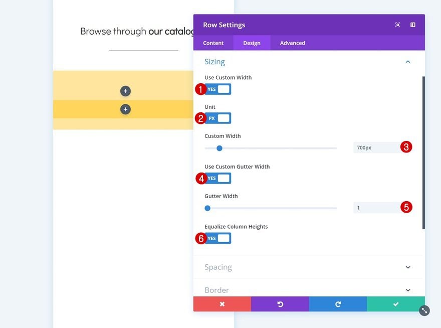
Sizing
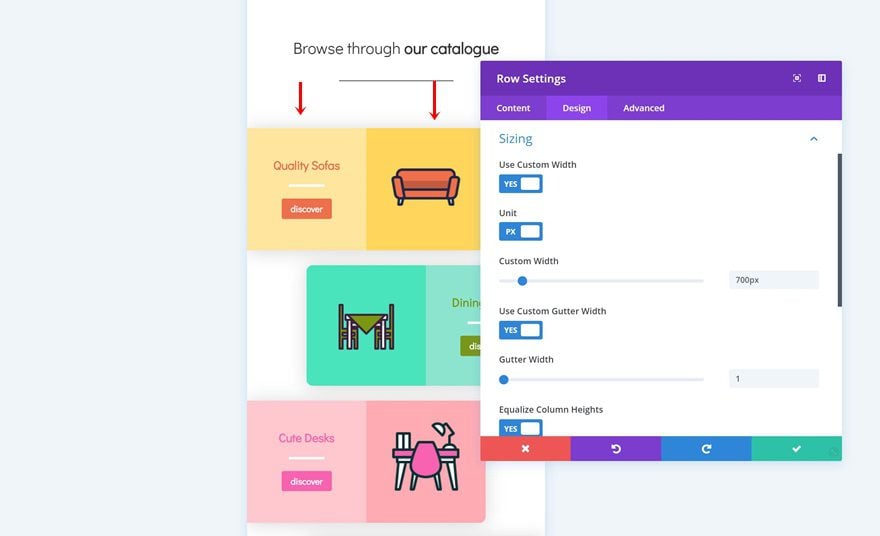
Open the sizing settings next. Here, we’ll want to remove all the default space between columns. We’re also using custom width for the column to make it look good on desktop.
- Use Custom Width: Yes
- Unit: PX
- Custom Width: 700px
- Use Custom Gutter Width: Yes
- Gutter Width: 1
- Equalize Column Heights: Yes
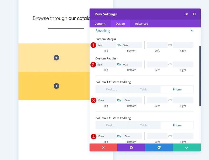
Spacing
Continue by going to the spacing settings and add some custom margin and padding values manually.
- Top Margin: 5vw
- Bottom Margin: 5vw
- Top Padding: 0px
- Bottom Padding: 0px
- Column 1 Top Padding: 10vw (Phone), 8vw (Tablet), 4vw (Desktop)
- Column 1 Bottom Padding: 10vw (Phone), 8vw (Tablet), 4vw (Desktop)
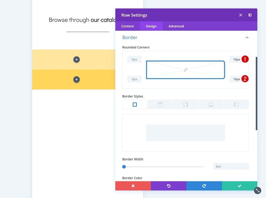
Border
Add some rounded corners to the row as well.
- Top Right: 10px
- Bottom Right: 10px
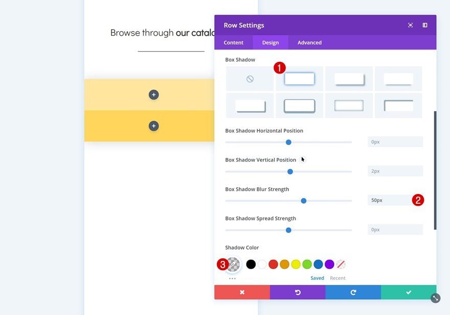
Box Shadow
And give it a subtle box shadow too.
- Box Shadow Blur Strength: 50px
- Shadow Color: rgba(0,0,0,0.16)
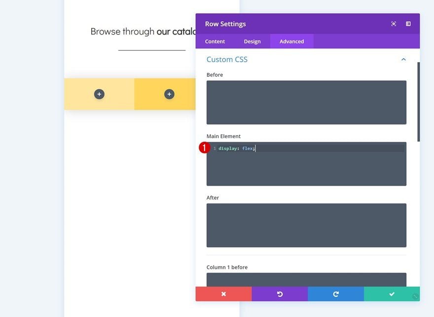
Custom CSS
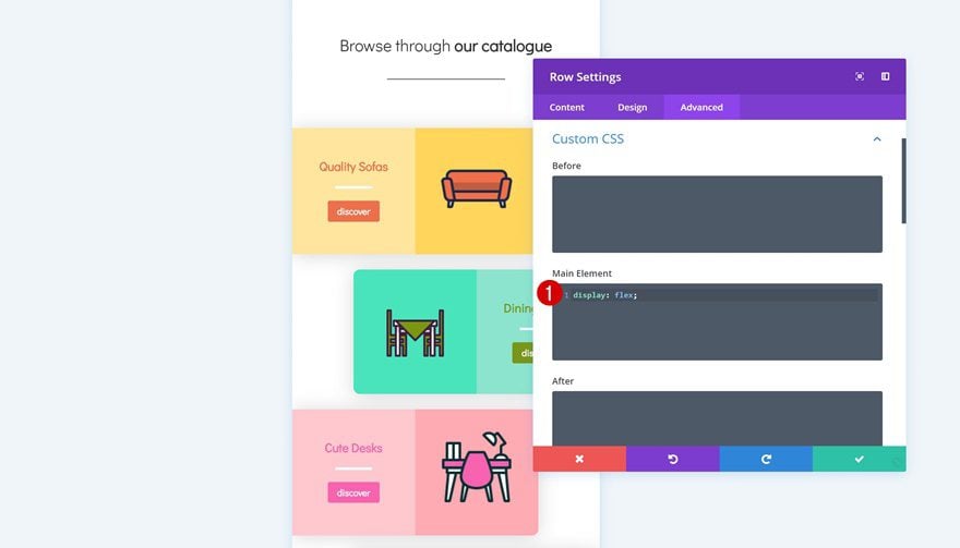
Last but not least, we’re going to place the columns next to each other on smaller screen sizes to make sure we’re taking full advantage of the horizontal space we have. Go to the advanced tab and add a single line of CSS code to the main element.
display: flex;
Add Text Module to Column 1
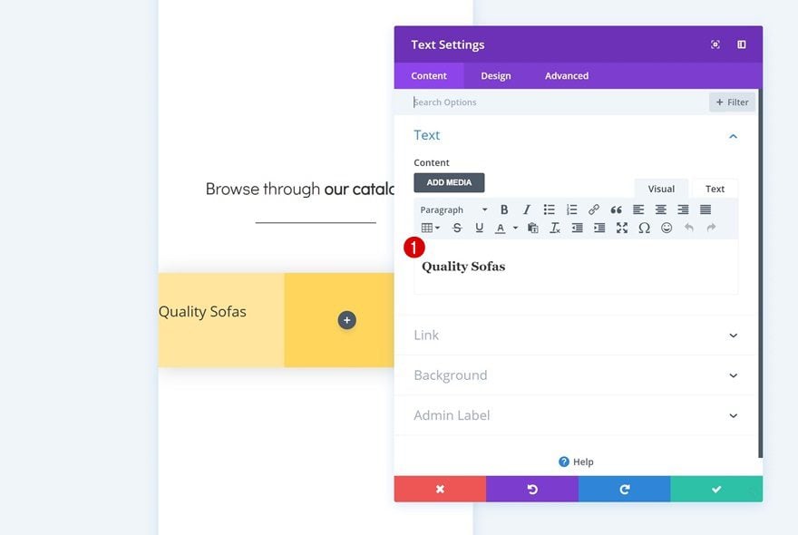
Add H3 Content
Time to start adding modules! Add a title Text Module to the first column and enter some H3 content.
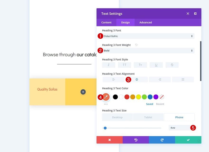
H3 Text Settings
Then, go to the design tab and modify the heading text settings.
- Heading 3 Font: Didact Gothic
- Heading 3 Font Weight: Bold
- Heading 3 Text Alignment: Center
- Heading 3 Text Color: #ee6f49
- Heading 3 Text Size: 4vw (Phone), 3vw (Tablet), 1.5vw (Desktop)
Add Divider Module to Column 1
Visibility
Add a Divider Module next. Make sure the ‘Show Divider’ option is enabled.
Color
Then, change the color of the divider.
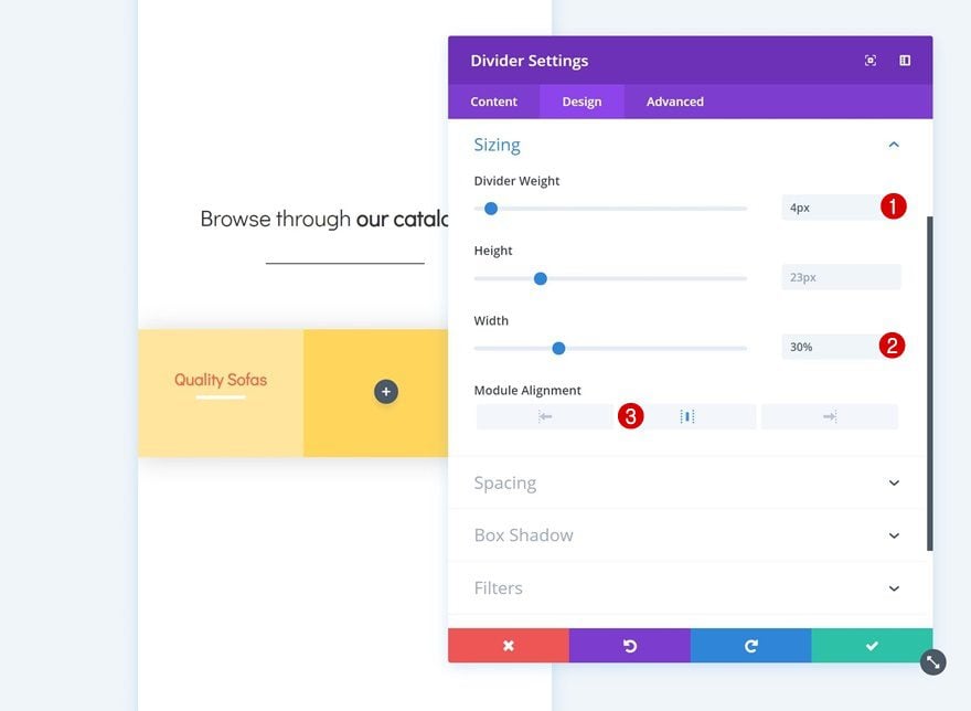
Sizing
Along with the sizing settings.
- Divider Weight: 4px
- Width: 30%
- Module Alignment: Center
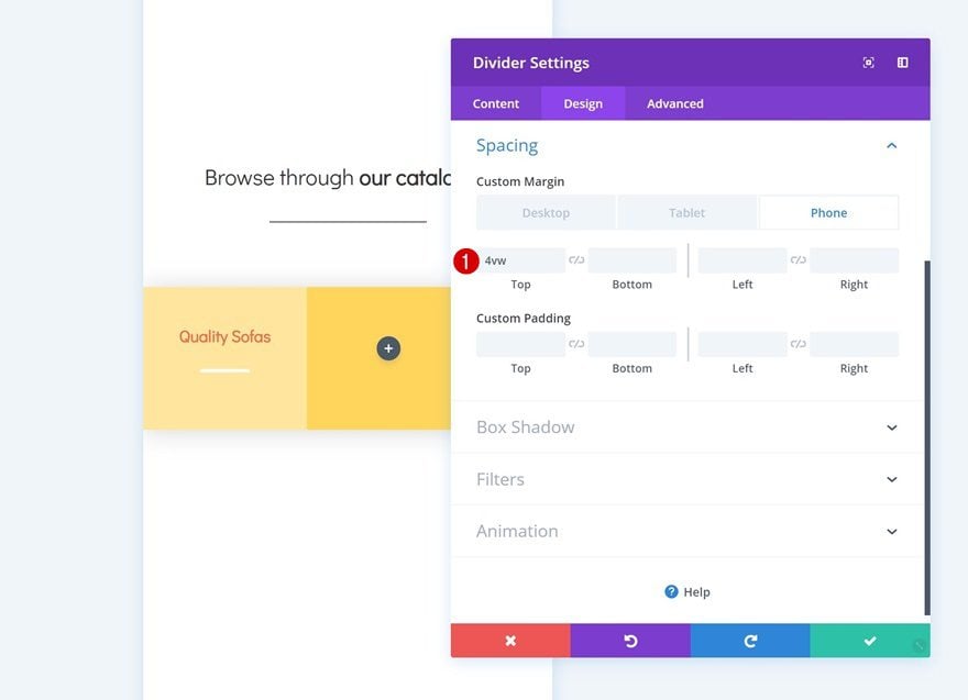
Spacing
Add some custom top margin to the module too.
- Top Margin: 4vw (Phone), 2vw (Tablet), 1.5vw (Phone)
Add Button Module to Column 1
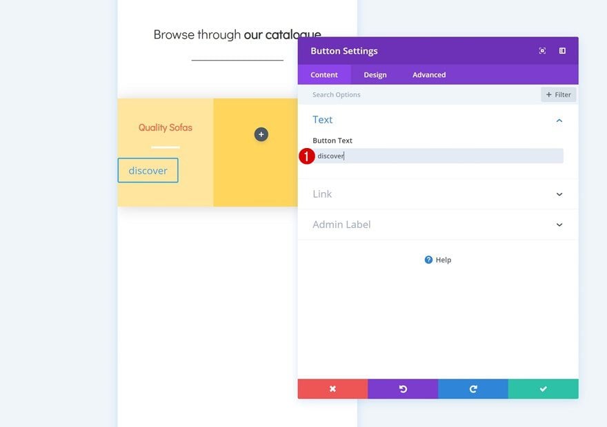
Add Copy
The next and last module needed in the first column is a Button Module. Enter some copy.
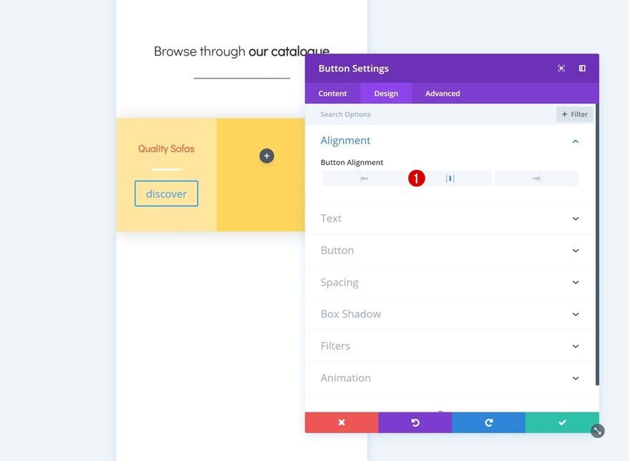
Alignment
Then go to the design tab and change the button alignment.
Button Settings
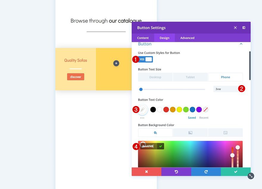
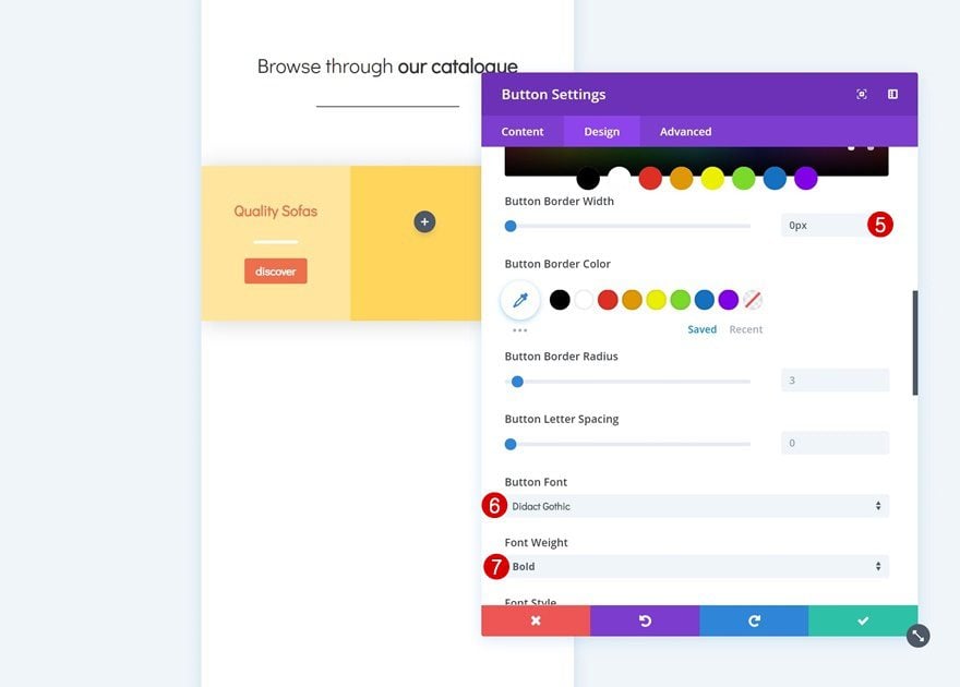
Modify the appearance of the button in the button settings as well.
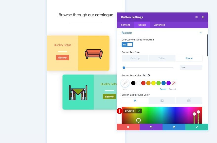
- Use Custom Styles for Button: Yes
- Button Text Size: 3vw (Phone), 2vw (Tablet), 1.5vw (Desktop)
- Button Text Color: #ffffff
- Button Background Color: #ee6f49
- Button Border Width: 0px
- Button Font: Didact Gothic
- Font Weight: Bold
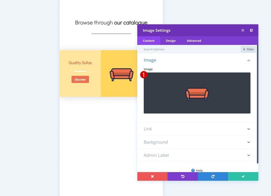
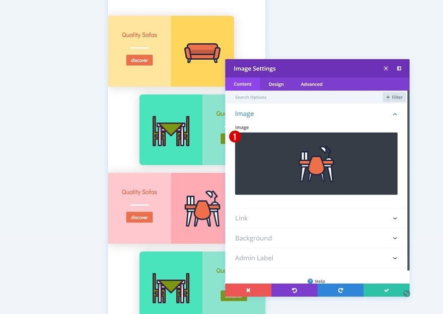
Add Image Module to Column 2
Upload Icon
The only module we’ll need in column 2 is an Image Module. You can use any image of your choice, but if you want to use the exact same icons that were used in this example, you can go to the Furniture Store Layout Pack and download them at the end of the post.
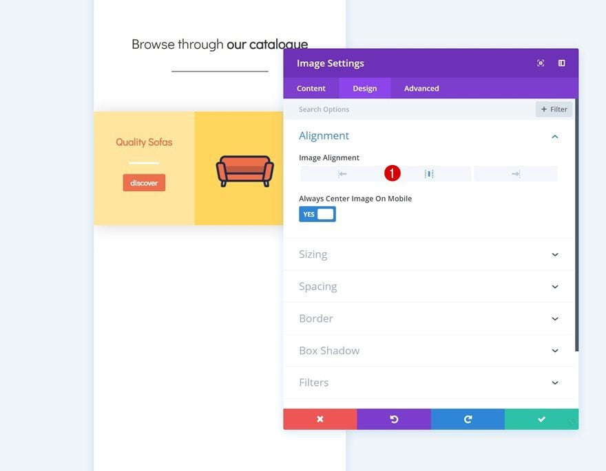
Alignment
Then, go to the design tab and change the image alignment.
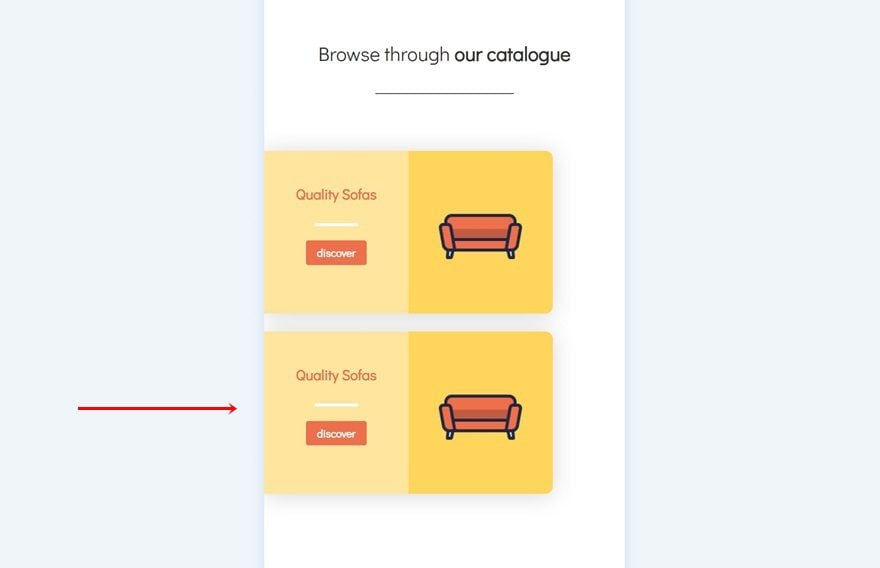
Clone Row #2
Once you’re done modifying the row, you can go ahead and clone it.
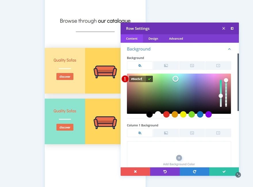
Change Row Background Color
We’ll need to make some changes to this duplicate, starting with the row background color.
- Background Color: #8ee5cf
Remove Column 2 Background Color
Continue by removing the column 2 background color.
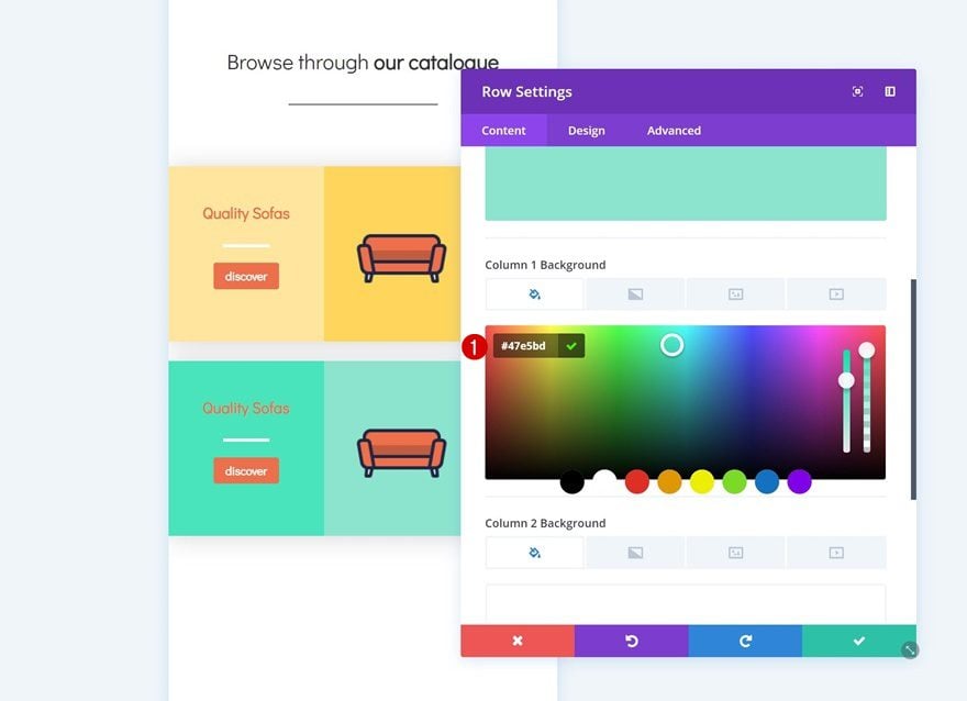
Add Column 1 Background Color
We’re adding a background color to the first column instead.
- Column 1 Background Color: #47e5bd
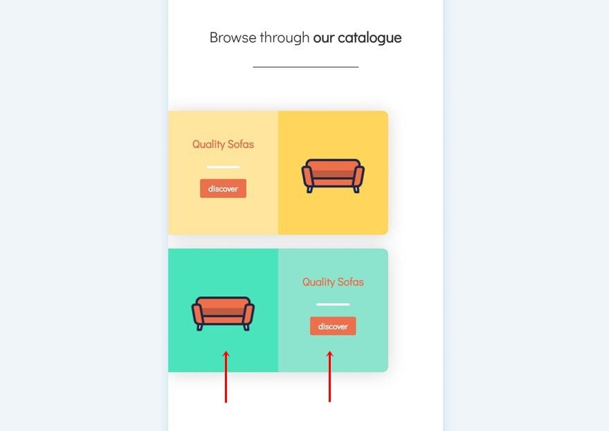
Change Modules in Columns
We’re also switching columns for the modules.
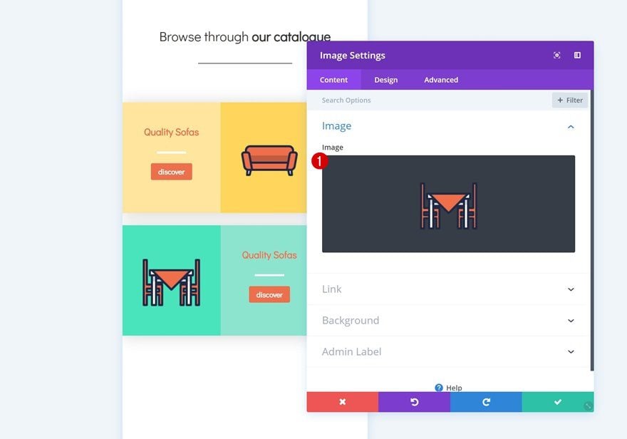
Change Icon in Image Module
Then, change the icon in the Image Module.
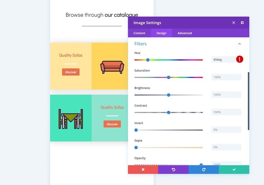
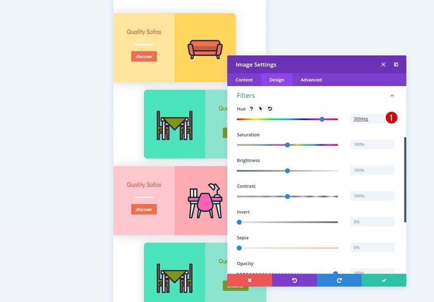
Add Filter to Image Module
And make it match with the new row and column background colors by changing the hue in the filters settings.
Change Row Alignment
Change the row alignment next.
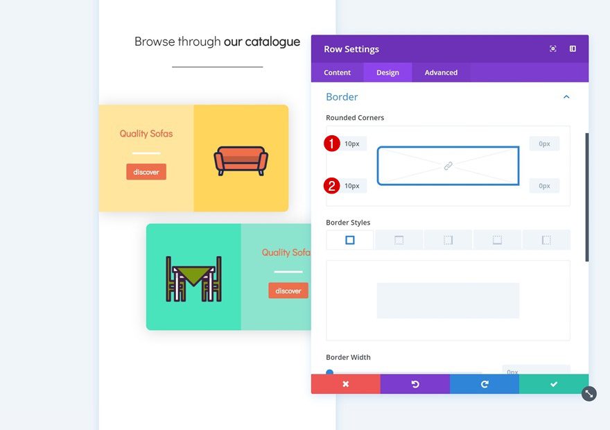
Change Row Border
Along with the rounded corners.
- Top Left: 10px
- Bottom Left: 10px
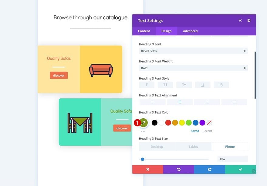
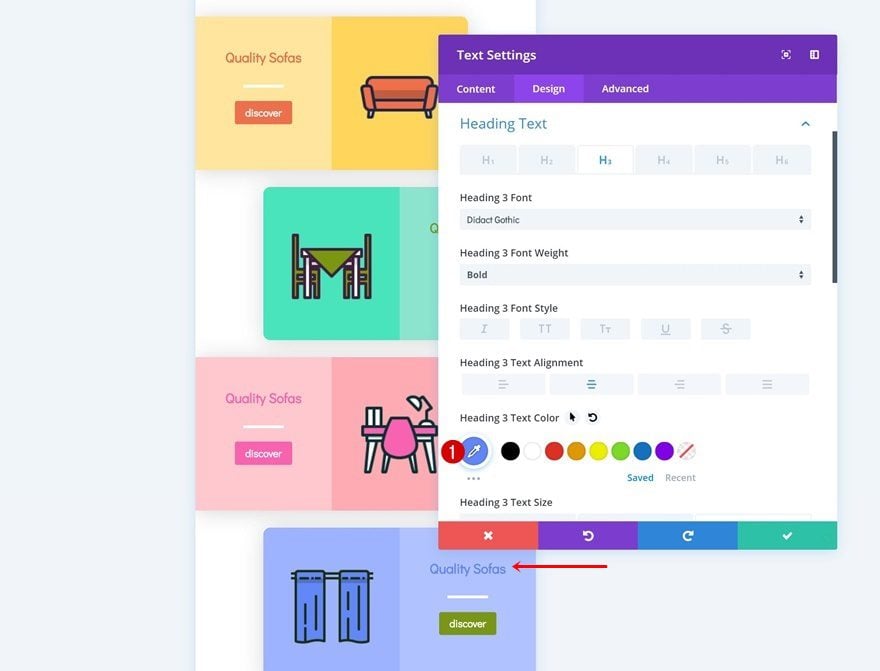
Change Text Color of Text Module in Column 2
We’re also using another text color for the Text Module in column 2.
- Heading 3 Text Color: #7b9710
Change Button Background Color
And we’re using that same color for the button background.
- Button Background Color: #7b9710
Clone Both Rows
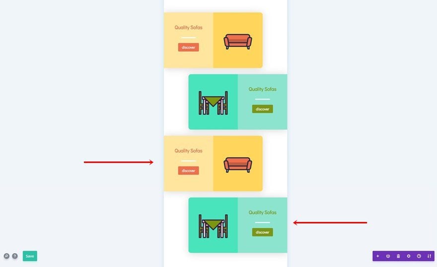
Now that we have both sides of the row, we can clone both of them up to as many times as we need and place them in order.
Modify Duplicate #1
Change Row Background Color
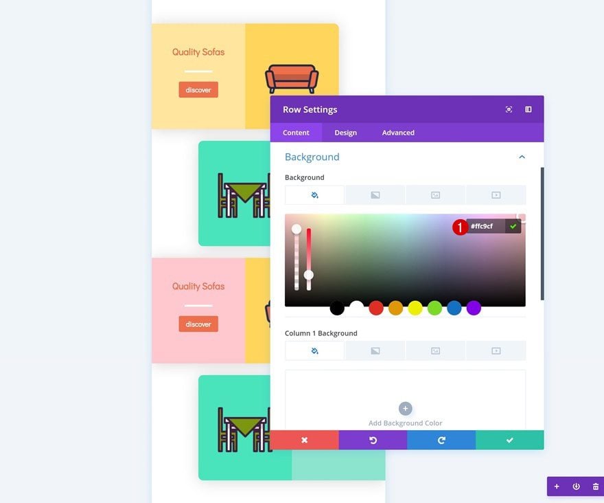
We’ll start by changing the row background color of the first duplicate.
- Background Color: #ffc9cf
Change Column Color
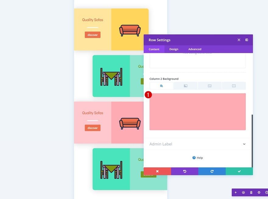
Then, we’ll modify the column 2 background color as well.
- Column 2 Background Color: #ffadb6
Change Icon in Image Module
Change the icon in the Image Module to another one of your choice.
Add Filter to Image Module
And change the hue in the filters settings to make it match with the new row and column background colors.
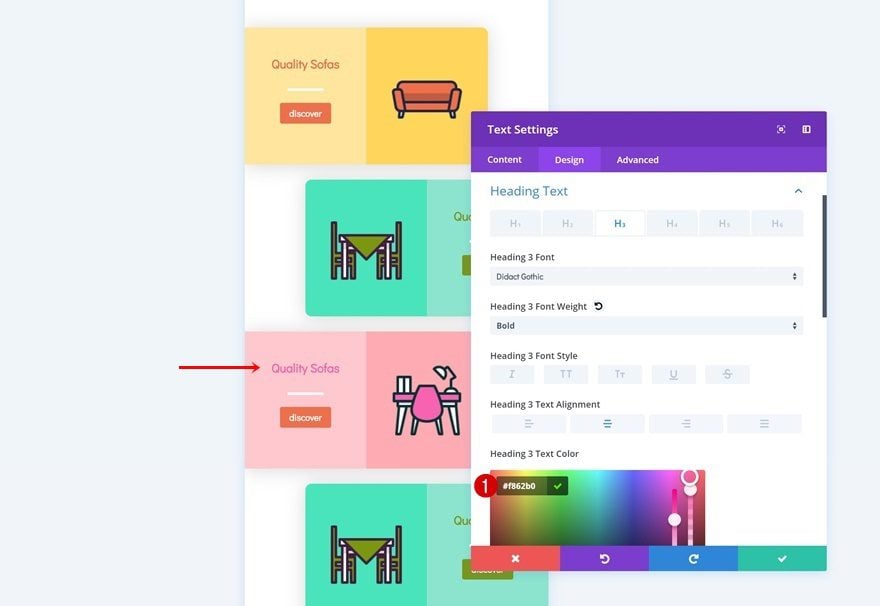
Change Text Color
We’re changing the text color too.
- Heading 3 Text Color: #f862b0
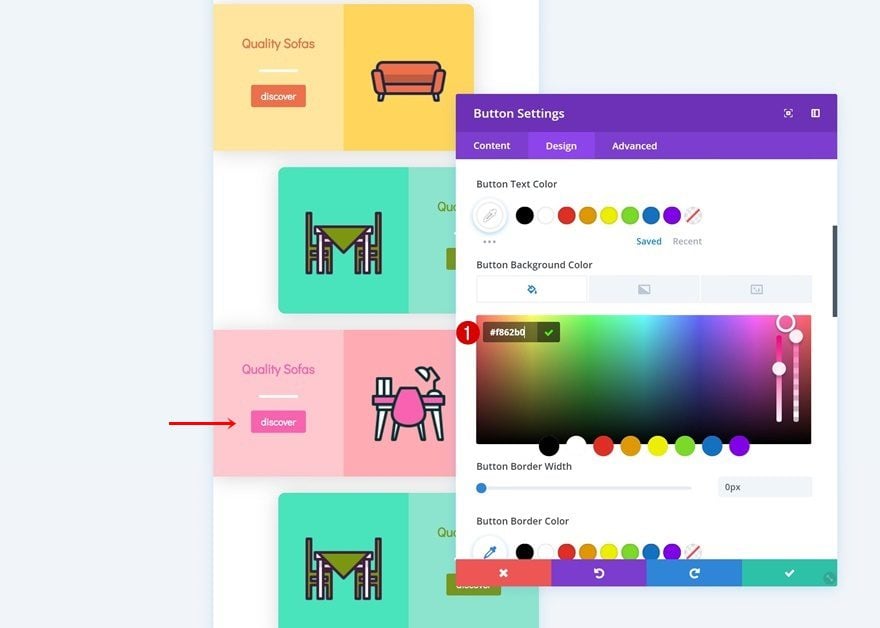
Change Button Background Color
And we’re using that same color for the button background.
- Button Background Color: #f862b0
Modify Duplicate #2
Change Row Background Color
On to the next and last duplicate! Change the row background color.
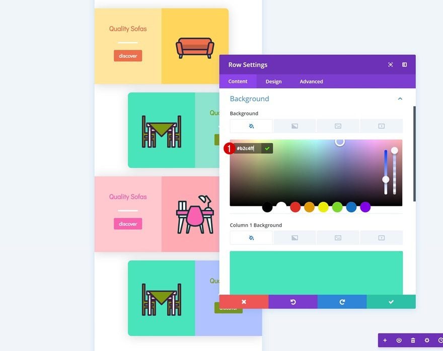
- Background Color: #b2c4ff
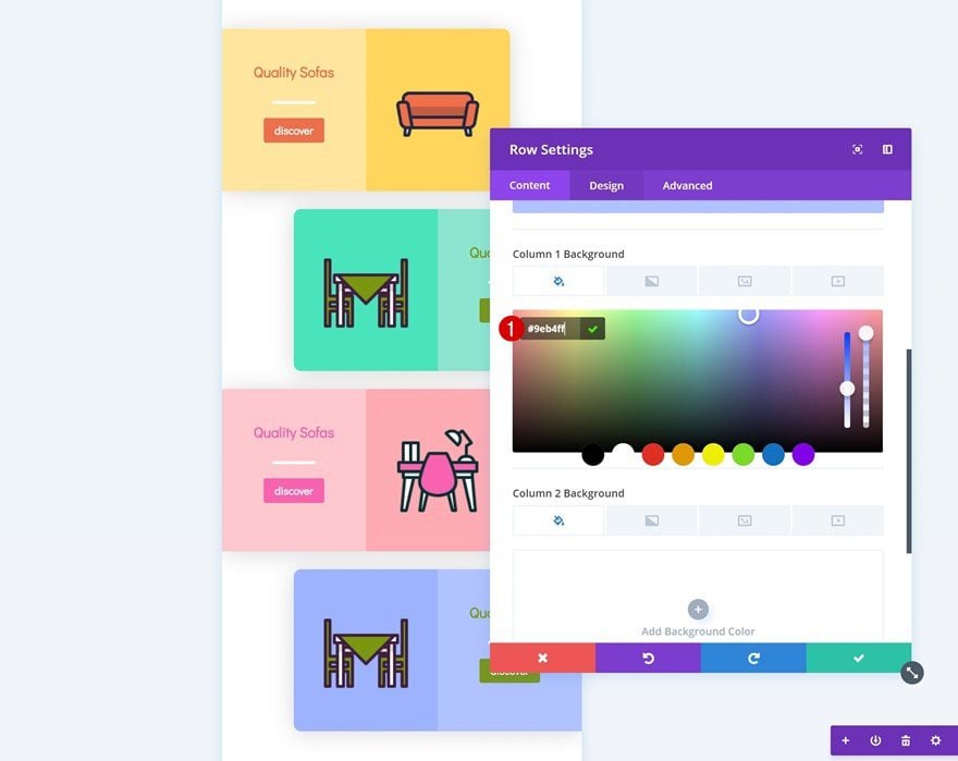
Change Column Color
Do the same thing for the column 1 background color.
- Column 1 Background Color: #9eb4ff
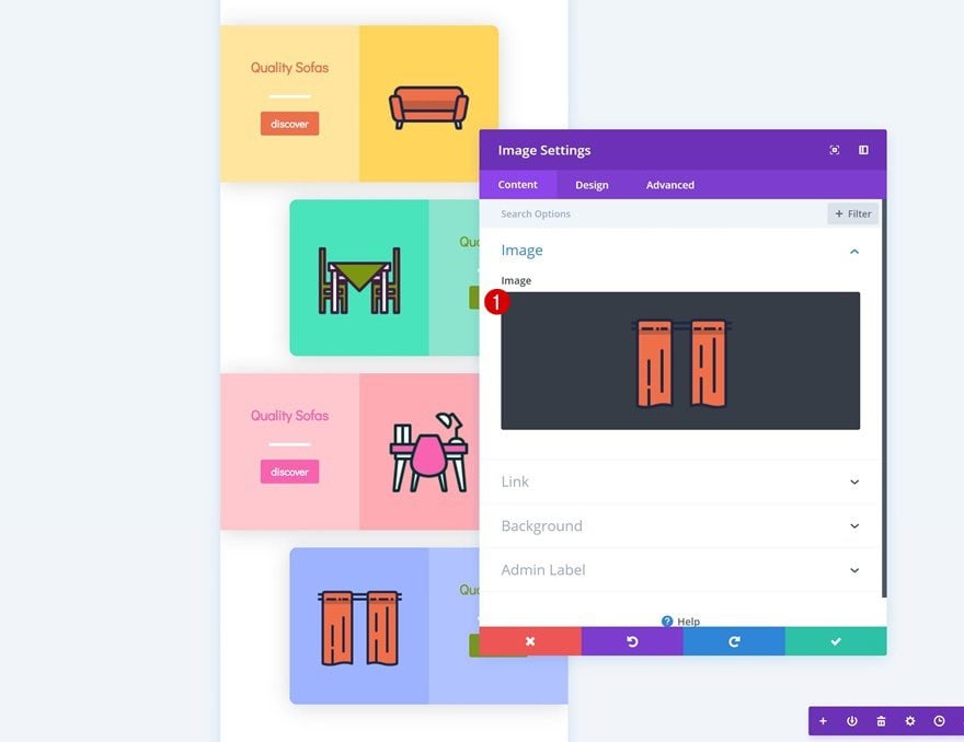
Change Icon in Image Module
Then, change the icon that is being used.
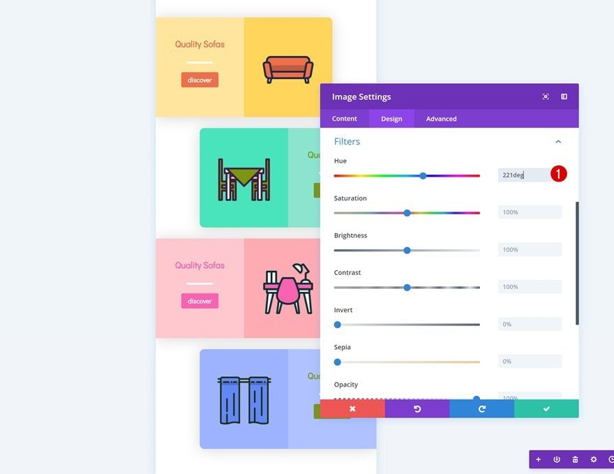
Add Filter to Image Module
Along with the hue in the filters settings of the Image Module.
Change Text Color
Modify the text color of the Image Module next.
- Heading 3 Text Color: #6287f9
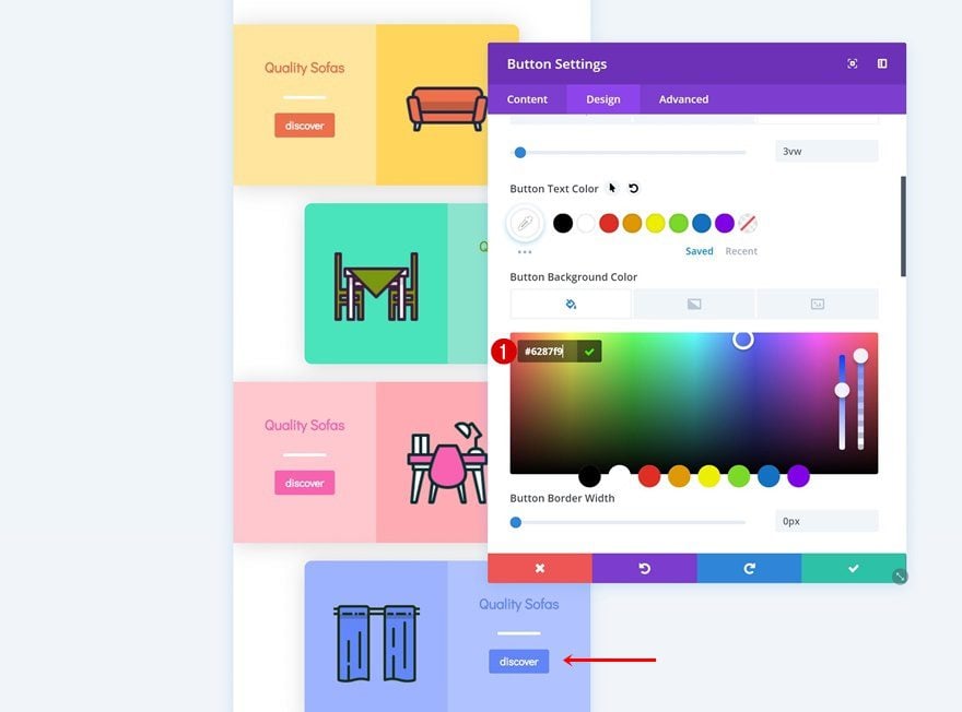
Change Button Background Color
And use that same color for the button background.
- Button Background Color: #6287f9
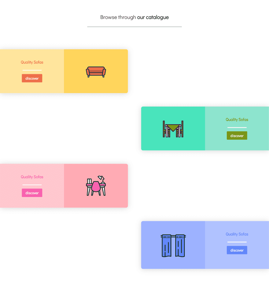
Preview
Now that we’ve gone through all the steps, let’s take a final look at the outcome.
Mobile
Desktop
Final Thoughts
If your main source of visitors comes from mobile devices, it’s important to optimize everything for that particular screen size. With Divi, everything becomes instantly responsive. But just because something is responsive, doesn’t mean it is optimized for that particular screen size as well. Another way to approach designing for mobiles is by starting your design from a mobile-first perspective. In this post, we’ve shared some tips and tricks on how to do that. Afterwards, we’ve recreated an example that lives up to these rules and allows us to create a stunning outcome. If you have any questions or suggestions, make sure you leave a comment in the comment section below!


