We know that most of you are always looking for new ways to make the websites you create unique. With Divi, there are many ways to make your website stand out from the other ones out there. Today, we’re going to show you how you can create stunning section titles using Divi’s built-in options only. This approach is great if you want to create a stunning design, maintain the overall page structure and keep the navigation seamless.
Let’s get to it!
Preview
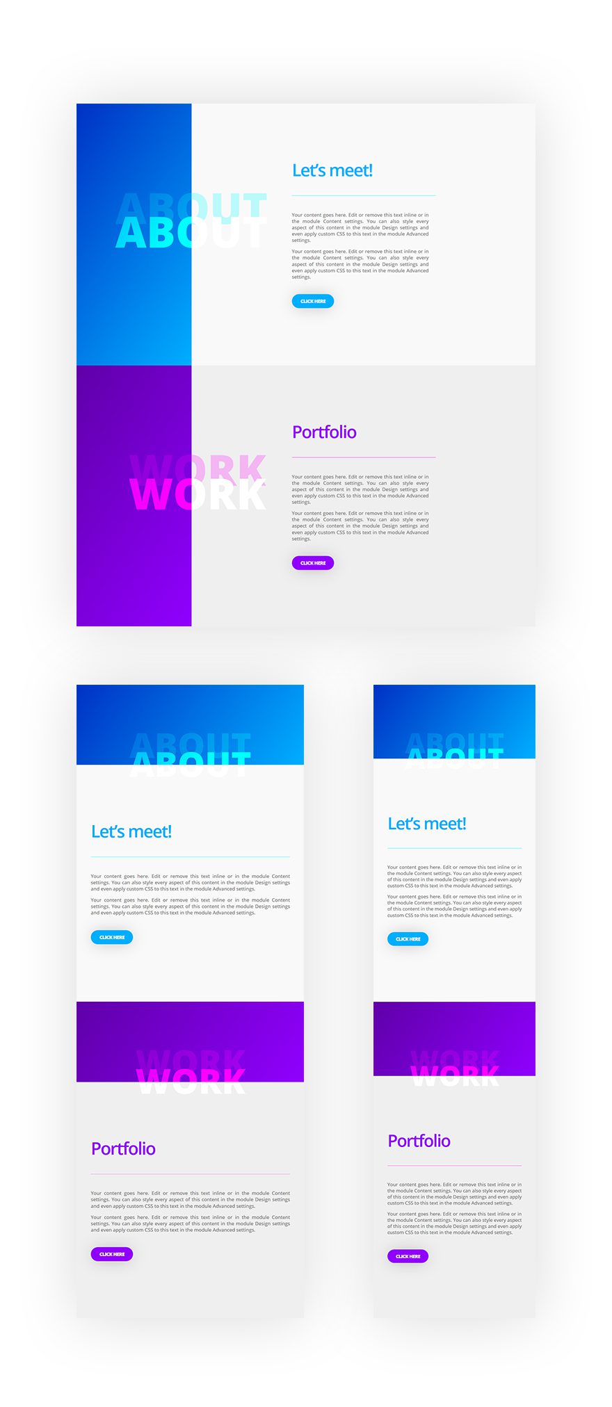
Before we dive into the tutorial, let’s take a look at the result we’re aiming to achieve on different screen sizes:
Let’s Start Creating!
Add New Regular Section
Spacing
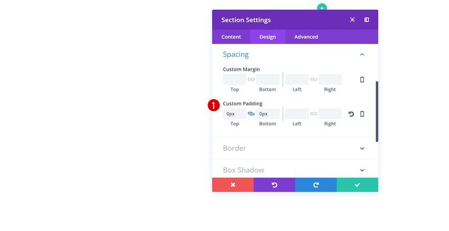
Start by opening a new page, switching over to Visual Builder and adding your first section. Without adding any rows or modules yet, open the section settings and add some padding:
- Top Padding: 0px
- Bottom Padding: 0px
Add New Row
Column Structure
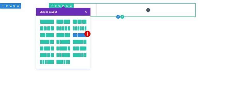
Continue by adding a row using the following column structure:
Background Color
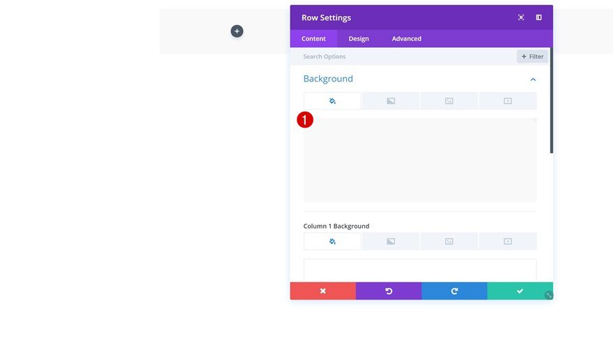
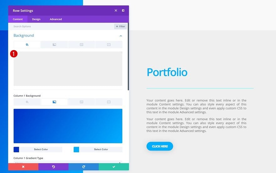
Open the row settings next and add a background color to your entire row:
- Background Color: #f9f9f9
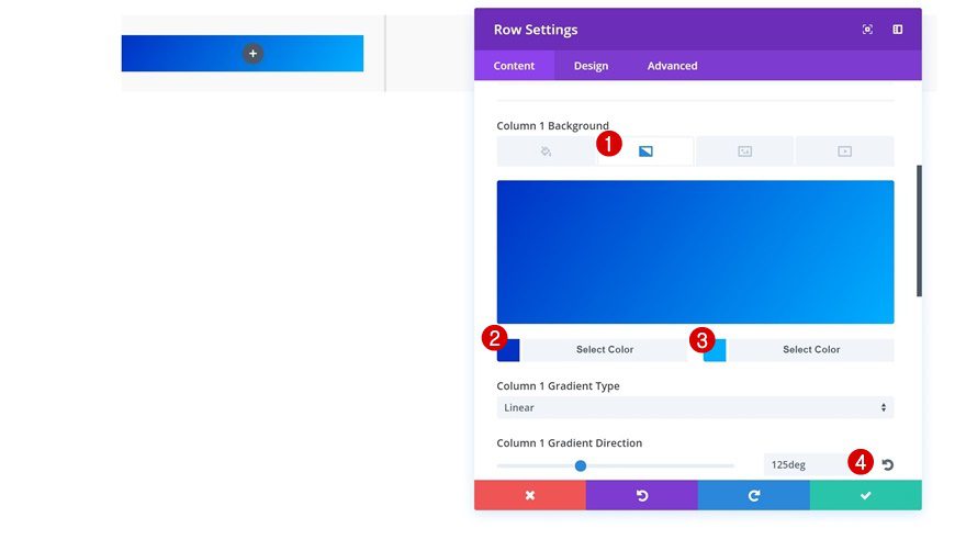
Column 1 Gradient Background
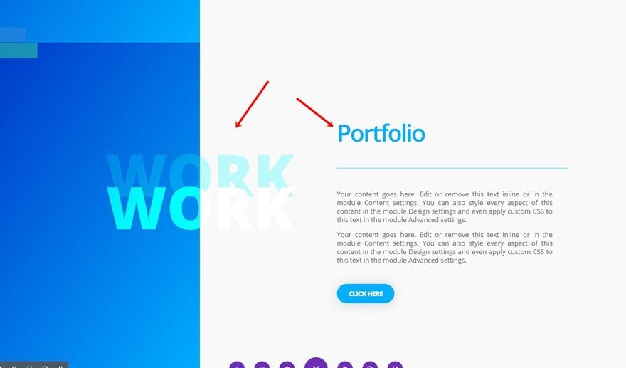
Then, add a subtle gradient background to your first column. This will help create the overlap of section titles between columns.
- Color 1: #0031c4
- Color 2: #00aeff
- Column 1 Gradient Direction: 125deg
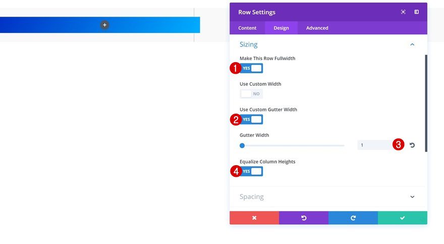
Sizing
Change the spacing of your row as well to make sure it takes up the entire width of the screen.
- Make This Row Fullwidth: Yes
- Use Custom gutter Width: Yes
- Gutter Width: 1
- Equalize Column Heights: Yes
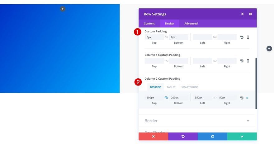
Spacing
Lastly, change the Spacing settings according to the different screen sizes:
- Top Padding: 0px
- Bottom Padding: 0px
- Column 2 Top Padding: 200px
- Column 2 Bottom Padding: 200px
- Column 2 Left Padding: 350px (Desktop), 50px (Tablet & Phone)
- Column 2 Right Padding: 50px
Add Section Title Text Module to Column 1
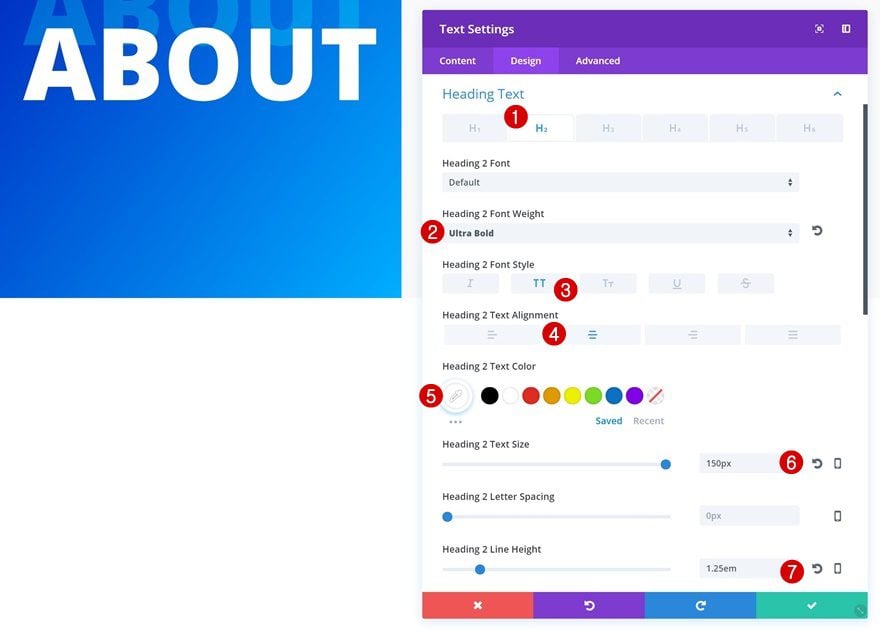
H2 Text Settings
Now that all row settings are in place, we can start adding modules. We’ll start with the first column. Here, the only module we’ll need is a Text Module. After adding the H2 content in the Content box, go ahead and change the H2 text settings:
- Heading 2 Font Weight: Ultra Bold
- Heading 2 Font Style: Uppercase
- Heading 2 Text Alignment: Center
- Heading 2 Text Color: #ffffff
- Heading 2 Text Size: 150px
- Heading 2 Line Height: 1.25em
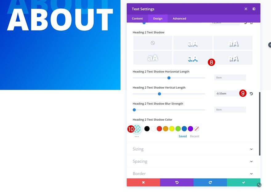
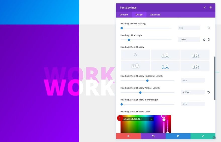
- Heading 2 Text Shadow Vertical Length: -0.55em
- Heading 2 Text Shadow Color: rgba(0,255,255,0.25)
Spacing
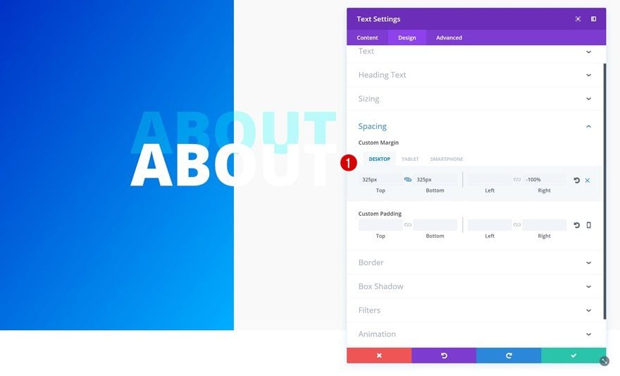
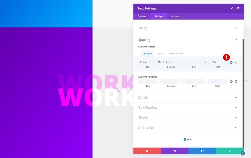
The overlap between column is different on desktop, tablet and phone. To create the overlap, we’ll make some changes to the Spacing settings of our Text Module:
- Top Margin: 325px (Desktop), 150px (Tablet & Phone)
- Bottom Margin: 325px, -120px (Tablet), -110px (Phone)
- Right Margin: -100% (Desktop), 0px (Tablet & Phone)
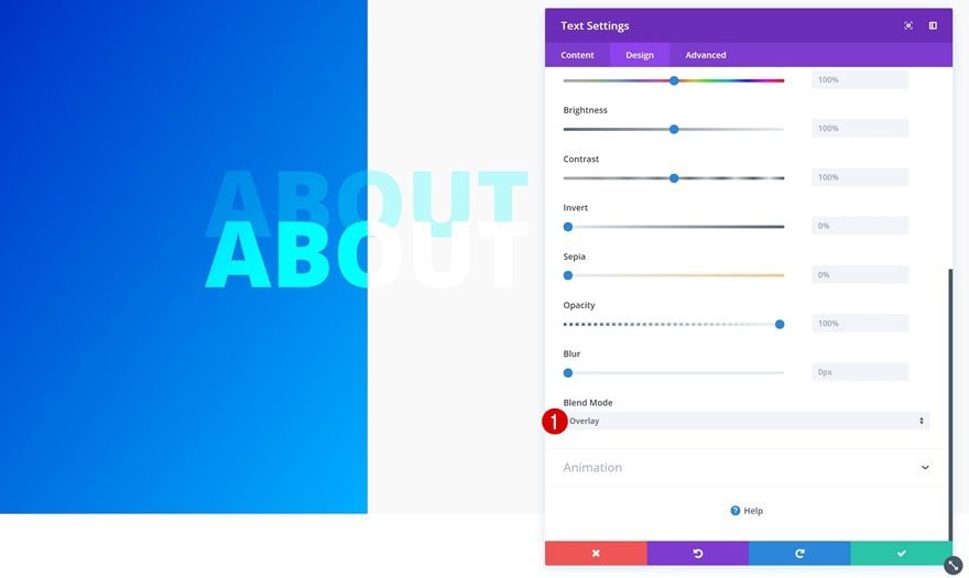
Filter
Last but not least, we’ll use a blend mode to create the difference in color for the text that shows up.
Add Title Text Module to Column 2
H3 Text Settings
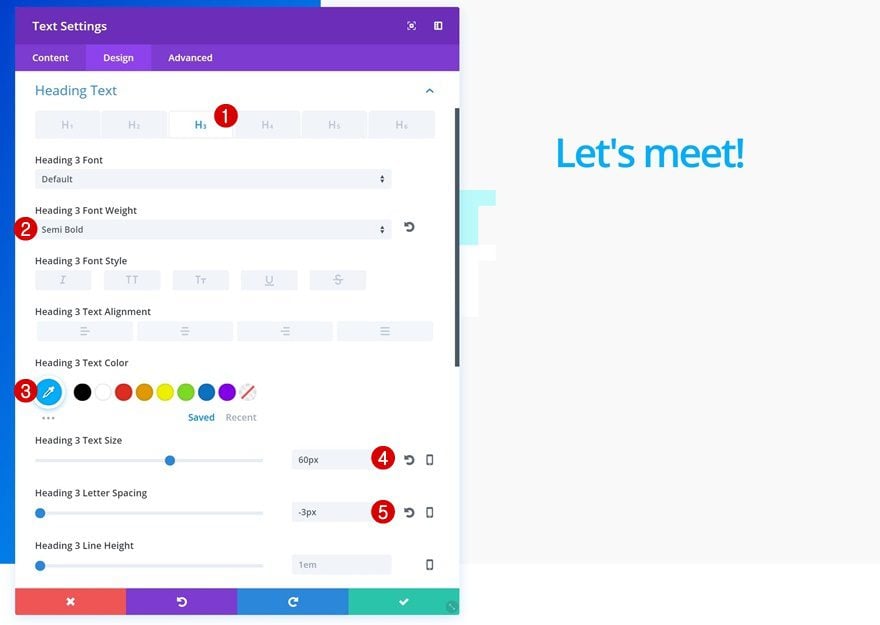
Let’s move on to the second column. There, the first module we’ll need is a title Text Module. After adding your H3 content, change the H3 text settings:
- Heading 3 Font Weight: Semi Bold
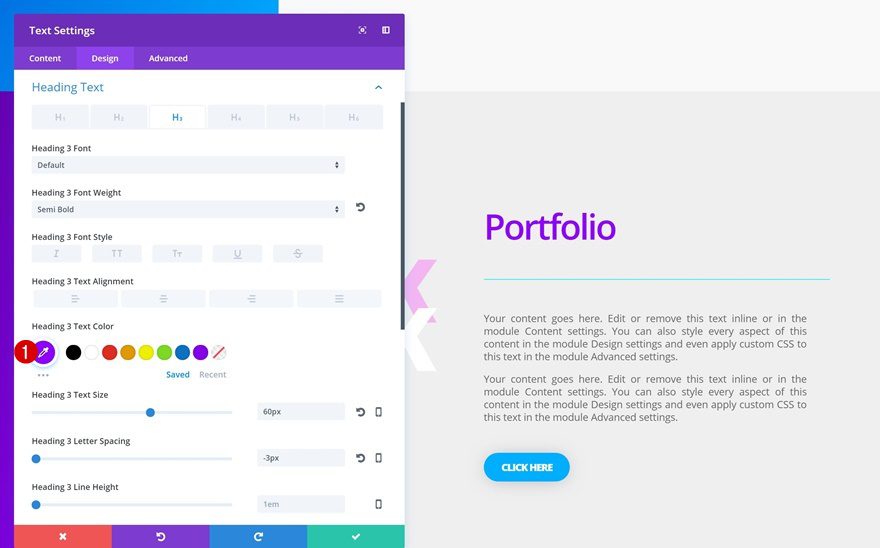
- Heading 3 Text Color: #00aeff
- Heading 3 Text Size: 60px
- Heading 3 Letter Spacing: -3px
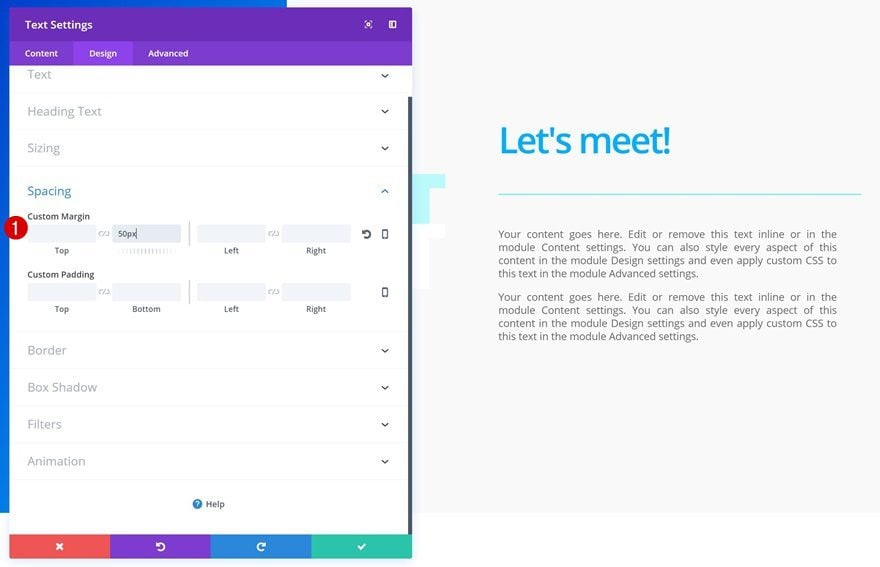
Spacing
Create some space by adding bottom margin next:
Add Divider Module to Column 2
Divider Color
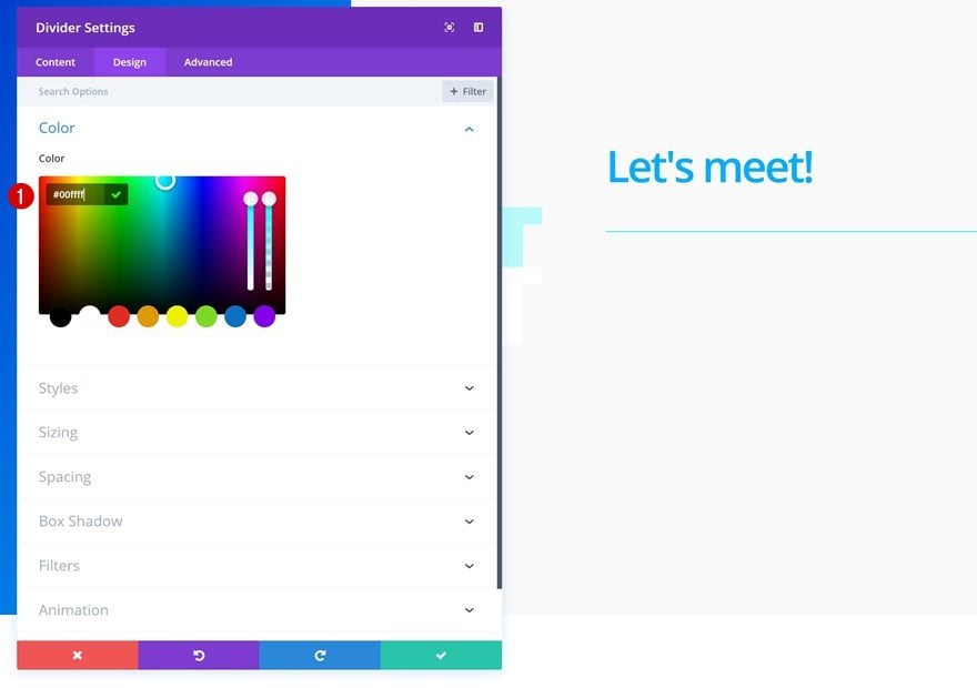
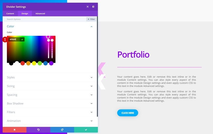
The second module we’ll need is a Divider Module. Open the Color settings and change the color to match with the color palette of the design:
Sizing
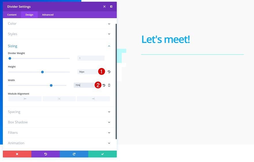
Then, modify the Sizing settings:
Add Description Text Module to Column 2
Text Settings
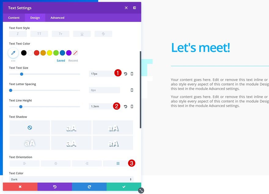
Continue by adding a description Text Module using the following text settings:
- Text Size: 17px
- Text Line Height: 1.3em
- Text Orientation: Justify
Sizing
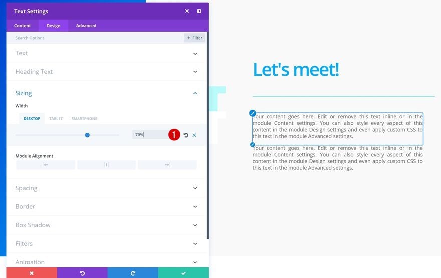
Change the Sizing settings next:
- Sizing: 70% (Desktop), 100% (Tablet & Phone)
Spacing
Add some space below this module using a bottom margin as well:
Add Button Module to Column 2
Button Settings
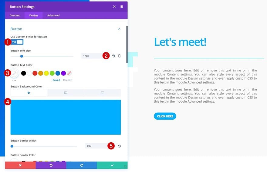
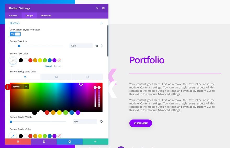
The last module we’ll need in this column is a Button Module. After adding the CTA, change the button settings:
- Use Custom Styles for Button: Yes
- Button Text Size: 17px
- Button Text Color: #ffffff
- Button Background Color: #00aeff
- Button Border Width: 0px
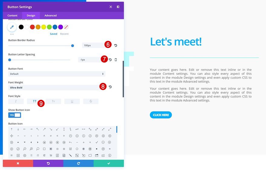
- Button Border Radius: 100px
- Button Letter Spacing: -1px
- Font Weight: Ultra Bold
- Font Style: Uppercase
Spacing
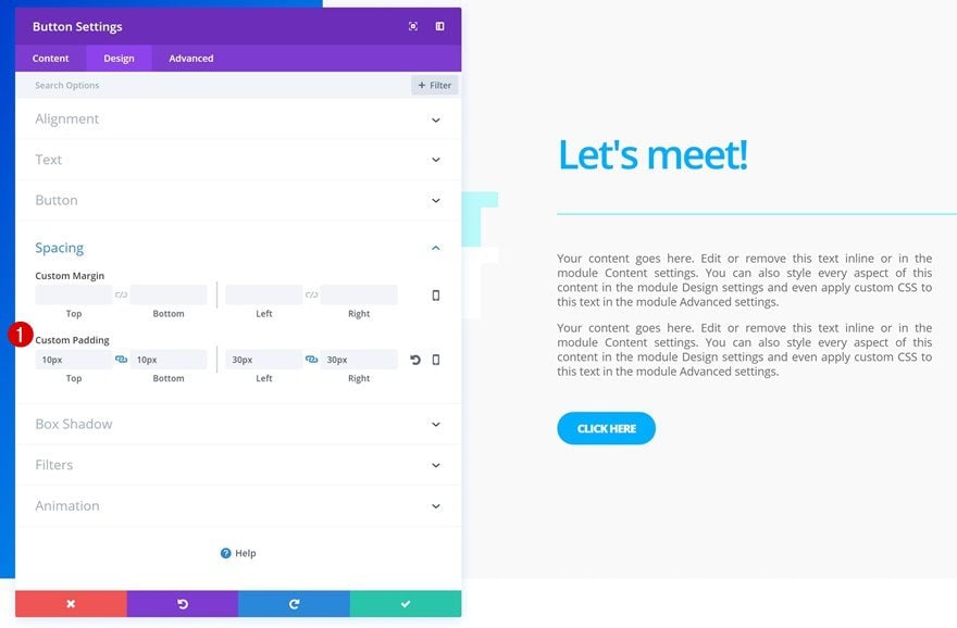
And to give the button a cleaner look and feel, we’ll add some padding as well:
- Top Padding: 10px
- Bottom Padding: 10px
- Left Padding: 30px
- Right Padding: 30px
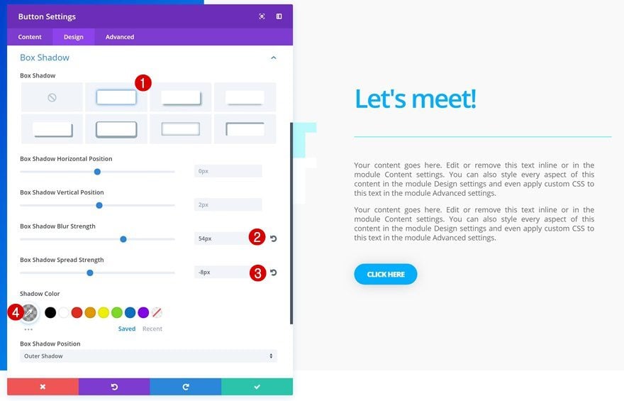
Box Shadow
Last but not least, we’ll use a subtle box shadow to add a bit of depth to our section:
- Box Shadow Blur Strength: 54px
- Box Shadow Spread Strength: -8px
- Shadow Color: rgba(0,0,0,0.3)
Clone Section
Change All Copy
To create the second section, we’re simply going to clone the one we’ve already created and then, change all the copy.
Change Row Background Color
For this new section, we’re going to use another color palette. Start by changing the background color of your row.
- Background Color: #efefef
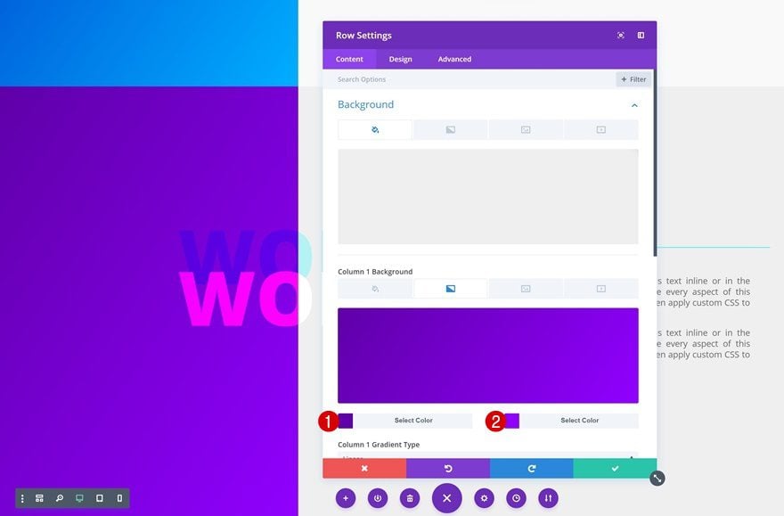
Change Column 1 Gradient Background
Then, choose another gradient background as well.
- Color 1: #5f00a8
- Color 2: #9000ff
Change Section Title Shadow Color
We’re matching the Text Shadow Color with our new color palette too:
- Heading 2 Text Shadow Color: rgba(255,0,255,0.24)
Change Section Title Spacing Settings
Depending on the length of the copy you’re using, you’ll need to play around with the negative right margin.
- Right Margin: -110% (Desktop)
Change Title Text Module Text Color
Then, change the Text Color of the title Text Module in column 2.
- Heading 3 Text Color: #9000ff
Change Divider Color
Likewise, make the divider color match the design.
Change Button Background Color
To finish off, you’ll need to change the background color of the Button Module.
- Button Background Color: #9000ff
Preview
Now that we’ve gone through all the steps, let’s take a final look at the end result on different screen sizes:
Final Thoughts
There are many ways you can make your web design stand out from the other websites out there. In this post, we’ve shown you how to create stunning section titles, and sections in general, using Divi’s built-in options only. We’ve combined column gradient backgrounds with Text Module overlaps, text shadows and blend modes to create a stunning end result. If you have any questions or suggestions, make sure you leave a comment in the comment section below!


