We all know that sliders are wonderful for maximizing that prime above-the-fold section of your website. They are great! Users are welcomed with multiple CTAs and important features that slide into view without ever having to scroll down the page. But, sometimes too much change in design and content from slide to slide can distract or overwhelm visitors. That’s why in this tutorial, I’m going to show you how to customize your Divi slider to change only specific elements with each slide transition. This allows you to keep the core content and design components of your slider consistent while you change only a specific element (like a single word or button) with each slide. Visitors will be able to easily process the change and clearly understand your call to action.
Let’s dive in!
Divi Slider Sneak Peek
Hear is a sneak peek at the design and functionality of the Divi slider we will build in today’s tutorial.
Notice how this changes only the one word in the body text on each slide.
Notice how with this example, both the body text word and the colors of the buttons and period change with each slide.
The Basic Concept Explained
By default, the Divi slider will animate the description text with each transition to a new slide that fades in and slightly moves the content upward into place.
But, with one simple line of custom CSS, we can disable that upward animation of the text. And, if we duplicate the slide, get rid of the background, and change only one of the elements (like the one word in the body text), you will see only one word changing with each slide.
You can use this concept to change only specific specific text, buttons, or colors while keeping the rest of the design elements in play with each slide.
Getting Started
Subscribe To Our Youtube Channel
For this tutorial, all you will need is the Divi Theme installed and active. We will be building our Divi slider from scratch using the Divi builder on the front end.
To get started, create a new page and give your page a title. Then click to use the Divi Builder and select the option to “Build from Scratch”. Then click the button to “Build on the Front End”.
Now you are ready to get started with the design.
Setting up the Divi Slider Content
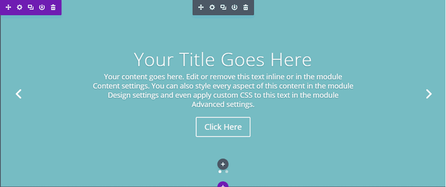
For this example, I’m going to use a fullwidth slider module, but this tutorial also applies to regular slider modules as well. Let’s start by adding a fullwidth section with a fullwidth slider module to your page.
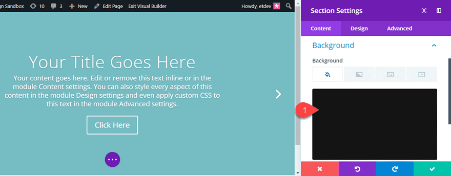
So that we can see the content changes to our slider, let’s temporarily add a dark background color to the fullwidth section first. Open the section settings and give it a black background color (#222222).
You won’t be able to see this yet because the default slider background color is covering it up. We will circle back to finish the section background design later in the tutorial.
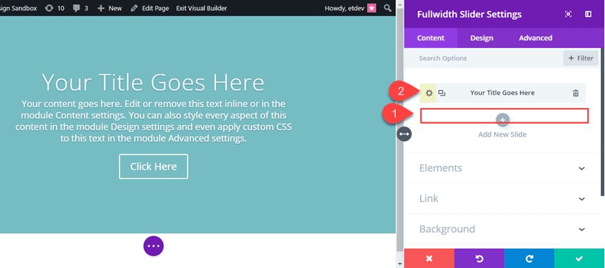
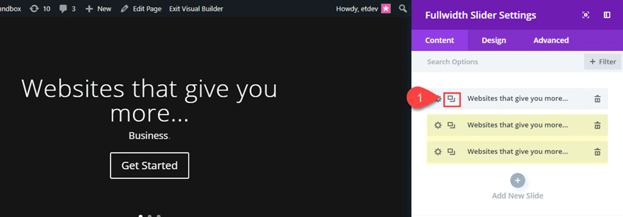
Now let’s jump into the Fullwidth Slider settings and delete one of the default slides, leaving only one. Then open the slide settings.
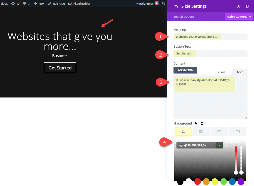
Update the slide settings as follows:
Heading: “Websites that give you more…”
Button Text: “Get Started”
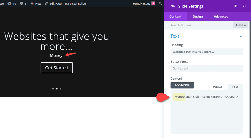
Under Content add the following html:
Business<span style="color: #EE164D;">.</span>
(This adds a custom color to the dot (or period) after the word.)
Background Color: rgba(255,255,255,0)
Save settings.
Now duplicate the slide twice so that you have a total of three slides.
Open the second slide settings. Under Content, replace only the word “Business” with “Money” keeping the rest of the html, heading, and button text the same. We only want to change this one word on each slide. Then save settings.
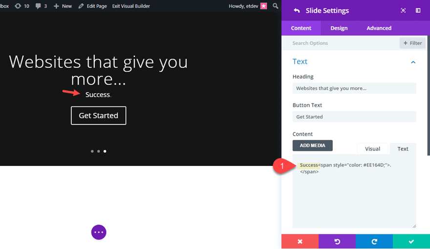
Then open the third slide settings. Under Content, replace the word “Business” with “Success” and save settings.
All done! That takes care of our slider content.
Optimizing the Description Text Animation
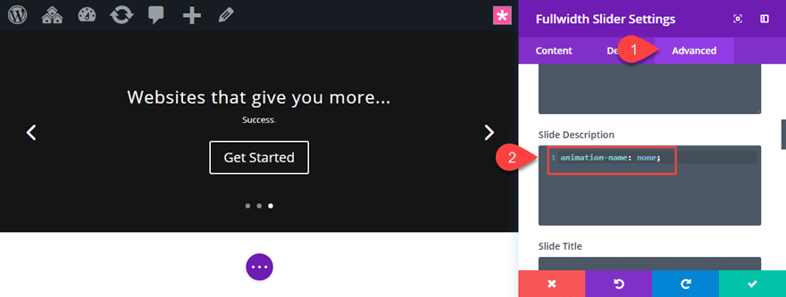
After our slider content is in place, we need to disable our animation so that our text doesn’t jump around with each slide. To do this, go to the fullwidth slider settings and add the following custom CSS under Slide Description:
animation-name: none;
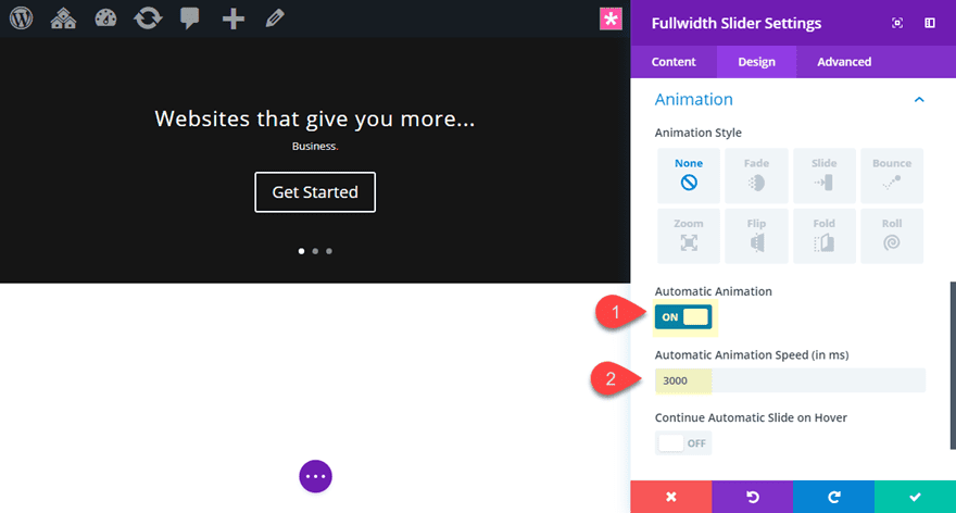
For this example, it makes sense to make our slider animation automatic and increase the animation speed so that users can see the word change in each slide quicker. To do this, go to the design tab and update the following:
Automatic Animation: ON
Automatic Animation Speed (in ms): 3000
Now check out the result so far. You should see only the one word in the content of each slider change without the upward animation.
Designing the Slider
With our content and functionality in place, we can begin styling our slider with a beautiful elegant design.
Open the fullwidth slider settings and update the following:
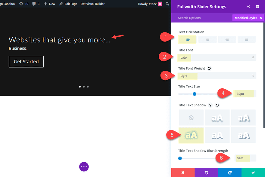
Text Orientation: left
Title Font: Lato
Title Font Weight: Light
Title Text Size: 32px
Title Text Shadow: see screenshot
Title Text Shadow Blur Strength: 0em (this basically takes out the default text shadow)
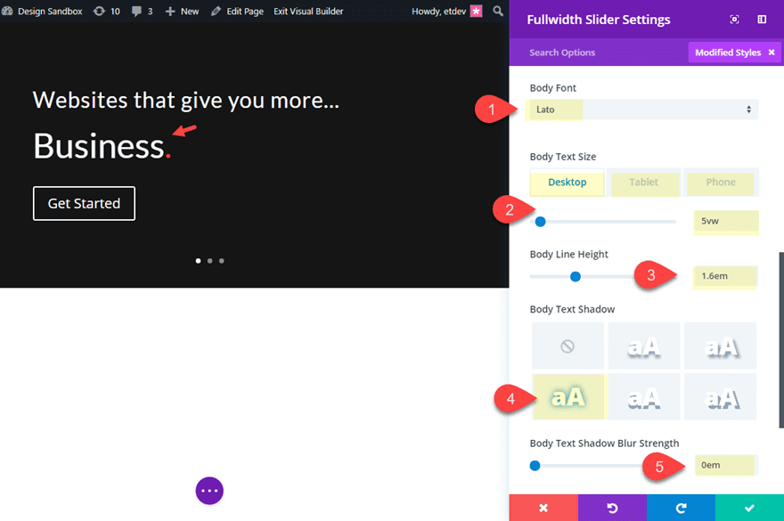
Body Font: Lato
Body Text Size: 5vw (desktop), 50px (tablet), 40px (smartphone)
Body Line Height: 1.6em
Body Text Shadow: see screenshot
Body Text Shadow Blur Strength: 0em (this basically takes out the default text shadow)
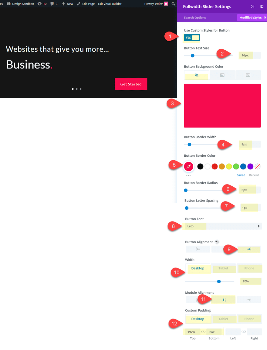
Button Text Size: 16px
Button background color: #ee164d
Button border width: 8px
Button border color: #ee164d
Button Border Radius: 0px
Button Letter Spacing: 1px
Button Font: Lato
Button Alignment: right
Width: 70% (desktop), 100% (tablet), 100% (smartphone)
Module Alignment: center
Custom Padding (desktop): 19vw top, 8vw bottom
Custom Padding (tablet): 19vw top, 4vw bottom. 0px left, 0px right
Custom Padding (smartphone): 30vw top, 4vw bottom, 0px left, 0px right
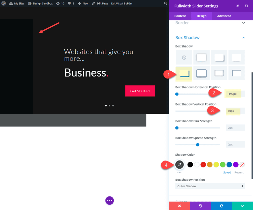
Box Shadow: see screenshot
Box Shadow Horizontal Position: -190px
Box Shadow Vertical Position: 60px
Box Shadow Color: rgba(0,16,17,0.7)
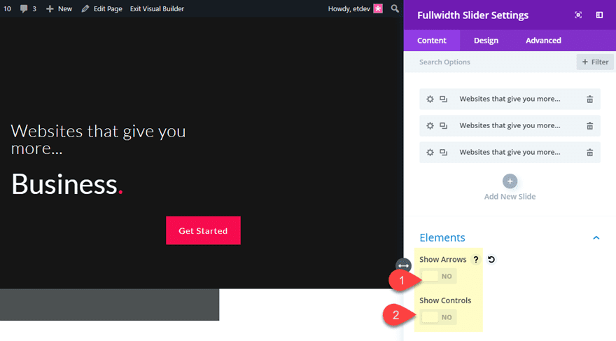
And for one last step, let’s disable our slider elements so that we don’t see the slider arrows or controls.
That takes care of our Divi slider design!
Customizing the Section Styles
The rest of the design will be added to our section, including our background image that will serve as a static background for all of our slides. Adding a background image to the section is better for this usage because you won’t see any slight transitions from one image to another like you would if you added the background image to your slider module.
Open up the section settings and update the following:
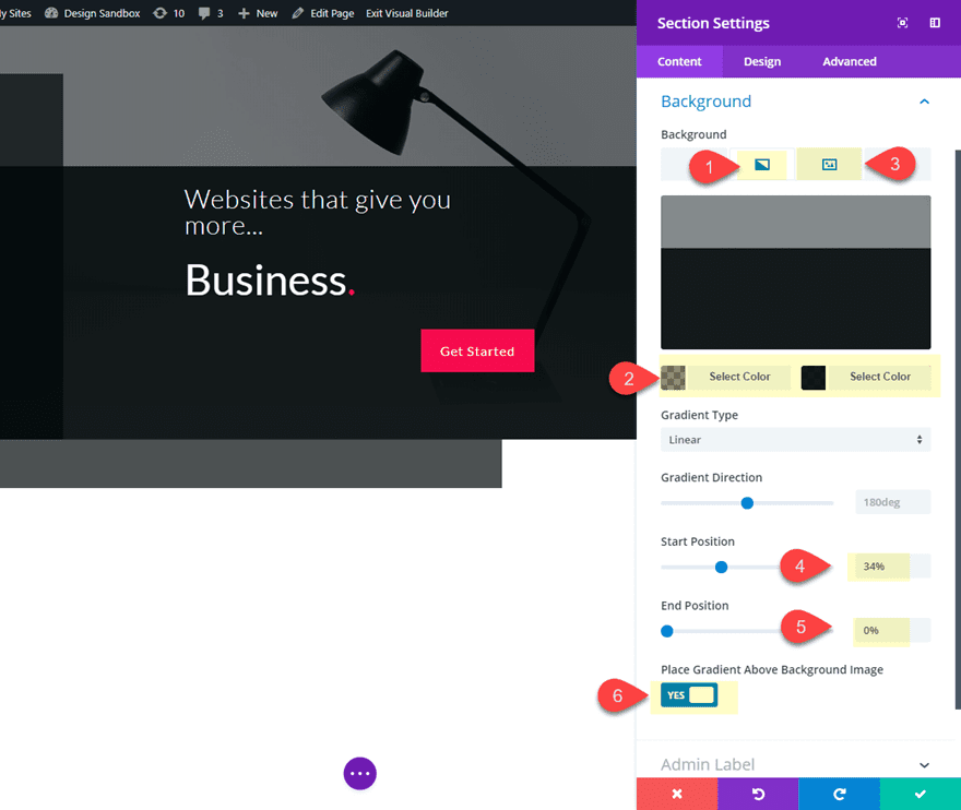
Background Image: [insert image around 1920px by 800px]
Background Gradient Left Color: rgba(0,16,17,0.45)
Background Gradient right color: rgba(0,16,17,0.92)
Start Position: 34%
End Position: 0%
Place Gradient Above Background Image: YES
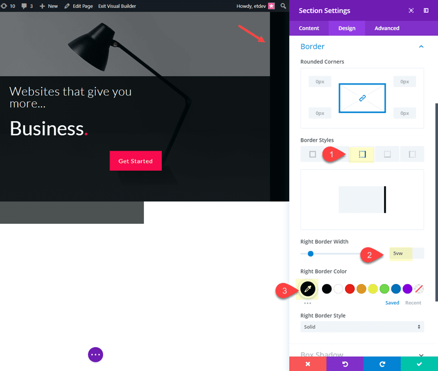
Next, give your section a right border as follows:
Right Border Width: 5vw
Right Border Color: #001011
And lastly, give you section a box shadow to help balance out the framework of the design.
Box Shadow: see screenshot
Box Shadow Horizontal Position: -200px
Box Shadow Vertical Position: -150px
Box Shadow Color: rgba(0,16,17,0.74)
That’s it!
Final Design of the Divi Slider
Here is the final design of the custom Divi slider.
And here is the functionality of the slides. Notice how only the one word changes with each slide.
Final Design on Mobile
Tablet
Smartphone
Experiment with Changing Other Elements
You can experiment with changing other elements with each slide for more creative designs and functionality. For example, you could give each of your slide buttons a different color with each slide as well as match the color of the period with the new button color on each slide.
Here is what that would look like.
You could even explore changing on the slide box-shadow color or some other design element. There are countless possibilities!
Final Thoughts
This custom Divi slider design and functionality provides a nice alternative to those traditional sliders out there. The core of the design doesn’t change, which further highlights the important aspect of your CTA that does change with each slide. Seems like this could be something you could test to see if it may boost conversions!
Let me know what you think in the comments below.
Cheers!
https://www.elegantthemes.com/blog/divi-resources/how-to-customize-your-divi-slider-to-change-specific-elements-with-each-slide


