A timeline layout can come in handy for a lot of different applications on a website, especially if it looks great on mobile. You can use it for showcasing a sequence of milestones on an about page, featuring the steps of a process, and much more. And with Divi and its scroll effects, you can make a timeline design come alive!
In this tutorial, we’ll show you how to design a complete Divi timeline layout with scroll effects. The timeline layout is versatile, elegant, and responsive. And, the scroll effect features a running dot that leads the user down the timeline, highlighting each event as the user scrolls.
Check it out!
Sneak Peek
Download the Divi Timeline Layout for FREE
To lay your hands on the designs from this tutorial, you will first need to download it using the button below. To gain access to the download you will need to subscribe to our newsletter by using the form below. As a new subscriber, you will receive even more Divi goodness and a free Divi Layout pack every Monday! If you’re already on the list, simply enter your email address below and click download. You will not be “resubscribed” or receive extra emails.
To import the layout to your page, simply extract the zip file and drag the JSON file into the Divi Builder.
Let’s get to the tutorial, shall we?
What You Need to Get Started
To get started, you will need to do the following:
- If you haven’t yet, install and activate the Divi Theme.
- Create a new page in WordPress and use the Divi Builder to edit the page on the front end (visual builder).
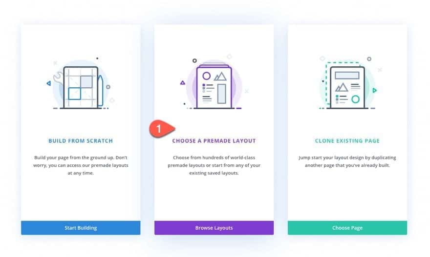
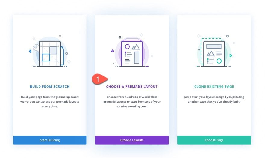
- Choose the option “Build From Scratch”.
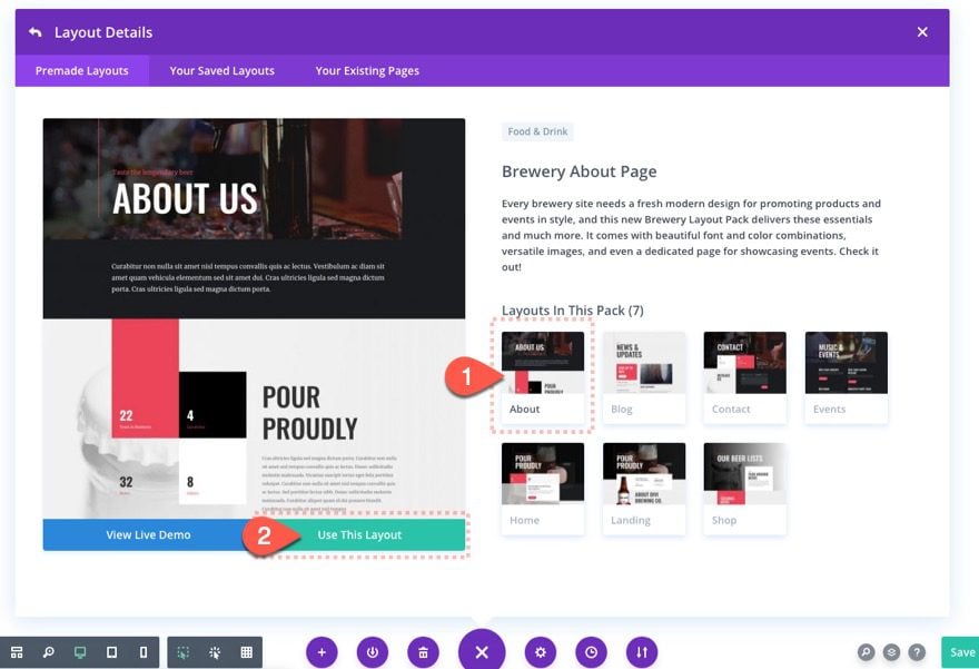
- Then search for and select the Brewery Layout Pack under the premade layouts tab. Then select the Brewery About Page layout and click the “Use This Layout” button.
After that, you are ready to start designing in Divi.
Creating a Timeline Layout with Scroll Effects in Divi
This timeline layout design includes two main parts – the header section and the timeline section. We are using the Brewery About Page premade layout so that we can incorporate great looking design elements while we concentrate on designing the layout and scroll effects.
The key features of this layout include the creative positioning of blurbs as the event items on the timeline. The centered line is actually the left border of a row that is positioned to the right half of the viewport. And the scroll effects are added to multiple divider modules that have been converted into colored circles that are positioned and moved with precise offsets as the user scrolls down the page.
Let’s get to it.
Part 1: Creating the Header Section
Deleting Unwanted Sections
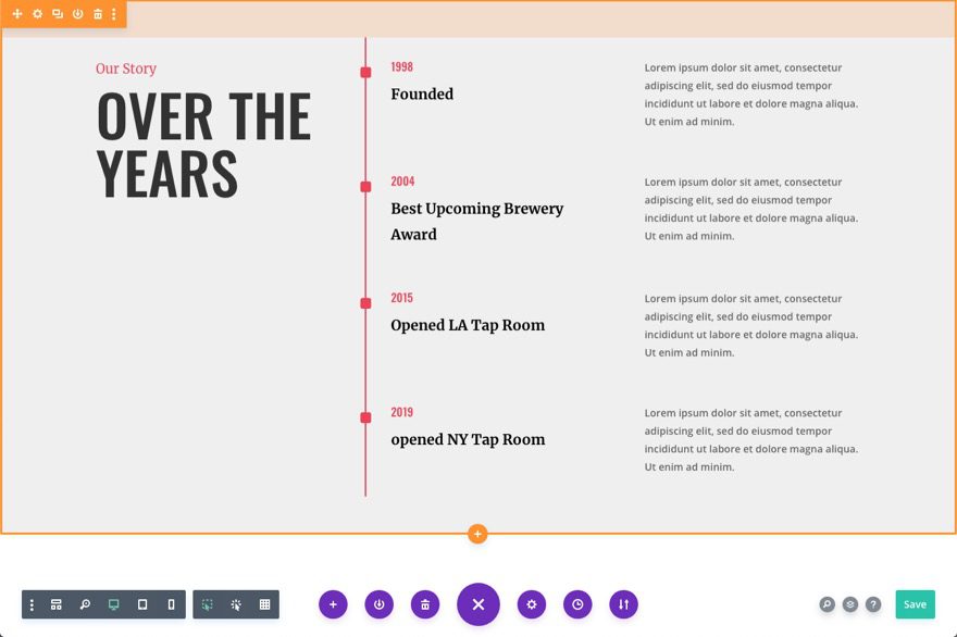
First, make sure you have successfully loaded the Brewery About Page Layout to the page using the Divi Builder. For this design, we are only going to be using the section that features a timeline toward the bottom of the page. Delete all sections above and below that section so that only it remains.
You should have this section below left.
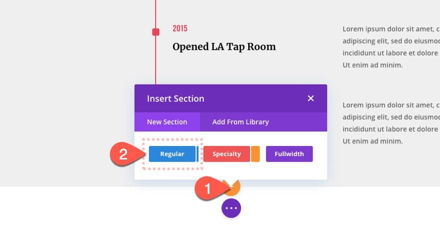
Add New Section
Now add a new section under the premade section and drag it to the top of the page.
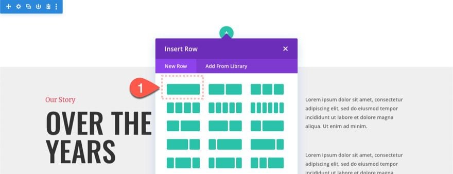
Add Row
Add a one-column row to the section.
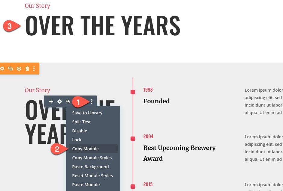
Copy and Paste Text Module from Premade Section
Drag (or copy) the text module in the left column of the premade section that has the heading. Then place (or paste) the module in the new column above.
Section Background
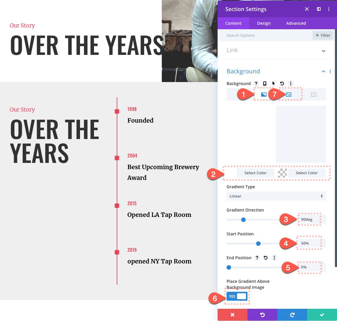
Once the text is in place, open the settings of the top section and add a background as follows:
- Gradient Background Left Color: #ffffff
- Gradient Background Right Color: rgba(255,255,255,0)
- Gradient Direction: 90deg
- Start Position: 50%
- End Position: 0%
- Place Gradient Above Background Image: YES
Section Design
Under the design tab, update the following:
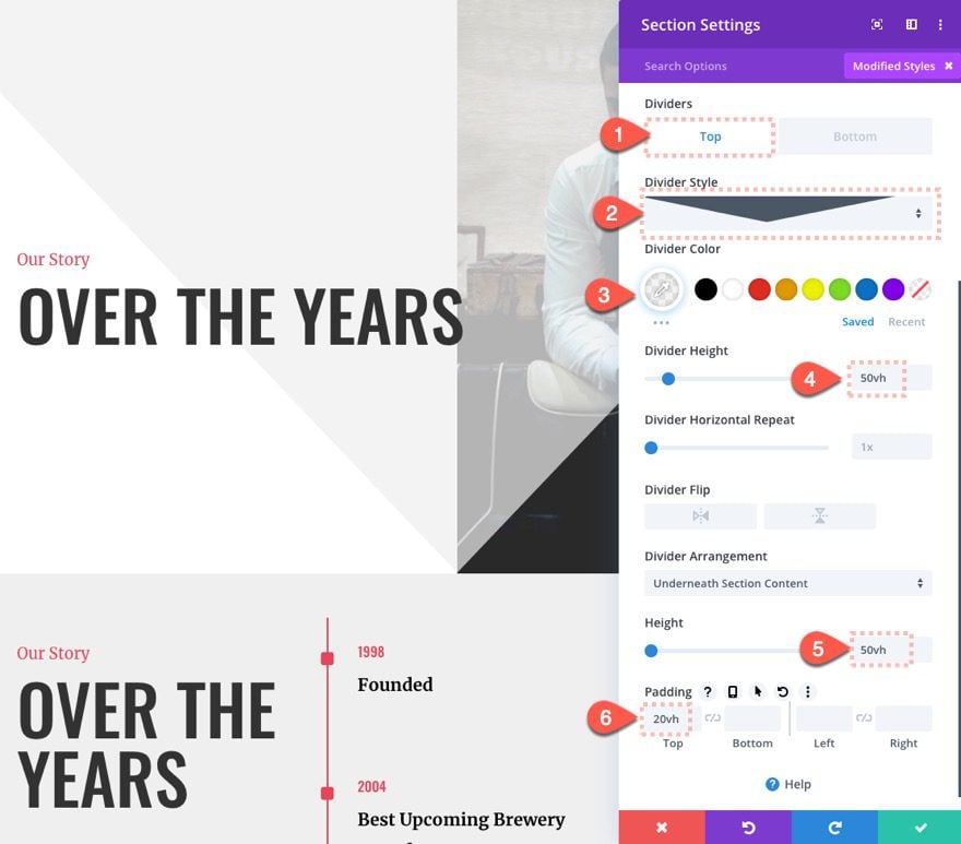
Divider
- Top Divider Style: see screenshot
- Divider Color: rgba(238,238,238,0.7)
- Divider Height: 50vh
Size and Spacing
- Height: 50vh
- Padding: 20vh
Part 2: Creating the Timeline Section
Once the header section is in place, we can start the main section of our layout – the timeline.
Add Section and Row
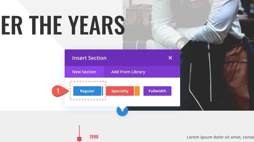
To start, add a new regular section below the header section we just created.
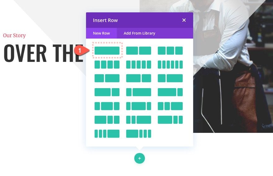
Then add a one-column row to the new section.
Section Background
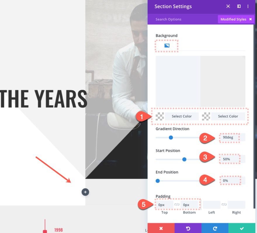
Before we start adding modules, open the settings for the new section and give update the background design and padding as follows:
- Gradient Background Left Color: rgba(255,255,255,0)
- Gradient Background Right Color: #eeeeee
- Gradient Direction: 90deg
- Start Position: 50%
- End Position: 0%
- Place Gradient Above Background Image: YES
- Padding: 0px top, 0px bottom
Row Settings
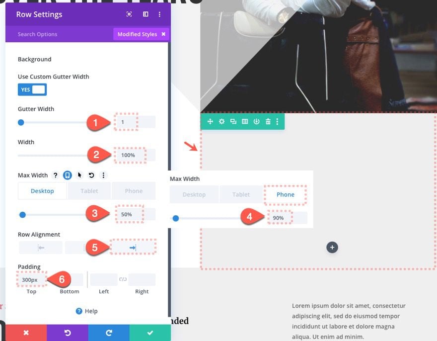
Once the section is finished, open the settings for the row and update the following:
- Gutter Width: 1
- Width: 100%
- Width: 100%
- Max Width: 50% (desktop), 90% (phone)
- Row Alignment: Right
- Padding: 300px top
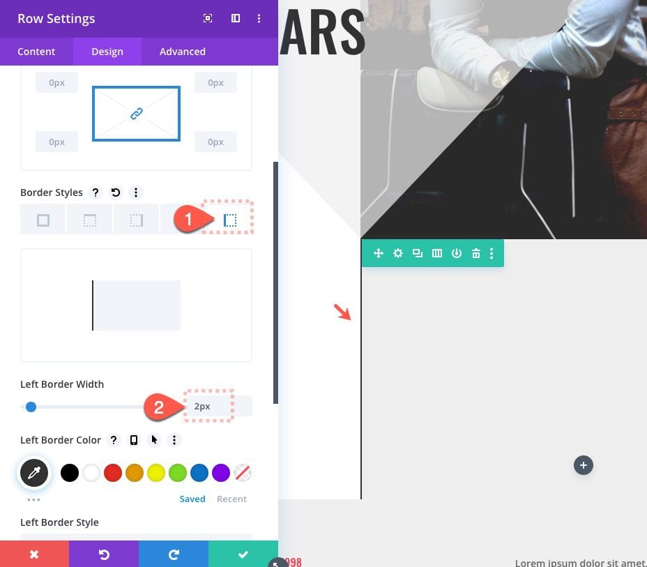
Border
- Left Border Width: 2px
- Left Border Color: #333333
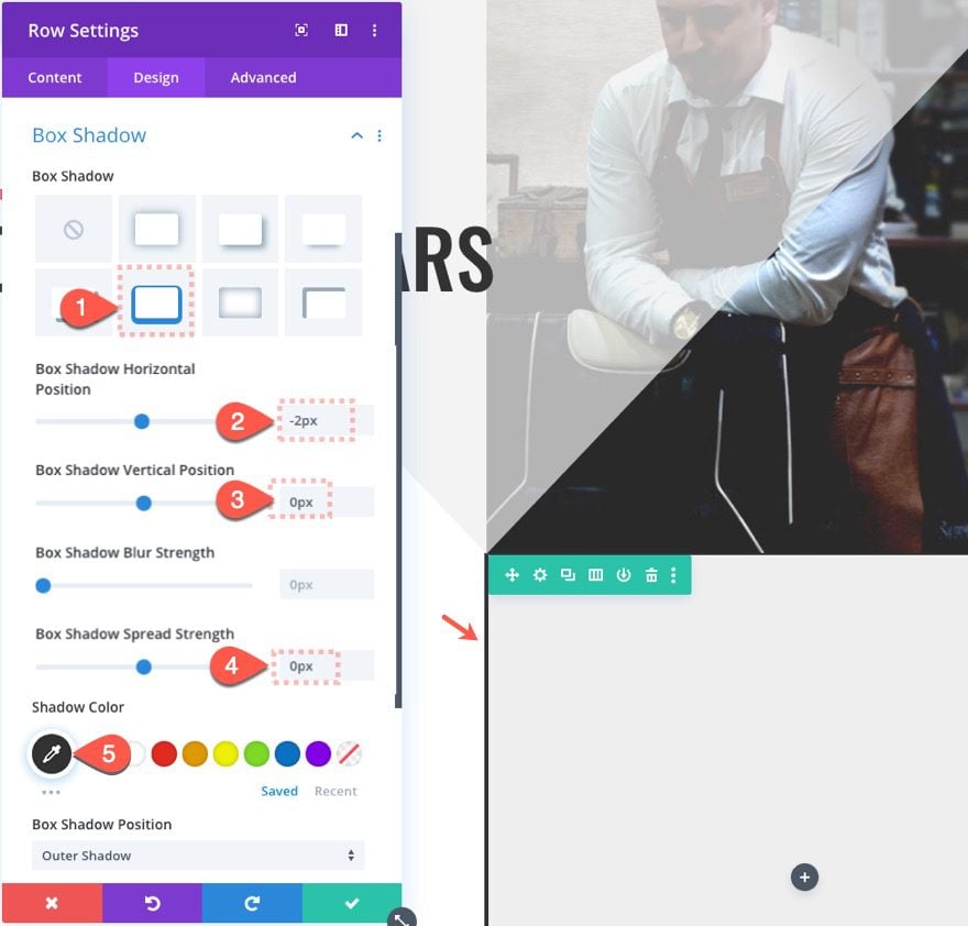
Box Shadow
- Box shadow Style: see screenshot
- Box Shadow Horizontal Position: 0px
- Box Shadow Spread Strength: 0px
- Shadow Color: #333333
The combination of border and box-shadow creates a line that is centered on the page which will be used for the timeline.
Building Blurb 1
Now that our line is in place, we can start adding our blurbs.
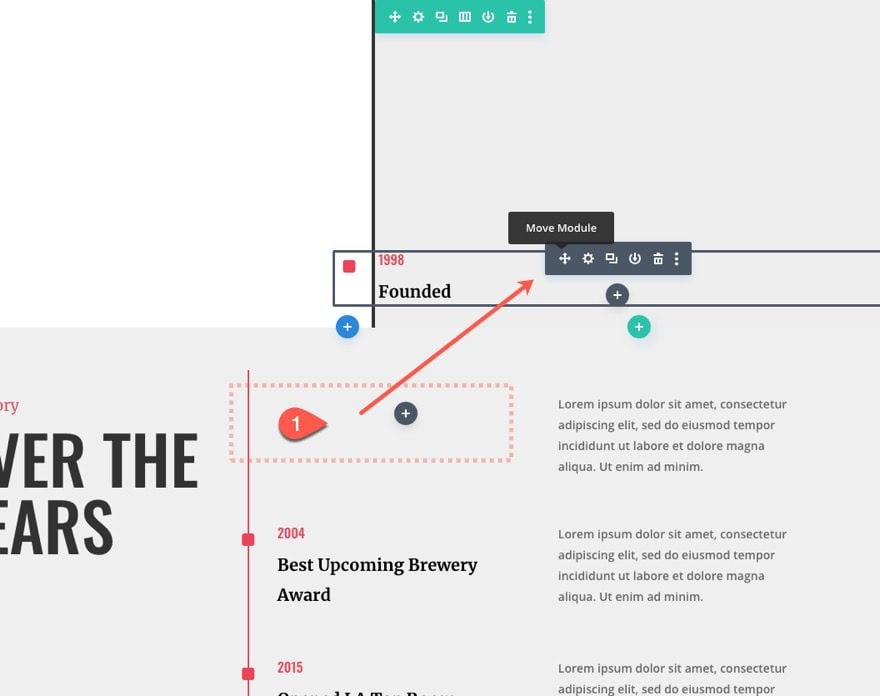
Copy and Paste Premade Blurb Module
To create the first blurb, let’s drag the first blurb in the premade section below into the new row.
Update Blurb Content
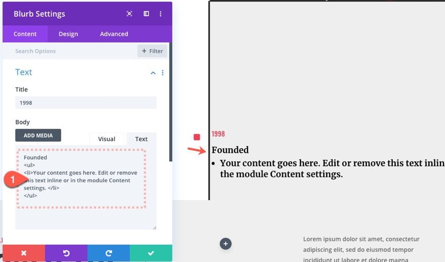
Open the settings for the blurb and paste the following content inside the body:
Founded
<ul>
<li>Your content goes here. Edit or remove this text inline or in the module Content settings. </li>
</ul>
Blurb List Design
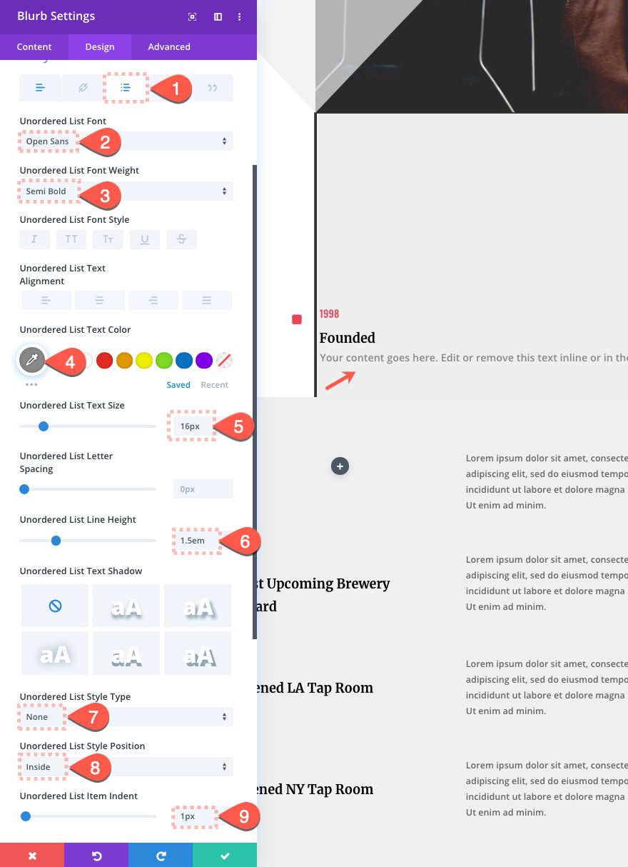
Then update the design for the list as follows:
- Unordered List Font: Open Sans
- Unordered List Font Weight: Semi Bold
- Unordered List Text Color: #888888
- Unordered List Text Size: 16px
- Unordered List Line Height: 1.5em
- Unordered List Style Type: None
- Unordered List Style Position: Inside
- Unordered List Item Indent: 1px
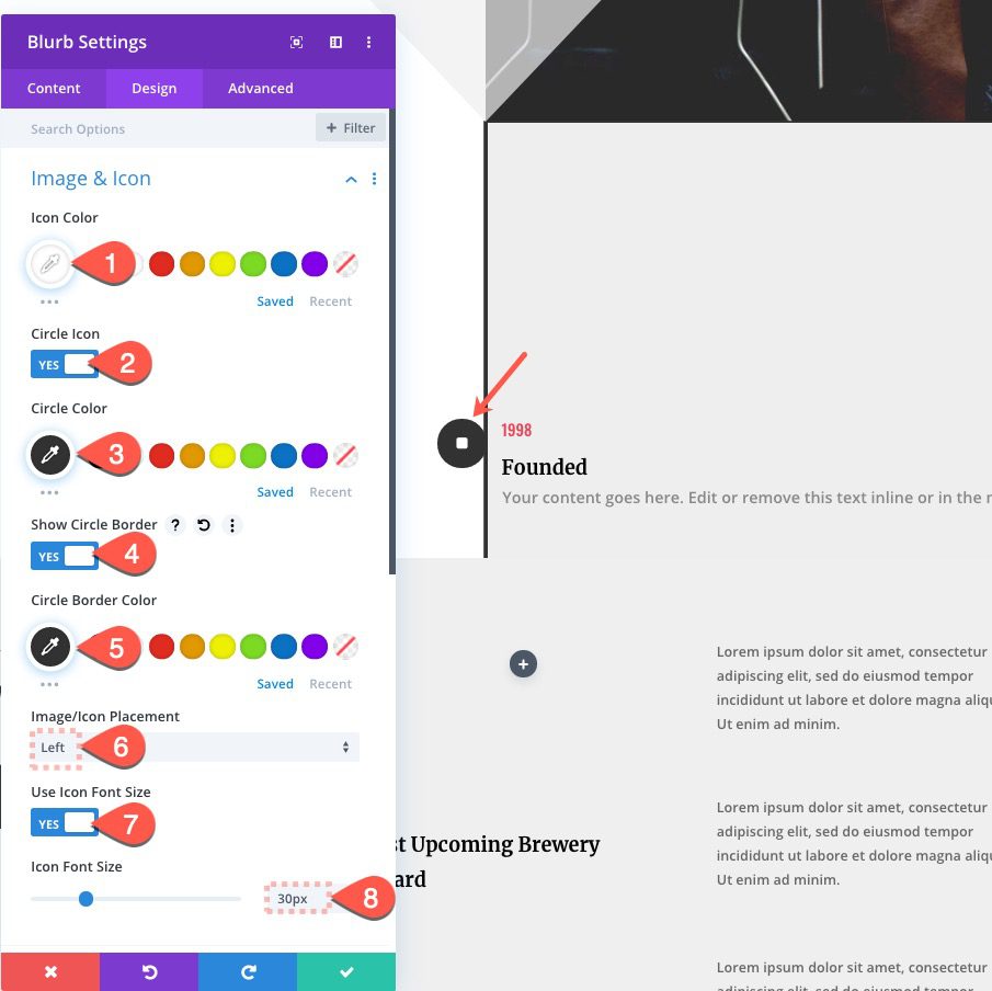
Blurb Icon Design
- Icon Color: #ffffff
- Circle Color: #333333
- Circle Border Color: #333333
- Image/Icon Placement: Left
- Icon Font Size: 30px
The icon font size combined with the circle and border should be exactly 50px by 50px. This will become helpful for centering the icon over the line made by the row border and box-shadow.
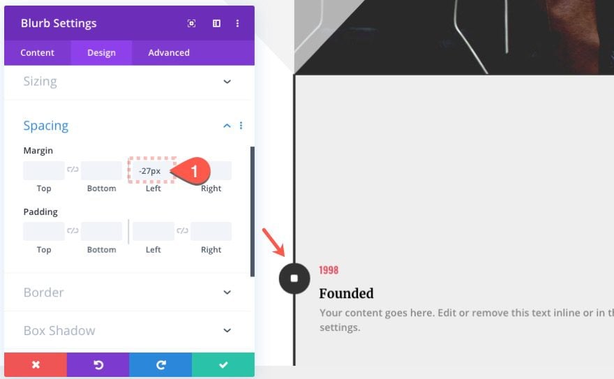
Blurb Margin
To center the icon over the line, we need to move the icon over to the left by 27 pixels. The 27 pixels accounts for exactly half the width of the icon (25px) plus half of the line (2px).
Blurb Sizing
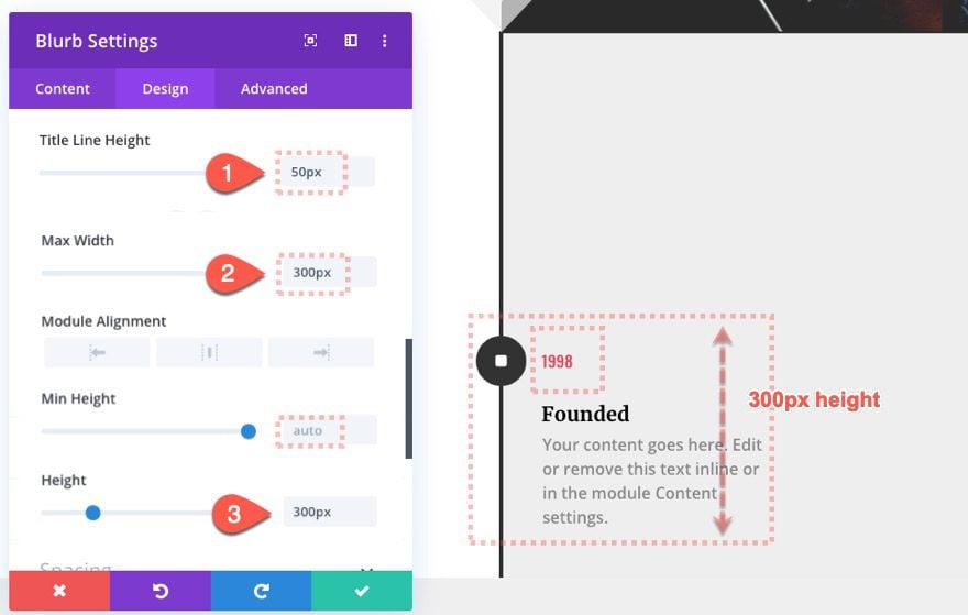
For this design, it’s important to give our blurb a height set with a pixel length unit. This will allow us to add predictable scroll effect offset values which are also based on a pixel length unit. Since we are going to be moving a circle down the blurb module by 300px increments, we need a set height value to do that.
No Animation
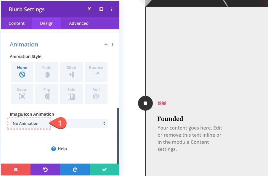
Before we forget, let’s take out the default animation that is added to all blurb icons.
Blurb Z Index
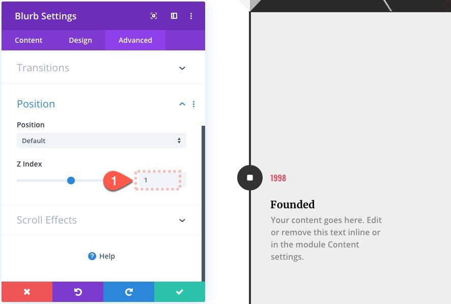
Then set the Z Index to 1. This will make sure the circles we add later will sit behind the blurb icons.
Creating the Running Circle Divider
The next step is to create a divider that will be shaped like a circle, positioned absolutely, and then moved along the line from one blurb icon to the next (300px) on scroll.
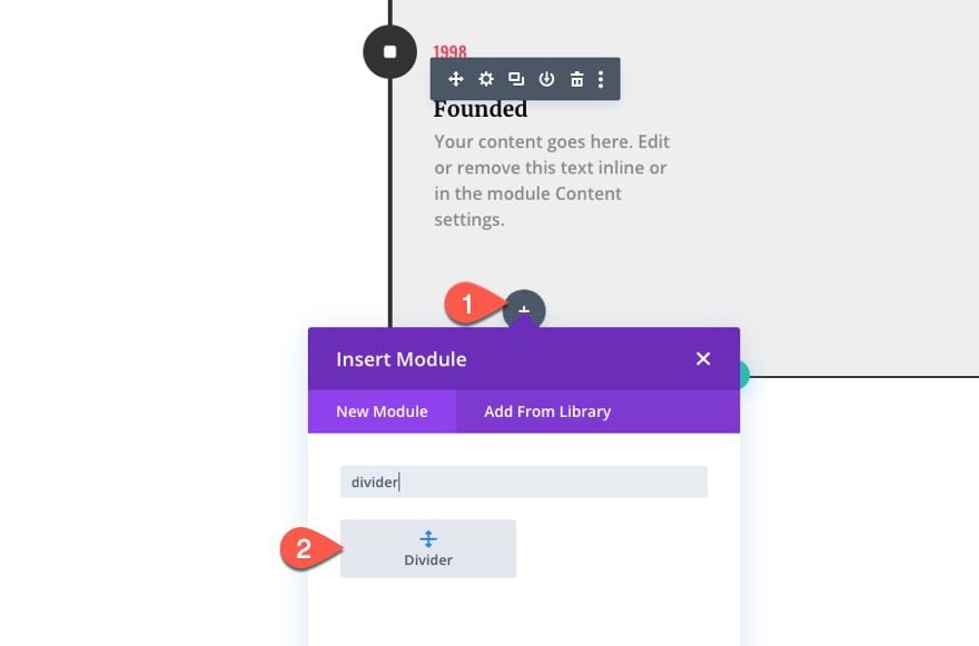
Add Divider
Add a new divider module under Blurb 1.
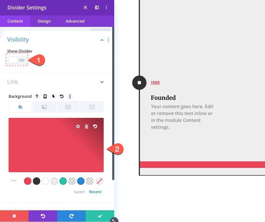
Divider Background
Then select NO under Show Divider and give the Divider a background color:
- Background Color: #e94558
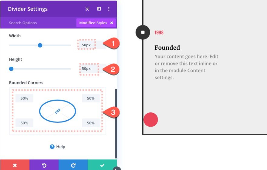
Make Divider Circular
To make the divider circular, set the width and height to the same value (50px) and set the border-radius/rounded corners to 50%.
- Width: 50px
- Height: 50px
- Rounded Corners: 50%
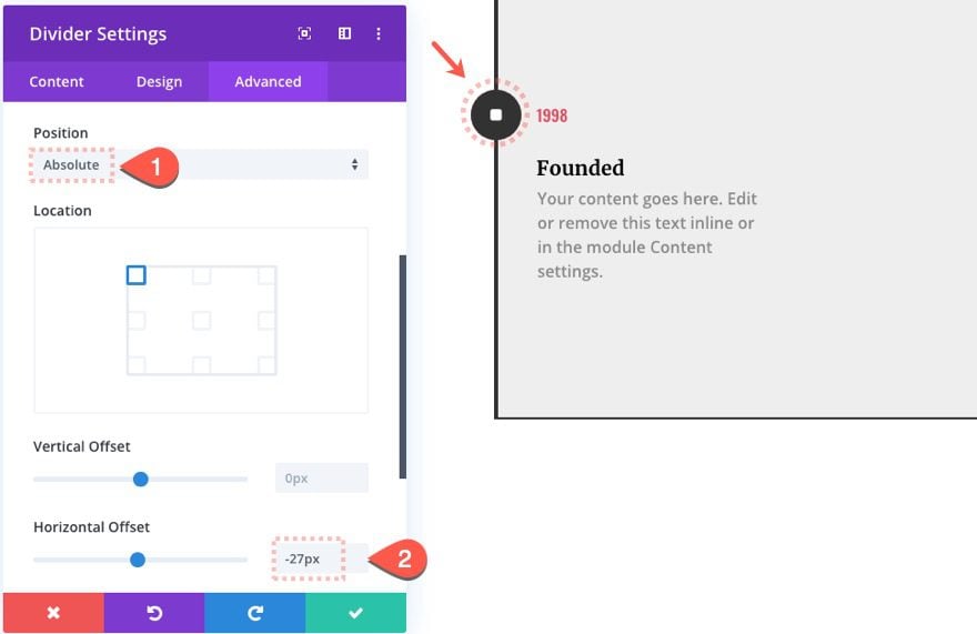
Divider Position
Then position the divider behind the blurb icon by updating the following:
- Position: Absolute
- Horizontal Offset: -27px
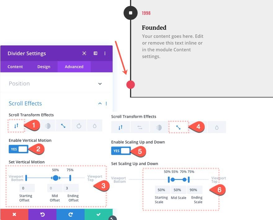
Divider 1 Scroll Effects
Once the circle divider is in place, we can add the scroll effects that will create the “running circle” motion.
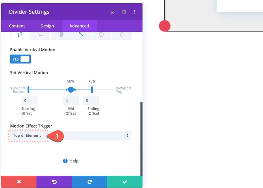
Under the Vertical Motion tab…
- Enable Vertical Motion: YES
- Starting Offset: 0 (at 0% viewport)
- Mid Offset: 0 (at 50% viewport)
- Ending Offset: 3 (at 75% viewport)
NOTE: The Ending Offset is 3 which represents 300px so the divider will travel from the top of the blurb to the bottom of the blurb exactly 300px which is the exact height of the blurb.
Under the Scaling Up and Down tab…
- Enable Scaling Up and Down: YES
- Starting Scale: 50% (at 50% viewport)
- Mid Scale: 50% (at 55%-70% viewport)
- Ending Offset: 90% (at 75% viewport)
Make sure to set the motion effect trigger to the Top of Element.
Creating the “Pulse Highlight” Divider
The next divider we need to create will add a pulse highlighting effect to the blurb icon as the running circle reaches it or when the icon reaches 50% (the center) of the viewport.
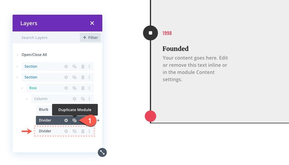
To create the new pulse divider, open up the layers view box and duplicate the divider we just created.
Adding the “Pulse and Highlight” Scroll Effect
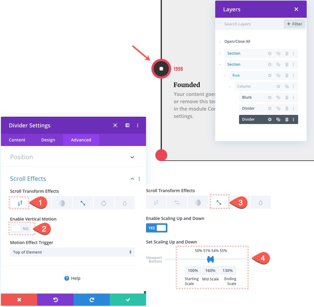
Then open the duplicate divider’s settings and update the following scroll effects:
Under the Vertical Motion tab…
- Enable Vertical Motion: NO
Under the Scaling Up and Down tab…
- Starting Scale: 100% (at 50% viewport)
- Mid Scale: 160% (at 51%-54% viewport)
- Ending Offset: 130% (at 55% viewport)
This will cause the circle divider to scale to 160% briefly before settling at a size slightly larger than the blurb icon. This will cause the pulse effect and then the highlight effect.
Label the First Three Modules
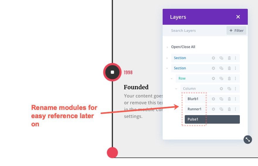
For better organization, label the first group of three modules as follows:
Duplicate First Three Modules
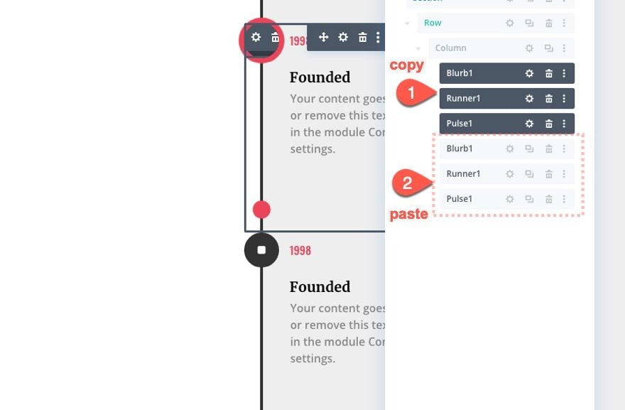
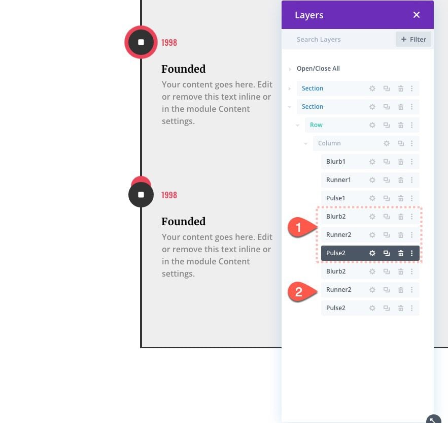
Now we need to continue this process to create more event items to the timeline with scroll effects. To do this, copy the first three modules and paste them below, making sure they keep the original order (blurb 1, runner 1, pulse1).
Then rename the duplicate modules as follows:
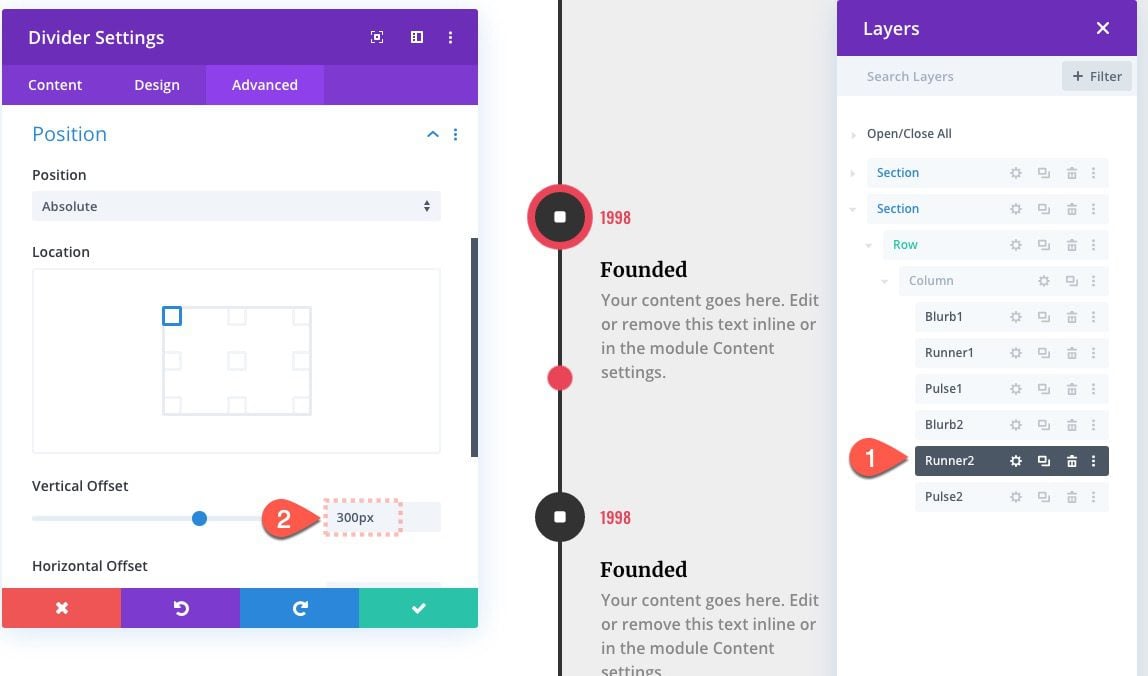
Update Running Circle 2 Divider Position
Next, update the running circle divider (runner 2) with a new vertical offset that starts at the second blurb module, exactly 300px down the page.
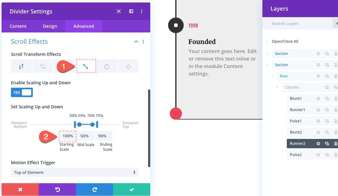
Running Circle Divider 2 Scroll Effects
Then update the scroll effect as follows:
Under the Scaling Up and Down tab…
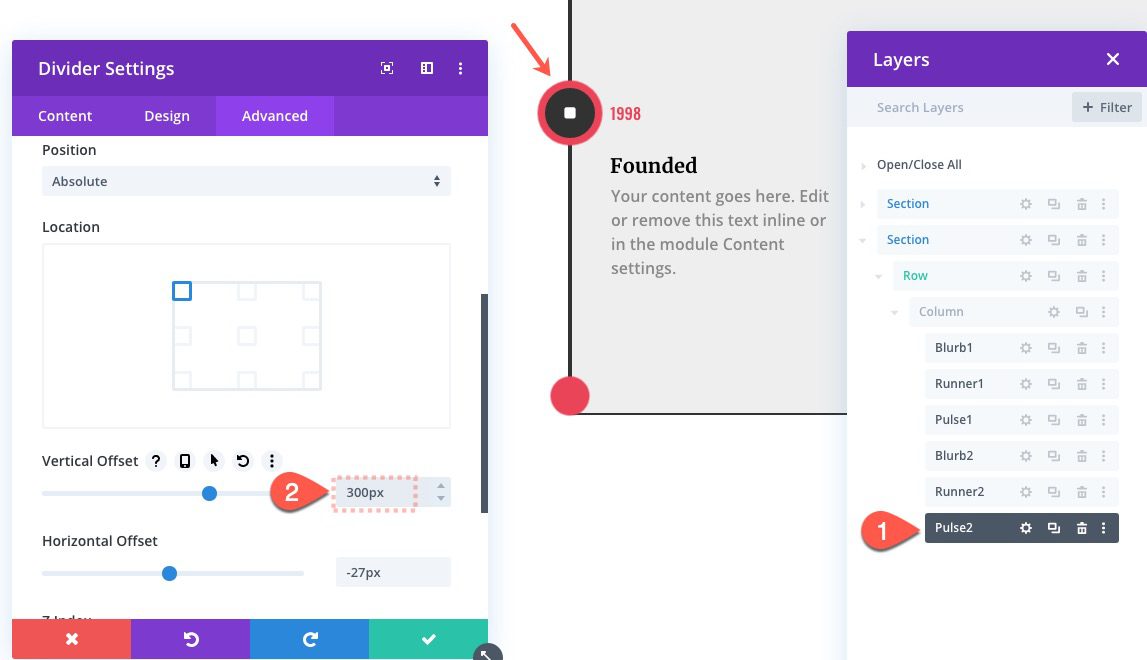
Update Pulse Divider 2 Postion
After “runner 2” has been updated, open the settings for the second pulse divider (pulse 2) and update the vertical offset as well.
That takes care of our second group. Let’s do one more.
Duplicate Second Group of Three Modules
To create our third group of modules, copy the second group (blurb2, runner2, pulse2) and paste them below, making sure to keep their same order.
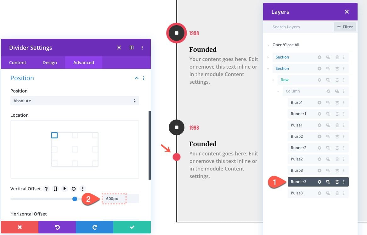
Update Running Circle Divider 3 Position
Update running circle divider 3 (runner3) with a new vertical offset that starts at the next blurb icon.
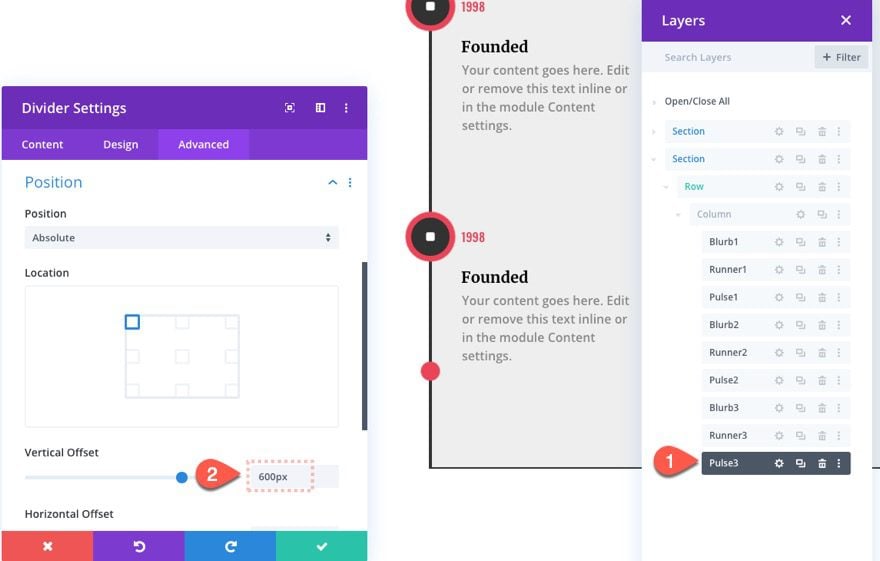
Update Pulse Divider 3 Position
Then open the settings for the pulse divider (pulse 3) and give it the same offset.
At this point, you can continue to add more items to the timeline following these three steps:
- Duplicate previous group of three modules
- Update Runner Divider with Vertical Offset increased by 300px
- Update Pulse Divider with Vertical Offset increased by 300px
Flipping Blurb 2
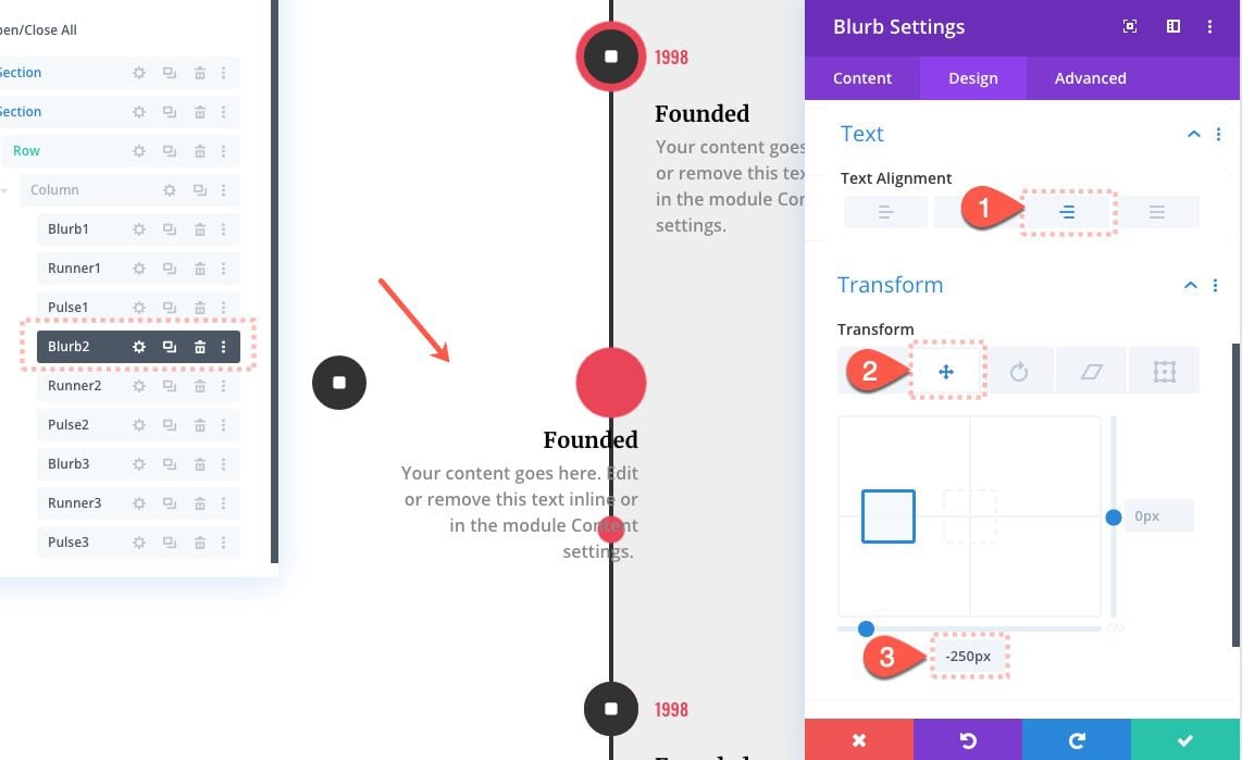
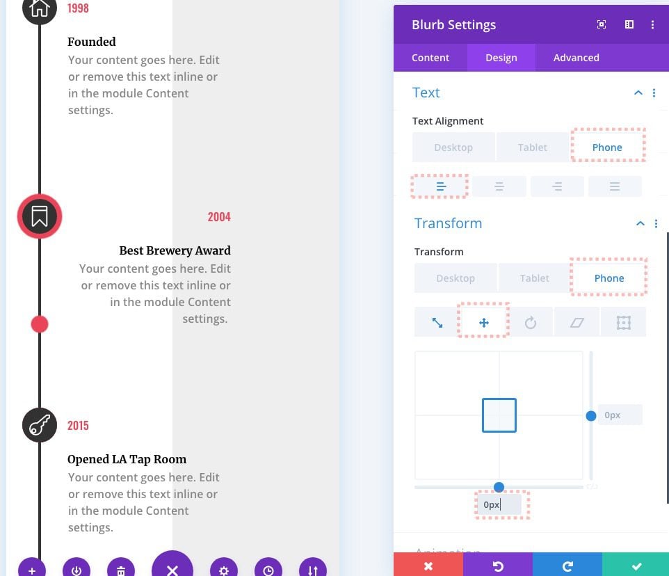
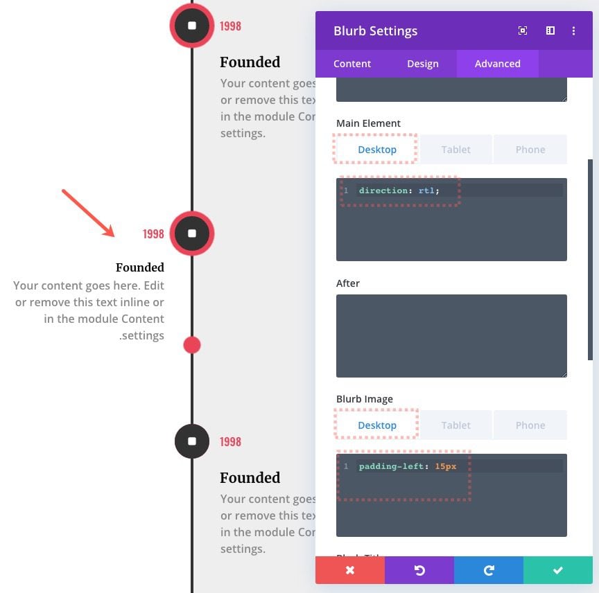
Right now, all the events are located on the right side of the line inside the row. To create a more balanced design, we can flip the second blurb so that it sits on the right side. To do this, open the blurb settings and update the following:
- Text Alignment: Right (desktop), Left (phone)
- Transform Translate X Axis: -250px (desktop), 0px (phone)
Custom CSS
Next, add the following custom CSS to the Main Element:
direction:rtl;
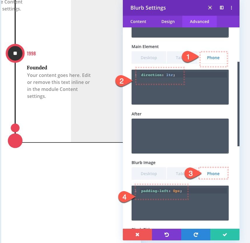
And then under the phone tab, add the following:
direction:rtl;
Then add the following custom CSS to the Blurb Image:
padding-left: 15px
Under the phone tab, add the following:
padding-left: 0px
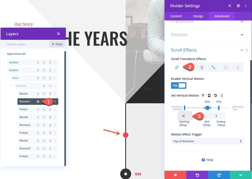
Extending the Start of Running Circle Divider 1
As a finishing touch, let’s adjust the first running circle divider (runner 1) so that it starts above the first blurb icon. To do this, open the settings for runner 1 and update the following:
Final Result
Check out the final result on desktop and mobile.
Final Thoughts
The Divi timeline layout features an elegant design with scroll effects that are refreshingly helpful to the user. Plus, the design seemingly has endless possible variations to explore new effects. Hopefully, this layout will come in handy on your next project.
I look forward to hearing from you in the comments.
Cheers!
https://www.elegantthemes.com/blog/divi-resources/how-to-design-a-divi-timeline-layout-with-scroll-effects

