Do you want to show a before and after photo in WordPress?
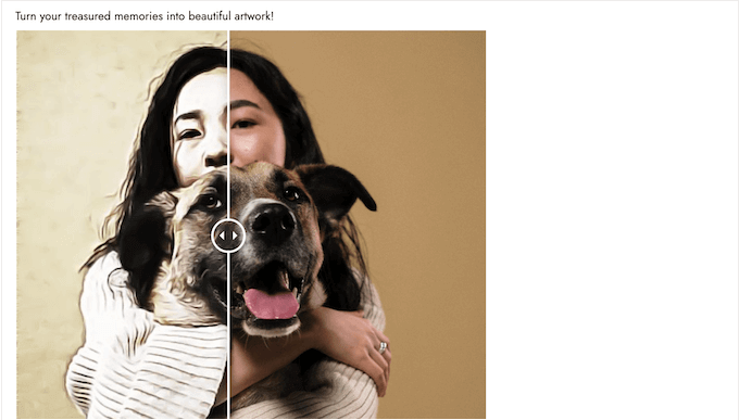
A before and after photo allows you to show a side by side comparison of two images with minor differences. This is perfect for showing the impact of your products and services, or simply encouraging people to interact with your content.
In this article, we’ll show you how to add a before/after photo to your WordPress website with a slide effect.
Why Show Before and After Photos in WordPress (with Slide Effect)?
A before-and-after image is an interactive picture that typically shows some kind of change.
Visitors can use a slider to switch between the different ‘versions’ of the image in an engaging and interactive way.
If you run an online store using a plugin such as WooCommerce, then a before and after photo can show the effect of your products or services.
You simply need to show a ‘before’ photo that the customer can relate to, and a desirable ‘after’ photo. This will make shoppers want to buy the thing that takes them from the ‘before’ state to the ‘after’ state.
If you’re an affiliate marketer, then showing persuasive before and after photos on your website is a great way to promote your affiliate links, and get more sales.
Before and after photos can also encourage visitors to interact with your content. Dragging a slider to reveal the ‘after’ photo is an easy way to get more engagement, which can keep visitors on your site for longer. This can also help increase your pageviews and reduce bounce rate in WordPress.
With that being said, let’s see how you can create a before and after photo in WordPress using a slide effect. Simply use the quick links below to jump straight to the method you want to use.
Method 1. How to Show Before and After Photos Using a Free Plugin (Easy)
The easiest way to create before and after photos is by using the Ultimate Before After Image Slider & Gallery (BEA).
The BEA plugin allows you to create horizontal and vertical sliders, and customize the image with different labels and colors.
The first thing you need to do is to install and activate the Ultimate Before After Image Slider & Gallery (BEA) plugin. For more details, see our step-by-step guide on how to install a WordPress plugin.
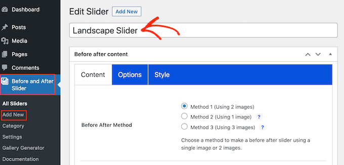
Upon activation, go to Before and After Slider » Add New in your dashboard.
To start, type in a name for the image slider. This is just for your reference so you can use anything that will help you identify it.
With that done, you can add the ‘before’ image by scrolling to the ‘Before Image’ section.
Here, click on ‘Add or Upload Image’ and then either choose a picture from the WordPress media library or upload a new file from your computer.
To help search engines understand this image and show it to the right people, it’s a good idea to add some image alt text. To do this, simply type into the ‘Image Alt’ field.
For more information about alt text, please see our beginner’s guide to image SEO.
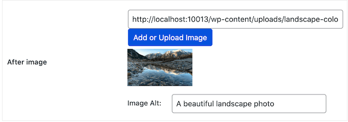
With that done, scroll to the ‘After Image’ section.
You can now add the ‘after’ image by following the same process described above. Don’t forget to add some alt text to this image, too, since it’s important for WordPress SEO.
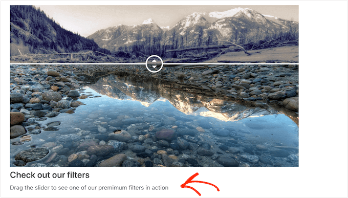
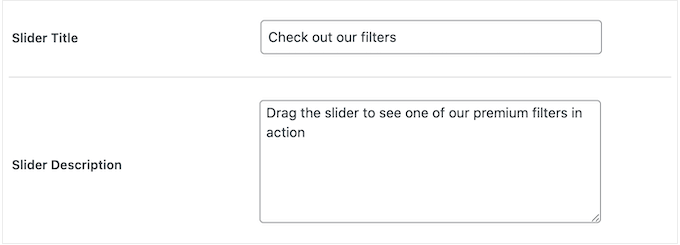
You can also show some text below the image, by adding a title and a description.
For example, you might encourage visitors to interact with the slider. This is especially important for visitors who might have never run across a before-and-after photo before.
This is also an easy way to add some context to the image.
To add some text, simply type into the ‘Slider Title’ or ‘Slider Description’ fields.
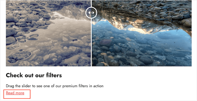
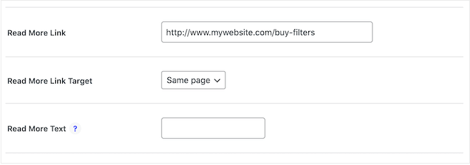
You can also add a ‘Read More’ URL, which can link to any post or page on your WordPress website, or even an external website. For example, you might send visitors to a page where they can buy the product featured in the slider image.
This link will appear below the before/after image, and also beneath any slider title or description you’re using.
To add a link, type the destination into the ‘Read More Link’ field.
You can then decide whether to open the link in the same tab, or in a new tab using the ‘Read More Link Target’ dropdown.
If you’re linking to another website, then we recommend choosing ‘New tab’ so you’re not sending visitors away from your WordPress blog.
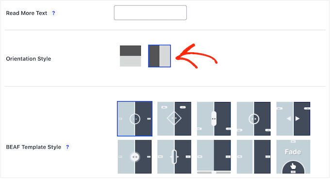
With that done, you can choose whether you want to create a vertical or horizontal slider by clicking on one of the thumbnails in the ‘Orientation Style’ section.
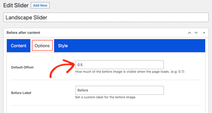
After that, scroll to the top of the screen and click on ‘Options.’
Here, you’ll see the ‘Default offset’ is set 0.5. This means the visitor sees half of the ‘before’ image when the page first loads.
If you want to show more of the before image, then type in a bigger number such as 0.6, 0.7, or higher.
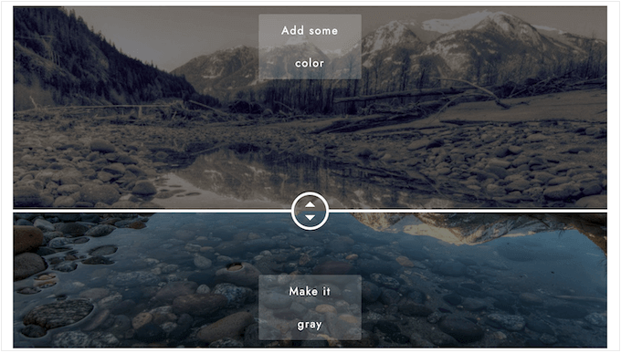
If you want to show the entire before image, then type in 1. This will place the slider at the top or right of the before image, as you can see in the following image.
By default, the plugin shows ‘Before’ and ‘After’ labels when the visitor hovers their mouse over the image.
You may want to replace these labels with something more descriptive.
To do this, simply go ahead and type into the ‘Before Label’ and ‘After Label’ fields.
By default, visitors will move the slider using drag and drop. Some people may find this difficult, especially if they have mobility issues or they’re using smaller devices like smartphones or tablets.
With that being said, you may want to change how visitors move the slider.
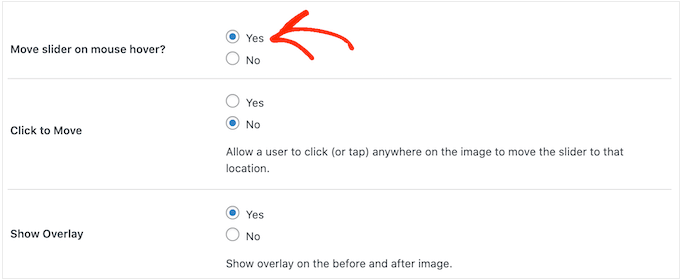
If you select the ‘Yes’ button next to ‘Move slider on mouse hover,’ then visitors can move the slider simply by hovering their mouse over the image.
If you select the ‘Yes’ button next to ‘Click to move,’ then visitors can click anywhere on the image to move the slider to that point.
These settings can make it easier to interact with the before/after image, but it’s typically not the way that sliders behave. With that in mind, we recommend using these settings carefully.
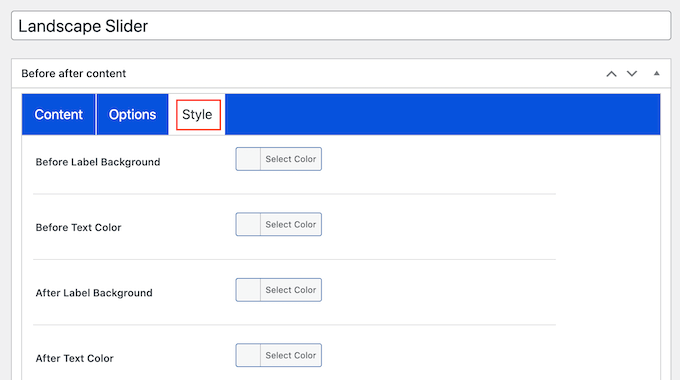
Next, click on the ‘Style’ tab.
Here, you can change the colors used for the different labels, backgrounds, headings, descriptions, and the read more button. This can help the before/after image blend in with your WordPress theme, or even stand out from the rest of your website’s design.
You can also change the font size and text alignment.
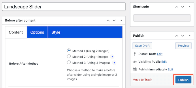
When you’re happy with how the slider is set up, click on the ‘Publish’ button.
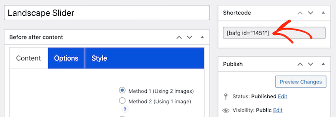
This creates a shortcode that allows you to add the before/after image and slider to any page, post, or widget-ready area.
For more information on how to place the shortcode, please see our guide on how to add a shortcode in WordPress.
After adding the shortcode to your site, simply click on the ‘Publish’ or ‘Update’ button to make the before/after image and slider effect live.
Method 2. How to Show A Before and After Photo Using SeedProd (Advanced)
If you simply want to add a before and after image to a page or post, then the BEA plugin may be a good choice. However, if you’re using the image to promote a product, service, or business then we recommend using SeedProd.
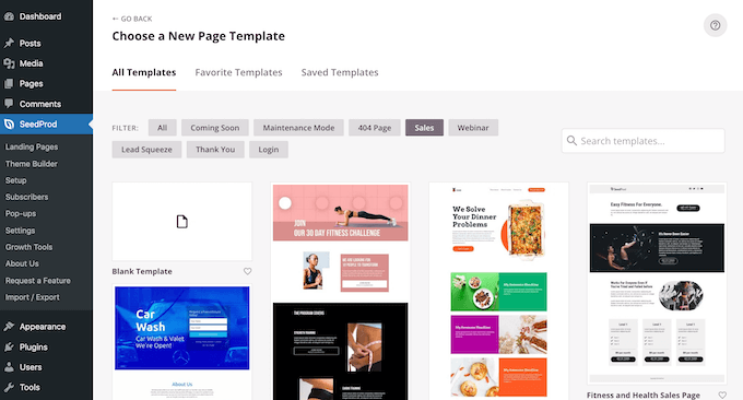
SeedProd is the best drag-and-drop WordPress page builder. It comes with more than 180 ready-made templates that you can use to create high-converting landing pages, sales designs, and more.
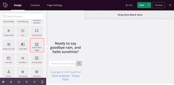
It also has a ready-made ‘Before After Toggle’ block that you can use to create beautiful before-and-after images your users can interact with.
Simply drag the block from the left-hand menu, and then drop it onto any page design that you may happen to be working on, including sales pages.
If you’re using WooCommerce to sell your products, then SeedProd integrates with WooCommerce and even comes with special eCommerce blocks. This is perfect if you plan to use before and after images to promote your WooCommerce products.
Note: There is a free version of SeedProd that allows you to create custom pages no matter your budget. However, we’ll be using the premium version as it comes with the Before After Toggle block. It also integrates with many of the best email marketing services you may already be using on your website.
For information on how to use SeedProd, please see our guide on how to create a custom page in WordPress.
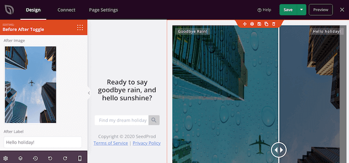
After creating a page, it’s easy to add a before and after image to your design. In the SeedProd page editor, simply find the ‘Before After Toggle’ block.
You can then drag and drop this block anywhere on your design, to add it to the page layout.
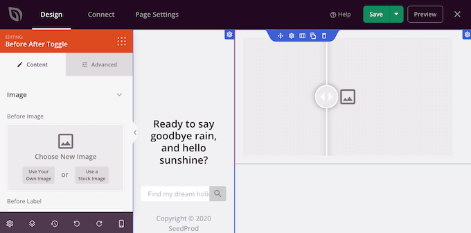
With that done, simply click to select the ‘Before After Toggle’ block. The left-hand menu will now update to show all the settings you can use to create your before-and-after image.
To start, you’ll need to add the picture you want to use as the before image. Under ‘Before Image’ either click on ‘Use Your Own Image’ or ‘Use a Stock Image’ and choose the picture you want to use.
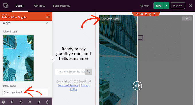
By default, SeedProd shows a ‘Before’ label above this image. However, you can change this to something more descriptive by typing it into the ‘Before Label’ field.
With that done, scroll to the ‘After Image’ section.
You can now add an image and customize the default ‘After’ label by following the same process described above.
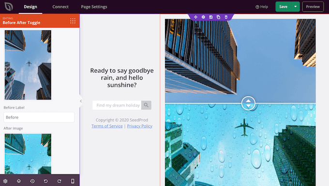
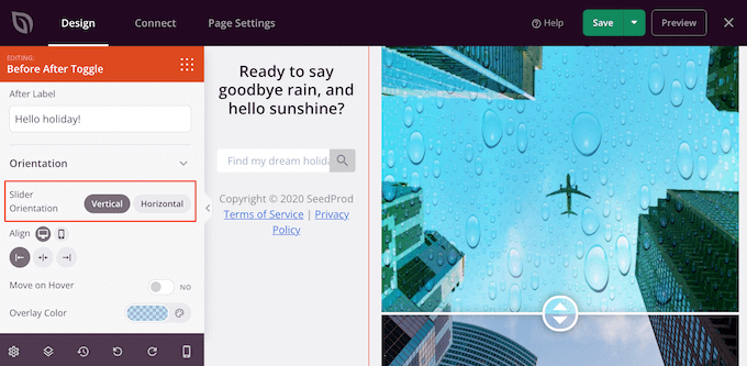
SeedProd can add a vertical or horizontal slide effect.
To switch between these two styles, scroll to the ‘Slider Orientation’ section and then click on either ‘Vertical’ or ‘Horizontal.’
By default, visitors will move between the before and after images by dragging the slider. However, some users may find it easier to move the slider by hovering their mouse over the image.
This is particularly true for larger images where the visitor would need to drag the slider a greater distance.
To try this setting, enable ‘Move on Hover’ in the left-hand menu.
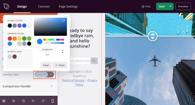
Next, you may want to add a colored overlay to both the before and after images. This can help the image blend in with the rest of the color scheme, or stand out from the background.
You can even make the colored overlay semi-transparent, to create a more subtle effect.
To try different colors, click on the ‘Overlay Color’ section and then make your changes in the popup that appears.
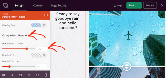
With that done, you can customize the slider handle by clicking to expand the ‘Comparison Handle’ section.
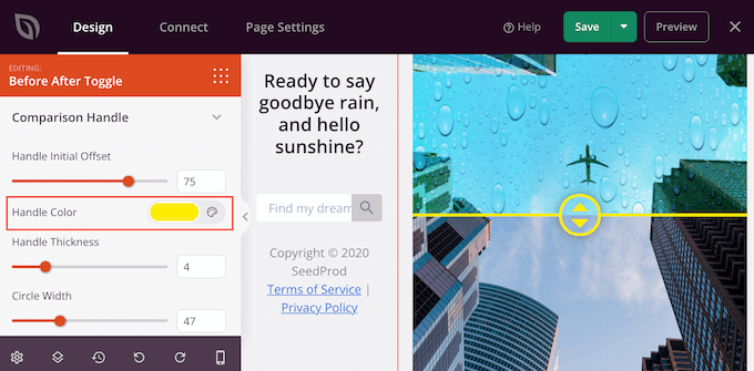
By default, SeedProd shows half of the ‘before’ image and half of the ‘after’ image. To change this, simply drag the ‘Handle Initial Offset’ slider.
To display less of the before image, drag the slider to the left so that it shows a lower number. To show more of the before image, drag the slider to the right, which increases the number.
Next, you can change the slider’s color using the ‘Handle Color’ settings.
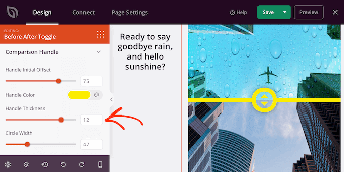
You can also make the handle thicker or thinner using the ‘Handle Thickness’ slider.
In this way, you can make the handle stand out, or create a more subtle effect.
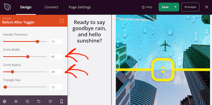
When you’re happy with the handle, you may want to change the circle. You can make the circle bigger or smaller using the ‘Circle Width’ settings, and change the ‘Circle Radius’ to create sharp or curved corners.
As you make changes, the live preview will update automatically so you can try different settings to see what looks the best.
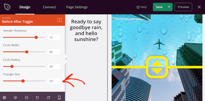
When you’re happy with the circle, you may want to change the size of the triangles inside that circle. For example, if you’ve made the circle bigger then you might want to increase the size of the triangles too.
To make this change, drag the ‘Triangle Size’ slider until you’re happy with how it looks.
With that done, you can continue adding new blocks and customizing the content on your SeedProd page.
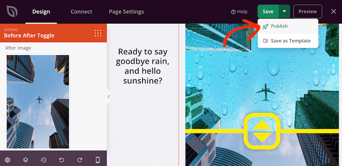
When you’re happy with how the page looks, just click on the arrow next to the ‘Save’ button and then select ‘Publish.’
Now if you visit your website you’ll see your page design with the before-and after-image live.
We hope this article helped you learn how to add a before and after photo to your WordPress website with a slide effect. You can also go through our guide on the best social proof plugins for WordPress and how to choose the best web design software.
If you liked this article, then please subscribe to our YouTube Channel for WordPress video tutorials. You can also find us on Twitter and Facebook.


