The number one rule of blogging is content is king. To make your blog truly stand out and succeed, you need truly great content. But more than that, you need people to read that content. Many people default to sliders (bad idea because they get ignored and only 1% of people click them). But have you ever considered a news ticker? Well, here’s why you might want to.
Adding a News Ticker
Microinteractions and animations are The Next Big Thing in web design, and a news ticker is a simple way to easily add that kind of functionality to your blog without going nuts with SVGs and CSS. You can use a plugin called Ditty News Ticker to get things set up and ticking away in pretty short order.
Download Ditty
The plugin is available on the WP.org repo, so you just need to head over there (or use your Add New Plugin button from the WP dash) and install it. Once you’re up and running, you will see a new option in your admin sidebar called News Tickers.
It’s a pretty straightforward menu. It actually works very similarly to adding new posts and pages, so don’t worry about it being over your head at all.
Setting the Settings
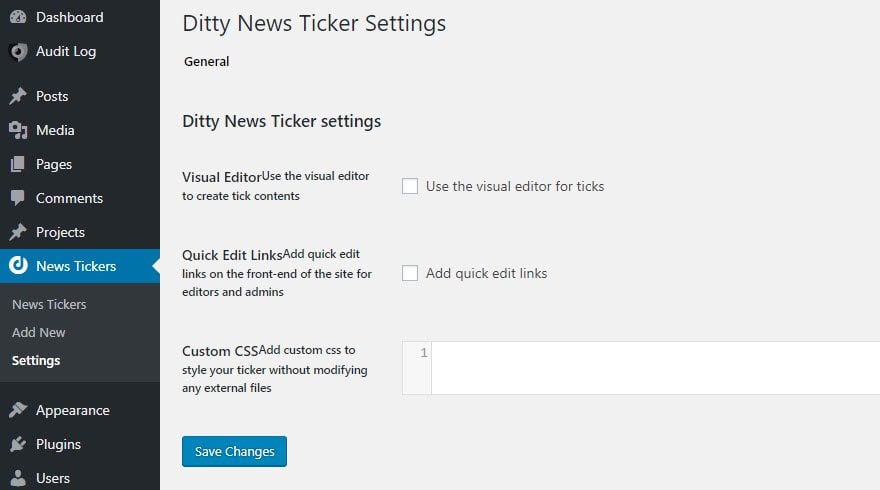
As usual with a new plugin, you should at least check out the Settings page first. The ones for Ditty News Ticker are pretty straightforward, as you can see.
The settings are actually totally optional. I personally would use the visual editor for your ticks so that you can do a little more with the text without going into CSS. But that’s personal preference.
Creating a Ticker
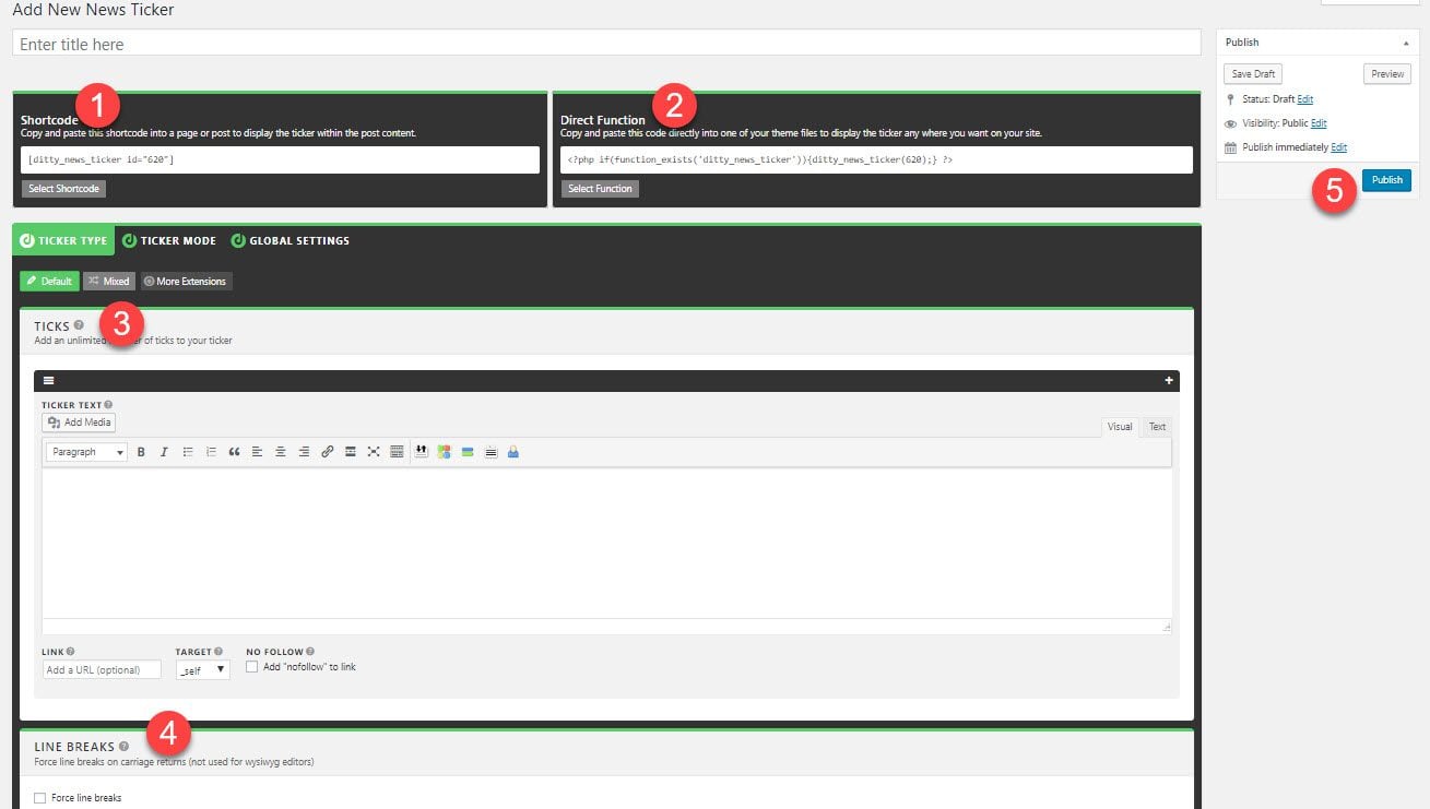
Go on into the Add New button, either from the sidebar or the list of tickers under News Tickers – News Tickers. Either way, you will be brought to a pretty complex-looking screen that’s actually simple and easy to navigate.
- Ticker Shortcode – You can put a news ticker anywhere you can render a shortcode on your site. Whether in a post body, header, footer, sidebar widget, or something else, you can highlight whatever content you need visitors to see.
- Direct Function – If you plan on using the ticker indefinitely and want it rooted in your theme, this function will display the ticker just like the shortcode.
- Ticks – The content of your messages will go here. Anything that needs to tick across the screen can be inserted here. You can make the whole ticker clickable by putting a URL in the Link field. Or you can use rich text to make only part a hyperlink. You can also tick images and other media across, too.
- Line Breaks – Make your ticker more than one line tall.
- Publish Box – Exactly like a post or page. You can set it to draft, have your editors review and approve it, or push it live right now.
And that’s just the Ticker Type tab!
Ticker Mode and Global Settings
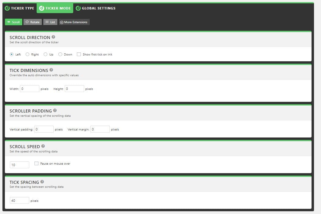
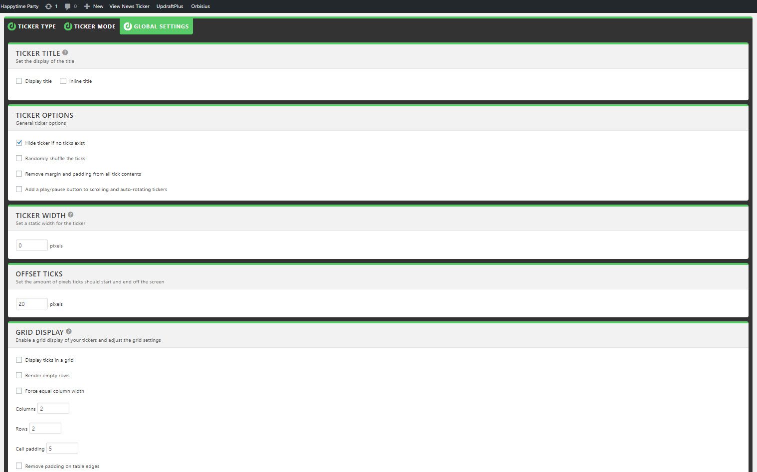
What kind of addition would a news ticker be if you couldn’t make it your own? The Ticker Mode and Global Settings tabs give you control over pretty much everything, from the scrolling speed to spacing between individual ticks to picking the direction it scrolls from.
You may or may not do any tweaking under the Global Settings tab, depending on where you’re putting the ticker on your page. You can choose a title or to shuffle the various ticks that you scroll through at random. The one you may be most interested in will be Ticker Width, especially if you include the shortcode it in a header or post. You may not want the message scrolling across the whole screen, only a portion.
The List
Whenever you save and publish a new news ticker, it adds itself to the overall list of all tickers. From this list, you can grab any shortcode immediately without having to go inside the ticker details. More plugin developers should include this kind of option because I find this sort of display so helpful.
The Ticker Itself
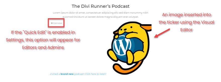
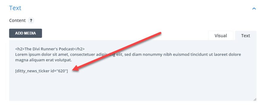
Once you have it configured and the messages and images all set, you are ready to insert it into your site. Like I said before, you can put it wherever you can render a shortcode, so I just threw it in a text box in a page I made with the Divi builder.
Save it (obviously), and on the front end of your site, you can see your handiwork ticking across the screen in all its glory.
Extra! Extra! That’s Just the Free Version
There are a handful of other things that you may want to use to spice up your site a little. Ditty does offer a handful of other premium add-ons for the news ticker plugin. While most of what many of you will need is contained in the primary, free plugin, I think that the premium add-ons worth are mentioning if you plan on using this news ticker for news.
There are Facebook, Twitter, Posts, and RSS extensions, and these will automatically update whatever news ticker you have it connected to so you don’t have to manually edit it. Displaying all new posts on your site or all new podcasts in an RSS feed can be done manually. But highlighting them automatically is probably worth the cost if you need the info to be always up-to-date.
Wrapping Up
Adding a news ticker to your site is far simpler than you may have expected. By keeping the functionality behind a shortcode (or a raw function, if that’s your preference), Ditty News Ticker gives you a lot of power to spice up your blog. You can really highlight some of your best content for users in a way that won’t get ignored (cough sliders cough cough) and will definitely catch their eye. Plus, you’ll be on-trend with animations and microinteractions. So it’s a win-win situation for everyone involved.
What kind of content do you think works best in a news ticker on your site?
Article featured image by sumkinn / shutterstock.com


