Divi has built-in responsive design editing that makes it extremely easy to adjust the style of your website on desktop, tablet, or phone display (without knowing CSS). Part of Divi’s built-in responsive editing includes a simplified method for making more advanced responsive design changes using custom CSS. This is much more convenient than having to rely on an external style sheet with media queries. You can even make adjustments to the CSS visually in real time for each of the device displays, taking much of the guesswork out of responsive design.
In this tutorial, I’m going to show you how to make convenient responsive design changes using custom CSS so that you can make advanced design touch ups that may not be available in Divi’s built-in design options.
Let’s get started.
Divi’s Built-in Breakpoints for Responsive Editing
Divi has three general responsive breakpoints (points where the design changes based on the width of the browser) that are built in to the settings of any element in the Divi Builder. These three breakpoints are primarily meant to facilitate the specific design settings for desktop, tablet, and phone displays.
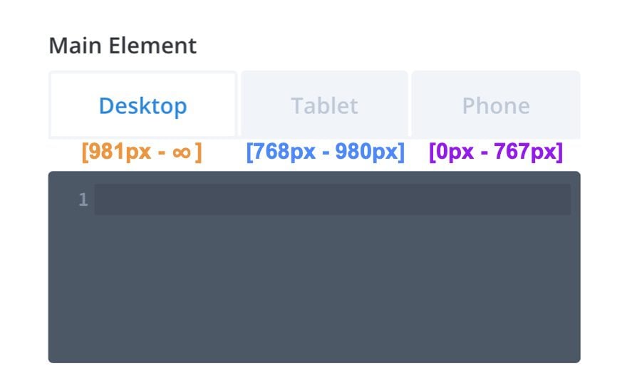
Divi’s three main responsive breakpoints for desktop, tablet, and phone displays are as follows:
- Desktop: 981px and above
- Tablet: between 980px and 768px
- Mobile: 767px and below
These three breakpoints are the same through all of the responsive design tabs throughout the Divi builder, not just for advanced custom CSS. So everytime you deploy the responsive design tabs, any styling done under those tabs will be displayed within the range of those three main responsive breakpoints.
Also, it is worth mentioning that these general breakpoints for device displays are not the only breakpoints that are built in to the structure of the Divi Theme. You can learn about those on our article on identifying Divi’s responsive breakpoints.
Understanding Divi’s Custom CSS Input Boxes
When you customize an element (section, row, or module) within the Divi builder, each design option corresponds (or targets) a specific part of that element. For example, when editing a text module, you can target any part of that module using the built-in settings (ie. Heading 2 Font, Left Padding, etc…).
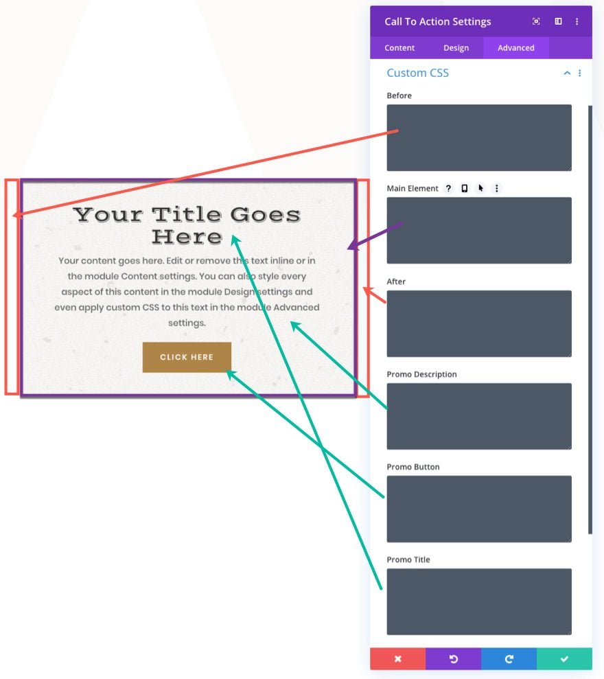
Similarly, when you customize a Divi element (section, row, or module) using the advanced Custom CSS input boxes, each input box will correspond (or target) the whole or certain parts of that Divi element. The number of available Custom CSS boxes will differ depending on the element you are styling. A text module may only have three custom CSS element input boxes (before, main, and after), but a call to action module will have additional boxes for title, description, and button. This is because the module has more parts that can be targeted within that module element.
Here is an illustration of the different custom CSS input boxes available for the Call to Action module.
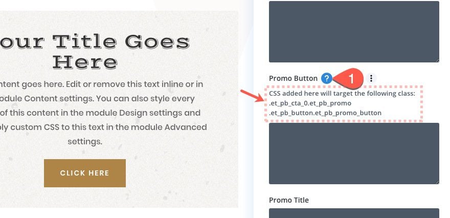
Each custom CSS input box targets a specific CSS class within the element. To see the class being targeted for a particular element, simply hover over the element and click the question mark icon. There you will see the CSS class being targeted.
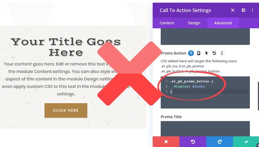
Therefore, you don’t need to add a CSS class to your CSS snippet in the input box. If you do, the code will not work.
Instead simply add the CSS properties directly to the box that you want applied to the class already being targeted.
How to Add Custom CSS to Responsive Design Breakpoints
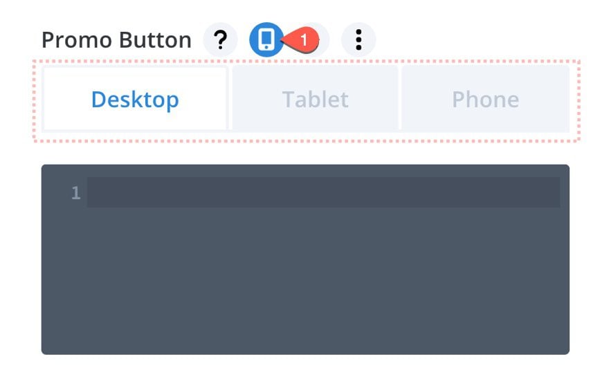
To access the three main responsive design breakpoints for any of the css input boxes, simply hover over the element and click the tablet icon. Then you will see the three responsive design tabs.
Now all you would need to do is use the tabs to add CSS to any of the three device displays (desktop, tablet, and phone).
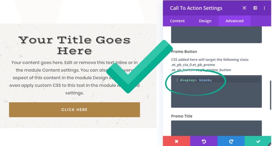
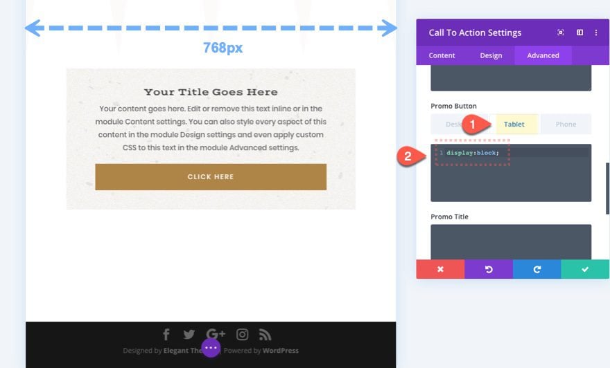
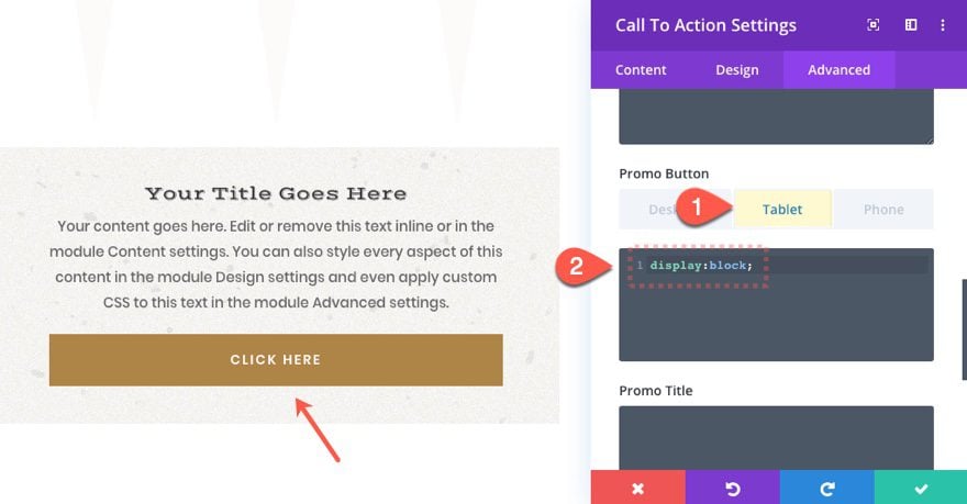
For example, let’s say you want to have the promo button for a Call to action to span the full width of the module on tablet and phone but not on desktop. You would select the tablet tab under the Promo Button input box and add “display: block;”.
Notice that when you select the tablet tab, the Divi Builder View Mode shifts to the Tablet View Mode (a width of 768px) for a better glimpse of what your design will look like in real time.
Smaller Device Inherit the CSS of Larger Devices by Default
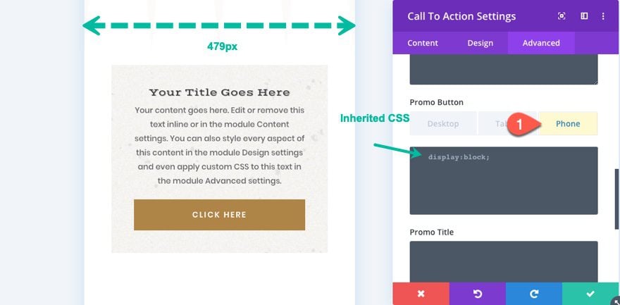
By default, the code that is applied to the tablet tab will also be inherited by the phone display as well. To help remind us of this, Divi adds gray placeholder code to the input box with the same code that was added to the tablet display.
The reason that the phone display inherits the tablet display is because the actual breakpoint (media query) for the tablet display on the backend is set to “max-width: 980px;” which means that the code added to the tablet will also be applied to phone because the phone display is less than 980px wide. So if you want to apply a different style to phone, you will need to add additional code to the phone tab input box.
NOTE: If you also add Custom CSS to the phone display, Divi will smartly change the media query for tablet on the backend to the more precise range between 768px and 980px (or max-width: 980px and min-width: 768px).
What the Custom CSS is Applied on the Backend
Let’s say we add custom CSS to all three responsive tabs (desktop, tablet, and phone).
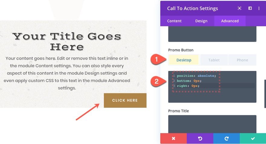
On desktop, we position the button to the bottom right of the module.
On tablet, we override the desktop code and simply span the button to the full width of the module.
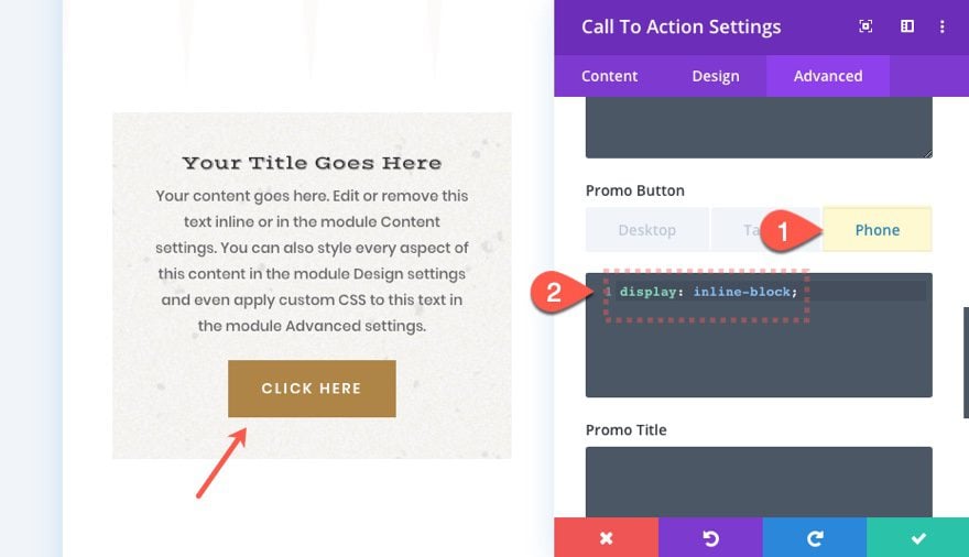
On phone, we override the tablet CSS and return the display to normal.
If we inspect the CSS on the backend, you can see that Divi organizes the code with the following media queries so you don’t have to:
Desktop:
@media only screen and (min-width: 981px)
.et_pb_cta_0.et_pb_promo.et_pb_promo .et_pb_button.et_pb_promo_button {
    position: absolute;
    bottom: 0px;
    right: 0px;
}
Tablet:
@media only screen and (max-width: 980px) and (min-width: 768px)
.et_pb_cta_0.et_pb_promo.et_pb_promo .et_pb_button.et_pb_promo_button {
    display: block;
}
Phone
@media only screen and (max-width: 767px)
.et_pb_cta_0.et_pb_promo.et_pb_promo .et_pb_button.et_pb_promo_button {
    display: inline-block;
}
How is the CSS stored in Divi?
As a part Divi’s built-in speed optimizations, all styling within the Divi Builder (including the custom CSS) will be combined, minified and stored as a static CSS file for faster page loading. So if you are wanting to bypass the need for adding custom CSS via a child theme, you can take advantage of the built-in responsive CSS inputs without having to worry about slowing down your site.
For more, check out our post on how to speed up your Divi site.
Final Thoughts
Hopefully, this post will help you understand a bit better how to take advantage of Divi’s built-in custom CSS input boxes to make convenient responsive design changes to your website.
For most people, there will be no need to venture over to the advanced tab to add custom CSS to your design. Divi has so many options that are built-in that even advanced users will rarely find a need to use custom CSS. However, if the time comes when you need advanced styling, it helps to know how easy it is to do in Divi.
What has your experience been with Divi’s custom CSS inputs?


