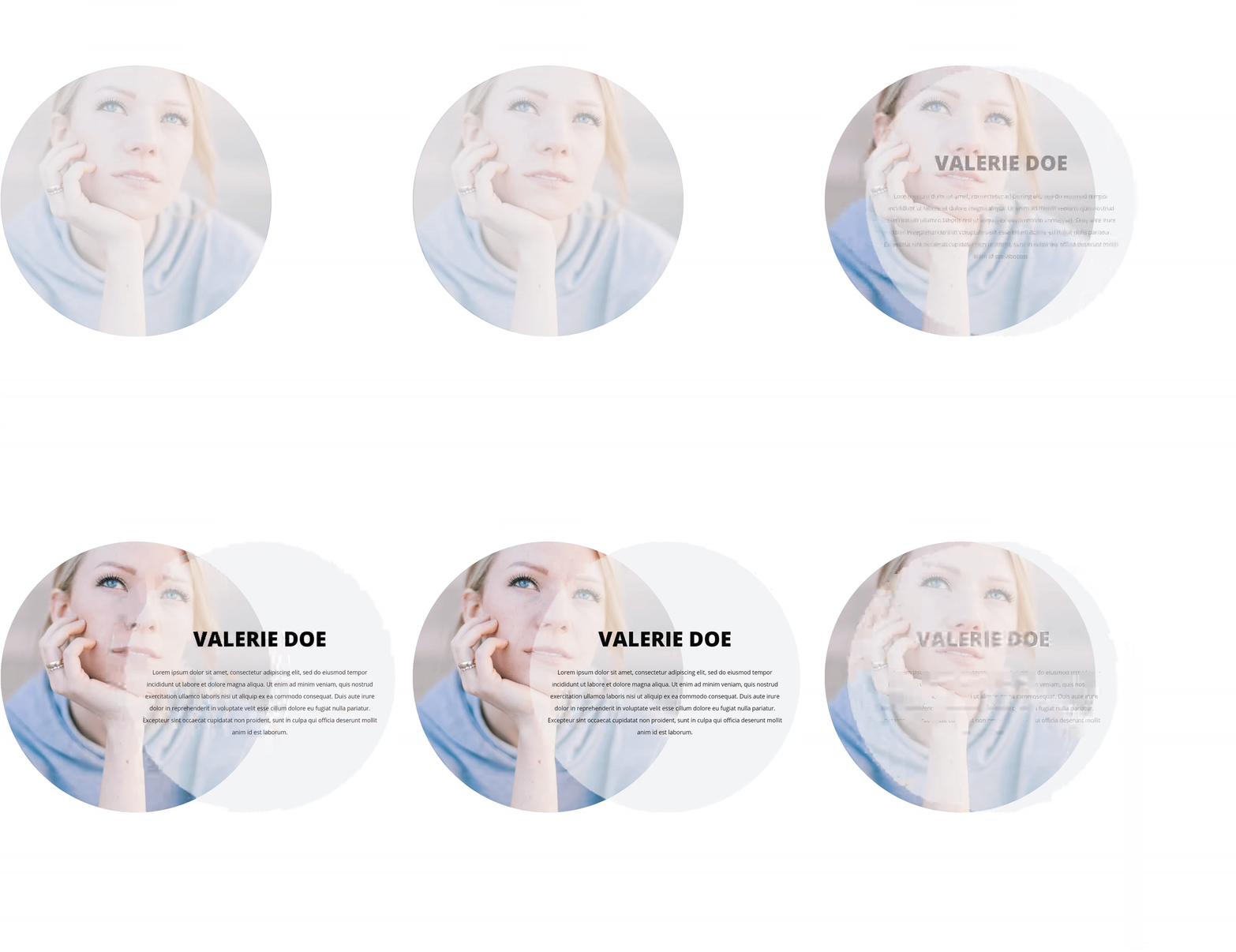
Looking for a creative way to add descriptions to images? With Divi and its built-in hover options, it’s now easier than ever. You can use this approach for various purposes on your website, from testimonials to team member descriptions and more. In this tutorial, we’ll go over 4 different examples that’ll help you achieve stunning web design. We’re creating all four examples using Divi’s built-in options only.
Let’s get to it!
Preview
Before we dive into the step-by-step tutorial, let’s take a quick look at the end result on different screen sizes.
Desktop
Mobile
General Steps
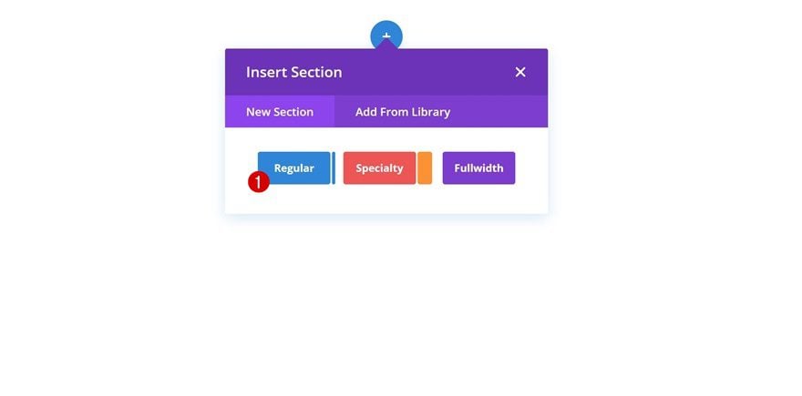
Add New Section
To make this tutorial easier to follow, we’ll start with some general steps. Afterwards, we’ll handle the steps that are unique to each one of the examples. Start by adding a new regular section to a new or existing page.
Add Row
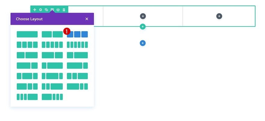
Column Structure
Go ahead and choose the following column structure (you can make this work with other column structures too):
Column 1 Background Image
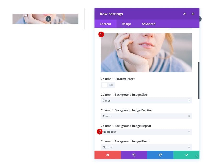
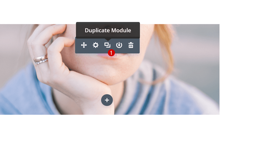
Without adding any modules yet, open the row settings and add a background image to the first column.
- Column 1 Background Image Repeat: No Repeat
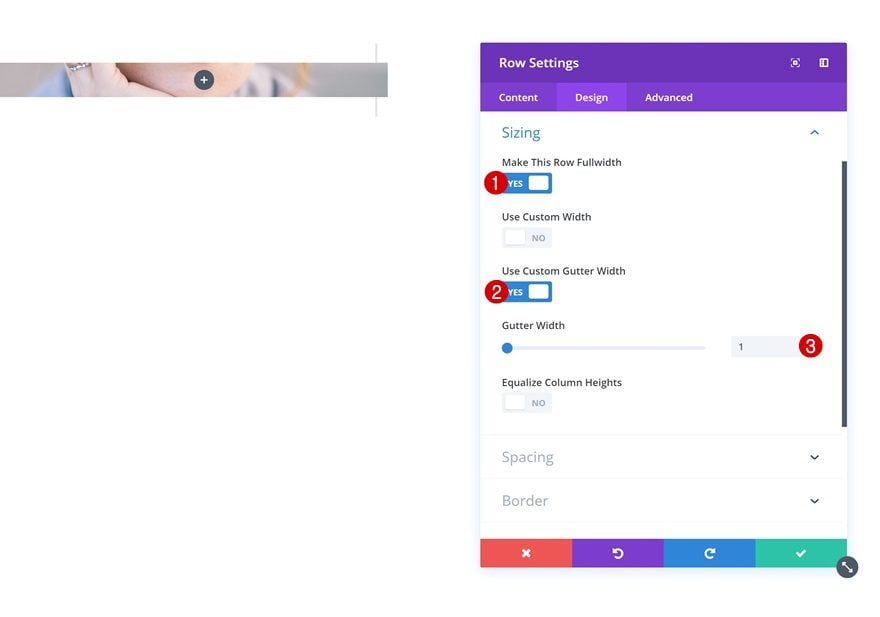
Sizing
Continue by changing the sizing settings of the row.
- Make This Row Fullwidth: Yes
- Use Custom Gutter Width: Yes
- Gutter Width: 1
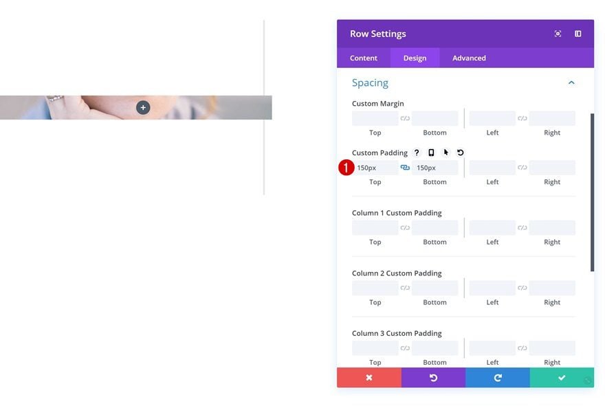
Spacing
And add some custom padding values next.
- Top Padding: 150px
- Bottom Padding: 150px
Add Text Module to Column 1
Add Content
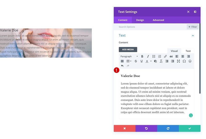
To show the description on hover, we’ll be using a Text Module for each one of the four examples. Go ahead and add this Text Module to the same column you’ve added a background image to.
Default Text Settings
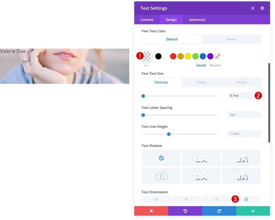
Then, go to the text settings and make some changes.
- Text Color: rgba(255,255,255,0)
- Text Size: 0.7vw (Desktop), 12px (Tablet & Phone)
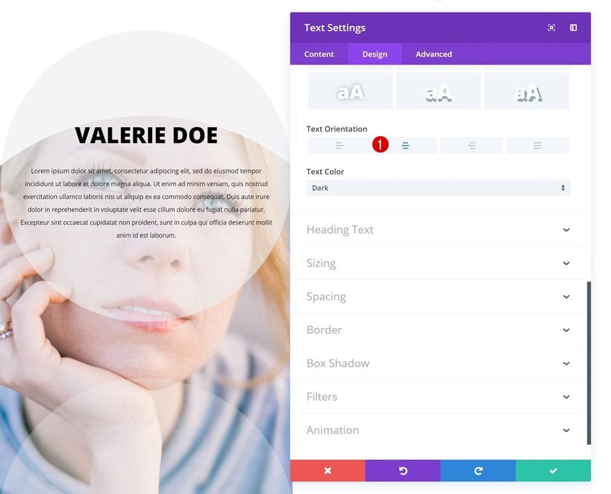
- Text Orientation: Justify
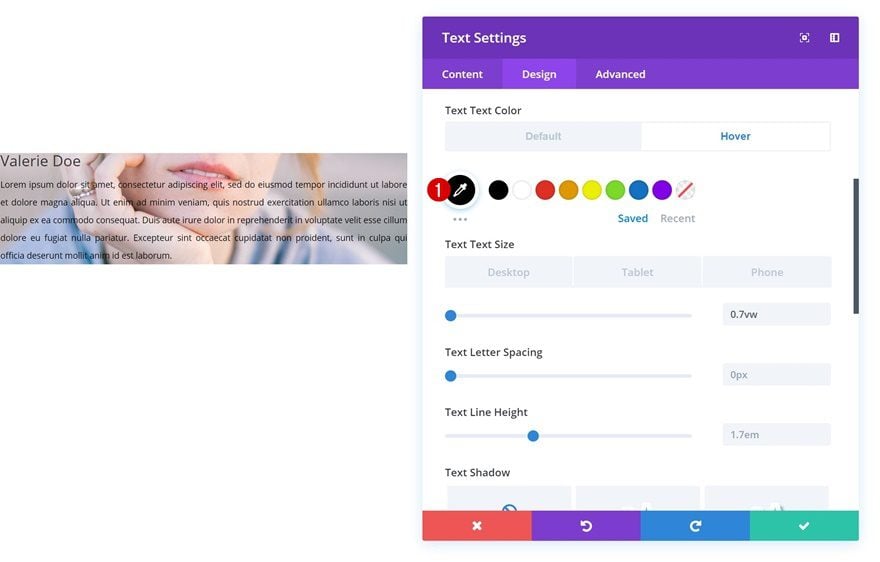
Hover Text Settings
Change the text color on hover.
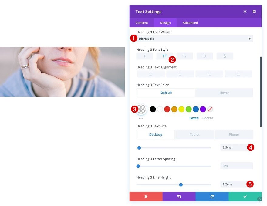
Default Heading Text Settings
Change the H3 text settings as well.
- Heading 3 Font Weight: Ultra Bold
- Heading 3 Font Style: Uppercase
- Heading 3 Text Color: rgba(255,255,255,0)
- Heading 3 Text Size: 2.5vw (Desktop), 40px (Tablet), 30px (Phone)
- Heading 3 Line Height: 2.2em
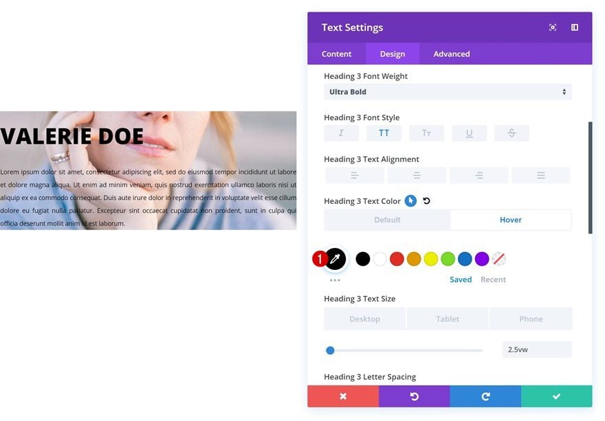
Hover Heading Text Settings
And apply a different H3 text color on hover.
- Heading 3 Text Color: #000000
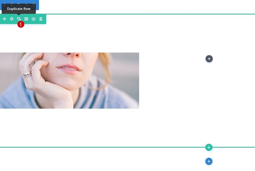
Clone Row 3 Times
Now that we’ve gone through all the general steps, we can go ahead and clone the row we’ve created three times which will allow us to have one row for each one of the four examples. Make sure that at the beginning of each example, you move on to the next row.
Example #1
Change Text Module
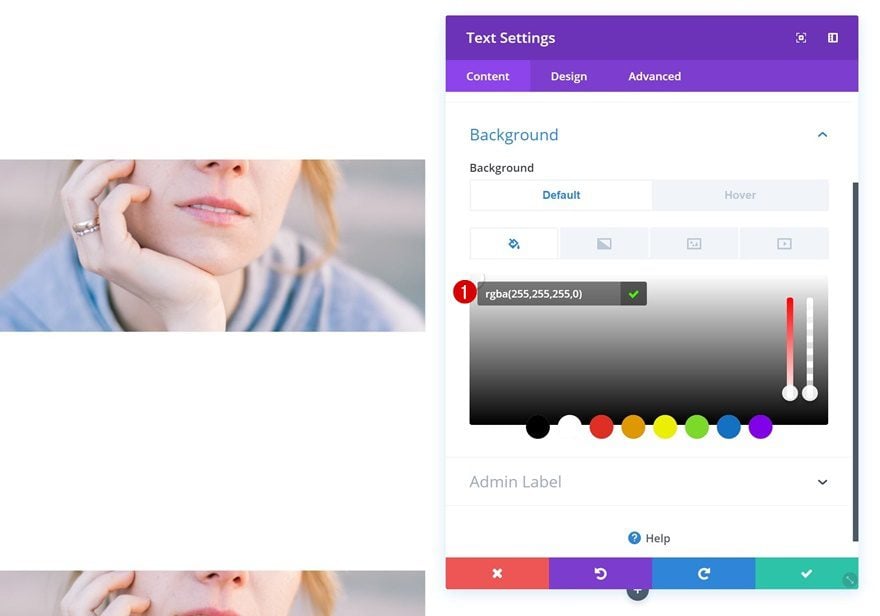
Default Background Color
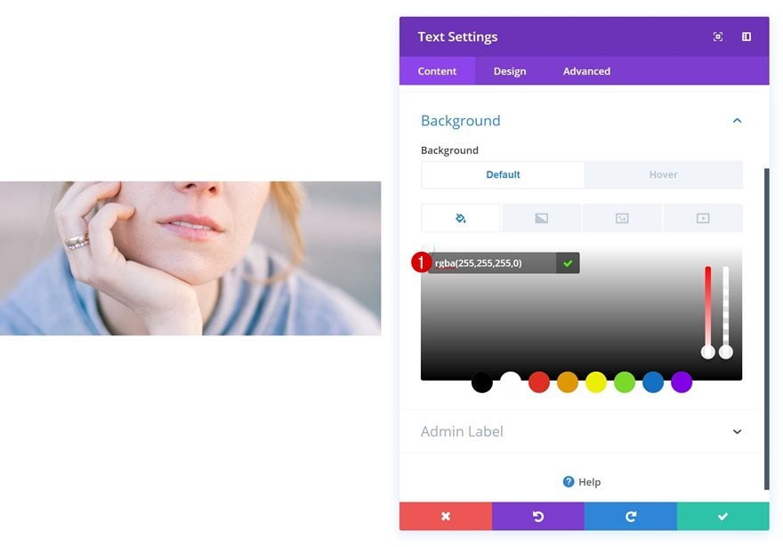
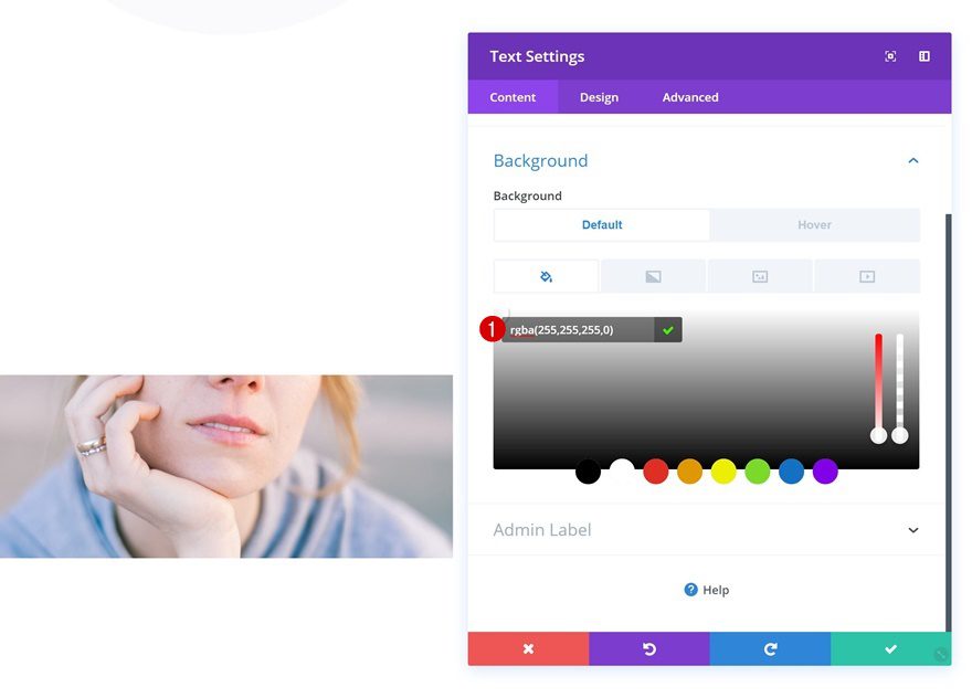
Let’s get started with the first example! Open the Text Module in the first column and add a background color.
- Background Color: rgba(255,255,255,0)
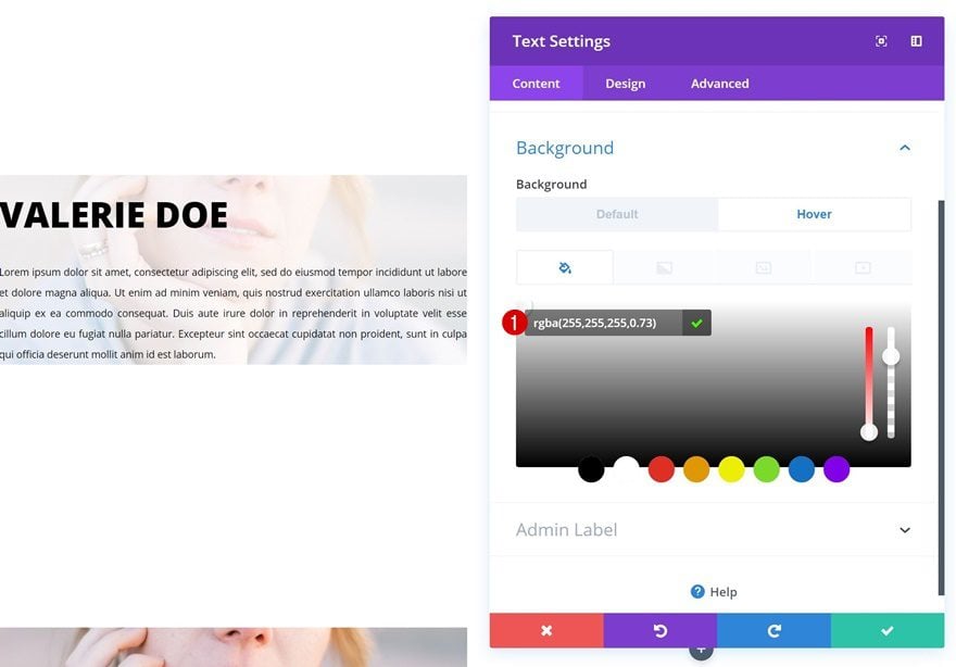
Hover Background Color
Change this background color on hover.
- Background Color: rgba(255,255,255,0.73)
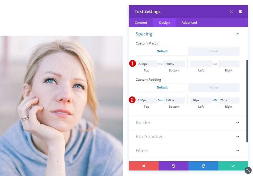
Default Spacing
Add some custom margin and padding next.
- Top Margin: -500px
- Bottom Margin: 500px
- Top Padding: 250px
- Bottom Padding: 250px
- Left Padding: 70px
- Right Padding: 70px
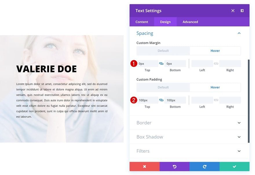
Hover Spacing
Change the values on hover.
- Top Margin: 0px
- Bottom Margin: 0px
- Top Padding: 100px
- Bottom Padding: 100px
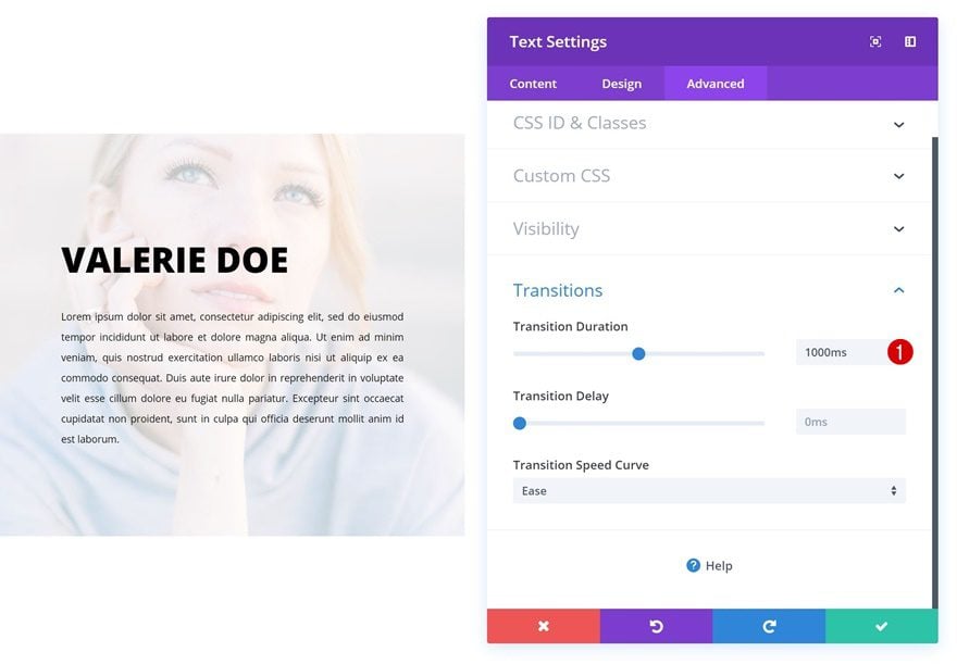
Transitions
Lastly, create a smooth transition by increasing the transition duration in the advanced tab.
- Transition Duration: 1000ms
Example #2
Change Text Module
Default Background Color
On to the next example! Open the Text Module in the first column and add a background color.
- Background Color: rgba(255,255,255,0)
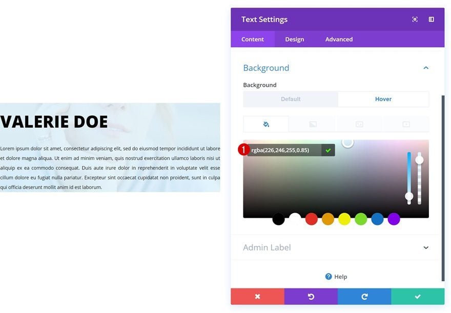
Hover Background Color
Change the background color on hover.
- Background Color: rgba(226,246,255,0.85)
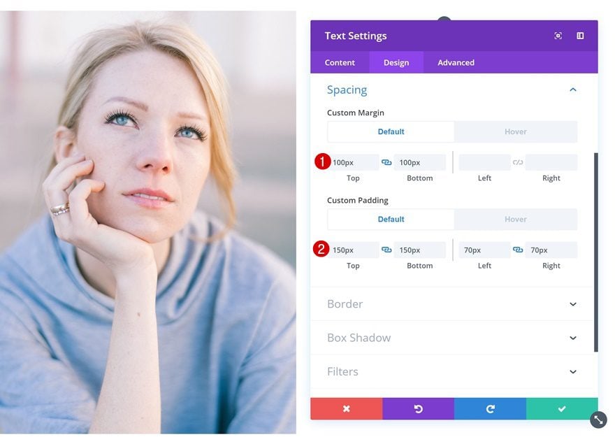
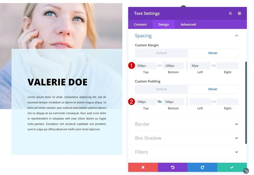
Default Spacing
Add some custom margin and padding values next.
- Top Margin: 100px
- Bottom Margin: 100px
- Top Padding: 150px
- Bottom Padding: 150px
- Left Padding: 70px
- Right Padding: 70px
Hover Spacing
Change these values on hover.
- Top Margin: 200px
- Bottom Margin: -200px
- Left Margin: 50px
- Top Padding: 100px
- Bottom Padding: 100px
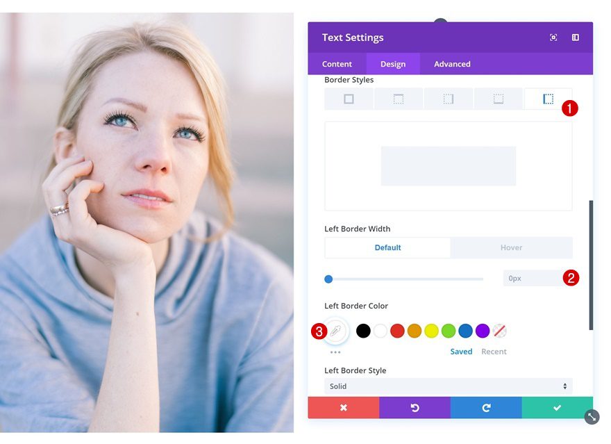
Default Border
Continue by adding a border to the Text Module.
- Left Border Width: 0px
- Left Border Color: #ffffff
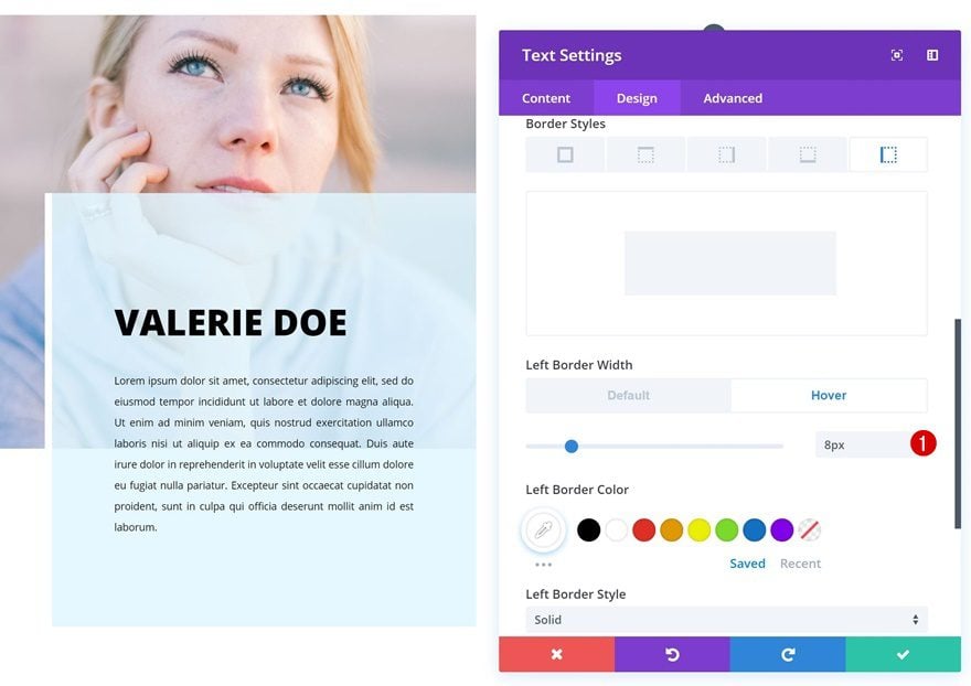
Hover Border
And change the border width on hover.
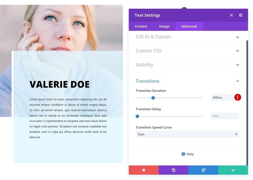
Transitions
Last but not least, increase the transition duration for a smooth transition.
- Transition Duration: 500ms
Example #3
Clone Text Module
On to the third example! For this example, we’ll need to create a separate version for smaller screen sizes. Clone the Text Module in the first column.
Add Column 1 Gradient Background
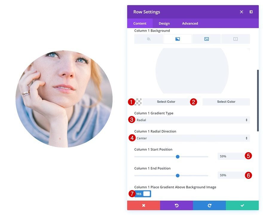
Then, open the row settings and add a gradient background to the first column using the following settings:
- Color 1: rgba(43,135,218,0)
- Color 2: #ffffff
- Column 1 Gradient Type: Radial
- Column 1 Radial Direction: Center
- Column 1 Start Position: 59%
- Column 1 End Position: 59%
- Column 1 Place Gradient Above Background Image: Yes
Change Text Module #1
Gradient Background
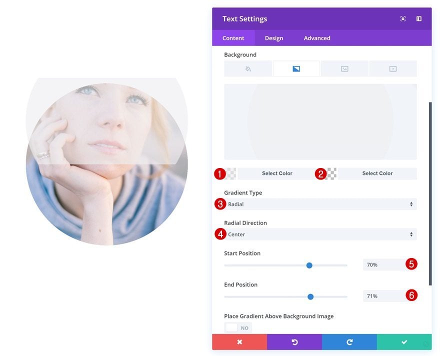
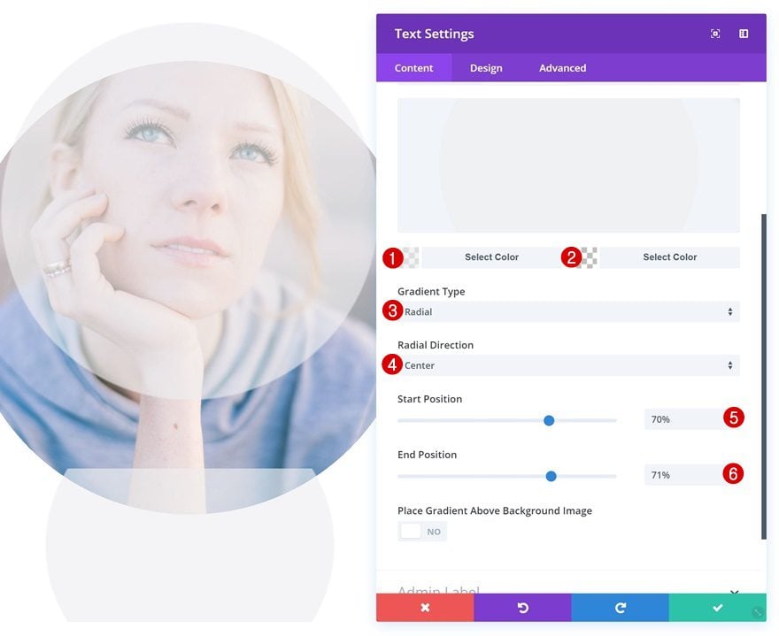
Open the first Text Module in column 1. This will be the description that appears on desktop. Add a gradient background.
- Color 1: rgba(239,239,239,0.65)
- Color 2: rgba(255,255,255,0)
- Gradient Type: Radial
- Radial Direction: Center
- Start Position: 70%
- End Position: 71%
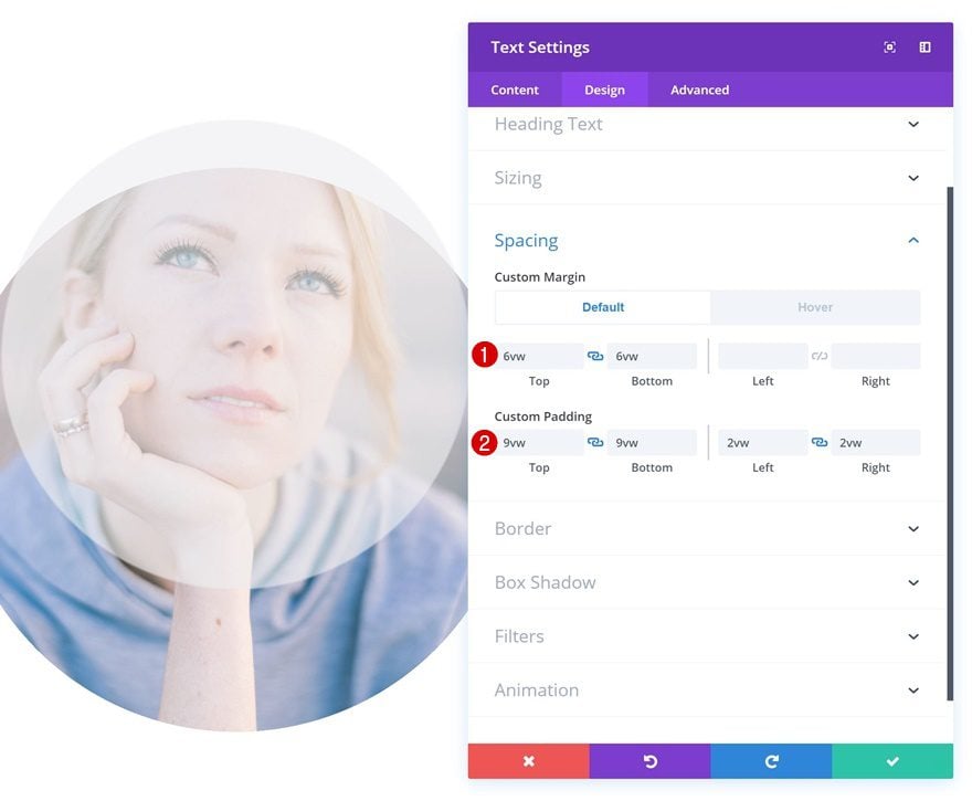
Default Spacing
Then, add some custom margin and padding values.
- Top Margin: 6vw
- Bottom Margin: 6vw
- Top Padding: 9vw
- Bottom Padding: 9vw
- Left Padding: 2vw
- Right Padding: 2vw
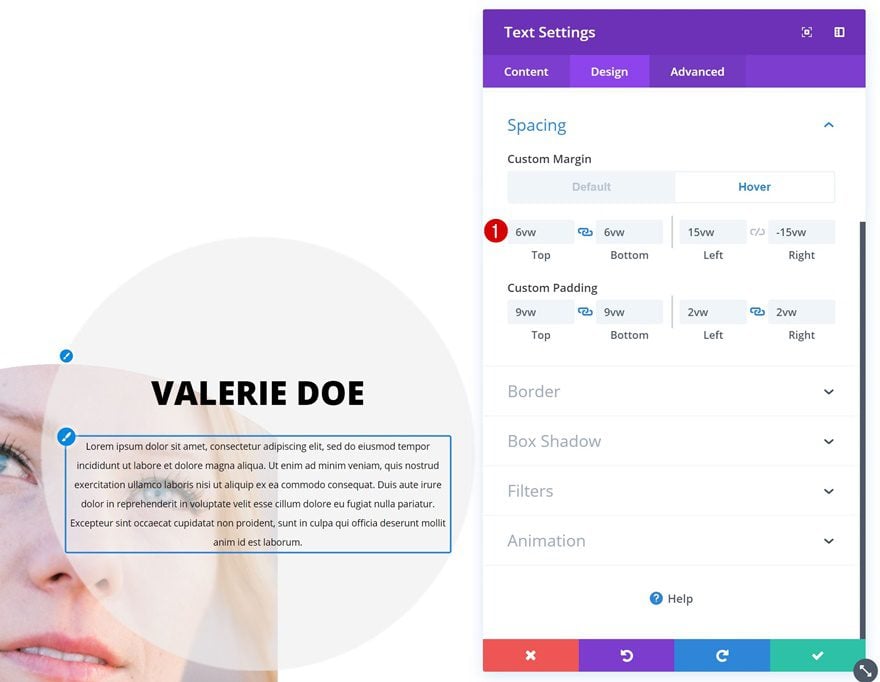
Hover Spacing
Change the margin values on hover.
- Left Margin: 15vw
- Right Margin: -15vw
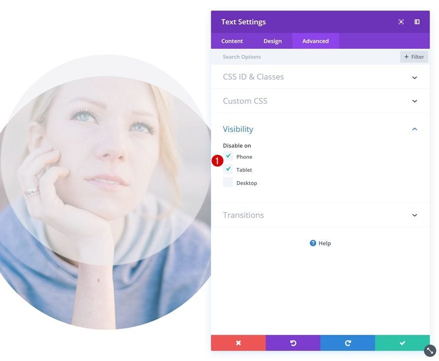
Visibility
And disable the module on tablet and phone.
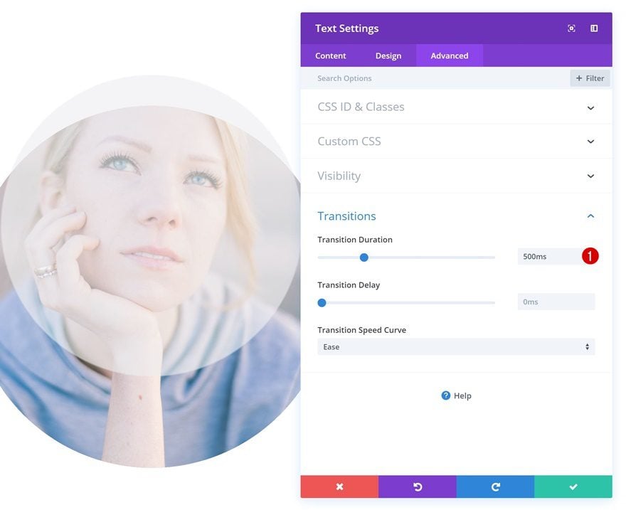
Transitions
Increase the transition duration as well.
- Transition Duration: 500ms
Change Text Module #2
Gradient Background
The second module in column 1 is the description that’ll appear on smaller screen sizes. Start by adding a gradient background.
- Color 1: rgba(239,239,239,0.65)
- Color 2: rgba(255,255,255,0)
- Gradient Type: Radial
- Radial Direction: Center
- Start Position: 70%
- End Position: 71%
Default Spacing
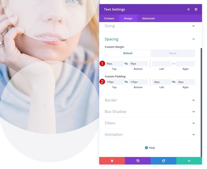
Add some custom margin and padding values next.
- Top Margin: 95px
- Bottom Margin: 95px
- Top Padding: 170px
- Bottom Padding: 170px
- Left Padding: 20px
- Right Padding: 20px
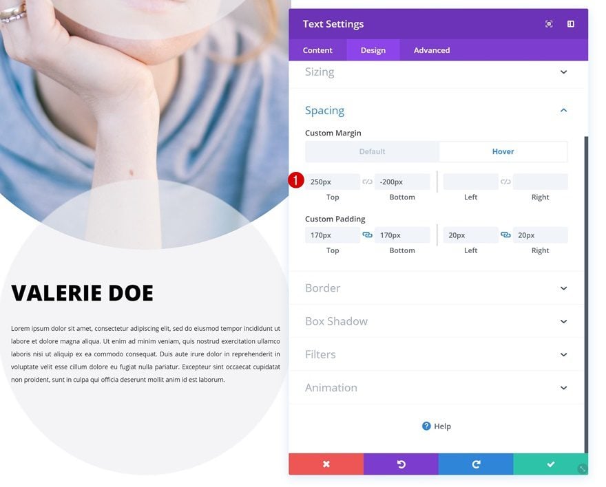
Hover Spacing
Change the margin values on hover.
- Top Margin: 250px
- Bottom Margin: -200px
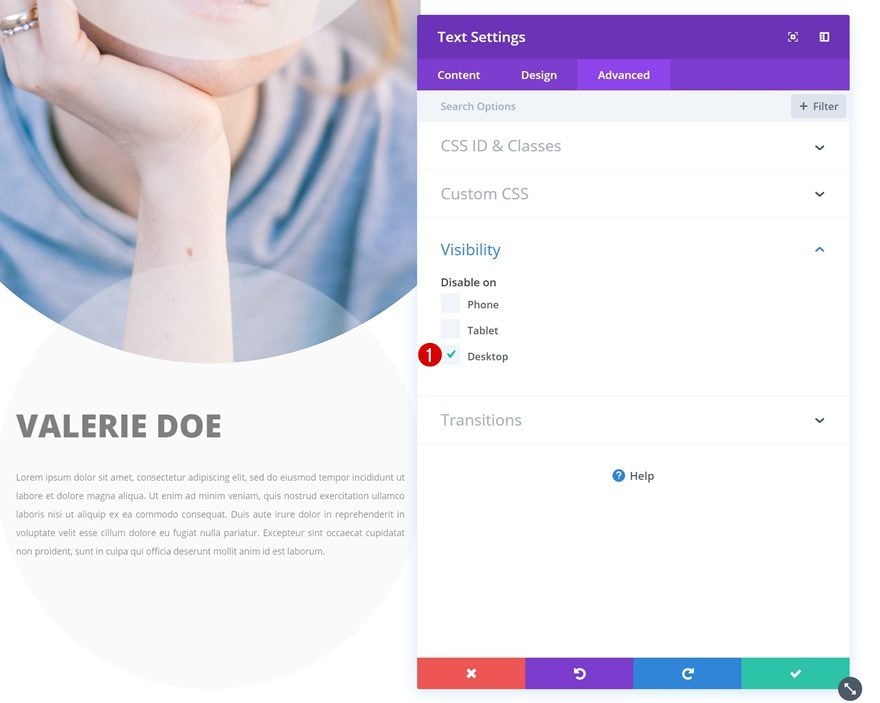
Visibility
And disable the module on desktop.
Change Text Orientation of Both Text Modules
Last but not least, make sure you change the text orientation of both modules as well to achieve the desired outcome.
Example #4
Change Text Module
Default Background Color
On to the fourth and last example! Add the following background color to the Text Module in column 1:
- Background Color: rgba(255,255,255,0)
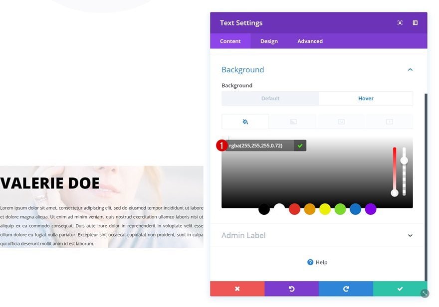
Hover Background Color
Change this background color on hover.
- Background Color: rgba(255,255,255,0.72)
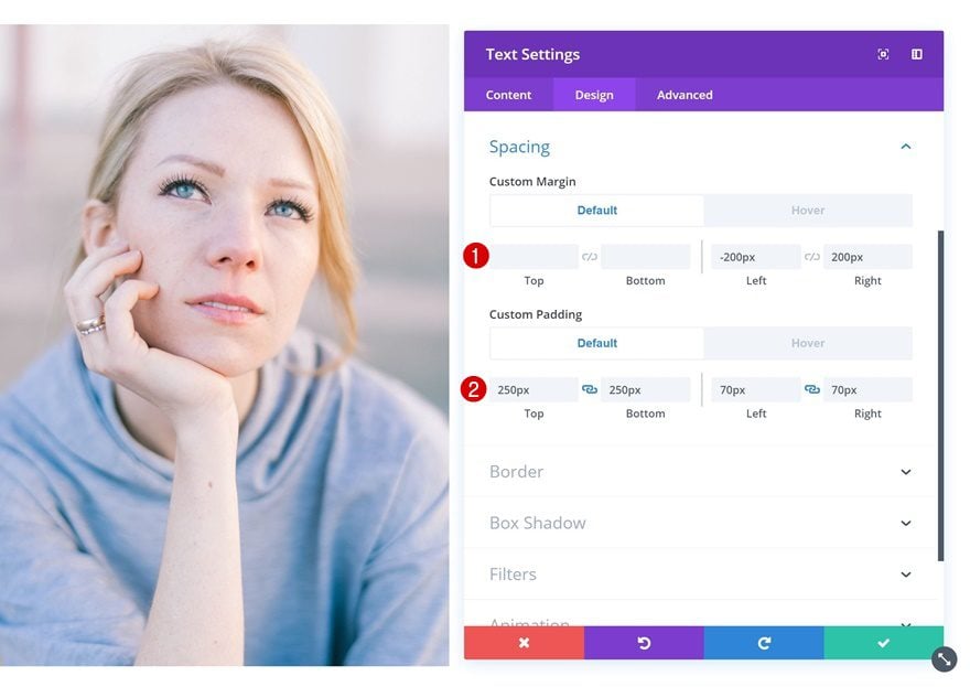
Default Spacing
Go to the spacing settings next and add some custom margin and padding values there.
- Left Margin: -200px
- Right Margin: 200px
- Top Padding: 250px
- Bottom Padding: 250px
- Left Padding: 70px
- Right Padding: 70px
Hover Spacing
Modify these values on hover.
- Left Margin: 0px
- Right Margin: 0px
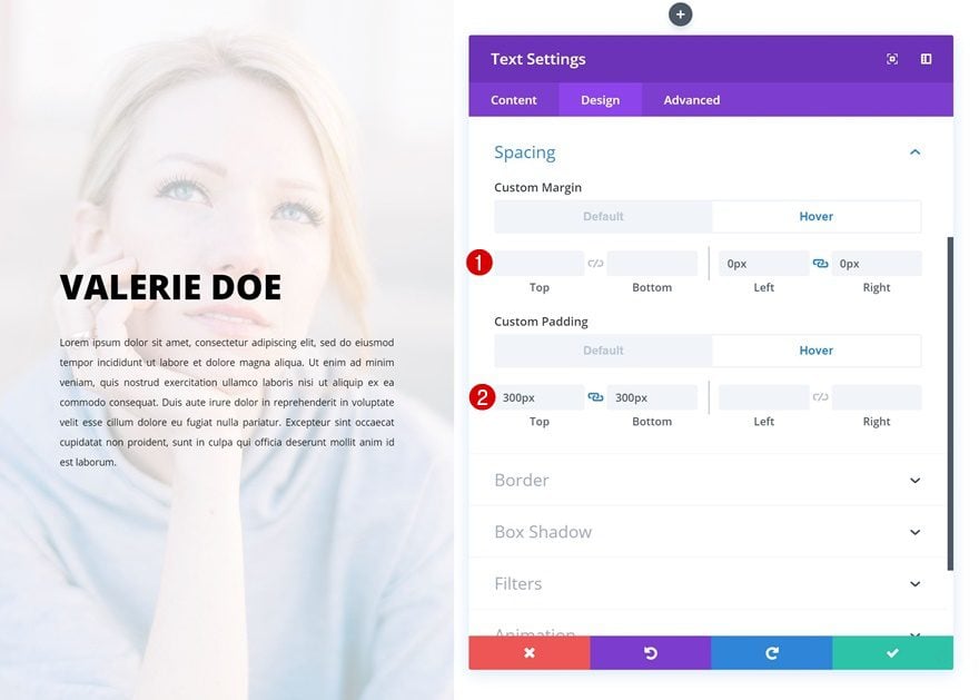
- Top Padding: 300px
- Bottom Padding: 300px
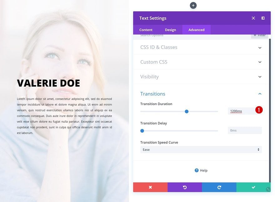
Transitions
Last but not least, increase the transition duration for a smooth transition.
- Transition Duration: 1200ms
Preview
Now that we’ve gone through all the steps, let’s take a final look at the outcome on different screen sizes.
Desktop
Mobile
Final Thoughts
In this post, we’ve shown you how you can creatively use Divi’s hover options to showcase person descriptions on hover. With these four examples, you are ready to transform any testimonial or team member description into an interactive design element on your page. If you have any questions or suggestions, make sure you leave a comment in the comment section below!


