When looking at the past few years’ web designs, you can’t help but notice a pattern of bright colors, asymmetric shapes, and duotones, Truly unique website designs are trending right now. And what’s bolder than taking your words that just lie there flat most of the time and making them into vertical text?
So let’s dig in on today’s tutorial and see what it’s gonna take to get #verticaltext trending.
What You’ll Be Making
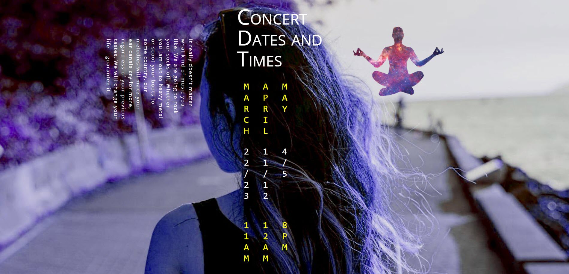
The final result of what I’m walking you through today is simple, clean, and — dare I say it? — elegant. Vertical text is not an effect you want to overuse, so I am thinking of it being maybe a concert schedule, or maybe a listing of class times. Even a food truck menu or location schedule. Basically any information that is quick and needs to be both eye-catching and memorable.
Now let’s get to making it happen for you!
Using Sideways and Vertical Text to Create a Unique Landing Page with Divi
Subscribe To Our Youtube Channel
Add a Specialty Section!
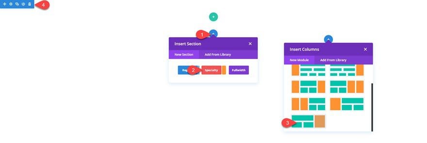
When you open up a new page in Divi, you’re presented with an almost-blank canvas. You start with a regular section. But we don’t want a regular section. We want a specialty section. So hit the blue + circle, click the specialty section button in the middle, and choose the very last one in the new modal. Then delete that boring old regular section.
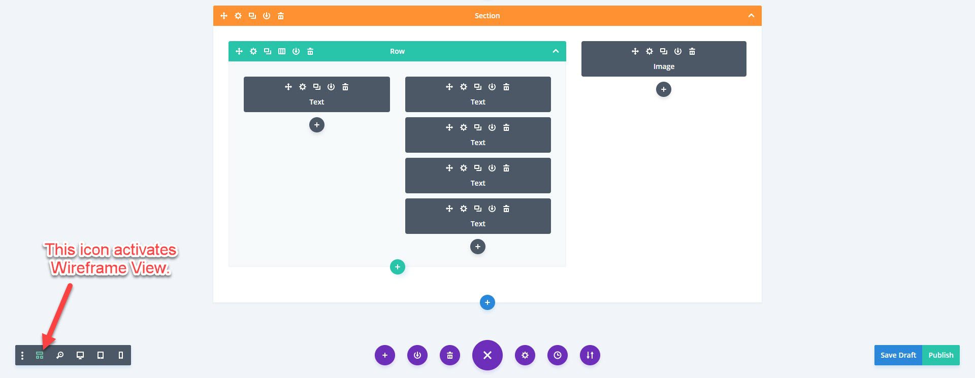
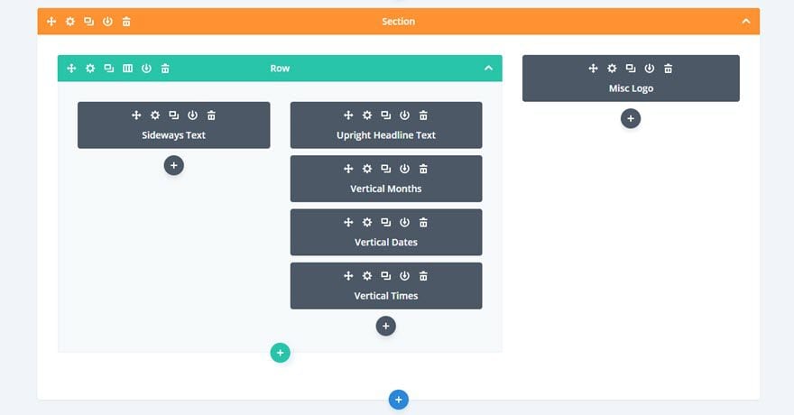
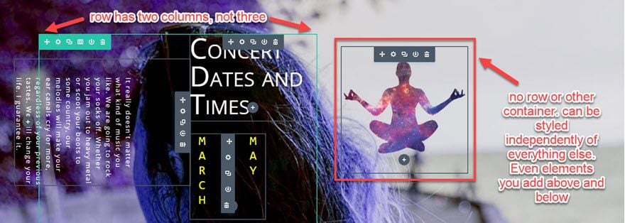
Now, you’re left with a shiny, orange specialty section that’s gonna treat you like you deserve to be treated — special. Inside it, here’s what you want to add: a two-column row with 1 text module in the left column and 4 text modules in the right one. Then you’ll use a single image module in the stand-alone spot to the right.
Also, take note: this is Wireframe View inside the visual builder, and it works just like the back-end builder, but it’s faster. If you haven’t tried it, please give it a shot. It’s really awesome.
Next Stop: Custom CSS
Even if you’re not totally into CSS, these snippets are simple to use and implement, and I’ve made sure to comment the code so you know what each line does. Be aware that the WP built-in linter does not like text-orientation: upright;. Without it, this won’t work. This is one case you can ignore that yellow triangle.
.sideways-text {
transform: rotate(90deg); /* makes entire paragraphs and lines rotate sideways */
}

.vertical-yellow {
text-orientation: upright; /* makes individual characters stand upright, not whole lines like transform: rotate */
writing-mode: vertical-lr; /* continues left-to-right at line break */
color: yellow;
font-size:2rem; /* this will make the body text twice the relative size of the default set for the whole site */
line-height: 200%; /* line height is VISUALLY line-width when it's vertical */
text-transform: uppercase;
font-family: monospace; /* this just pretties up the whole deal, making all characters the same width */
}

.vertical-white {
text-orientation: upright;
writing-mode: vertical-lr;
color: white;
font-size:2rem;
line-height: 200%;
text-transform: uppercase;
font-family: monospace;
}
You can copy and paste this code into your Divi Theme Options‘ Custom CSS field (under the General tab).
Feel free to adjust the class names and colors as you need to for your design. I just liked the way yellow and white looked with the background I used. Speaking of the background…
Making Your Background
I think these kinds of bold sites look awesome with not-so-natural color palettes. Duotones are really on trend right now, so I wanted something like that. There are lots of ways to adjust your images’ colors to duotone, but Flywheel has an awesome tutorial on how to use Photoshop to make one. This time, however, I didn’t use Photoshop — I just played around in Snagit and made something I liked.
I used one of Joy’s amazing photos as a base. (Feel free to download this image and use it however you want, too!). Here’s the original:
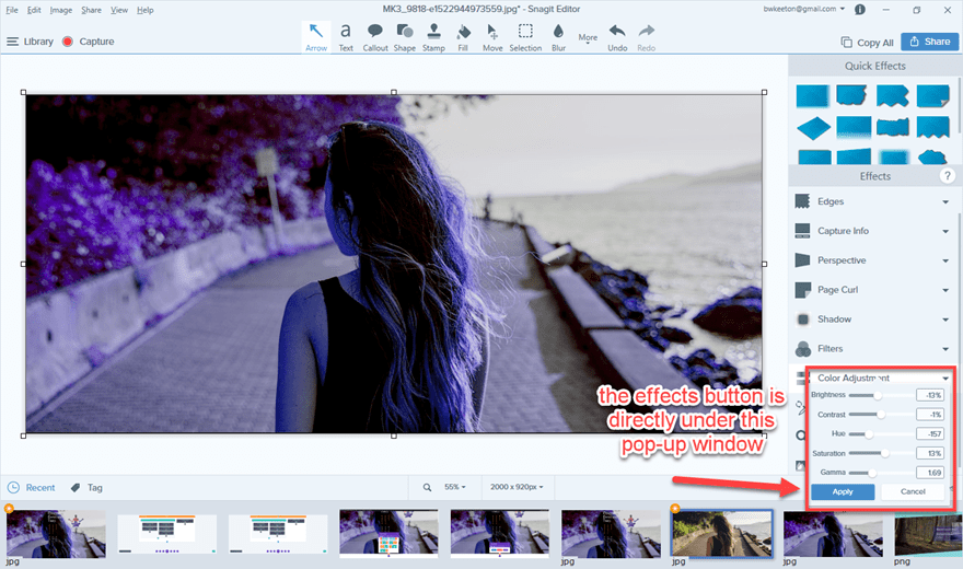
I cropped it down a little (to 2000×920 from 2000×1333), and opened up the Effects window in the lower-right corner and played with the Color Adjustment settings.
- Brightness: -13%
- Contrast: -1%
- Hue: -157
- Saturation: 13%
- Gamma: 1.69
It’s not quite a duotone, but it gave me the same kind of palette to work with.
Once that was done, I went to buildin’ with Divi.
Makin’ It With Divi
Like our text, let’s just start at the top-left and work our way down the page. First up, I made sure to label all the modules for you in the Admin Label section of the module settings. You can also type it in-line using Wireframe View.
Sideways Text
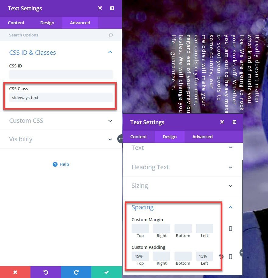
We made the sideways text with a single line of CSS: transform: rotate(90deg); Notice that it’s not a text-transform, just transform. That means anything — images, videos, etc. — in this module will be rotated 90 degrees. (Or the amount you put in).
For the Divi settings, you want to make these changes:
- Design tab, Spacing: 45% top padding, 15% left padding
- Advanced tab, CSS ID & Classes: “sideways-text” in the CSS class field (with no “.” to indicate it’s a class)
Upright Headline Text
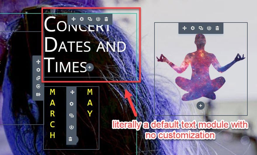
For the Upright Headline Text box…you have to do absolutely nothing. I set this one at H2 and hit save (outside of giving it an Admin Label). (This is Grid View in the Visual Builder in case you were wondering.)
Vertical Months, Dates, Times
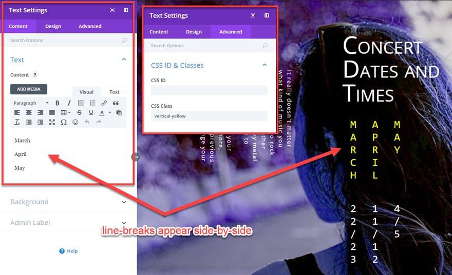
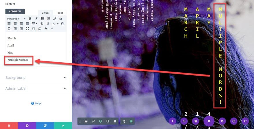
These are, again, text modules stacked on top of one another. Because of the CSS we entered earlier, you can type whatever you want into the content box, and it will come out vertically. When you enter and begin a new paragraph, that will be to the left of the previous one (thanks to the writing-mode: vertical-lr; snippet). If you want the new paragraphs to the right, you can change it to writing-mode: vertical-rl; where the last two letters represent either left-to-right or right-to-left.
This is the same for each and every one of these modules. The only customization I made was adding the vertical-yellow or vertical-white CSS class. The reason for this is that, yes, the CSS we entered with the monospacing and uppercase helps a lot, but the Divi Specialty section is already lined up so that the content is contained well. That’s why I chose to use specialty over normal. It requires a lot less playing with margins and padding and alignment than most sections, rows, and columns usually do.
Now, depending on your background image when you do this, you might have to move stuff around with margins or different specialty sections. I feel like a center-focused background image works well for this kind of site, but if you have one where the main element is to the left or right (or top or bottom, even), positioning may require a little more tweaking.
One other thing: you can also type multiple words. This example just happens to be one word per line. Whole sentences are fine, though harder to read. Keep it short, but you’re not limited to only solo words.
The Lone Image Module
I think of this adding a module over here as optional. It’s there as part of the specialty section, and I think a logo looks nice in most cases. However, if you want to leave it blank, you can. The spacing that the Divi specialty section provides keeps the rest of the page lined up regardless. This one isn’t in a row, which means it’s independent of the styling and spacing you give that container and elements that you place above and below it.
Final Result
I think you’ll be proud of the stuff you can create with these neat effects. Here’s what the above steps will get you, once again.
There You Have It
When you combine the ridiculous number of options you get from Divi (like specialty sections) with just a couple cool (and kind of obscure) lines of CSS, you can make some really unique pages. While this effect is absolutely not right for every site, the inclusion of sideways and vertical text can really make pages stand out and be more memorable than a traditional landing page. So go forth, Divi Nation, and see what cool stuff you can do with vertical text and sidways rotations.
What cool effects have you been able to make with sideways or vertical text?


