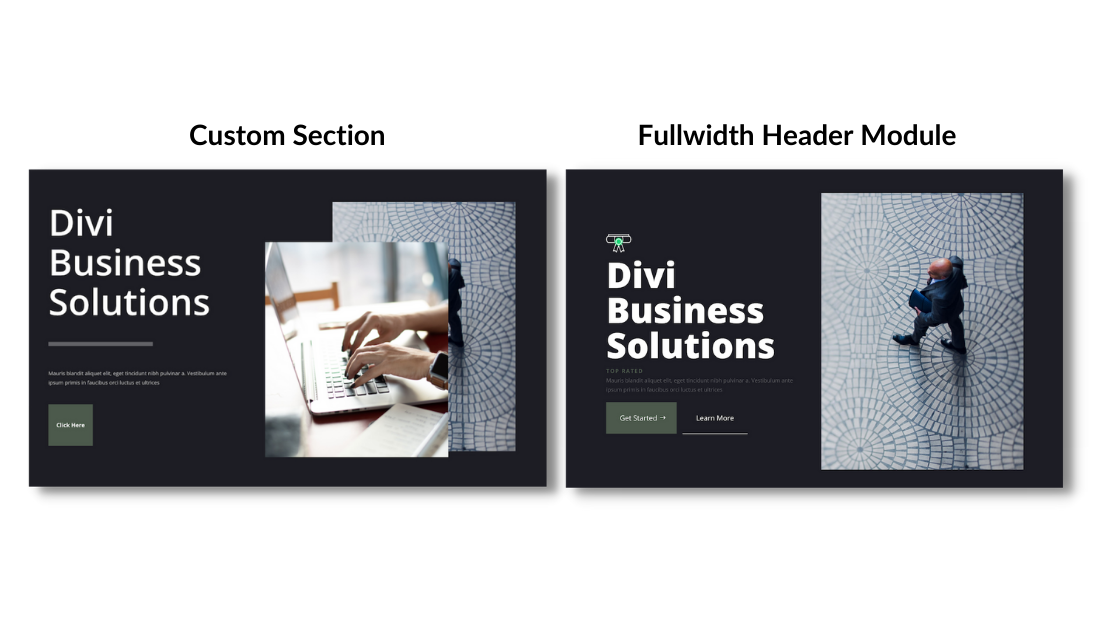
Building a website hero section from scratch or using the Divi Fullwidth Header module are both ways you can build an eye-catching design for your site. In this post, we’re going to look at the pros and cons of using a fullwidth header module versus building your own hero section with Divi.
Let’s get to it!
The Importance of Website Hero Sections
A hero section is the very first section your visitors see when they land on your website. It’s often a fullwidth banner and can also be called a hero header. It’s a prominent spot on your website as it has the power to leave a lasting first impression so it’s important that it’s designed in a way that’s easy to read while also eye-catching and compelling. Website hero sections are important because they can catch the eye of potential customers, quickly describe a page, and lead to further engagement and potential leads. Hero sections should be branded, include an h1 title, and a call to action.
Building a Hero Section from Scratch
Building a hero section from scratch allows you to have complete control over the design and content. Depending on your circumstances and needs, this could be a great solution for your website. Let’s take a look at the pros and cons of this approach.
Pros of this approach
First, let’s take a look at the pros of building a website hero section from scratch using Divi.
1. Complete Control of Design
Building a hero section from scratch allows you to completely control how the design looks. There are no pre-set design styles in place and you’re able to customize to your heart’s content with Divi. You can make it look exactly how you want.
2. Use Any Divi Module
Since you’re building the section from scratch you’re able to add any Divi module to the header. That means you could add an email option, a contact form, a button, a text module, a gallery, etc. The customization options are endless!
Cons of this approach
Now let’s take a look at the cons of building a hero section from scratch.
1. You’re Having to Build From Scratch
If you are looking to get a hero section up in minutes, it might take you a little more tweaking to design a hero section from scratch. There are no pre-set designs in place, so you’ll have complete control, but might spend more time tinkering to get things just right.
2. Requires Multiple Modules
Building a hero section from scratch means you’ll be using multiple modules at once. While this allows for great customization options, this also means your content will be spread out amongst several modules instead of all together in one.
Building a Hero Section With the Divi Fullwidth Header Module
Building a hero section using the Divi Fullwidth Header module makes it easy to build an eye-catching and mobile responsive design in just minutes. Let’s take a look at the pros and cons of this approach.
Pros of This Approach
Let’s take a look at the pros of building a hero section with the Divi Fullwidth Header module.
1. All Your Content is in One Module
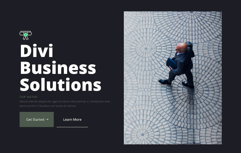
The Divi Fullwidth Header module has it all – images, an icon, header text, subtitle text, body text, and two buttons all within the module. That means you won’t need multiple modules to get the job done, and all your content lives within one module making it easy to customize every aspect of the hero section within one place.
2. Already Design Optimized
The Fullwidth Header module is designed in a way to already be mobile-optimized. That means the elements within the module automatically stack in an eye-appealing way when your visitor is viewing your website on mobile.
Cons of This Approach
Now let’s evaluate the cons of building a hero section with the Divi Fullwidth Header module.
1. Less Flexibility With Design
The Divi Fullwidth Header module comes with pre-defined content options, while many, can be limiting if you are looking to add a piece of content that is not available within the module. This means you’ll have less flexibility with the overall design.
Building Both Hero Sections Step by Step
Now that you understand the pros and cons of both approaches, let’s build each hero section so you can see exactly how each approach works.
What You Need to Get Started
To get started, you will need to do the following:
- Install Divi on your WordPress website.
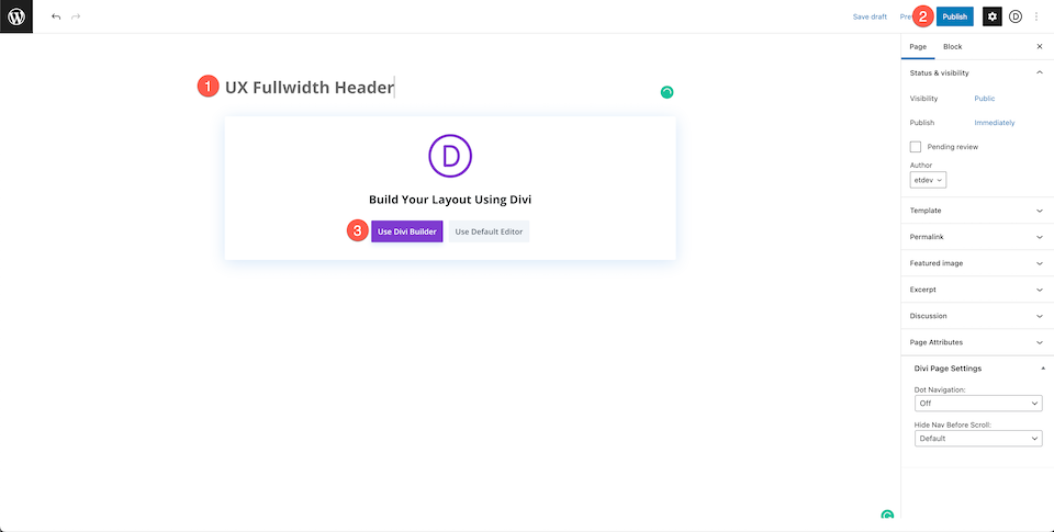
- Add a Page and give it a title.
- Enable the Visual Builder
Creating Your Hero Section from Scratch
Now that we have our page set up, let’s start with creating a hero section from scratch.
Enable the Visual Builder
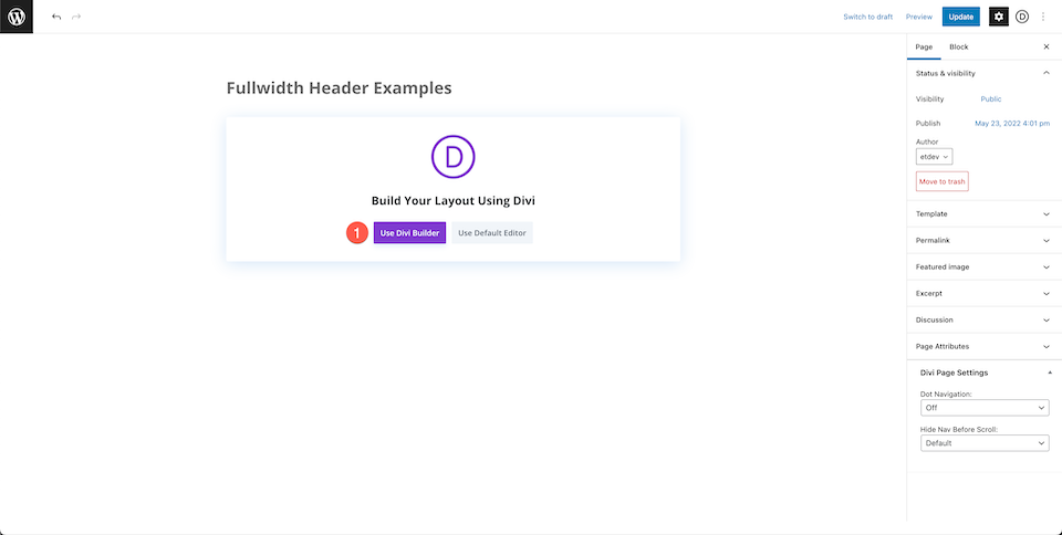
In order to use Divi’s drag and drop builder, we’ll need to enable the Visual Builder by clicking the “Use Divi Builder” button. This will reload the page using the Divi Visual Builder.
Select: Build From Scratch
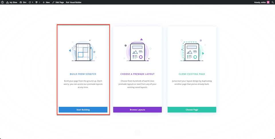
Now that your page has reloaded with the visual builder enabled, click the “build from scratch” options so that we have a blank page to work with when re-creating our design.
Add a Row and Set up Columns
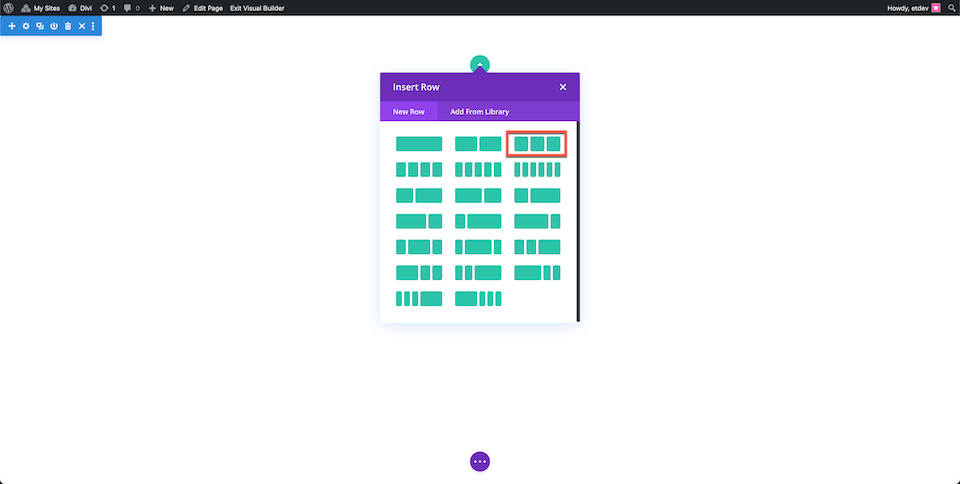
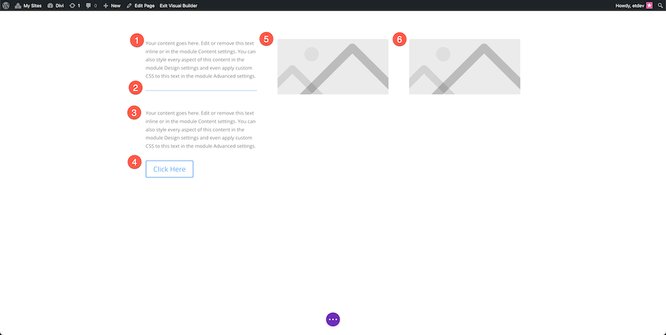
Add a row and choose three columns.
Add Modules
Now let’s add the content modules that we’ll need.
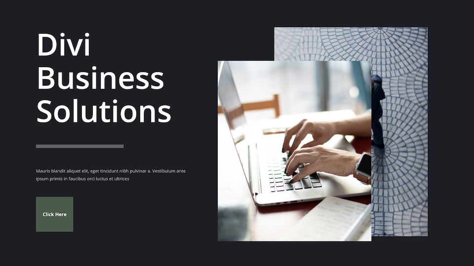
- Left Column: 2 text modules, divider, one button
- Middle Column: Image
- Right Column: Image
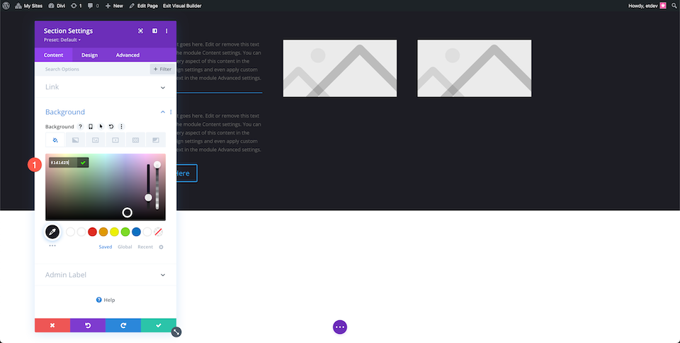
Style Section
Now let’s set up the section settings.
Add a section and then configure the following settings:
- Background color: #1d1d25
Style Header Text
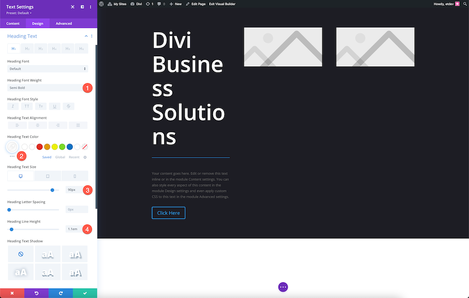
Style the header text:
- Heading Font Weight: Semi Bold
- Heading Text Color: #ffffff
- Heading Text Size: 90px
- Heading Line Height: 1.1em
Style Divider
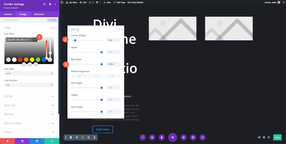
Configure the divider settings:
- Color: rgba(255,255,255,0.3)
- Divider Weight: 10px
- Max Width: 260px
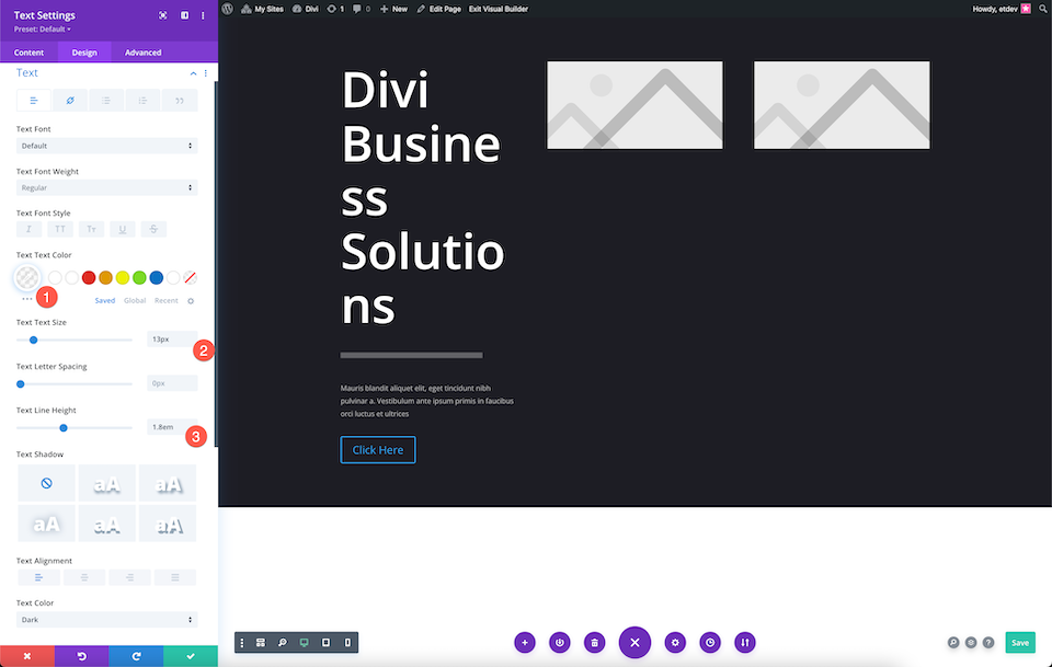
Style Body Text
Style the body text:
- Body Text Color: rgba(255,255,255,0.7)
- Text Size: 13px
- Text Line Height: 1.8em
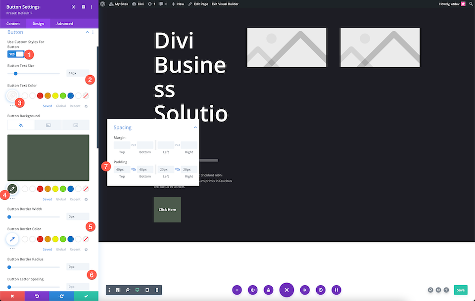
Style Button
Now let’s style the button.
In the Button Tab:
- Use Custom Styles For Button: Yes
- Button Text Size: 14px
- Button Text Color: #ffffff
- Button Background:
- Button Border Width: 0px
- Button Border Radius: 0px
In The Spacing Tab:
- Top and Bottom: 40px
- Left and Right: 20px
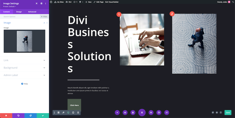
Add Images
Add the images to the image modules.
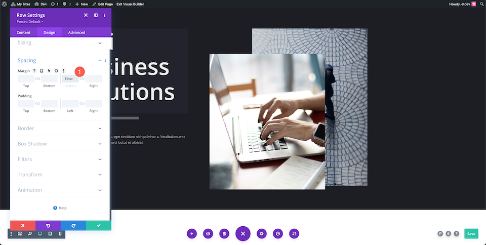
Adjust Row Settings
In the row settings:
- Add 15vw to the left margin.
Adjust 2nd Column
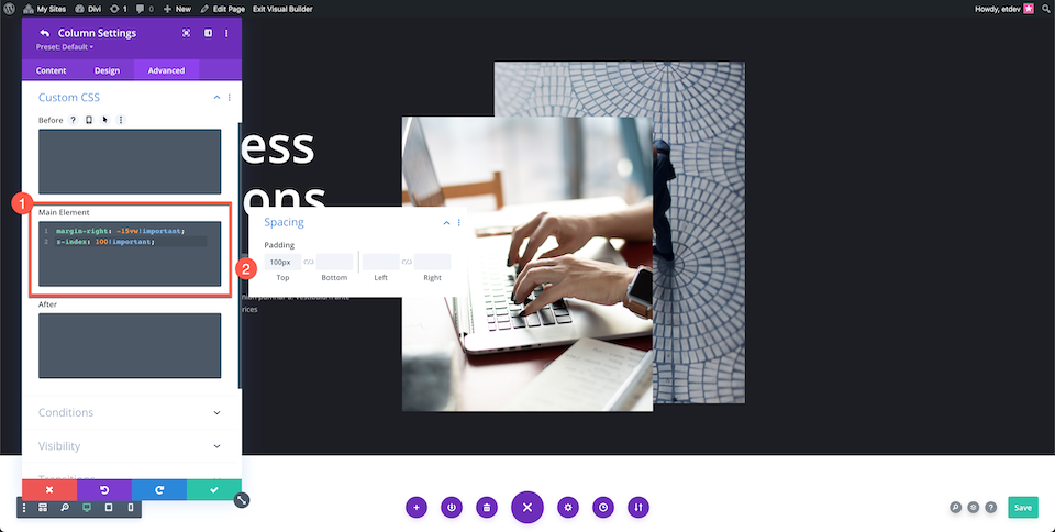
In the second column configure these settings:
Custom CSS
Paste the following code into the Main Element code section:
margin-right: -15vw!important;
z-index: 100!important;
Spacing
Add 100px of top padding.
Voila! Now you have a fully designed custom hero section.
Creating Your Hero Section with Divi’s Fullwidth Header Module
Now let’s explore how to re-create this hero section using Divi’s Fullwidth Header module.
Add a Page and Select Build From Scratch
Add a new page, give it a title, and then click “Use Divi Builder” and then select Build From Scratch.
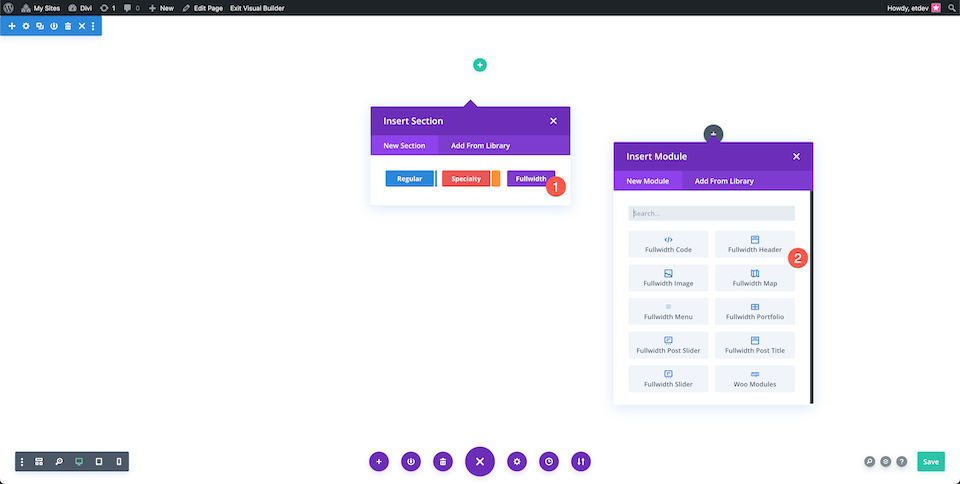
Add a Fullwidth Section and Fullwidth Header
Add a fullwidth section and then select Fullwidth Header from the module library.
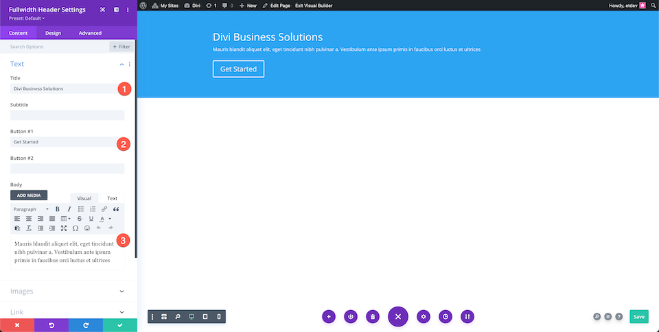
Add Content
Add the text content to the module in the Text tab.
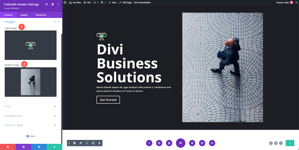
Add Images
Add the images in the image tab.
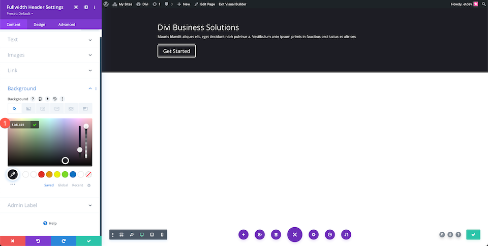
Change Background Color
In the background tab, configure the following setting:
- Background Color: #1D1D25
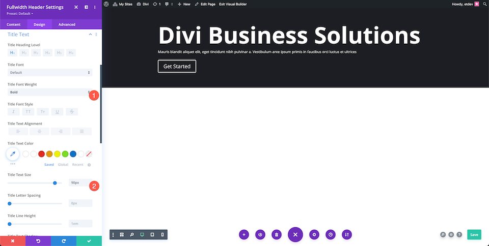
Style Header Text
Configure the Header Text settings:
- Title Font Weight: Bold
- Title Text Size: 90px
Style Body Text
Configure the Body Text settings:
- Body Text Color: rgba(255,255,255,0.55)
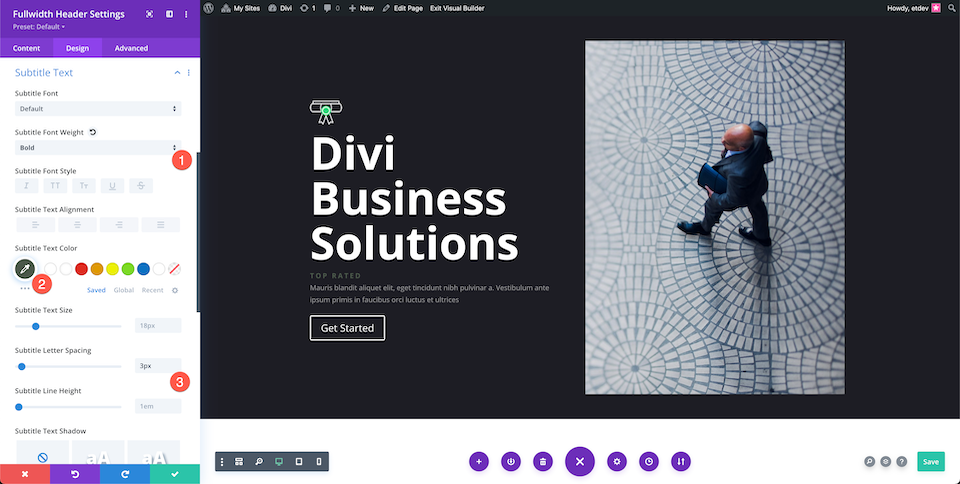
Style Subtitle Text
Configure the Subtitle Text settings:
- Subtitle Font Weight: Bold
- Subtitle Text Color: #4C594C
- Subtitle Letter Spacing: 3px
Style Buttons
Now let’s style the two buttons.
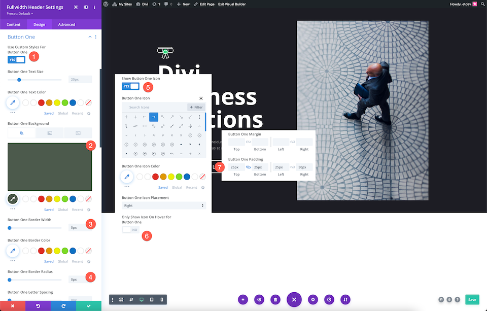
Button One
In the Button One Tab configure the following settings:
- Use Custom Styles For Button One: Yes
- Button One Background: #4c594c
- Button One Border Width: 0px
- Button One Border Radius: 0px
- Show Button Icon One: Yes
- Only Show Icon On Hover For Button One: No
- Button ONe Padding: 25px top and bottom; 25px left, 50px right.
Button Two
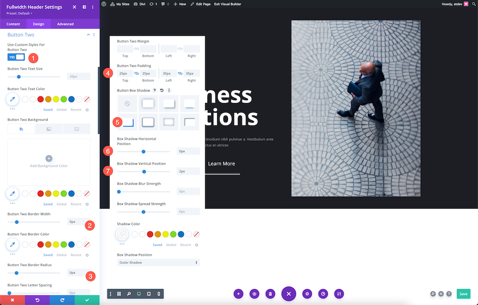
In the Button Two Tab configure the following settings:
- Use Custom Styles For Button Two: Yes
- Button Two Border Width: 0px
- Button Two Border Radius: 0px
- Button Two Padding: 25px top and bottom; 25px left and right.
- Button Box Shadow: Choose the 4th one
- Box Shadow Horizontal Position: 0px
- Box Shadow Vertical Position: 2px
- Shadow Color: #ffffff
Voila! Now you have a fully designed hero section using the Divi Fullwidth Header module.
Final Thoughts
Building a hero section with Divi is easy, whether you’re building from scratch or using the Fullwidth Header module. Both options allow you to create stunning header designs that capture your visitor’s interest. Depending on your unique needs, either option is a great option to consider when styling your hero section. After reading through the pros and cons of both, which way would you design your hero section?

